10,000 search results
(0.026 seconds)
- Work In Progress by StereoType Fonts,
$39.00 Work In Progress is a smooth script font with a very specific style of connected curves. It brings a unique curly style with the possibility to create dynamic dancing words with it's ligatures and alternates.
 - Bitters by Aboutype,
$24.99A grotesque style with extended caps, true short caps and a thin mono-weight drop shadow. Bitters was designed for all media in a wide point size range. Bitters requires subjective display kerning and compensation. - Dirty Bunny by Letterafandi Studio,
$14.00 Dirty Bunny is a Display font. That font is perfect for ; logos, greeting cards, a package design, a brand identity, craft design, any DIY project, book title, wedding invitation, packaging, another christmas project and more.
 - Cocleng Brush by Realtype,
$12.00 INTRODUCE COCLENG HANDWRITING FONTS. Cocleng is a natural brushed font with a dirty textures. This font will give you a fresh and edgy looking design and will look beautiful with offers, fashion magazines, logos & more.
 - Ounce by Typomancer,
$26.00 Ounce is a didone typeface, a combine of high-contrast and rounded characteristic gives a unique feeling. Ounce comes with various weights from Light to Black and two options for Italic. Especially, headline for display.
 - Lunarmod by MADType,
$21.00 Lunarmod is an attempt at creating a full font from a single basic shape, a box with oval ends. It ended up being very modular and looks slightly alien or spacey, hence the name Lunarmod.
 - Potter Alaska by Aldedesign,
$18.00 Potter Alaska is Nice Bold Script Font - A stylish and quirky new bold script. Potter Alaska font was created to look as close to a readable bold script as possible by including a couple ligatures.
 - Mountisa by Lemonthe,
$15.00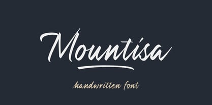 Mountisa is a script font with a dynamic and energetic style. It’s perfect for signature, stationery, photography, social media posts, product packaging, greeting cards, and every other design that needs a unique and striking font.
 - Peperoncino Vintage by Resistenza,
$29.00 Peperoncino is a sans serif font. Designed first with a marker, the irregular strokes create a fresh handmade feeling. After the big success of Peperoncino Family, we create its vintage version adding some "rusted" elements.
 - Swifty by Match & Kerosene,
$25.00 Swifty is four-style font family that features a low x-height and a towering cap height. This gives the font a distinct retro look that is great for titles, magazines, signs, shirts, and scrapbooking.
 - Posie by Great Lakes Lettering,
$30.00 Posie is a hand made font created in Procreate by MJ herself. It's a fun and whimsical font that would be perfect for greeting cards, toys, picture books or anything that requires a naive sensibility
 - Wintery Mix by DP Fonts,
$35.00 Wintery Mix contains a set of small winter and holiday illustrations collected from years of holiday cards I created. A winter scene or greeting can be created with the tap of an 'a' or 'B'.
 - Chubs by Type.p,
$24.00 "Chubs," a typeface specifically designed for large display sizes, perfect for making a bold statement. Each letter in Chubs has been meticulously crafted to possess a thick and prominent appearance, ensuring that your designs leave a lasting impact on viewers. Chubs's distinctive weight and blackness make it an ideal choice for a wide range of applications, including posters, packaging, and logos. Whether you want to create eye-catching promotional materials or design a powerful brand identity, Chubs has got you covered. Within the Chubs typeface family, you'll find two distinct styles, each with its own personality and visual appeal. The first style, "Chubs Black," features letters with a captivating slit, reminiscent of a belly that overlaps. This distinctive groove adds an extra layer of visual interest and uniqueness to your designs. On the other hand, "Chubs Filled" offers a solid and plump appearance, without the characteristic slit. This style amplifies the chubby nature of the letters, resulting in a bold and impactful display. To further enhance your creative options, both styles within the Chubs family include an alternate character set featuring a wink shadow in every letter. These additional characters provide a touch of fanciness and playfulness, allowing you to experiment and add unique elements to your designs. Choose "Chubs" for your next big project, and witness the boldness and charm that sets your designs apart from the rest. Let Chubs bring your ideas to life and make a powerful visual statement that captures attention and leaves a lasting impression.
 - Haunted House by HiH,
$8.00 Halloween lends itself to graphic images: witches, ghosts, bats, jack-o'lanterns and haunted houses. When we think of a haunted house, we generally think of a large, abandoned, derelict Victorian wood-frame house. The style is usually Second Empire or Queen Anne. There tends to be a lot of decoration. There is usually a porch or two with decorative spindle work. There is probably a tower, either square with a mansard roof such as one might see in Paris or round with a conical roof borrowed from a Loire Valley chateau. These houses were generally built in the United States between 1860 and 1900, products of the exuberance of a time before income tax. It took at least three servants to maintain such a house and was very expensive. Few can afford them today. That is why so many were converted to professional offices, multi-family dwellings or simply abandoned. HAUNTED HOUSE is our typographical contribution to Halloween. Based on our font PETRARKA ML, it features decorative capitol letters that utilize the silhouette of a Second Empire style house complete with a dead tree and a full moon. The font includes 8 ornaments suitable for flyers and party invitations. Revision 2.000 eliminates dual encoding, harmonizes metrics, adds new glyphs, and adds open type features. The zip package includes two versions of the font at no extra charge. There is an OTF version which is in Open PS (Post Script Type 1) format and a TTF version which is in Open TT (True Type)format. Use whichever works best for your applications.
 - Daily Routines by Fikryal,
$23.00 The “Daily Routines” Handwritten Display Font is a delightful and charismatic typeface that effortlessly captures the essence of casual elegance. With its carefully crafted strokes and artful imperfections, this font exudes a sense of handmade authenticity that is both inviting and versatile. Designed with meticulous attention to detail, “Daily Routines” showcases a harmonious blend of playful curves and well-balanced letterforms, making it a perfect choice for projects that seek to strike a harmonious balance between approachability and sophistication. Its smooth and flowing lines lend a sense of fluidity and ease, evoking a feeling of effortlessness and natural rhythm. The irregularities in each letter lend a unique charm, reminiscent of handwritten notes penned with care. The “Daily Routines” Handwritten Display Font is specifically tailored for projects that demand a warm and friendly touch, such as invitations, greeting cards, product packaging, and branding materials. It easily conveys a sense of personal connection, making it ideal for conveying heartfelt messages or highlighting the human element in design. Whether utilized for digital or print media, this font ensures legibility and readability, even in smaller sizes. Its captivating appearance adds a touch of personality to any text, making it stand out while retaining a sense of tasteful subtlety. Embrace the captivating allure of the “Daily Routines” Handwritten Display Font to infuse your designs with a genuine and endearing character, elevating them to new levels of aesthetic appeal and resonating with your audience on a profound level. If you have any questions please don’t hesitate to contact me follow my Instagram: fkryall Thank you
 - Nexus Typewriter Pro by Martin Majoor,
$49.00 Nexus (2004) consists of three matching variants – a serif, a sans and a slab – which makes it a highly versatile typeface. Nexus started as an alternative to Seria, a typeface Majoor had designed some 5 years earlier. But soon the design developed into a new typeface, with numerous changes in proportions and in details and with a redrawn italic. Besides the three connected versions (Nexus Serif, Nexus Sans, Nexus Mix) Majoor designed a monospaced version called Nexus Typewriter. The Nexus family is a workhorse typeface system like Scala, with features such as small caps in all weights, four different sorts of numbers and an extensive set of ligatures. All fonts in the Nexus family come in regular, italic, bold and bold italic. Free bonus: there are more than 100 elegant Swash italics and dozens of arrows and other icons. The Nexus family was awarded the First Prize at the Creative Review Type Design Awards 2006.
 - Ebisu by Thinkdust,
$10.00 Ebisu is a sans serif family consisting of 10 different weights. Designed by Alex Haigh in 2010, and influenced by one of his original designs from 2008 Hiruko - Ebisu loses the soft sans serif curves, for a more robust geometric styling. But it’s much more than a geo-replica. The lowercase characters also have a more exaggerated sharpness that gives the whole family a unique look and feel. The kerning has been individually crafted for each letter, with vigorous attention - to ensure that each letter from is produced in a way that works with every member of the set, for a tightly knit sans serif family. It speaks many languages too. The open type features have an extended character set to support Eastern and Western European languages. With each weight conveying a different personality, Ebisu is set to become the modern new sans serif family to sit alongside you classics for versatility, cleanliness and a crafted edge.
 - Balmecia by IbraCreative,
$17.00 Balmecia – A Tall Display Serif Typeface Balmecia is a distinguished tall display serif typeface that exudes a timeless elegance and sophistication. With its tall and slender letterforms, Balmecia commands attention and lends a touch of grace to any design it graces. The carefully crafted serifs add a classic flair, while the generous letter spacing ensures optimal legibility even in larger sizes. Balmecia’s vertical proportions create a sense of stateliness, making it an ideal choice for headings, titles, and other display applications where a touch of refinement is desired. This typeface seamlessly blends tradition with a modern aesthetic, offering a unique personality that captures the essence of both vintage and contemporary design sensibilities. Balmecia is perfect for branding projects, logo, wedding designs, social media posts, advertisements, product packaging, product designs, label, photography, watermark, invitation, stationery, game, fashion and any projects. Fonts include multilingual support for; Afrikaans, Albanian, Czech, Danish, Dutch, English, Estonian, Finnish, French, German, Hungarian, Italian, Latvian, Lithuanian, Norwegian, Polish, Portuguese, Slovak, Slovenian, Spanish, Swedish. **Uppercase
 - Jano Sans Pro by Craceltype,
$39.00 Jano Sans™ Pro is a neo humanist sans serif that was initially created to be used as a text and display typeface in brand communication. The result is a type family with a relatable character and a collaborative profile. Designed with elegant forms, low contrast and a geometric feel, Jano Sans™ Pro is a highly legible typeface suited for any text application and typographic reproduction. Jano Sans™ Pro has 18 styles and its a workhorse type system. It covers 290+ languages, including Extended Latin, Cyrillic and Greek writing systems. With over 1800 glyphs per style, its Opentype features include alternative shapes, small caps, standard and discretionary ligatures, localized forms in Latin and Cyrillic, case sensitive forms, numerators and denominators, proportional and tabular figures, slashed zero, fractions and more. The techie personality and the huge set of features and glyphs makes Jano Sans™ Pro an excellent choice for a wide range of applications, such as branding, editorial, web and broadcast.
 - Haakke by Dawnland,
$13.00 Haakke (or Håkke) - a casual, hand drawn (Stabilo OH pen, Fine) font with 4 alternates to all upper and lower case letters (a-z + å ä ö) as well as numbers for a realistic hand written look and feel! “Ligatures” have been created for double letters (TT, tt, ff, ll & LL (open type version of the font and open type compatible layout application required). Of course it holds all(?) the special characters that you will ever need. 451 glyphs... Haakke also includes symbols. Zodiak signs (letter a-l, upper case A-L write the corresponding name of the sign), planet signs (m-z, upper case M-Z write the corresponding name of the planet) triangles, squares and stars (from pentagrams (5 pointed) to Dodecagrams (12 pointed). (Write a 4, or shift-4 ("euro-sign", european keyboard, or "dollar sign", american keyboard) before your star or triangle and you will get a circle around it).
 - Reilief by Sopheynoft,
$35.00 Reilief is an elegant font, timeless and sophisticated choice that adds a personal touch to any design project. With its flowing strokes and graceful curves, this typeface captures the artistry and fluidity of a skilled calligrapher's pen. Each letter is thoughtfully crafted to convey a sense of elegance and refinement, with delicate flourishes and tapered strokes that lend a sense of movement and grace. With many available ligatures, joining certain letter combinations it creates more legible and pleasing appearance, with the letters appearing to dance across the page. Whether used for wedding invitations, branding, or editorial design, Reilief Fonts brings a touch of intimacy and personality to any project. Its warmth and beauty create a connection with the reader, conveying a sense of care and attention to detail. With its timeless appeal and ability to convey emotion and personality, an elegant handwriting font is a versatile choice for any designer looking to add a touch of sophistication and style to their work.
 - Locked Puzzle by Linecreative,
$16.00 Introducing "Locked Puzzle," a captivating and bold font designed to elevate your creative endeavors with a playful twist. This unique typeface defies the conventional sharp angles, opting instead for a smooth and curvaceous form that seamlessly interlocks, embodying the essence of a puzzle waiting to be solved. Locked Puzzle's characters are imbued with a sense of whimsy and charm, making it a perfect choice for titles, posters, murals, and various works of art that demand attention. The absence of corners in this font contributes to its fluidity and friendly demeanor, creating a visual experience that is both engaging and approachable. What sets Locked Puzzle apart is its ingenious interlocking ligatures. These ligatures provide a dynamic and cohesive flow between letters, adding an element of surprise and coherence to your text. Whether used in digital or print media, PuzzleLock transforms ordinary words into visual puzzles, sparking curiosity and leaving a lasting impression on your audience. **Uppercase
 - Omni Serif by ArtyType,
$29.00 Typefaces don't simply appear fully formed to a designer, even with a clear concept in mind, they evolve naturally during the design & development process. Out of the current 'Artytype' collection, Omni has evolved the most, being a stripped back off-spring from several exploratory exercises. At first glance and particularly at small scale, you'd be forgiven for thinking the basic characteristics have a conventional outlook; but on closer inspection, it's own distinctive, clean cut, subtle styling becomes apparent, revealing enough personality to stand alone or complement a wide variety of projects; subsequently, it's a font that won't go out of style quickly and may even become a modern classic in time. The Omni family has 2 distinct styles, sans and serif, each style being available in 4 weights; all 8 fonts have slanted options to match making a total of 16 fonts. Dictionary definition of OMNI: Combining form - Of all things, in all ways or places. Quite an apt name for a font with ubiquitous aspirations.
 - Nexus Mix Pro by Martin Majoor,
$49.00 Nexus (2004) consists of three matching variants – a serif, a sans and a slab – which makes it a highly versatile typeface. Nexus started as an alternative to Seria, a typeface Majoor had designed some 5 years earlier. But soon the design developed into a new typeface, with numerous changes in proportions and in details and with a redrawn italic. Besides the three connected versions (Nexus Serif, Nexus Sans, Nexus Mix) Majoor designed a monospaced version called Nexus Typewriter. The Nexus family is a workhorse typeface system like Scala, with features such as small caps in all weights, four different sorts of numbers and an extensive set of ligatures. All fonts in the Nexus family come in regular, italic, bold and bold italic. Free bonus: there are more than 100 elegant Swash italics and dozens of arrows and other icons. The Nexus family was awarded the First Prize at the Creative Review Type Design Awards 2006.
 - Kronix by Hazztype,
$20.00 Introducing Kronix, a geometric, futuristic font that embodies the essence of technology in the digital age. Kronix combines sleek lines, precise angles, and contemporary design elements to create a visually striking font perfect for technology-themed projects. Its clean and minimalist letterforms embody the essence of modernity and sophistication, capturing the attention of tech-savvy audiences. With its crisp edges and precise spacing, this font creates a harmonious visual rhythm that adds a touch of elegance to any design. Kronix is versatile and adaptable, making it suitable for a wide range of applications, including websites, mobile apps, and branding materials. Its modern aesthetic aligns perfectly with the fast-paced advancements in technology, allowing your design to stay relevant and visually impactful. Whether you're designing a tech magazine cover, creating a sci-fi movie poster, or developing a high-tech product packaging, Kronix is the ultimate choice for adding a geometric, futuristic flair that captivates the imagination and elevates your design to the forefront of modern technology.
 - Strenght To Strenght by Ronny Studio,
$19.00 Strenght To Strenght is distinctive handwriting and encapsulates the essence of street style. It gives every design project an urban vibe with its rugged and raw characteristics. This font is the perfect choice for people looking for a strong and influential typeface inspired by the rebellious spirit of street culture and graffiti. This font is designed to be versatile, making it suitable for a wide range of creative projects. Whether you're working on a skateboard deck design, a streetwear stuff, or a poster for an underground event, this font will infuse your work with urban attitude and a raw, handcrafted feel. The uppercase characters in Thrasher Head are bold and impactful, while the lowercase letters exhibit a slightly more refined style, providing a balanced mix of legibility and street-inspired aesthetics. This typeface is perfect for an poster event, movie title, streetwear stuff, magazine layout, fashion brand, quotes, or simply as a stylish text overlay to any background image.
 - Holahop by IbraCreative,
$17.00 Holahop – A Chic Signature Typeface Holahop, a chic signature typeface, epitomizes elegance and sophistication with its gracefully flowing lines and distinctive design. This font effortlessly captures the essence of a stylish, handwritten signature, adding a touch of glamour to any project. Holahop’s cursive strokes and carefully crafted letterforms exude a sense of refined simplicity, making it a versatile choice for branding, invitations, and upscale designs. Whether used for personal or professional purposes, Holahop elevates the aesthetic, creating a signature style that resonates with modern charm and timeless grace. This typeface is a seamless blend of chic aesthetics and individuality, offering a distinctive visual identity to any creative endeavor. Holahop is perfect for branding projects, logo, wedding designs, social media posts, advertisements, product packaging, product designs, label, photography, watermark, invitation, stationery, game, fashion and any projects. Fonts include multilingual support for; Afrikaans, Albanian, Czech, Danish, Dutch, English, Estonian, Finnish, French, German, Hungarian, Italian, Latvian, Lithuanian, Norwegian, Polish, Portuguese, Slovak, Slovenian, Spanish, Swedish.
 - Majora Pro by Latinotype,
$29.00 Majora Pro is a slab serif typeface which derives its name from a Portuguese historical toy manufacturer. The font comes in 8 styles, ranging from a delicate Thin to a robust Black, with matching italics and an upright version of stencil fonts, resulting in a total of 24 weights. Majora Pro is well-suited to a wide range of design projects which include packaging, editorial design, screen use, etc. Its humanistic features and moderate contrast between thick and thin strokes make it also suitable for long block of texts while having a high degree of legibility. The font includes a set of alternate glyphs which help give your compositions a different and unique look. The Stencil version was specially designed for use in signage, packaging, titles and headings. Majora Pro contains an extensive set of 750 characters (including small caps, different figure styles, etc.) that support over 200 Latin-based languages. Majora is the previous version of Majora Pro.
 - Kaeswaii by insigne,
$29.99 Introducing Kaeswaii, a font that is ideal for anyone wishing to infuse their creations with a dash of inspiration and delight. It's ideal for producing fresh designs that will stand out thanks to its unique contrast and rounded serifs. It has a joyful feel because of its high x-height, and its playful serifs give it a funky touch. Kaeswaii has enough variety to help your project look better than the rest with forty-eight different styles. Select from nine weights and italics for the standard, condensed, and extended styles. It has rounded corners and a luscious texture and a squishy, gloopy vibe. Atarimae, the hint is to use Kaeswaii when you want to infuse your products with a dash of inspiration and delight. It has a happy feel with its high x-height and rounded serifs. It's ideal for producing fresh designs. Put a playful spin on your work with the unique personality of Kaeswaii's rounded terminals. Let Kaeswaii bring life to your ideas!
 - Sales Pitch JNL by Jeff Levine,
$29.00 Have you ever wanted to set a headline within a burst, but found the drawing of all of those angles was a bit too tedious? Sales Pitch JNL solves that problem by setting letters, numbers and punctuation inside individual sections which, when typed out, generates an extended burst pattern. For a flat sided pair of end caps, use the left or right bracket keys. For burst ends, use the left or right brace keys. A blank space is located on the equal sign keystroke, and a wider blank space is on the plus sign. Keep in mind the optical illusion in some program that shows line gaps between characters on the screen. All characters have equal sidebar settings, and are flush with each other. Sales Pitch JNL contains the basic A-Z and 0-9 characters as well as numerous punctuation. For a companion font with a more complete character set, use Prankster JNL, the same type design, but without the burst pattern.
 - Mica Valo by Jolicia Type,
$19.00 Mica Valo is a sophisticated serif font that exudes timeless elegance and refinement. Its graceful curves and meticulous detailing make it the perfect choice for projects that demand a touch of class. The inspiration for Mica Valo is drawn from the seamless marriage of classic serif aesthetics and a modern sensibility. The result is a font that transcends time, adding a touch of grace and poise to any visual composition. What sets Mica Valo apart is its Alternate version, which introduces a unique twist to the classic serif style. The alternates offer a subtle variation in letterforms, providing designers with the flexibility to experiment and create distinct, personalized looks. This feature makes Mica Valo an ideal choice for branding, editorial design, and other creative projects where a touch of individuality is desired. Incorporate Mica Valo into your creative toolkit and let its elegant vibes and alternate options elevate your designs to new heights, leaving a lasting impression on your audience.
 - Mr Chips by The Ampersand Forest,
$35.00 Mr Chips is a love letter to modern text serif families like Century Schoolbook and Scotch Romans of all kinds. There's nothing precious about Mr Chips. He's built sturdily, but with a less upright stance than his forebears, with a lower, more relaxed x-height. Mr Chips is dependable and true, with recognizable shapes that make him a pleasure to read. He's a Clarendon, but without the bulkiness that makes Clarendons difficult in text. Mr Chips has character sets for Western Europe, Cyrillic, and monotonic Greek. He has a full set of true small caps for versatility and hierarchy, and some fun and functional ligatures. His alternate characters include a one-story a and g in the upright versions, straight and curly Ka's and Zhe's in Cyrillic, and two styles of ampersand. He's an all around usable, agreeable guy! Mr Chips is a companion typeface to Miss McGee, also from The Ampersand Forest!
 - Laborat by Monotype,
$50.99 Typeface Laborat™, designed by Kristína Jandová, is a Grotesk typeface that combines the geometry of a circle and a square. The visual message of geometry is applied to stylistic sets and modified by special characters, including abstract forms or symbols, that turn the typeface into a visual “graphic” language. The basic character of the typeface lies in the default set based on the circle-like shapes of letters. The stylistic sets 01 to 03 are characterized by different geometrical modifications of the growing character and the idea “from circle to square” applied on the letters a, f, g, l, r, t, u, y. By using these different alterations of consistent letterforms, it offers a playful space for everyone. The first inspiration of the typeface origins in Paul Renner’s Futura sketches, that were a celebration of geometrical playfulness of modernism meeting constructivism. It is modified into a new contemporary “wave” of typography as a graphical method. Laborat comes in six weights, from Hairline to Heavy.
 - Gingersans by Sryga,
$22.00 Introducing Gingersans, the typeface that's basically a font party in 12 different weights! Imagine a font that's not just a font but a personality chameleon, smoothly transitioning from easygoing and polite in the regular weights to downright wild and fun in the bolds. It's like having multiple distinct characters living in one seamless universe. The design? Oh, it's calligraphy meets sans serif – the rebel child of fonts. The curves are having a party of their own; they go wild on the Black, get too cute on the Hairline, and throw in some artsy politeness on the Regulars. It's a typographic adventure that keeps the vibe consistent, whether you're going Hairline, Regular or Black. And here's the best part – Gingersans is not just a font; it's a variable font too, with a weight axis to cater to your every design mood swing. Get ready to fall in love with the font that's as versatile as your ever-changing design whims! 🎉✨ #Gingersans #TypefaceMagic
 - Gummies by Heyfonts,
$15.00 Gummies - The fat bubble font is a stylish and playful typeface that features rounded and inflated letterforms, resembling bubbles. The letters are often chunky, with exaggerated curves and soft edges, giving them a plump and rounded appearance. This type of font is popular for its fun and whimsical nature, making it suitable for designs targeting a young audience or those looking to create a lighthearted and energetic atmosphere. The thick and rounded letterforms give a sense of friendliness and approachability, adding a touch of playfulness to any text. The fat bubble font is versatile and can be used in various design applications, such as logos, headlines, posters, invitations, stickers, or website headers. It adds a touch of personality and uniqueness to designs, helping them stand out and grab attention. Overall, Gummies font is an eye-catching and cheerful typeface that captures the joy and energy of bubbles, making it a popular choice for designs that want to exude a sense of fun and playfulness.
 - Resita by Andfonts,
$17.00 Introducing Resita, a sophisticated and elegant Serif font perfect for adding a touch of luxury to your design projects. Resita's thin strokes and delicate curves create a refined and modern look that is perfect for luxury branding, editorial design, and high-end fashion projects. With its unique and distinctive letterforms, Resita stands out from other Serif fonts and adds an air of sophistication and refinement to any design. Its legibility and versatility make it a great choice for a wide range of design applications, from elegant wedding invitations to stylish fashion magazines. Resita is also versatile and easy to work with, making it a great choice for both print and digital projects. Whether you're creating a logo, designing a website, or working on a branding project, Resita's timeless elegance and sophistication will help you create stunning designs that stand out from the crowd. Choose Resita for your next design project and experience the benefits of this luxurious and refined Serif font.
 - Zeppelotta by IKIIKOWRK,
$19.00 Proudly present Zeppelotta - Classic Art Deco Type, created by ikiiko Zeppelota is a classic serif font adapted from the art deco style, a visual style that emerged in the 1920s and 1930s. This font is characterized by bold geometric shapes, a symmetrical design, and a sense of modernity and glamour. Zeppelotta is designed to have a distinctive classic impression with the presence of decorative elements such as extended lines, neat and tidy decorative shapes and types. These decorative elements can add a sense of sophistication and luxury to text. With a wide selection of alternates and ligatures, you can create a variety of styles and play with this unique fonts. This typeface is perfect for an elegant logo, jewelry stuff, packaging, magazine design, fashion brand, classic stuff, poster, flyer, wedding invitation, quotes, or simply as a stylish text overlay to any background image. What's Included? Uppercase & Lowercase Numbers & Punctuation Alternates, Stylistic & Ligature Multilingual Support Works on PC & Mac
 - Simplified by Redy Studio,
$19.00 Simplified – Casual Chic Font Simplified is a casual and natural font, with a spirit of clean-cut modern and classic. This typeface has been specially designed to give a feeling of casual luxury. This is not easy typography! We have done a lot of effort to build this font. In the past, we have experimented with a ton of fonts that are similar to Simplified, and Simplified is better in every aspect that I have found, including some OpenType features and ligatures, lowercase beginning & ending swashes that you can use to make your own style. In short, it’s a typeface that you must have! Simplified features: A full set of upper & lowercase characters Numbers & punctuation 63 Gorgeous ligatures Lowercase beginning swashes Lowercase ending swashes Multilingual symbols PUA Encoded Characters – Fully accessible without additional design software. Feel free to give me a message if you have a problem or question. Thank you so much for taking the time to look at one of our products.
 - ITC New Winchester by ITC,
$29.99ITC New Winchester is a revival of a typeface that never really had a first release. The original Winchester was an experimental design created by the American type designer W.A. Dwiggins in 1944. Dwiggins was interested in improving the legibility of the English language by reducing the number of ascenders and descenders; to do this, he gave Winchester very short descenders and created uncial forms for a number of letters. The result was a distinctive text typeface that was occasionally used by Dwiggins and Dorothy Abbe in handset form. Fifty years later, Indiana type designer Jim Spiece has turned Dwiggins's experiment into a new family of digital text types. Spiece gave New Winchester a bold weight, as well as small caps (both roman and italic) and old style figures; he also created two forms of the lowercase f, one with and one without an overhang (in metal type, a kern), and a full set of f-ligatures. - VLNL Boulangerie by VetteLetters,
$35.00 VLNL Boulangerie was originally an incomplete set of early 20th century wood type letters, that Donald Roos found in a dust covered carton box stashed away somewhere at the Royal Academy in The Hague. Charmed by the letter forms Donald decided to print them on paper with a printing press. Next he digitised the prints as they came out, including small imperfections and damages. The missing characters were composed and added digitally to complete the alphabet. (See if you can spot those!?) We think VLNL Boulangerie is a little French in appearance (hence the name), it's joyful, warm, a little crunchy and round-ish. It defenitely has that ‘je-ne-sais-quoi’ that seperates it from most wood type grotesques. It can be perfect for lettering on a storefront window of – let's say a bread shop or a lunchroom. Or a logo for a downtown hipster café. VLNL Boulangerie hardly has any limitations actually.