10,000 search results
(0.027 seconds)
- Amateur Hunter by Invasi Studio,
$12.00Introducing a Handdrawn Sans Serif, the Amateur Hunter inspired by outdoor lifestyle. Amateur Hunter includes 4 font files with Regular, Stencil, and Stamp styles. Amateur Hunter is a great font for achieving an authentic vintage aesthetic as seen in the display images or Body text project, it is perfect for headings, flyers, greeting cards, product packaging, book cover, quotes, logotype, apparel design, album covers. - Challista by madeDeduk,
$15.00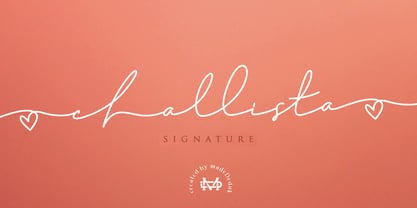 Challista is a luxurious handmade signature font. Challista Signature includes more than 30 ligatures to make everything look like a natural handmade signature.This font is perfect for poster design, book covers, merchandise, fashion campaigns, newsletters, branding, advertising, magazines, greeting cards, album covers, and quote designs and more. Features - Uppercase - lowercase - Numbers and Symbols - International Glyphs - Ligatures If you need anything else please contact me by dedukvic@gmail.com
 - Mastel Gerling by madeDeduk,
$14.00 Mastel Gerling is a modern handwritten Brush. This font perfect for poster design, book covers, merchandise, fashion campaigns, newsletters, branding, advertising, magazines, greeting cards, album covers, and quote designs and more. Feature Uppercase & Lowercase Number & Symbol International Glyphs Multilingual support Alternative Ligature Thanks so much for checking out my shop and feel free to drop us a message any time and follow my shop for upcoming updates
 - SugarBoo by Inumocca,
$20.00 SugarBoo is A Reverse-Contrast letterform , Modern look, Fresh, eyecatching, strong character and power full. The Typeface comes with Stylistic Set Combinations Exellent typeface to use for covering your Project, like Branding, Movie Title, Headline Letter, Bookcover or Book Content, Magazine cover, Poster, Quotes Lettering, Logos, and more your project design. - Unique glyphs - Multilingual Characters Support - UPPERCASE - Lowercase - Numeric - Symbol - Punctuation Character - Stylistic Set inumocca type Studio
 - Laguna Vintage by Aiyari,
$25.00 Introducing Laguna Font Collection. Inspired from American motor inn signs and vintage restaurant signs in 50s-70s. Laguna comes with open type features such stylistic alternates, stylistic sets, contextual alternates & ligatures. Also available in variable font format. Laguna Font Collection is best uses for headings, Logo type, quotes, apparel design, invitations, flyer, poster, greeting cards, product packaging, book cover, printed quotes, cover album, movie, etc
 - Facet Black, a creation by FontFabric, stands out as an emblem of modernity and bold artistic expression within the realm of typography. This font carries a certain robustness and assertiveness throu...
- TypeWritersSubstitute-Black, crafted by the prolific and versatile typeface creator Manfred Klein, is a tribute to the classic, mechanical aura of typewritten documents, infused with a contemporary a...
- Chalk Hand Lettering by Fontscafe,
$39.00 If you are into the vintage feel, you will love this one. This is as vintage as it probably gets. There are probably only a handful of places in the world where schools still use blackboards and chalk – they’ve given way to their white board and marker counterparts for decades now. White boards are definitely more practical and less messy when compared to chalk, but then if you are creatively inclined you will agree that a little bit of mess is worth it if you are going to get the effects that you desired! Well, we can give you the effects minus the mess with our chalk hand lettering fonts! As the name suggests, this font gives you that distinctly unique chalk on slate feel, and if you are wondering what’s distinct about it; writing on slate or blackboard was a slow process which required deliberated and concentrated efforts resulting in a handwriting which was usually quite different to a person’s handwriting on paper. Typography of chalk on slate was an everyday event in the classrooms of yesterday, and today we hardly ever get to see one of these if it all. Writing on a black board with chalk was quite an interesting achievement in its own right, if you ended up with anything legible and if your writing remained focused and ‘in-line’! But of course like everything else, his took time to master and when you did get it right, chalk hand lettering was quite an enjoyable experience! For semi-permanent designs, say for example an eventful day at school; students of the day would create beautiful typography on the boards, and add a solidarity to it sometimes by shading one side of the lettering – usual y the right side towards which the lettering leaned. This is the effect our chalk hands lettering shaded variation gives you. You could get this font individually, but we strongly advise you check out the “chalk hand lettering pack” font. It includes the simple “chalk hand lettering” (minus the shading effect) and also a “chalk hand elements” bag of tricks. The elements is a collection of graphic art which resemble shapes and designs that used to be added to chalk art, to beautify the typography. If you enjoyed seeing the effects of our Chalk Hands font, and the shaded variant – you are simply going to go gaga over Chalk Hand Elements! The chalk hand font of course enables you to make typographic art similar to the effect of chalks on slates and black boards. This was quite the art form in the days gone by! The shaded variation added a bit of solidarity and the technique was commonly used to make semi-permanent designs say for example a welcome note when somebody important was to visit. Classic chalk hand designs, especially the semi permanent ones often had little pieces of art to help beautify the creation as a whole. It could simply be symmetrical graphics appearing before and after the title and headings, maybe just an interesting shape to fill in an empty area on the board, and such…our Chalk Hand Elements offers you a ton of such graphics. The two chalk hand variations and the elements are all included in the Chalk Hand Family, and this is strongly recommended if you want to make designs that are truly reminiscent of the days of chalk on slate.
 - Neue Echo by RMU,
$30.00 Inspired by the former Schriftguss, Dresden, font Echo, this fresh-drawn und designed Neue Echo can be filled in many different ways, and makes it a great display font for labels, posters, headlines etc.
 - Hebrew Saphire Tanach by Samtype,
$189.00 Beautiful font, good for posters, books, and folders, Siddurim, Tehilim, and Tanakh. This is a complete font with all diacritic marks (Nikud and Taamim) and also Shevana, Kamatz Katan, Dagesh Chazak, and Holam chaser.
 - ArgonType by Vic Fieger,
$26.99ArgonType is the first commercial font produced by Vic Fieger. It features thick vertical strokes, soft curves, and incomplete loops. It was designed to be used as an alternative for serif fonts where appropriate. - Gmuender Antiqua Pro by RMU,
$40.00 Inspired by the former hot-metal fonts of Imprimatur, Gmuender Antiqua Pro is a fresh designed versatile and multilingual serif font family. All five styles contain three different forms of numbers and small caps.
 - Carouge Pro by André Simard,
$14.00 Carouge Pro is a contemporary typeface with a classical twist. This duality gives Carouge an energetic and vivid sensibility. Its subtle shapes are highly suitable for all types of documents, including corporate collateral and publicity literature. The fineness of the types provides a pure and elegant style that is highly valued in the fashion and design industry. While extremely legible in small body sizes, its personality comes into full bloom when used in large type sizes. Carouge comprises a wide range of bold fonts, from Ultra Thin to Ultra. The italic companion of the roman type has a split-line allure with a rounded personality. Carouge Pro is available in eight weights from the UltraThin to an Ultra Black. Each weight is also supported by a strong personality cursive italic. “When I designed Carouge, I wanted to create a typeface with a sober appearance and a dash of audacity. Carouge provides a fine balance between two different worlds.” — André Simard Carouge Pro is a contemporary typeface with a classical twist. This duality gives Carouge an energetic and vivid sensibility. Its subtle shapes are highly suitable for all types of documents, including corporate collateral and publicity literature. The fineness of the types provides a pure and elegant style that is highly valued in the fashion and design industry. While extremely legible in small body sizes, its personality comes into full bloom when used in large type sizes. Carouge comprises a wide range of bold fonts, from Ultra Thin to Ultra. The italic companion of the roman type has a split-line allure with a rounded personality. Carouge Pro is available in eight weights from the UltraThin to an Ultra Black. Each weight is also supported by a strong personality cursive italic. “When I designed Carouge, I wanted to create a typeface with a sober appearance and a dash of audacity. Carouge provides a fine balance between two different worlds.” — André Simard
 - Sofia Pro Condensed by Mostardesign,
$25.00 A geometric sans for space saving typography Sofia Pro Condensed is the condensed version of the popular Sofia Pro font family. This typeface was completely drawn with the look of the original normal-width version. Sofia Pro Condensed contains 16 styles from Ultra Light to Black (Ultra Light, Extra Light, Light, Regular, Medium, Semi Bold, Bold and Black) with an alternative glyph set to improve its use in different graphic contexts. This typeface will be suitable for many projects such as titles, subtitles, long editorials, brand building, mobile applications, ebooks, websites or company signage. Its contemporary aspect and its condensed style will also be suitable for editorial projects who needs to save space. Sofia Pro Condensed also has many powerful OpenType features such as case sensitivite forms, old style and tabular figures, ligatures, capital spacing, fractions and alternative characters to give personality to graphic design projects. Designed also for complex editorial content, this typeface has a powerful home kerning system called “Pro Kerning”. With more than 1500 pairs of glyphs in many languages, Pro Kerning optimizes headlines, subtitles, texts as well as long paragraphs in real time. In addition to all the features of its kind, Sofia Pro Condensed is part of a very complete “type system” with style variants such as the normal-width-version (Sofia Pro), the soft version (Sofia Soft) or the rough version (Sofia Rough). With all these typefaces, you have more than 40 styles to make your own vibrant and professional graphics or web creations while maintaining consistency in your creations. The OpenType features of Sofia Pro Condensed have an extended character set to support Central and Eastern European as well as Western European languages, Cyrillic and Greek. For more info about the powerful opentype features and the complete character map of Sofia Pro Condensed, download the PDF specimen to get a detailed view of all features.
 - Oktah Round by Groteskly Yours,
$25.00 Oktah Round Overview: 1600+ characters per font 16 static fonts 1 variable fonts Extensive OpenType features Support for 220+ Languages (Latin & Cyrillic) Special Symbols, Alternate Sets, and Features Free Trial Fonts Available Oktah Round is a rounded version of Oktah Neue. Oktah Round is soft and friendly, modern and warm. It's a typeface that combines human touch with high functionality. Oktah Round comes equipped with 1600+ characters per font and is available in 16 styles (from Thin to Black), and as a variable font that allows you to change weight and slant angle. Oktah Round supports more than 200 Latin languages and has amazing support for Cyrillic languages like Bulgarian, Serbian, Ukrainian, Macedonian, Russian, and others. Relying heavily on the geometric forms and proportions first introduced in Oktah, this rounded version does more than just smooth out a few corners. To make curves sharper and more uniform, some terminals were modified. Other visual features (like curving tails in 'l' and 't') were dropped to create more clear cut look. Oktah Round is perfectly balanced and finely tuned to be the font you'd want to use again and again. The variety or styles and availability of a variable font give Oktah Round a potential to be used across multiple mediums. Oktah Round supports most Latin based languages, it also has support for Extended Cyrillic. The remainder of the extensive 1600+ glyph character set is reserved for punctuation, numbers, special symbols, and all sorts of additional symbols like squared numbers, geometric shapes, etc. All characters are evenly spaced and carefully kerned, so that there are no overlaps or glaring gaps in any language. OpenType features include Legible Alternates, Case Sensitive Punctuation, Fractions, Sub- and Superscript, Black and White Circled Figures, Ligatures, Oldstyle Figures, Tabular Figures and many others. The variable font incorporates both axes (Weight and Slant) and can be used for web and graphic design alike. 16 static font styles can be purchased separately or as part of Oktah Round family. Two fonts can be downloaded free of charge.
 - Tazugane Gothic by Monotype,
$187.99 The Tazugane Gothic typeface family is the first original Japanese typeface created by Monotype. Designed by Akira Kobayashi, Kazuhiro Yamada and Ryota Doi of the Monotype Studio, the Tazugane Gothic typeface offers ten weights and was developed to complement the classic Latin typeface, Neue Frutiger. The design of the Tazugane Gothic typeface balances an original, humanistic style with elements of traditional Japanese handwriting. The two typefaces work together in a natural, seamless and adaptable manner so that Japanese and Latin texts can be used side-by-side for a wide range of applications, including in magazines, books and other print media; on digital devices; in branding and corporate identity systems; and in signage for buildings, highways and mass transit. Tazugane Gothic was updated to support the “Reiwa” new era symbol. Reiwa can be written as two kanji: 令和. This update to Tazugane Gothic includes Reiwa designed as a single ligature and is encoded as U+32FF. The inspiration for the Tazugane Gothic typeface is as elegant as its design. Since antiquity, cranes have been regarded in East Asia as auspicious birds for their noble appearance and elegance in flight. The typeface is named Tazugane Gothic in honor of the longevity of the crane, with the goal that it will be used for many years to come. The combination of the Tazugane Gothic typefaces’ traditional and humanistic elements, along with its intended ability to complement popular Latin typefaces, makes it one of the most uniquely flexible designs for applications where Japanese and Latin texts can be used together. The typeface family was created to have wide appeal, with a pleasing and consistent experience for readers, for use on screen, in print, in signage, packaging and advertising. Tazugane Gothic has 10 weights. The Light, Book, Regular, Medium and Bold weights are considered best for text sizes. The Ultra Light, Thin, Heavy, Black and Extra Black weights are recommended for headline sizes.
 - Sada by Arabetics,
$45.00 Sada is a text font designed with hand held devices and ebooks in mind. Glyphs are designed to be larger than usual and very clear with soft visual characteristics and many traditional Arabic calligraphic transitional features incorporated to improve legibility. The word “sada” means “echo” in Arabic. Even though Sada is a cursive style font it offers clearly distinguished and visually unified letter shapes in every position of a word. Sada supports all Arabetic scripts covered by Unicode 6.1, and the latest Arabic Supplement and Extended-A Unicode blocks, including support for Quranic texts. It comes with three weights, regular, bold, and ultra-light. Each weight has normal and left-slanted “italic” styles. The script design of this font family follows the Arabetics Mutamathil Taqlidi style and utilizes varying x-heights. The Mutamathil Taqlidi type style uses one glyph per every basic Arabic Unicode character or letter, as defined by the Unicode Standards, and one additional final form glyph, for each freely-connecting letter in an Arabic text. Sada includes the required Lam-Alif ligatures in addition to all vowel diacritic ligatures. Sada’s soft-vowel diacritic marks (harakat) are only selectively positioned with most of them appearing on similar lower or upper positions to emphasize they are not part of letters. Kashida is zero width glyph.
 - Caride Script by Krafted,
$10.00 Look back to learn how to look forward - Joe Girard Find yourself and share your purpose with the Caride Script. With its bold vintage script type, sometimes you need to remind others that we must look to the past to pave a better way for our future. It’s time for you to unleash the old school retro trend again. Leather jackets? Making a comeback. Pompadour hairdos? Definitely cool. 70s music? They’re sampled in the music all over our radio stations! The magnificence of the past will surely help you give a new and fresh breath of life to your projects. This font was designed for you to use in any kind of projects that you might have! They were specifically designed to fit in anywhere you want them to be. We assure you that there will be no awkwardness in the relationship between your text and your designs, they’ll get along well like old-timey partners! The Caride Script is the perfect addition to bring your perspective to the world. Have the world see you and your encompassing view of the human experience with your creations!
 - Eknaton by T4 Foundry,
$21.00The powerful Eknaton comes with slanted slabserifs, a new way to add some spring to the old Egyptian slabs. Eknaton echoes the tradition that started with Napoleon's Egyptian campaign 1798, and the simultaneous looting of Egyptian art. The imports led to new ladies fashion in Europe, new architecture and new typefaces like Antique (Figgins, 1815) and Egyptian (Caslon, 1816). The Egyptian faces were also the origin of the famous Clarendon (1845) and Ionic No.5 (1925) as well as the rest of "the legibility types". In the 20th century the slabserifs became popular again with Bauhaus incarnations like Memphis (Wolf, 1929) and Beton (Jost, 1931). The Bauhaus movement, otherwise anti-serif, liked the architectural influence in Egyptian slabserifs. The Bo Berndal design of Eknaton puts some speed into the old Sphinx - the cat is back, in better form than ever! Bo Berndal, born 1924, has been designing typefaces for 56 years, for Monotype, Linotype and other foundries. Eknaton comes in five different widths, from Tight to Expanded, and is an OpenType typeface for both PC and Mac. Swedish type foundry T4 premiere new fonts every month. Eknaton is our eleventh introduction. - Johto by Superpencil,
$32.00 Finally, a font that’s ready for your pixel adventures. Johto is a hand-crafted, pixelated font that captures the excitement of 1990s Tokyo for today’s developers, designers, and video-game makers. We all love the pixelated games we played as kids. Now, as programmers, video makers, and creators of side projects that make our hearts pound with passion, there is nothing more satisfying than imagining ourselves in the shoes of the people that inspired us. We want to feel like we're right back there in the excitement of 1990s Tokyo, as an artist or engineer. Johto was created because of our disappointment with the pixel fonts we found online. And for people like us, who care deeply about the quality of our work - especially the work we do for ourselves - we realized we needed a high-quality pixel font to give our work the look it deserves. With over six hundred characters plus support for dozens of languages, including Japanese, tons of fun hand-crafted ligatures to get the look right, Johto is an authentic nostalgia trip. It has all those missing details you didn't notice, but your brain did.
 - Chopper by Canada Type,
$24.95 In 1972, VGC released two typefaces by designer friends Dick Jensen and Harry Villhardt. Jensen’s was called Serpentine, and Villhardt’s was called Venture. Even though both faces had the same elements and a somewhat similar construct, one of them became very popular and chased the other away from the spotlight. Serpentine went on to become the James Bond font, the Pepsi and every other soda pop font, the everything font, all the way through the glories of digital lala-land where it was hacked, imitated and overused by hundreds of designers. But the only advantage it really had over Venture was being a 4-style family, including the bold italic that made it all the rage, as opposed to Venture’s lone upright style. One must wonder how differently things would have played if a Venture Italic was around back then. Chopper is Canada Type’s revival of Venture, that underdog of 1972. This time around it comes with a roman, an italic, and corresponding biform styles to make it a much more attractive and refreshing alternative to Serpentine. Chopper comes in all popular formats, boasts extended language support, and contains a ton of alternate characters sprinkled throughout the character map.
 - Hickory by FontMesa,
$25.00Hickory is the revival of an old unnamed font dating back to 1852 and was sold through a few different type foundries including Bruce, MacKellar Smiths & Jordan and James Conner's Sons. By the year 1900 this font disappeared from the major type foundries, now with the digital age of type we're proud to revive this old classic font that hasn't been used in over one hundred years. The original font was only available as an uppercase with punctuation and an ampersand. Today the character set has been updated to include a new lowercase, numbers and accented characters for Eastern, Central and Western European countries. Three fill fonts have been created for the Hickory font making it easier for you to add different colors, textures and patterns to the letters. You will need an application that works in layers such as Adobe Photoshop or Illustrator in order to use the fill fonts, some fill fonts may look good as a stand alone font, the Hickory fill fonts however do not look good used apart from the Hickory main font. I hope you enjoy this old font as much as I did making it. - Othello by Monotype,
$29.99 Othello's dense graphic demeanor delivers a straightforward, no-nonsense message. This versatile revival has a direct, experiential quality that suggests action and the outdoors. Originally released by Monotype in 1928, Othello was offered as competition to Rudolf Koch's Neuland typeface. This new digital version includes a wide variety of previously unavailable characters. Small caps, alternate letters, ligatures, and special joined logotype" characters add to the versatility of this powerful communications tool. These many letter variants create new possibilities for headlines and short text blocks in advertisements, signage, and packaging, suggesting the immediacy of woodcuts or hand-drawn lettering."
 - Ethna by NREY,
$19.00 Ethna is a modern sans-serif font. It perfectly represents modern and vintage esthetics. The font includes uppercase and lowercase letters and multilingual support. This font looks amazing as standalone words and as full text blocks. Also it good for bright captions and unforgettable logos. Language support for more than 30 languages: Afrikaans, Basque, Bosnian, Catalan, Croatian, Czech, Danish, Dutch, English, Estonian, Filipino, Finnish, French, Galician, German, Indonesian, Irish, Italian, Latvian, Lithuanian, Malay, Norwegian Bokmal, Portuguese, Romanian, Russian, Slovak, Slovenian, Spanish, Swahili, Swedish, Zulu etc. Download Ethna for your next project today! Thank you and have a great day!
 - TWT Prospero by Three Islands Press,
$24.00TWT Prospero is the kind of typeface you seldom find in blocks of continuous text these days. Similar fonts based on late-18th-century work by Bodoni, the Didots, and others tend to be reserved for display type: their exaggerated contrast and vanishing hairlines can make you squint and strain at small sizes. But TWT Prospero, with its moderate contrast and fairly robust hairlines, is impressively legible in book text while remaining ideal for use in display situations. The full family has seven styles: roman, italic, bold, bold italic, condensed roman, condensed italic, and condensed bold. - Adelios by Ilham Herry,
$20.00 Adelios is a display typeface with 12 styles that can stand alone or with layering system. There are 6 styles that can stand alone: Outline, Base 01, Inline, Block, Wireframe, and Monoline, and also allows for mix and match to make this font more decorative by adding Outline, Extrude, Line, Cast, Light, Bottom. Traveling posters, movie theater sign, and Building art deco were the main inspiration for this font. Geometric and decorative shapes are the main characteristics of this font. This font is perfect for Headline, Poster, Signage, Menuboard, Greetingcard, etc. Hope you enjoy with this font.
 - FF Prater Serif by FontFont,
$62.99 German type designers Henning Wagenbreth and Steffen Sauerteig created this display and serif FontFont in 2000. The family contains 2 weights: Regular and Bold and is ideally suited for advertising and packaging, festive occasions, film and tv, editorial and publishing as well as poster and billboards. FF Prater Serif provides advanced typographical support with features such as ligatures, alternate characters, and case-sensitive forms. It comes with tabular lining and proportional lining figures. This FontFont is a member of the FF Prater super family, which also includes FF Prater Block, FF Prater Sans, and FF Prater Script.
 - Tolkiens Christmas by Kaer,
$19.00 Hey guys! Once I got a book "Letters From Father Christmas" by J.R.R. Tolkien. He wrote them for the children every December from 1920 to 1943. I totally fell in love with the calligraphy in those letters. Now I created a font and you can use it to write your own letter from the North Pole. I've also redrawn stamps and patterns from that book, so you can decorate your blank. It's Icons font style. You'll get: Regular and Icons styles Numbers and symbols Multilingual support and alternative symbols Thanks! Feel free to request to add characters you need: kaer.pro@gmail.com
 - Marconi by Linotype,
$29.99 Marconi was created by Hermann Zapf in 1973. According to Gerard Unger, it was the world's first digital typeface. Zapf’s design was developed as a text face for books and magazines. The round forms of the Marconi follow the principle of the superellipse. The lowercase letters are enlarged as the result of reading tests, while the capital letters are slightly reduced. The 8-point size — normally used for newspapers — looks more like 9 1/2 points. Marconi is a legible typeface with its large and open lowercase letters. It is ideal for long text blocks in newspaper, book, and magazine production.
 - Crimmy by HansCo,
$15.00 Crimmy is a modern and clean brush with natural a handwritten font. This texture is very detailed. You can see the swash brushes as alternate characters in this font. Crimmy is suitable for logos, shirts, fashion, blogs, websites, product branding, posters, flyers, any print template or for text overlay to any background image. How to use alternate: if you use Adobe / Corel Draw you just block one of the letters / numbers (for swash) and an arrow will appear under the letter, and you can replace it with alternative characters. Alternative character ready for " f , g , j , y and numeral 0 - 9 "
 - Hiroshima Gyoshi by 38-lineart,
$14.00 Hiroshima Gyoshi is a handwritten font inspired by ancient Japanese calligraphy. The thick and random strokes look very prominent and play with negative space. You will feel the rhythm in irregularity. it is a bold handwritten font, carefully handcrafted to become a true favorite. Its casual charm makes it appear wonderfully down-to-earth, readable and, ultimately, incredibly versatile. This fantastic font is best suited for headlines of all sizes, as well as for blocks of text that have both maximum and minimum variations. Whether it’s for web, print, moving images or anything else – Hiroshima Gyoshi will look spectacular
 - KG Build A Game by Kimberly Geswein,
$5.00 Build your own board game! This unique font contains lots of bits and pieces to put together your very own custom board game. Print the backgrounds large on cardstock and use the blank die outline to createa custom die! This is a great creativity builder for kids – let them create their own game with their own rules! Alisha Peare of The Bubbly Blonde has come up with a great free synonym/antonym game to showcase some of the ways you can use this font. Download her excellent game for free here: http://www.teacherspayteachers.com/Product/Lost-Leprechaun-AntonymSynonym-Game-Board-FREEBIE
 - TyfoonScript by Fontforecast,
$20.00 TyfoonScript is the handwritten relative of TyfoonSans. With its slightly rough contours it has a lot of personality and good legibility when used in small sizes. It consists of 719 glyphs, has multiple language support and comes in 3 weights. Stylistic alternates, ligatures and contextual alternatives contribute to an authentic handwritten appearance. Fractions, old-style and tabular figures are also included. Suitable for blocks of text as well as quotes, remarks, statements or a personal friendly emphasis. TyfoonScript and TyfoonSans share the same metrics and blend together perfectly. They can be used in the same text frame without adjustments to leading or size.
 - FF Prater Sans by FontFont,
$62.99 German type designers Henning Wagenbreth and Steffen Sauerteig created this display and sans FontFont in 2000. The family contains 2 weights: Regular and Bold and is ideally suited for advertising and packaging, festive occasions, film and tv, editorial and publishing as well as poster and billboards. FF Prater Sans provides advanced typographical support with features such as ligatures, alternate characters, and case-sensitive forms. It comes with tabular lining and proportional lining figures. This FontFont is a member of the FF Prater super family, which also includes FF Prater Block, FF Prater Script, and FF Prater Serif.
 - TF The Fest by Tyfomono,
$29.00 Take your design game to the next level with a bold, thick and expressive font that truly looks hand painted. The Fest uses authentic looking fonts and is sure to grab the attention of customers and designers alike. We made 2 styles for The Fest, it lets you explore and improve the personality of your design works. This version is also great for blocks of text and small print. Slanted - With a little improvement for the slanted version, The Fest Slanted is fit for the any size. These style is alternative of your choices for the look.
 - Coma by Volcano Type,
$19.00 Originally designed by Alois Ganslmeier as a Billboard-Font, the Coma Font was later developed into a complete typeset with capitals and small letters, Cyrillic letters, Greek letters and Hebrew letters by Andy Jörder and Jörg Herz. The Coma Font is a massive constructed font which can be used for headlines. When only typed in capitals it gives the impression of blocks for there are no ascenders or descenders. The font comes alive because of its massive appearance, its edgy form and the opulence impression when used line-by-line. Not without reason, the font is named “dick und eckig”.
 - Hammer and Tongs by Komet & Flicker,
$10.00 Hammer & Tongs works great for all kinds of branding projects, advertising, websites, packaging, and posters – essentially anywhere you need bold, strong communication. Inspired by the lettering found on military vehicles, this font works great for headlines and is effective for short blocks of body copy. H&T also has a strong retro industrial/athletic vibe and works well for modern-vintage style designs. This font is available in two styles: a Hard version with sharp, crisp edges and a Soft version with rounded corners. Both styles include a complete set of numbers, punctuation marks, and extended characters.
 - VVDS Rashfield by Vintage Voyage Design Supply,
$20.00 Rashfield is a soft serif type family in 5 weights and italics. Inspired by classical Windsor mood in Woody Allen movie titles, with outward bent h, m, n and a lot of modern alternates. Softly character with a hint of retro feeling. Rashfield has a lots of stylistic alternates that makes it very playful in various uses like logos, prints, branding, web design, packaging and more. Use it to create short powerful phrases and headlines and also use it in longer text like paragraphs and block texts. Perfect for modern projects with a little retro mood feel.
 - Umberland Slab by Sharkshock,
$115.00 Umberland Slab is an attractive family available in 3 different weights with italics. There’s a particular emphasis on simple geometric shapes and the way they interact with tall vertical strokes. Smooth curves and sharp angles blend together in a pleasing symmetry. Stroke widths are given variable degrees of contrast but serifs are consistent and heavy handed. Spacing is on the tight side with some lowercase pairs quite snug against each other. Umberland Slab would work well in small blocks of text, corporate logos, menus, or signage. This family is equipped with European accents/diacritics for international support, fractions, alternates, and ligatures.
 - Nordic Tale by Struvictory.art,
$14.00 We would like to introduce our new Christmas typeface Nordic Tale. The font is created with love for the Scandinavian aesthetics, it is decorated with Nordic patterns. Every letter of the folkart font is a separate cultural story. The typeface includes Decorative, Blank and Symbol versions. The font is easy to use in various design programs or without any program. Nordic Tale font is suitable for lettering posters and cards, tourist brochures, photo overlays, Christmas and cozy winter design. The font works great both for printing clothes and interior decoration. Also use individual letters and symbols to create logos and monograms.