7,576 search results
(0.024 seconds)
- Mantap by Sulthan Studio,
$10.00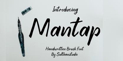 is a sweet and friendly handwritten font. Its natural and unique style makes it incredibly fitting to a large pool of designs. The only limit is your imagination!
 - Master Flo by ParaType,
$25.00 Master Flo is a freestyle script based on handwriting. The face inspired by flat-nib felted pen or brush calligraphy. For use in short texts and informal headlines.
 - Happy Dreamer by Seemly Fonts,
$12.00 Happy Dreamer is a simple handwritten font. Its natural and unique style makes it incredibly fitting to a large pool of designs. The only limit is your imagination!
 - Qasiru by Phoenix Group,
$13.00 Qasiru is a messy handwriting font with a theme of fun and love, it has bold and irregular lines, but fits perfectly in the whole lettering. Thank you
 - LF Plain Jane by Lo-Fi Fonts,
$5.00 Don’t go for the fonts with all that fancy flare. You want something classy and timeless. A font that tips the hat to the old school hand letterers.
 - LHF Firehouse by Letterhead Fonts,
$42.00 This style was actually inspired by some old stock certificates Tom had collected. It’s a very versatile font and allows for some horizontal stretching. Fits almost any space.
 - Six Minutes Narrow by Rawblind Basetype,
$11.99 SixMinutesNarrow is - as the name suggests - a narrow version of SixMinutes. Just as quick, dirty and tasty as SixMinutes, but it will fit more text in less space.
 - EgyptianTwo by Wooden Type Fonts,
$15.00 A revival of one of the popular wooden type fonts of the 19th century, with classic flat slab serifs, unbracketed, short descenders. Very popular in the 19th century.
 - Flamante Serif by deFharo,
$8.00 Flamante Serif is a family of 8 typographies with thick square serifs of the slab type, also known by the Egyptians, which are released with four weights: Light, Book, Medium and Bold and their corresponding italic versions. They are heiress fonts of the Egyptian types arisen at the beginning of the S. XIX and descendants of the fonts "Flamante Sans" Special corporate typographies to design resounding titles on any advertising medium, also for any type of publication like magazines or newspapers. They include the Bitcoin symbol. ================================== OpenType Features: Standard Ligatures, Additional languages, All Alternates, Alternate Annotation Forms, Superscript, Kerning, Superiors, Capital Spacing, Localized Forms, Superior letters, Discretionary Ligatures, Subscript, Fractions, Slashed Zero, Inferiors, Extended Fractions, Scientific Inferiors, Ordinals, Denominators, Oldstyle Figures, Numerators, Historical Forms, Historical Ligatures. - 500 glyphs. Latin Extended-A • OTF & TTF.
 - Calypso E by Typolar,
$72.00 Founded on a rigid structure of modernist type, Calypso E has a determined tone without an authoritative tang. It is an updated interpretation of a Neo-grotesque model Egyptian with a hint of Humanist lightness in its forms. Seriously big x-height, square basic form and sturdy serifs create firm text regardless of the weight. This makes Calypso E well suited for various media, from sharp plotter images to low-res television screens. Calypso E includes four suitable body copy styles. Book, Regular, Normal and Medium can be applied according to, for example, the size of text and quality of paper. All styles in the family are equipped with an expanded character set, small caps, case sensitive forms, discretionary ligatures and much more to make even the most elaborate typographic detailing possible.
 - Ingrian Euroika by Ingrimayne Type,
$6.95 In the 1990s Adobe’s MultipleMaster technology introduced interpolation into font editing programs. Though the obvious use of interpolation was to create an unlimited number of weights for a font, interpolation could also be used to crossbreed two completely different typefaces. IngrianEuroikaH is a hybrid resulting from such crossbreeding of two very different parents. Euroika is a decorative font with high contrast and thin, square serifs while Ingriana is a relaxed, informal typeface. IngrianEuroikaH was constructed in 1995-6; updates in 2012 and 2020 cleaned up many of the remaining oddities that resulted when parts of the parent fonts clashed. The family retains some peculiarities from the method of its construction but is highly readable as text. The IngrianEuroikaH family has six styles: regular, semibold, bold, italic, semibold italic and bold italic.
 - Cordelia by PintassilgoPrints,
$20.00 Impacting and vibrant, Cordelia family draws inspiration from covers of 'cordel literature’, small booklets of popular story-poems that played an essential role on the folk-popular cultural life of Brazil. Printed in coarse paper, usually with an woodcut illustration and lettering in the front, these booklets were sold on the streets, in marketplaces and town squares, hung in a cord - therefore the name ‘cordel’. The work of these humble printers and poet-singers of northeastern Brazil strongly served as source for acclaimed romances and movies and still inspires writers of all genres, movie makers, painters, musicians. And type designers too :) Cordelia doesn’t bring a picture font yet, but it goes pretty well with Chronic and Manicuore illustrations. It goes well with and without them. It definitely goes well. You bet!
 - Bronzo by XO Type Co,
$39.00 This is a 2023 redesign of Bronzo, originally designed by Rick Valicenti and Mouli Marur in 1991. With this redesign, Bronzo now has 6 new weights, for a total of 9, and 587 more glyphs than it was able to in 1991. Bronzo appears to move forward, yet remain still, via a center stroke that only sticks out on the left, a tense curve that only happens on the right, and a width that sits uncomfortably between square and rectangle. Those three things, combined with a balanced light to dark ratio, are what makes Bronzo appear tense and ready. Bronzo accepts Modernist ideals of minimal, rational construction—but it also adopts luxuriant shapes over Modernism’s sandblasted neutrality. It’s almost an alternate reality, a “what if?” of Modernism. Modernism’s fun, interesting, cute reboot.
 - Technik by CarnokyType,
$25.00 Technik is a constructed typeface, which is almost strictly designed from basic geometrical elements consisting of mainly circles, also squares and diagonal shapes. Another characteristic is the connection of diagonals, verticals and diagonals, and also of some circle shapes touching each other at one point. It gives this type an original look, and prevents the problematic dark places in some letters. The technical feeling of the type (mainly in uppercase letters) is balanced by the design of lowercase which looks more friendly and fresh. Technik is not designed as a text typeface, it is recommended mainly for display typesetting. You can use it for example in fashion industry or in branding typography, or everywhere where you need the technical feeling of the constructed typefaces to look less cold and more friendly.
 - Joschmi by Adobe,
$29.00Joost Schmidt?s (1893?1948) name is undoubtedly connected with monolinear condensed letters of geometric appearance ? his unfinished draft of a stencil alphabet, constructed on grid paper in 1930, is much lesser known. These modular shapes simply consist of half circles, quarter circles and square strokes with half-round terminals. From just six original letterforms (a, b, c, d, e, g), Flavia Zimbardi completed Schmidt?s draft and extended it to a full character set for contemporary use, adding upper case letters and different figure sets including old-style. Joschmi overcomes legibility issues usually associated with this stencil style, with special attention to the design of white space. Zimbardi lends the face even more character by carefully adding round terminals in subtle spots of the alphabet, accessible through stylistic sets. - Legan by PeGGO Fonts,
$39.00 Legan, created by PeGGO Fonts, is a typeface with a large number of glyphs. The uppercase letters follow the classical Trajan pattern. It is designed with several geometrical proportions such as root five, divine proportion (Golden Ratio), regular square, and others, just like the Greek Trajan letters used on Trajan’s Column. The major innovation is a lowercase that is designed in accordance with the same Trajan rules. My concern for the global community is reflected by the large number of diacritics I have provided, first on the basic alphabet, then on extended latin languages, as well as ones for Cyrillic and Greek. Because it is OpenType, there are various setup possibilities including traditional ligatures, as well as various alternates. Altogether you will find this a very playful, fashionable, and elegant typeface.
 - Tessie Dingies by Ingrimayne Type,
$9.95 A tessellation is a shape that can be used to completely fill the plane--simple examples are isosceles triangles, squares, and hexagons. The TessieDingie fonts contain tessellation shapes that can be used to construct tessellation patterns. The repeating unit, which may contain only one of the shapes or a several of the shapes, is on one key so making patterns is trivial with these fonts. TessieDingieAbstract contains abstract shapes that tessellate. TessieDingiePictures contains shapes that resemble real world objects, such as birds, animals, tools, and vehicles. Make sure the leading is the same as font size or the rows will not line up. Tessellation patterns are eye-catching and visually appealing, which is the reason that they have long been popular in a variety of decorative situations, such as quilting.
 - Ma Braille by Echopraxium,
$5.00 The "Ma" in "Ma Braille" is used as a minimalist way to say "Negative Space". "Ma" in japanese arts is an "esthetical usage of emptiness". Thus this font explicits the negative space around visible braille dots in each glyph. A. Font user guide a.1. Lowercase glyphs { A..Z } In these glyphs, dots are represented as "black squares" while the negative space is displayed as 1 or 2 white filled polygons. a.2. Uppercase glyphs { a..z } In these glyphs, dots are represented as "white squares" while the negative space is displayed as 1 or 2 black filled polygons. a.3. Digits: they are just the same than a..j, but the "North US version" is also provided in ascii codes 0xE0..0xE4 (1..5) and 0xE7..0xEB (6..0). a.5. "Dashed Border": a.5.1. "Black dashed" border glyphs; { £, ¥, µ, Â, Ä, Ê, Ë, Î, Ï, Ô } a.5.2. "White dashed" border glyphs; { Ö, Õ, °, ô, ö, î, ï, û, u, õ } B. Posters Poster 1: "Font Logo" version 1, it displays "Ma Braille" text surrounded by the "black dashed border" glyphs. Poster 2: "Font Logo" version 2, it displays "MA" glyphs in big size and smaller "Braille" glyphs within "M" and within "A" as well. Poster 3: the classical pangram to test a font "The Quick Brown Fox jumps over the Lazy dog". Poster 4: Article 1 of the Human Rights: All human beings are born free and equal in dignity and rights. They are endowed with reason and conscience and should act towards one another in a spirit of brotherhood. Poster 5: the "Glyph set" (Border glyphs not included) with A..Z, a..z, digits and special characters.
 - Anisette Std by Typofonderie,
$59.00 A geometric Art Déco multi-widths type family Anisette has sprouted as a way to test some ideas of designs. It has started with a simple line construction (not outlines as usual) that can be easily expanded and condensed in its width in Illustrator. Subsequently, this principle of multiple widths and extreme weights permitted to Jean François Porchez to have a better understanding with the limitations associated with the use of MultipleMaster to create intermediate font weights. Anisette is built around the idea of two widths capitals can be described as a geometric sanserif typeface influenced by the 30s and the Art Deco movement. Its design relies on multiple sources, from Banjo through Cassandre posters, but especially lettering of Paul Iribe. In France, at that time, the Art Déco spirit is mainly capitals. Gérard Blanchard has pointed to Jean François that Art Nouveau typefaces designed by Bellery-Desfontaines was featured before the Banjo with this principle of two widths capitals. A simple sentence will be as diverse in its representations, as the number of Anisette variables available to the user. With Anisette, typography becomes a game, as to design any title page as flamboyant as if it has been specially drawn for it. Two typefaces, many possibilities The complementarity between the two typefaces are these wide capitals mixed with narrow capitals for the Anisette while the Anisette Petite – in its latest version proposes capitals on a square proportions, intermediate between the two others sets. Anisette Petite proposes capitals in a square proportion, intermediate between the two other sets, all of which are interchangeable. In addition, Anisette Petite also includes a set of lowercase letters. Its style references shop signs present in our cities throughout the twentieth century. Anisette, an Art Déco typeface Anisette: Reveal your typographic expertise Club des directeurs artistiques, 46e palmarès Bukva:raz 2001 Slanted: Contemporary Typefaces #24
 - Gaz by Typodermic,
$11.95 Introducing Gaz, the square display typeface inspired by the gasoline station signs of the twentieth century. Sign painters used to refer to this type of lettering as “stovepipe”, due to its sharp angles and rounded corners. Gaz’s unique squareness exudes a vintage industrial charm, while still maintaining a friendly, almost organic feel. Gaz is available in seven weights and italics, giving you the flexibility to create a wide range of designs. But that’s not all. Gaz also comes in five greasy effect styles, perfect for creating that worn, grungy look. The ligatures contained in these styles are automatically substituted in most applications, projecting a more natural and authentic tone. Whether you’re creating a bold poster, an eye-catching logo, or a sleek website design, Gaz is the perfect choice for adding a touch of vintage industrial style. Try Gaz today and bring a piece of the past into your designs. Most Latin-based European writing systems are supported, including the following languages. Afaan Oromo, Afar, Afrikaans, Albanian, Alsatian, Aromanian, Aymara, Bashkir (Latin), Basque, Belarusian (Latin), Bemba, Bikol, Bosnian, Breton, Cape Verdean, Creole, Catalan, Cebuano, Chamorro, Chavacano, Chichewa, Crimean Tatar (Latin), Croatian, Czech, Danish, Dawan, Dholuo, Dutch, English, Estonian, Faroese, Fijian, Filipino, Finnish, French, Frisian, Friulian, Gagauz (Latin), Galician, Ganda, Genoese, German, Greenlandic, Guadeloupean Creole, Haitian Creole, Hawaiian, Hiligaynon, Hungarian, Icelandic, Ilocano, Indonesian, Irish, Italian, Jamaican, Kaqchikel, Karakalpak (Latin), Kashubian, Kikongo, Kinyarwanda, Kirundi, Kurdish (Latin), Latvian, Lithuanian, Lombard, Low Saxon, Luxembourgish, Maasai, Makhuwa, Malay, Maltese, Māori, Moldovan, Montenegrin, Ndebele, Neapolitan, Norwegian, Novial, Occitan, Ossetian (Latin), Papiamento, Piedmontese, Polish, Portuguese, Quechua, Rarotongan, Romanian, Romansh, Sami, Sango, Saramaccan, Sardinian, Scottish Gaelic, Serbian (Latin), Shona, Sicilian, Silesian, Slovak, Slovenian, Somali, Sorbian, Sotho, Spanish, Swahili, Swazi, Swedish, Tagalog, Tahitian, Tetum, Tongan, Tshiluba, Tsonga, Tswana, Tumbuka, Turkish, Turkmen (Latin), Tuvaluan, Uzbek (Latin), Venetian, Vepsian, Võro, Walloon, Waray-Waray, Wayuu, Welsh, Wolof, Xhosa, Yapese, Zapotec Zulu and Zuni.
 - Loyolliams by Eyad Al-Samman,
$5.00 “Loyolliams” is my first designed Latin typeface which has special meanings and unforgettable memories for me. The font's name, Loyolliams, consists of two mixed syllables stand for two different names. The first syllable is derived from the name “Loyola” and the second syllable is derived from the last five letters of the name “Williams.” These two names are related to “Concordia University”—located in Montreal in Canada—where I studied at a short academic term and spent in a very special period of my life in the late 2005. This renowned Canadian academic institution was created following the 1974 merger of “Loyola College” (1896) and “Sir George Williams University” (1926). This conglomeration formed “Concordia University” and the name Concordia itself was taken from the motto of the city of Montreal, Concordia salus (meaning ‘well-being through harmony’). This font comes in two different weights; light and regular. “Loyolliams” is a square, geometric, techno, and modern font. It is suitable for T-shirts, books' covers, websites’ addresses, advertisement light boards, and titles in technical, artistic, and other types of magazines and signboards. “Loyolliams” can be used also in posters, surfaces of electrical and electronic tools, digital devices and chips, geometrical machines, trucks, tractors, calculators, mobile phones, watches, laptops, personal computers, power equipments, digital cameras, technical magazines, and other digital and electronic tools. This fonts can be effectively used in titles especially when its uppercase and lowercase letters are mixed together and when it is used in its italic mode. "Loyolliams" is suitable for writing and printing small textual paragraphs in cards, magazines advertisements, and also posters. The main characteristic of "Loyolliams" Typeface is its non-curve style in most of its alphanumeric letters. The characters are deliberately designed to have only angular and square shapes.
 - HWT Konop by Hamilton Wood Type Collection,
$24.95 HWT Konop is a monospaced (fixed-width) typeface that is also square! Designed by Mark Simonson (Proxima Nova) as square characters that can be arranged vertically or horizontally and in any orientation. To a traditional letterpress job printer, a font like this wouldn’t make much sense. But to a modern letterpress printer it is an unusual and creative design toolkit. The bold gothic style is reminiscent of gothic wood types but more geometric. Since the characters are meant to be used in any orientation, the usual optical adjustments, such as making verticals thicker than horizontals and making tops smaller than bottoms are set aside. This results in a quirky but charming design. To provide more design options, Simonson came up with a modular system consisting of three sizes: 12-line, 8-line, and 6-line. These three sizes can be used together like Lego® bricks, with endless arrangements possible. And the sidebearing match so that characters always align when different sizes are used together. The digital version of Konop replicates the wood type version as much as possible, including the three different size designs. It includes OpenType stylistic sets that allow most characters to be rotated in place, 90° left, 90° right, or 180°, just like the wood type version. Extra characters not available in the wood type version are included with the digital fonts. The set of 3 is priced just $5 more than one single font, so order via "Package Options" HWT Konop is named for Don Konop, a retired Hamilton Manufacturing employee, who worked from 1959 to 2003. In addition to serving on the Two Rivers Historical Society Board from 2004 to present-day, he was also instrumental as a volunteer in helping with the museum’s move to its current home in 2013.
 - XXII YeahScript by Doubletwo Studios,
$59.99 XXII YeahScript – This brush script font with its large range of alternates fits great for any kind of signpainter job. It is designed to easily create cool logos, headlines and text phrases within a blink of an eye. Just open your glyphspalette and simply chose the alternates that fits best to your creation. Lots of swashes alternates and linestrokes will help you to complete your unique designs. For further detail click Behance Project or download the pdf in the gallery.
 - As of my last update in 2023, SquareType B, as crafted by the digital design entity digitalAM, presents itself as a contemporary embodiment of geometric clarity and digital boldness. This typeface, w...
- CommScriptTT - Unknown license

- Motherblood by Letterafandi Studio,
$10.00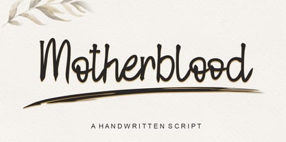 Motherblood is a sweet and friendly handwritten font. Its natural and unique style makes it incredibly fitting to a large pool of designs. The only limit is your imagination!
 - Bonita by Monotype,
$40.99Bonita is a bold handlettering style based on movie poster lettering from the early 20th century. It's similar to the typeface Broadway, but much bolder and far less formal. - Flintoye by Illushvara,
$10.00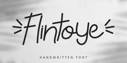 Flintoye is a sweet and friendly handwritten font. Its natural and unique style makes it incredibly fitting to a large pool of designs. The only limit is your imagination!
 - Majestic Valentine by Seemly Fonts,
$12.00 Majestic Valentine is a tall and sweet font. Its natural and unique style makes it incredibly fitting to a large pool of designs. The only limit is your imagination!
 - Georado by Balpirick,
$15.00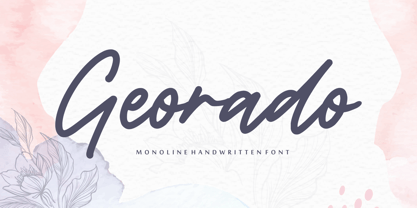 Georado is a sweet and friendly handwritten font. Its natural and unique style makes it incredibly fitting to a large pool of designs. The only limit is your imagination!
 - Love Radiate by Seemly Fonts,
$12.00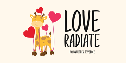 Love Radiate a joyful and casual handwritten font. Its natural and unique style makes it incredibly fitting to a large pool of designs. The only limit is your imagination!
 - Pattaya by Larin Type Co,
$12.00 Modern script font inspired by summer, airy and attractive, Pattaya will fit perfectly into any project and decorate it. Alternates and ligatures will help to make it more natural.
 - Moonstone by Device,
$29.00 Moonstone is for all those misunderstood goth Buffy fans. This font contains alternative versions that enable customisation of headlines and are intended to be freely mixed in one setting.
 - Easter Discover by Seemly Fonts,
$14.00 Easter Discover a joyful and casual handwritten font. Its natural and unique style makes it incredibly fitting to a large pool of designs. The only limit is your imagination!
 - Derivation by Seemly Fonts,
$12.00 Derivation is a sweet and friendly handwritten font. Its natural and unique style makes it incredibly fitting to a large pool of designs. The only limit is your imagination!
 - TOMO Catcher by TOMO Fonts,
$15.00 TOMO Catcher is a sweet and friendly handwritten font. The extra narrow style makes it incredibly fitting to a large pool of designs. The only limit is your imagination!
 - The Blockletter font is a typeface characterized by its heavy, bold, and solid appearance, often reflecting the style of collegiate or sports lettering. Its main characters are typically wide and squ...
- As of my last update in April 2023, "The Haine au Carré!" by TN2 isn't a widely recognized or documented font within mainstream typography resources. Since it's not a part of the commonly known font ...
- TT Milks by TypeType,
$29.00 TT Milks useful links: Specimen | Graphic presentation | Customization options About TT Milks: The collection of scripts and wonderful decorative typefaces. Initially the idea for TT Milks was to create a collection of fonts to be used for packaging and branding of dairy products. While working on the initial idea, we've tested all possible glyph variations, which resulted in a large decorative designer font family. Thanks to a variety of elements, TT Milks collection has exceeded its initial idea and now offers an unlimited application range. TT Milks type collection includes several subfamilies and consists of 26 typefaces: TT Milks Script subfamily is a satellite to the basic typefaces and features 5 weights. Every typeface of the TT Milks Script subfamily consists of 801 glyphs and supports a lot of OT features: ordn, frac, case, sups, sinf, numr, dnom, tnum, onum, pnum, liga, calt. TT Milks Casual Script consists of two script faces with a different degree of roughness. In TT Milks Casual we've collected 6 typefaces—the unique Black called 900 in three degrees of roughness, and the Bold called 700 featuring three degrees of roughness as well. TT Milks Casual Shadow is a version with broader letter setting and shadow effects. There's a clean shadowed version, three variants of rough typefaces with shadows, and a rough shadowed inline typeface—5 typefaces in total. TT Milks Casual Pie is a special set of typefaces which can be easily combined with each other using different layers. The set of the subfamily includes two basic typefaces—black and inline, and also features a typeface with a clean shadow, a shadowed inline typeface and line typeface. TT Milks Outline completes the collection. It consists of a total of 3 amusing super-display typefaces—outline, outline shadow, and a cow pelt patterned typeface. All typefaces belonging to TT Milks Casual and TT Milks Outline subfamilies contain uppercase letters only, and support tabular numbers and case sensitivity. TT Milks language support: Acehnese, Afar, Albanian, Alsatian, Aragonese, Arumanian, Asu, Aymara, Banjar, Basque, Belarusian (cyr), Bemba, Bena, Betawi, Bislama, Boholano, Bosnian (cyr), Bosnian (lat), Breton, Bulgarian (cyr), Cebuano, Chamorro, Chiga, Colognian, Cornish, Corsican, Cree, Croatian, Czech, Danish, Embu, English, Erzya, Estonian, Faroese, Fijian, Filipino, Finnish, French, Friulian, Gaelic, Gagauz (lat), Galician, German, Gusii, Haitian Creole, Hawaiian, Hiri Motu, Hungarian, Icelandic, Ilocano, Indonesian, Innu-aimun, Interlingua, Irish, Italian, Javanese, Judaeo-Spanish, Judaeo-Spanish, Kalenjin, Karachay-Balkar (lat), Karaim (lat), Karakalpak (lat), Kashubian, Khasi, Khvarshi, Kinyarwanda, Kirundi, Kongo, Kumyk, Kurdish (lat), Ladin, Latvian, Laz, Leonese, Lithuanian, Luganda, Luo, Luxembourgish, Luyia, Macedonian, Machame, Makhuwa-Meetto, Makonde, Malay, Manx, Maori, Mauritian Creole, Minangkabau, Moldavian (lat), Montenegrin (lat), Mordvin-moksha, Morisyen, Nahuatl, Nauruan, Ndebele, Nias, Nogai, Norwegian, Nyankole, Occitan, Oromo, Palauan, Polish, Portuguese, Quechua, Rheto-Romance, Rohingya, Romanian, Romansh, Rombo, Rundi, Russian, Rusyn, Rwa, Salar, Samburu, Samoan, Sango, Sangu, Scots, Sena, Serbian (cyr), Serbian (lat), Seychellois Creole, Shambala, Shona, Slovak, Slovenian, Soga, Somali, Sorbian, Sotho, Spanish, Sundanese, Swahili, Swazi, Swedish, Swiss German, Swiss German, Tagalog, Tahitian, Taita, Tatar, Tetum, Tok Pisin, Tongan, Tsonga, Tswana, Turkish, Turkmen (lat), Ukrainian, Uyghur, Vepsian, Volapük, Võro, Vunjo, Xhosa, Zaza, Zulu.
 - TT Ramillas by TypeType,
$39.00 TT Ramillas useful links: Specimen | Graphic presentation | Customization options TT Ramillas in numbers: • 28 styles: 7weights, 7 true italics, 4 decorative styles, 7 initials styles, and 3 variable fonts • 900 glyphs in each style (except decorative & initials styles) • Support for more than 180+ languages: extended Latin, Cyrillic • 25 OpenType features in each style (except outline styles): small capitals, ligatures, old-style figures, arrows and other useful features • Amazing Manual TrueType Hinting TT Ramillas is a fully reconsidered high contrast transitional serif, which is perfectly adapted to modern realities and requirements. When starting this project, we wanted to try to draw a modern serif with the precisely verified shapes, high contrast and detailed elaboration of each character. The visual features of TT Ramillas are high contrast, small flared serifs, variable slope of ovals, open aperture of signs, contrasting thin nodules and no drops. In addition, TT Ramillas has a characteristic flame-like element in the lowercase Cyrillic letter ? and a bright "tongue" in the letters ??, ductile legs in ??, ??, and ??, as well as a very interesting upper terminal in the letter a. TT Ramillas is perfect for use in magazines, in the fashion industry, in the branding of premium goods and services. TT Ramillas is quite versatile and suitable for use both in headings and in text arrays. In addition, we have done manual hinting in the typeface, and now it can be used with a clear conscience in the web and applications. In the process of working on TT Ramillas, we wanted to expand the functionality of the typeface a little more, and thus, after a few experiments, two pairs of decorative fonts were born: Outline, Decor and their oblique versions. These decorative fonts work great for headlines and bold accent lettering. We thought that in these decorative fonts, small caps and some specific features would not be needed, otherwise the composition of decorative fonts is identical to the basic ones. The TT Ramillas typeface consists of 28 styles: 7 weights and 7 corresponding italics, 4 decorative ones, 7 initials styles and 3 variable fonts. Each typeface style consists of 900 glyphs (except for the decoratives). TT Ramillas supports over 180+ languages, including Cyrillic support and Extended Latin support. When creating the typeface, we did not forget to add small caps, ligatures, old style figures, arrows, hands, card suits and many other useful characters and OpenType features. For the most demanding users, we have prepared a variable version of basic styles. Using the variability slider, you can adjust and select the individual thickness, without reference to the existing weight distribution. An important clarification — not all programs support variable technologies yet, you can check the support status here: https://v-fonts.com/support/. TT Ramillas OpenType features list: aalt, kern, ccmp, locl, subs, sinf, sups, numr, dnom, frac, ordn, tnum, onum, lnum, pnum, calt, ss01, ss02, ss03, ss04, c2sc, smcp, liga, dlig, case. TT Ramillas language support: Acehnese, Afar, Albanian, Aleut (lat), Alsatian, Aragonese, Arumanian, Asu, Aymara, Azerbaijani, Banjar, Basque, Belarusian (cyr), Belarusian (lat), Bemba, Bena, Betawi, Bislama, Boholano, Bosnian (cyr), Bosnian (lat), Breton, Bulgarian (cyr), Catalan, Cebuano, Chamorro, Chichewa, Chiga, Colognian, Cornish, Corsican, Cree, Croatian, Czech, Danish, Dutch, Embu, English, Erzya, Esperanto, Estonian, Faroese, Fijian, Filipino, Finnish, French, Frisian, Friulian, Gaelic, Gagauz (lat), Galician, Ganda, German, Gusii, Haitian Creole, Hawaiian, Hiri Motu, Hungarian, Icelandic, Ilocano, Indonesian, Innu-aimun, Interlingua, Irish, Italian, Javanese, Jola-Fonyi, Judaeo-Spanish, Kabuverdianu, Kalenjin, Karachay-Balkar (cyr), Karachay-Balkar (lat), Karaim (lat), Karakalpak (lat), Karelian, Kashubian, Kazakh (lat), Khasi, Khvarshi, Kinyarwanda, Kirundi, Kongo, Kumyk, Kurdish (lat), Ladin, Latvian, Leonese, Lithuanian, Livvi-Karelian, Luba-Kasai, Ludic, Luganda, Luo, Luxembourgish, Luyia, Macedonian, Machame, Makhuwa-Meetto, Makonde, Malagasy, Malay, Maltese, Manx, Maori, Marshallese, Mauritian Creole, Minangkabau, Moldavian (lat), Montenegrin (cyr), Montenegrin (lat), Mordvin-moksha, Morisyen, Nahuatl, Nauruan, Ndebele, Nias, Nogai, Norwegian, Nyankole, Occitan, Oromo, Palauan, Polish, Portuguese, Quechua, Rheto-Romance, Rohingya, Romanian, Romansh, Rombo, Rundi, Russian, Rusyn, Rwa, Salar, Samburu, Samoan, Sango, Sangu, Sasak, Scots, Sena, Serbian (cyr), Serbian (lat), Seychellois Creole, Shambala, Shona, Silesian, Slovak, Slovenian, Soga, Somali, Sorbian, Sotho, Spanish, Sundanese, Swahili, Swazi, Swedish, Swiss German, Tagalog, Tahitian, Taita, Tatar, Teso, Tetum, Tok Pisin, Tongan, Tsonga, Tswana, Turkish, Turkmen (lat), Ukrainian, Uyghur, Valencian, Vastese, Vepsian, Volapük, Võro, Vunjo, Walloon, Welsh, Wolof, Xhosa, Zaza, Zulu.
