10,000 search results
(0.031 seconds)
- Agoxes Game by Sealoung,
$10.00 Agoxes Game is an awesome display font. It features an authentic style that makes it perfect for games, posters, movies, magazines and any design that requires a great look!
 - Classy Diner by Haiku Monkey,
$10.00Handwritten with care, and made bold and consistent with an art deco flair. If I owned a classy diner, this is how I'd like my chalkboard menus to look. - Kris Kringle by Sealoung,
$15.00 Kris Kringle is a bold and chunky lettered display font. Add this font to your creative ideas and notice how it will make them stand out! All caps fonts.
 - Baker Signet by Bitstream,
$29.99A design on classical lines with subtle but effective calligraphic touches, by Arthur Baker for VGC. The Bold version is used for the Coke logo all over the world. - Potato Sans by 4RM Font,
$9.00 Made with a cute shape, making this font suitable for use in graphic designs related to unique things. This font is available in 2 styles namely bold and black.
 - Trapeze by Solotype,
$19.95We took a distressed-looking Victorian type called Cabinet and redesigned it with clean lines to make it more suitable for today's decorative work. Quite readable in all sizes. - FG Muriel by YOFF,
$14.95FG Muriel is an all-caps font with different letters for caps and lowercase which can be combined to make it look like true handwriting. I love this font! - Majestic Valentine by Seemly Fonts,
$12.00 Majestic Valentine is a tall and sweet font. Its natural and unique style makes it incredibly fitting to a large pool of designs. The only limit is your imagination!
 - Lucidity by DogHead Studio,
$20.00 Lucidity is a condensed, handwritten font with emphasis on texture and default wide spacing. This makes it a versatile font for display, medium amounts of text, and T-Shirts.
 - Vasavine by Rvandtype,
$9.00 Vasavine is a Blackletter font. Its elegant and cool look makes it the perfect choice for logos, branding, invitations, stationery, wedding designs, social media posts, and so much more.
 - Hardy Mind by Seemly Fonts,
$12.00 Hardy Mind is a simple, organic and bold display font. Simple but with a strong visual effect, this font will instantly make your creation more appealing than any others.
 - Cartoon Book by PojolType,
$12.00 I made this cartoon book font in my own handwriting. This type of font is great for writing comic stories, children's games, and is perfect for making cartoon movies.
 - River Jade by Angele Kamp,
$24.00 River Jade a fresh signature font with lots of ligatures for that handwritten feel. And it comes with bonus clipart which will make designing so much easier and fun.
 - Play It Cool by PizzaDude.dk,
$17.00 Play it cool with your designs - especially if you do something handcrafted! This font has 4 different versions of each letter - enough to make it look random and handcrafted!
 - Georado by Balpirick,
$15.00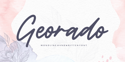 Georado is a sweet and friendly handwritten font. Its natural and unique style makes it incredibly fitting to a large pool of designs. The only limit is your imagination!
 - Love Radiate by Seemly Fonts,
$12.00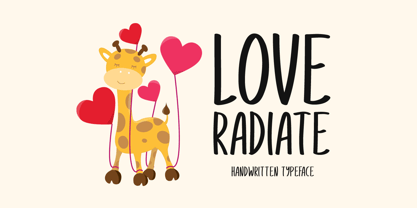 Love Radiate a joyful and casual handwritten font. Its natural and unique style makes it incredibly fitting to a large pool of designs. The only limit is your imagination!
 - Pattaya by Larin Type Co,
$12.00 Modern script font inspired by summer, airy and attractive, Pattaya will fit perfectly into any project and decorate it. Alternates and ligatures will help to make it more natural.
 - Elah Pro by RodrigoTypo,
$29.00 Elah Pro is a Title Typography, which contains different styles such as Ornaments and Dingbats, special to play and combine and make a much more pleasant and entertaining title.
 - Lights in Pairs by Bogstav,
$18.00 It's legible, it's handmade and it has a lot of personality...with a twist of organic freshness it is guaranteed to make that next project of yours stand out!
 - Roquero by FallenGraphic,
$19.00 Roquero is an amazing, sport styled, display font and will make your design more beautiful and powerful. This font is suitable for any design like branding, quotes and more
 - Easter Discover by Seemly Fonts,
$14.00 Easter Discover a joyful and casual handwritten font. Its natural and unique style makes it incredibly fitting to a large pool of designs. The only limit is your imagination!
 - Dreamland by Monotype,
$29.00 Dreamland is a bold, top-heavy style inspired by mid-20th century poster lettering. It has a lower case and is quite informal. Featured in: Best Fonts for Logos
 - PL Fiedler Gothic by Monotype,
$29.99PL Fiedler Gothic Bold is a display sans serif designed by Hal Fiedler. The distinguishing characters in the PL Fiedler Gothic Bold font are lower case q and t. - Derivation by Seemly Fonts,
$12.00 Derivation is a sweet and friendly handwritten font. Its natural and unique style makes it incredibly fitting to a large pool of designs. The only limit is your imagination!
 - TOMO Catcher by TOMO Fonts,
$15.00 TOMO Catcher is a sweet and friendly handwritten font. The extra narrow style makes it incredibly fitting to a large pool of designs. The only limit is your imagination!
 - Antique Stencils JNL by Jeff Levine,
$29.00 A butterfly, plants, animals, borders, embellishments, a center piece and corner pieces make up this assortment of charming stencil designs re-drawn from vintage sources for Antique Stencils JNL.
 - Cartelle Inline by Stereo Type Haus,
$30.00 Cartelle is a sexy small caps bitmap design characterized by it's whimsical curls and ornate flourishes. It's inspiration came from a French poster design from the early 1900's.
 - Sweater School by Typodermic,
$11.95 Introducing Sweater School, a typeface that feels like the friendly embrace of a warm sweater on a chilly day. With its casual pen strokes and relaxed letterforms, this inviting teacher’s typeface is perfect for anyone who wants to convey a sense of approachability and warmth. Sweater School is a unique typeface that draws inspiration from the print style preferred by elementary school teachers, but with significant improvements that make it easier to read and more pleasant to look at. We know how important it is to get your message across clearly, and that’s why we’ve created Sweater School with readability in mind. One of the standout features of Sweater School is its alternate characters, including a charming “J”, “I”, and “q”, as well as nut fractions (vertical fractions). These variations can be easily accessed through your application’s OpenType “stylistic alternates” capability, allowing you to add a touch of whimsy to your designs and make them stand out from the crowd. Sweater School is available in four weights and italics, making it a versatile choice for a variety of projects. Whether you’re designing a logo, creating a presentation, or crafting a social media post, Sweater School is sure to help you make a statement with its friendly, approachable style. So why not cozy up to Sweater School today? Let its inviting warmth and casual charm elevate your designs and connect with your audience in a whole new way. Most Latin-based European writing systems are supported, including the following languages. Afaan Oromo, Afar, Afrikaans, Albanian, Alsatian, Aromanian, Aymara, Bashkir (Latin), Basque, Belarusian (Latin), Bemba, Bikol, Bosnian, Breton, Cape Verdean, Creole, Catalan, Cebuano, Chamorro, Chavacano, Chichewa, Crimean Tatar (Latin), Croatian, Czech, Danish, Dawan, Dholuo, Dutch, English, Estonian, Faroese, Fijian, Filipino, Finnish, French, Frisian, Friulian, Gagauz (Latin), Galician, Ganda, Genoese, German, Greenlandic, Guadeloupean Creole, Haitian Creole, Hawaiian, Hiligaynon, Hungarian, Icelandic, Ilocano, Indonesian, Irish, Italian, Jamaican, Kaqchikel, Karakalpak (Latin), Kashubian, Kikongo, Kinyarwanda, Kirundi, Kurdish (Latin), Latvian, Lithuanian, Lombard, Low Saxon, Luxembourgish, Maasai, Makhuwa, Malay, Maltese, Māori, Moldovan, Montenegrin, Ndebele, Neapolitan, Norwegian, Novial, Occitan, Ossetian (Latin), Papiamento, Piedmontese, Polish, Portuguese, Quechua, Rarotongan, Romanian, Romansh, Sami, Sango, Saramaccan, Sardinian, Scottish Gaelic, Serbian (Latin), Shona, Sicilian, Silesian, Slovak, Slovenian, Somali, Sorbian, Sotho, Spanish, Swahili, Swazi, Swedish, Tagalog, Tahitian, Tetum, Tongan, Tshiluba, Tsonga, Tswana, Tumbuka, Turkish, Turkmen (Latin), Tuvaluan, Uzbek (Latin), Venetian, Vepsian, Võro, Walloon, Waray-Waray, Wayuu, Welsh, Wolof, Xhosa, Yapese, Zapotec Zulu and Zuni.
 - Hermanz Titling by California Type Foundry,
$47.00 Hermanz™ Titling is inspired by the most majestic caps that Hermann Zapf ever drew. They are inscriptional caps, square caps, or “capitalis monumentalis”. These caps are some of the most beautiful letters made by one of the greatest talents of our time; so beautiful they deserve to be seen and appreciated by everyone. If you do any work for churches, wedding, funeral, anniversary, or other ceremonies, for the fine arts, exclusive clubs, or higher education—you will love how these letters make your brochures, pamphlets and announcements look. Hermanz Titling works for anything labeled "fine": fine dining, fine music, fine art (pamphlets, books, posters, cookbooks). It also fits well for religious topics: posters, events, websites, hymnals, for biblical; and ceremonies, religious or otherwise. Emotions It Can Communicate: • Importance • Timelessness • Special Event • Tradition • Reverence • Artistry • Beauty Released June 2021 on the Memorial of Hermann Zapf, as part of the California Type Foundry Memorial Series: Honoring the life and work of the great font designers. FONT STORY The Majestic Caps When I was on one of my visits to rare books rooms I found some large caps of Hermann Zapf, and I knew that I had to make a font inspired by these. I was surprised that no one had ever made them into a font. They were some of the most beautiful caps I had ever seen. These caps were surprisingly difficult to make. I thought it would take me a week or two; to get the detail and spirit right took significantly longer– but it was well worth the effort! When you print Hermanz Titling on a page, you will see what I mean. Even when printed digitally, it’s the closest thing to letterpress. You might even have some people thing it was printed by a traditional method with ink! (Note: Unless printed at very large sizes, this font is not recommended for actual letterpress, because the serifs are too thin.) If you do any work for churches, wedding, funeral, anniversary, or other ceremonies, for the fine arts, exclusive clubs, or higher education—you will love how these letters make your brochures, pamphlets and announcements look. Enjoy this breathtaking font, and may it help inspire people with your messages! –Dave Lawrence & the California Type Foundry
 - Blue Goblet Drawn by insigne,
$5.00 This best selling series has now been extended to include a new member, Blue Goblet Drawn. Blue Goblet is hand-drawn by the artist, Cory Godbey, and is organic, charming and exuberant. Characters bounce and dance above and below the baseline and x-height, making this a whimsical and fun script. Not only is Blue Goblet Drawn a excellent choice, it also is also a versatile member of a wide family of different fonts. You can use it side by side with the original Blue Goblet fonts, and there are a wide range of ornaments available in the supplemental ornament sets--over 370 illustrations! These illustrations include doodley frames, lovely florals and other text ornaments that can be inserted into your text and resized at will. This makes the Blue Goblet series a great pick when you want a type system for a very unique and consistent look. The Blue Goblet series also continues to expand, making any of these family members a valuable investment for the future. Blue Goblet Drawn comes in three weights and three widths in each weight, with complementary italics for maximum impact for a total of eighteen pro fonts. The compact thin weights are delicate and tall, while the Regular has just enough heft for those situations where subtlety doesn't work. If you don't need the professional features, there are three stripped down fonts that include only the basic character set! Blue Goblet Drawn also includes auto-replacing ligatures that make it appear that the script was drawn by the artistís own hand--just for you! Blue Goblet Drawn also includes a wide variety of alternates that can be accessed in any OpenType enabled application. Blue Goblet includes over 190 additional glyphs and is loaded with features including an even more unique alternate alphabet. Included are swash alternates, style sets, old style figures and small caps. Please see the informative PDF brochure to see these features in action. OpenType enabled applications such as the Adobe suite or Quark can take full advantage of the automatic replacing ligatures and alternates. This family also includes the glyphs to support a wide range of languages. Blue Goblet Drawn is a great choice for friendly display type in children's books, packaging, organic packaging or other unique applications. Use Blue Goblet whenever you want to inject a handmade sense of fun and whimsy to your designs. Give the Blue Goblet series a whirl today!
 - Sugar Medley by Scrowleyfonts,
$16.00 Sugar Medley was originally inspired by piped icing writing on celebratory cakes. It lends itself to any project requiring a ‘controlled messy’, fun feel. It has a total of 885 glyphs, every letter has 5 alternates to create that hand lettered look. Sugar Medley also includes a full set of stylistic alternates which really goes wild with curls and swirls. These are complemented by a total of 38 ornaments including reflections and rotations.
 - Les Bonbon Boutique PW by Patty Whack Fonts,
$29.98Reminiscent of vintage Paris. Think Tea Parties, Sweet Treats, Candy Shoppes, Boutiques, Fine China, Couture, Cakes and Pastries. This font is perfect for cards, menus, signage, and much more. Les Bonbon Boutique PW is intended and suitable for Display use and Titles. It's not suitable for long paragraphs of text. This font is meant for display, titles, beautiful signage, cards, etc. Les Bonbon Boutique PW is available in OpenType, and TrueType format. - Girasol by Lián Types,
$35.00 This is a cute story about a mother and her son. :) About a decade ago my own mother got very interested in my work. She used to say my letters had so many swirls and dazzling swashes, and suggested my job seemed to be very fun. She wondered if she could ever try to make her own alphabet... Well, she is a civil engineer and a maths teacher, and appeared to be a little tired of exact sciences... I remember answering this, while she was listening with her typical tender look: -"Mamá... While type-design may be a really enjoyable thing to do, it also involves having a great eye and knowledge about the history of letters: nice curves and shapes require a meticulous study and, like it happens in many fields, practice makes perfect"-. Well, she raised her eyebrows at me. -"and so what?"- She didn't have any experience neither in the field of art nor in the field of graphic design so, I told her that if she really wanted to get into this she should borrow some of my calligraphic books from my beloved shelves in my office. So... she did. Some weeks after that, she came to me with many sketches made with pencils and markers: some letters where very nice and unique while others naturally needed some work. I remember she added ball terminals to all of her letters (even if they didn't need them) because that was one of the rules she imposed. After some back and forth, we had the basis for what would be today, ten years later, the seed of this lovely font Girasol. Her proposal was nice, something I was not accustomed to do, that’s why many years later I decided to watch it with fresh new eyes and finished it. While she was in charge of making the lowercase letters, I helped with the uppercase and also added my hallmark in the alternates, already seen in others of my expressive fonts. The result is an upright decorative font that follows the behavior of the copperplate nib with a naive touch that makes it really cute and useful for a wide range of products. Many alternates per glyph make Girasol a very fun to use font which will delight you. Above posters are a proof of that! This font is a gift for my mother, Susana, who, in spite of her exacts academic background, taught me that beauty can also be found in the imperfect. 1 NOTES (1) In my fonts I'm always in seek of the perfect curve. When I designed Erotica and Dream Script, I read about Fibonacci’s spirals!
 - Lilard by Putracetol,
$28.00 Lilard - Elegant Serif Font Lilard - Elegant Serif Font is a beautiful typeface that exudes sophistication and grace. The font was designed with the idea of creating a classic and elegant look, while still maintaining a modern and clean feel. The result is a font that is versatile and can be used for a variety of projects such as branding, logos, packaging, photography, and more. The design of Lilard font is inspired by the timeless and elegant look of serif fonts, but with a contemporary twist. The designer wanted to create a font that would stand out and be memorable, while also being easy to read and understand. The elegant curves and sharp serifs make Lilard a perfect choice for projects that require a touch of elegance and sophistication. Lilard font is best used for projects that require an elegant and refined look. This font is perfect for use in wedding invitations, business cards, and other high-end print materials. The font works well when paired with other sans-serif fonts, which helps to create a modern and clean feel. Lilard font comes with a variety of features that make it stand out from other fonts. The font includes uppercase and lowercase letters, as well as opentype features such as alternates and ligatures. Additionally, the font includes numbers, punctuation, and symbols, making it a versatile choice for a variety of projects. The font also supports multiple languages, making it a great choice for international projects. If you're looking for a font that is elegant, sophisticated, and versatile, Lilard - Elegant Serif Font is the perfect choice. Its unique design and features make it an ideal choice for a variety of projects. Use this font to add a touch of elegance and refinement to your designs and make them stand out. In summary, Lilard - Elegant Serif Font is a beautiful and elegant font that is perfect for high-end projects. Its unique design, features, and versatility make it a great choice for a variety of projects, including branding, logos, packaging, photography, and more. With its opentype features, multiple language support, and easy-to-use formats, Lilard is sure to become a go-to font for designers looking for an elegant and refined look.
 - Brutal Milk No 1 by Casloop Studio,
$9.00 Introducing Brutal Milk Font Collection where prominence, trustworthiness, and sophistication converge. Brutal Milk is a captivating grotesque typeface that seamlessly blends the robust aesthetics of brutalism with the sleek sophistication of Swiss Design and the nostalgia of Y2K. This collection featuring three distinctive variants – Brutal Milk No1, Brutal Milk No2, and Brutal Milk No3 – offers a unique typographic journey for extraordinary design. Let's break down what we present in this work - Brutal Milk No.1 | Modern Elegance with a Brutal Twist Aims for body text with the perfect balance of elegance and modernity. Brutal Milk No.1 is meticulously crafted for optimal readability, making it an ideal choice for a wide range of applications. - Brutal Milk No.2 | Softened Brutalism for Approachable Headers Aims for display/header text with a gentle and approachable impression. Brutal Milk No.2 is crafted to add a touch of warmth to your designs, making it perfect for conveying a friendly and inviting tone. - Brutal Milk No.3 | Rigid Rebellion for Prominent Headers Make a bold statement with headers that exude firmness. Brutal Milk No.3 is designed to capture attention with its rigid impression, injecting a sense of prominence and confidence into a visual identity. The Features The Brutal Milk Font Collection comes loaded with features such as case-sensitive forms, discretionary ligatures, ordinals, fractions, denominators, numerators, superscripts, and scientific inferiors – ensuring flexibility in design needs. Language Support From Western and Central European languages to South Eastern European, South American, Oceanian, and even Esperanto, Brutal Milk Collections caters to a diverse range of linguistic needs. Brutal Milk stands as a testament to versatility and innovation. Whether you're crafting a sleek logo, establishing a brand identity, adorning decor, creating impactful posters, delivering compelling presentations, designing dynamic websites, refining UI/UX experiences, or engaging in graphic design endeavour. The impressions it imparts—modern, minimal, youthful, funky, groovy, trendy, hip, fly, and undeniably cool—speak volumes about its adaptability to contemporary design trends. Redefine the boundaries of creativity and immerse yourself in the dynamic world of Brutal.
 - Desperate by Typodermic,
$11.95 Are you tired of playing it safe with your typography? Want to stand out from the crowd and make a bold statement? Look no further than Desperate, the punk rock font that will bring a rebellious edge to your designs. With interlocking shapes that give it a new wave feel, Desperate is a font that refuses to play by the rules. And with OpenType technology, it generates wild ligatures for over 200 letter combinations, adding to its unpredictable, untamed vibe. But Desperate isn’t just about making a scene. It delivers your message with an aggressive, hard-hitting style that commands attention. Whether you’re designing a gig poster, album cover, or anything in between, this font will give your work the punk rock attitude it deserves. So why settle for boring fonts when you can embrace your inner rebel with Desperate? It’s time to make your mark and let your designs scream out loud. Most Latin-based European writing systems are supported, including the following languages. Afaan Oromo, Afar, Afrikaans, Albanian, Alsatian, Aromanian, Aymara, Bashkir (Latin), Basque, Belarusian (Latin), Bemba, Bikol, Bosnian, Breton, Cape Verdean, Creole, Catalan, Cebuano, Chamorro, Chavacano, Chichewa, Crimean Tatar (Latin), Croatian, Czech, Danish, Dawan, Dholuo, Dutch, English, Estonian, Faroese, Fijian, Filipino, Finnish, French, Frisian, Friulian, Gagauz (Latin), Galician, Ganda, Genoese, German, Greenlandic, Guadeloupean Creole, Haitian Creole, Hawaiian, Hiligaynon, Hungarian, Icelandic, Ilocano, Indonesian, Irish, Italian, Jamaican, Kaqchikel, Karakalpak (Latin), Kashubian, Kikongo, Kinyarwanda, Kirundi, Kurdish (Latin), Latvian, Lithuanian, Lombard, Low Saxon, Luxembourgish, Maasai, Makhuwa, Malay, Maltese, Māori, Moldovan, Montenegrin, Ndebele, Neapolitan, Norwegian, Novial, Occitan, Ossetian (Latin), Papiamento, Piedmontese, Polish, Portuguese, Quechua, Rarotongan, Romanian, Romansh, Sami, Sango, Saramaccan, Sardinian, Scottish Gaelic, Serbian (Latin), Shona, Sicilian, Silesian, Slovak, Slovenian, Somali, Sorbian, Sotho, Spanish, Swahili, Swazi, Swedish, Tagalog, Tahitian, Tetum, Tongan, Tshiluba, Tsonga, Tswana, Tumbuka, Turkish, Turkmen (Latin), Tuvaluan, Uzbek (Latin), Venetian, Vepsian, Võro, Walloon, Waray-Waray, Wayuu, Welsh, Wolof, Xhosa, Yapese, Zapotec Zulu and Zuni.
 - Caryn by Typodermic,
$11.95 Y’all, have you met Caryn? She’s a typeface that’s as friendly as a front porch conversation on a sunny day. With her short brush strokes and swooping flourishes, she’ll make your words sing with genuine warmth and charm. Caryn is like a cozy quilt or a hot apple pie, bringing a homemade touch to everything she touches. Whether you’re crafting a wedding invitation, designing a logo for your farm stand, or just writing a letter to a friend, she’ll help you express your message with a down-to-earth grace. And here’s the best part: Caryn doesn’t put on airs. She’s unassuming and approachable, like a neighbor who always has a smile and a kind word. You don’t need fancy design skills or a big budget to make Caryn work for you. She’ll fit right in with your homespun style and make you look like a pro. So if you want to add a touch of warmth and hospitality to your next project, give Caryn a try. She’s the perfect typeface to welcome your readers, customers, or loved ones with open arms. Most Latin-based European writing systems are supported, including the following languages. Afaan Oromo, Afar, Afrikaans, Albanian, Alsatian, Aromanian, Aymara, Bashkir (Latin), Basque, Belarusian (Latin), Bemba, Bikol, Bosnian, Breton, Cape Verdean, Creole, Catalan, Cebuano, Chamorro, Chavacano, Chichewa, Crimean Tatar (Latin), Croatian, Czech, Danish, Dawan, Dholuo, Dutch, English, Estonian, Faroese, Fijian, Filipino, Finnish, French, Frisian, Friulian, Gagauz (Latin), Galician, Ganda, Genoese, German, Greenlandic, Guadeloupean Creole, Haitian Creole, Hawaiian, Hiligaynon, Hungarian, Icelandic, Ilocano, Indonesian, Irish, Italian, Jamaican, Kaqchikel, Karakalpak (Latin), Kashubian, Kikongo, Kinyarwanda, Kirundi, Kurdish (Latin), Latvian, Lithuanian, Lombard, Low Saxon, Luxembourgish, Maasai, Makhuwa, Malay, Maltese, Māori, Moldovan, Montenegrin, Ndebele, Neapolitan, Norwegian, Novial, Occitan, Ossetian (Latin), Papiamento, Piedmontese, Polish, Portuguese, Quechua, Rarotongan, Romanian, Romansh, Sami, Sango, Saramaccan, Sardinian, Scottish Gaelic, Serbian (Latin), Shona, Sicilian, Silesian, Slovak, Slovenian, Somali, Sorbian, Sotho, Spanish, Swahili, Swazi, Swedish, Tagalog, Tahitian, Tetum, Tongan, Tshiluba, Tsonga, Tswana, Tumbuka, Turkish, Turkmen (Latin), Tuvaluan, Uzbek (Latin), Venetian, Vepsian, Võro, Walloon, Waray-Waray, Wayuu, Welsh, Wolof, Xhosa, Yapese, Zapotec Zulu and Zuni.
 - Mantika Book by Linotype,
$50.99 Mantika Book was originally conceived and drawn parallel to the first Agilita drawings. *[images: pencil drawings] It took several years before having a chance looking at these designs again. But then, my first impulse was to turn this alphabet into a new sanserif, which was to become Mantika Sans. This was the starting point to conceive a super family consisting of different design styles and corresponding weights. The initial drawings of Mantika Book were refined and an Italic was developed to go with it. The aim was to create a modern serif typeface which is reminiscent of humanistic Renaissance typefaces, yet without following a particular historic model. Its large x-height for one is far away from original Renaissance models. Mantika Book was designed as a companion serif typeface to Mantika Sans that can be set for lengthy texts as in books, hence its name. It shares the same x-height with Mantika Sans but has longer ascenders and descenders, making for better word shapes in long, continuous reading. The approach of an ›old-style‹ looking typeface with large minuscules makes Mantika Book also a choice for magazine text settings where one often needs smaller point sizes to fit in a multiple columns layout. The unique details of Mantika Book are the asymetric bracketed serifs in the upright font and its higher stroke contrast than usual in a Renaissance style. The stems are slightly curved inwards. Also, the Italics have a low degree of inclination, which makes longer passages of text set in Italic rather pleasing to read. Another feature Mantika Book shares with Mantika Sans is that all four weights take up the same line length. It covers all European languages plus Cyrillic and Greek, is equipped with lots of useful scientific symbols [double square brackets, angle brackets, empty set, arrows] and the regular weight has small caps. There is a kind of an old-style feeling to Mantika Book, yet these citations were turned into a contemporary serif typeface with a soft but sturdy character.
 - Sancoale Softened by insigne,
$22.00 Sancoale Softened is the new rounded companion to Sancoale. While the original Sancoale is crisp and defined, its delicate forms also lend themselves well to a lighter, more rounded version. The stems of Sancoale Softened are blunted, and its corners have been carefully rounded, avoiding the “sausage” look seen with some rounded fonts. This blend of definition and delicacy makes the Sancoale Superfamily versatile and appropriate for a variety of applications. The design minimizes the characters to their essence, leaving a default set of simple characters without notches or spurs. However, the typeface family’s slightly technological feel still appears friendly and approachable to the reader. It’s slightly condensed proportions and tall x-height also make the design readable at a wide range of sizes, which works especially well for web pages. These softer letterforms give Softened its unique, futuristic look--great for distinguishing your text or display. There are six weights with true italics. All insigne fonts are fully loaded with OpenType features. Sancoale Softened is also equipped for complex professional typography, including alternates with stems, small caps and plenty of alts, including “normalized” capitals and lowercase letters. The face includes a number of numeral sets, including fractions, old-style and lining figures with superiors and inferiors. OpenType capable applications such as Quark or the Adobe suite can take full advantage of automatically replacing ligatures and alternates. You can find these features demonstrated in the .pdf brochure. The Sancoale family also includes the glyphs to support a wide range of languages, including Central, Eastern and Western European languages. In all, Sancoale Softened supports over 40 languages that use the extended Latin script, making the new addition a great choice for multi-lingual publications and packaging. Sancoale Softened continues with Sancoale’s successfully simple, geometric and legible structure. With its suitability for a wide range of uses, the Sancoale superfamily is a very economical and versatile addition to any designer’s font collection.
 - Cocogoose Pro Narrows by Zetafonts,
$39.00 Cocogoose Pro Narrows has been completely re-engineered in 2020 to include extra features and technologies. A darkmode weight range has been added to the whole family, to keep consistency of effect when the typeface is used in reverse on the web and in dark mode interfaces. Also, a new Ultra Compressed subfamily has been developed for display usage. Designed by Cosimo Lorenzo Pancini in 2013, Cocogoose was first expanded in 2015 with the help of Francesco Canovaro who co-designed the decorative display weights and Andrea Tartarelli who developed the condensed widths. In 2020 a full redesign of the typeface has been published: Cocogoose Pro now includes new widths, weights, open type features and characters, thanks to the help of Mario De Libero. Influenced by vernacular sign-painting and modernist ideals, Cocogoose is drawn on a classic geometric sans skeleton, softened by rounded corners and slight visual corrections. Its very low contrast, dark colour and tall x-height make it a solid choice for all designers looking for a powerful display typeface for logos, headings and vintage-inspired branding. The tall x-height makes texts set in Cocogoose very readable even at small sizes, while the bold regular weight allows for maximum impact when used as a branding, signage or decorative typeface. Cocogoose Pro was designed as a highly reliable tool for design problem solving, and given all the features a graphic designer needs, starting from its wide range of widths and weights. Its 2000+ latin, cyrillic and greek characters make sure it covers over 200 languages worldwide, while its comprehensive set of open type features allows faultless typesetting thanks to small capitals, positional numbers & case sensitive forms. A wide range of alternate letterforms, developed along nine different stylistic sets, gives you an extra level of design fine-tuning. The layerable and colour-ready display variants include inline, outline, shadow and a letterpress version that can simulate the effect of old print, also thanks to programmed randomization of its letters.