10,000 search results
(0.028 seconds)
- Urban Daily by Mvmet,
$12.00 Urban Daily is a playful daily handwritten font, inspired by graffiti-style tags. It will elevate a wide range of design projects to the highest level. You can use this font for many design ideas such as stickers, t-shirt designs, amazing logo designs, magazine or book covers, comics, cartoon drawings, and many more. This font will add a super cool touch to your designs!
 - Rosttaly Script by Rastype Studio,
$18.00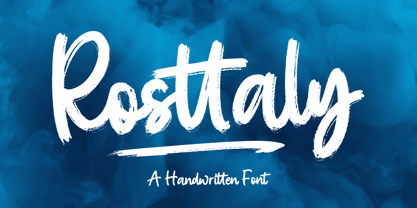 Rosttaly is a textured brush font, with natural handcraft and underlines and ligatures that make your designs more interesting. Suitable for use in designs, such as clothing, invitations, book titles, stationery designs, quotes, branding, logos, greeting cards, t-shirts, packaging designs, posters and more. The font includes OpenType features with ligature styles and multi-language support. Thank you for your purchase and happy designing!
 - Neela by Bykineks,
$10.00 Neela is an Art Nouveau serif typeface designed for a variety of design needs. With 27 font families consisting of thin, extralight, light, regular, medium, semibold, bold, extrabold, and black, as well as condensed and expanded types, Neela can be used for various sizes and design needs. Neela is characterized by sleek and elegant letters, with typical Art Nouveau elements, such as subtle and elegant decorative flourishes. This font is suitable for various design needs, such as: Book covers, wine labels, wedding invitations, exhibitions, packaging, merchandise, event billboards, posters and many others. Neela also supports 65 Latin alphabet languages, so it can be used for various design needs throughout the world. Characteristics The letters are sleek and elegant Distinctive Art Nouveau elements Suitable for a variety of design needs Neela is the perfect typeface for designers looking for an elegant and versatile Art Nouveau serif typeface. This font can be used for various design needs, from book design, labels, invitations, to graphic design.
 - Leophard by Arterfak Project,
$16.00 Create a great combination design with this font family! Leophard font family is a modern slab serif that is inspired by sporty design and vintage style. There are 6 different styles that you can apply in your design projects. This font is made with tenacious basic shapes, the visuality of strength, old school movement, and modern minimalist style. - Regular style - good for your titles, sub-headlines or body text for readability. - Bold style - recommended for your titles, naming, labels or logos. - Bold inline style - is cool for your big typographic designs that are showing the precision of the shapes. - Outline style - good for your additional text, or minimalism design purposes. - Shadow style - suitable for vintage logos, minimalist effects, and titles. - Stencil style - inspired by street art and letterpress design. Recommended for design project which visualizes strength and movement. Make a great combination on your label designs, brand, poster headlines, movie titles, storefront, monograms, sport designs and merchandise design.
 - Lisbeth by TypeTogether,
$39.00 Louisa Fröhlich’s Lisbeth is the charming all-italic trailblazer that handles branding and text with internal vividness. With no roman style, it’s an italic-only family whose creation was guided by imagination instead of restrictive writing tools. Some type families aren’t sure what they want. Lisbeth proceeds with the utmost confidence on its own terms — it’s a feisty three-dimensional thespian amidst the cast of strait-laced characters you’re used to. With branding and magazine usage in mind, Lisbeth addresses the distinct challenges of text and display in a characterful way. The curves of the text weights show a soft angularity, emphasising the handwritten quality and the subtle twist inside the letters. The stroke’s carefully balanced contrast is more pronounced in the vibrant heavier weights but almost absent in the graceful structure of the thin weight. The angle of the letters is almost upright and the x-height is relatively large, so longer texts can be read comfortably and without effort. Lisbeth is slightly condensed and so uses a smaller area to efficiently impart much information. So if a type design can be thought of as the clothing letters wear, then Lisbeth is an energetic, freely flowing stroke wrapped around practical and efficient letter proportions. Another highlight of the family is the quirky high-contrast display style, easily catching every eye. The design concept of the twisted stroke shows at the extreme here and makes the letters dance a little on the page. Even though the shapes behave wildly, every letter is carefully balanced in itself so that the rhythmic repetition of the lettershapes results in an even and harmonic total picture. Lisbeth’s five text weights (from thin to bold) perform excellently in text settings, and its funky display style amps up the internal shimmer within each glyph. It supports numerous languages (Latin-A extended) and comes with ligatures and contextual alternates to produce beautiful typography. The character set contains proportional lining and oldstyle figures, tabular figures, subscripts, superscripts, and fractions. The complete Lisbeth family, along with our entire catalogue, has been optimised for today’s varied screen uses.
 - Lust Stencil by Positype,
$39.00 When you hear that name, you likely ask yourself, ‘why?!’ I did too, but the number of requests could not be ignored. Once I finally decided to move forward with it, the only way to solve the offering would be to adhere to the same theme of indulgence, I planned for the same number of optical weights AND Italics. Yeah, italic stencils… ok, why not? It’s not a new concept. One thing to note and a creative liberty I assumed during the design. Lust Stencil would not be just a redaction or removal of stress to produce a quick stencil. To do that, would just be a cheap solution. Strokes had to resolve themselves correctly and/or uniquely to the concept of the stencil format. And, it had to be heftier. For it it to look correctly, it needed about 8% additional mass to the strokes for it to retain the effervescent flow of the curves and the resolute scalloped lachrymals. The Lust Collection is the culmination of 5 years of exploration and development, and I am very excited to share it with everyone. When the original Lust was first conceived in 2010 and released a year and half later, I had planned for a Script and a Sans to accompany it. The Script was released about a year later, but I paused the Sans. The primary reason was the amount of feedback and requests I was receiving for alternate versions, expansions, and ‘hey, have you considered making?’ and so on. I listen to my customers and what they are needing… and besides, I was stalling with the Sans. Like Optima and other earlier high-contrast sans, they are difficult to deliver responsibly without suffering from ill-conceived excess or timidity. The new Lust Collection aggregates all of that past customer feedback and distills it into 6 separate families, each adhering to the original Lust precept of exercises in indulgence and each based in large part on the original 2010 exemplars produced for Lust. I just hate that it took so long to deliver, but better right, than rushed, I imagine. It would have taken even longer if not for font engineer and designer, Potch Auacherdkul. Thanks Potch.
 - Noort by TypeTogether,
$51.60 Juan Bruce’s Noort is not a type family for wayfinding or mapmaking alone, but for clarifying information and engaging readers along their own journey. The information designer’s role is to bring clarity and style to overwhelming amounts of information, which fortunately is Noort’s purpose as well. Hierarchies submit to its will and layering colour only adds more presence to its active posture. Noort’s design uses the proven editorial text features of a large x-height, ample spacing, and low contrast to check all the boxes for paragraph text use. But it’s the long serifs, wide characters, and overall typographic presence that make it resilient and ease the task of reading in small point sizes. These details mean Noort is able to demonstrate importance not only with its five pitch-perfect weights, but with its brindled colour within a layout. Noort’s roman and italic styles play off each other by transplanting their design features. The roman style’s serifs are transferred in substance but expectedly increased in speed in the italic styles. And the italic’s inktraps and separated strokes are echoed amidst the roman’s upright structure. Where digitisation could have removed the influence of the hand, Noort retains the analogue nature of its creation. This antiphonal seeding of details creates a cohesive family that is as fascinating as it is functional. Noort’s axis and serifs have a slightly varying ductus — the directional flow that aids reading and character clarity. Its latent obviousness in text sizes immediately becomes its signature style when bumped up to subhead sizes. And since Noort’s counters are so wide and welcoming, its heavier weights can expand more within themselves than along their exterior edges. Noort’s ten total fonts cover the Latin A Extended glyph set to bring its unbordered, globetrotting sensibilities to your projects. OpenType features include ligatures, fractions, and several figure styles, along with mature-rather-than-overbearing swashes. Aligned with TypeTogether’s commitment to produce high-quality type for the global market, the complete Noort family can set digital and printed works with ease, capitalising on the dual needs of clear information and fascinating textual artistry.
 - Kunstler Grotesk by HiH,
$12.00 Künstler Grotesk ML is one of a number of typeface designs that attempts to reconcile Germany’s blackletter tradition with the international familiarity of roman letterforms in a simple, robust design suitable for meeting the demands of a modern industrial economy, while rejecting the extraneous ornamentation of the departing Victorian era. It is an all-cap design with a number of playful ligatures. It has an appealing boldness that reverses well. Künstler means ‘artist’ in German. I had always assumed it was a person’s name until I came across the translation. Lesson: conjecture is not fact. Grotesk refers to a sans serif letterform tradition. Kunstler Grotesk was originally released by Bauer'sche Giesserei of Frankfurt am Main circa 1900. Künstler Grotesk ML represents a major extension of the original release, with the following changes: 1. Added glyphs for the 1250 Central Europe, the 1252 Turkish and the 1257 Baltic Code Pages. Added glyphs to complete standard 1252 Western Europe Code Page. Special glyphs relocated and assigned Unicode codepoints, some in Private Use area. Total of 350 glyphs, 260 kerning pairs. 2. Added OpenType GSUB layout features: pnum, salt, dlig (19) and hist. 3. Revised vertical metrics for improved cross-platform line spacing. 4. Redesigned mathematical operators. 5. Included tabular (std) & proportional (opt) numbers. 6. Refined various glyph outlines. 7. Made CcNnOoSsZz-kreska available (salt). 8. Incorporated alternate glyphs in lower case.
 - KookyKaps - Unknown license

- KookyLower - Unknown license

- Haeock by Pedro Teixeira,
$16.00 Haeock is very readable, an beautiful slab serif designed by Pedro Alexandre Teixeira. This font family works very well on packagings, branding and editorial design, tiles, books, magazines, corporate design.
 - Grotley by Owl king project,
$39.00 Grotley is designed with a sweet shape, supported by several weights, making the equipment very supportive for all design needs or projects that look premium. let's start designing. Be happy
 - Vintage Retro by Nirmana Visual,
$22.00 Vintage Retro Inspired by Renaissance Design Era. Vintage Retro offers beautiful typographic harmony for a diversity of design projects, including logos & branding, social media posts, advertisements & product designs. Happy Creating!
 - Parlinttons Script by FadeLine Studio,
$12.00 Parlinttons Script is a trendy, elegant, natural and thin font. It is suitable for use in various design styles such as watercolors, minimalism, flat, modern designs, classic designs, and more.
 - Acorde by Willerstorfer,
$95.00 Please note: Acorde webfonts are exclusively available at willerstorfer.com Acorde is a reliable workhorse for large, demanding design projects. It was designed to be perfectly suited to all different sizes, from small continuous text to large headlines and big signage. The typeface’s name is derived from ‘a’ ‘cor’porate ‘de’sign typeface, however Acorde is not only suitable for corporate design programmes but for information design and editorial design purposes as well. Acorde’s inception was in early 2005 as Stefan Willerstorfer’s final project in the Type and Media course at the Royal Academy of Art in The Hague (NL). It is a humanist sans serif with noticeable diagonal contrast and shows clear influences of the broad nib pen, especially in the Italics. Acorde’s characterful details give it a distinctive appearance in large sizes and contribute to its high legibility in small sizes. It comes in 14 styles – seven weights in Roman and Italic each. While the proportions of the Regular style were chosen to guarantee optimal legibility without being too space consuming, the heavier the weight gets the more suitable it is for headline purposes. The heavy weights are relatively narrower than the lighter ones, which gives them a strong appearance. The huge character set contains 925 glyphs per font and covers a vast range of latin-based languages. Various accented letters, small caps, eleven figure-sets, superscript and subscript are all included. OpenType features allow for a comfortable use of the large set. Acorde was honored with the 2010 Joseph Binder Bronze award for type design by DesignAustria.
 - Bangkok Restless by Roland Hüse Design,
$25.00 I have been walking around the streets of Bangkok with my good old film camera taking photos the way like back in the day. I think there is something magical and authentic in it. Guess what, the first day I went out with that camera I stumbled upon a place is called Fotoclub BKK they develop film rolls how cool is that! I shoot all the 36 photos at the Silom area, taking random photos most came out off centred subject, wrong settings, blurry just like the way I wanted! Soon after I was working on a handwritten script that is a perfect match to the overall topic of my stay in Bangkok so I named it after this exceptional adventure I have had here. The font contains all European diacritics and special characters, some double letter ligatures and stylistic alternates for better flow and more organic and natural look. I hope you guys like it and it will add some spiciness to your next creative project! Any feedback or questions, character request please don't hesitate to contact me either in email or on social.
 - Lust Slim by Positype,
$50.00 Check out the new Lust Pro & Lust Pro Didone to see how the series has grown and evolved. Confident and versatile, Lust is an exercise in indulgence—an attempt to create something over the top and vastly useful. If Lust Slim seems both new and familiar, that’s because it is. The series unapologetically channels Herb Lubalin, but produced with a deliberate, contemporary twist. There is an intentional slyness infused in the letterforms—the extreme thick and thin lines flow effortlessly without becoming gratuitous. It’s always just enough, not too much. What makes the type series so appealing? The curves. When asked to describe the letterforms, most people unwittingly allude to the human form, using adjectives usually reserved for describing physical traits… creating all-too-familiar comparisons. Summerour has grown to accept this as unavoidable and reasonable given his acknowledgement of its influences and has provided nuances within the letterforms to accentuate that. Intended to be set large, the typeface has both Standard (Lust, Lust Didone and a single unified Italic) and Display variants making it perfect for editorial use and a flexible solution for any display need.
 - Mustang by Robert Arnow,
$21.99 Mustang is a powerfully expressive brush font that combines an edgy urban aesthetic with a smooth feminine flow. Some have suggested that Mustang is romantic. Some say it has something to do with speed or freedom. While precisely what Mustang expresses is up to debate, there’s no doubt that it’s expressing it with intensity. The style was born in my high school years, when I would wreck my notebooks with multiple layers of graffiti tags which would start in the margins and then creep in to cover the entire page. I developed a sensibility towards a very fast, expressive use of my hand, which later easily and naturally translated into brush. I used this style typographically on several projects throughout the years, and even turned it into a signature illustration style. Mustang is the second font, after Streetbrush, to use this brushwork as its inspiration. Mustang will be especially evocative at large sizes, where the details and sharpness of the shapes really come to life. It also holds together well for use as body copy, but may lose some of its aesthetic integrity at really small sizes.
 - Tertius by Scholtz Fonts,
$21.00 Tertius, with its high ascenders and clubbed serifs, is a modern interpretation of the classic Carolingian style (7th - 9th centuries AD). There was no capital form in the Carolinian hand and Roman square capitals were originally used with it. The Carolingian hand began, after a while, to develop more cursive tendencies as people looked for a way to speed up the writing process. I have “capitalized” on this trend and have devised an appropriate and dramatic set of flowing capitals for this family. With its elegant swashes and bold letter shapes, Tertius embodies the romance of medieval life, of knights, castles, and chivalry. Tertius comes in four styles:- -- Regular: with elegant, smoothly penned characters; -- Crenellated: written with a scratchy pen over rough parchment -- many drops of ink and blotches have been left on the parchment (“Crenellated” means battlements -- the rough protrusions on the top of castle walls); and -- Romantic: the capitals have been loosely overwritten generating a contemporary version of illuminated capitals. -- Illuminated: richly decorated illuminated capitals for use with Tertius Regular (28 characters) All fonts have been carefully crafted, letterspaced and kerned and contain full character sets of 237 characters.
 - Sunetta by Linotype,
$29.99An inkstone, a brush, ink, and paper. In China, one speaks of “wenfang sibao” — the four treasures of the scholar’s study. With these centuries-old hand tools, Werner Schneider created a calligraphic type trilogy of the highest aesthetic order; he named this typeface family after Buddha’s stepbrother, Sunetta. Sunetta is an outstanding choice for contemporary display type purposes. Its combination of lively forms overcome sterile text passages, lending them a more personal note and feeling. But Sunetta is not only recommended for documents bestowing distinction and accolades; the fonts are superb for shorter text passages as well. Sunetta’s spirited flow raises it above the fray that so many generic letterforms find themselves mired in, creating an unforgettable impression. Sunetta’s three complementary styles, Sunetta Flair, Sunetta Charme, and Sunetta Magic, offer three varying degrees of calligraphic verve. The family’s base font, Sunetta Flair, harkens back to the showcard lettering styles of the 1950s, while remaining distinctly European in taste. Sunetta Charme has a more swash-type appearance, while Sunetta Magic is joyfully decorative — its brush-written strokes dance across the line. Together, they may help you reach typographic nirvana. - Salome by Canada Type,
$24.95 Salome is a revival, normalization and elaborate expansion of a 1972 film face called Cantini. The original film type, released by a tiny independent outfit called Letter Graphics, looked like it was hand drawn with little consideration for consistency in essential lettering flow measurements, like angles, stroke widths, and vertical metrics. All these issues have been resolved in this digital version, and the original character set, including the whole lot of alternates, was entirely redrawn and expanded to include even more alternates and many useful ligatures, as well as extended support for Latin-based languages. Combining elements of early 20th century art nouveau with common 1960s and 1970s signage and poster lettering flair, Salome uses curls and curves to wave its fantastic shapes in a most hypnotic dance. Salome simply cannot be unseen. Just like its namesake, the female seduction icon, it does not hesitate to put all of its natural beauty and energy on display in order to get what it wants. Salome comes in all popular font formats. The OpenType version, Salome Pro, combines the main font with the alternates one, and contains convenient features for push-button alternation and ligature substitution in supporting software programs.
 - Delfin Scripts by Eclectotype,
$40.00 Delfino Script is a cool, connecting script that can appear both retro and contemporary. Curved on the outsides of strokes, and jagged inside, the forms look like an abstraction of strips of tape, folding and flowing, or even marker pen style lettering. This script is not created by any pen though - its forms are constructed, not painted. Typographic features like ink traps add sparkle to the text. OpenType features include ligatures, contextual alternates (for more realistic connections) and stylistic sets. Stylistic Set 1 changes certain upper case letters into forms more suited for all caps setting, although they can also be used freely with the lower case. Set 2 changes the r into a less scripty form and set 3 adds a connecting tail to the q. Delfino Script would find itself at home in cookery books, fashion blogs, vintage car magazines and set large and proud on expanses of concrete, or, most likely, whatever you might have in mind for it! Delfina Script is practically identical to Delfino save for round tittles, periods and any other dot shaped glyph components. Strangely for such a little change, it does seem to give the face a different character.
 - Cut Nyak Dhin by Nandatype Studio,
$12.00 Cut Nyak Dhin is a modern script with handwriting, decorative characters, designed to perfectly combine informal, sassy, romantic, sweet scripts. Hand-drawn design elements allow you to create many beautiful typographic designs in an instant like branding, logos, web design and editorial, prints, invitations, crafts, quotes, and more.
 - Just Calling by Din Studio,
$29.00 Say hello to Just Calling , designed with modern style. It will make your design more beautiful. It's suitable for branding, web design, personal signature (logo) and many other modern designs. It has support for multiple languages and many ligatures. Thanks for visiting and purchasing my font! Best regards Donis
 - Harley by Motokiwo,
$5.00 Harley is all caps Sans Family with three weight, thin, regular, bold, and stencil version for regular weight. The design anatomy is simple, only straight shapes with no curves and it's suitable for techno design, poster, headline, products design, print design, etc. Harley also support standard multilingual characters.
 - Luruh Light by Sebeningjingga,
$5.00 Overview: Pixel perfect design. 1 style included. Works on PC & Mac Perfect for both printing and screen display. Usage: Luruh light font family is perfect for both printing and screen display, and is most suitable for modern design, technology, sci-fi, futuristic style, flat design and web design.
 - Frencos Olstd by Olexstudio,
$19.00 FRENCOS Olstd - Comic Font will look gorgeous on all your designs, kids invitation, kids poster design, kids book design, branding materials, kids logo's, and all project design other. WHAT'S INCLUDED FRENCOS Olstd - Comic Font contains standard characters, Uppercase, Uppercase Alternates, Lowercase, Lowercase Alternates, numbers, punctuation and international glyphs.
 - Degalena by Agny Hasya Studio,
$12.00 Degalena is a Modern Retro Vintage Display Font with bold curves, groovy, '70s '80s, and '90s vibes, and unique, beautiful, elegant, and versatile. Come in 2 (two) styles (regular & italic) and is created with glyph variations like alternates and ligatures. Featured with Uppercase and Lowercase, Numeral and Punctuation, Multilingual Support, and Opentype Features. Perfect for your design projects like logos, branding, advertising, product designs, stationery, magazine designs, book/cover title designs, photography, art quotes, wedding designs, fashion designs, special events, labels, product packaging, and more.
 - Arsilon by Dhan Studio,
$23.00 Arsilon is a textured brush font, a contemporary approach to design, naturally handmade and with underscores. It also has alternatives and ligatures that make your design more attractive. Suitable for use in title design such as clothing, invitations, tittle books, stationery designs, quotes, branding, logos, greeting cards, t-shirts, packaging designs, posters and more. ⚡ New update, Now the Arsilon font has been updated or has two styles with the Arsilon Smooth version, so you can already choose the style you want to use for your design.
 - Kiera by Putracetol,
$22.00 Kiera - Display Typeface Font is an outstanding modern typeface that will add a unique touch to any display design. The font is inspired by vintage typography and posters with display themes, resulting in a classic, fun, and trendy impression that is easily recognizable. Kiera's unique features include the use of ligatures, making it stand out even more among other modern display typefaces. Kiera is an ideal choice for various display purposes, including album covers, posters, labels, t-shirts, apparel, signage, quotes, logos, greeting cards, and logotypes. Additionally, this typeface font supports multiple languages, making it suitable for a wide range of design projects. This font also offers a range of Open Type features that are accessible via Open Type savvy programs like Adobe Illustrator, Adobe InDesign, Adobe Photoshop Corel Draw X version, and Microsoft Word. The Open Type features include Swash, Stylistic Sets, Stylistic Alternates, Contextual Alternates, and Ligature, which provide an array of creative possibilities to enhance your design. Kiera font is also compatible with different devices. In conclusion, Kiera - Display Typeface Font is an exceptional font that combines vintage typography with modern design elements to create a unique and versatile display typeface that works for a wide range of design projects. Whether you are working on album covers, posters, labels, t-shirts, or any other display project, Kiera will make your designs stand out. With its multiple language support and Open Type features, Kiera is a must-have for any designer looking for a modern and unique display typeface.
 - Equate by BA Graphics,
$45.00 An elegant Large and Smallcap design great for magazine and all sophisticated designs.
 - KookySquat - Unknown license

- Monkey Was Here by Intellecta Design,
$22.90 A collection of fonts by the type foundry Intellecta Design. Distressed and antique, use these fonts in display purposes for a stylized type design. Contains a limited amount of letter designs.
 - Graffiti Youth by Nirmana Visual,
$22.00 Inspired by Graffiti style Design, with 2 Style : Regular & Shadow Graffiti Youth offers beautiful typographic harmony for a diversity of design projects, including logos & branding, social media posts, advertisements & product designs.
 - Graffiti Boldy by Nirmana Visual,
$19.00 Inspired by Graffiti style Design, with 2 Style : Regular & Shadow Graffiti Boldy offers beautiful typographic harmony for a diversity of design projects, including logos & branding, social media posts, advertisements & product designs.
 - Eroxion BT by Bitstream,
$50.99Eroxion was designed by Eduardo Manso in 1997. It is a good example of degenerative typographic design, borrowing from techniques first explored in the early 1990s by the designers at Letterror. - Monkey Messed Gutenberg Caps by Intellecta Design,
$22.90 A collection of fonts by the type foundry Intellecta Design. Distressed and antique, use these fonts in display purposes for a stylized type design. Contains a limited amount of letter designs.
 - Monkey In The Middle Ages by Intellecta Design,
$24.90 A collection of fonts by the type foundry Intellecta Design. Distressed and antique, use these fonts in display purposes for a stylized type design. Contains a limited amount of letter designs.
 - Ninfa Serif by dooType,
$22.00 Using the genetic inheritance of semi-serif typeface Ninfa, designed in 2008, Ninfa Serif has 10 styles and designed to fulfill all needs in the design of text - books and magazines.
 - Graffiti Urban by Nirmana Visual,
$17.00 Inspired by Graffiti style Design, with 2 Style : Regular & Shadow Graffiti Urban offers beautiful typographic harmony for a diversity of design projects, including logos & branding, social media posts, advertisements & product designs.


