2,732 search results
(0.015 seconds)
- Brushtones by PintassilgoPrints,
$29.00 Freely hand-painted with a flat brush, this font conveys spontaneity both through its typeface design and the numerous alternates it delivers. There are four different glyphs for each lower and uppercase letter and two variations for figures (and yet some punctuation marks). All these alternates are programmed to easily cycle at the click of a button - yes, the absolutely amazing Contextual Alternates one. Brushtones, a bold brush font, nice and handy, just perfect to color your message. Give it a try!
 - Darling Emily NF by Nick's Fonts,
$10.00The typeface Weiner Grotesk, designed by Rudolf Geyer for the H. Berthold AG foundry of Berlin in 1912, provides the pattern for this classic Jugendstil font. The design is very versatile: used as all caps, you can create elegant, compact headlines; and, as upper and lower, you can create subheads with decidedly dramatic contrast. Either way, this one is a "Weiner". All versions of this font include the Unicode 1250 Central European character set in addition to the standard Unicode 1252 Latin set. - Chewy Caramel by Hanoded,
$15.00 I really don’t like candy. In fact, I even hate the smell of candy! But… You can wake me up for caramel in any form or shape! When I was a kid, we used to get a tin of wrapped English ‘quality’ toffees for Christmas. My favourites were the big, flat chewy caramels in a bright purple wrapper! Chewy Caramel is a happy handmade font, ideal for book covers, candy wrappers and labels. Comes with double-letter ligatures for the lower case.
 - Decour Soft by Latinotype,
$26.00 Decour Soft is the rounded-edged version of Decour. It is a slab serif humanist low contrast typeface. The overall design also features strong curves, making it a very friendly face. The font retains the original elegant features of Decour—based on Art Deco design—such as high contrast between upper and lower case characters. Decour Soft is a suitable font for logotypes and packaging. Its design also allows it to be used with certain elegance in book titles and magazines subheadings.
 - Hockleys by Maulana Creative,
$11.00 Hockleys is a Cursive script font. With light mono-line stroke, slant and fun character with a bit of ligatures and a bit lower alternates. To give you an extra creative work. Hockleys font support multilingual more than 100+ language. This font is good for logo design, Social media, Movie Titles, Books Titles, a short text even a long text letter and good for your secondary text font with sans or serif. Make a stunning work with Hockleys font. Cheers, MaulanaCreative
 - Decalled script by SemutHitam,
$12.00 Introducing Decalled Script. Decalled Script is sharp and elegant font script. Comes with many opentype feature, upper and lower case standard character, punctuation and numerals, multilingual characters, ligatures, stylistic alternates, swash, and many more glyph. Perfect for personal and commercial use your company logo, branding, poster, flyers, greetings, invitation, book cover, quotes, and many more. We hope you enjoy with Decalled Script. Feel free to comment and give any feedback to build more good font. Thanks for your purchasing, and Happy creating... :)
 - EB Humboldt by Fenotype,
$9.95 Humboldt is an ultra fat headline face. How bold can you go? Humboldt is an experiment to push the boundaries of character recognition: Its forms are extremely bloated yet highly distinctive. Open type savvy features provide an unexpected embellishment: small capitals, both lower case and upper case figures and several alternate glyphs are intrinsic in the design. Humboldt makes nice headlines and striking poster typography or logotypes. It can to some extent be used for setting even short phrases of text.
 - Anko by Eko Bimantara,
$22.00 Anko is a mix of Old Style Roman Serif styles. The glyphs are formed in extend width, smooth strokes, moderate stem contrast and soft edges to pursue clarity, quick recognizable text and warm personality. The italics style is 8 degree low slanted with redrawned lowercase which shown in more organic and flowy forms. Anko contains 8 weights with more than 450 glyphs that support extended latin language and opentype features such as standard and discretionary ligature and a variation of numeral figures.
 - Packing Heat by Hanoded,
$16.00 I came across a photo of Al Capone and some of his henchmen when searching the internet for something completely unrelated. We don’t have a history of notorious gangsters in Holland, so I was intrigued by Capone all of my life. Packing Heat is 1930’s slang for ‘carrying a gun’, which I thought befitted this handmade font with an early 20th century look. Packing Heat comes with multilingual support and a set of alternates for the lower case glyphs.
 - Kartbones by Maulana Creative,
$15.00 Kartbones is a Casual Signature script font. With thin contrast stroke, super slanted and Unique Upper and lower character with a bit of ligatures. To give you an extra creative work. Kartbones font support multilingual more than 100+ language. This font is good for logo design, Social media, Movie Titles, Books Titles, a short text even a long text letter and good for your secondary text font with sans or serif. Make a stunning work with Kartbones font. Cheers, MaulanaCreative
 - Vintage Travel by Fenotype,
$20.00 Inspired and after 20th century’s travel posters, Vintage Travel is a font duo with a monoline Script that has small x-height and a bulky vernacular Sans designed to play together. Script is equipped with several OpenType features such as Swash and Titling alternates as well as Small Caps for small capital letters. Sans comes with Stylistic Alternates that provides you with a selection of lowered accented characters that can be used to create more uniform text blocks and tighter leading.
 - Byte 305 by Talbot Type,
$15.00 Byte 305 is a modular font, resulting from experiments in creating a practical, legible font from a minimum set of geometric components on a uniform grid. It has full upper and lower case character sets and includes all accented characters for Western and Central European languages. It's available in three styles – 105, 205 and 305. Each style has different corners, 105 is square, 205 is bevelled and 305 is round. Each style is available in three weights, Light, Medium and Bold.
 - Anklettes by Maulana Creative,
$15.00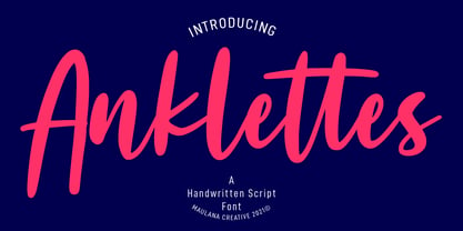 Anklettes is a fancy handwritten script font. With bold stroke, slant and Unique Upper and lower characters with bit of ligatures and alternate lowercase. To give you an extra creative work. Anklettes font support multilingual more than 100+ language. This font is good for logo design, Social media, Movie Titles, Books Titles, a short text even a long text letter and good for your secondary text font with sans or serif. Make a stunning work with Anklettes font. Cheers, MaulanaCreative
 - WL Rasteroids Monospace by Writ Large,
$5.00 Rasteroids Monospace is a typographic flashback to computing of the mid 1980s, when 9-pin dot-matrix printers were the state of the art, and most home computer displays were TVs hooked up to RF modulators. Rasteroids not only captures the dot-matrix printer look, but recreates the rasterized appearance of text on those lower-resolution monitors. Because of its fixed character width, Rasteroids Monospace is intended for use in accents or small areas of copy rather than long documents.
 - Kartell by ParaType,
$25.00 Kartell type family was designed by Oleg Karpinsky for ParaType in 2006. Design features: lower contrast between strokes and slim serifs. It consists of three weight styles with corresponding Italics. The Open Type version contains a lot of alternate characters and additional ligatures. Italic styles contain some alternate letterforms and lots of swash characters. Kartell is recommended for long text passages at magazines, books and booklets, as well as for headlines, logos, billboards, visit cards, newspaper adds and so on.
 - Byronic by Alan Meeks,
$30.00 Byronic is soft modern sans-serif but with an antique style lower-case. The rounded end soft look gives Byronic a friendly soft look whilst still retaining a classical typographic appearance. A very clean style and slightly condensed it is excellent for text setting and headline with an unusual loser case that compliments the caps perfectly. Available in a range of 5 weights and 5 italics and a Latin Pro character set of 430 characters including ranging numerals and small caps.
 - Trinculo by Scriptorium,
$12.00Trinculo is a cursive font which combines traditional letter forms with ridiculously ornate embellishments and flourishes. It's rather like what an 18th century clerk might have done with his lettering if he was bored to distraction with writing the same old letters again and again. The upper case characters are more complex with simpler versions of the same characters in the lower case. Trinculo is a lot of fun, though if you use it too much it may become overwhelming. - Riposte by Scholtz Fonts,
$15.00 Riposte is a powerful and carefully-integrated handwriting font. You should use it where you want to create a strong impact but want to avoid heavy, boxy, formal fonts. The characters were designed for excellent letter-spacing without kerning, but you can switch kerning on to add some subtle enhancements to the letter-spacing. Riposte is readable, even at quite small sizes. It was designed to be used as a mix of upper and lower-case letters. Do not make text using only uppercase letters since the spacing of the uppercase letters was optimized for use together with lowercase letters. So remember, when you want your text to have the powerful impact of the master swordsman with his balanced stance and vigorous movement -- try Riposte. The font is fully professional: carefully letterspaced and kerned. It contains over 235 characters - (upper and lower case characters, punctuation, numerals, symbols and accented characters are present). It has all the accented characters used in the major European languages. Riposte works well in professional layout application packages as well as in word-processing packages such as Microsoft Word® that do not support professional kerning.
 - Lemonado by Melvastype,
$29.00 Lemonado is a type family drawn with a dry brush pen. It includes upright and italic scripts and all caps fonts with brush texture or with smooth edges. Lemonado Script is playful and slightly bouncing connecting script. It includes two sets of lower cases to increase the hand writing effect. By enabling Contextual Alternates from OpenType panel you can cycle these two sets and achieve variation. Lemonado Script also includes set of lowercases without connecting stroke, you can use those in the middle of words or automatically add them at the end of words by enabling Stylistic Set 1 at the OpenType panel. There are also set of lower cases with end swashes, you can automatically add these swashes to end of words by enabling Stylistic Set 2 at the OpenType panel. Also other alternate characters and underlines are included to give you even more possibilities to play with. Lemonado Caps has two sets of upper case letters, high and low ones. You can achieve this fun looking bouncing effect by varying them. Just enable Contextual Alternates from OpenType panel and those two sets will cycle.
 - Balkiez Hellenistic by Bykineks,
$15.00 Entered into the bykineks culture typeface edition. This 2nd edition typeface is inspired by the meander curves and waves often found in the culture and art of the Hellenistic era. The specifications for this font are bold typeface script, high contrast slope classification, stress axis, and X height. Comes with various alternatives for each upper and lower case letters. small offer a variety of silicates or optimal shapes for a given placement, having binding and sweeping characteristics. Suitable for coffeeshop branding needs, web design, stickers, apparel, invitation cards, and others. Consists of 503 glyphs support Languages : Afrikaans, Albanian, Asu, Basque, Bemba, Bena, Breton, Chiga, ColognianCornish, Croatian, Danish, Dutch, Embu, English, Esperanto, Estonian, Faroese, Filipino, Finnish, French, Friulian, Galician ,Double,Germany,Gusii,Hungary,Inari Sami,Indonesia,Ireland,Italy,Jola-Fonyi,Kabuverdianu,Kalaallisut,Kalenjin,Kamba,Kikuyu,Kinyarwanda,Lithuania,Lower Sorbia,Luo,Luxembourg,Luyia,Machame, Makhuwa-Meetto , Malagasy, Malt Manx, Meru, Morisyen, North Ndebele, Norwegian Bokmål, Norwegian Nynorsk, Nyankole, Oromo, Polish, Portuguese, Quechua, Romansh, Rombo, Rundi, Rwa, Samburu, Sango, Sangu, Sobia ,Shambala , Somalia, Spain , Swahili, Swedish, Swiss German, Taita, Teso, Turkish, Upper Sorbian, Uzbek (Latin) Volapük, Vunjo, Walser, Zulu.
 - Klatter by Scholtz Fonts,
$19.00Klatter is a font that is "in your face". It can't be ignored, and draws attention to itself no matter how noisy the environment. It is available in three styles: - Klatter Regular is a clean, spunky, non-grunge font that uses a combination of straight lines and sharp angles to make a strong, no-nonsense statement; - Klatter SmallCaps, in which the lower case is a true "small caps" and not a shrunken version of the upper case (generated by the operating system); - Klatter Grunge is based on Klatter Regular but is "dirty" and messy, giving the impression of printing problems and wet ink being smudged. Unlike many other grunge fonts, Klatter Grunge is a font that is full of character. Both styles have a full character set with upper and lower case, numerals and mathematical symbols, as well as a full set of accented and special characters. The font has been carefully letter-spaced and kerned and the vertical spacing has been appropriately set. Klatter Grunge and Regular are appropriately purchased together since they complement one another when used in the same graphic design job. - Interleave OCR SB by Scangraphic Digital Type Collection,
$26.00Since the release of these fonts most typefaces in the Scangraphic Type Collection appear in two versions. One is designed specifically for headline typesetting (SH: Scangraphic Headline Types) and one specifically for text typesetting (SB Scangraphic Bodytypes). The most obvious differentiation can be found in the spacing. That of the Bodytypes is adjusted for readability. That of the Headline Types is decidedly more narrow in order to do justice to the requirements of headline typesetting. The kerning tables, as well, have been individualized for each of these type varieties. In addition to the adjustment of spacing, there are also adjustments in the design. For the Bodytypes, fine spaces were created which prevented the smear effect on acute angles in small typesizes. For a number of Bodytypes, hairlines and serifs were thickened or the whole typeface was adjusted to meet the optical requirements for setting type in small sizes. For the German lower-case diacritical marks, all Headline Types complements contain alternative integrated accents which allow the compact setting of lower-case headlines. Please note that Interleave SB and Interleave OCR SB are versions which are for decorative purposes only. - Filigree by Scholtz Fonts,
$19.00 Filigree, reminiscent of the delicate lace and jewelry produced in Europe in the 16th to 18th centuries, was inspired by the font Always, and by the way in which the threads (or filia) of the characters in Always intertwined. It has a soft, wafty character. It is best used as a display font at a relatively large size. At too small a size the delicacy of the individual filaments will be lost. Best results also from a combination of upper and lower case characters. Using upper case characters alone will not look as good. Alternate characters and ligatures are also included. If your application program supports "kerning" then I suggest that you turn it on. Although not essential, this will enhance the spacing of the letters. The font contains over 272 characters - (upper and lower case characters, punctuation, numerals, symbols and accented characters are present). It also includes a number of "open-type" characters - these enhance the flexibility of the font by providing alternatives that are used either at the discretion of the designer or are determined by the circumstances in which the font is used. It has all the accented characters used in the major European languages.
 - Lunanic by Ingrimayne Type,
$9.00 Lunanic is a geometric novelty typeface family with a touch of graffiti. The letters are formed from a circle with a notch or nick taken out, a shape that reminds me of a partial lunar eclipse. Half of the family have the nick on the left and half on the right. The faces are monospaced and so tightly spaced that there is no space between most of the letters so the filled styles cannot be used alone without tweaking. There are several ways to tweak them to make them readable: adjacent letters can be colored differently, the characters spacing can be increased, or an outlined style can be layered on top of the filled letters. The family does not have a true lower case. Most of the characters in the lower-case slots are alternates for those on the upper-case keys and they can be mixed in whatever way the user finds best. The family has twelve members: two orientations with three weights each and each of these six has an outline style to go with it. Lunanic is fun, bizarre, weird, and obviously a decorative display font.
 - 1509 Leyden by GLC,
$49.00 This script font was inspired by the type used in Leyden by Jan Seversz to print Breviores elegantioresque epistolae [...], author Francesco Filfelo, circa 1509. The original font contains all lower case characters, except w, eth, thorn, lslash, oslash and so... and almost upper case. In addition, one set of small lombardic initials were also nearly complete. It take place instead of the Bold style (in only one package)offering a real and rare complete historical printing set... The original small "a" hight was 2,8 mm !, the upper case hight no more than nearly 5 mm, the initials hight almost 15 mm, covering nearly two lines. This font includes "long s", naturally, as typically medieval and also a few ligatures, but not any variants. We have entirely recreated some characters, upper, lower and initials, to fill gaps. It is used as variously as web-site titles, posters and fliers design, publishing texts looking like ancient ones, or greeting cards, all various sorts of presentations, menus, certificates, as a very decorative, elegant and unusual font, besides its historical scrupulous reality... This font supports enlargement as well as small size.
 - Carve by Scholtz Fonts,
$19.00 Carve is an African font that was inspired by fonts such as Othello and Neuland designed in the mid-1920s. Rather than attempting to re-create these fonts in a digital form as so many others have done, I have tried to capture the “spirit” of the period and emphasize the “woodcarving” style of the font, while simultaneously giving it a contemporary feel. As a result the characters differ markedly any of the original styles and have much less of an “Art Deco” look to them. To further modernize Carve, I have included all the characters required for a full character set (lower case, as well as all punctuation, numerals, diacritics, special characters etc). The result is a thoroughly modern re-interpretation. The numbers (0 to 9) bear no relation to any originals but, I believe, are fully in keeping with the upper and lower alphabetic characters of my font. Carve comes in two styles: --Regular: contemporary, angular African style --Incised: exaggerating the chunky, hand-carved "woodcut" effect. The "in-line" effect has been hand-crafted to avoid the mechanical effect of computer-generated inline effects.
 - News Gothic SB Vietnam by Scangraphic Digital Type Collection,
$26.00 This version of News Gothic contains the Vietnamese character set. Since the release of these fonts most typefaces in the Scangraphic Type Collection appear in two versions. One is designed specifically for headline typesetting (SH: Scangraphic Headline Types) and one specifically for text typesetting (SB Scangraphic Body Types). The most obvious differentiation can be found in the spacing. That of the Body Types is adjusted for readability. That of the Headline Types is decidedly more narrow in order to do justice to the requirements of headline typesetting. The kerning tables, as well, have been individualized for each of these type varieties. In addition to the adjustment of spacing, there are also adjustments in the design. For the Body Types, fine spaces were created which prevented the smear effect on acute angles in small type sizes. For a number of Body Types, hairlines and serifs were thickened or the whole typeface was adjusted to meet the optical requirements for setting type in small sizes. For the German lower-case diacritical marks, all Headline Types complements contain alternative integrated accents which allow the compact setting of lower-case headlines.
 - Cotford Variable by Monotype,
$188.99 New from the Monotype Studio, Cotford is a contemporary serif from Creative Type Director, Tom Foley. Dynamic, adaptable, and surprising—Cotford is a languid serif that ranges from delicate thins, bending and reaching like flower stems, to bold heavy weights that command the page and screen with confidence and vintage charm. And as a variable font, Cotford allows designers to explore and refine the design almost endlessly, unearthing its many visual tones and hidden secrets. Foley set out to design a soulful, contemporary serif typeface that delivers all the versatility and robustness today's designers expect. The variable font unlocks an expandsive spectrum of visual expression that allows designers to explore, tweak, and adjust the typeface until they find the perfect weight, contrast, and optical size for their project. At the same time, Cotford’s static weights follow a traditional model of 3 text and 5 display weights, making it a strong choice for brands looking for simple implementation. A pop serif for the digital age, Cotford takes you places.
 - Bach by Los Andes,
$39.00 We have grown a new flower in our Garden, but this time, in a more emotional way, capturing its vibrations and using them to create a fresh handmade typeface: ‘Bach’, a display type system inspired by the new lifestyle trends that look to go back to basics and increase the value of old natural healing methods. Bach comes in two styles: a 6-weight Serif font in regular and italic versions, and a 2-weight Script in regular and bold versions. Ornaments are also included! Bach Script is based on the calligraphic catchwords set (handcrafted with brush pen) and the Serif version of the Garden typeface. This font is the perfect choice for labelling, packaging, illustrated books and posters. Go back to nature and feel the vibration again, this time with Bach! Bach is a Mendoza Vergara Studio design with the collaboration of Cecilia Mendoza in digital editing, under the supervision of Luciano Vergara and Coto Mendoza.
 - Genie by Canada Type,
$24.95The flower children of Canada Type are at it again. This time we went above and beyond the call of duty and right into the land of reconstruction in order to make this font. When we saw a few letters from an early 1970s film type called Jefferson Aeroplane, we had the sudden urge to bring their beauty to digital life. But since further research revealed no more letters or information, we just had to "wing" the rest of this Aeroplane. Now this Genie is out of the lava lamp, and it's nothing short of groovy. A few symbols and alternates come within the font, so make sure to check out the very full character set. We love this font so much that we couldn't help but play with it for a week. Some of the Wes Wilson-inspired results are in this page's gallery, so check them out for a flashback. Keep on trucking! - San Remo Casual SG by Spiece Graphics,
$39.00 Now is a great time to dust off your old motor scooter and take a ride along the Italian Riviera. Let’s head to the flower city of San Remo, Italy - the namesake for this versatile, 1950s style script. Try San Remo on your next brochure or flyer project. You may want to consider using it to create a special logo or icon for your personal stationery. It’s perfect for any job that requires linked or connected letters. And for your convenience, this dashing design sports a variety of alternate characters plus lining and old style figures. San Remo Casual is also available as an OpenType font. It contains lining and oldstyle figures, prebuilt fractions, stylistic alternates, and a wide assortment of f-ligatures, plus more. These advanced features currently work in Adobe Creative Suite InDesign and Illustrator. Check for OpenType advanced feature support in other applications as it gradually becomes available with upgrades. Ciao!
 - Babetta by Viktor Nübel Type Design,
$- Babetta is a display typeface that comes with some decorative typographical features. Alongside a set of arrows and flower icons, it also includes an alternative ›E‹, some special diacritic marks, a wavy ›S‹ and a series of ligatures. It features 5 weights, a special ›Neon‹ version and supports a wide range of Latin languages. This typographical tool box provides a large and playful variety of options for headlines and logotypes. Babetta supports Latin and Cyrillic languages. The initial inspiration for Babetta was an illuminated vintage shop sign—that of a famous bookstore in Berlin called Karl-Marx-Buchhandlung that dates back to the days of East Germany. During the course of the design process, this slightly shabby historical original was kissed by an Italian Art Deco beauty and has blossomed into a new typeface with its own special charm. The aim was not to preserve the original lettering, but to use it as a starting point for typographical exploration.
 - Well, imagine if a jar of honey and a bouquet of flowers had a baby on a sunny spring afternoon. That baby would be the font "Feelin Sweet" by Ardian Nuvianto. It's like every letter was dipped in a ...
- Roadbrush by Kustomtype,
$25.00 Roadbrush was inspired by the mid-20th-century hand lettering of Albert Eckhardt, Jr., that I found in a 1950’s sign painting book. Roadbrush is a retro brush-style script that I re-designed and completely re-mastered. Roadbrush is a powerful font that can be used for logotype, packaging, posters, T-shirts, signage & design projects with a retro & vintage feel. Roadbrush comes with four styles that contain all upper and lower case characters, punctuation, numerals and mathematical operators, as well as all accented characters.
 - Lasta by Tour De Force,
$25.00 Lasta is small serif font family with simple elegant shapes, refreshing Italics and poetic endings. Containing 2 weights and 2 italics, with lower x-height which brings more air (empty space, white space...) into paragraphs making text more graceful and legible. Thin serifs bring small touch of dynamic into letter forms, just enough to bring specific tone to paragraph. Beside being mainly imagined as fully text family, Lasta is suitable titles or decorative typography as well for, especially the Italics with fancy curvy endings.
 - Margaux by Scholtz Fonts,
$19.95 Margaux is an elegant, smooth, disciplined italic font, based on French fonts of the early 20th century. It evokes Paris in her heyday - culture, romance, and sophistication. Margaux is beautifully crafted, with simple, neat lower case characters, and upper case characters that are elegant but decoratively curled. This font lends itself to the creation of romantic adverts, wedding stationery, greeting cards, theatre posters, romantic book covers, certificates. Margaux has all the features usually included in a fully professional font. Language support includes all European character sets.
 - Clichy by Eurotypo,
$32.00 Clichy is a delightfully handwritten font with strong character. Clichy is a font inspired by the successful Nuit font, looking for the same harmony and casual character, Nuit's rounded strokes are now straight. Clichy has even more stylistic alternatives, decorative characters, ligatures, initial and terminal forms in upper and lower case, that allow you to mix and match pairs of letters. Also, with Clichy it is possible to write in capital letters. Clichy will help your creativity and make your typographic work expressive and elegant.
 - Vglee by Ingrimayne Type,
$8.50 With its split serifs, Vglee looks like it could be a copy of an “Old West” font but it is not. It was constructed by taking a motif and applying it regardless of consequences. Vglee does not have lower-case letters but it does include a full set of Western and Central European accented characters. Its distinctive, odd appearance can be useful in small doses for decorative purposes. The VgleeStar style contains only the ornament. It is intended to be used in layers with Vglee.
 - Rusty Cage by Hanoded,
$15.00 I named this font after one of my favorite songs by Soundgarden: "Rusty Cage". The font is a mishmash of letters, which were hand-drawn and given a photoshop overhaul to make them look grungy and grotesque. I mixed upper and lower case letters, added a whole bunch of alternate letters, spooned in some Salt and Calt and added a pinch of Liga as well. The result is a weird concoction, which looks good on posters, in ads and possibly even tattoos. I dare you!
 - Alexandria Signature by Ergibi Studio,
$20.00 Alexandria Signature is a modern Signature font crafted in an elegant and professional style with alternative characters. perfect font for creating signature logos and watermarks for photography studios or personal photography logos, best for initial logo or brand signatures.Alexandria Signature includes a full set of beautiful handwritten upper and lower case letters, numbers, assorted punctuation marks. All lowercase letters include start and end strokes, providing a realistic handwriting style. If you have any questions about our fonts, please feel free to contact us Thank You Ergibi Studio