10,000 search results
(0.059 seconds)
- Astromonkey by Hanoded,
$15.00 Astromonkey - here he is, all new, all excited to be alive! Astromonkey comes from outer space, where he has rubbed shoulders with the Star Trekkers, the aliens and Major Tom, who is still floating in his tin can. The font is a squarish all caps, with a different set of glyphs for upper and lower case (so they mingle quite well) and Astromonkey himself - disguised as the paragraph glyph. Enjoy.
 - Kenwyn by Talbot Type,
$19.50 Kenwyn is a bold, geometric, Egyptian style slab-serif display font. It comes in two variations — Single Dot and Double Dot — each with an accompanying Stencil variation. Essentially a blend of circles and squares, Single Dot features a circular counter at the centre of each character, while Double Dot uses a lower and upper circle. Although the two variations are similar in principle, the results are visually quite different.
 - Newt Juice by Cool Fonts,
$24.00 Newt Juice is a funky hand drawn font comes in both Outline and Fill styles. Put them both together in your favorite application and you can get some really organic looks. Newt Juice is perfect for kid stuff or grungy graffiti. While it is an all caps font, the upper and lower case characters are position differently to create more randomness. Be the first on your block to juice the newt!
 - Pikolo by Ideabuk,
$16.00 Pikolo font family is inspired by vintage woodblock printing. It is a bold and playful slightly rounded display typeface, perfect for headings, logos and so much more! The font comes with full upper & lower case characters, numbers, symbols and includes the most common stylistic ligatures. Multilingual support, languages include: Dutch, Danish, Norwegian, Finish, Swedish, Icelandic, Estonian, Latvian, Lithuanian, German, Hungarian, French, Portuguese, Spanish, Italian, Bosnian, Croatian, Czech, Slovak.
 - Brass by HiH,
$8.00 The Brass Family has a lineage that extends into English history. About five hundred years ago a devout, but anonymous Englishman gave glory to the God he worshipped by designing the capital letters and decorations of these two fonts. Originally recorded in The History Of Mediaeval Alphabets And Devices by Henry Shaw (London 1853), they are described by Alexander Nesbitt in his Decorative Alphabets And Initials (Mineola, NY 1959) as “Initials and stop ornaments from brasses in Westminster Abbey.” I wish I could say I remember seeing them when I was there, but that was forty-two years ago and all I remember was seeing the tomb of Edward the Confessor. One definition of “stop” as a noun is a point of punctuation. I have heard people from the British Isles speak of a “full stop” when referring to a period. Some may remember a 19th century form of communication called a telegram being read aloud in an old movie, with the use of the word “stop” to indicate the end of a sentence or fragment. A full dozen of these stop ornaments are provided. They occupy positions 060, 062, 094, 123, 125, 126, 135, 137, 167, 172, 177 & 190. The Brass Family consists of two fonts: Brass and Brass Too. Both fonts have an identical upper case and ornaments, but paired with different lower cases. Although the typefaces from which the lower cases were drawn are both of modern design, both are interpretations of the textura style of blackletter in use in England when the upper case and ornaments were fashioned for the Abbey. Brass is paired with Morris Gothic, which matches the color of the upper case quite well. Brass Too is paired with Wedding Regular, which is distinctly lighter than the upper case. I find it very interesting how each connects differently. The resulting fonts are unusual and most useful for evoking an historic atmosphere.
 - First Grade by m u r,
$10.00Searching for a font that resembled true children's handwriting, this font's creator designed a font from his own first grade penmanship assignments. Ideal for anything related to children. - Thalia by profonts,
$41.99 Thalia is a wonderful Artdeco typeface design reminiscent of 1900. Very likely, it was originally designed at that time. Unger redesigned the typeface based on old prints, completed the character set and expanded the typeface to cover the full Latin glyph set. Thalia is perfect for anything about theater, such as posters, programs, etc.
 - Tel Avaloz by Ilhamtaro,
$23.00 TEL AVALOZ is a vintage font with a serif base. But even though it's vintage, it's also suitable for modern designs. Also suitable for headlines, social media design and branding. To enable the OpenType Stylistic alternates, you need a program that supports OpenType features such as Adobe Illustrator CS, Adobe Indesign & CorelDraw X6-X7. Cheers!
 - Tzavelast by Ilhamtaro,
$23.00 TZAVELAST is a vintage font with a serif base. But even though it's vintage, it's also suitable for modern designs. Also suitable for headlines, social media design and branding. To enable the OpenType Stylistic alternates, you need a program that supports OpenType features such as Adobe Illustrator CS, Adobe Indesign & CorelDraw X6-X7. Cheers!
 - 1864 GLC Monogram by GLC,
$20.00 This family of two character monograms and initial letters was inspired from a French portfolio containing about two hundred examples of "Chiffres - deux lettres", destinated to engravers and jewelers, published in Paris in 1864, drawn by French engraver, C. Demengeot. Unfortunately, a large part of the pages were lost, so we have had to redraw about two thirds of the complete monogram family. Each package contains numerals and two complete sets of two-letter monograms, for example the A-B set, containing AA AB AC... corresponding to caps keys alphabet and BA, BB, BC... corresponding to lower case keys alphabet. We have added an Initial set, with two choices of single characters. Warning: I and J have strictly identical monograms.
 - Grange Rough by Device,
$39.00 Grange Rough is an inky, distressed version of Grange that mimics the effects of vintage hot-metal type on rougher paper. Grange is the Device interpretation of the classic “Grot” thick/thin sans style. Unlike the traditional models on which it is based, Grange takes a rational, consistent approach across wide range of weights and widths for contemporary use. The font includes alternative curved and straighter versions of key characters, most obviously the lower-case ‘g' and capital ‘R', allowing the font to take on either a sharper or warmer, more playful appearance. These can be toggled on or off using the ‘Alts' feature in Illustrator, or ‘Stylistc Sets’ in Indesign. Contains proportional, lining and tabular numerals. Perfect for both headline and text.
 - ITC Posterboy by ITC,
$29.99If you are looking for a friendly type design that jumps off the page, ITC Posterboy might be for you. Although not quite a script, the font displays strong brush-stroke overtones. The design's inspiration, according to designer Chester Wajda, came from the window-poster lettering in my neighborhood grocery store." The slight top-heavy quality of the design is most noticeable in characters like the 'F,' 'G,' and 's.' ITC Posterboy also has a charming sense of naïveté which is most evident in letters like the cap 'S' and 'J' and lowercase 'f'' and 'g.' ITC Posterboy is a brilliant display design that adds spark and charm to the most mundane display copy. A multifaceted artist, Wajda has been an art director, multimedia and print designer, illustrator, cartoonist, animator, writer, typographer, and infographic designer. ITC Posterboy is his second typeface created for ITC." - The Hoca by Afkari Studio,
$15.00 The Hoca Display Serif Font is made with unique typeface font and also has vintage serif display font. This font is suitable for any branding of your design needs, project, labeling, clothing, movie screen, poster, studio brand, Halloween design, magic design, kids design, movie title, gigs, invitations, social media posts, clothing, any poster design, cafe/resto sign, album covers, logos, and much more. Features; 3 Styles; Regular, Bold, and Outline Uppercase, Lowercase, Number, and Punctuation Alternates and Special Ligatures Works on PC & Mac Simple installations Accessible in Adobe Illustrator, Adobe Photoshop, Adobe InDesign, and even work on Microsoft Word Fully accessible without additional design software. Mültîlíñgúãl Sùppört; Hope you enjoy our font and this font is useful for your projects!
 - Content Creator by Dumadi,
$20.00 Content Creator – Playful Typeface is a comic themed font that can be used for your design needs. as the title suggests, this font is specifically for content creators to improve the quality of the designs and projects you are working on. Content Creator is perfect for design, logos, social media, brands, advertising, product design, handwritten quotes, product packaging, headers, posters, merchandise, and other designs. What’s Included : + Standard glyphs + Ligature + Web Font + Multilingual Accent + Works on PC & Mac, Simple installations Accessible in Adobe Illustrator, Adobe Photoshop, Adobe InDesign, even work on Microsoft Word. PUA Encoded Characters – Fully accessible without additional design software. Fonts include multilingual support + Image used: All photographs/pictures/vectors used in the preview are not included, they are intended for illustration purposes only. Thanks
 - Hustony Extrude by MJB Letters,
$16.00 Hustony is a layered retro bold script that comes with a regular and extrudes version which will make it easier for you to make a retro effect on a design, this font is designed carefully to be used for many purposes such as logo design, poster design, branding, labels, covers, magazine, wedding design, fashion design and more. You will get : Hustony Regular Hustony Extrude In order to use the beautiful swashes, you need a program that supports OpenType features such as Adobe Illustrator CS, Adobe Photoshop CC, Adobe Indesign, and Corel Draw. but if your software doesn’t have a Glyphs panel, you can install additional swash font files: if you have questions about the latest fonts, please provide a short message to us Thank You! MJB Letters
 - Mr Eaves Modern by Emigre,
$59.00 Mr Eaves is the often requested and finally finished sans-serif companion to Mrs Eaves, one of Emigre’s classic typeface designs. Created by Zuzana Licko, this 2009 addition to the Emigre Type Library expands the versatility of the original Mrs Eaves with two complimentary families: Mr Eaves Sans and Mr Eaves Modern. Mr Eaves was based on the proportions of Mrs Eaves, but Licko took some liberty with its design. One of the main concerns was to avoid creating a typeface that looked like it simply had its serifs cut off. And while it matches Mrs Eaves in weight, color, and armature, Mr Eaves stands as its own typeface with many unique characteristics. The Sans version relates most directly to the original serif version, noticeably in the roman lower case letters a, e, and g, as well as in subtle details such as the angled lead in strokes, the counter forms of the b, d, p, and q, and the flared leg of the capital R, the tail of the Q. The distinctly loose-fitting letter spacing of Mrs Eaves was applied also to the Sans version. This, together with generous built-in line spacing due to a small x-height and extended ascenders and descenders, renders the same kind of lightness and airiness when setting text that is so characteristic of Mrs Eaves. Deviations from the original Mrs Eaves are evident in the overall decrease of contrast, as well as in details such as the flag and tail of the f and j, and the finial of the t, which were shortened to maintain a cleaner, sans serif look. And the lower case c had to be balanced out differently after it lost its top ball terminal. And with the loss of serifs, Mr Eaves set width is slightly narrower. Mr Eaves Italic also carries over many forms from its Mrs Eaves model, most notably the v, w, and z, which are unusually flamboyant for a sans italic design. It also utilizes lead in and terminal tails that are reminiscent of the serif italic. The biggest departure here is the width of the characters. The extra narrow gauge and delicate features seemed more appropriate for the Serif than the Sans. To allow for a comfortable fit, Mr Eaves Italic has a more robust design and wider character width. Meanwhile, the Modern family provides an overall less humanistic look, with simpler and more geometric-looking shapes, most noticeably in the squared-off terminals and symmetric lower case counters. This family has moved furthest from its roots, yet still contains some of Mrs Eaves’ DNA. The Modern Italic is free of tails, and overall the Modern exhibits more repetition of forms, projecting a cleaner look. This provides stronger differentiation from the serif version whenever a more contrasting look is desired. Each version (Sans and Modern) contains its own set of alternates providing unique options for applications such as headlines, word logos, letterheads, pull quotes, and other short text settings. Both the Sans and Modern come in six weights. The simpler forms of a sans-serif provide the opportunity of more weights than do serif letter forms, which are more complex in structure, making it difficult to accommodate additional weight without distortions. Regular and Bold match the original Mrs Eaves weights, while the Heavy provides an additional weight for extra emphasis.
 - Mr Eaves Sans by Emigre,
$59.00 Mr Eaves is the sans-serif companion to Mrs Eaves, one of Emigre’s classic typeface designs. Created by Zuzana Licko, this 2009 addition to the Emigre Type Library expands the versatility of the original Mrs Eaves with two complementary families: Mr Eaves Sans and Mr Eaves Modern. Mr Eaves was based on the proportions of Mrs Eaves, but Licko took some liberty with its design. One of the main concerns was to avoid creating a typeface that looked like it simply had its serifs cut off. And while it matches Mrs Eaves in weight, color, and armature, Mr Eaves stands as its own typeface with many unique characteristics. The Sans version relates most directly to the original serif version, noticeably in the roman lower case letters a, e, and g, as well as in subtle details such as the angled lead in strokes, the counter forms of the b, d, p, and q, and the flared leg of the capital R, the tail of the Q. The distinctly loose-fitting letter spacing of Mrs Eaves was applied also to the Sans version. This, together with generous built-in line spacing due to a small x-height and extended ascenders and descenders, renders the same kind of lightness and airiness when setting text that is so characteristic of Mrs Eaves. Deviations from the original Mrs Eaves are evident in the overall decrease of contrast, as well as in details such as the flag and tail of the f and j, and the finial of the t, which were shortened to maintain a cleaner, sans serif look. And the lower case c had to be balanced out differently after it lost its top ball terminal. And with the loss of serifs, Mr Eaves set width is slightly narrower. Mr Eaves Italic also carries over many forms from its Mrs Eaves model, most notably the v, w, and z, which are unusually flamboyant for a sans italic design. It also utilizes lead in and terminal tails that are reminiscent of the serif italic. The biggest departure here is the width of the characters. The extra narrow gauge and delicate features seemed more appropriate for the Serif than the Sans. To allow for a comfortable fit, Mr Eaves Italic has a more robust design and wider character width. Meanwhile, the Modern family provides an overall less humanistic look, with simpler and more geometric-looking shapes, most noticeably in the squared-off terminals and symmetric lower case counters. This family has moved furthest from its roots, yet still contains some of Mrs Eaves' DNA. The Modern Italic is free of tails, and overall the Modern exhibits more repetition of forms, projecting a cleaner look. This provides stronger differentiation from the serif version whenever a more contrasting look is desired. Each version (Sans and Modern) contains its own set of alternates providing unique options for applications such as headlines, word logos, letterheads, pull quotes, and other short text settings. Both the Sans and Modern come in three weights. The simpler forms of a sans-serif provide the opportunity of more weights than do serif letter forms, which are more complex in structure, making it difficult to accommodate additional weight without distortions. Regular and Bold match the original Mrs Eaves weights, while the Heavy provides an additional weight for extra emphasis.
 - AE Prosperity by Altered Ego,
$50.00 Well suited for headlines, packaging and display applications, AE Prosperity will be a robust and versatile addition to your script library. It’s purposefully designed to infer the visual connections of letters for a hand-lettered feel. Some characters will connect, and others will guide your eye to the next letter from, making it highly legible. In 1779, the schooner Prosperity sailed the high seas. Commissioned by a young continental congress, with 6 guns & at twenty tons, she sailed under a Letter of Marque for patriotism and profit. Look lively, because with contextual and alternate glyph sets (contextual glyphs, alternate lower case glyphs and an extended set of alternate capitals), this robust typeface is as inspiring as her namesake and adapts to whatever winds may blow. Prosperity is designed as a free-flowing script, for a spontaneous and historic aesthetic. Contextual glyphs include variations on tt (short and longbar), t longbar, ll, cc and other characters. Contextual features change ascender heights and descender styles. Alternate glyphs (set 1) include variations on b,d,f,g,h,l,o,p,r,s,t,y. Alternate capitals (set 2) include a complete set of alternate upper case letters. Most useful with Adobe® InDesign®, multiple variations of letter combinations can be achieved by selecting Contextual glyphs, and/or set 1 and set 2 from the Character Palette: OpenType: Stylistic Sets menu. Alternate glyphs and contextual characters will be available based on the OpenType support of your application. AE Prosperity™ is available exclusively in OpenType format.
 - Transport New by K-Type,
$20.00 Transport New is a redrawing of the typeface designed for British road signs. In addition to the familiar Heavy and Medium weights, Transport New extrapolates and adds a previously unreleased Light weight font originally planned for back-lit signage but never actually applied. Version 3.0 of Transport New features significant improvements including numerous outline and spacing refinements, and a full complement of Latin Extended-A characters. Also, to align Transport New with the 2015 release of Motorway, the other typeface used for UK road signage, Italic fonts for all three weights have been added. Originally designed by Jock Kinneir and Margaret Calvert beginning in 1957 and first published on the Preston bypass in 1958, the original Transport font has subtle eccentricities which add to its distinctiveness, and drawing the New version involved walking a tightrope between impertinently eliminating awkwardness and maintaining idiosyncrasy. The Grotesk roots of the glyphs were investigated and cheekily fine-tuned – uncomfortably close terminals of characters such as 5, 6, C, G, and e were shortened, the S and s were given a more upright aspect and their protruding lower terminals tucked in, overly wide glyphs like the number 4 were narrowed, and some claustrophobic counters were slightly opened up. The question mark was redesigned and parentheses given some stroke contrast. The x height was edged fractionally even taller. The Heavy font is actually more of a Bold, and the Light is pretty much a regular weight, but the original nomenclature has been retained for old times’ sake.
 - AT Move Powerplay by André Toet Design,
$39.95 POWERPLAY a monospace lowercase alphabet with a 3D twist. Designed by André Toet in 1976 (during his study at Central School of Art & Design, London, UK) and he redesigned this in 2011. The name Powerplay is based on the Battersea Power Station, London. The remarkable architecture of the building is also used as a decor for films and for one of the covers by Pink Floyd (Animals, the flying pig). Concept/Art Direction/ Design: André Toet © 2017
 - Photomark Signature by MJB Letters,
$17.00 Photomark Signature is a Casual and Stylish Signature font, it has unique style in uppercase and lowercase character and very perfect for branding, signature, card designs, wedding designs, watermarks, logos and other. Photomark Signature includes full set of uppercase and lowercase letters, numeral, punctuations and ligatures. Included in this set: Works on PC & Mac Simple installations Accessible in the Adobe Illustrator, Adobe Photoshop, Adobe InDesign, even work on Microsoft Word. PUA Encoded Characters – Fully accessible without additional design software
 - Doobie by Canada Type,
$24.95One would think the whole hippy thing would have died out after the knighting of Mick Jagger and the selling out of the The Who. Not at Canada Type. We still occasionally read Burroughs and Ginsberg, listen to Dylan and Hendrix, and use the backyard to pretend (um, like run barefoot with the dog). And we're always happy to make another psychedelic font. This one is based on an early 1970s film type that went by the names Hoopla and Scorpio. Doobie is a typical hippy font that uses the simplest elements of the art nouveau genre. Bubbly and wavy, Doobie exudes an almost child-like innocence, the ever laid back, optimistic simplicity of flower power. It is right at home alongside the many other psychedelic fonts that make Canada Type the definite home of the groovy alphabet. Far out! - Sweet Pattern by Krafted,
$10.00 Sweet Pattern, just as sweet as flowers, flawless as you! A perfect font for your minimal yet beautiful website, social media branding, Pinterest banners, printed invitations, and more! Sweet Pattern fonts, like a fragrance, speak your heart, your audience’s, clients and guests and people around you! What you’ll get: Multilingual & Ligature Support Full sets of Punctuation and Numerals Compatible with: Adobe Suite Microsoft Office KeyNote Pages Software Requirements: The fonts that you’ll receive in the pack are widely supported by most software. In order to get the full functionality of the selection of standard ligatures (custom created letters) in the script font, any software that can read OpenType fonts will work. We hope you enjoy this font and that it makes your branding sparkle! Feel free to reach out to us if you’d like more information or if you have any concerns.
 - Signtype by Good Java Studio,
$449.00 Signtype Modern Script font is a natural & modern handwritten font. It's perfect for logo, invitation, stationery, wedding designs, social media posts, advertisements, product packaging, product designs, label, photography, watermark, special events or anything. This font includes ligatures and also Multilingual support. - PUA Encoded open - Support for Adobe Illustrator, Corel Draw, Indesign or Adobe Photoshop - Support for MAC or WINDOWS
 - Hugio by Rockboys Studio,
$23.00 Hugio is a simple and casual serif font with an undeniably clean feel. With its neat and beautiful arrangement of letters, this typeface will look outstanding in both formal and non-formal designs. PUA encoded = Accessible in the Adobe Illustrator, Adobe Photoshop, Adobe InDesign, even work on Microsoft Word. PUA Encoded Characters - Fully accessible without additional design software.
 - Heist by Nyalaapi,
$15.00 Heist is a sporty font, comes with two styles that make perfect for your design. Ideal for branding project, logos, quotes and every other design which need strong feel. Features - 4 Ligatures - Multilingual support Open type features can be accessed using Open Type programs such as Adobe Illustrator CS/CC, Adobe Photoshop CS/CC, Adobe Indesign & CorelDraw X6-X7.
 - Circles JY by JY&A,
$39.00Based on electrical circuitry, David Philpott's Circles typefaces are oddly legible, even though one might think they were destined for display usage only. The circle is the base form, repeated throughout the design. Originally drafted during his time at the Massey University School of Design, subsequent refinements have turned Circles into two complete fonts with a full character set. - Ornata G by Wiescher Design,
$39.50 Ornata G is the seventh of a series of old ornaments that I am trying to save from oblivion. I am completely redesigning the ornaments from scratch. These ornaments have been designed around 1890, I think by someone at the Enschede foundry in Holland. These have a lot of nice swings. Your digitizing type-designing savior, Gert Wiescher
 - Odile by Kontour Type,
$50.00 Odile is a text typeface with bracketed head and bracket-free bottom lower case serifs, a quality that counters rigidness most traditional slab serif typefaces possess. This contemporary design draws inspiration from an experimental typeface named Charter originally designed by the American book and type designer William Addision Dwiggins. It consisted of an informal lowercase alphabet, a narrow seemingly non-inclined vertical letter with script attributes, featuring non-joining letterforms. Dwiggins’ contemplated Charter as the italic companion to Arcadia, Experimental No. 221. The Charter project progressed sporadic stalled during the Second World War and came to a halt in 1955. Charter remained incomplete and was never commercially released. Assessing Charter’s whimsical design, its fragments were rethought and developed into a comprehensive text family. Odile Upright Italic reveals recognizable similarities shared by Dwiggin’s Charter and defines the design approach for the family. The steep calligraphic outstroke and low junctions off the stem as in the upright italic “n” or “r”, for example, are gradually lessened in the italic and moved up for the roman weights. The six optically balanced weights range from the delicate Light to stark Black, accompanied by display variants with feminine flair and ardent Ornaments. Two sorts of Initials, one amplified with interweaving swashes, the other more restrained, both are clearly derived from the Upright Italic. This mid-contrast serif offers a wide range of tools for text and display typographies with a palette of strict to playful. This family shines in magazine, book and display use. The graceful serifed type harmonizes perfectly with Elido, Odile’s sans companion. Sans and serif share the family array and OpenType features in perfect tune. Odile offers an extensive character set, numerous OT features including roman and italic Small Caps, five sets of numerals, alluring ligatures, and many more. OT stylistic variants (with accents) offer a one-story “a” for the roman weights, alternate “g” and “s” designs for the italics, and a variant “s” for the Upright Italic.
 - Hamptons BF by Bomparte's Fonts,
$40.00 Hamptons BF is a beautiful, elegant sans serif with dramatic individuality. A font that steps out in Art Deco style. As a design movement Art Deco came into prominence during the 1920s and 30s when forms were typically sleek, symmetrical, geometric or highly stylized. Today the influence of this enduring style can be clearly seen in architecture, industrial design, fashion, art, graphic design, and yes, even type design. Art Deco style exemplifies luxury, glamour and modernity. I believe Hamptons BF captures something of that retro look in a nod to the past without ever looking dated, all the while retaining a contemporary flair. Named after the well-known New York resorts synonymous with style and elegance, this gothic or sans serif type is based upon University Roman, an early 1970s serif design which in turn was influenced by yet another serif design called Forum Flair (late 1960s); and that in turn owes its pedigree to the late 1930s’ Stunt Roman, which is the original source of inspiration for all of these. Quite a family tree! There’s dynamic interplay between certain wide, full-round letters such as C, D, G, O, P, Q, R, S and narrow ones like A, E, F, H, K, L, M, N, U, etc. This contrast repeats throughout certain lower case letters and serves to create a unique look of distinction. Light and Regular weights communicate a romantic, feminine appeal while the Bold offers a complementary emphasis. The font is somewhat versatile as in addition to its primary purpose for display, Hamptons BF also succeeds in settings containing short blocks of large text. It’s right at home in a variety of typographic environments: branding, packaging, signage logos, magazine headlines, invitations, menus, trendy cafes and more. Among the included OpenType features are Stylistic Alternates, Automatic Ligatures and Fractions. There is extended language support for Western, Central and Eastern Europe and Turkish.
 - Gradl Initialen ML by HiH,
$12.00 Max Joseph Gradl designed Art Nouveau jewelry in Germany. At least some of his designs were produced by Theodor Fahrner of Pforzheim, Germany -- one of the leading manufacturers of fine art jewelry on the Continent from 1855 to 1979. I don't know if he designed for Fahrner exclusively, but every example I found was produced by that firm. I assume it was also the same M.J, who edited a book, Authentic Art Nouveau Stained Glass which was reissued by Dover and is still available. For an artist as accomplished as Gradl was, he is very tough to research. There just does not seem to have been much written about him. The jeweler is visible in most of his typeface designs. They exhibit a sculptural quality as if they were modeled in clay (or gold) rather than drawn on paper. His monograms, especially, reflect that quality. Those shown in plates 112 through 116 in Petzendorfer actually appear to have been designed specifically for fabricating in the form of gold or silver pendents. Of the initial letters that came out of Germany during this period, these by Gradl seem unusually open and lyrical. They seem to be dancing on the page, rather than sitting. Please note that Gradl designed only the decorated initials. All other characters supplied were extrapolated by HiH, including the accented initials. Orn.1 (unicode E004) is based on a jeweled gold clasp designed by Gradl (please check out Gallery Image on Myfonts.com). Also included are an art nouveau girl’s face, a swan and the face from Munch’s “Scream”, from scans of old printer’s ornaments. Gradl Initialen M represents a major extension of the original release, with the following changes: 1. Added glyphs for the 1250 Central Europe, the 1252 Turkish and the 1257 Baltic Code Pages. Added glyphs to complete standard 1252 Western Europe Code Page. Special glyphs relocated and assigned Unicode codepoints, some in Private Use area. Total of 341 glyphs. Both upper & lower case provided with appropriate accents. 2. 558 Kerning Pairs. 3. Added OpenType GSUB layout features: salt, dlig, ornm and kern. 4. Revised vertical metrics for improved cross-platform line spacing. 5. Refined various glyph outlines. 6. Alternative characters: 16 upper case letters (with gaps in surrounding decorations for accents above letter). 8. Four Ornaments: face1, face2, swan and orn1 (silhouette of Gradl clasp) The zip package includes two versions of the font at no extra charge. There is an OTF version which is in Open PS (Post Script Type 1) format and a TTF version which is in Open TT (True Type)format. Use whichever works best for your applications.
 - Black Sansa Pro by Authentype,
$14.00 Black Sansa - Retro display font with a full set of uppercase and lowercase letters, multilingual symbols, numbers, punctuation, stylistic set, and ligatures. Black Sansa retro display font style for retro poster, magazine, retro beauty branding design in vintage style suitable for your retro design concept. Features: Simple installations, accessible in Adobe Illustrator, Adobe Photoshop, Adobe InDesign, even work on Microsoft Word. PUA Encoded Characters – Fully accessible without additional design software. Fonts include multilingual support for; ä ö ü Ä Ö Ü ß ¿ ¡ ____ PLEASE NOTE Most of the fonts require advanced graphic software that supports Open Type Features like Adobe (Illustrator, InDesign, Photoshop), Affinity (Photo, Designer, Publisher), Corel Draw, or similar software. Image used: All photographs/pictures/logo/vector used in the preview are not included, they are intended for illustration purposes only. Thank you Hope you enjoy our font!
 - Maxim by profonts,
$39.99Splendor was originally produced and released in 1930 by Schriftgu� AG, Dresden. The typeface was designed by Berlin designer Wilhelm Berg. Ralph M. Unger, who in the last few years has created a whole series of revivals and redesigns from the hot metal era, ?retrieved? this jewel of a typeface design, redesigning, complementing and digitally remastering it for profonts. Splendor is a broad nip, non-connecting handwriting script of timeless elegance, charm and beauty. It needs tight setting with plenty of space around it. The font contains a number of alternate characters: Two uppercase As, Ss (with descender); in addition, two uppercase Ms, Ns and Zs as well as two lowercase zs. - Splendor by profonts,
$41.99 Splendor was originally produced and released in 1930 by Schriftgu� AG, Dresden. The typeface was designed by Berlin designer Wilhelm Berg. Ralph M. Unger, who in the last few years has created a whole series of revivals and redesigns from the hot metal era, ?retrieved? this jewel of a typeface design, redesigning, complementing and digitally remastering it for profonts. Splendor is a broad nip, non-connecting handwriting script of timeless elegance, charm and beauty. It needs tight setting with plenty of space around it. The font contains a number of alternate characters: Two uppercase As, Ss (with descender); in addition, two uppercase Ms, Ns and Zs as well as two lowercase zs.
 - Monarda by Monotype,
$29.99 Monarda™ is Terrance Weinzierl’s take on the loud and splashy brush scripts of the 1950s. It’s energetic, playful, and equally at home in hardcopy headlines as it is in interactive banners. In addition to the basic alphabet, OpenType® fonts of Monarda are also awash in super-sized swash caps, contextual alternate characters and ligatures. Pair Monarda with a mid-century structural sans like Trade Gothic® or a sturdy slab serif like Egyptian Slate™ to create typographic counterpoint that’s confident, compelling and memorable! Named for a riotous bright red flower that attracts butterflies and humming birds, Monarda is a rare combination of flamboyance and effortless beauty. Weinzierl describes it as “casual yet precise: a stiff denim jacket or perfectly white sneakers at a formal event.” Monarda clearly stands out – and always fits in. Well, almost always. Drawn for print, the design’s robust x-height, open counters and wide apertures also make Monarda screen-friendly. Monarda can be perfect for a wide variety of food and lifestyle applications as well as travel, stationery and packaging projects. Advertising campaigns and product branding are also well within its reach. Monarda works best when used large – but economically. Two or three words are its sweet spot. Think: product name, print headline or the lettering on the side of a truck. It could easily become your go-to design for projects that call for a script with a bright personality and fearless demeanor. The excellence of Weinzierl’s work has been recognized by the Type Directors Club and Print Magazine. When not working on creating new typefaces, he augments his professional practice through calligraphy, lettering, and letterpress printing. Monarda is another winner from Weinzierl’s creative mind and talented hand.
 - Saya Satpol by Dumadi,
$20.00 Saya Satpol – Sketched Typeface made with a sketch-themed application that gives a relaxed and cool feel. Saya Satpol is perfect for design, logo, social media, branding, advertising, product design, handwritten quotes, product packaging, headers, posters, merchandise, and other designs. What’s Included : + Saya Satpol + Standard glyphs + All Caps + Multilingual Accent + Works on PC & Mac, Simple installations Accessible in Adobe Illustrator, Adobe Photoshop, Adobe InDesign, even work on Microsoft Word. PUA Encoded Characters – Fully accessible without additional design software. Fonts include multilingual support + Image used: All photographs/pictures/vectors used in the preview are not included, they are intended for illustration purposes only. Thanks
 - Ukasyah by Javatypestd,
$15.00 Ukasyah is a Modern Calligraphy font that will give a beautiful impression to your designs Ukasyah would perfect for photography, watermark, social media posts, quotes, logos & branding, invitation, product designs, label, stationery, wedding designs, product packaging, special events or anything that need handwriting taste. What’s Included : - Web Font - Standard glyphs - Ligature and Stylish Set - Works on PC & Mac - Simple installations - Accessible in Adobe Illustrator, Adobe Photoshop, Adobe InDesign, even work on Microsoft Word. - PUA Encoded Characters – Fully accessible without additional design software. - Fonts include multilingual support Thank you for your purchase! Hope you enjoy our font!
 - Child Happy by MC Creative,
$9.00 Child Happy is a delightful display font. It embodies playfulness and authenticity and is perfect for children themed designs, especially when combined with bright colors. perfect for branding projects, logo, wedding designs, social media posts, advertisements, product packaging, product designs, label, photography, watermark, invitation, stationery and any projects that need handwriting taste. What’s Included : Standard Glyphs Ligature Works on PC & Mac Simple installations Accessible in the Adobe Illustrator, Adobe Photoshop, Adobe InDesign, even work on Microsoft Word. PUA Encoded Characters – Fully accessible without additional design software. Fonts include multilingual support for; ä ö ü Ä Ö Ü ß ¿ ¡
 - Sattinda by MC Creative,
$10.00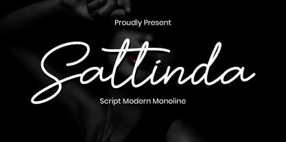 Sattinda is a thin and elegant handwritten font. It features a cute and joyful style that will take your designs to the next level! perfect for branding projects, logo, wedding designs, social media posts, advertisements, product packaging, product designs, label, photography, watermark, invitation, stationery and any projects that need handwriting taste. What’s Included : Standard Glyphs Ligature Works on PC & Mac Simple installations Accessible in the Adobe Illustrator, Adobe Photoshop, Adobe InDesign, even work on Microsoft Word. PUA Encoded Characters – Fully accessible without additional design software. Fonts include multilingual support for; ä ö ü Ä Ö Ü ß ¿ ¡
 - Strange Agent by Dumadi,
$35.00 Strange Agent – Casual Brush is a font that goes well with procreate a relaxed, fun and friendly atmosphere. Strange Agent perfect for designs, logos, social media, brands, content, advertisements, product designs, quotes, product packaging, headers, posters, merchandise, and other designs. What’s Included : + Standard glyphs + Ligature + Web Font + Multilingual Accent + Works on PC & Mac, Simple installations Accessible in Adobe Illustrator, Adobe Photoshop, Adobe InDesign, even work on Microsoft Word. PUA Encoded Characters – Fully accessible without additional design software. Fonts include multilingual support + Image used: All photographs/pictures/vectors used in the preview are not included, they are intended for illustration purposes only. Thanks