2,290 search results
(0.016 seconds)
- Moranga by Latinotype,
$29.00 Moranga is a contemporary, serif, retro-style typeface with a strong personality. Its design is a mixture between Café Brasil's flowing, organic shapes and elements from 70's popular fonts such as Cooper and Souvenir. Moranga, in 5 weights and matching italics, is the perfect choice for headlines, display use and high-impact or friendly designs. Moranga contains a set of more than 400 characters and supports over 200 Latin-based languages.
 - Casablanca by Red Rooster Collection,
$45.00Casablanca is a decorative sans serif font family. It was designed and produced in 1997 by Steve Jackaman (International TypeFounders). Jackaman loosely based the designs on the Carlos Winkow typeface ‘Electra’ from the Spanish foundry, Nacional, circa early 1940’s. Casablanca has a clean, Art Deco, jazz, and/or noir film feel. It sets nicely at any size, and brings an air of bold mystery to the projects it is applied in. - Booden by Lithographe,
$36.00 Booden is a name not to boo but to use in display type situations. but as texts funtion s to be read its functionality ges beyond a Cyber-tech font single weight single time use. it can be used for branding purposes or any type of editorial text because of its readability. Be it a logo, or a Title headliner, web or print booden typeface can certainly entertain your need for simple variation.
 - Kamryn by Sharkshock,
$115.00 Kamryn is an updated overhaul of an earlier project. This version retains a distinct retro look with swashes and rounded serifs. This gives it a wholesome feel that will work well in children’s books, 80’s era apparel, or scrapbooking. European accents and extended punctuation were added along with improved kerning and alternates. Overlap may occur in certain uppercase/lowercase combinations. The 3D versions are equipped with several ligatures that correct this.
 - Rocket Clouds by Wacaksara co,
$18.00 Introducing our new font called Rocket Clouds inspired by Sythwave Style, 80's Music, and Neon Light Sign. This font offer the aesthetic style and retro mood for your design needed. The Rocket Clouds style has a universal and timeless design. This font uses style of classic sign typography. Rocket Clouds immediately engages you no matter what you use it for. It’s beautiful for product labels, houseware and text overlay to any background picture.
 - Radio Stereo by Senekaligrafika,
$12.00 "Radio Stereo" is experimental vintage font style that to speak instant retro sensation, it was inspired by the inscription on the radio/televisiom in the 2000's era. "Radio Stereo" will help you to create special and touching typographical design for your nostalgic and oldschool projects.Perfect when you place them into magazines, book cover, cafe product, newspaper titles, poster, and many more. It is really universal and modern font. The owner of endless possibilities!
 - The Moonlight by Aiyari,
$16.00 Introducing a new handwritten font called The Moonlight. Inspired by ball pen handwritten combine with retro (80-90's) nuance. The typeface comes with open type features such as stylistic alternates, stylistic sets, & ligatures and also support with the PUA encoded to help you make a stunning design. The Moonlight is perfect for headings, logo type, quotes, apparel design, invitations, flyer, poster, greeting cards, product packaging, book cover, printed quotes, cover album, movie, etc.
 - Musical Arrangement JNL by Jeff Levine,
$29.00 The hand-lettered title on a piece of sheet music for 1938's "Don't Be That Way" (as recorded by Benny Goodman) featured squared letters with rounded corners, slight variants in line thickness and interesting "overhangs". Additionally, some letters closed off on one end while others were opened, giving the impression of a slight "maze" effect. This unique song title was enough of an inspiration to be turned into Musical Arrangement JNL.
 - Modernista FA by Fontarte,
$39.00 An inspiration for two fonts of FA Modernista was the second page of Polish vanguard magazine "Praesens" Nr 1 from 1926 designed (as the first page) by Henryk Stażewski. The type applied - Baccarat was a sans serif from Polish foundry Jan Idźkowski i S-ka. Fonts FA Modernista imitate the effect of letterpress with spilled printing ink. Letters of two cuts vary in distortion as in the old days of letterpress technology.
 - Miss Demeanor by Typadelic,
$19.95 Miss Demeanor has a tendency to create her own rules due to her free-spirited nature. She conforms to every day typographic expectations but she wouldn’t like you to think so. She has unusual yet casual and eye catching shapes and makes the best of any situation. I hope you enjoy her pretty style! My inspiration for Miss Demeanor came from a specimen sheet of an american type style from the early 1930’s.
 - Lovadelic by Aiyari,
$20.00 Introducing a new retro & groovy typeface called Lovadelic. Inspired from 70's script lettering combine with psychedelic balloon typography. Lovadelic comes with open type features such stylistic alternates, stylistic sets, contextual alternates & ligatures. The package also comes with extras graphic to help you make stunning design. Lovadelic typeface is best uses for headings, Logo type, quotes, apparel design, invitations, flyer, poster, greeting cards, product packaging, book cover, printed quotes, cover album, movie, etc
 - Jadeite by TEKNIKE,
$129.00 Note: This family only contains Capital letters Jadeite is a geometric monospaced display font. The typeface has a distinct style inspired by the Mid-Century Modern era and designed to be easy to read. The Jadeite name comes from a mineral form of jade and also represents a color of green, reminiscent and popular of the 1950’s era. Jadeite is great for display work, quotes, invitations, film credits, fashion, architecture, posters and headings.
 - Senza by Blackmoon Foundry,
$40.00 Senza is a contemporary, neutral, all-purpose sans serif family designed by Elena Albertoni. It was specially designed for the use on screen. With open shapes and large x-heights Senza guarantees high legibility for body text in small sizes. Senza ’s character-set covers all European languages written in Latin alphabet including real small caps, ligatures, proportional and tabular figures. Senza comes in four weights from Light to Black with matching italics.
 - Asikue by Kereatype,
$14.00 Asikue is a soft serif font family inspired by the 70’s retro styles that bring chunky retro typography to the modern era. Asikue consists of 10 styles from Regular to Extra Bold with each matching Oblique. Asikue includes Asikue have Opentype features: Alternate, Ligature, Swashes, etc providing you with a variety of captivating custom text arrangements. Whether it's a fancy retro-inspired, logo, or engaging bold header text Asikue is able to deliver.
 - Junior Clerk JNL by Jeff Levine,
$29.00 Junior Clerk JNL is the plain sans serif version of the lettering found on the cover of the sheet music for 1919's "The World is Waiting for the Sunrise". The song title was originally set in a decorative sans serif with an engraved line adorning each character. This version of the more fanciful design is available as the companion font Legal Eagle JNL. Junior Clerk JNL is available in both regular and oblique versions.
 - Hoeflers by Maulana Creative,
$12.00 Hoeflers is a Hand-lettered font inspired by the vintage 70's sign board, music, shop and movies, it has a rough stroke outline and then we fill it. Hoeflers includes opentype features Ligatures. It support multilingual more than 100+ language. This font is good for logo design, Movie Titles, Books Titles and any awesome project you create. Make a stunning work with Hoeflers Rough sans font. Its a caps only fonts. Cheers, MaulanaCreative
 - Suffragette by muccaTypo,
$33.00 Suffragette, an all-caps typeface introduced for the branding of the Hermitage Hotel in Nashville, is inspired by the Hotel’s Beaux-Arts architecture injected with a healthy 2020’s aesthetic. This unique roman capital design, with its sans serif-medium contrast shapes and slightly pronounced serifs, is the perfect match for luxury packaging and high-end couture. If your brand wants to project elegance with a playful edge, Suffragette is the font for you!
 - Phraxtured by Ingrimayne Type,
$13.95 Phraxtured is a fairly accurate rendition of the letter forms used in an old German-language publication that I found in a trash heap. However, several characters in fraktur, such as the k, y, x, and S, look bizarre to English-language readers, and I have created more comfortable alternatives. The Phraxtured-Deutsch version has the more traditional characters. The ShadowedInside style is designed to be used in layers with the Shadowed style.
 - Caslon Gotisch by RMU,
$25.00 A blackletter font by William Caslon (1692-1766), with Dutch influences, which appeared for the first time in a font sample book of William Caslon & Son, London, 1763. To access all ligatures in this font, it is recommended to activate both OT features Standard and Discretionary Ligatures. The round s occupies the number sign key, and typing N - o - period and activating this combination with the OT feature Ordinals gives you the numero sign.
 - Culpepper by Galapagos,
$39.00I've always admired the work of Rudolph Koch. Culpepper is what I think Neuland would have looked like if it had been developed with lowercase, small caps and a range of weights. I started work on this series in the late 80’s and, like so many of my ideas, it was shelved when life drew me in another direction. Culpepper is the name of one of the islands in the Galapagos chain. - Luckiest Softie Pro by Stiggy & Sands,
$29.00 Our Luckiest Softie Pro is a softened variation of our Luckiest Guy Pro typeface, inspired by hand-lettered vintage 1950's advertisement. The charm of the original typeface is enhanced with softened corners to give the typeface a more cuddly charisma. Opentype features include: - SmallCaps. - Full set of Inferiors and Superiors for limitless fractions. - Tabular, Proportional, and Oldstyle figure sets (along with SmallCaps versions of the figures). - Stylistic Alternates for Caps to SmallCaps conversion.
 - Bengawan by Panritype Studio,
$13.00 Bengawan is a modern, elegant, beautiful script. It has beautiful characters and it's perfect for project such as logos, wedding invitation, posters, social media headlines, birthday cards and also match with other design project. Bengawan comes with natural ligatures and extra alternates that can make your project more beautiful and elegant. Features: - Natural Ligatures - More Extra Alternates - PUA Encoded - Multilanguage Support Thank You For Download. Have question(s)? drop here: fajry.al.fatih13@gmail.com Thank You
 - HT Fiorista by Dharma Type,
$19.99 Fiorista is a pretty brush scrip with thin and curly line. Florists works best for greeting card, wedding ceremony invitation or shop card of fashion or apparel. It could also be used for film, magazines, advertising and websites. Holiday Type Project offers retro hand drawing scripts. Inspired by retro script on shopfront lettering, wall paint advertisements in Italy around 1950s. Check out the script fonts from Holiday Type!
 - Magic Ivy by Anmark,
$18.00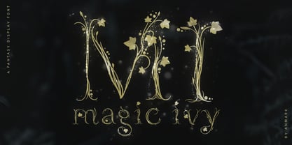 I’m pleased to introduce my decorative font Magic Ivy. Magic Ivy is a fantasy font to add a touch of magic to your designs! Unique uppercase letters are ideal for your wedding monograms and logos. Use this botanical font for wedding invitations, branding, packaging, magazines, florist shops, social media, restaurant menus, greeting cards, headers, poster, fabulous book cover and many more. Magic Ivy comes with uppercase, lowercase, numerals and punctuation.
 - DBE-Rigil Kentaurus - Personal use only

- Caflisch Script by Adobe,
$35.00Caflisch Script was designed by Robert Slimbach in 1993. The design is based on the handwriting of Max Caflisch, one of the foremost graphic designers of this century. Caflisch, a teacher of graphic arts for over three decades in Zurich, is author of several books on typography and designer of the 1952 Columna typeface. Caflisch�s handwriting has a free flowing yet disciplined character, the result of years of practice and devotion to the calligraphic arts. Slimbach retained the subtleties and natural letter joins of Caflisch�s original handwriting while adapting it into a typographically sound and highly practical script typeface. Caflisch Script is a multiple master typeface with a weight axis that allows the typeface to transition smoothly from light to heavy weights, maintaining legibility and visual appeal at a full range of point sizes. Caflisch Script can be used anywhere the appearance of a fine hand is desired, as well as more sophisticated and practical situations such as display work in books and copysetting for advertisements. - The Mumbai Sticker by Roland Hüse Design,
$29.00 “The Mumbai Sticker” is a layered script font. I have created this font from the sticker I designed for my Mumbai trip for my friend’s wedding, you can watch a short video of the process and the story behind. https://youtu.be/bO8e9lQ0DNU instructions to use: • for smooth connections of v s, v r, v z, w s, w r, and w z please enable “standard ligatures” in open type features panel • Type a text with the “Regular” version, then copy and paste in back (cmd B) and switch to “Outline” version. Please make sure you give it a different color to make the main font visible. Looks best in Black and white as you can see in the poster image but feel free to play around! (Please refer to the PDF included within the downloadable .zip file. • • • For full version and commercial license please visit https://rolandhuse.com or contact@rolandhuse.com The full / commercial version contains Western and Eastern European accented characters and special characters, punctuation and ligatures. @rolandhusedesign Follow me on Instagram
 - Glyphic Neue by Typeco,
$29.00Glyphic Neue was inspired by the Op Art style of lettering in the United States that ran rampant in many photo type houses in the 1960's and 1970's. The Glyphic Series from the Franklin Photolettering group was an influence and spring board for this family of fonts, hence it's name. But Glyphic Neue departs from its unicase Franklin influence in several ways. Firstly the designer created both upper and lower case forms. The lowercase has been designed with barley protruding ascenders and descenders and with an x-height equivalent to the cap height, so that upper and lower can be exchanged indiscriminately for a quirky effect. Some of the letters take a cue from the original Glyphic series but many have been redesigned entirely to fit the designers vision. The italic forms differ enough from the upright version making it almost an entirely different display alphabet. Glyphic Neue is a versatile family of 6 fonts -- 3 widths, each with an accompanying italic that look equally at home when used on a party flier or a sports team visual identity. - Gorgonzola Gothic by The Ampersand Forest,
$20.00 Gorgonzola Gothic is a geometrically-inspired gothic sans serif family that's robust and versatile. Inspired by the geometric quirkiness of IxD (also by The Ampersand Forest), Gorgonzola Gothic expands into a thirty-style family that works for everything from branding to text. It further mitigates IxD's quirkiness by offering two options in the round and shouldered lowercase glyphs. The standard letterforms, like IxD, have notched joins, giving them an assertive, almost futuristic look. The alternates of those letterforms (housed in Stylistic Set 01, and available as immediate hoverable glyph options in the Adobe Suite) are more conventional (as are the SS01 ampersand, Q, S, a, and s). In this way, Gorgonzola Gothic offers the best of both worlds: a flavorful, slightly futuristic family (in the same world as geometric classics like Eurostile) and a workhorse gothic sans (like the Benton classics Franklin Gothic, News Gothic, etc.). Its three widths: Skinny, Slim, and Standard, give it a wide range of applications, from display to body. Gorgonzola Gothic makes a statement with strength and sureness.
 - Bayside Tavern by FontMesa,
$25.00 Bayside Tavern is a weathered version of our Tavern Alt font family. With its straight sides Bayside Tavern fits better in tight spaces and reads better at smaller point sizes than the regular Bay Tavern version. With three weights, open faced and outline versions to choose from you're sure to find the right style for your new project, restaurant menu, logo, t-shirt design or Pirate costume party. While our original Tavern Alt font has been increased to include five weights additional weights for Bay Tavern will have to wait for now, adding the notched cut in's were all done by hand which causes a lot of cramping so a long break is needed before creating the extra weights. The Fill fonts in the Bayside Tavern family are meant to be layered behind the Bayside Open fonts, if you're using Bayside Open select Bayside Fill, if you're using Bayside Open L select Bayside Fill L, if you're using Bayside Open S select Bayside Fill S and so on.
 - Mackay by René Bieder,
$39.00 Mackay is a powerful transitional serif in 6 weights plus matching italics, designed for screen and print. The eccentric serifs on uppercase letters like E, F, L and T are inspired by Alexander Kay’s “Ronaldson” from 1884, working as the starting point for the family. The lowercase letters follow the traditional Antiqua model with attributes tracing back to drawings from the early 20th century. The “grotesk” lowercase a, as well as the sharp lowercase s, derived from the closed shapes of uppercase letters like C, G or S, create a compact and bold appearance while a large x-height and small descenders add a modern look. In favor of a dynamic and elegant impression, the design of the italic cuts come with a strong calligraphic influence. This results in completely new shapes for letters like lowercase a or g, ensuring a smooth integration into their surrounding letters while maintaining a distinctive appearance when combining with romans. The family comes with a variety of opentype features like case sensitive shapes, old style figures, fractions, ordinals and many more. Additional attention was given to the standard and discretionary ligatures, extending the structure of the basic glyphs with elegantly designed letter combinations for g/i, i/t or s/t. According to their dynamic architecture, the italic weights are equipped with additional initial swash characters to subtle accentuate the calligraphic roots. As a result of a high stroke contrast the family works great in paragraphs with medium to large font sizes like headlines, short paragraphs or logos. With its 12 cuts, the family meets all requirements on high quality typography.
 - Dorset by Positype,
$49.00 Dorset marks Léon Hugues first script typeface and first release with the Positype Flourish label. Built crosscurrent to a strict revival or calligraphic digitization, Dorset’s aim was to understand how a font could interact with various calligraphic influences in a single execution and how that interpretation by Léon would lead to new, exclusive design choices. The design purposely chose to connect various gestures from Spencerian handwriting and copperplate calligraphy and meld that with his initial experiments with fine, flat nibs. The result is wholly unique and useful when clear, open, and legible script typography is desired. OpenType features included in this typeface allow the user to seamlessly move from an italic to connected script, while the various stylistic sets can lead you to variations of texture and rhythm, allowing for a more personal and exact expression.
 - Prestissimo Classy by Burntilldead,
$20.00 Prestissimo Classy is a combination font package between copperplate script and retro serif style. A perfect combo for you who need elegant, stylish, retro, casual & professional look on the same plate. Save your priceless time with the best solution! The easiest way to bring professional calligrapher, Penmanship or spencerian script. Now you have this unique opportunity to try the early American handwriting. Really bring classy vibes & easy to use, powered with opentype features & PUA encoded. Our Prestissimo Classy is feature with contextual alternates and stylistic sets to broaden your possibilities - Common and extended ligatures are included. The set is supplemented by flourish ornaments to round out your design. Each style feature full Western Latin character support (multi language), formatted in OpenType (OTF) and will work on your Machintosh or PC. Perfect For: wedding invitations stationary logos postcards letterpress address titles
 - Catesque by Gumpita Rahayu,
$20.00 After several months discovering and developing the traits and personalities well balanced typefaces such like Frutiger and the other identical typefaces, Catesque was born as the new typefaces. The vocal flourish yet harmonious shapes not purely geometrically, it has imperfect rounded characters such as “O” “C” and “G”. Catesque can make some distinctness for large scale design as well as small text. The traits versatilities usable for many design applications, it’s comes with five weights from light to black plus mathcing italics. All characters included the Tabular figures, case-sensitive forms, fractions, and another most common numerals features such as super & subscript to accomplish the numeric design works such like menu, annual reports, etc. The alternate characters are included as well, all features can accessed with OpenType-savvy programs on Adobe Creative Suite via OpenType Panel.
 - Rosella by Monotype,
$50.99 The Rosella™ family, by Sabina Chipară, is an elegant and playful suite of typefaces that are ideal for book covers, social announcements, packaging and posters. Inspired by late 19th century engravers typefaces that mimic the delicate and ornate hairlines of steel and copperplate engraving, the family’s foundation is built on the dramatic Solid design and then expands to Deco, Engraved, Flourish, Hatched and Inline styles. Rosella also takes to color like the beautiful Australian parrot it is named after. Words set in the typeface come alive when vibrant colors, or tinted backgrounds become part of their plumage. While modern as today, the design also has a quiet antique vibe that brings an understated refinement to a variety of hardcopy projects. Rosella is a typeface for those times you need a design that stands out from the crowd – but with grace and composure.
 - Vtg Stencil Germany No.101 by astype,
$31.00 Vtg Stencil Germany No.101 is modeled after historic stencil plates from Bavaria. The design is a blackletter chancery, a romantic reprise of a style that was common in German writing offices from the 14th to the 16th century. The flourishes stylistically quote the Baroque period. A talented mind, perhaps around 1890, has transformed the textura shapes into a modular stencil system. Many elements are repeated throughout the glyph set - see for example the initial swashes on the letters A, B, U etc. Overall, this decorative blackletter doesn’t look like a stencil design. Maybe it was originally used by a sign painter, and all the typical stencil bridges would have been painted over in the final work. If you’re looking for a decorative blackletter font with a unique touch and a romantic feel, you will love Germany No.101.
 - Stevia by Andinistas,
$47.00 Stevia is a font family designed by Carlos Fabian Camargo Guerrero. Stevia is a sweet font family created to design logos, cards, posters, book covers, blogs, packaging, walls, etc. Stevia is useful to differentiate your designs and stimulate your imagination through 5 fonts drawn with an apparent handmade lettering look. Stevia dingbats has more than 250 special monolineal icons to accompany Stevia Script Black (600 glyphs), Stevia Script Light (470 glyphs), Stevia Subtitles Bold (300 glyphs) and Stevia Subtitles Light (300 glyphs) in quotes, legends and short writings. That’s why you'll get a lot of alternative letters in uppercase, lowercase and opentype numbers as well as ligatures and flourishes ideal for beginning, middle and end of word. In summary Stevia is great for communicating naturalness and freshness in designs that need to be outside conventional typographic norms.
 - ITC Rastko by ITC,
$29.99ITC Rastko began as a series of initial letters for a book of poetry. Serbian designer Olivera Stojadinovic had been working with a small publishing house creating a special series of books under the Masterpieces" brand. Her goal was to draw a new set of initial letters for each book. ITC Rastko, named after the Serbian poet Rastko Petrovic, was a project that required initial letters for the entire alphabet. Once Stojadinovic had drawn the majority of the capital letters, she realized that a companion lowercase would make a distinctive script typeface. Sketches of the letters were drawn quickly with a pointed pen. Stojadinovic then refined these, keeping the spontaneous, hand-drawn quality. Capitals are wide and flourished, while the lowercase letters are more condensed and subdued. It's no surprise that the capitals also make great initial letters." - As of my last update in April 2023, there isn't a widely recognized font named "Spaceman" within major font libraries or among widely used typefaces. However, let's imagine what a font aptly named "S...
- Tiffanky by Maulana Creative,
$11.00 Tiffanky is a Classic Cursive monoline font casual and clean stoke font includes alternate lowercase and opentype features Ligatures inspired by the late 80's sign board. It support multilingual more than 100+ language. This font is suitable for logo design and any awesome project you create. Make stunning work with Tiffanky Monoline font. Give your designs an authentic handcrafted feel. "Tiffanky Monoline Cursive Font" is perfectly suited to stationery, logos and much more. Thanks for Download, Maulana Creative
