10,000 search results
(0.019 seconds)
- Conveyor Belt by DesignByLight,
$12.00 Conveyor Belt was designed for an environmental paper made from sugar cane waste called bagasse. The paper mill use conveyor belts to produce the paper from when the bagasse gets loaded to the finished paper product. This was the inspiration for this font. It has some alternatives to give options for different words linking different letters. This is a moving font and flowing.
 - Auchentaller by HiH,
$12.00 Auchentaller was inspired by a travel poster by Josef Maria Auchentaller in 1906. To our knowledge, it was never cast in type. Grado lies on the northern Adriatic, between Venice and Trieste. At one time the port for the important Roman town of Aquileia. With the decline of the Roman Empire, the upper Adriatic region came under the rule of the Visigoths, the Ostrogoths, the Byzantines, the Lombards, the Franks, the Germans, the Venetians and finally, in 1796, the Austrian Hapsburgs. So it remained until the dissolution of the Austro-Hungarian Monarchy in 1919, following World War I, when the seaport of Trieste was awarded to Italy. With Trieste came Montefalcone, Aquileia and Grado. The area was marked by years of political tension between Italy and Yugoslavia, exemplified by the d'Annunzio expedition to capture Fiume (Rijeka) in September, 1919. Some basic discussion of the period from 1919 to 1939 may be found in Seton-Watson’s Eastern Europe Between The Wars (Cambridge 1945) and Rothschild’s East Central Europe Between The Two World Wars (Seattle 1974). In 1965 I was traveling by train from Venice to Vienna. Crossing the Alps, the train stopped for customs inspection at the rural Italian-Austrian border, just above Slovenia. We were warned not to get off the train because there were still shooting skirmishes in the area. Through all this, Grado remained literally an island of tranquility, connected to the mainland by a only causeway and lines on a map. Auchentaller not only painted the beach scene at Grado, he moved there, living out the rest of his life in this comfortable little island town. His travel illustration contains the text from which the design of our font Auchentaller is drawn. The text translates: "Seaside resort : Grado / Austrian coastal land". Please see our gallery images to see a map locating Grado, as well as Auchentaller’s painting of the resort. Auchentaller is a monoline all-cap font, light and open in design , with a lot of typically art nouveau letter forms. Included in our font are a number of ligatures. As is frequently seen in designs by German speakers, the umlaut is embedded in the O & U below the tops of the letters. This approach led to two whimsies: a happy umlauted O and a sad umlauted U. This font has a clean, crisp look that is very appealing and very distinctive. Auchentaller ML represents a major extension of the original release, with the following changes: 1. Added glyphs for the 1250 Central Europe, the 1252 Turkish and the 1257 Baltic Code Pages. Add glyphs to complete standard 1252 Western Europe Code Page. Special glyphs relocated and assigned Unicode codepoints, some in Private Use area. Total of 336 glyphs. 2. Added OpenType GSUB layout features: pnum, liga, salt & ornm. 3. Added 116 kerning pairs. 4. Revised vertical metrics for improved cross-platform line spacing. 5. Revised ‘J’. 6. Minor refinements to various glyph outlines. 7. Inclusion of both tabular & proportional numbers. 8. Inclusion of both standard acute and Polish kreska with choice of alternate accented glyphs for c,n,r,s & z. Please note that some older applications may only be able to access the Western Europe character set (approximately 221 glyphs). The zip package includes two versions of the font at no extra charge. There is an OTF version which is in Open PS (Post Script Type 1) format and a TTF version which is in Open TT (True Type)format. Use whichever works best for your applications.
 - Reghina by Cititype,
$16.00 Let the ink flows and create your elegant design with Reghina font. This font is PUA encoded. PUA stands for “Private Use Areas”. When a font is PUA encoded it means that you can access all special characters such as Alternates, Swash, stylistic and ligature Playing with alternate glyphs is the same thing by playing combinations according to your taste. Coupled with ligatures to reinforce the natural feel, lowercase swashes at the beginning and ending make your design framed in a flexible flow This font is great for digital signatures, photographic text, website banners and brand logos. Unique and flowing naturally makes this font worth having
 - Edifact by Typodermic,
$11.95 Welcome to the world of Edifact, a damaged display typeface that’s here to shake things up! With its roots in the magnetic ink lettering of the 1960s, this typeface is all about breaking the rules and forging a new path forward. But Edifact isn’t just any old font. Oh no, it’s so much more than that! With OpenType ligatures, you can unlock a world of custom combos that will bring a whole new level of realism to your work. And let’s be honest, who doesn’t love a little bit of extra pizzazz? But the real magic of Edifact lies in its unique blend of retro-futurism and post-apocalyptic roughness. This typeface isn’t afraid to get its hands dirty, and it’s not afraid to take risks. With Edifact, your message will stand out from the crowd and grab your audience’s attention like never before. So don’t be shy—embrace the wild, post-apocalyptic world of Edifact and let your creativity run wild! Most Latin-based European writing systems are supported, including the following languages. Afaan Oromo, Afar, Afrikaans, Albanian, Alsatian, Aromanian, Aymara, Bashkir (Latin), Basque, Belarusian (Latin), Bemba, Bikol, Bosnian, Breton, Cape Verdean, Creole, Catalan, Cebuano, Chamorro, Chavacano, Chichewa, Crimean Tatar (Latin), Croatian, Czech, Danish, Dawan, Dholuo, Dutch, English, Estonian, Faroese, Fijian, Filipino, Finnish, French, Frisian, Friulian, Gagauz (Latin), Galician, Ganda, Genoese, German, Greenlandic, Guadeloupean Creole, Haitian Creole, Hawaiian, Hiligaynon, Hungarian, Icelandic, Ilocano, Indonesian, Irish, Italian, Jamaican, Kaqchikel, Karakalpak (Latin), Kashubian, Kikongo, Kinyarwanda, Kirundi, Kurdish (Latin), Latvian, Lithuanian, Lombard, Low Saxon, Luxembourgish, Maasai, Makhuwa, Malay, Maltese, Māori, Moldovan, Montenegrin, Ndebele, Neapolitan, Norwegian, Novial, Occitan, Ossetian (Latin), Papiamento, Piedmontese, Polish, Portuguese, Quechua, Rarotongan, Romanian, Romansh, Sami, Sango, Saramaccan, Sardinian, Scottish Gaelic, Serbian (Latin), Shona, Sicilian, Silesian, Slovak, Slovenian, Somali, Sorbian, Sotho, Spanish, Swahili, Swazi, Swedish, Tagalog, Tahitian, Tetum, Tongan, Tshiluba, Tsonga, Tswana, Tumbuka, Turkish, Turkmen (Latin), Tuvaluan, Uzbek (Latin), Venetian, Vepsian, Võro, Walloon, Waray-Waray, Wayuu, Welsh, Wolof, Xhosa, Yapese, Zapotec Zulu and Zuni.
 - Mollroy by Orenari,
$17.00 Please welcome Mollroy. A simple but special handwritting and it's perfect for quotes. Mollroy also fit for any range of your design projects. This font is naturally written by my self, so the flow of each characters became unique. Take your design project to the next level with Mollroy.
 - Trisula Street Graffiti by Sipanji21,
$20.00 “Trisula Street” sounds like an intriguing font choice for graffiti-inspired designs. Monoline graffiti fonts often feature a balanced and flowing style that adds an artistic and urban touch to various projects. Given its complexity, it can be particularly suitable for streetwear designs, car decals, product packaging, and more.
 - Vintage Mohai by Nirmana Visual,
$29.00 Vintage Mohai Inspired by art nouveau Design Era. This Serift font is perfect for adding a touch of elegance and sophistication to your designs. With its flowing lines and graceful curves, it is ideal for a diversity of design projects, including logos & branding, social media posts, advertisements & product designs.
 - Puppies Play by TypeSETit,
$24.95 Puppies Play is a fun, bouncy script with connectors that give a playful flow. Perfect for baby shower invitations, nursery rhymes, and other items that require a fun, children's look.
 - LD Cursive Flourish by Illustration Ink,
$3.00LD Cursive Flourish is the ultimate in casual elegance. This handwritten script comes complete with fancy flowing flourishes. Intricate and so unique! See LD Cursive for this font without flourishes. - Lyanna by Jonahfonts,
$35.00 Free flowing legible connected-script with glyph terminals including all diacritics. Suitable for various applications such as captions, fashion headlines, packaging, invitations, cards, posters, ads, greeting cards and book jackets..
 - Torch by Bunny Dojo,
$23.00 Torch is a spirited, sophisticated sans. With an open flow that embraces and accentuates the beauty of its surroundings, Torch carries a confidence and triumphal whimsy ideal for any celebration.
 - Moon Earth by Orenari,
$17.00 Please welcome, Moon Earth. A simple cozy handwritting and it's perfect for quotes. Moon Earth also fit for any range of your design projects. This font is naturally written by my self, so the flow of each characters became unique. Take your design project to the next level with Moon Earth.
 - Yustine Signature by Lemonthe,
$14.00 Yustine Signature is a signature script font, featuring a lovely flow. It has a clean and smooth vibe and it will be a hit for any design that you want to add it to. Is perfect for many different project such as logos & branding, invitation, product designs, label, photography, and more.
 - Ailre Heleris by Tanincreate,
$17.00 Ailre Heleris is an elegant script font with an expression of natural handwritten style that flows freely. Perfect for titling, long texts that need handwritten feel, branding projects, social media, wedding invitations, greeting cards, elegant packaging, headlines, posters. It features multi language support (for most of Western Europe), contains glyphs with some OpenType features – some standard ligatures, alternates for lowercase letters (beginning and ending swashes).
 - Mielle CF by Connary Fagen,
$25.00 Flowing like warm honey, Mielle® CF is a playful cursive script perfect for logos, signage, and posters. Automatic ligatures and contextual letters flow across Mielle's six weights. Mielle® CF pairs well with simple, elegant typefaces that won’t compete for visual attention, such as Artifex CF and Artifex Hand CF. Please note that some contextual glyphs may not appear in the generated previews, but will work correctly in the full typeface. All typefaces from Connary Fagen include free updates, including new features, and free technical support.
 - Talonica by Nantia.co,
$24.00 Greek Signature Font Talonica The Greek Signature Font Talonica is a signature decorative font with which you can achieve a hand-lettering style. Talonica is a multilingual lettering font with Greek (of course), Latin characters, and diacritics. Supports all European languages. This signature style is perfect if you want to achieve a modern-looking graphic design project. In addition, this font has a really nice flow so you can also use it in a larger body of text. It can also be used on social media content, for branding or packaging applications. Also, this is the ideal typeface for organic product wine branding and packaging. You can use it to create logotypes with character and natural flow. Additionally, you can use its romantic vibes for wedding invitation designs. Especially if you are looking for a handwritten font for Instagram quote posts or any other social media content, this signature typeface is for you!
 - Arbour Soft by TypeUnion,
$35.00 Arbour Soft is the cheeky version of it's big brother, Arbour. The soft version creates a smooth finish that flows perfectly across screens and print. Arbour Soft comes in 7 weights, from a delicate extra-light to a soft, strong black, with matching soft italics for each upright. The soft black weights are perfect for your new brand or article headlines, and the light weights are great for calling out text. The mid weights are perfect for longer texts.
 - Kijs Display by MMarch NY,
$24.00 Great for branding and headlines, Kijs is a serif type with a twist. Kijs is a “nature font” that communicates earthiness with a free spirit and personality. Kijs has slightly overfilled joints and corners for a natural print look, rounded terminals, and many alternate letters for design variation and for creating a truly organic feel. The thinner font weights speak to natural elegance and sophistication, and bolder weights reveal a concept of flow and organic matter.
 - Cake Bake by wearecolt,
$18.00 There's always time for Cake! Check out my latest display font - Cake Bake. It's a fun bubble font full of character, with 70's retro vibes. An all uppercase type (alternate uppers on the lowercase keys) hand drawn for a natural flow and feel. Use this for logos, headings, book titles, quotes, or whatever you want to add a splash of cheeky fun. For good measure, I added an outline version... you're welcome. More Colt Type Co. fonts
 - Nina Ketchup by Fonts of Chaos,
$10.00 Nina Ketchup is a hand drawn font made with lines. Each letters have his own style. Work perfectly with wood background or hipster logo types. Natural flow for a fantastic effect.
 - 112 Hours by Device,
$9.00 Rian Hughes’ 15th collection of fonts, “112 Hours”, is entirely dedicated to numbers. Culled from a myriad of sources – clock faces, tickets, watches house numbers – it is an eclectic and wide-ranging set. Each font contains only numerals and related punctuation – no letters. A new book has been designed by Hughes to show the collection, and includes sample settings, complete character sets, source material and an introduction. This is available print-to-order on Blurb in paperback and hardback: http://www.blurb.com/b/5539073-112-hours-hardback http://www.blurb.com/b/5539045-112-hours-paperback From the introduction: The idea for this, the fifteenth Device Fonts collection, began when I came across an online auction site dedicated to antique clocks. I was mesmerized by the inventive and bizarre numerals on their faces. Shorn of the need to extend the internal logic of a typeface through the entire alphabet, the designers of these treasures were free to explore interesting forms and shapes that would otherwise be denied them. Given this horological starting point, I decided to produce 12 fonts, each featuring just the numbers from 1 to 12 and, where appropriate, a small set of supporting characters — in most cases, the international currency symbols, a colon, full stop, hyphen, slash and the number sign. 10, 11 and 12 I opted to place in the capital A, B and C slots. Each font is shown in its entirety here. I soon passed 12, so the next logical finish line was 24. Like a typographic Jack Bauer, I soon passed that too -— the more I researched, the more I came across interesting and unique examples that insisted on digitization, or that inspired me to explore some new design direction. The sources broadened to include tickets, numbering machines, ecclesiastical brass plates and more. Though not derived from clock faces, I opted to keep the 1-12 conceit for consistency, which allowed me to design what are effectively numerical ligatures. I finally concluded one hundred fonts over my original estimate at 112. Even though it’s not strictly divisible by 12, the number has a certain symmetry, I reasoned, and was as good a place as any to round off the project. An overview reveals a broad range that nonetheless fall into several loose categories. There are fairly faithful revivals, only diverging from their source material to even out inconsistencies and regularize weighting or shape to make them more functional in a modern context; designs taken directly from the source material, preserving all the inky grit and character of the original; designs that are loosely based on a couple of numbers from the source material but diverge dramatically for reasons of improved aesthetics or mere whim; and entirely new designs with no historical precedent. As projects like this evolve (and, to be frank, get out of hand), they can take you in directions and to places you didn’t envisage when you first set out. Along the way, I corresponded with experts in railway livery, and now know about the history of cab side and smokebox plates; I travelled to the Musée de l’imprimerie in Nantes, France, to examine their numbering machines; I photographed house numbers in Paris, Florence, Venice, Amsterdam and here in the UK; I delved into my collection of tickets, passes and printed ephemera; I visited the Science Museum in London, the Royal Signals Museum in Dorset, and the Museum of London to source early adding machines, war-time telegraphs and post-war ration books. I photographed watches at Worthing Museum, weighing scales large enough to stand on in a Brick Lane pub, and digital station clocks at Baker Street tube station. I went to the London Under-ground archive at Acton Depot, where you can see all manner of vintage enamel signs and woodblock type; I photographed grocer’s stalls in East End street markets; I dug out old clocks I recalled from childhood at my parents’ place, examined old manual typewriters and cash tills, and crouched down with a torch to look at my electricity meter. I found out that Jane Fonda kicked a policeman, and unusually for someone with a lifelong aversion to sport, picked up some horse-racing jargon. I share some of that research here. In many cases I have not been slavish about staying close to the source material if I didn’t think it warranted it, so a close comparison will reveal differences. These changes could be made for aesthetic reasons, functional reasons (the originals didn’t need to be set in any combination, for example), or just reasons of personal taste. Where reference for the additional characters were not available — which was always the case with fonts derived from clock faces — I have endeavored to design them in a sympathetic style. I may even extend some of these to the full alphabet in the future. If I do, these number-only fonts could be considered as experimental design exercises: forays into form to probe interesting new graphic possibilities.
 - Robur by Canada Type,
$24.95 It shouldn't be a surprise to anyone that these letter shapes are familiar. They have the unmistakable color and weight of Cooper Black, Oswald Cooper's most famous typeface from 1921. What should be a surprise is that these letters are actually from George Auriol's Robur Noir (or Robur Black), published in France circa 1909 by the Peignot foundry as a bolder, solid counterpart to its popular Auriol typeface (1901). This face precedes Cooper Black by a dozen of years and a whole Great War. Cooper Black has always been a bit of a strange typographical apparition to anyone who tried to explain its original purpose, instant popularity in the 1920s, and major revival in the late 1960s. BB&S and Oswald Cooper PR aside, it is quite evident that the majority of Cooper Black's forms did not evolve from Cooper Old Style, as its originators claimed. And the claim that it collected various Art Nouveau elements is of course too ambiguous to be questioned. But when compared with Robur Noir, the "elements" in question can hardly be debated. The chronology of this "machine age" ad face in metal is amusing and stands as somewhat of a general index of post-Great War global industrial competition: - 1901: Peignot releases Auriol, based on the handwriting of George Auriol (the "quintessential Art Nouveau designer," according to Steven Heller and Louise Fili), and it becomes very popular. - 1909-1912: Peignot releases the Robur family of faces. The eight styles released are Robur Noir and its italic, a condensed version called Robur Noir Allongée (Elongated) and its italic, an outline version called Clair De Lune and its condensed/elongated, a lined/striped version called Robur Tigre, and its condensed/elongated counterpart. - 1914 to 1918: World War One uses up economies on both sides of the Atlantic, claims Georges Peignot with a bullet to the forehead, and non-war industry stalls for 4 years. - 1921: BB&S releases Cooper Black with a lot of hype to hungry publishing, manufacturing and advertising industries. - 1924: Robert Middleton releases Ludlow Black. - 1924: The Stevens Shanks foundry, the British successor to the Figgins legacy, releases its own exact copies of Robur Noir and Robur Noir Allongée, alongside a lined version called Royal Lining. - 1925: Oswald Cooper releases his Cooper Black Condensed, with similar math to Robur Noir Allongée (20% reduction in width and vectical stroke). - 1925: Monotype releases Frederick Goudy's Goudy Heavy, an "answer to Cooper Black". Type historians gravely note it as the "teacher steals from his student" scandal. Goudy Heavy Condensed follows a few years later. - 1928: Linotype releases Chauncey Griffith's Pabst Extra Bold. The condensed counterpart is released in 1931. When type production technologies changed and it was time to retool the old faces for the Typositor age, Cooper Black was a frontrunning candidate, while Robur Noir was all but erased from history. This was mostly due to its commercial revival by flourishing and media-driven music and advertising industries. By the late 1960s variations and spinoffs of Cooper Black were in every typesetting catalog. In the early- to mid-1970s, VGC, wanting to capitalize on the Art Nouveau onslaught, published an uncredited exact copy of Robur Black under the name Skylark. But that also went with the dust of history and PR when digital tech came around, and Cooper Black was once again a prime retooling candidate. The "old fellows stole all of our best ideas" indeed. So almost a hundred years after its initial fizz, Robur is here in digital form, to reclaim its rightful position as the inspiration for, and the best alternative to, Cooper Black. Given that its forms date back to the turn of the century, a time when foundry output had a closer relationship to calligraphic and humanist craft, its shapes are truer to brush strokes and much more idiosyncratic than Cooper Black in their totality's construct. Robur and Robur Italic come in all popular font formats. Language support includes Western, Central and Eastern European character sets, as well as Baltic, Esperanto, Maltese, Turkish, and Celtic/Welsh languages. A range of complementary f-ligatures and a few alternates letters are included within the fonts.
 - Hand Sketch Rough Poster by TypoGraphicDesign,
$25.00 “Hand Sketch Rough Poster” is a handmade, rough and dirty sans-serif display font for decorative headline sizes. Hand drawn. A–Z (× 2), a–z (× 2) and 0–9 (× 4) are each many different forms. Contextual alternates. Is intended to show the hand-made character and the vibrancy of the display font. The different forms of roughness creates a liveliness in the typeface. Standard ligatures like ae, oe, AE, OE, ff, fl, fi, fj, ffl, ffi, ffj and more decorative ligatures like CT, LC, LE, LH, LI, LO, LU, LY, TOO, TC, TE, TH, TU, TZ and ch, cl, ck, ct, sh, sk, st, sp, additional logotypes like BPM, fff, ppp, sfz and many more … plus Versal Eszett (Capital Letter Double S) give the font more life and shows that despite their retro-looks works with modern OpenType technology (type the word note for the symbol ♫ and the word love for the dingbat ❤ … ). Symbols like play, stop, eject, forward, backward, skip, pause and so on. The topic for the discretionary ligatures and the symbols are music. Have fun with this font – turn up the volume! How To Use – awesome magic OpenType-Features in your layout application ■ In Adobe Photoshop and Adobe InDesign, font feature controls are within the Character panel sub-menu → OpenType → Discretionary Ligatures … Checked features are applied/on. Unchecked features are off. ■ In Adobe Illustrator, font feature controls are within the OpenType panel. Icons at the bottom of the panel are button controls. Darker ‘pressed’ buttons are applied/on. ■ Additionally in Adobe InDesign and Adobe Illustrator, alternate glyphs can manually be inserted into a text frame by using the glyphs panel. The panel can be opened by selecting Window from the menu bar → Type → Glyphs. Or use sign-overview of your operating system. ■ For a overview of OpenType-Feature compatibility for common applications, follow the myfonts-help http://www.myfonts.com/help/#looks-different ■ It may process a little bit slowly in some applications, because the font has a lot of lovely rough details (anchor points). TECHNICAL SPECIFICATIONS ■ Font Name: Hand Sketch Rough Poster ■ Font Weights: Regular ■ Fonts Category: Display for Headline Size ■ Desktop-Font Format: OTF (OpenType Font for Mac + Win) + TTF (TrueType Font) ■ Web-Font Format: SVG + EOT + TTF + WOF ■ Font License: Desktop license, Web license, App license, eBook license, Server license ■ Glyph coverage: 715 ■ Language Support: Afrikaans, Albanian, Alsatian, Aragonese, Arapaho, Aromanian, Arrernte, Asturian, Aymara, Basque, Belarusian (Lacinka), Bislama, Bosnian, Breton, Catalan, Cebuano, Chamorro, Cheyenne, Chichewa (Nyanja), Cimbrian, Corsican, Croatian, Czech, Danish, Dutch, English, Esperanto, Estonian, Fijian, Finnish, French, French Creole (Saint Lucia), Frisian, Friulian, Galician, Genoese, German, Gilbertese (Kiribati), Greenlandic, Haitian Creole, Hawaiian, Hiligaynon, Hmong, Hopi, Hungarian, Ibanag, Iloko (Ilokano), Indonesian, Interglossa (Glosa), Interlingua, Irish (Gaelic), Istro-Romanian, Italian, Jèrriais, Kashubian, Kurdish (Kurmanji), Ladin, Latvian, Lithuanian, Lojban, Lombard, Low Saxon, Luxembourgian, Malagasy, Malay (Latinized), Maltese, Manx, Maori, Megleno-Romanian, Mohawk, Nahuatl, Norfolk/Pitcairnese, Northern Sotho (Pedi), Norwegian, Occitan, Oromo, Pangasinan, Papiamento, Piedmontese, Polish, Portuguese, Potawatomi, Quechua, Rhaeto-Romance, Romanian, Romansh (Rumantsch), Rotokas, Sami (Inari), Sami (Lule), Samoan, Sardinian (Sardu), Scots (Gaelic), Seychellois Creole (Seselwa), Shona, Sicilian, Slovak, Slovenian (Slovene), Somali, Southern Ndebele, Southern Sotho (Sesotho), Spanish, Swahili, Swati/Swazi, Swedish, Tagalog (Filipino/Pilipino), Tahitian, Tausug, Tetum (Tetun), Tok Pisin, Tongan (Faka-Tonga), Tswana, Turkish, Turkmen, Turkmen (Latinized), Tuvaluan, Uyghur (Latinized), Veps, Volapük, Votic (Latinized), Walloon, Warlpiri, Welsh, Xhosa, Yapese, Zulu ■ Specials: Alternative letters, logotypes, dingbats & symbols, accents & €. OpenType-Features like Access All Alternates (aalt), Contextual Alternates (calt), Glyph Composition/Decomposition (ccmp), Discretionary Ligatures (dlig) Denominators (dnom), Fractions (frac), Kerning (kern), Standard Ligatures (liga), Lining Figures (lnum), Numerators (numr), Old Style Figures (onum) Ordinals (ordn), Proportional Figures (pnum), Stylistic Alternates (salt), Stylistic Set 01 (ss01), Stylistic Set 02 (ss02), Stylistic Set 03 (ss03), Stylistic Set 04 (ss04), Superscript (sups), Tabular Figures (tnum) ■ Design Date: 2015 ■ Type Designer: Manuel Viergutz
 - Seraphon by Lemonthe,
$15.00 Seraphon is a stylish and delicate handwritten font. It has a gentle and beautiful flow and it will be a hit for any design that you want to add it to. is perfect for many different project such as logos & branding, invitation, stationery, wedding designs, signature, product designs, label, photography, and more!
 - Sundae by SparkyType,
$25.00Sundae is a brush script drawn with a naïve hand-made twist. The flow of curves, contrast in stroke and variations in letter heights add a human touch while the consistency in design allows for semi-extended setting. Sundae is best suited for large, confident headings where a personal impact is desired. - Classic Cool by Celebrity Fontz,
$19.99An original calligraphic typeface blending the penmanship of French royalty with smooth, modern strokes. The result is a classical flowing design. Includes many accented characters from the Latin-1 Supplement set and others as well as kerning pairs for a tighter look in applications such as Word for Windows that support font kerning. - Cristhyna Signature by Namara Creative Studio,
$12.00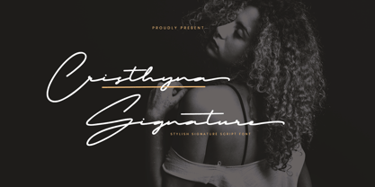 Cristhyna Signature is a modern handwritten script font with natural and stylish flow, this Typeface is an incredible addition to your font library. Perfect for business branding, wedding invitation, cosmetics, fashion, signature logo, magazine cover, advertising and these typefaces work well for many different aesthetics. Features : Stylish & Modern Font Alternates, Ligatures & Multilingual Support
 - Adorne by Aestherica Studio,
$9.00 Adorne is a handwritten script with a natural & stylish flow. This collection of scripts is perfect for personal branding. Adorne is a handwritten script is perfect for branding projects, logo, wedding designs, social media posts, advertisements, product packaging, product designs, label, photography, watermark, invitation, stationery and any projects that need handwriting taste.
 - Dockyard by Lemonthe,
$15.00 Dockyard is a relaxed handwritten font, has a gentle and beautiful flow. This font is perfect for logo, wedding invitations, stationery, photography, social media posts, product packaging, greeting cards, and much more!
 - Halbrein by Mr. Typeman,
$14.00 Meet my new font Halbrein – a romantic delicate script font with its poetic flow, which simulates natural handwriting. Halbrein comes with uppercase, lowercase, standard punctuation and special letters for most European languages.
 - Adulatory by Ali Hamidi,
$12.00 Adulatory is a classy, elegant, and flowing calligraphy script font perfect for your favorite projects. Fall in love with its incredibly distinct and timeless style, and use it to create spectacular designs!
 - Mykonos by Deniart Systems,
$20.00 A geometrical, modern, angular design inspired by the Greek Key. It's complex yet simple, creating smooth, continuously flowing print. This font is well suited for headlines, posters, greeting cards, and much more.
 - Hastina by Warung Grafis 62,
$12.00 Hastina is a beautiful handwritten font with a flowing and elegant style. It features a varying baseline, smooth lines, and stunning alternates. Hastina is perfect for creating a personal and inviting touch to your designs, such as wedding invitations, thank you cards, quotes, greeting cards, logos, business cards, and more. Here are some of the key features of the Hastina font: Handwritten style with a flowing and elegant look Varying baseline Smooth lines Stunning alternates Versatile and can be used for a variety of purposes Hastina is a great choice for: Wedding invitations Thank you cards Quotes Greeting cards Logos Business cards Other designs that need a handwritten touch Overall, Hastina is a beautiful and versatile handwritten font that is perfect for creating a personal and inviting touch to your designs.
 - Thunder Shutter by Aminmario Studio,
$20.00 Thunder Shutter font is modern and elegant signature with a great flow effect. This font is great for your creative projects such as watermark on photography, and perfect for logos & branding, photography, invitation, watermark, advertisements, product designs, stationery, wedding designs,label, product packaging, social media, movie titles, books titles, a short text even a long text letter and good for your secondary text font with sans or serif. And also for special events or anything that need handwritting taste. Thanks for checking out this font. I hope you enjoy it!
 - Horthen by Subectype,
$15.00 'Horthen' is a Bold Signature Font script with a natural & stylish flow. This font is perfect for personal branding. It was made with the intention to be used for your personal branding. But it works well for many applications. Everything from personal branding, photography signature, advertising could benefit from this collection of this bold signature fonts. These typefaces work well for many different aesthetics. They work well with something like 'cosmetics' for example but would also work well with Liquor Labels, Signage, & any type of signature-styled logo.
 - Golden Blast by Zeenesia Studio,
$15.00 Golden Blast is a Bold Signature Font script with a natural & stylish flow. This collection of scripts is perfect for personal branding. It was made with the intention to be used for your personal branding. But, this works well for many applications. Everything from personal branding, photography signature, product packaging, advertising could benefit from this collection of this bold signature fonts. These typefaces work well for many different aesthetics. They work well with something like ‘cosmetics’ for example but would also work well with Liquor Labels, Signage, & any type of signature-styled logo.
 - Super Active Matrix by Folding Type,
$9.00 S.A.M (Super Active Matrix) combines the big, bright and bold with the microscopic and mathematically precise. Inspired by old science fiction films and new technologies, S.A.M merges the rigid constraints of display mechanics with the free-flowing curves of neon signs. This font is great for a classic sci-fi look – perfect for headlines/logotype. S.A.M also works for blocks of text, unlike some other display fonts. The matrix exists to bring order to an idea – it tames the free-flowing curves of neon signage into a repeatable structure while maintaining a retro aesthetic. Each character, glyph or symbol is drawn on a bitmap grid, merged with a dot matrix to round off the edges.
 - Jimuella by Illushvara,
$12.00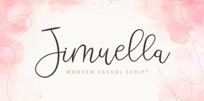 Jimuella is a flowing handwritten font, described by an elegant touch, perfect for your favorite projects. Fall in love with its incredibly distinct and timeless style and use it to create spectacular designs!
 - Miss Mince by Sealoung,
$12.00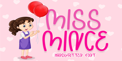 Miss Minceis a flowing handwritten font, described by an elegant touch, perfect for your favorite projects. Fall in love with its incredibly distinct and timeless style and use it to create spectacular designs!
 - Better Black by Aldedesign,
$25.00 Better Black is a flowing handwritten font, described by an elegant touch, perfect for your favorite projects. This font is PUA encoded which means you can access all glyphs and swashes with ease!