10,000 search results
(0.032 seconds)
- Save The Date by Latinotype,
$40.00 A wedding begins long before the "I Do's" on the big day—everyone works together throughout the process to make sure that everything happens as planned: details, color combinations, decorations, the way we convey the magic of the visual elements and deliver our message of love. Through this beautiful font, we would like to deliver to you that very message, you make it your own and express yourself in your own way—through the perfect invitation on your wedding day. No matter how sweet or wild your invitation looks, try to be yourself. Save the Date is a font collection consisting of 9 styles and 4 variants: Script, Sans, Serif and Small. The font set is intended to provide users with a wide range of choices for any design project. Save the Date was designed by Paula Nazal and Daniel Hernández. Digital editing by Rodrigo Fuenzalida. Photos by Mónica Muñoz. Mónica specializes in wedding photography. You can find more of her work here: www.thewildbrides.com
 - SK Seren by Salih Kizilkaya,
$9.99 SK Seren is a clean, double weight and semi-serif font family. This font family, which you can use in long texts or headlines, logos and posters you will design without hesitation, manages to stand out even in the most crowded environments. As you can easily use in print and web design, this is the only font you need in every medium. This family consists of 10 different fonts and 5890 glyphs. In this way, it contains all the typographic materials you will need in your design and offers full support to the Latin alphabet. This font family is a new version of the first font I designed while studying college in 2018. This version includes many new glyphs that were not available in the first version, and all bugs found in the first version were fixed and kerning settings were reconfigured.
 - Savattera by Prioritype,
$18.00 Introducing a new script font with a beautiful, uniquely elegant and very charming look, you can click it and can be used in your projects such as wedding invitations, quotes, creative posts, clothing product packaging, promotions, video preview images, logos and much more to explore. because it has many cool variations. As a picture you can see the preview above. Features: -Uppercase -Lowercase -Numeral -Punctuation -Multilingual -Alternate -Ligature -Swash Thanks.
 - Chu Ching San JNL by Jeff Levine,
$29.00 Novelty songs and their often crazy or extra-long titles were all the rage at the beginning of the 20th century. A piece of sheet music for the 1920 song "When Chu-Ching-San weds Paddy McCann" had the title hand lettered in an unusually bold form of Asian-inspired lettering. This has been recreated digitally as the type font named for the song - Chu Ching San JNL.
 - Apple Slices by Prioritype,
$13.00 It's a mix of two simple fonts that can make your design projects amazing. You could say that it is beautiful and eye-catching for this one font. You can apply it to branding designs, social media posts, logos, posters, quotes, food menus, wedding invitations, book covers, video content etc. See some of the previews above for reference. Features: -Uppercase -Lowercase -Numeral -Punctuation -Multilingual -PUA Encoded -Opentype Features Thanks.
 - Better Grade by Heinzel Std,
$20.00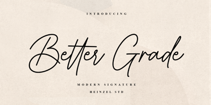 Better Grade is a flowing handwritten font, described by an elegant touch, perfect for your favorite projects. It looks stunning on wedding invitations, thank you cards, quotes, greeting cards, logos, business cards and every other design which needs a handwritten touch. Fall in love with its incredibly distinct and timeless style and use it to create spectacular designs! What's Included : Better Grade Web Font PUA Encoded Multilingual Support
 - Alyesina by Sealoung,
$15.00 Alyesina is a very luxurious elegant calligraphy font for your classy projects that is complemented by a pretty and stylish alternative. This font includes alternatives, style sets, ligatures, swashes and multilingual support with the Pua encode opentype feature. In some glyphs it has a pretty stylistic alternative. Perfect for startup projects, wedding invitations, logos, packaging, quotes, branding, web, blogs, etc. FEATURES : Uppercase Lowercase Number Punctuation Multilingual PUA Encode Opentype Stylistic Alternate
 - Cigra by Identitype Co,
$19.00 Cigra is a standout display font that is an ode to fashion typography in present day. It's elaborate curves and unique shapes make it perfect for headings, logos & wedding invitations. Cigra is all class so if you want a stylish font that is guaranteed to draw the eye, then this is it! The alternative characters were divided into several features such as Stylistic Sets, Stylistic Alternates, Contextual Alternate, SWASH and Ligature. The Open Type features can be accessed by using Open Type savvy programs such as Adobe Illustrator, Adobe InDesign, Adobe Photoshop Corel Draw X version, And Microsoft Word. And this Font has given PUA unicode (specially coded fonts). so that all the alternate characters can easily be accessed in full What’s Included : Web Font Hundred of glyphs Alternates and Ligatures Punctional Works on PC & Mac PUA Encoded Characters - Fully accessible without additional design software. Simple installations Accessible in the Adobe Illustrator, Adobe Photoshop, Adobe InDesign, even work on Microsoft Word. Fonts include Multilingual Support Extended Latin
 - Love Wins by Resistenza,
$19.00 In 2007 we shared our first pride together. More than 1 million people took the streets of Madrid for this huge celebration … seeing the diversity of people supporting love was incredibly touching. Gay Pride is a celebration of freedom, human rights and the right to love whoever we want. It’s a memorial for the battles, the lives lost and the pain suffered while fighting for a growing list of equal rights. But let’s not forget there are still places where LGTBQ community is repressed and persecuted. As Letter crafters we love seeing the signs people design for their different pride parades, and we wondered… Why don’t we create a collection of handcrafted lettering to share some love and to add a typographic realness to the party? Love Wins Font is a series of 60 phrases handwritten with expertise and love specially designed to celebrate diversity. The lettering was crafted with different calligraphic tools creating diverse aesthetics. You can use them to create your signs, t-shirts, stickers, poster, banners.. all you need is to spread love during your Pride Celebrations (or day-to-day life!).
 - Fada by Gaslight,
$25.00 Fada is a unicase geometric grotesque that was made on the basis of a logo for a bar, which we have designed. We were inspired by the license plate, in which the letters have specific heats in places conjoined. The only difference between upper or lower case characters is reduced and increased waist. This is characteristic not only for letters and digits. Fada - good for fashion, editorial, posters, logos and so on.
 - Mattius Rossy by Zamjump,
$17.00 Mattius Rossy is a handwritten font suitable for branding, signatures, wedding invitations, promotions, product packaging and other necessities. This font is modern, simple, but still authentic. You will get a full set of lowercase and uppercase letters, numbers and punctuation marks, multilingual symbols, ligatures, dashes, and swashes. This is tutorial to use ligature and swash : To use swash you can type a + underscore + underscore ( a_ _ ) without space. this only applies up to ( j_ _ ) for ligatures available only ( ee, ff, ll, oo, rr, ss, tt ). "To generate all ligatures, go to Adobe Illustrator - Type - Glyphs." Please send me a message if you are having trouble either installing or using this font. We want to hear your feedback to further improve our product. If you're using this product and come across a problem or come across something we might have missed, feel free to drop us a message.
 - Beskill by CBRTEXT Studio,
$15.00 Beskill is a modern handwritten script font. Every hand stroke, we keep it simple. The ligature is also available which gives a beautiful impression on this font. This font is perfect for your project or branding such as quotes, weddings, headings, designs, logos, invitations, and more! Thank you!
 - Tally Text by Solotype,
$19.95Tally Text Light is an early photolettering type, sometime in the 1940s, when words were hand assembled from individual film positives of the letters, then re-photographed. We made the bold face version of Tally Text Light by optical trickery long before the computer came into general use. - Sweet Boho by Sulthan Studio,
$12.00 Sweet boho is this amazing typeface handmade script font we created in freestyle for those of you who do work and crafts. It's perfect for any type of work you're working various purposes such as logos, wedding invitations, headings, t-shirts, letterheads, signage, labels, news, posters, badges etc.
 - SEISDEDOS DEAD - Personal use only

- Dutch Mediaeval Book by Canada Type,
$29.95This is the elaborately expanded version of what is arguably the most classic and popular of all historic Dutch faces: Sjoerd Hendrik de Roos's Hollandse Mediaeval from 1912. Over the decades, many pressmen and typography connoisseurs have gushed loving prose about this typeface. An extended family of two weights, corresponding italics, small caps, four condensed fonts, four book fonts, a set of initials and some very Dutch ornaments, Dutch Mediaeval is a versatile workhorse that flows comfortably and artistically, with the elegance of the main weights nicely complemented by the sturdiness of the bolds. Very few text faces are this clean and inviting while being crafty as well. The Dutch Mediaeval family comes with quite a few OpenType features and extended Latin language support. - Comicblast by Kustomtype,
$25.00 Comicblast is a comic and hand-drawn font family with a universal and timeless design. The font is inspired by the work of acclaimed Belgian comic artists. The font is unique and helps you to complete your designs with a custom and handmade look. This typeface has six styles, available in regular, medium and bold weights, with italic counterparts, all-in-one style-linked. In short: a complete and affordable package for each designer. Comicblast has smooth and round shapes. It looks friendly and casual, is completely handmade and suitable for comics, logos, titles, package design or wherever you need a fun and warmhearted comic font, for all your fantastic designs! Comicblast is designed by Coert De Decker in 2018 and published by Kustomtype Font Foundry.
 - Leonardian by Cubo Fonts,
$25.00 The Vitruvian Man is a world-renowned drawing created by Leonardo da Vinci circa 1487. The drawing depicts a male figure in two superimposed positions with his arms and legs apart and simultaneously inscribed in a circle and square. The drawing and text are sometimes called the Canon of Proportions or, less often, Proportions of Man.The drawing is based on the correlations of ideal human proportions with geometry described by the ancient Roman architect Vitruvius in Book III of his treatise De Architectura. Vitruvius described the human figure as being the principal source of proportion among the Classical orders of architecture. That's how "Leonardian" was buid as well: a quest for ideal proportions, a harmonious design springing up from a geometric "collision", circle and square's intersections.
 - Shine Pro by Thinkdust,
$10.00 Shine Pro is the quintessential sans serif gentleman you’ve been looking for all your life. It doesn’t confuse, confound, or complicate - it politely offers up what it has as though your fontal satisfaction is the most important thing in the world; and to Shine Pro, it is. The Regular weight is subtle, gentle - his softer side; while the Bold weight has impact and creates an imposing, important air.. In order to please everyone, Shine Pro has an impressive 10,000 kerning pairs and extensive language support, including cyrillic. Designed with traditional influences but with a contemporary coup-de-grace, the clean, smartly turned out, and oh-so-reliable Shine Pro is ready to become your new go-to font for all matters.
 - Dutch Mediaeval by Canada Type,
$29.95This is the elaborately expanded version of what is arguably the most classic and popular of all historic Dutch faces: Sjoerd Hendrik de Roos's Hollandse Mediaeval from 1912. Over the decades, many pressmen and typography connoisseurs have gushed loving prose about this typeface. An extended family of two weights, corresponding italics, small caps, four condensed fonts, four book fonts, a set of initials and some very Dutch ornaments, Dutch Mediaeval is a versatile workhorse that flows comfortably and artistically, with the elegance of the main weights nicely complemented by the sturdiness of the bolds. Very few text faces are this clean and inviting while being crafty as well. The Dutch Mediaeval family comes with quite a few OpenType features and extended Latin language support. - Aloha Script by Borges Lettering,
$49.95 Aloha! Veteran Sign Painter Pierre Tardif and Lettering Artist Charles Borges de Oliveria have teamed up to bring you these fun to use brush fonts. Aloha Script comes in two flavors: Aloha Script and Aloha Script Casual. Both fonts contain the same lowercase, alternates, and ligatures – the difference is in the capitals. By mixing both fonts you can create a variety of unique logos. Aloha Scripts Casual can be set in all caps for greater emphasis on captions. Both fonts contains over 100 alternate characters, as well as an assortment of ligatures, swashes and underlines. With over a year and a half in development, Aloha is bound to please. Great for logo design, signs, posters, culinary food packaging and so much more. Aloha!
 - Fontwax by Kustomtype,
$25.00 The Fontwax font is inspired by sign painters in sixties advertisings with a touch of Arts & Crafts. This style of type is instantly associated with advertising and design for high-end products. Fontwax is meticulously drawn for quality and readability. Fontwax is great for display, logos, branding, packaging, advertising, food, sports, titles, film, tv, and much more. Fontwax comes in 4 styles which perfectly match together. Fontwax is a great display family with roots in the advertising and sign painting industry of the 20th century. It is smoothly polished with all the features a good designer needs. For the best price, I recommend you grab the whole pack! Fontwax is designed by Coert De Decker in 2018 and published by Kustomtype Font Foundry.
 - Hypercreepos by Bisou,
$15.00 Hypercreepos is a sweet and creepy hyper-bold font inspired by the horror comic books of the 60s. Handmade in La Chaux-de-Fonds (Switzerland) on lined A4 papers, the letter's shape is conscientiously designed to give a punchos impact on the reader. The unique and vibrant contours are drawn on an improvised backlit table inherited from Bisou's mother. Definitely contemporary, the overall feeling given off by Hypercreepos is profound and human, evoking the graphite smell of the comic's workshops. Exclusively made for titles, this impactos font will suite with delight the text of posters, signs of comics bookstore, gaming bar, horror movie theater or film festival. That said, the designer is not responsible for the use of Hypercreepos and wish it will serve beyond all expectation.
 - Odishi - Unknown license

- Trendy by Estudio Calderon,
$69.90 Welcome fashionistas, we have designed a type family based on fashion and current trends. Trendy, the new font of our studio follows the same design line that represents us, processes with brush lettering, variety of characters, OpenType programming and a special touch that reflects a boho chic style. The soul of Trendy is inspired in the logotype of one of the most influential type foundries around the world. Because of its great contribution in graphic design we have decided to pay tribute by expressing our gratitude for being an icon in the design world, the most recognized type designers of the last years have been part of that type foundry and for being source of inspiration for new designers. Trendy represents a fashion house, a place that breathes fashion, there are inside 5 determining variables for designing time: Regular, Bold, Black, Display & Stencil. Discover this new way to see the glamour world all include in a type family. To know more about our new project, Trendy, visit our web site www.estudiocalderon.co and our portafolio in Behance.
 - Guanabara Sans by Plau,
$20.00 Guanabara is the third release of Plau Type Foundry. It started from the need of a wayfinding typeface that had personality enough to be the brand typeface for a city. The city of Rio de Janeiro, with its never-ending curves and all year long summer weather provided the constraints and requirements of this typeface. From there, it evolved to be a workhorse, with 8 weights from Thin to Black and matching true italics. It just had to have the features that all us designers have grown to love, such as alternate letters (a, g and r for the romans), tabular and proportional figures in lining and oldstyle set-ups as well as small caps, fractions and all that jazz (I mean, samba). And it needed to be recognizable and distinct. For that, design features like tapered R legs, capitals with classic proportions and calligraphic finishes on the terminals proved crucial. And last, but not least, like Rio, it had to welcome many cultures. We came to think of it as the “Typeface from Ipanema”, with a classic, timeless look, swinging elegance and joyful attitude.
 - Bembo MT by Monotype,
$45.99 The origins of Bembo go back to one of the most famous printers of the Italian Renaissance, Aldus Manutius. In 1496, he used a new roman typeface to print the book de Aetna, a travelogue by the popular writer Pietro Bembo. This type was designed by Francesco Griffo, a prolific punchcutter who was one of the first to depart from the heavier pen-drawn look of humanist calligraphy to develop the more stylized look we associate with roman types today. In 1929, Stanley Morison and the design staff at the Monotype Corporation used Griffo's roman as the model for a revival type design named Bembo. They made a number of changes to the fifteenth-century letters to make the font more adaptable to machine composition. The italic is based on letters cut by the Renaissance scribe Giovanni Tagliente. Because of their quiet presence and graceful stability, the lighter weights of Bembo are popular for book typography. The heavier weights impart a look of conservative dependability to advertising and packaging projects. With 31 weights, including small caps, Old style figures, expert characters, and an alternate cap R, Bembo makes an excellent all-purpose font family.
 - Bembo Infant by Monotype,
$45.99The origins of Bembo go back to one of the most famous printers of the Italian Renaissance, Aldus Manutius. In 1496, he used a new roman typeface to print the book de Aetna, a travelogue by the popular writer Pietro Bembo. This type was designed by Francesco Griffo, a prolific punchcutter who was one of the first to depart from the heavier pen-drawn look of humanist calligraphy to develop the more stylized look we associate with roman types today. In 1929, Stanley Morison and the design staff at the Monotype Corporation used Griffo's roman as the model for a revival type design named Bembo. They made a number of changes to the fifteenth-century letters to make the font more adaptable to machine composition. The italic is based on letters cut by the Renaissance scribe Giovanni Tagliente. Because of their quiet presence and graceful stability, the lighter weights of Bembo are popular for book typography. The heavier weights impart a look of conservative dependability to advertising and packaging projects. With 31 weights, including small caps, Old style figures, expert characters, and an alternate cap R, Bembo makes an excellent all-purpose font family. - Cabrito Serif by insigne,
$33.00 The Cabrito family is making a statement again. Launched as a supplement to the children's book, The Clothes Letters Wear, the original Cabrito is carefree, fun and easy on the eyes. Now, by balancing this friendly connection with new elegance, Cabrito Serif arrives: attractive copy text with an extra sophisticated sensibility incorporated into the design. Still bright and playful, this new Cabrito is cleaner and leaner, ensuring that its polished appearance retains legibility. 54 fonts include upright alternates, ligatures, and old figures. The range includes extended and condensed variants. To see any of these interactive features, see the PDF manual. The family also includes language support for 72 Latin-based languages, and there are more than 600 glyphs. Cabrito Serif can be used for logos and packaging, as well as for brochures and web pages. It’s readability makes it an excellent choice for a wide range of jobs. Take a walk with Cabrito Serif and see how much fun it is. By the way, look at some other Cabrito members and see how much you love the original, Inverto, Contrast or Didone.
 - Minimela Tm by Mustafa Demirel,
$30.00 "It is hard to believe, but they won't be able to give up on us" The story of this font has started with a little suitcase actually. These characters were trying to do something for minimela kitchen which it named.After that, they looked that they was wanting to be that font beautiful writings written with it, belonging to it, special to it and reminding it to everybody. These cute monsters that have shaped themselves were a piece of a whole, of a little whole. They were totally believing to beautiful and long ways that have being waited them. They have given a sincere promise they will continue with little steps on that ways. "It is hard to believe, but they won't be able to give up on us" while telling this, we were totally talking about that
 - Dave Gibbons Journal by Comicraft,
$19.00 Get over the trauma of seeing that icky dog carcass in the alley this morning, you know, the one with the tire tread on the burst stomach? The city might be afraid of you, but now you can see its true typeface. Yes, when the gutters between YOUR comic book panels are full of blood, we here at ComicBookFonts.com recommend DaveGibbonsJournal for all your psychotic ramblings. Don't pose precariously on the precipice of a building without it. Artwork by Dave Gibbons from Elephantmen #25
 - Shakuro Brush by Letterhend,
$16.00 Introducing, Shakuro. As you can see, this brush typeface has unique letterforms inspired by japanese kanji typography. Very suitable to use for headlines, titles, logos or anything especially related to Japanese or asian themes. Features : uppercase & lowercase (alternates) numbers and punctuation multilingual PUA encoded We highly recommend using a program that supports OpenType features and Glyphs panels like many of Adobe apps and Corel Draw, so you can see and access all Glyph variations. Email us to letterhend@gmail.com if you need something! Happy Designing!
 - LTC Creepy Ornaments by Lanston Type Co.,
$24.95 In researching historic decorative material offered by Lanston Monotype as well as other metal foundries such as Barnhart Brothers and Spindler, there were occasionally ornaments that defied description. Perhaps it was a Victorian sense of humor or someone really thought these were a good idea or perhaps popular taste has just changed so much over the last hundred years, or our forbearers were completely insane. In any case, LTC is somewhat proud to present a collection of the most bizarre, disturbing and baffling printers ornaments we could find. Along with mutant fowl-children and frolicsome amphibians, there are also Masonic and other secret fraternal symbols that may not be creepy to everyone, but just enough to be moderately disturbing.
 - Vendetta by Emigre,
$69.00 The famous roman type cut in Venice by Nicolas Jenson, and used in 1470 for his printing of the tract, De Evangelica Praeparatione, Eusebius, has usually been declared the seminal and definitive representative of a class of types known as Venetian Old Style. The Jenson type is thought to have been the primary model for types that immediately followed. Subsequent 15th-century Venetian Old Style types, cut by other punchcutters in Venice and elsewhere in Italy, are also worthy of study, but have been largely neglected by 20th-century type designers. There were many versions of Venetian Old Style types produced in the final quarter of the quattrocento. The exact number is unknown, but numerous printed examples survive, though the actual types, matrices, and punches are long gone. All these types are not, however, conspicuously Jensonian in character. Each shows a liberal amount of individuality, inconsistency, and eccentricity. My fascination with these historical types began in the 1970s and eventually led to the production of my first text typeface, Iowan Old Style (Bitstream, 1991). Sometime in the early 1990s, I started doodling letters for another Venetian typeface. The letters were pieced together from sections of circles and squares. The n, a standard lowercase control character in a text typeface, came first. Its most unusual feature was its head serif, a bisected quadrant of a circle. My aim was to see if its sharp beak would work with blunt, rectangular, foot serifs. Next, I wanted to see if I could construct a set of capital letters by following a similar design system. Rectangular serifs, or what we today call "slab serifs," were common in early roman printing types, particularly text types cut in Italy before 1500. Slab serifs are evident on both lowercase and uppercase characters in roman types of the Incunabula period, but they are seen mainly at the feet of the lowercase letters. The head serifs on lowercase letters of early roman types were usually angled. They were not arched, like mine. Oddly, there seems to be no actual historical precedent for my approach. Another characteristic of my arched serif is that the side opposite the arch is flat, not concave. Arched, concave serifs were used extensively in early italic types, a genre which first appeared more than a quarter century after roman types. Their forms followed humanistic cursive writing, common in Italy since before movable type was used there. Initially, italic characters were all lowercase, set with upright capitals (a practice I much admire and would like to see revived). Sloped italic capitals were not introduced until the middle of the sixteenth century, and they have very little to do with the evolution of humanist scripts. In contrast to the cursive writing on which italic types were based, formal book hands used by humanist scholars to transcribe classical texts served as a source of inspiration for the lowercase letters of the first roman types cut in Italy. While book hands were not as informal as cursive scripts, they still had features which could be said to be more calligraphic than geometric in detail. Over time, though, the copied vestiges of calligraphy virtually disappeared from roman fonts, and type became more rational. This profound change in the way type developed was also due in part to popular interest in the classical inscriptions of Roman antiquity. Imperial Roman letters, or majuscules, became models for the capital letters in nearly all early roman printing types. So it was, that the first letters in my typeface arose from pondering how shapes of lowercase letters and capital letters relate to one another in terms of classical ideals and geometric proportions, two pinnacles in a range of artistic notions which emerged during the Italian Renaissance. Indeed, such ideas are interesting to explore, but in the field of type design they often lead to dead ends. It is generally acknowledged, for instance, that pure geometry, as a strict approach to type design, has limitations. No roman alphabet, based solely on the circle and square, has ever been ideal for continuous reading. This much, I knew from the start. In the course of developing my typeface for text, innumerable compromises were made. Even though the finished letterforms retain a measure of geometric structure, they were modified again and again to improve their performance en masse. Each modification caused further deviation from my original scheme, and gave every font a slightly different direction. In the lower case letters especially, I made countless variations, and diverged significantly from my original plan. For example, not all the arcs remained radial, and they were designed to vary from font to font. Such variety added to the individuality of each style. The counters of many letters are described by intersecting arcs or angled facets, and the bowls are not round. In the capitals, angular bracketing was used practically everywhere stems and serifs meet, accentuating the terseness of the characters. As a result of all my tinkering, the entire family took on a kind of rich, familiar, coarseness - akin to roman types of the late 1400s. In his book, Printing Types D. B. Updike wrote: "Almost all Italian roman fonts in the last half of the fifteenth century had an air of "security" and generous ease extremely agreeable to the eye. Indeed, there is nothing better than fine Italian roman type in the whole history of typography." It does seem a shame that only in the 20th century have revivals of these beautiful types found acceptance in the English language. For four centuries (circa 1500 - circa 1900) Venetian Old Style faces were definitely not in favor in any living language. Recently, though, reinterpretations of early Italian printing types have been returning with a vengeance. The name Vendetta, which as an Italian sound I like, struck me as being a word that could be taken to signifiy a comeback of types designed in the Venetian style. In closing, I should add that a large measure of Vendetta's overall character comes from a synthesis of ideas, old and new. Hallmarks of roman type design from the Incunabula period are blended with contemporary concerns for the optimal display of letterforms on computer screens. Vendetta is thus not a historical revival. It is instead an indirect but personal digital homage to the roman types of punchcutters whose work was influenced by the example Jenson set in 1470. John Downer.
 - The "Somalove" font, crafted by the imaginative folks at Happy Lovers Town, stands out as a beacon of warmth and endearment in the realm of typography. At its heart, Somalove is a celebration of love...
- Febyetska by CBRTEXT Studio,
$15.00 Febyetska is an elegant new signature style font. The thick and thin parts of each glyph give the impression of beauty and make it classy. With a new style, we want to help your project or brand become fresher and make it elegant and pleasant for all who see it.
 - AT Move Straw by André Toet Design,
$39.95 STRAW The inspiration for this capital alphabet came from those beautiful haystacks you see in summer and the old fashioned Mikado game! We wanted to create a light, fragile and airy typeface with an optical effect. And here it is ... it’s just STRAW ! Concept/Art Direction/Design: André Toet © 2017
 - The font Tresdias, crafted by the talented Asclê de Oliveira, is a fascinating blend of artistic freedom and structural sophistication. This unique font speaks volumes of Oliveira's dedication and ke...
- Gundrada ML by HiH,
$12.00 Gundrada ML was inspired by the lettering on the tomb of Gundrada de Warenne. She was buried at Southover Church at Lewes, Sussex, in the south of England in 1085. The Latin inscription on her tomb, STIRPS GUNDRADA DUCUM, meaning “Gundrada, descendant of the Duke” may have led to the speculation that she was the daughter of William, Duke of Normandy and bastard son of Robert the Devil of Normandy and Arletta, daughter of a tanner in Falaise. In 1066 William defeated Harold at the Battle of Hastings and was crowned William I of England. More commonly known as William the Conquerer, he commissioned a string of forts around the kingdom and charged trusted Norman Barons to control the contentious Anglo-Saxon population. William de Warenne, husband of Gundrada, was one of these Barons. There has also been the suggestion that Gundrada may have been the daughter of William’s wife, Matilda of Flanders, by a previous marriage. According to the Dictionary of National Biography (Oxford University Press, Oxford, England 1921-22), both of these contentions are in dispute. Searching the past of a thousand years ago is like wandering in a heavy fog: facts are only dimly in view. Regardless, I know that I found these letterforms immediately engaging in their simplicity. Unadorned and unsophisticated, they have a direct honesty that rests well in the company of humanistic sans serifs like Franklin Gothic or Gill Sans, appealing to a contemporary sensibility. The lettering on the tomb is in upper case only. Although Gundrada does not sound Norman French to me, her husband certainly and her father probably were Norman French. Nonetheless, the man that carved her tombstone was probably Anglo-Saxon, like most of the people. For that reason, we are quite comfortable with a fairly generic lower case from an Anglo-Saxon document of the time. The time was a time of transition, of contending language influences. This font reflects some of that tension. Features 1. Multi-Lingual Font with 389 glyphs and 698 Kerning Pairs. 2. OpenType GSUB layout features: onum, dlig, liga, salt & hist. 3. Tabular Figures and Alternate Old-Style Figures. 4. Alternate Ruled Caps (line above and below, matching to brackets). 5. Central Europe, Western Europe, Turkish and Baltic Code Pages. 6. Additional accents for Cornish and Old Gaelic. 7. Stylistic alternates A, E, y and #. 8. Ligatures ST, Th, fi and fl. 9. Historic alternate longs. The zip package includes two versions of the font at no extra charge. There is an OTF version which is in Open PS (Post Script Type 1) format and a TTF version which is in Open TT (True Type)format. Use whichever works best for your applications.
 - Linda by profonts,
$51.99 Linda - a typeface not only for girls! Linda, a graphic design trainee, started this font as an experiment. It should become a professional typographic project. Linda is like Linda: youthful, feminine, and easygoing. Dear Linda,we are quite happy now you are finished. We enjoyed an exciting period of time with you, and we learned a lot of new things through you. With every new step, we became more convinced of you. Your aesthetics, your easiness, and your wonderful Teenie-charakter are so beautiful and charming. Copy text or headlines: your flow is absolutely fantastic and versatility is your strength. We really look forward to seeing more of you, maybe on posters or book titles, for example. Just carry on.

