4,499 search results
(0.011 seconds)
- Rulinover by Ridtype,
$18.00 Rulinover is a serif font inspired by adrenaline-pumping gothic horror movies and games. With that comes Rulinover as a supporting tool to support typography based on genres of horror adventure, challenge and dare in a particular game or film. And also supported by many alternative ligature and letter concepts that are useful in making logotypes or monogram styles. For that, Rulinover is also equipped with various languages such as Latin 1 & 2.
 - Arethusa Pro by AVP,
$35.99 Arethusa Pro is a versatile font after the 'transitional' style – a style that has been evolving for 250 years. The balanced design of familiar letter forms blends form with function to create highly readable text. Twelve fonts organised in three sub-families provide a range of weights and styles. Language support includes Greek and Cyrillic and each font contains small capitals, superscript, fractions, ligatures, old-style numerals, case-sensitive forms and other opentype alternatives.
 - Terital United by Letterbox,
$80.00 The long and frustrating search for a dynamic, monoline script drew our attention to the lack of such a typeface. This prompted us to create our very own, Terital, named after the 1960s Italian overcoat advertisement that was the original reference point for its 2003 creation. Fearing the odd all-caps script setting, we cheekily designed Terital as a lowercase set. This limitation was revised in the 2011 version. Beautiful swash capitals were also added.
 - Heart Of Mine by Epiclinez,
$18.00 Heart Of Mine is a fun and cute handwritten font that allows you to add an adorable touch to your projects. This font is perfect for the Valentine's Day season, but also for any other time of the year when you want to add a little love and warmth to your writing. So what’s included : Basic Latin Uppercase and Lowercase Numbers, symbols, and punctuations Multilingual Support. Simple Installations works on PC & Mac
 - Umerica by Typotheticals,
$4.00 Umerica first made its appearance in 2007 as a series of characters in a pdf I posted to Typophile. It has taken a lot of time, and determination, for me to finally decide to complete it. I had the basic font completed in 2008, but put it aside as the creation of the italics it deserved were beyond me. That was then. Now the italic version has finally been added twelve years later.
 - Regeneration by Comicraft,
$69.00 It’s the end, but the moment has been prepared for... the Time War is over and things are wearing a bit thin, time for a new face, a new body, a new companion for our Timelord font... a REGENERATION! Features: 138 automatic connecting ligatures Language support for Western & Central Europe and Vietnamese Solid Variable Font for complete control of weight and italic Levels Variable font can access any point between Inline, Midline & Outline
 - Snemand by Hanoded,
$15.00 Snemand, in Danish, means Snowman. Quite appropriate for the last month of the year! The font is all caps, but upper and lower case letters can be interchanged and it includes alternates for all lower case letters. Snemand is a very legible font and has that great 'unevenish' look - making it a great typeface for packaging and books. Enjoy the snow - while it lasts and go out. You might even build a Snemand!
 - Modulair by Beware of the moose,
$17.99 Modulair is a dot matrix based font with nice typographic features. Various figures, complete punctuation and small caps in three weights makes the Modulair a very usable font for subtile typographic solutions or headlines. Since autumn 2023, the Modular has been expanded with italics in three weights. The first sketches were made in 1979 on my father's Olivetti typewriter. Forty years later I used these sketches as the basis for the Modular.
 - Park West JNL by Jeff Levine,
$29.00 The thin, stylish Art Deco slab serif lettering featured on the cover of the 1934 sheet music for “Then I’ll be Tired of You” inspired the digital type face Park West JNL, which is available in both regular and oblique versions. Central Park West has always been the upscale area for affluent New Yorkers, but in the Great Depression years of the 1930s the mystique of the well-to-do held an even stronger significance.
 - JollyGood Sans by Letradora,
$18.00 Finally, a serious alternative to that other comic font. After years of mocking the font that shall not be named, I decided to create an alternative. I wanted to keep the fun feel and the comic book roots, but have a more polished look. The result? JollyGood, a complete font family, with great language support, a big range of weights and styles, and a friendly look. Check out the other members of the JollyGood family
 - Olimpico by MAC Rhino Fonts,
$59.00 The name of this typeface is a hymn to the Stadio Olimpico in Rome. The home arena to the World's most beautiful football club – AS ROMA. A club with many great players through the years. The biggest of them all, is already a living legend… Francesco Totti. The design is a 2-weight family perfect for elegant display work. The regular weight is more even in blackness while the bold weight carry more contrast.
 - Keltichi by Dima Pole,
$27.00 Keltichi typeface is based on the Book of Kells, the Irish uncial manuscript, the most beautiful European medieval style of writing. Keltichi contains many Opentype features, which make this font absolutely awesome. It looks great, specially titling uppercase sets, simulating the real Book of Kells scripts. Work on this project lasted 1 year, and now, I believe, Keltichi it is the best font simulating the Book of Kells scripts. Glory, glory to the Celts!
 - MVB Emmascript by MVB,
$39.00Kanna Aoki drew the letters for MVB Emmascript while on a picnic near the Conservatory of Flowers in San Francisco’s Golden Gate Park. Mark van Bronkhorst adapted the writing as a font that maintains a very natural scrawl. Later a bold weight was added. MVB Emmascript has been used to add a lighthearted, human touch to everything from fiction paperbacks to potato chip packaging. The typeface is named for Aoki's 1968 Volkswagen, Emma. - Fleischmann Gotisch PT by preussTYPE,
$29.00 Johann Michael Fleischmann was born June 15th, 1707 in Wöhrd near Nuremberg. After attending Latinschool he started an apprenticeship as punchcutter in the crafts enterprise of Konstantin Hartwig in Nuremberg, which ought to last six years. For his extraordinary talent Fleischmann completed his apprenticeship after four and a half years, which was very unusual. 1727 his years of travel (very common in these days) began, during which he perfected his handcraft by working in different enterprises as journeyman. First location was Frankfurt/Main where he worked for nearly a year at the renowned type foundery of Luther and Egenolff. Passing Mainz he continued to Holland, where he arrived in November 1728 and stayed till he died in 1768. In Amsterdam he worked for several type founderies, among others some weeks for Izaak van der Putte; in The Hague for Hermanus Uytwerf. Between 1729 and 1732 he created several exquisite alphabets for Uytwerf, which were published under his own name (after his move to Holland Fleischmann abandoned the second n in his name), apparently following the stream of the time. After the two years with Uytwerf, Fleischmann returned to Amsterdam, where he established his own buiseness as punchcutter; following an advice of the bookkeeper and printer from Basel Rudolf Wetstein he opened his own type foundery 1732, which he sold in 1735 to Wetstein for financial reasons. In the following Fleischmann created several types and matrices exclusively for Wetstein. In 1743 after the type foundery was sold by Wetstein’s son Hendrik Floris to the upcoming enterprise of Izaak and Johannes Enschedé, Fleischmann worked as independent punchcutter mostly for this house in Haarlem. Recognizing his exceptional skills soon Fleischmann was consigned to cutting the difficult small-sized font types. The corresponding titling alphabets were mostly done by Jaques-Francois Rosart, who also cut the main part of the ornaments and borders used in the font examples of Enschedé. Fleischmann created for Enschedé numerous fonts. The font example published 1768 by Enschedé contains 3 titling alphabets, 16 antiquacuts, 14 italic cuts, 13 textura- and 2 scriptcuts, 2 greek typesets (upper cases and ligatures), 1 arabic, 1 malayan and 7 armenian font systems, 5 sets of musicnotes and the poliphonian musicnotesystem by Fleischmann. In total he brought into being about 100 alphabets - the fruits of fourty years of creative work as a punchcutter. Fleischmann died May 27th, 1768 at the age of 61. For a long time he was thought one of the leading punchcutters in Europe. A tragedy, that his creating fell into the turning of baroque to classicism. The following generations could not take much pleasure in his imaginative fonts, which were more connected to the sensuous baroque than to the bare rationalism of the upcoming industrialisation. Unfortunately therefore his masterpieces did not survive the 19th century and person and work of Fleischmann sank into oblivion. The impressive re-interpretation of the Fleischmann Antiqua and the corresponding italics by Erhard Kaiser from Leipzig, which were done for the Dutch Type Library from 1993 to 1997, snatched Fleischmann away from being forgotten by history. Therefore we want to place strong emphasis on this beautiful font. Fleischman Gotisch The other fonts by Fleischmann are only known to a small circle of connoisseurs and enthusiasts. So far they are not available in adequat quality for modern systems. Same applies the "Fleischman Gotisch", which has been made available cross platform to modern typeset-systems as CFF Open Type font through the presented sample. The Fleischman Gotisch has been proved to be one of the fonts, on which Fleischmann spent a good deal of his best effort; this font simply was near to his heart. Between 1744 and 1762 he created 13 different sizes of this font. All follow the same principles of forms, but their richness of details has been adapted to the particular sizes. In later times the font was modified more or less sensitive by various type founderies; letters were added, changed to current taste or replaced by others; so that nowadays a unique and binding mastercopy of this font is missing. Likewise the name of the font underwent several changes. Fleischmann himself probably never named his font, as he did with none of his fonts. By Enschedé this textura was named Nederduits, later on Nederduitsch. When the font was offered by the german type foundery Flinsch in Frankfurt/Main, the more convenient name of Fleischmann-Gotisch was chosen. In his "Masterbook of the font" and his "Abstract about the Et-character" Jan Tschichold refered to it as "Duyts" again. To honour the genious of Johann Michael Fleischmann we decided to name the writing "Fleischmann Gotisch PT" (unhyphenated). Developing the digital Fleischman Gotisch I decided not to use one of the thirteen sizes as binding mastercopy, but corresponding to the typical ductus of the font to re-create an independent use of forms strongly based on Fleischmann´s language of forms. All ascenders and descenders were standardised. Some characters, identified as added later on, were eliminated (especially the round lower case-R and several versions of longs- respectively f-ligatures) and others were adjusted to the principles of Fleischmann. Where indicated the diverse characters were integrated as alternative. They can be selected in the corresponding menu. All for the correct german black letter necessary longs and other ligatures were generated. Through the according integration into the feature-code about 85% of all ligatures in the type can be generated automatically. Problematic combinations (Fl, Fk, Fh, ll, lh, lk, lb) were created as ligatures and are likewise constructed automatically. A historically interesting letter is the "round r", which was already designated by Fleischmann; it is used after preceding round letters. Likewise interesting is the inventive form of the &-character, which is mentioned by Tschichold in his corresponding abstract. Nevertheless despite all interpretation it was very important to me to maintain the utmost fidelity to the original. With this digital version of a phantastic texturfont of the late baroque I hope to contribute to a blossoming of interest for this genious master of his kind: Johann Michel Fleischmann. OpenType features: - Unicode (ISO 10646-2) - contains 520 glyphes - Basic Latin - Latin-1 Supplement - Latin Extended-A - Latin Extended-B - Central European Glyhps - Ornaments - Fractions - Standard ligatures - Discretionary ligatures - Historical ligatures - Kerning-Table
 - Guinevere Pro by Canada Type,
$29.95 Guinevere Pro is a typeface designed by Icelandic art director Sigurdur Armannsson. It started in 2001 as simple hand-drawn sketches of a few letters built from modules, then became an experiment with four goals: - Construct an original alphabet from a specific set of predetermined modules. - See how certain letter forms built without said modules would behave within the totality of the module-constructed alphabet. - See if certain letters would actually enforce their own shapes to be drawn a certain way within the totality of the typeface. Likewise, see if the totality of the alphabet demands that individual letters be drawn in a specific way, and if so, how much room for variation would there be? - See how all of the above reacts/changes to implementing the alphabet across different weights. The experiment was finessed and re-worked over many years of technology changes, and Guinevere Pro is the final outcome, ten years later. The Guinevere Pro set is four cross-platform Open Type fonts, with built-in small caps, alternates, ligatures, and support for a wide range of Latin-based languages.
 - Highand by Craft Supply Co,
$20.00 Highand – Gothic Font A Font of Horror Highand – Gothic Font encapsulates the essence of terror, designed meticulously to send spine-tingling shivers down your spine and evoke chilling emotions. Dreadful Display Furthermore, Highand’s unnerving aesthetics deliver an atmosphere of dread, creating an unforgettable and unsettling experience for your audience. It’s the perfect choice for spine-tingling displays that demand immediate attention. Terrifying Typography With every character, Highand conjures a feeling of impending doom. Its jagged edges and macabre curves create a nightmarish impression that lingers in the mind. Ideal for Horror-themed Projects Highand is tailor-made for horror-themed projects. Whether it’s for spine-chilling horror movie posters, eerie Halloween invitations, or haunting haunted house flyers, this font sets the eerie tone with sinister grace. In Conclusion Highand – Gothic Font is your sinister accomplice in design, evoking fear and suspense with every meticulously crafted letter. Embrace the darkness and plunge your audience into an abyss of fear. Make your displays truly terrifying with Highand’s chilling presence, ensuring an unforgettable and spine-tingling experience that leaves a lasting impression of horror.
 - Jessen-Schrift by profonts,
$41.99 The original Jessen typeface, named in reminiscence of the great supporter of the printing art at the end of the 19th century, Peter Jessen, was designed in the years of 1924 until 1930. Bible Gothic was created by the famous German designer Rudolf Koch. Ralph M. Unger digitized this font exclusively for profonts in 2005, keeping his digitization as close as possible to the original design of Koch in order to preserve the distinguished character and the partly unconventional, original forms. The concept of a Bible Gothic was developing for years in Koch's mind and drove the direction of his work, but only after the experience with his Neuland design could he start the creation of his Peter Jessen typeface. Produced quite like Neuland, Jessen, however, is much more refined and more accurate in detail than Neuland. At first glance, it seems to look plain and simple, but if you look closer, the richness of its distinguished upper case forms unfold to a perfectly clear flow of text
 - Century 751 by Bitstream,
$29.99The year 1914 marked the appearance of Washington Ludlow's first typograph machine. This remarkable invention permitted typesetters to quickly cast a full line of lead type in one operation using supplied brass matrices, a procedure which was for the time a major technological improvement over the usual hand-set foundry type methods. Casting type the Ludlow way necessitated the creation of an entire range of new Ludlow typefaces, a development which made Ludlow not only a major manufacturer of printing machinery, but also one of the world's leading sources of professional type design. Renowned typographers such as Douglas C. McMurtrie and Ernest F. Detterer created original faces at Ludlow's request. Robert Hunter Middleton was Ludlow's design director for over fifty years, and during his distinguished career produced an entire library of typefaces representing virtually every known typographic style. He is recognized as one of the most prolific type designers of all time. Today, new Ludlow computer fonts are in preparation, including optically-correct versions of many classic Ludlow typefaces, drawn directly from the originals in the Ludlow company library. - Scotch Modern by Shinntype,
$79.00 Sporting pot-hook serifs and a tiny aperture, the Scotch Modern was an evolution of the Didone and Scotch Roman classifications, becoming the default type genre of the 19th century. Recontextualizing the 10-point type of a scientific report published in 1873, Nick Shinn has produced sleekly refined, micro-detailed vector drawings by eye, without the assistance of scans, of this magnificent classic. A beautiful genre of type, so popular in books, magazines and advertisements during the Victorian era and much of the 20th century, the Scotch Modern was derided by advocates of both the Arts & Crafts movement and 20th century modernists, and was never been properly adapted to hot metal, phototype, or digital media -- until now. Now the full range of typographic expression is possible in this style. The OpenType fonts support Western and CE encodings, Cyrillic (with Bulgarian alternates) and Polytonic Greek. There are many special features, including small caps, unicase, italic swash capitals, ten sets of figures per font, and both slashed and nut (vertical) fractions. Together with Figgins Sans, comprises The ModernSuite of matched fonts.
 - Lust Script by Positype,
$49.00 Boom. You asked for more, um, well just ‘more’—more swashes, more options, more weights, more of everything. I cannot give you more weights. The design just won’t allow it and anything else would be a compromise or a bastardization of the exemplars just to make money that I am unwilling to do. But, I did give you an overly indulgent, 90% cacao bar and espresso, Lust Script Fine. The ending strokes on these glyphs will literally draw blood. Enjoy it as much as I have. The Lust Collection is the culmination of 5 years of exploration and development, and I am very excited to share it with everyone. When the original Lust was first conceived in 2010 and released a year and half later, I had planned for a Script and a Sans to accompany it. The Script was released about a year later, but I paused the Sans. The primary reason was the amount of feedback and requests I was receiving for alternate versions, expansions, and ‘hey, have you considered making?’ and so on. I listen to my customers and what they are needing… and besides, I was stalling with the Sans. Like Optima and other earlier high-contrast sans, they are difficult to deliver responsibly without suffering from ill-conceived excess or timidity. The new Lust Collection aggregates all of that past customer feedback and distills it into 6 separate families, each adhering to the original Lust precept of exercises in indulgence and each based in large part on the original 2010 exemplars produced for Lust. I just hate that it took so long to deliver, but better right, than rushed, I imagine.
 - Elektrakution by Comicraft,
$19.00 SHE'S DEAD, FRANK It's the year 1991, BC (Before Comicraft) when REM were still making records and Frank Miller’s memorable run on Marvel Comics’ DAREDEVIL was just over ten years old. Comicraft’s Richard Starkings found himself working in Anaheim, California for Graphitti Designs. Graphitti had produced the first hardcover edition of Miller’s Batman tale, DARK KNIGHT RETURNS and was now putting together the sequel to Miller’s DAREDEVIL — ELEKTRA LIVES AGAIN! Richard was not engaged to letter this book, the pages of Frank’s incredible original art that came through Graphitti’s studio were already lettered by Marvel Stalwart, Jim Novak. However, there were some cover elements that needed to be added, based on the logo originally rendered by Frank’s brother, Steve. Starkings set about the task of creating an alphabet that could be used to develop Steve’s idea for the trade dress -- the cover elements, the back cover copy and credits on the interior pages. This was long before Macintosh computers and font programs made this work considerably easier, so Rich sat down with a pencil and a sheet of vellum and rendered an alphabet that could be used as the basis for the text that was needed... Those sketches have languished in a drawer for nearly thirty years, but now, finally, Comicraft’s John Roshell has dusted off those old letterforms and Elektrakuted a font based on those designs, a font we HAD to call ELEKTRAKUTION! As for Elektra; she’s dead, Frank. Features: Ten weights (Light, Regular, Bold; Rough Light, Regular & Bold; Inline, Inline Rough, Outline & Outline Rough) with upper & lowercase characters, Western & Central European accents and Greek characters.
 - Deadfall by Mofr24,
$11.00 Discover Deadfall, the ultimate horror display font that will send shivers down your spine! What sets Deadfall apart is its unique blend of fear-inducing aesthetics and multilingual capabilities. This Monospace typeface exudes a captivating dripped and splash style, adding an extra layer of terror to your designs. Notably, Deadfall supports the Cyrillic alphabet, making it an ideal choice for a global audience. Deadfall offers both regular and italic variations, granting you even more creative possibilities. Whether you're designing posters, crafting marketing materials, conjuring chilling movie titles, creating Death metal logotypes, or working on Halloween-themed crafts, Deadfall will infuse your projects with a bone-chilling atmosphere. To ensure versatility, consider pairing Deadfall with related font families or other typefaces that complement its macabre charm. Its functional aspects include an extensive character set and special features, making it suitable for a wide range of applications. The design concept behind Deadfall revolves around the idea of capturing the essence of horror. The font's distinctive dripped and splash style adds a sense of chaos and unease to any composition, immersing the viewer in a world of terror. The inclusion of the Cyrillic alphabet reflects our commitment to providing a font that caters to diverse audiences, bringing fear to every corner of the globe. We created Deadfall to meet the demand for a truly spine-tingling font that conveys a sense of horror and foreboding. Whether you're a graphic designer looking to evoke fear or a Halloween enthusiast seeking to amplify the spooky atmosphere, Deadfall is here to unleash terror in your designs. Get ready to embrace the darkness with Deadfall - the ultimate font for all things haunting and macabre!
 - Conspired Lovers by Harald Geisler,
$39.00 Conspired Lovers is based on five years of love-letter writing. A font to capture the intentions of love letters more than any other font. How did the Project start? In the last five years I wrote love letters with two persons. I became used to the joy of handwriting with ink and nib on fine paper. Through practice a experimentation my style continuously refined. As life moves on, suddenly I found myself with no one to write love letters to. It's a luxury to have someone to write letters to. Missing the joy of writing and listening to Gregory Porter’s “Be Good”, the decision was made to take this 5 years of writing and make this dance on paper a font. A handwritten typeface for everyone to use. This font was created in July, 2012 and named Conspired Lovers. A font to capture and convey your message in a special way to the beloved one close to your heart. With a long practice of writing crafted into the unique design I hope that you and the recipient of your writing will soon enjoy this design. The Open-type version features 350+ glyphs including alternates and ligatures. All lowercase and most uppercase letters are connected, to create a realistic hand-writing-calligraphy on your creations. Conspired Lovers is international and supports a wide range of eastern european languages with accented letters to reach everyone in Sweden, France, Hungary and almost everywhere around the globe. A trailer for Conspired Lovers can be seen here: http://vimeo.com/haraldgeisler/conspired-lovers If you're looking for more heart related fonts also check out my other fonts.
 - Neue Haas Unica by Linotype,
$53.99 The Neue Haas Unica™ family is an extended, reimagined version of the Haas Unica® design, a Helvetica® alternative that achieved near mythical status in the type community before it virtually disappeared. Originally released in 1980 by the Haas Type Foundry and designed by Team ’77 — André Gürtler, Erich Gschwind and Christian Mengelt— for phototypesetting technology of the day, the design was never successfully updated for today’s digital environments – until now. Toshi Omagari of Monotype Studio has given this classic a fresh, digital facelift with more weights, more languages and more letters to meet today’s digital and print needs. Available in 18 styles, the Neue Haas Unica family is remarkably appropriate for a wide range of applications, possessing a delicate gradation of weights and clear character shapes. The family's lighter weights are perfect for headlines and other large settings, as well as small blocks of copy at typical text sizes. The regular, medium and bold weights know no boundaries and the heavy and black designs are ideal for when typography needs to be powerful and commanding. Like the Neue Helvetica and Univers Next typefaces, the Neue Haas Unica family can be used just about anywhere – or for any project. In addition to its 9 tailored weights and complementary italics, the Neue Haas Unica family also possesses additional characters for Eastern and Central European, Greek and Cyrillic language support, which did not exist in the original design. A cosmopolitan typeface for today's modern, discerning design needs, the Neue Haas Unica collection is a new classic in the making—one that every designer should surely have at their disposal.
 - Jeles by Tour De Force,
$25.00 Inheriting the beauty and style of old type classics from this genre, Jeles is blended with very elegant modern approach featuring soft corners, round slab serifs and tasty ball terminals. Jeles is designed mostly for display use and it is highly recommended to get the whole family if you want to get the best result. It is designed in two styles Condensed and Normal. The Condensed version is developed in two weights each coming with corresponding italics. While the Normal styles are three ranging from Regular, Bold and Black. The total of 7 separate fonts inside the family are quite enough if you look for diversity and flexibility at one place. You could use the uprights for more serious and strong headlines while the Italics work perfectly for more fresh and live subheads. Of course editorial design is only one of the many directions where Jeles family could be used successfully as we all know typefaces with so visible contrast between thin and thick and combined with classic elegance, could be easily used in every design of cosmetic industry, fashion, food, jewelry, etc. Try to design a stylish boutique shop signboard and you will surely discover its beauty and potential. Easy-to-read, it is good for print design, revealing its authentic letterpress-like character as well as perfect for screen use note that the thin strokes and serifs are not that thin to vanish on a low resolution monitor. Professionally designed, they are solid enough yet very elegant and even gentle making Jeles a desired family design of attractive web banners, web sites, apps and e-books.
 - Gyoza by Ahmad Jamaludin,
$15.00 Introducing Gyoza - Font Family (4 Fonts) Gyoza - was designed in late 2022 and published on January 2023. The Typeface was inspired by the 90’s playful cartoons and comic books. This font comes with 4 weights; Regular, Semibold, Bold, and Black. Gyoza - available with the variable fonts in weights and the Ink Trap. With the regular style, you'll have the correct anatomy of the fonts. with the Ink Trap style, it added more extreme space on the Ink Trap. Gyoza - contains everything you need to create stunning typography – from headline fonts to body text fonts - all in one place. Whether you're starting out or you've been designing for years, Gyoza has everything you need. Can be used for modern and vintage designs, and also can be easily paired with some graphic elements (Illustration, Photography) this font is perfect for, Logotype, Branding, Title, and Packaging. So take your design skills up a notch and get started on some fresh new projects with Gyoza today! Similar Item: Gunydrops : LINK HERE Kelpo : LINK HERE Swipe : LINK HERE Replay : LINK HERE What you get : Gyoza Regular Gyoza Semibold Gyoza Bold Gyoza Black Features : Ligatures Instructions ( Access special characters, even in circuit design ) Letters, numbers, symbols, and punctuation No special software is required to use this typeface even work in Canva Multilingual Support Language Support: Danish, English, Estonian, Filipino, Finnish, French, Friulian, Galician, German, Gusii, Indonesian, Irish, Italian, Luxembourgish, Norwegian Bokmål, Norwegian Nynorsk, Nyankole, Oromo, Portuguese, Romansh, Rombo, Spanish, Swedish, Swiss-German, Uzbek (Latin) Please contact us if you have any questions. Enjoy crafting and thanks for supporting us! Come and say hello over on Instagram! https://www.instagram.com/dharmas.studio/ Regards, Dharmas Studio
 - Esmeralda Pro by Sudtipos,
$59.00 From the beginning “Esmeralda” was born with a strong influence of the classical “capitalis monumentalis”, carved in stone. In the same way, the origin of this majuscule writing emerged from the brush, from a way of writing made merely by hand. For this reason, these two universes were intended to lie beneath the shape of each letter, redefining them. And this combination of styles should also be reflected in a lower case set that also allows to open up the spectrum of usage possibilities. Foundational calligraphy represented a solid base for the development of lower case glyphs, ensuring proper interaction with the upper case letters. “Esmeralda” features a great number of ligatures that mix classic structures with a more contemporary impression. With more than eleven hundred glyphs, it provides a multiplicity of uses across a wide combinatory of ligatures, alternative signs, initial caps, miscellaneous and connectors; each one of them accessible through Open Type. “Esmeralda” is perfect to speak with a classical yet fresh, modern – and a little bit bold – tone of voice. Designed by Guille Vizzari, together with the tough and remarkable work of Ale Paul, in use “Esmeralda” stands out in a subtle and unexpected way that’s almost unnoticeable. Its delicate yet solid curves, serifs and endings give each composition a fine, elegant and exquisite feeling, along with a firm and sturdy look. “Esmeralda” was initially born as a typographic project developed by Guillermo Vizzari – tutored by Ale Paul and Ana Sanfelippo – under completion of the Specialization in Typography Design at University of Buenos Aires, Argentina, during the years 2011 and 2012.
 - Xmas by Linotype,
$29.99Christmas cookies have already slowly crept onto your local supermarket's shelves -- the Linotype Xmas Fonts just can't wait any longer! Ravishingly friendly and universally applicable: Fuenfwerken -- a design studio from Wiesbaden, Germany -- is proud to present its latest Fun Font Family. Bringing variety to the dry Christmas card genre, these fonts can also be used on posters to spread holiday cheer at home. No limits are placed on your creativity here! The family has three different fonts, each with more than 60 symbols inside: Xmas Story includes the whole figure palette necessary for a classical Christmas story. From a cute little Baby Jesus to the Three Wise Men and woolly Aramaic sheep and everything that one needs to add special flair to a letter to grandma, or to set up a Nativity Scene at home for the kids is included. Customers who aren't searching for a biblical font should check out Xmas Essentials. This font contains typical non-denominational end-of-the-year holiday ornaments, such as snowflakes, decorated Christmas trees, nutcrackers, and stars. Last but not least is the Xmas Modern font. Just as global warming poses severe risks to snowmen, this font will make recipients of your holiday and New Year's cards melt. Glyphs such as Santa Claus riding on a Vespa -- complete with iPod -- speed away from normal, stuffy holiday seriousness, and signal that the Fun Generation has arrived! The best choice, of course, is to treat yourself to all three fonts this Christmas. Then you'll be prepared for every situation. Happy Holidays! - Village by Font Bureau,
$40.00 David Berlow undertook the revival of Frederic W. Goudy’s Village family in the early ’90s as the first real step in the successful redesign of Esquire magazine. Goudy originally cut Village No. 2 in 1932 to bring early ideas up to date, adding the italic a year or two later for his own satisfaction. Font Bureau expanded Village, the model for Goudy’s mature style, into a ten-part series designed for Esquire’s use in text and display; FB 1994
 - Dalle by Stawix,
$40.00 Dalle was designed in 2012 by Stawix Ruecha, and has been continued to develop over the last two years in order to keep pace with the changing trends and to apply for different uses. Dalle comes with a large font family and is ideally suited for body texts and also display. This typeface has OpenType features including multi-ligatures support and tabular figures. Add Dalle (Sans) in your font menu and spice up your layouts with this new flavour!
 - Lualaba Snake by Scholtz Fonts,
$19.00Lualaba Snake is a bold display font, characterized by the snake-like decoration used in each letter. The design of the font was inspired by the legend of the Lualaba River in Central Africa. Snakes enjoy a special status in Africa, as they are reputed to be messengers of the ancestors, and are therefore good. Near the Lualaba river is a pool in which a big snake called Kabwe lives. Our ancestors are thought to communicate through this snake. - Orchard Trees by Supfonts,
$15.00 Hello dears! I fulfilled my old dream and drew (wrote it to whom as you like :) a font in the Modern Calligraphy style. Also I added Ligatures and Swashes, have fun :) Orchard Trees will look beautiful on holiday invitations, wedding invites and stationery, logos, and more. Test it out below to see how it could look for your next project! Includes: Uppercase and lowercase Numbers and punctuation Foreign language support Check out my blog: https://www.instagram.com/zloillev pinterest.com/dmitriychirkov7
 - Back Groove Outline by Gatype,
$9.00 The Back Groove font is smooth in totality and elegance. One of the best releases earlier this year, drawn with pinpoint accuracy. Back Groove has the perfect simplicity and refinement for your next project. Back Groove It perfectly represents a precise and vintage aesthetic. Because it's guided by Outlen's Back Groove I recommend this font for your next celebrations, logos, invitations, and home decor projects that need a touch of compact alternative combinations! Check it out and enjoy!
 - Forgotten Playbill by Lauren Ashpole,
$15.00 Years ago, I came across a vintage playbill and was struck by its lettering. The detailed floral pattern surrounded by thick outlines stayed in my mind even though the play's name and cast have faded. I finally tried to recreate the style from memory and Forgotten Playbill is the result. While all letters are actually capitals, the uppercase rotate slightly counterclockwise and the lowercase slightly clockwise. I suggest alternating between the two to reproduce my mystery inspiration.
 - MC Skitsy by Maulana Creative,
$16.00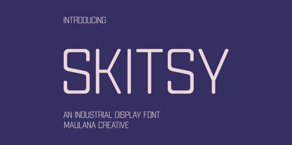 Skitsy is an industrial tech genre sans display font. With regular stroke, fun character with a bit of ligatures and alternates. To give you an extra creative work. Skitsy font support multilingual more than 100+ language. This font is good for logo design, Social media, Movie Titles, Books Titles, a short text even a long text letter and good for your secondary text font with script or serif. Make a stunning work with Skitsy font. Cheers, Maulana Creative
 - Modesto by Parkinson,
$25.00 Modesto is a loose-knit family based on a signpainters lettering style popular in the late-19th and early-20th centuries. It evolved from the lettering I used for the Ringling Bros. and Barnum & Bailey Circus Logo. The Modesto family was not planned. It just happened, a few fonts at a time over about fifteen years. In 2014 four new Italic fonts were added. There is a downloadable MODESTO USER MANUAL PDF in the Gallery section for this family.
 - La Jefa by Lauren Ashpole,
$15.00 A short font for short people* La Jefa is very, very loosely based on a Christmas card I received years ago from my boss at the time. Designed to capture that personalized touch, it's a hand lettered font with a short x-height and ample spacing. Although all of the letters are lowercase, the uppercase provides a unique set of characters that can be mixed in for a more natural handwritten feel. *also people of tall or average height
 - Borrowdale by Hanoded,
$20.00 Borrowdale is a valley and civil parish in the English Lake District. In the 16th century a major deposit of graphite was discovered near Seathwaite, which kickstarted the pencil industry. Borrowdale font was made with one of my son's coloring pencils (which probably does not contain a single molecule of graphite). It is a very legible and easy-on-the-eye font, ideal for children's books, texts and product packaging. Comes with a mother lode of diacritics.
 - Coliseum Pro by Red Rooster Collection,
$60.00 Coliseum Pro is a five-weight compressed spur serif font family. ITF’s original Coliseum family, released in 1992, was designed by Julie Hopwood and Pat Hickson. Steve Jackaman completely redesigned, redrew, and improved the Coliseum family over a two-year period, and two additional lighter weights have emerged: Light and Book. Coliseum Pro is inspired by Roman display typefaces, and is powerful and eye-catching at any size. Two sister typefaces, Clydesdale and Torpedo, were born from Coliseum’s redesign.
 - Milanello by Mevstory Studio,
$25.00 Milanello is a strong sans serif font with medium contrast. Inspired by the High Octane Rock genre and modern-classic fashion. Carefully designed with a short ascender to give a solid look, also the sharp serif makes the letters look more strong. Milanello is a display-type which perfect for a headline, sub-headline, and short body text for magazine, books, fashion, quotes, hipster t-shirt, signboards, logo, and etc. A great choice for a brave concept!