10,000 search results
(0.018 seconds)
- Killman by Grontype,
$12.00 Killman is a nice, neat and playful Font that is very useful for making Headline header or unique quotes or making flyer titles, even good for making company logo taglines. This font is made by adding some useful ligatures to create various font variations Features : All Character Set Numbering And Punctuations Ligatures Multilanguage Support Thankyou For Downloading This Font, Hope You Enjoy It Regard. Grontype
 - Rumblekill by Invasi Studio,
$19.00 Rumblekill is a blackletter font in the retro style. Elegant and rounded, it adds a bold touch to your projects and will inspire you to create something unique and modern. This font is also equipped with alternative characters, Ligatures, and multi-language support. Rumblekill Font is ideal for headings, flyers, greeting cards, product packaging, book covers, printed quotes, logotype, apparel design, and album covers.
 - The Beardy by Aiyari,
$25.00 Introducing a new elegant retro display typeface called The Beardy Inspired from serif didone combine with flourish typography and 60s-70s pop culture. The Beardy came with open type features such stylistic alternates, stylistic set 01-18, & ligatures. The Beardy typeface mainly intent for logo, headings, branding, magazine, cover album, book cover, movie, apparel design, quotes, invitations, flyer, poster, greeting cards, product packaging, printed quotes, etc
 - Rolan by Larin Type Co,
$12.00 Rolan This is a light elongated font that includes light, regular and bold weights, as well as these weights in a rough style. It is versatile and will perfectly fit into any project in both modern and vintage style, it is perfect for creating a logo, banners, flyers, labels, branding and much more This font family has only Capital letters and some of them are different.
 - Mustank by Rochart,
$18.00 Mustank Casual lettering script is a font collection that contains three font family there are script, display and sans. The collection of fonts that are designed to complement each other in their use. Mustank is perfect for logo design, t-shirts, flyers, apparel, packaging, advertising etc. This typeface contain of Uppercase, Lowercase, Alternate, Swash, Number, Symbol, Punctuation, Ligature etc. Also support multilingual and already PUA encoded.
 - Lumierre Bear by The Ocean Studio,
$12.00 Lumierre Bear is playful font family which puts a smile on your projects and will inspire you to create something fun and memorable. It is perfect for headings, flyer, greeting cards, product packaging, book cover, printed quotes, logotype, apparel design, album covers, etc. . Includes: – Lumierre Bear OTF – Lumierre Bear Doodles OTF Features: – Multilingual Support – PUA Encoded – Numerals and Punctuation Thank you for downloading from Ocean Stud.
 - Wargear by Grontype,
$12.00 Wargear is a black display type. Simple in a good way and tough look. This font designed with tight kerning making this font a perfect choice if you want a bold way in your design. The font is great to create a logo tagline, flyer header, or even magazine title. Features: All Standard Glyphs Multilingual Support Numbering & Punctuation Thankyou for Choosing this font Regard, Grontype
 - South East by Girinesia,
$17.00 South East is stylish handwritten font. South East looks original and can be used for all your project needs. South East would perfect for Youtube Cover or Thumbnails, sports flyers, mockup , tote bags, kids books, scrapbooks, logos, icons, phrases or quotes for winter greeting cards (Halloween, Christmas or New Year holidays), photo overlay, short phrases, gift shops tags, presentation in social media Pinterest, Instagram, Facebook and more.
 - Exodar by Rometheme,
$15.00 Exodar is a modern futuristic typeface with elegance in every single letter. This font looks modern, sci-fi, futuristic, future, readable, stylish, catchy and easy to use. Exodar is the best choice for your professional design projects, including: logos, poster design, t-shirts, headlines, flyers, cd cover albums, quotes, business cards, branding, magazines, social media, advertisements, product design, or anything that need a modern or futuristic look.
 - Buguri Slab by Grontype,
$16.00 Buguri Slab is a Bold, Modern and Tough Serif font. This font is kerned tightly to give a solid and strong impression. It comes with more variation and alternates. The fonts can be applied on T-shirts, Company brands, Book cover flyers and especially for the Gamers Tagline Logo. Features Every Glyph has Alternates Multilingual Support Numerals and Punctuations Thankyou For Downloading Grontype's Fonts. Enjoy!
 - Sacred Musk by Invasi Studio,
$16.00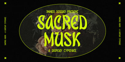 Introducing a Retro vibes font, the Sacred Musk inspired by psychedelic. Sacred Musk with retro, bold, and playful design. Sacred Musk is a great font for achieving an authentic retro aesthetic as seen in the display images project, it is perfect for headings, flyers, greeting cards, product packaging, book cover, quotes, logotype, apparel design, album covers. Amateur Hunter Features: Multi-language Punctuation Contextual Alternates
 - Roughpen by Putracetol,
$28.00 Roughpen is a bold, hand-drawn brush typeface. With this font you can create stunning custom hand drawn brush looks. Roughpen also includes lots of binding characters which make the project even more amazing. You can use this font for making an awesome logos, header, titles, prints, apparel, logotype, quotes, packaging, flyer, poster, cover & other creative process possibilities. This font also support multi language.
 - Quick Game by Linecreative,
$16.00 Introducing “Quick Game”, the futuristic font that was inspired from a sci-fi movie. Quick Game is a display font that is suitable on your headline to your magazine, flyer, poster or neon installation. Also clearly shaped to be applied in print design like t-shirt, mug, banner or motion graphic. • Uppercase • Lower-caps • Numbers • Punctuations • Supports Multi linguage (Latin Western Europe) • Ligatures Character & Stylistic alternates Character
 - Regt by Larin Type Co,
$15.00 Regt this is a military display font family , including three styles: regular, rough, pressed. This font is a wide specialization, it will be an excellent option for creating projects in the military style in both modern and vintage versions. It is great for creating logos, labels, branding projects, magazines, video game, flyers, posters and much more. This font is easy to use has OpenType features.
 - Grisha by Grontype,
$14.00 Grisha is a futuristic and modern retro look. Each uppercase and lowercase letter has its own characteristics, plus some alternates and ligatures. This font is bold and tight kerning, very suitable for your design projects such logo tagline, logotype, name card, flyers invitation, magazine header etc. Features: Uppercase glyphs Lowercase glyphs Numeral and Punctuations Standard Ligatures Stylistic Alternates Thankyou for choosing this font Regard, Grontype
 - Worthbites by Invasi Studio,
$13.00 WORTHBITES is a Biteable, Uneven, Unexpected, and Playful font special for Food Display, that puts a smile on your projects and will inspire you to create something fun and memorable. WORTHBITES will help you to create special and touching typographical designs for fun or childish projects, It is perfect for headings, flyers, greeting cards, product packaging, book cover, printed quotes, logotype, apparel design, album covers.
 - Patinas Stencil by Inumocca,
$13.00 Patinas Stencil Family come with 3 Style Moon Star , Reguler and Slant. Modern Urban Serif Font, Powerfull and has a great Character, Good Font to use for covering your Project, like Branding, Headline Letter, Flyer, Signage, Quotes, Poster Typography, Bookcover, Magazine cover, Poster, Quotes Lettering, Logos, and more your project design. - Unique glyphs - Multilingual Characters Support - UPPERCASE - Lowercase - Numeric - Symbol - Punctuation Character inumocca type Studio
 - Hipetype Vector by Get Studio,
$17.00 Introducing Hipetype, a handwritten font with a unique and strong character crafted with high-definition paint textures. Hipetype can be used for various types of design needs such as branding materials, t-shirts, social media templates, business cards, logos, promotional flyers, posters, and more. With multilingual support, this font is also suitable to be combined with san-serif to get an extraordinary result for your design projects.
 - Amateur Hunter by Invasi Studio,
$12.00Introducing a Handdrawn Sans Serif, the Amateur Hunter inspired by outdoor lifestyle. Amateur Hunter includes 4 font files with Regular, Stencil, and Stamp styles. Amateur Hunter is a great font for achieving an authentic vintage aesthetic as seen in the display images or Body text project, it is perfect for headings, flyers, greeting cards, product packaging, book cover, quotes, logotype, apparel design, album covers. - LB Priester 1906 by Jonahfonts,
$30.00 There are many fonts inspired by Lucian Bernhard. I have always admired his 1906 award-winning poster: ‘Priester’— believed to be the birth of the ‘Sachplakat’ (or Object Poster). I have interpreted the hand lettered “Priester” logo into a formal typeface and only hope I have done it justice. Usage recommendations: Captions, fliers, packaging, cards, posters, ads, book jackets, manuals, bulletins, magazines, greetings, announcements.
 - Laguna Vintage by Aiyari,
$25.00 Introducing Laguna Font Collection. Inspired from American motor inn signs and vintage restaurant signs in 50s-70s. Laguna comes with open type features such stylistic alternates, stylistic sets, contextual alternates & ligatures. Also available in variable font format. Laguna Font Collection is best uses for headings, Logo type, quotes, apparel design, invitations, flyer, poster, greeting cards, product packaging, book cover, printed quotes, cover album, movie, etc
 - Guanabara Sans by Plau,
$20.00 Guanabara is the third release of Plau Type Foundry. It started from the need of a wayfinding typeface that had personality enough to be the brand typeface for a city. The city of Rio de Janeiro, with its never-ending curves and all year long summer weather provided the constraints and requirements of this typeface. From there, it evolved to be a workhorse, with 8 weights from Thin to Black and matching true italics. It just had to have the features that all us designers have grown to love, such as alternate letters (a, g and r for the romans), tabular and proportional figures in lining and oldstyle set-ups as well as small caps, fractions and all that jazz (I mean, samba). And it needed to be recognizable and distinct. For that, design features like tapered R legs, capitals with classic proportions and calligraphic finishes on the terminals proved crucial. And last, but not least, like Rio, it had to welcome many cultures. We came to think of it as the “Typeface from Ipanema”, with a classic, timeless look, swinging elegance and joyful attitude.
 - Bembo MT by Monotype,
$45.99 The origins of Bembo go back to one of the most famous printers of the Italian Renaissance, Aldus Manutius. In 1496, he used a new roman typeface to print the book de Aetna, a travelogue by the popular writer Pietro Bembo. This type was designed by Francesco Griffo, a prolific punchcutter who was one of the first to depart from the heavier pen-drawn look of humanist calligraphy to develop the more stylized look we associate with roman types today. In 1929, Stanley Morison and the design staff at the Monotype Corporation used Griffo's roman as the model for a revival type design named Bembo. They made a number of changes to the fifteenth-century letters to make the font more adaptable to machine composition. The italic is based on letters cut by the Renaissance scribe Giovanni Tagliente. Because of their quiet presence and graceful stability, the lighter weights of Bembo are popular for book typography. The heavier weights impart a look of conservative dependability to advertising and packaging projects. With 31 weights, including small caps, Old style figures, expert characters, and an alternate cap R, Bembo makes an excellent all-purpose font family.
 - Bembo Infant by Monotype,
$45.99The origins of Bembo go back to one of the most famous printers of the Italian Renaissance, Aldus Manutius. In 1496, he used a new roman typeface to print the book de Aetna, a travelogue by the popular writer Pietro Bembo. This type was designed by Francesco Griffo, a prolific punchcutter who was one of the first to depart from the heavier pen-drawn look of humanist calligraphy to develop the more stylized look we associate with roman types today. In 1929, Stanley Morison and the design staff at the Monotype Corporation used Griffo's roman as the model for a revival type design named Bembo. They made a number of changes to the fifteenth-century letters to make the font more adaptable to machine composition. The italic is based on letters cut by the Renaissance scribe Giovanni Tagliente. Because of their quiet presence and graceful stability, the lighter weights of Bembo are popular for book typography. The heavier weights impart a look of conservative dependability to advertising and packaging projects. With 31 weights, including small caps, Old style figures, expert characters, and an alternate cap R, Bembo makes an excellent all-purpose font family. - Cori by HiH,
$8.00 You wrote on your school notebooks, didn't you. Of course, just about everyone did. And those that didn't are probably in therapy trying to overcome the repression and guilt. Balloon letters are fun, easy to draw and have a light-hearted presence. With little autonomy, what young person can resist the opportunity to make a public, personal statement on their notebook. Guess what! Adults do it too - with our cars, our houses, our toys, our accessories and so on. And how "grown-up" are we really? Anyway, my niece, Cori, made this nice, colorful, hand-drawn birthday card. It was so vibrant and fun - in warm circus colors - that I could not resist making it into a font. Use it for positive, fun stuff, stuff with a light touch - an invitation for an informal party perhaps, but probably not a formal dinner at the White House. This font is not comfortable in a bowtie. But don't be fooled. Casual as Cori is, you can set at least twelve major European languages with it, in addition to English: Albanian, Danish, Dutch, Finnish, French, German, Hungarian, Italian, Norwegian, Portuguese, Spanish and Swedish. Cori Valentine adds a decorative Valentine border to the upper case of Cori. By leaving out the bow in the upper center of the border we were able to fit the border around the accented caps. Similarly, we omitted the butterfly for the Ccedilla glyph. Blank versions of the regular border & the bowless border are provided at positions 135 & 137 in case you want to put a border around your signature or something like that. Just for reference, the letterforms for Cori Valentine are 75% the size as the regular Cori font. We would like to assure you that it is permissible to use Cori Valentine to create a romantic card, flyer or note during any month with less the 32 days.
 - Tatline by Groteskly Yours,
$15.00 Tatline was intended to be a fun side project that developed into something cool and rather unprecedented. It's bold, it's chunky —and it just looks good whether it's a mock movie poster or a key element in a brand identity for a business. With serifs thicker than stems, it looks more down to earth, solid, reliable and firm. And yet there's an almost imperceptible playfulness in the way it looks and behaved on the screen and paper. Tatline would look great on posters and flyers. We've tried creating a coffee brand identity with it —and surprise, looks great again. Maybe it's magic, but we like to think it's just a result of tough work put into creation of Tatline. Try it yourself and let us know what you think!
 - I'm Fashionista! by Fontscafe,
$39.00 We’re delighted to bring you ‘I’m Fashionista,’ which simply oozes trendiness, style, glamour, and of course high fashion! This is a font that sings out ‘elite’ in the design sense of the word. Its sophisticated sensibility sets it apart from any other font you may have used. If you’ve ever needed to create your own fonts to use on a fashion flyer, you can already appreciate the value of having ready-to-use fonts such as ‘I’m Fashionsita’ in your bag of tricks! Anything to do with fashion and glamour needs to have that touch of delicacy, charm, beauty, and exclusivity to it, and we find the ‘I’m Fashionsita’ a perfect fit for such jobs. ‘I’m Fashionista’ is a must-have for any designer, especially those working with modern and upmarket designs.
 - Cabrito Serif by insigne,
$33.00 The Cabrito family is making a statement again. Launched as a supplement to the children's book, The Clothes Letters Wear, the original Cabrito is carefree, fun and easy on the eyes. Now, by balancing this friendly connection with new elegance, Cabrito Serif arrives: attractive copy text with an extra sophisticated sensibility incorporated into the design. Still bright and playful, this new Cabrito is cleaner and leaner, ensuring that its polished appearance retains legibility. 54 fonts include upright alternates, ligatures, and old figures. The range includes extended and condensed variants. To see any of these interactive features, see the PDF manual. The family also includes language support for 72 Latin-based languages, and there are more than 600 glyphs. Cabrito Serif can be used for logos and packaging, as well as for brochures and web pages. It’s readability makes it an excellent choice for a wide range of jobs. Take a walk with Cabrito Serif and see how much fun it is. By the way, look at some other Cabrito members and see how much you love the original, Inverto, Contrast or Didone.
 - Minimela Tm by Mustafa Demirel,
$30.00 "It is hard to believe, but they won't be able to give up on us" The story of this font has started with a little suitcase actually. These characters were trying to do something for minimela kitchen which it named.After that, they looked that they was wanting to be that font beautiful writings written with it, belonging to it, special to it and reminding it to everybody. These cute monsters that have shaped themselves were a piece of a whole, of a little whole. They were totally believing to beautiful and long ways that have being waited them. They have given a sincere promise they will continue with little steps on that ways. "It is hard to believe, but they won't be able to give up on us" while telling this, we were totally talking about that
 - Dave Gibbons Journal by Comicraft,
$19.00 Get over the trauma of seeing that icky dog carcass in the alley this morning, you know, the one with the tire tread on the burst stomach? The city might be afraid of you, but now you can see its true typeface. Yes, when the gutters between YOUR comic book panels are full of blood, we here at ComicBookFonts.com recommend DaveGibbonsJournal for all your psychotic ramblings. Don't pose precariously on the precipice of a building without it. Artwork by Dave Gibbons from Elephantmen #25
 - Shakuro Brush by Letterhend,
$16.00 Introducing, Shakuro. As you can see, this brush typeface has unique letterforms inspired by japanese kanji typography. Very suitable to use for headlines, titles, logos or anything especially related to Japanese or asian themes. Features : uppercase & lowercase (alternates) numbers and punctuation multilingual PUA encoded We highly recommend using a program that supports OpenType features and Glyphs panels like many of Adobe apps and Corel Draw, so you can see and access all Glyph variations. Email us to letterhend@gmail.com if you need something! Happy Designing!
 - LTC Creepy Ornaments by Lanston Type Co.,
$24.95 In researching historic decorative material offered by Lanston Monotype as well as other metal foundries such as Barnhart Brothers and Spindler, there were occasionally ornaments that defied description. Perhaps it was a Victorian sense of humor or someone really thought these were a good idea or perhaps popular taste has just changed so much over the last hundred years, or our forbearers were completely insane. In any case, LTC is somewhat proud to present a collection of the most bizarre, disturbing and baffling printers ornaments we could find. Along with mutant fowl-children and frolicsome amphibians, there are also Masonic and other secret fraternal symbols that may not be creepy to everyone, but just enough to be moderately disturbing.
 - Vendetta by Emigre,
$69.00 The famous roman type cut in Venice by Nicolas Jenson, and used in 1470 for his printing of the tract, De Evangelica Praeparatione, Eusebius, has usually been declared the seminal and definitive representative of a class of types known as Venetian Old Style. The Jenson type is thought to have been the primary model for types that immediately followed. Subsequent 15th-century Venetian Old Style types, cut by other punchcutters in Venice and elsewhere in Italy, are also worthy of study, but have been largely neglected by 20th-century type designers. There were many versions of Venetian Old Style types produced in the final quarter of the quattrocento. The exact number is unknown, but numerous printed examples survive, though the actual types, matrices, and punches are long gone. All these types are not, however, conspicuously Jensonian in character. Each shows a liberal amount of individuality, inconsistency, and eccentricity. My fascination with these historical types began in the 1970s and eventually led to the production of my first text typeface, Iowan Old Style (Bitstream, 1991). Sometime in the early 1990s, I started doodling letters for another Venetian typeface. The letters were pieced together from sections of circles and squares. The n, a standard lowercase control character in a text typeface, came first. Its most unusual feature was its head serif, a bisected quadrant of a circle. My aim was to see if its sharp beak would work with blunt, rectangular, foot serifs. Next, I wanted to see if I could construct a set of capital letters by following a similar design system. Rectangular serifs, or what we today call "slab serifs," were common in early roman printing types, particularly text types cut in Italy before 1500. Slab serifs are evident on both lowercase and uppercase characters in roman types of the Incunabula period, but they are seen mainly at the feet of the lowercase letters. The head serifs on lowercase letters of early roman types were usually angled. They were not arched, like mine. Oddly, there seems to be no actual historical precedent for my approach. Another characteristic of my arched serif is that the side opposite the arch is flat, not concave. Arched, concave serifs were used extensively in early italic types, a genre which first appeared more than a quarter century after roman types. Their forms followed humanistic cursive writing, common in Italy since before movable type was used there. Initially, italic characters were all lowercase, set with upright capitals (a practice I much admire and would like to see revived). Sloped italic capitals were not introduced until the middle of the sixteenth century, and they have very little to do with the evolution of humanist scripts. In contrast to the cursive writing on which italic types were based, formal book hands used by humanist scholars to transcribe classical texts served as a source of inspiration for the lowercase letters of the first roman types cut in Italy. While book hands were not as informal as cursive scripts, they still had features which could be said to be more calligraphic than geometric in detail. Over time, though, the copied vestiges of calligraphy virtually disappeared from roman fonts, and type became more rational. This profound change in the way type developed was also due in part to popular interest in the classical inscriptions of Roman antiquity. Imperial Roman letters, or majuscules, became models for the capital letters in nearly all early roman printing types. So it was, that the first letters in my typeface arose from pondering how shapes of lowercase letters and capital letters relate to one another in terms of classical ideals and geometric proportions, two pinnacles in a range of artistic notions which emerged during the Italian Renaissance. Indeed, such ideas are interesting to explore, but in the field of type design they often lead to dead ends. It is generally acknowledged, for instance, that pure geometry, as a strict approach to type design, has limitations. No roman alphabet, based solely on the circle and square, has ever been ideal for continuous reading. This much, I knew from the start. In the course of developing my typeface for text, innumerable compromises were made. Even though the finished letterforms retain a measure of geometric structure, they were modified again and again to improve their performance en masse. Each modification caused further deviation from my original scheme, and gave every font a slightly different direction. In the lower case letters especially, I made countless variations, and diverged significantly from my original plan. For example, not all the arcs remained radial, and they were designed to vary from font to font. Such variety added to the individuality of each style. The counters of many letters are described by intersecting arcs or angled facets, and the bowls are not round. In the capitals, angular bracketing was used practically everywhere stems and serifs meet, accentuating the terseness of the characters. As a result of all my tinkering, the entire family took on a kind of rich, familiar, coarseness - akin to roman types of the late 1400s. In his book, Printing Types D. B. Updike wrote: "Almost all Italian roman fonts in the last half of the fifteenth century had an air of "security" and generous ease extremely agreeable to the eye. Indeed, there is nothing better than fine Italian roman type in the whole history of typography." It does seem a shame that only in the 20th century have revivals of these beautiful types found acceptance in the English language. For four centuries (circa 1500 - circa 1900) Venetian Old Style faces were definitely not in favor in any living language. Recently, though, reinterpretations of early Italian printing types have been returning with a vengeance. The name Vendetta, which as an Italian sound I like, struck me as being a word that could be taken to signifiy a comeback of types designed in the Venetian style. In closing, I should add that a large measure of Vendetta's overall character comes from a synthesis of ideas, old and new. Hallmarks of roman type design from the Incunabula period are blended with contemporary concerns for the optimal display of letterforms on computer screens. Vendetta is thus not a historical revival. It is instead an indirect but personal digital homage to the roman types of punchcutters whose work was influenced by the example Jenson set in 1470. John Downer.
 - The "Somalove" font, crafted by the imaginative folks at Happy Lovers Town, stands out as a beacon of warmth and endearment in the realm of typography. At its heart, Somalove is a celebration of love...
- Febyetska by CBRTEXT Studio,
$15.00 Febyetska is an elegant new signature style font. The thick and thin parts of each glyph give the impression of beauty and make it classy. With a new style, we want to help your project or brand become fresher and make it elegant and pleasant for all who see it.
 - AT Move Straw by André Toet Design,
$39.95 STRAW The inspiration for this capital alphabet came from those beautiful haystacks you see in summer and the old fashioned Mikado game! We wanted to create a light, fragile and airy typeface with an optical effect. And here it is ... it’s just STRAW ! Concept/Art Direction/Design: André Toet © 2017
 - The font Tresdias, crafted by the talented Asclê de Oliveira, is a fascinating blend of artistic freedom and structural sophistication. This unique font speaks volumes of Oliveira's dedication and ke...
- Gundrada ML by HiH,
$12.00 Gundrada ML was inspired by the lettering on the tomb of Gundrada de Warenne. She was buried at Southover Church at Lewes, Sussex, in the south of England in 1085. The Latin inscription on her tomb, STIRPS GUNDRADA DUCUM, meaning “Gundrada, descendant of the Duke” may have led to the speculation that she was the daughter of William, Duke of Normandy and bastard son of Robert the Devil of Normandy and Arletta, daughter of a tanner in Falaise. In 1066 William defeated Harold at the Battle of Hastings and was crowned William I of England. More commonly known as William the Conquerer, he commissioned a string of forts around the kingdom and charged trusted Norman Barons to control the contentious Anglo-Saxon population. William de Warenne, husband of Gundrada, was one of these Barons. There has also been the suggestion that Gundrada may have been the daughter of William’s wife, Matilda of Flanders, by a previous marriage. According to the Dictionary of National Biography (Oxford University Press, Oxford, England 1921-22), both of these contentions are in dispute. Searching the past of a thousand years ago is like wandering in a heavy fog: facts are only dimly in view. Regardless, I know that I found these letterforms immediately engaging in their simplicity. Unadorned and unsophisticated, they have a direct honesty that rests well in the company of humanistic sans serifs like Franklin Gothic or Gill Sans, appealing to a contemporary sensibility. The lettering on the tomb is in upper case only. Although Gundrada does not sound Norman French to me, her husband certainly and her father probably were Norman French. Nonetheless, the man that carved her tombstone was probably Anglo-Saxon, like most of the people. For that reason, we are quite comfortable with a fairly generic lower case from an Anglo-Saxon document of the time. The time was a time of transition, of contending language influences. This font reflects some of that tension. Features 1. Multi-Lingual Font with 389 glyphs and 698 Kerning Pairs. 2. OpenType GSUB layout features: onum, dlig, liga, salt & hist. 3. Tabular Figures and Alternate Old-Style Figures. 4. Alternate Ruled Caps (line above and below, matching to brackets). 5. Central Europe, Western Europe, Turkish and Baltic Code Pages. 6. Additional accents for Cornish and Old Gaelic. 7. Stylistic alternates A, E, y and #. 8. Ligatures ST, Th, fi and fl. 9. Historic alternate longs. The zip package includes two versions of the font at no extra charge. There is an OTF version which is in Open PS (Post Script Type 1) format and a TTF version which is in Open TT (True Type)format. Use whichever works best for your applications.
 - Linda by profonts,
$51.99 Linda - a typeface not only for girls! Linda, a graphic design trainee, started this font as an experiment. It should become a professional typographic project. Linda is like Linda: youthful, feminine, and easygoing. Dear Linda,we are quite happy now you are finished. We enjoyed an exciting period of time with you, and we learned a lot of new things through you. With every new step, we became more convinced of you. Your aesthetics, your easiness, and your wonderful Teenie-charakter are so beautiful and charming. Copy text or headlines: your flow is absolutely fantastic and versatility is your strength. We really look forward to seeing more of you, maybe on posters or book titles, for example. Just carry on.
 - Contype by Wiescher Design,
$39.50 Once I had a young, very eager and interested designer in my employ. We got into talking about where our letterforms come from and the habits in perception we are used to. He did not quite believe me. So I said, let's try to design a typeface where everything is just the opposite of what we are used to. We really had a hard time, our habits crept up on us all the time. But after a couple of weeks we finally finished this typeface and wanted to call it crazytype, but my young apprentice who did most of the manual labor said Contype sounded crazier. So it became Contype and it's really crazy, with a small asian touch to it. Yours very crazy Gert Wiescher