10,000 search results
(0.033 seconds)
- UT Triumph by Uniontype,
$29.00 UT Triumph Script by Uniontype is a modern type family inspired by classic Americana scripts. The family consists of regular, vintage, and press styles. Also it contains shadow layers with which you can quickly & easily add depth of UT Triumph Script by duplicating the text layer and switching it to Shadow. Choose сolor and offset according to your taste. UT Triumph Script provides advanced typographical support with contextual alternates, ligatures and swashes. UT Triumph Script is good for menu, signs, packaging, posters, letterings and logos. Use the vintage and press styles to feel the true spirit of new retro!
 - Westbourne Serif by Typetemp Studio,
$20.00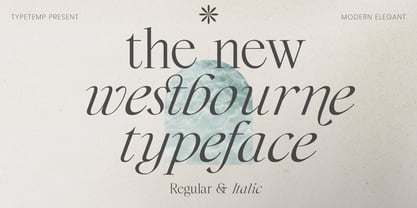 Westbourne Modern Serif Typeface is a stylish font It has both modern look. Comes with alternatives and ligatures, helps to create stunning logos, quotes, posts, blog posts. branding projects, magazine imagery, wedding invitations, and much more. WHAT'S YOU GET ? Westbourne Regular and Italic Unique Letterforms Works on PC & Mac Simple Installations Accessible in the Adobe Illustrator, Adobe Photoshop, Microsoft Word Fully accessible without additional design software. I really hope you'll get pleasure using Westbourne font and it will be perfect addition to your font collection! Contact me with an inbox message If you have any question. Thank you! Happy Creating.
 - Sweetest by Supersemarletter,
$11.00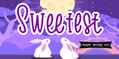 Sweetest is a cute and friendly handwritten font. It embodies playfulness and authenticity and is the perfect choice for any children activity or school project. Provide Ligatures with special character make the design letters looks incredible. Honestly it works perfectly for headlines, logos, posters, packaging, T-shirt and much more. Font Features : . Regular Version . Character set A-Z in Uppercase and Lowercase . Ligatures in lowercase and special . Numerals and Punctuation . Accented Characters . Multiple Languange Supported Recomended to use in Adobe Illustrator or Adobe Photoshop with opentype feature. If you have any questions, just send me a message and I'm glad to help.
 - Dinkle by Chank,
$30.00 The Dinkle fonts are the creation of a sketchbook artist who spent years refining her craft, Diana Hollingsworth Gessler. She created the Dinkle handwriting fonts for use in her book "Very New Orleans," and now you can use it in four convenient styles: Regular, Bold, Italic and Bold Italic. Each font in this family was drawn individually, capturing nuanced differences of natural penmanship when the weights are paired together. A hand-lettered journal style, the highly legible Dinkle fonts offer tidy text and clear captions. Use it for signage, quotations, or anywhere you need a personal touch in your designs.
 - Core Gothic D by S-Core,
$72.00 Core Gothic D is a simple and modern sans-serif Korean font consists of 9 weights (Thin, ExtraLight, Light, Regular, Medium, Bold, ExtraBold, Heavy & Black). Character set is consist of Korean 11,172 characters, Hirakana & Katakana, Latin and Korean symbols. It is well balenced between Korean and Latin characters. Latin typeface (Core Sans D) was adjusted to be matched with korean typeface. Spaces between individual letter forms are adjusted in detail so that it makes perfect typesetting. Supported codepages are MS Windows 1252 Latin1 and MS Windows 949 Korean. We recommend to use for books, web, screen displays and so on.
 - Beeching by Greater Albion Typefounders,
$14.95 Beeching is a family of six typefaces designed to combine extreme legibility with a hint of retrospective character. It is inspired by the lettering used in the Leslie Green designed stations of the London Underground and is as up to date today as it was the day those stations opened. The Beeching faces (Regular, Bold, Small Capitals, Small Capitals Bold, Shadowed and Small Capitals Shadowed) are ideal for use in large scale signage that needs to be seen over long distances. We feel the family provides a clear demonstration that traditional details, such as serifs and ligatures serve to enhance legibility.
 - Asking Ladies by Youngtype,
$18.00 New Asking Ladies Beautiful Modern Serif . This professional resource is also powerful because each font has its own magical design. Equipped with three versions Regular, Italic & Bold. You can use it for almost anything like blog headers, posters, wedding elements, t-shirts, clothing, book covers, business cards, greeting cards, branding, invitations and quotes, and so on. Feature: Uppercase Lowercase Number Accents (multilingual characters) How To Access Alternate Characters: https://www.youtube.com/watch?v=Go9vacoYmBw https://www.youtube.com/watch?v=XzwjMkbB-wQ https://www.youtube.com/watch?v=x1A_ilsBsGs https://www.youtube.com/watch?v=xFlMwARHusY https://www.youtube.com/watch?v=NVJlZQ3EZU0 Thanks for your purchase!
 - PF Synch Pro by Parachute,
$79.00 An industrial strength slab-serif typeface which performs equally well with headlines as well as longer text. It differs from the stiff almost mechanical structure of other slabs, by introducing distinct letterforms in characters like ‘f’, ‘r’ and managing at the same time to combine effectively the typeface’s round parts with deep cuts and sharp inner corners, which add an interesting character to this otherwise contemporary series. PF Synch Pro consists of 4 fonts from black to regular. It is loaded with 3 special OpenType features and offers multilingual support for all European languages including Greek and Cyrillic.
 - Rollgates Victoria by Cotbada Studio,
$16.00 It's too much fun! Of all the fonts I have designed, this is my favorite. Thin strokes and delicate embellishments really do it for me and I hope it's for you too! You won't find curves like this in regular fonts. This is modern meets the classic, minimally meets the decorative. Look at the numbers ... then, look again. They have curves of all kinds of unusual places. If you want to stand out then this is the font for you. Logo or title, fashion distribution to masthead, monogram or Instagram, create beautiful art with this font. Rollgates Victoria can do it!
 - Replica Rough SG by Spiece Graphics,
$39.00 Here’s an edge-tattered, slightly distorted typeface that was developed from hand stamping using ink. You’ll find it ideal for both display and text situations where legibility is a big concern. This version holds up in very small sizes. Replica Rough SG Regular and Bold are now available in the OpenType format. This OpenType version includes stylistic alternates, discretionary ligatures, small caps, petite caps, ornaments and oldstye figures. Advanced features currently work in Adobe Creative Suite InDesign, Creative Suite Illustrator, and Quark XPress. Check for OpenType advanced feature support in other applications as it gradually becomes available with upgrades.
 - VLNL Breakz by VetteLetters,
$35.00 Donald DBXL Beekman needed a break. And he took it too. While sitting there consuming a sandwich and a half-pint of milk, he took up his ruler and pencil. By the time there was no milk left and only some bread crumbs remained on his plate, VLNL Breakz was finished. That’s DBXL for you. Get your letters during your break. VLNL Breakz was originally designed as the headline and logo font for the breakdance competition Amsterdam Breakz, but turned out to be very versatile. It has 4 variations, Regular and Condensed widths / Bold and Light weights.
 - Burma by Runsell Type,
$25.00 Burma perfectly represents vintage aesthetics sans serif display typefaces. This project is inspired by beautiful lettering on old label. It come with 4 style (regular, soft, rough and outline). Some letters contain beautiful stylistic alternates characters (ss01 - ss04) and feature ligatures. Burma can be applied in designs such as logotypes, posters, packaging, branding, quotes, badge and more custom design. It features uppercase, lowercase, numeral, punctuation & symbol, ligatures, alternates, multilingual support, and is PUA encoded (fully accessible without additional design software). How to get access alternate glyphs with designing software to open type fonts check this link: http://adobe.ly/1m1fn4Y
 - Grotesk Polski FA by Fontarte,
$39.00 Grotesk Polski FA developed in 1998-2006, was inspired by the Polish eminent pre-WWII text typeface - Antykwa Półtawskiego. Adam Półtawski designing his antiqua had took into consideration the special qualities of Polish language. He designed unique letters: k, w, y, z and R, K, Y. Another unique element of his typeface was polygonal dot. Grotesk Polski keeps all that shapes and goes further. It is a contemporary sans serif in four cuts: Regular, Italic, Bold and Stencil. The proportions of the typeface were rebalanced to give it a neo-grotesque form with a Polish twist.
 - Anavio by Greater Albion Typefounders,
$14.95 Anavio is named in honor of the ancient Roman name of an English Derbyshire town. Anavio is a classically inspired family of Roman faces, emphasizing simplicity of form and elegance. Regular and Bold weights are offered, along with condensed forms. Anavio is offered in both upper and lower case and small capitals faces. Its simple lines are immediately legible, lending it to both text and display uses. A range of ligatures, both standard and discretionary, are included as are stylistic alternates and two styles of numerals. Use Anavio to lend that indefinable air of elegance to your next project.
 - Lark by Shana Hu,
$20.00 Lark is a modern calligraphic sans inspired by a rich history of broad-edge and translation contrast calligraphy. By combining its sharp geometry with flared curves, Lark exhibits a nice warmth as a display face. Lark was initially conceived as a final project as part of the Type@Cooper West Extended Program's post-graduate certificate program in typeface design, so its journey has benefitted from routine feedback from experienced typeface designers. Comes in Bold, Medium, Regular, and Light weights for both roman and italic, and supports multiple languages including Danish, Dutch, English, French, German, Italian, Portuguese, Spanish, Swedish, and more.
 - Centim by Tour De Force,
$25.00 Centim is contemporary sans with sharp top endings of stems that give a bit technical charm to typeface. With a squarish look, it can be used widely in all modern publications or become a part of an corporate identity. In smaller sizes, Centim offers good readability due to its simple and good balanced lines. Centim is available in Regular and Bold weights, as an ideal high-contrasted combination where all characteristics of the typeface are purely effective. Centim is the archaic Serbian word for Centimeter, a word that was mostly used in tailoring during XIX and XX century.
 - Narin by Ahmet Altun,
$19.00 Narin Font Family is a geometric sans design with rounded corners which seems much softer and eye-pleasing even though it still has geometric and straight borders. The family comes in six weights with regular and italic forms. Narin Font Family is legible from very small size to very large ones. It is suitable for letterpress and also long texts. With the small caps, all fonts can be used to create great and gorgeous works like logos, texts, presentations, t-shirts etc. and can be used to create the pressworks such as posters, magazines and books. The word "Narin" means "graceful" in Turkish.
 - Madre Rose by Letterhend,
$17.00 Madre Rose is a sophisticated sans serif with 3 weight style to choose from, bold, thin and regular. It has many beautiful ligatures which you can play around to match your project, whether for a standout headline, or for a tagline, you name it. The unique letterform makes this font one of a kind! Perfectly to be applied to the other various formal forms such as invitations, labels, logos, magazines, books, greeting / wedding cards, packaging, fashion, make up, stationery, novels, labels or any type of advertising purpose. Features : 3 weight style uppercase & lowercase numbers and punctuation multilingual alternates & ligatures PUA encoded
 - Battle Road by Fachranheit,
$15.00 The Battle Road is an old, vintage display typeface. It has regular characters and a ventage style. It can be used for logos, t-shirts, quotes, badge, branding, headers, labels, packaging and much more! This is what you'll be get : Battle Road Regular.ttf Battle Road Italic.ttf Battle Road Ventage.ttf Battle Road Ventage Italic.ttf Features : Character Set A-Z Numerals & Punctuations (TrueType Standard) Accents (Multilingual characters) Above the description of this font, I hope you're satisfied with what I have created. if there's anyone who purchase and find some problem, don`t hesitate to using product support Thanks and enjoy designing.
 - Club Type by Club Type,
$37.00 Perhaps the greatest tragedy in all English history began in 1642 when, for five years, families and friends were divided by violent struggle. Respect for the monarchy was as great then as it is today; but it was squandered by Charles I and Civil War ensued. Out of Cromwell's eventual victory came a period of absolute rule just as arbitrary. In communicating the affairs of Court, Mercurius Aulicus can claim to be England's first regular newspaper, printed at Oxford and reprinted in London almost throughout the entire war. This typeface family echoes the calligraphic scripts of newspaper cartoons of the time.
 - Joaquin by Mozatype,
$11.00 JOAQUIN is a vintage font family. This font's retro look and style is inspired from many vintage packaging and from typographic cover lettering. It is perfect for vintage logo design, labels, posters, signage, t-shirt, storefront, headlines, or packaging design. greeting cards and logotype. JOAQUIN includes 4 different styles; Normal, Regular, Inline, and Shadow. So you can combine them with each other and get fancy headlines. What’s Included : - Works on PC & Mac - Easy to use ( Installations ) - Compatibility Windows, Apple, Linux, Cricut, Silhouette, and Other cutting machines Thank you for purchasing this font. Please appreciate, if you like this. ENJOY it :)
 - Core Gothic N by S-Core,
$72.00 Core Gothic N is a simple and modern sans-serif Korean font consists of 9 weights (Thin, ExtraLight, Light, Regular, Medium, Bold, ExtraBold, Heavy & Black). Character set is consist of Korean 11,172 characters, Hirakana & Katakana, Latin and Korean symbols. It is well balenced between Korean and Latin characters. Latin typeface (Core Sans N) was adjusted to be matched with korean typeface. Spaces between individual letter forms are adjusted in detail so that it makes perfect typesetting. Supported codepages are MS Windows 1252 Latin1 and MS Windows 949 Korean. We recommend to use for books, web, screen displays and so on.
 - Bon Vivant Family by Nicky Laatz,
$20.00 If you've got style and love all the luxuries in life, you're Bon Vivant! Add a touch of luxury and style to your projects too, with the new Bon Vivant Font Collection. It's highly recommended to turn your Opentype features on while using the script font, to make use of it's best features - the multitude of OpenType ligatures. As you type, your text looks like natural handwriting, and less like a monotonous font. The handsome serif comes in 2 weights, regular and bold. Designed to be a perfect complimentary font to the script, its just as striking used on its own.
 - Voga by North Type,
$35.00 Meet Voga. Voga is a condensed modern Didone typeface with three weights: Regular, medium and bold. My aim was to create a very elegant and “sexy” typeface with some unique letterforms based on the principle of contrast - curves vs. strong straight lines - thin hairlines vs. thick stems - ball terminals vs. geometric serifs. These contrasts make it a glamourous display font for titles and large typography settings, yet readable at text sizes. Voga was inspired by iconic typefaces such as Bodoni and Didot. It has an extensive glyph set that supports languages for the Americas and most of Europe.
 - Nouveau Years JNL by Jeff Levine,
$29.00 Sheet music at the beginning of the 20th Century reflects both the musical and artistic tastes of the times in often colorful ways. It seemed to be a favorite thing amongst songwriters of that era to come up with very wordy song titles. The cover of the sheet music for 1907’s “Every Little Bit Added to What You’ve Got Makes Just A Little Bit More” checks in at fourteen words, but the hand lettered title (done in an Art Nouveau style) made it worthy of transposition into a digital type face. Nouveau Years JNL is available in both regular and oblique versions.
 - Vianor by Larin Type Co,
$15.00 Vianor this is a lovely vintage label font. It is presented in two styles, regular and rough, as well as a decorative layer for them. This font works great with text, but it looks even better with display titles, logos, and others. This font is included many alternates for the uppercase and lowercase has alternatives for uppercases and many alternates for lowercaes, with them you can make your design more expressive, varied and playful, change them and you will see how many options you can get for your design, also use ornaments to complement your design.
 - Slandic by Vibrant Types,
$42.00 Headlines are transformed into clear-cut messages with the handwriting type family Slandic. Its robust appeal combines the elegance of script typefaces with the lightness of handwritten notes. What makes the Slandic so playful is the synergy between the quite narrow lowercase letters and the wide uppercase letters. Therefore it might rather be an upright chancery italic of a humanist sans. You can see it very clearly in its sharp upward angles and its long-limbed ascenders. Its visual appeal sets a reliable tone. It is precisely balanced with a solid stroke contrast and confidently angular-shaped curves. Slandic perfectly enhances exciting contrasting typography adding a personal note without giving it a comic spin.
 - Paneuropa 1931 by ROHH,
$19.00 Paneuropa 1931™ is a faithful recreation of XX-century Polish classic, made by Idzikowski foundry in Warsaw, 1931. Original Paneuropa was a renowned and highly popular typeface in XX-century Poland, and was widely used in all kinds of design, editorial use and printed materials for decades. Paneuropa is a geometric, clean and versatile font family inspired by Paul Renner's famous Futura - it is a bit narrower, with different proportions and details in drawing, completely different figures and punctuation shapes than Futura. It is an interesting and refreshing alternative to Futura with its own distinct personality and a subtle authentic vintage flavour. Paneuropa 1931 contains separate styles for display and large sizes as well as styles for small text sizes - differing in spacing and the softness of letterforms. The family features an original Paneuropa Double font - a beautiful inline style for headlines and display use. The whole family is completed with added missing inbetween styles as well as italics. The original subfamily set is available for purchase and it contains solely the original Paneuropa styles (Thin, Regular, Bold, Text Regular, Text Italic, Double). Paneuropa 1931 characteristics: letter shapes and proportions are very faithful to the original, keeping its idiosycrasies and inconsistencies spacing and kerning are carefully adjusted in order to achieve the colour of the original fonts, keeping maximum possible consistency - a compromise between authentic vintage feel and legible consistent text colour (for hardcore users: just turn off the kerning) weights precisely matching the original (Thin, Regular, Bold, Text Regular, Text Italic, Double), inbetween weights were added (Light, Demi Bold, as well as missing italic styles) italic angle faithful to the original (8 degrees) softened corners help achieving the character of old imprecise printed display styles for big sizes are sharper and have tight spacing, text styles have softer shapes (recreating small print imperfect print) and broader spacing for use in paragraph text (spacing in both display and text styles matches the original as well) original style names in Polish for devices with Polish set as their primary language The family is very versatile. The Inline style as well as bold and thin weights are perfect for headlines and display use, other styles works wonderfully as paragraph text. Paneuropa 1931 consists of 18 fonts - 5 display weights with corresponding italics + 3 text weights with corresponding italics + 2 inline styles (for big and small print sizes). It has extended support for latin languages, as well as broad number of OpenType features, such as case sensitive forms, fractions, superscript and subscript, ordinals, currencies and symbols.
 - Royante - Personal use only

- Beachy by Mofr24,
$11.00 Introducing "Beachy," the ultimate summer display font that effortlessly blends elegance with nostalgic 90's and 00's vibes. Uniquely crafted, this multilingual typeface captures the essence of beachy aesthetics, offering both regular and outline variations. Whether you're designing posters, marketing materials, T-shirts, or headlines, "Beachy" infuses your projects with a touch of sophistication. Its versatility shines through, reflecting the sun-soaked days and gentle coastal breezes. What sets "Beachy" apart is its ability to evoke a sense of timeless charm while embracing the retro styles of the past. It pays homage to the bygone era while remaining relevant in modern design trends. Pairing "Beachy" with other related font families or typefaces further enhances its appeal. Consider combining it with complementary styles to create harmonious typographic compositions that exude a cohesive visual experience. Apart from its aesthetic appeal, "Beachy" boasts a wide range of functional aspects. Its character set includes support for multiple languages, allowing you to communicate your message effectively across various cultures and regions. The regular and outline variations offer flexibility, empowering you to experiment and create eye-catching designs that suit your specific needs. The design concept behind "Beachy" was born out of a deep appreciation for the carefree spirit and timeless beauty of coastal living. It aims to encapsulate the feeling of warm sand between your toes, the sound of crashing waves, and the nostalgia associated with 90's and 00's aesthetics. We created "Beachy" because we believe that design should not only be visually captivating but also evoke emotions and memories. By using this font, you can transport your audience to a place where summer never ends, allowing your creativity to flourish in a world of endless possibilities. Let "Beachy" be your gateway to capturing the magic of sun-soaked days and embracing the allure of the coastal lifestyle.
 - Ability by Scholtz Fonts,
$15.00 Ability is a family of stylish and contemporary handwriting fonts that combine the vigor of hand-drawn fonts such as Affable with the elegance of fonts such as Blythe. What is unusual about Ability is that it enables a word to be formed from a group of letters in a variety of ways: not only the conventional linking of letters as in a cursive script or the placing of letters close to each other on a common baseline, but it uses the overlapping of the swashes and swirls that contribute to the individuality of the characters to integrate the letters into a single word. Ability comes in a number of styles: Legacy - Regular (medium weighted and the basic type of the other styles); - Black (a vigorous and dramatic version of Regular); - Condensed Medium - Condensed Light - Linear 45 (medium-weight font made from a mono-width line) - Linear 25 (light-weight font made from a mono-width line) Suggestions for use: - wedding stationery - greeting cards - valentines day media - beauty products media - lingerie tags - women’s magazine pages - classical music media - award certificates - magazine pages The font is fully professional: carefully letterspaced and kerned. It contains over 235 characters - (upper and lower case characters, punctuation, numerals, symbols and accented characters are present). It has all the accented characters used in the major European languages.
 - Baronessa by Juraj Chrastina,
$39.00 Baronessa is a handmade font with a “once-upon-a-time” world feeling, warm and friendly but not excessively childish. No swashes or ornaments, subtle irregularity and carefully chosen letter shapes make it sweet and funny but not crazy.
 - Candyful - Personal use only

- Adelaide - Personal use only

- Moulin Rouge - Unknown license

- Banco - Unknown license

- K5 - Personal use only

- Cardiff - Unknown license

- badabum - happyloverstown.eu - Personal use only

- Smoke - Unknown license


