10,000 search results
(0.071 seconds)
- Elvira Serif by Sudtipos,
$39.00 Elvira Serif is a typeface family that proposes to make the use of display serifs a little more fun, including in its anatomy some sharp points, ink traps implanted in some glyphs, and the formality of a traditional serif. All of these elements make Elvira Serif a great option that balances the contemporary with traditional touches. Elvira Serif has 9 weights, as well as true italics, which gives it dimension and versatility in its use. It can be used for a wide variety of purposes: it works well on the web, headlines and especially designed for book publishing at small sizes. Elvira Serif has the ability to look robust and imposing in its black weight, and subtle and elegant in its light weight. Enjoy it, it is made with a lot of passion and fun by Sudtipos and Vástago.
 - Ginder by Craft Supply Co,
$20.00 Ginder – Bold Serif Font: Striking and Versatile Bold and Commanding Presence: Ginder – Bold Serif Font stands out with its strong, bold character. It’s perfect for titles and posters needing a powerful impact. This font captures attention effortlessly. Ideal for Titles and Posters: With its robust design, Ginder excels in creating striking titles and posters. It enhances visibility and readability. This font is a top choice for impactful visual designs. Adaptable Across Mediums: Despite its boldness, Ginder is surprisingly adaptable. It works well in both digital and print formats. This versatility makes it a valuable tool for various design projects. User-Friendly for Designers: Ginder is designed for ease of use, suitable for all skill levels. Its compatibility with multiple design platforms adds to its appeal. It’s a favorite among graphic designers for its simplicity and impact.
 - Comic Tantrum by David Engelby Foundry,
$25.00 Comic Tantrum is a versatile font – you can use it for headline posters, for infographics, for web pages or other media, when you need an expressive comic font. And you can skew it and squeeze it. It also has many special designed alternates, swash versions and ligatures. Have fun!
 - Nuuk by Hanoded,
$15.00 Nuuk is the capital of Greenland. It is the Kalaallisut word for "cape". I really like the sound of it, so I just had to name this font Nuuk. Nuuk is a whimsical, handmade serif font. It comes in four weights, each weight with its own Italic style.
 - Carlomagno ND by Neufville Digital,
$29.60 Carlomango is a typeface designed by Ricardo Rousselot. It maintains the characteristics of the Carolingian script while preserving legibility. It stands out for the realism of its strokes, which look as if they are handwritten, bringing freshness and authenticity to its applications. Carlomagno is a Trademark of BauerTypes SL
 - SdrawkcabTOC by Ingrimayne Type,
$9.95 SdrawkcabTOC allows one to create mirror writing, that is, writing which looks correct when viewed in a mirror. To understand why it is named as it is, print out the name “Sdrawkcab” using the typeface and hold it up to a mirror. It is derived from the font TiredOfCourier.
 - Black Raven by The Design Speak,
$100.00 Black Raven is a sans serif font that has an eerie feel to it. It is meant to be used as a contemporary take on anti-design. It maintains an eclectic design and something that you normally wouldn't see every day. Use it for movie posters, book covers, etc.
 - Capricho by Hoftype,
$49.00 Capricho is a warm, comfy, and pleasantly readable typeface. It unites the virtues of a 17th century transitional typeface with its own distinctive and individual flavour. Its large descenders and ascenders make for a distinguished appearance. The complementary Italics with its gently flowing ductus is the contrasting counterpoint.
 - Blubber by Jesse Tilley,
$18.64 This strange mysterious "blubber" is told to hold the secrets of the universe, many legends and myths have been told about its strange and amazing powers. Great fortunes await to those who can harness its power. NOT TO BE USED FOR EVIL. Get it before it gets you...
 - SdrawkcabJJ by Ingrimayne Type,
$9.95 SdrawkcabJJ allows one to create mirror writing, that is, writing which looks correct when viewed in a mirror. To understand why it is named as it is, print out the name “Sdrawkcab” using the typeface and hold it up to a mirror. It is derived from the font JetJane.
 - Densa by Graviton,
$24.00 Densa font family has been designed for Graviton Font Foundry by Pablo Balcells in 2020. It is a condensed sans serif typeface with some unconventional display endings. Its condensed design makes it very effective for space economizing and its display features make it a very interesting option for display usages such as logos, packaging and posters. It has been conceived to be most suitable for headlines and short length text blocks. Densa consists of 8 styles. Each containing small caps and glyph coverage for several languages.
 - Miss Christine by Letterara,
$12.00 Miss Christine is a beautiful script font with lots of authenticities!. It has beautiful and well-balanced characters and as a result, it matches a wide pool of designs. It will turn any design project into a true stand-out. Add it to your most creative ideas and notice how it makes them come alive! This font is PUA encoded which means you can access all of the amazing glyphs and swashes with ease! It also features a wealth of special features including alternate glyphs and ligatures.
 - Gazpacho by Monotype,
$29.00 Gazpacho is inspired by the serif typefaces used in editorial media in the 70s and 80s. The morphology of the letterforms makes this typeface ideal for display purposes like logos and big, bold headlines. Also, thanks to its large x-height it works perfectly on headlines with tight leading. On the other hand, its high contrast and very simple and recognisable shapes makes it highly readable, so it works on small, long texts as well. It comes in 7 different weights and 2 styles (Standard & Italic).
 - Heartberry by Letterara,
$14.00 heartberry is a lovely romantic script font with lots of authenticities!. It has beautiful and well-balanced characters and as a result, it matches a wide pool of designs. It will turn any design project into a true stand-out. Add it to your most creative ideas and notice how it makes them come alive! This font is PUA encoded which means you can access all of the amazing glyphs and swashes with ease! It also features a wealth of special features including alternate glyphs and ligatures.
 - Rotunda by TipoType,
$24.00 Rotunda blends the best of three worlds: it’s geometric, humanist and grotesque. But, far from being a tasteless hybrid, it has a strong personality and British undertones that turn it into a stylish and sober classic font face. Thanks to its ample character set and many variables, it stands as a versatile, all-terrain font. Strong and elegant, modern and classic, firm and humanistic. It truly is a 21st Century classic. It includes a very thorough coverage for a wide variety of Latin alphabet-based language families.
 - Hello Snow Swash by Stefani Letter,
$14.00 Hello Snow is a sweet and snowy display font with a magical feel. Each of its letters is covered in snow, making it the ideal font for any Winter-project! It embodies playfulness and authenticity and is the perfect choice for any children's activity, Christmas, thanksgiving, poster, logo, packaging, or school project. Fall in love with its incredibly adaptable style and use it to create amazing designs! Add this beautiful display font to each of your creative ideas and notice how it makes them stand out!
 - Leather by Canada Type,
$24.95 Over the past few years, every designer has seen the surprising outbreak of blackletter types in marketing campaigns for major sports clothing manufacturers, a few phone companies, soft drink makers, and more recently on entertainment and music products. In such campaigns, blackletter type combined with photos of usual daily activity simply adds a level of strength and mystique to things we see and do on a regular basis. But we couldn't help noticing that the typography was very odd in such campaigns, where the type overpowers all the other design elements. This is because almost all blackletter fonts ever made express too much strength and time-stamp themselves in a definite manner, thereby eliminating themselves as possible type choices for a variety of common contemporary design approaches, such as minimal, geometric, modular, etc. So extending the idea of using blackletter in modern design was a bit of a wild goose chase for us. But we finally found the face that completes the equation no other blackletter could fit into: Leather is a digitization and major expansion of Imre Reiner's forgotten but excellent 1933 Gotika design, which was very much ahead of its time. In its own time this design saw very little use because it caused problems to printers, where the thin serifs and inner bars were too fragile and broke off too easily when used in metal. But now, more than seventy years later, it seems like it was made for current technologies, and it is nothing short of being the perfect candidate for using blackletter in grid-based settings. Leather has three features usually not found in other blackletter fonts: - Grid-based geometric strokes and curves: In the early 1930s, blackletter design had already begun interacting back with the modern sans serif it birthed at the turn of the century. This design is one of the very few manifestations of such interaction. - Fragile, Boboni-like serifs, sprout from mostly expected places in the minuscules, but are sprinkled very aesthetically on some of the majuscules. The overall result is magnificently modern. - The usual complexity of blackletter uppercase's inner bars is rendered simple, geometric and very visually appealing. The contrast between the inner bars and thick outer strokes creates a surprising circuitry-like effect on some of the letters (D, O, Q), wonderfully plays with the idea of fragile balances on some others (M, N and P), and boldly introduces new concepts on others (B, F, K, L, R). Our research seems to suggest that the original numerals used with this design in the 1930s were adopted from a previous Imre Reiner typeface. They didn't really fit with the idea of this font, so we created brand new numerals for Leather. We also expanded the character set to cover all Western Latin-based languages, and scattered plenty of alternates and ligatures throughout the map. The name, Leather, was derived from a humorous attempt at naming a font. Initially we wanted to call it Black Leather (blackletter...blackleather), but the closer we came to finishing it, the more respect we developed for its attempt to introduce a plausible convergence between two entirely different type categories. Sadly for the art, this idea of convergence didn't go much further back then, due to technological limitations and the eventual war a few years later. We're hoping this revival would encourage people to look at blackletter under a new light in these modern times of multiple design influences.
 - Classic Grotesque by Monotype,
$40.99 Classic Grotesque by Rod McDonald: a traditional font with a modern face. The growing popularity of grotesque typefaces meant that many new sans serif analogues were published in the early 20th century. Setting machines were not compatible with each other but all foundries wanted to offer up-to-date fonts, and as a result numerous different typeface families appeared that seem almost identical at first glance and yet go their separate ways with regard to details. One of the first fonts created with automatic typesetting in mind was Monotype Grotesque®. Although this typeface that was designed and published by Frank Hinman Pierpont in 1926 has since been digitalised, it has never achieved the status of other grotesque fonts of this period. But Monotype Grotesque was always one of designer Rod McDonald’s favourites, and he was overjoyed when he finally got the go-ahead from Monotype in 2008 to update this “hidden treasure”. The design process lasted four years, with regular interruptions due to the need to complete projects for other clients. In retrospect, McDonald admits that he had no idea at the beginning of just how challenging and complex a task it would be to create Classic Grotesque™. It took him considerable time before he found the right approach. In his initial drafts, he tried to develop Monotype Grotesque only to find that the result was almost identical with Arial®, a typeface that is also derived in many respects from Monotype Grotesque. It was only when he went back a stage, and incorporated elements of Bauer Font’s Venus™ and Ideal Grotesk by the Julius Klinkhardt foundry into the design process, that he found the way forward. Both these typefaces had served as the original inspiration for Monotype Grotesque. The name says it all: Classic Grotesque has all the attributes of the early grotesque fonts of the 20th century: The slightly artificial nature gives the characters a formal appearance. There are very few and only minor variations in line width. The tittles of the ‘i’ and ‘j’, the umlaut diacritic and other diacritic marks are rectangular. Interestingly, it is among the uppercase letters that certain variations from the standard pattern can be found, and it is these that enliven the typeface. Hence the horizontal bars of the “E”, “F” and “L” have bevelled terminals. The chamfered terminal of the bow of the “J” has a particular flamboyance, while the slightly curved descender of the “Q” provides for additional dynamism. The character alternatives available through the OpenType option provide the designer with a wealth of opportunities. These include a closed “a”, a double-counter “g” and an “e” in which the transverse bar deviates slightly from the horizontal. The seven different weights also extend the scope of uses of Classic Grotesque. These range from the delicate Light to the super thick Extrabold. There are genuine italic versions of each weight; these are not only slightly narrower than their counterparts, but also have variant shapes. The “a” is closed, the “f” has a semi-descender while the “e” is rounded. Its neutral appearance and excellent features mean that Classic Grotesque is suitable for use in nearly all imaginable applications. Even during the design phase, McDonald used his new font to set books and in promotional projects. However, he would be pleased to learn of possible applications that he himself has not yet considered. Classic Grotesque, which has its own individual character despite its neutral and restrained appearance, is the ideal partner for your print and web project.
 - Kernig Braille by Echopraxium,
$5.00 This font is the younger sister of HexBraille with which it may be combined to create new patterns. This also explains why their introductory text are similar. Introduction The purpose of this monospace font is to display braille in an original and "steganographic" way. The Kernig prefix means "Robust" in German, this is because of the crank shapes . The core of the glyph design is a flat hexagon which can be read as 3 rows of 2 dots (i.e. regular braille glyph grid). Even if within a glyph, braille dots ("square dots" indeed) are placed on the vertices of a flat hexagon, the difference with HexBraille is that edges connecting vertices are not straight lines but "crank shapes" instead. This can be summarized by saying that the whole glyph is a Hexcrank (a flat hexagon where vertice pairs are connected by a crank shape) NB: The initial design is illustrated by glyphs 'ç' (no dot) and 'û' (6 dots) as shown by poster 6. A. "Kernig Lattice" In KernigBraille, glyphs are connected to each other, thus for each Hexcrank glyph there are 6 connections: 2 on left/right and 4 on top/bottom. In the final design some cranks were removed for esthetical reason (i.e. leave empty space for allowing patterns diversity). In summary, a text using this font won't display a honeycomb but a lattice instead. NB: Please notice that in order to obtain the lattice without vertical gaps, you must set the interline to 0. The lattice is made from 3 kind of shapes: a.1. Hexcrank a.2. Square a.3. Irregular cross (mostly unclosed) The design favored squares over crosses. The whole slightly resembling a PCB. B. Text Frames It's possible to frame the text with 4 sets of frame glyphs (as illustrated by poster 2) b.1. Kernig { € ° £ µ § ¥ ~ ¢ } b.2. Rectangular-High { è é ê ï î à â ä } b.3. Rectangular-Low { Â ù Ä Ê Ë Ô õ ö } b.4. Mixed Kernig+High: a mix of Kernig and Rectangular-High frame glyphs When using frame glyphs, it is advised to show Pilcrow (¶) and Non Breaking Space, which are replaced by empty shapes in this font (e.g. in Microsoft Word, use CTRL+8 or use [¶] button in the ribbon).
 - Bladesmith by Hanoded,
$15.00 I have always had a keen interest in forging; I used to be a silversmith, and I love working with metal. Some time ago I forged my first axe (a skeggøx or bearded axe), sharpened it and fitted it with a handmade ash handle. It isn’t perfect, but it is my first ever forged axe and I’m pretty proud of it. All of this went through my head when I started drawing the glyphs for this font. And to be honest, I couldn’t find a more suitable name for it! Bladesmith is a handmade font, forged in fire (haha). It was actually made with an old sharpie. It is a rough and ready font, quite suited for headlines, book covers and posters.
 - Deportivo by 8AV,
$15.00 Welcome Deportivo - Spanish for sporty. Deportivo is a simple and powerful typeface based on the lettering on vintage sports equipment. I saw it as a brand on a pair of old skis and fell in love with it because it is so bold and it can be easily read while moving at high speed, making it perfect in a sports and dynamic environment. Due to its high legibility, it gets great results with sports teams, league names and t-shirt numbers and race indications. The high x-height gives the typeface a unique look and a strong tone of voice - that will echo in each arena and outside making it perfect also for headlines in newspapers and magazines and product names. Keep scoring!
 - FG Matilda by YOFF,
$13.95FG Matilda is a great casual handwriting - it has something special about it! - Clarence Alt by RodrigoTypo,
$25.00 It is a new version of Clarence, with very noticeable changes, very funny and informal signs. It also contains different variants like Shine, Extrude and you can combine them enjoy it! :)
 - Salas by AdultHumanMale,
$20.00 Salas is a fun, chunky, slab serif omnicase display font. It's blocky and loud, so it can scream from Posters and Headlines. Think of a clown with poor hearing making a Skype call, he's shouting, but you like it. Anyway: it has over 300 glyphs, several variations on the standard alphabet and lots of those extra foreign features for sending international ransom notes. OpenType coded, it has various letter pairings that interlock automatically to create a more randomized, bespoke feel to your copy. It also has some extra characters available directly through your glyphs palette. Play around with it, I hope you like it.
 - ITC Handel Gothic Arabic by ITC,
$103.99 ITC Handel Gothic Arabic is a modern Kufi design by Nadine Chahine, created especially for headlines and display purposes. It comes in 5 different weights ranging from Light to Heavy which extends its usage capabilities considerably. The design is mono-linear and with the typical geometric construction associated with the Kufi style. Its usage can vary from headlines to logos to packaging. Given its large counters, it can function quite well in very small sizes too. Its pattern is quite homogenous, so it is not recommended to use this for whole paragraphs. The character set supports Arabic, Persian, and Urdu and also includes Basic Latin.
 - Masiva by Graviton,
$24.00 Masiva font family has been designed for Graviton Font Foundry by Pablo Balcells in 2018. It is a geometric sans serif typeface with carefully crafted curves that provide a soft and pleasant appearance. Its universal shapes make it suitable for any kind of project, text length and size. It can be used as a powerful display typeface in big sizes. Also, thanks to its legibility, it can be used in long body texts in very small sizes and everything in between. It performs just as well in classic style projects as in contemporary or modern ones. Masiva consists of 12 styles, each containing small caps and glyph coverage for several languages.
 - Nophine by Mantype Studio,
$18.00 Nophine is a typeface conceived by Sulai Man specifically for intensive editorial use, mainly in newspapers, magazines, and online, its personality and flexibility make it a true multipurpose typeface. The intermediate weights deliver a neutral look when used in text sizes, providing the usual robustness expected in a newspaper font. The unobtrusive appearance, excellent texture, and slightly colour allow it to behave flawlessly in continuous text, even in the most unforgiving editorial applications. As it becomes larger in print,Nophine shows its personality through a series of measured particularities which make it easy to remember and identify. Its energetic character, becomes evident when used for subheadings and headlines.
 - Rimbomba by Muykyta,
$13.00 Rimbomba is a freehand style font with long ascenders and descenders and a steep slant making it elegant yet casual. It is inspired by writing letters by hand, as it was done before, with strokes that in the normal style imitate the tip of a pen and in the medium and bold styles they imitate a round pen stroke. It is a font with strength in its movements and finesse in its curves, which creates a homogeneous set that is easy to read and which produces a certain reading speed. It is complemented with stylistic alternatives for the beginning and the end of the words.
 - Reins by Craft Supply Co,
$20.00 Introduction Introducing Reins – Serif Typeface, a masterpiece that exudes classic elegance with a modern twist. Initially, it captivates with its timeless appearance and style. Versatility at its Best Moreover, it’s incredibly versatile, adapting seamlessly to a multitude of projects. From logos to editorial designs, it enhances every artwork it graces. Furthermore, it brings out the richness in your content, making each word profoundly striking. Classic Appeal This typeface carries a classic appeal, gracefully bridging the past and the present. Coupled with a sense of nostalgia, it remains relevant and attractive for contemporary designs. Therefore, each character stands out, adding a touch of historical elegance.
 - Gerdika by Mantype Studio,
$22.00 Gerdika is a typeface conceived by Sulai Man specifically for intensive editorial use, mainly in newspapers, magazines, and online, its personality and flexibility make it a true multipurpose typeface. The intermediate weights deliver a neutral look when used in text sizes, providing the usual robustness expected in a newspaper font. The unobtrusive appearance, excellent texture, and slightly colour allow it to behave flawlessly in continuous text, even in the most unforgiving editorial applications. As it becomes larger in print,Gerdika shows its personality through a series of measured particularities which make it easy to remember and identify. Its energetic character, becomes evident when used for subheadings and headlines.
 - SK Coisa by Shriftovik,
$32.00 SK Coisa is a decorative slanted geometric typeface with a daring character. Its sharp shapes and angles, and indeed the whole structure, scream for its extraordinary nature. It is unusual and stands out, and most importantly, it does not hesitate to be not like everyone else. SK Coisa is built on the contrast of rounded and sharp geometric shapes, and because of it, its appearance is impossible to forget. The typeface has both capital and lowercase characters. It supports the basic and expanded Cyrillic and Latin alphabet, as well as many other languages and character sets. If you want your design to scream, then SK Coisa is exactly what you need!
 - MB NOIR by Ben Burford Fonts,
$30.00 MB NOIR is a 4 weight with italics font family that visually has different layers of style, at first glance its a modern clean geometry based face with some nice retro touches, it also has hints of the vintage about it, with a nod to the art deco style, with alternates and ligatures it gives a lot of scope for its uses and works very well at large and small sizes.
 - HS Elham by Hiba Studio,
$59.00 HS Elham is a modern Kufi font with a new idea with round shapes. It is a decorative font with mathematical proportions. It is based on Hasan Elham font with a new idea for connecting letters one another. It also includes new shapes for many letters. It may be considered a new modification version of Hasan Elham. It is useful for titles and graphic projects and supports Arabic, Persian and Urdu.
 - Christmas Valentine by Mvmet,
$16.00 Christmas Valentine is a lovely comic display font. You can use it for anything ranging from t-shirts, book designs, and greeting cards to stickers and posters, or anything that needs a casual touch. If you want to use it for Christmas or Valentine themed designs, it will be your perfect font to pick. Fall in love with its incredibly versatile style, and use it to create lovely designs!
 - Soothing Along by Mvmet,
$18.00 Soothing Along is a fun and playful grunge handmade font. You can use it for anything ranging from t-shirts, book designs, and greeting cards to stickers and posters, or anything that needs a casual touch. If you want to use it for Christmas or Valentine themed designs, it will be your perfect font to pick. Fall in love with its incredibly versatile style, and use it to create lovely designs!
 - Activity by Arendxstudio,
$16.00 Activity is an energetic hand styled script. It is beautiful for wedding card design, logotype, website headers, fashion design and much more. It includes multi-lingual and swash characters. There it is! I really hope you enjoy it - comments and likes are always welcome and accepted. More importantly, don't hesitate to send a message if you have a problem or question. Now just read this, go there and make it happen :)
 - Groovy Christmas by Mvmet,
$16.00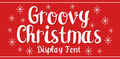 Groovy Christmas is a playful script display font. You can use it for anything ranging from t-shirts, book designs, and greeting cards to stickers and posters, or anything that needs a casual touch. If you want to use it for Christmas or Valentine themed designs, it will be your perfect font to pick. Fall in love with its incredibly versatile style, and use it to create lovely designs!
 - STROKIN by AdultHumanMale,
$15.00 STROKIN is an inky, messy, Omnicase display font. It’s part charcoal part paint strokes, reversed in lighter tones it looks like chalk, add a splash a red and it starts to look like blood. It has over 250 glyphs including all those extra pesky foreign features. OpenType coded, It has various letter pairings that interlock automatically to create a more randomized, bespoke feel to your copy. Hope you like it.
 - Artigo by Nova Type Foundry,
$42.00 Artigo is an old style inspired typeface system for text. It was inspired by the handwriting aspect of the first roman types but it intends to be a contemporary interpretation. Its abilities are in small text with personality. The italics capture a lot of its dynamic feeling even more expressive on the display version that stands as the most handwritten one. It gives text a lot of personality and great readability.
 - Yefimov Sans by ParaType,
$30.00 Yefimov Sans is a sans companion for Yefimov Serif . It is one of the last original faces by Vladimir Yefimov. It has contemporary design, squarish shapes of the round letters and legible proportions. Thanks to open aperture, it works well in small point sizes, and its distinctive letterforms make it good also for display purposes. The typeface was completed by Maria Selezeneva and Alexandra Korolkova. Released by ParaType in 2015.