10,000 search results
(0.034 seconds)
- Linotype Aroma by Linotype,
$29.99From the designer, Tim Ahrens... I started designing this typeface about half a year after learning that Frutiger was not a new brand of sweets and that Garamond is not the name of a fragrance. In time it became clear that designing a sans serif must always be considered as a transformation of traditional serifed typefaces instead of deriving it from typefaces that have been derived from others which have been derived from others again. I did not want Aroma to be one of those odourless and tasteless typefaces wich sacrifice a natural feeling and the characteristic shapes of the letters to neutrality. I think that beauty often evolves unintentionally. For example, I am fascinated by the beauty of airfoils, which are actually a careful transformation of a bird's wing. I love their anorganic and abstract shape which still bears the essence and all the complexity of what they are modelled on. This is exactly the formal concept behind Aroma. Many of the outlines are actually parabolics. The small r, for example, consists exclusively of straight lines and parabolics. I decided to give Aroma more stroke contrast than it is usual for sans serif designs. Many strokes are slightly convex, which gives the font an anorganic feeling. The font was intended to have a feel similar to the antiqua. More specifically, it is based on Old Style Faces. The character of those fonts, which were cut during the Renaissance, is still inherent to Aroma. - Senlot Didone by insigne,
$35.00 Senlot Didone enchants with this fresh and cutting-edge sequel. It’s a modern interpretation of Senlot that says glamor and seduction. The typeface adds to the original high contrast sans serif with it’s modern high contrast shape, and features a new beauty with the distinctive sinuosity of contrasting forms. Senlot Didone is the sleek, serifed, high contrast follow-up to Senlot, and it's low contrast sequel, Senlot Sans. A serif typeface suitable for text and display work joined in 2019. Senlot Didone includes a wide range of OpenType features, including titling capitals, superscripts and subscripts, and oldstyle figures. Senlot Didone is composed of 3 widths: Condensed, Normal, and Extended, with 9 weights and their italics for a total of 54 fonts with more than 800 glyphs. Senlot Didone is a great display typeface for logos, branding, packaging, and advertising. With its broad palate of options, the font covers over 72 Latin-based languages. Dress your text in any of nine separate styles from Thin to Bold. With Senlot Didone, there's no need to compromise on another font with fewer features. Simple, elegant, and versatile, Senlot Didone now makes perfect more possible. Take the show by storm with this high contrast serif. The seductive figure of Senlot Didone is here to entice your viewer.
 - Windgard by Runsell Type,
$17.00 Introducing Windgard - A Clean Brush Script Windgard inspired by hand lettering brush style that moves in clean, make with perfectly horizontal vertical bezier handles. Each glyph has its own uniqueness and when meeting with others will provide a dynamic and playfully. Alternate characters has 6 set (Contextual Alternates, Stylistic Alternates, and ss01-ss04). In addition to the purposes of logotype Windgard Font can also be applied in the esport logo, sticker, apparel, bag, magazine, website headlines, packaging, branding, quotes, business cards, and more. We hope this can make inspire for your work.
 - Dunk City by Epiclinez,
$18.00 Bring the street to your design projects with this cool brush typeface. Dunk City is a hand brush font that's perfect for poster, branding, and packaging. With a graffiti-style calligraphy feel, its letters feature a unique style to your designs. The subtle imperfections are designed to make the typeface more lively: it's the key to opening a whole new world of brushwork. So what’s included : Basic Latin Uppercase and Lowercase Numbers, symbols, and punctuations Multilingual Support. PUA Encoded and fully accessible without additional design software Simple Installations works on PC & Mac Thank You!
 - Silent Movies JNL by Jeff Levine,
$29.00 An ad in the Oct. 27, 1919 issue of the trade magazine “The Moving Picture World” promoted “Princess Virtue” from Bluebird Pictures starring Mae Murray – The Adorable [as noted by the movie studio in the ad]. The Art Nouveau hand lettering emulated the style usually drawn with a round nib pen, but was given a specialized treatment for the ad. It was re-drawn in a more traditional ‘pen nib’ look for digital revival. The end result is Silent Movies JNL, which is available in both regular and oblique versions.
 - Freibeuter NR by Otto Maurer,
$23.00 FREIBEUTER NR is a typical Western font but this is based on a FAMOUS Motorcycle Club from the television that everyone knows. The word FREIBEUTER is the German version of pirate. FREIBEUTER did in earlier times what pirates do, but they do it with the government togetherness. NR stands for NIEDERRHEIN, this is the area where I live and work. The PATCH Version is the best way to make fast a nice Banner or Patch with this font. You can use the WrapTEXT tool in Illustrator or Photoshop to wrap the banner in al forms!
 - Luazerva by Ilhamtaro,
$14.00 LUAZERVA is a font that is quite unique because the base is a classic serif font with the Victorian genre, why is it unique, because this font has a characteristic that is broken and loses the thin body of the letter itself, so besides being unique this font also has a rather difficult readability. So this font is really a display font that is not suitable for making long text. To enable the OpenType Stylistic alternates, you need a program that supports OpenType features such as Adobe Illustrator CS, Adobe Indesign & CorelDraw X6-X7. Cheers!
 - Blanquotey by Sartstudio,
$10.00 Blanquotey is a simple and modern font. Whether it�s for web, print, moving images or anything else � Blanquotey will look spectacular. This font is very suitable for the needs of branding, logos, technology themes and others. very easy to use and can be installed on any graphics software such as Adobe illustrator, photoshop, Microsoft Office and others. Works on PC & Mac Simple installation Can be accessed in Adobe Illustrator, Adobe Photoshop, Adobe InDesign, and even works in Microsoft Word. Long-term support, Can be accessed completely without additional design software.
 - Cinnabar Brush by Hanoded,
$15.00 Cinnabar Brush is a font named after a mineral - mercury sulfide to be precise. I quite like the name and the color, so naming a font after it made sense. Cinnabar Brush is a very bold, very outspoken brush font. It is all caps, but upper and lower case glyphs differ and can be mixed. It is a bit on the heavy side, so I wouldn't set a text in it. Use Cinnabar Brush for posters, book covers, T-shirts and the like. Comes with a mother lode of diacritics.
 - Crazy Fever by PizzaDude.dk,
$18.00 Is it snow? Is it water? Is it slime? Is it from this earth? The questions are many - one thing is certain - with this font you can create cool effects by mixing the layers - and in the end, you decide whether the result is going to be scary, delicious or somewhere in between! Use the different layers and your favourite color scheme and just type ahead - the contextual alternates (with 4 different versions of each letter) automatically cycles the letters and make your text look more lively - or maybe even scary!
 - Cirque by Matt Frost,
$25.00 Cirque is a lively Western/Circus/Victorian/Whatever font—it'll fit in wherever you want to stick it to old Tschichold and make something cool instead. Mix up caps and lower case for curious results. To see more check out the Frost Foundry page at http://facebook.com/frostfoundry
 - Raggedy by Mircea Boboc,
$19.00 Raggedy is a contemporary and lively font that exudes a notably impactful presence. What distinguishes it is the dynamic motion effect created through variations in rhythm, lengths, and lettering. This font proves especially beneficial for logo designers, urban musicians, and any projects embracing rebellion and avant-garde concepts.
 - Vintersjov by Bogstav,
$16.00 Here's my tall and thin and brand new winter font ("Vintersjov is "winter fun" in danish) A super legible and fun font, suitable for things that have got to do with winter. But also spring, summer and fall - in fact mostly anything that needs a lively and handmade look!
 - Geis by Galapagos,
$39.00In 1978 I went to work at Mergenthaler as a letter drawer. Being an inquisitive sort I decided that I should take a stab at this type design 'stuff'. I drew 25 or 30 glyphs before the work found its way to a high shelf in a dark corner of my apartment. Just 23 years later I found the drawings on a different shelf, in a different home, in a different city and decided to finish what I had started. I'm still trying to deal with my predisposition toward procrastination but I've finished the font. The name of the font is the last name of somebody I played softball with before I moved to Beantown. Ronnie Geis was one of the courageous firefighters we lost on September 11th when the WTC collapsed. - ITC Cyberkugel by ITC,
$29.99ITC Cyberkugel is the work of British designer Timothy Donaldson, who occasionally likes to write with an extra-fine ballpoint pen. I like the spindly scrawny forms that it gives me when I follow all the usual 'italic' writing conventions", he says. And there lie the origins of ITC Cyberkugel, although the creative process was moved from pen and paper to software and a Wacom tablet. "I like the fact that people will be buying it to give them a 'human', 'organic', 'non-digital' look, and yet no ink has soiled paper. Although the movements of the hand are still the essence, the whole thing was created in cyberspace." The name comes from combining cyberspace and Kugelschreiber, the German word for ballpoint pen. ITC Cyberkugel is a fresh interpretation of traditional calligraphy." - Bronzo by XO Type Co,
$39.00 This is a 2023 redesign of Bronzo, originally designed by Rick Valicenti and Mouli Marur in 1991. With this redesign, Bronzo now has 6 new weights, for a total of 9, and 587 more glyphs than it was able to in 1991. Bronzo appears to move forward, yet remain still, via a center stroke that only sticks out on the left, a tense curve that only happens on the right, and a width that sits uncomfortably between square and rectangle. Those three things, combined with a balanced light to dark ratio, are what makes Bronzo appear tense and ready. Bronzo accepts Modernist ideals of minimal, rational construction—but it also adopts luxuriant shapes over Modernism’s sandblasted neutrality. It’s almost an alternate reality, a “what if?” of Modernism. Modernism’s fun, interesting, cute reboot.
 - Pounder by CozyFonts,
$20.00 Pounder Fonts were designed by Tom Nikosey / CozyFonts Foundry. This font, as all my fonts started with pencil sketches based on the letter O. Once I arrived at the comfortable shape I worked out the C, G, & Q. The H, M, T matched the visual weight and so I moved on to E & S. As the E & S are 2 of the most repeated characters in fonts' I wanted a little bit extra here. The font is obviously heavy weighted yet very legible and almost architectural in presence. There are flashes of Art Deco yet futuristic style. After sketching the feel of this font I was excited by the possibility of the numerals styling. I can see these used for many applications. Why the title Pounder? Why not it seems to fit.
 - CA Normal by Cape Arcona Type Foundry,
$40.00 CA Normal is a typeface aiming for beauty without ostensible effects, merely relying on clarity and well balanced proportions. True beauty is not to be found in perfect geometry, so slight irregularities and inconsequences are spread throughout the typographic image. That’s perfection through imperfection. CA Normal merges influences from European grotesques and American gothics, breeding an experimental mongrel. The underlying concept stays in the background, giving the design a great self-evidence. Although it is doubtful if there can be such thing as neutrality, CA Normal comes pretty close to what people mean when speaking of a neutral font. Nevertheless it’s not faceless, anonymous or confound able. It’s just that the charm comes from subtle details rather than obvious design features. As good text typefaces must not be too smooth nor too agitated, CA Normal is smuggling little uneven details into the typographic image, that keep the readers eye awake. The well crafted oblique follows the grotesque tradition which knows no individually drawn italics. A rather unexpected addition is the reverse oblique, a style mainly used for maps. Under the classic surface lies a modern well equipped font, featuring small caps, a Central European character set and numerals in all kinds of flavors. Numerous ligatures round up the overall impression. By default CA Normal will set numbers as proportional lining figures. But if you prefer oldstyle figures, or tabular figures, just use the OpenType functions of your layout program. These allow access to the small caps as well, which feature a complete central European character set, brackets, punctuation and lining figures in small caps height.
 - Sachiko - Personal use only

- Acid Green by The Flying Type,
$26.00 Acid Green has quite a psychedelic flair, but its origins are from long before the sixties psychedelia. Its roots date back to 1914, from an unnamed alphabet by J.M. Bergling, the amazing jewelry engraver and 'letterform inventor'—as he considered himself—whose books of art alphabets and lettering influenced countless artists, including, not surprisingly, those involved with the genesis of Art Nouveau and Art Deco movements. Perfect for multiple display uses, including retro designs and trippy letterings, Acid Green has an extensive character set, with multilingual support covering 208 languages. There are yet some handy stylistic alternatives for some extra grooviness. Acid Green is somewhat retro looking, for sure, but it can sound perfectly contemporary too. Tune in and enjoy a creative trip! [Pizza illustration on the first graphic by our neighbor @pedrocorrea84]
 - Genau by Aronetiv,
$9.99 The Genau family is a geometric sans serif designed under the influence of the constructivist schools of Vkhutemas and Bauhaus. Despite the traditional shapes, the family has characteristic features in the modern outline. The sharp junction of round and straight strokes repeats the sharp tails in “a” “d” “n” “u” and other. The family has an even, smooth texture. The family has been developed to advert materials for architecture, design, education, modern art. The family has high readability in a small size, and doesn't lose aesthetic qualities when enlarged. The font family contains 8 styles The font is equipped with a Variable file with two axes (weight and slope) Supports languages of central Europe and some languages of eastern Europe Contains small uppercase letters Contains tabular figures There are several alternates in the font The font has more than 1700 kerning pairs
 - FS Sophie by Fontsmith,
$50.00 Slinky Chic, svelte and slinky, FS Sophie was inspired by and designed in partnership with ATTIK UK. With clean lines, simple, elegant curves and dynamic forms, it brings a feminine sophistication to text and headlines in publishing and advertising. Kinky FS Sophie’s engaging simplicity arises from its construction, using a modular set of core, rounded shapes and straight strokes, drawn and then repeated to create letterforms. An extra technical detail of occasional, short 45-degree diagonals adds a distinctive little kink to Sophie’s cool exterior. Alchemy By some kind of typographic alchemy, the combination of simple curves and lines with unexpected twists to the shapes of characters creates an unusually spirited and lively design in all three weights and their italic sets. Born for the spotlight, FS Sophie is a natural for big headlines, pull quotes and other high-profile text elements.
 - Balmecia by IbraCreative,
$17.00 Balmecia – A Tall Display Serif Typeface Balmecia is a distinguished tall display serif typeface that exudes a timeless elegance and sophistication. With its tall and slender letterforms, Balmecia commands attention and lends a touch of grace to any design it graces. The carefully crafted serifs add a classic flair, while the generous letter spacing ensures optimal legibility even in larger sizes. Balmecia’s vertical proportions create a sense of stateliness, making it an ideal choice for headings, titles, and other display applications where a touch of refinement is desired. This typeface seamlessly blends tradition with a modern aesthetic, offering a unique personality that captures the essence of both vintage and contemporary design sensibilities. Balmecia is perfect for branding projects, logo, wedding designs, social media posts, advertisements, product packaging, product designs, label, photography, watermark, invitation, stationery, game, fashion and any projects. Fonts include multilingual support for; Afrikaans, Albanian, Czech, Danish, Dutch, English, Estonian, Finnish, French, German, Hungarian, Italian, Latvian, Lithuanian, Norwegian, Polish, Portuguese, Slovak, Slovenian, Spanish, Swedish. **Uppercase
 - Velino Text by DSType,
$55.00 Velino is the most recent of our premium typefaces. The serif version comes in two packages with three widths: Velino, Velino Condensed, and Velino Compressed. The display package contains high-contrast typefaces, with a modern flair—very feminine but with plenty of character, especially designed for fine print in big text sizes. The text package was designed for any running text. Its proportions and colors make it the ideal for text, even in very difficult conditions such as newspaper printing. We also designed the perfect companion to this enormous type system: Velino Poster, a slab serif typeface with only one weight and its respective italic, but with plenty of muscle, for every time some extra strength is needed, such as setting very big text, magazine covers or newspapers’ special sections. Finally, we designed Velino Sans and Velino Sans Condensed to perfectly match the weight and proportions of Velino, all with matching italics.
 - Kapture by Stiggy & Sands,
$39.00 There are script typefaces that embody sensuality, and our Kapture typeface is now amongst that collection. From its thin weighting to its effortlessly flowing strokes, and a visual rhythm between quick and slow movements, Kapture truly captures a romance in letterforms. Stylistic Alternates offer a change-up set of Capitals, while the Contextual Alternates feature plays with intro and final lowercase letterforms to visually mix things up a bit. Elegant, fashionable, sophisticated, sensual, and celebratory all at once. Kapture is a typestyle that finds itself at home in any design where a refined yet modern script is required. Kapture is loaded with features to give you plenty of customization options: - Stylistic Alternates for a collection of alternate Capitals - Contextual Alternates for alternate starting and ending lowercase letters - 110 Ligatures to make typesetting more dynamic - Ornaments to place before and after words or phrases for even more flair - A Full set of Inferiors and Superiors for Limitless Fractions - Proportional and Oldstyle numeral sets
 - Paukalani by IbraCreative,
$17.00 Paukalani – A classy Rounded Serif Typeface Paukalani, a sophisticated rounded serif typeface, effortlessly blends elegance with modern design. Its graceful curves and subtle serifs contribute to a timeless aesthetic, embodying a perfect balance between tradition and contemporary flair. The rounded edges of each character soften the overall appearance, creating a warm and inviting typographic experience. Paukalani’s meticulously crafted letterforms exude a sense of refinement, making it an ideal choice for projects that demand a touch of class and versatility. Whether used in print or digital media, Paukalani stands as a testament to the harmonious fusion of classic serif elements and a sleek, rounded demeanor, offering a distinctive and captivating visual identity to any design. Paukalani is perfect for branding projects, logo, wedding designs, social media posts, advertisements, product packaging, product designs, label, photography, watermark, invitation, stationery, game, fashion and any projects. Fonts include multilingual support for; Afrikaans, Albanian, Czech, Danish, Dutch, English, Estonian, Finnish, French, German, Hungarian, Italian, Latvian, Lithuanian, Norwegian, Polish, Portuguese, Slovak, Slovenian, Spanish, Swedish.
 - Didonesque Script by Monotype,
$25.99 Didonesque Script has the flair of a script typeface, yet retains the rigid structure and incline of its cousins in the Didonesque family. This makes for an interesting approach – the flamboyancy of this script is restrained which resonates a distinctly reserved and formal tone. This typeface is perfect for formal occasions, with its main intent for use in short runs of text, headlines, branding and logo applications. Open Type features are utilized to good effect – positional forms, contextual alternates, ligatures, stylistic alternates, and old style figures all add value to Didonesque Script. There are four weights, from delicate to voluptuous (Regular, Medium, Bold, and Black), which are replicated in “Display” versions – these are designed for use at larger point sizes. Key features: • 4 weights in two styles – Regular and Display • Positional Forms (when activated) ensure the correct glyphs appear in context as you type • Full European character set (Latin only) • 550+ glyphs per font.
 - Silentina by Typodermic,
$11.95 Silent films evoke a sense of nostalgia that is as timeless as the era itself. While the stars of silent cinema may have faded into the past, their influence is still felt in modern-day art, fashion, and design. Silentina is a typeface that embodies the spirit of the silent film era, inspired by the intertitles that were used to convey crucial information to audiences during these films. Buster Keaton, Mary Pickford, Clara Bow, and Rudolph Valentino all graced the silver screen with their emotive faces during the silent film era. These icons used their expressions to convey a range of emotions that captivated audiences and made them fall in love with the magic of cinema. Intertitles, the brief messages that would appear on-screen during the film, were just as essential in conveying information to moviegoers. Silentina is a typeface that pays homage to the unsung heroes of the silent film era—the intertitles. It channels the glitz and glamour of the roaring twenties, taking us back to a time of flapper dresses, jazz music, and speakeasies. But Silentina isn’t just a typeface—it’s a portal to another era. It transports us to a time when movies were an escape from reality, and each trip to the cinema was a chance to lose ourselves in a world of adventure and romance. With Silentina, you can project your message in the same way that the stars of silent cinema projected theirs. This typeface captures the essence of a bygone era, bringing it to life in the modern world. Use it to convey plot information, set the scene, or add a touch of vintage charm to your design. Whatever your message, Silentina will help you communicate it in the same glitzy way as the intertitles of the silent film era. Most Latin-based European writing systems are supported, including the following languages. Afaan Oromo, Afar, Afrikaans, Albanian, Alsatian, Aromanian, Aymara, Bashkir (Latin), Basque, Belarusian (Latin), Bemba, Bikol, Bosnian, Breton, Cape Verdean, Creole, Catalan, Cebuano, Chamorro, Chavacano, Chichewa, Crimean Tatar (Latin), Croatian, Czech, Danish, Dawan, Dholuo, Dutch, English, Estonian, Faroese, Fijian, Filipino, Finnish, French, Frisian, Friulian, Gagauz (Latin), Galician, Ganda, Genoese, German, Greenlandic, Guadeloupean Creole, Haitian Creole, Hawaiian, Hiligaynon, Hungarian, Icelandic, Ilocano, Indonesian, Irish, Italian, Jamaican, Kaqchikel, Karakalpak (Latin), Kashubian, Kikongo, Kinyarwanda, Kirundi, Kurdish (Latin), Latvian, Lithuanian, Lombard, Low Saxon, Luxembourgish, Maasai, Makhuwa, Malay, Maltese, Māori, Moldovan, Montenegrin, Ndebele, Neapolitan, Norwegian, Novial, Occitan, Ossetian (Latin), Papiamento, Piedmontese, Polish, Portuguese, Quechua, Rarotongan, Romanian, Romansh, Sami, Sango, Saramaccan, Sardinian, Scottish Gaelic, Serbian (Latin), Shona, Sicilian, Silesian, Slovak, Slovenian, Somali, Sorbian, Sotho, Spanish, Swahili, Swazi, Swedish, Tagalog, Tahitian, Tetum, Tongan, Tshiluba, Tsonga, Tswana, Tumbuka, Turkish, Turkmen (Latin), Tuvaluan, Uzbek (Latin), Venetian, Vepsian, Võro, Walloon, Waray-Waray, Wayuu, Welsh, Wolof, Xhosa, Yapese, Zapotec Zulu and Zuni.
 - Arta Machine by Wacaksara co,
$12.00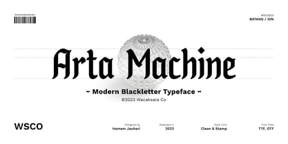 Introducing "Arta Machine" font, a modern blackletter typeface that skillfully combines classic elegance with contemporary flair. This versatile font family offers two unique styles: 'clean' for a sleek and refined appearance, and 'stamp' for a bold and rugged aesthetic. This font is perfect for use as poster designs, branding, logos, apparel, cards, packaging, quote, web, headline, tattoo, or other design needs. Features : Multilanguage Alternates PUA Encoded Ligatures Thank you.
 - ChefScript by Andinistas,
$79.95 Chef Script is an experimental font designed by Carlos Fabian Camargo G. Its fantasy design contains 1463 glyphs to compose words, phrases and short messages on small and large sizes. The idea was born in a sketchbook that was perfected again by hand and achieving "non-neutral drawings" on tracing paper. With bezier digitization the empty and full parts of letters appeared with soft and eloquent curves as calligraphic result produces optimal readability. Chef Script combines warmth and good humor running in countless design applications such as labels and base plates, covers, posters, movie titles, seals and any printed design that needs an unusual typographic tool. In that sense, Chef Script is influenced by Speedball lettering manual (1957), Ross F. George. The illustrative nature of "ChefScript-complete" does not look anything like the traditional type design hierarchies. Therefore offers 7 hierarchical resource groups to design comfortable contexts flavored with illustration and typography: • ChefScript-Basic: Letters with horizontal and vertical thrifty proportions mimic an uninterrupted calligraphy brush made with flat tip. Thus its letters have ascenders and descenders strokes perpendicular to its base line and equal to the height of the lowercase. • ChefScript-Swashes: Letters expressive and unique flourishes to design highlighted words or phrases. • ChefScript-Caps: Uppercase with lowercase height give the impression of interrupted uppercase italics writing within what is written with uninterrupted lowercase letters producing strong contrast within a paragraph fragment. • ChefScript-Containers: Container drawings designed to exchange with infinite possibilities each order so that its inferior serve to store information written or drawn. • ChefScript-Dingbats: Pictograms that communicate: kitchen, chef, restaurant, food, etc. • ChefScript-Numbers: Bulky and useful numbers to highlight prices or figures containing points or dollar signs. • Chef Script-Words: Predesigned words with uninterrupted letters diagonally leveled highlighting various thoughts in writing.
 - Phantom Isles by Wing's Art Studio,
$26.00 The Phantom Isles: Retro Tiki Font A Textured Retro Font Inspired by Tropical Tiki Style and South Sea Adventures! The Phantom Isles is a hand-drawn font inspired by 1950s Tiki culture, tales of exotic locations and south sea adventures. It features the textured look of weathered wood and is the perfect choice for book covers, movie titles, theme parks or vintage themed events. The font includes a complete set of uppercase and lowercase characters, along with numbers, punctuation, symbols and language support. You’ll also find a set of specially illustrated underlines, shapes and icons including flora and fauna, old rope, skulls and more. A Brief History of Tiki Culture Originating from Māori mythology, a tiki is a wooden or stone carving that represents deified ancestors found in most Polynesian cultures. The mainstream and commercialised Tiki Culture that became popular across America from the 1930s to 50s was inspired by the sentimental appeal of an idealised South Pacific, particularly Hawaii, as viewed through the experiences of those who had visited such areas during World War II and cinematic depictions of beautiful scenery, forbidden love and the potential for danger. Over time it selectively incorporated more cultural elements of other regions that affected Polynesia, such as Southeast Asia. The Americanised form of Tiki Culture maintains a dedicated following today, particularly among those interested in 1950s graphic and interior design, history and the escapist lounge aesthetic it inspires. Learn more about the history of Tiki and Polynesian culture.
 - Neospace Exp - Personal use only

- Mauritz Caps by Mans Greback,
$59.00 Mauritz Caps is a brush script typeface. A lively uppercase graffiti-style lettering fonts, Mauritz Caps was drawn and created by Mans Greback in 2021 to be the ultimate set of wild-style handwritings for logotypes and branding. This calligraphy family consists of five high-quality fonts in a variety of weights: Mauritz Caps Thin, Light, Regular and Bold. The font is built with advanced OpenType functionality and has a guaranteed top-notch quality, containing stylistic and contextual alternates, ligatures and more features; all to give you full control and customizability. It has extensive lingual support, covering all Latin-based languages, from North Europe to South Africa, from America to South-East Asia. It contains all characters and symbols you'll ever need, including all punctuation and numbers.
 - My Darling by Type Innovations,
$39.00 ‘My Darling’ is a stunning new typeface by Alex Kaczun. Inspired by the Didone shapes, ‘My Darling’ incorporates some Didot, a little Caslon, a splash of Scotch and a pinch of old Times. This unique display, with its high-contrast strokes is playful, formal and just a bit ‘sexy’. The swash capital terminals and lively curves, give this design a unique and distinctive look. It works well as a headline font, and because it was designed with generous counters, proportions and spacing—works equally well over a large range of text point sizes. My Darlings' character set supports most Central European and many Eastern European languages. Alex hopes to add many style variations, along with alternate glyph sets and weights to further enhance this offering. Stay tuned!
 - Bisco Condensed by Galapagos,
$39.00Bisco Condensed is a small capital design inspired by hand lettered memorial wall art from the Harlem section of New York City. As a memorial, this design is dedicated to a type design colleague who lost his long battle with cancer. This font is a tribute to his strength and his liveliness. The original idea for Bisco Condensed was to capture the energy of those unique "streetforms" in a text/display design and encapsulate them into a lively & fluid type design with a high level of readability at all point sizes. Bisco Condensed is an excellent type for expressive display layouts. It works well as an independent design or a long with contemporary sans serifs that complement Bisco's irregular contours, weighting and bounce. - Aguas Frescas by Chank,
$99.00 The Aguas Frescas font family is an outline, hand-drawn display typestyle that reflects script handwriting with a lively, whimsical twist. It is a flowery little font that dances across headlines with a happy and likable good-natured attitude and a lyrical lilt. For extra OpenType tastiness, there are alternate versions of all the lowercase glyphs and a Contextual Alternates feature to make the letters flow together more smoothly and look more natural and handmade. And if you want to kick it up one notch further, you can combine the outline font Horchata with its “aguas frescas” companion font Tamarindo which is the solid, filled-in version of this font. Duplicate your text in overlapping layers of the two fonts for an brighter multi-color effect.
 - Chaparral by Adobe,
$35.00Chaparral is the work of type designer Carol Twombly and combines the legibility of slab serif designs popularized in the 19th century with the grace of 16th century roman book lettering. The result is a versatile, hybrid slab-serif design. Unlike ""geometric"" slab serif designs, Chaparral has varying letter proportions that give it an accessible and friendly appearance in all weights from light to bold. And because it is a multiple master typeface with an optical axis (ranging from 7 to 72 points), Chaparral is clear and legible in smaller text settings while remaining subtle and lively at display sizes. Chaparral�s highly functional design is surprisingly beautiful, the perfect choice for correspondence, as well as book, poster and newsletter design. - Transitore by PintassilgoPrints,
$- Transitore is a lively hand-drawn font with loads of alternates and ligatures which, managed by advanced OpenType features, help create a convincing handcrafted look. The contextual alternates feature automagically substitute glyphs, providing a cool random effect, while the discretionary ligatures feature bring on witty interlocks and curly elements. Turn on both and multiply the possibilities! But wait; there's more! This font also brings a handy set of swashes for adding that extra special touch. And yet, there are three supplementary fonts: Transitore Color A and Transitore Color B work as stackable layers for easily adding colors, while Transitore Splashes generate irresistible splashes of ink. This family is a smart and complete toolbox that offers endless ways to style your text compositions. Enjoy!
 - Lab Sans Pro by Vanarchiv,
$25.00 Lab Sans Pro is a geometric sans-serif typeface with a technological and minimalist look and is suitable for use in large sizes. It has eight versatile weights, (from Thin to Black) including true italics for each one, and a wide range of stylish alternate characters to improve its use in different graphic contexts. The name of this typeface was inspired by an experiment, mixing a structure with calligraphic influences and completely geometrical and structured drawings. Lab Sans Pro has a wide range of OpenType® features such as: small caps, old style/titling and small caps figures, fractions, superior and inferior scripts, scientific components and ligatures. Versatile but original, precise but lively, Lab Sans Pro is a carefully crafted technological typeface designed by Tiponautas.
 - Berkin by Craft Supply Co,
$20.00 Berkin – Display Font is a captivating sans-serif typeface that breaks free from monotony with its playful and eye-catching design. Its stems and letterforms carry a dynamic and non-uniform style that instantly grabs attention, making it perfect for display purposes. Berkin’s unique design adds a sense of energy and spontaneity to your projects, ensuring that they stand out in a crowd. Whether you’re creating eye-catching headlines, signage, or branding materials, Berkin injects a distinctive and lively personality. This font is like a burst of creativity in the world of typography, making it an exceptional choice for projects that demand a playful and attention-grabbing aesthetic. Berkin’s playful and non-conformist approach ensures your designs are unforgettable and exude an enthusiastic and dynamic vibe.

