10,000 search results
(0.033 seconds)
- Sonny Gothic Vol 2 by W Type Foundry,
$25.00 Sonny Gothic Vol 2 is an extension of our popular font Sonny Gothic. All corners have been softened to get a friendlier and fluffy visual language. As Sonny Gothic, this typeface has ligatures inspired by the incredible work of Herb Lubalin, chiefly Avant Garde. We designed carefully Sonny’s Vol 2 ligatures, and we also created new ones to control the whites formed between softened characters such as FL, FB, FD, FE, FF, FH, FI, FK, FN, and FR. Developed with powerful OpenType features in mind. Each weight includes alternate characters, ligatures, fractions, special numbers, arrows, extended language support, small caps, and many more. Perfectly suited for graphic design advertising.
 - Mohair Sam NF by Nick's Fonts,
$10.00A collision between some stylin' caps from legendary lettering artist Samuel Welo and a lowercase loosely based on ATF’s Romany Script yields this curious little wonder. Named after a 70s song which averred that all it took to be “the coolest guy what is what am” is to talk fast, walk slow and look good wearing that 'hair. Please note that, due to the exaggerated overhang of the many of the uppercase characters, this font has been optimized for upper- and lowercase uses. Both versions of this font contain the Unicode 1252 (Latin) and Unicode 1250 (Central European) character sets, with localization for Romanian and Moldovan. - Munderic Godas by Ronny Studio,
$99.00 Munderic Godas Font is a cool alternative for you to easily create a logo for your Underground band or whatever. Using alternate front and ending letters brings the font to life, It comes with a basic character set and a small group of symbols and signs often used in the extreme music sector – the classics of Death- and Blackmetal like pentagram drops, roots, spikes and more. How to easily create Death metal & Black Metal logo from font : https://youtu.be/scdtMQUVWXI Features : - All Caps - numbers & punctuation - Alternate - Symbol Ornament - PUA encoded Please contact us if you have any questions. Enjoy Crafting and thanks for supporting us! :) Thank you
 - Alexander The Great by Omotu,
$19.00 BRIGHT LIGHT! A handwritten script brush font, all caps. BRIGHT LIGHT font is suitable for branding, logotype, apparel, T-shirt, Hoodie, product packaging, quotes, flyer, poster, book cover, advertising, etc. Whats Include? Opentype support Multilingual support PUA encoded Features: All uppercase, numerals, punctuations, and ligatures Accessible in the Adobe Illustrator Glyphs panel, or under Stylistic Alternates in the Adobe Photoshop OpenType menu, Adobe InDesign, Corel Draw, even work on Microsoft Word Please message me if you're unsure of any language support. Thanks for looking, and I hope you enjoy it! Please don't hesitate to drop me a message if you have any issues or queries.
 - 52-Kfx by ILOTT-TYPE,
$49.00 Where most fonts are available in varying weights, 52-Kfx is a family consisting of 3 heights; High, Mid and Low. These offer the typographer a full palette, Low is readable for setting copy while at the opposite end High is better suited for display—names, headlines and logotypes. 52-Kfx has a sophisticated and elegant period feel with clean, modern lines that remain relevant for contemporary application. Exaggerated ascenders and descenders of the lowercase and a tall cap-height give it a lofty stature while the low x-height keeps characters grounded. The spacing and lyrical rhythm are perfectly in sync and epitomized by the fluidity seen in the ligatures.
 - Galavant by Atlantic Fonts,
$32.00 Galavant will take you anywhere you want to go! Enjoy three font looks in one; a fun, chunky lower-case, a bold, animated upper-case, and in all-caps with discretionary ligatures turned on, Galavant is tightly interlocking. To explore the interlocking possibilities, turn some ligatures off and others on until you settle on the best combo. There are over 260 two, three, and four-letter ligatures available. Discover interlocking ligatures featuring lower-case "i" along the road as well. In sentence-case, turn discretionary ligatures off, except to add more handmade variation in double-letter pairs and to access a fine "ft". However you roam, Galavant aims to entertain.
 - Blacketor by Courtney Rhodes,
$20.00 Blacketor came about from hand lettering I had done for my own personal use several years ago. It remained unfinished until now. I was going for a more traditional serif font but in the process of play various versions came about while playing with the serifs, in an attempt to be slightly different. Many versions fell to the wayside as I learned more about what didn’t work than what did. What came about was a clean font with large open counters and short ascenders for an easy read. All caps works well for a bold but not shouty statement. A good font for Headlines and callouts as well as logotypes.
 - Sommet Slab by insigne,
$24.99 The Sommet family of typefaces has been updated with a new slab serif variant. Expanding on Sommet's successful design principals, Sommet Slab is there when you need more impact and power. Sommet Slab is available with six weights and complementary italics and plenty of OpenType features. Sommet Slab features a tall x-height, and its letterforms are compact, perfect for when layout space is at a premium. Over twenty OpenType alternate characters are available, including friendlier upright italic forms, and a unique simplified lowercase. Sommet Slab also includes oldstyle figures and small caps. Use Sommet Slab whenever you need a powerful and contemporary slab-serif.
 - Pitch Or Honey by Ana's Fonts,
$15.00 Pitch or Honey is a hand-lettered font trio with matching ornaments and floral elements. It includes: a faux-calligraphy style script font, with a bonus slant version a cute sans serif font, in roughly the same height as the lowercase script a tall, all-caps sans serif font, in roughly the same height as the uppercase script a set of 52 floral elements, with a bonus filled-in version a set of 52 ornamental swashes All you need for beautiful and easy designs with a hand-lettered, rustic feel, such as postcards and notes, creating logotypes, social media posts, branding and packaging, etc.
 - Grok by PintassilgoPrints,
$20.00 Bold as love, Grok is a hand-drawn typeface, assertive but soft. Showy and friendly. It's an all caps font with 2 choices for each letter, accessible via keyboard upper and lower case slots. For that handcrafted look, you know. Turn on the contextual alternates feature to automatically alternate these. Grok originally comes in two cuts: bold and… less-bold :) Later the outline style was added as a gift, a free font. And finally, there's yet a nifty picture font with dozens of dingbats to beautify your words every now and then. Perfectly suited for display uses: packaging, signage, web titlings, editorial design, book covers – and not-only-covers. Grok it?
 - Sore by Omotu,
$18.00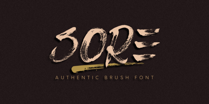 Sore is an authentic brush font, real brush texture. All caps characters. Sore is suitable for branding, logotype, apparel, T-shirts, Hoodies, product packaging, quotes, flyer, poster, advertising and more. Whats Include? 1. Uppercase and lowercase characters 2. Multilingual support. 3. Numerals, punctuations, alternate, and ligatures 4. Accessible in the Adobe Illustrator Glyphs panel, or under Stylistic Alternates in the Adobe Photoshop OpenType menu, Adobe InDesign, Corel Draw, even work on Microsoft Word. Please message me if you're unsure of any language support. Thanks for looking, and I hope you enjoy it! Please don't hesitate to drop me a message if you have any issues or queries. Omotu Studio
 - Dynamique by PizzaDude.dk,
$15.00 I wouldn't recommend that you use this font for massive text, or text written in CAPS ... but then again, go ahead and try - I even kerned all the capital letters ... just in case that you would do something so crazy! :) Dynamique is a kind of a "straight out of the highway" grid-font. But then again, not ... if you use the lowercase alone, you have this almost monospaced font - try starting every word with a capital letter, and let it end with the alternate ligature, your words suddenly got even more power! If you want to go lightspeed - then use the same technique, but only with the italic version!
 - Dreamfire by Ronny Studio,
$69.00 Dreamfire Font is a cool alternative for you to easily create a logo for your Underground band or whatever. Using alternate front and ending letters brings the font to life, It comes with a basic character set and a small group of symbols and signs often used in the extreme music sector – the classics of Death- and Blackmetal like pentagram drops, roots, spikes and more. How to easily create Death metal & Black Metal logo from font : https://youtu.be/NBYIjcMmEb4 Features : - All Caps - numbers & punctuation - Alternate - Symbol Ornament - PUA encoded Please contact us if you have any questions. Enjoy Crafting and thanks for supporting us! :) Thank you
 - Varese by Tarallo Design,
$18.99 Varese is a geometric and modular typeface inspired by early 1900s Art Deco posters. Its heavy weight is excellent for headlines, display, or large body text. The lowercase is similar to the uppercase, yet many of the lowercase letters have interior spaces and several have some variations on the form (see H/h, E/e, F/f, I/i, J/j, L/l, N/n, T/t). The lowercase also has two alternate glyph sets that are half size and align with cap height. One of the alternate glyph sets has an underline and the other set does not. Varese has a sibling, Varese Soft.
 - Aclonica Pro by Stiggy & Sands,
$29.00 Our Aclonica Pro is a strong and modern sans serif typeface with a slight deco/techno essence to it. Clean letterforms and a generous x-height lend to a friendlier feel and easily legible typestyle, while signature swoops and angular tapering stems exude a subtle sensual nature. The SmallCaps and extensive figure sets not only expand the usefulness of the typeface across a wider gamut, but also convey a more serious tone when needed. Opentype features include: - SmallCaps. - Full set of Inferiors and Superiors for limitless fractions. - Tabular, Proportional, and Oldstyle figure sets (along with SmallCaps versions of the figures). - Stylistic Alternates for Caps to SmallCaps conversion.
 - Macha by Positype,
$16.00 Macha shares the same DNA as its sibling Anago, but is a completely different species than the former or any of my other sans serifs (Aaux Next, Air, Akagi Pro or Wasabi). It's no-nonsense construction bears many influences from Gill Sans and Frutiger while stubbornly blending my own humanist touch. The focus on developing Macha was just to get to the point with each letterform and discard the rest. Macha takes a little but gives a lot. A fully-loaded character set includes: Small Caps, Proportional Lining and Oldstyle Numerals, Tabular Lining and Oldstyle Numerals, Fractions, Ordinals, Inferiors, Superiors, Stylistic Alternates, Ligatures, Case-sensitive, and more.
 - 1621 GLC Pilgrims by GLC,
$30.00 This font was created with inspiration from the wood blocks carved for chapbooks, posters, calendars or newspaper in the late 1500’s and early 1600’s. We have tried to keep their innocence and rough style. It has been conceived as an homage to the “Pilgrim fathers” landing in Plymouth Bay in 1620 and celebrating the first Thanksgiving with Native Indians in autumn, 1621. The font, consisting of two English capital alphabets (so, without any accented characters): Initials and caps, and a lot of separate figures added, is especially improved by strong enlargments, 72 pts and more, and has very good results when printed.
 - Righteous Pro by Stiggy & Sands,
$29.00 Our Righteous Pro was inspired by the all-capital letterforms from the deco posters of Hungarian artist Robert Berény for Modiano. Grid based and geometric in execution, the font is highly readable at a wide range of point sizes, ideal for display and print. Unlike that of its original inspiration source, Righteous has both a full lowercase and a SmallCaps set as well as an extensive figures set to increase flexibility and ease of use. Opentype features include: - SmallCaps. - Full set of Inferiors and Superiors for limitless fractions. - Tabular, Proportional, and Oldstyle figure sets (along with SmallCaps versions of the figures). - Stylistic Alternates for Caps to SmallCaps conversion.
 - Atlantic Sans by URW Type Foundry,
$39.99 The original plan for Atlantic was to design a typeface in the Venetian syle of the Renaissance, with handwriting character and large ascenders. There is a wave-rolling unevenness in both the x- and cap-height caused by the strong ductus pointing to the upper right, together with heavily curved serifs, resulting in a very lively image of text on a page. Atlantic ? its name reflects the ocean, ships, carriers and loads, tourism and so on. These are the themes Atlantic is best suited for. The extended family includes a serif, a sans, and a special variant ? a SeaWashed. Atlantic was designed for the URW++ SelecType collection.
 - Coconut Leaves by Omotu,
$16.00 COCONUT LEAVES! A handwritten display brush font, all caps. Coconut Leaves font is suitable for branding, logotype, apparel, T-shirt, Hoodie, product packaging, quotes, flyer, poster, book cover, advertising, etc. Whats Include? Opentype support Multilingual support PUA encoded Features: All uppercase, numerals, punctuations, and ligatures Accessible in the Adobe Illustrator Glyphs panel, or under Stylistic Alternates in the Adobe Photoshop OpenType menu, Adobe InDesign, Corel Draw, even work on Microsoft Word Please message me if you're unsure of any language support. Thanks for looking, and I hope you enjoy it! Please don't hesitate to drop me a message if you have any issues or queries.
 - Punkaholic by Sharkshock,
$115.00 Punkaholic started out as a loopy, all caps display font with a semi condensed feel. Before completion some of the letters such as A and W were given a more traditional look and were penciled in for alternates. In the end, however, they were added as uppercase characters instead. For this reason most words in lowercase vary in appearance from their uppercase counterparts. This dichotomy between straight lined capitals and rounded ones makes for some interesting contrasts. Punkaholic works best in less formal settings such as café menus, t-shirts, or children’s publications. It comes in 3 styles and contains Latin, extended Latin, punctuation, and kerning.
 - Nauman Neue by The Northern Block,
$39.95 Nauman Neue is a modern humanist sans serif typeface made for the screen. Broad open letter forms are combined with precise geometry to create a functional and legible font that’s ideal for web and on-screen applications. In 2021 Nauman was expanded to sixty styles, including two helpful widths condensed and semi-condensed. Included in the font are 900 characters per style, ten weights and three widths with matching italics. Opentype features consist of seven numerals variations, including inferiors, superiors, fractions, tabular, lining, and old style. It also has alternate lowercase a, e, I, M, small caps, arrows and language support covering Western, South, Central Europe and Vietnamese.
 - Atlantic Serif by URW Type Foundry,
$39.99 The original plan for Atlantic was to design a typeface in the Venetian syle of the Renaissance, with handwriting character and large ascenders. There is a wave-rolling unevenness in both the x- and cap-height caused by the strong ductus pointing to the upper right, together with heavily curved serifs, resulting in a very lively image of text on a page. Atlantic ? its name reflects the ocean, ships, carriers and loads, tourism and so on. These are the themes Atlantic is best suited for. The extended family includes a serif, a sans, and a special variant ? a SeaWashed. More? Atlantic was designed for the URW++ SelecType collection.
 - Pressroom by Three Islands Press,
$24.00Pressroom is a modern "legibility face," designed to be easy-to-read under even the harshest conditions. As you might expect of such a typeface, it's got an ample x-height, robust serifs, and minimalist descenders -- but Pressroom displays more grace and allure than most families of this kind. (Its designer nonetheless describes Pressroom as having "the sophistication of a crocodile.") Pressroom has regular, italic, and bold italic styles, along with a special black weight intended for headlines, callouts, and other display uses. Numerals are semi-cap in all but the black, where they are fully lining. Would work well in newsletters, flyers, office forms, or even periodicals. - Zolasixx by Typodermic,
$11.95 Welcome to the world of Zolasixx, an angular techno typeface inspired by the diagonal strokes and sharp angles of the iconic Zaxxon logo, bringing a retro, arcade-style aesthetic to your designs. With Zolasixx, you can unlock a whole new level of customization thanks to our interlocking letter combinations, which can be switched up using OpenType-savvy programs. This feature allows you to personalize the font and make it truly your own, creating a look that is both unique and professional. Zolasixx’s high-tech, harsh angularity will lend your message an aggressive technological voice that is sure to stand out from the crowd. But there’s also a whimsical sense of creativity to our font, giving you the perfect balance between playfulness and professionalism. Whether you’re designing a video game, a website, or a marketing campaign, Zolasixx is the perfect choice for anyone looking to make a bold statement. So why settle for boring, cliché fonts when you can take your designs to the next level with Zolasixx? Download it today and start creating! Most Latin-based European writing systems are supported, including the following languages. Afaan Oromo, Afar, Afrikaans, Albanian, Alsatian, Aromanian, Aymara, Bashkir (Latin), Basque, Belarusian (Latin), Bemba, Bikol, Bosnian, Breton, Cape Verdean, Creole, Catalan, Cebuano, Chamorro, Chavacano, Chichewa, Crimean Tatar (Latin), Croatian, Czech, Danish, Dawan, Dholuo, Dutch, English, Estonian, Faroese, Fijian, Filipino, Finnish, French, Frisian, Friulian, Gagauz (Latin), Galician, Ganda, Genoese, German, Greenlandic, Guadeloupean Creole, Haitian Creole, Hawaiian, Hiligaynon, Hungarian, Icelandic, Ilocano, Indonesian, Irish, Italian, Jamaican, Kaqchikel, Karakalpak (Latin), Kashubian, Kikongo, Kinyarwanda, Kirundi, Kurdish (Latin), Latvian, Lithuanian, Lombard, Low Saxon, Luxembourgish, Maasai, Makhuwa, Malay, Maltese, Māori, Moldovan, Montenegrin, Ndebele, Neapolitan, Norwegian, Novial, Occitan, Ossetian (Latin), Papiamento, Piedmontese, Polish, Portuguese, Quechua, Rarotongan, Romanian, Romansh, Sami, Sango, Saramaccan, Sardinian, Scottish Gaelic, Serbian (Latin), Shona, Sicilian, Silesian, Slovak, Slovenian, Somali, Sorbian, Sotho, Spanish, Swahili, Swazi, Swedish, Tagalog, Tahitian, Tetum, Tongan, Tshiluba, Tsonga, Tswana, Tumbuka, Turkish, Turkmen (Latin), Tuvaluan, Uzbek (Latin), Venetian, Vepsian, Võro, Walloon, Waray-Waray, Wayuu, Welsh, Wolof, Xhosa, Yapese, Zapotec Zulu and Zuni.
 - Ashemore by insigne,
$34.99 Ashemore developed as a result of my visits to Barcelona, Spain and to Germany, followed soon after by a visit to Asheville, North Carolina. Blending the styles of art and architecture from these three areas may seem initially to result in an unusual formula, but the distinct and flamboyant style of Art Nouveau and the Arts and Crafts style combined with the more strict rules of a sans serif transfer well into a beautiful and very usable blend of these individually eccentric forms. The resulting font retains the Art Nouveau and Craftsman style flavors, which shine through the typeface despite its geometric base. One of the font’s defining characteristics is the unique terminators of its C, G and S. This face’s texture and rhythm also moves well in longer texts. These and other features give Ashemore a restrained bohemian vibe that seems particularly appropriate for a coffee house or an art gallery. The Ashemore family has a full range of six weights from thin to black and includes condensed and extended options for a total of 36 fonts. The typeface also includes some unique OpenType alternates that make the superfamily even more versatile. Ashemore is equipped for complex professional typography, including alternates, small caps and many alternate characters. The face also has a number of numeral sets, including tabular figures, fractions, old-style, lining figures and superiors and inferiors. OpenType-capable applications such as Quark or the Adobe Suite can take full advantage of automatic ligatures and alternates. You can find these features demonstrated in the .pdf brochure. Ashemore also includes the glyphs to support a wide range of languages, including Central, Eastern and Western European languages. In all, Ashemore supports over 40 languages that use the extended Latin script, making the new addition a great choice for multi-lingual publications and packaging. Ashemore was designed by Jeremy Dooley with production assistance from Lucas Azevedo and Marcelo Magalhaes. Kerning assistance from iKern.
 - Pier Arcade by Studio K,
$45.00 This font is inspired by all those end-of-the-pier amusement arcades and fairground rides. It’s also a bit of a nod to comic book graphics of the Marvel era and the superheroes who deliver knockout punches in a spew of drop shadow typography. With Pier Arcade you can now create your own fairground ride or comic book adventure. Enjoy! See also my other fun fonts Bebopalula, Barrowboy and Calypso.
 - NorB Cobalt by NorFonts,
$35.00 NorB Cobalt is a fat handwritten text font and can use this font with any word processing program for text and display use, print and web projects, apps and ePub, comic books, graphic identities, branding, editorial, advertising, scrapbooking, cards and invitations and any casual lettering purpose… or even just for fun! NorB Cobalt comes with 8 weights, each with their matching italics and in a Light, Normal and Expanded version.
 - PolkaDot Wrench by Deniart Systems,
$20.00 An eye-catching modern, angular design with a little dottiness to add a wee bit of naughtiness to your designs. This font is a partner to PocketWrench and both can be used to complement each other in your designs. This typeface features over 90 extended characters for setting European languages such as Czech, Danish, Dutch, Esperanto, Finnish, French, German, Italian, Hungarian, Polish, Portuguese, Romanian, Spanish, Swedish, Turkish & Welsh.
 - Presicav by Typodermic,
$11.95 Introducing Presicav, the sans-serif typeface with a wide and charmingly unique design. Its bold and straightforward approach brings personality and appeal to any design project. We’ve taken inspiration from mid-20th century broad gothic typefaces for our heavyweight versions of Presicav, while the lower weights have a modern and enigmatic finish that sets it apart from other wide grotesques. Presicav is not your ordinary typeface, unlike others that can appear poker-faced and ascetic. Presicav is the perfect choice when you want to add a subtle hint to your readers that something out of the ordinary is happening. With six different weights available, including oblique styles, there’s a Presicav for every occasion. Whether you’re designing a website, creating a logo, or putting together a poster, Presicav will bring a touch of attractiveness and individuality to your project. Its bold and wide design is perfect for catching your reader’s attention and keeping them engaged. So why settle for a boring and ordinary typeface when you can choose Presicav? Try it out today and add a little bit of charm to your next design project! Most Latin-based European, Vietnamese, Greek, and most Cyrillic-based writing systems are supported, including the following languages. Afaan Oromo, Afar, Afrikaans, Albanian, Alsatian, Aromanian, Aymara, Azerbaijani, Bashkir, Bashkir (Latin), Basque, Belarusian, Belarusian (Latin), Bemba, Bikol, Bosnian, Breton, Bulgarian, Buryat, Cape Verdean, Creole, Catalan, Cebuano, Chamorro, Chavacano, Chichewa, Crimean Tatar (Latin), Croatian, Czech, Danish, Dawan, Dholuo, Dungan, Dutch, English, Estonian, Faroese, Fijian, Filipino, Finnish, French, Frisian, Friulian, Gagauz (Latin), Galician, Ganda, Genoese, German, Gikuyu, Greenlandic, Guadeloupean Creole, Haitian Creole, Hawaiian, Hiligaynon, Hungarian, Icelandic, Igbo, Ilocano, Indonesian, Irish, Italian, Jamaican, Kaingang, Khalkha, Kalmyk, Kanuri, Kaqchikel, Karakalpak (Latin), Kashubian, Kazakh, Kikongo, Kinyarwanda, Kirundi, Komi-Permyak, Kurdish, Kurdish (Latin), Kyrgyz, Latvian, Lithuanian, Lombard, Low Saxon, Luxembourgish, Maasai, Macedonian, Makhuwa, Malay, Maltese, Māori, Moldovan, Montenegrin, Nahuatl, Ndebele, Neapolitan, Norwegian, Novial, Occitan, Ossetian, Ossetian (Latin), Papiamento, Piedmontese, Polish, Portuguese, Quechua, Rarotongan, Romanian, Romansh, Russian, Rusyn, Sami, Sango, Saramaccan, Sardinian, Scottish Gaelic, Serbian, Serbian (Latin), Shona, Sicilian, Silesian, Slovak, Slovenian, Somali, Sorbian, Sotho, Spanish, Swahili, Swazi, Swedish, Tagalog, Tahitian, Tajik, Tatar, Tetum, Tongan, Tshiluba, Tsonga, Tswana, Tumbuka, Turkish, Turkmen (Latin), Tuvaluan, Ukrainian, Uzbek, Uzbek (Latin), Venda, Venetian, Vepsian, Vietnamese, Võro, Walloon, Waray-Waray, Wayuu, Welsh, Wolof, Xavante, Xhosa, Yapese, Zapotec, Zarma, Zazaki, Zulu and Zuni.
 - Guanabara Sans by Plau,
$20.00 Guanabara is the third release of Plau Type Foundry. It started from the need of a wayfinding typeface that had personality enough to be the brand typeface for a city. The city of Rio de Janeiro, with its never-ending curves and all year long summer weather provided the constraints and requirements of this typeface. From there, it evolved to be a workhorse, with 8 weights from Thin to Black and matching true italics. It just had to have the features that all us designers have grown to love, such as alternate letters (a, g and r for the romans), tabular and proportional figures in lining and oldstyle set-ups as well as small caps, fractions and all that jazz (I mean, samba). And it needed to be recognizable and distinct. For that, design features like tapered R legs, capitals with classic proportions and calligraphic finishes on the terminals proved crucial. And last, but not least, like Rio, it had to welcome many cultures. We came to think of it as the “Typeface from Ipanema”, with a classic, timeless look, swinging elegance and joyful attitude.
 - Drunken Pixel by TypoGraphicDesign,
$- The typeface Drunken Pixel is designed from 2021 for the font foundry Typo Graphic Design by Manuel Viergutz. The font system (sans-serif, slab serif, small caps & unicase) of the display typeface is inspired in the past and present. 20 font-styles (Bottle, BottleCorkBottle, BottleCork, Crown Cork × Sans Serif, Small Caps, Slab Serif, Unicase) + 4 icon-styles with 903 glyphs (Adobe Latin 3) incl. 300+ decorative extras like icons, arrows, dingbats, emojis, symbols, geometric shapes, catchwords, decorative ligatures (type the word #LOVE for ♥︎ or #SMILE for ☺ as OpenType-Feature dlig) and stylistic alternates (6 stylistic sets). PROST! For use in logos, magazines, posters, advertisement and packaging plus as webfont for decorative headlines. The font works best for display size. Have fun with this font & use the DEMO-FONT (with reduced glyph-set) FOR FREE!
 - Portuguesa by Sudtipos,
$49.00 Inspired by the graphic spirit of old packaging and store signs of Portugal, this font seeks to transmit the warm and sunny sound of Portuguese language in a visual way. Portuguesa has 3 partners, designed to work nicely together and to complement one with each other. Portuguesa Script, with friendly and rhythmic personality, great for titles and short text, Portuguesa Caps, with small caps and ligatures that perfectly match (and contrast) with the script version. And Portuguesa Icons, that recalls the legendary blue tiles. This last version was specially designed to mix signs up with delightful combinations for creating patterns, borders, stationary, tableware and all kind of commercial products and projects that needs a memorable strike. The possibilities are numberless. As a mantra, Portuguesa is always in a positive mood, spreading the “Portuguese art of welcoming people”. Seja Bem-Vindo!
 - Antiquary by DimitriAna,
$22.00 The Antiquary font collection was designed and illustrated, to reanimate the art of vintage advertising design. The fonts are inspired by the old ad posters and product labels, as well as the art of sign-making. The 4 typographic styles are combined with shapes and ornaments to create a variety of designs. They are ideal for logos, packaging, branding and all kinds of advertisements. Typographic styles: Antiquary: Old fashioned, serif, with 2 styles (Regular and Outline), stylistic alternates and ligatures. Antiquary Wide: All caps, bold, serif, vintage, with 3 styles: Regular, Inline and Outline. Antiquary Script: Modern brush calligraphy with terminal forms, contextual alternates, stylistic alternates and ligatures. Antiquary Thin: All caps, minimal, old fashioned. Antiquary Elements: 52 symbols, ribbons, frames and ornaments. The font collection supports Western, Central, Eastern, European, Baltic, Turkish and Greek languages.
 - Rational by René Bieder,
$39.00 Rational is a contemporary representative of the Grotesk genre inspired by drawings dating back to the early 20th century. It is a highly utilitarian family focusing on clarity and simplicity by approaching the design with a strong modernist fused attitude. Rooted in Swiss traditional and pragmatic design, Rational contains ingredients like horizontal terminals and uniform widths which result in a highly functional and flexible font. This is juxtaposed with circular and subtle calligraphic elements creating a warm and approachable layer within an objective surrounding. With more than 800 glyphs per font, the family is optimized for numerous scenarios. It comes in 10 weights with matching italics containing opentype features like small caps, stylistic sets, case sensitive shapes, tabular figures and many more, making Rational the perfect choice for modern, contemporary and professional typography.
 - Newport Classic SG by Spiece Graphics,
$39.00 Willard T. Sniffin designed this extra condensed art deco typeface for American Type Founders in 1932. Low-waisted capital letters curve in stunning geometric fashion next to large, oversized lowercase letters. The heart of this classic design is undeniably 1930s but it also looks just fine in contemporary situations. Many of the original alternate characters plus a few new ones have been included in this complete digital version. Newport Classic with Alternates is also available as an OpenType font. This version now contains small caps, lining and oldstyle figures, prebuilt fractions, stylistic alternates, word ornaments and a wide assortment of f-ligatures. These advanced features currently work in Adobe Creative Suite InDesign and Illustrator. Check for OpenType advanced feature support in other applications as it gradually becomes available with upgrades.
 - Rhetoric by Monotype,
$25.00 Rhetoric is a friendly display typeface that’s full of personality. The fonts are defined by their roman characters which could be described as “upright italic” – the style traditionally associated with a cursive character set has been applied to the roman glyphs. Rhetoric embraces its curves –exemplified by the voluptuous caps for /A/M/U/V/W/X/Y/ which further enhance this typeface’s quirky nature. This 18-font type family has weights from Hairline to Ultra in both roman and italic. Western European languages are covered in its basic character set, but there are a number of alternates and discretionary ligatures that allow you to embellish your typographic designs. Designed for branding purposes, headlines and short runs of text, Rhetoric will be a worthy addition to your type collection.
 - Kappa Vol. 2 by W Type Foundry,
$25.00 Kappa Vol.2 is the serif version of our popular Kappa. Just as Kappa sans, this font has a slight narrowed structure and a prominent ascender height, therefore this font is suitable for a large range of platforms. Moreover, due to its serif Kappa Vol.2’s level of legibility is more accurate, so when you use it alongside Kappa sans the results will be extremely effective. Designed with powerful OpenType features in mind. Each weight includes alternate characters, ligatures, fractions, special numbers, arrows, extended language support, small caps and many more… Perfectly suited for graphic design and any display / text use. The 36 fonts are part of the larger Kappa super family. Learn about upcoming releases, work in progress and get to know us better! On Instagram W Foundry On facebook W Foundry wtypefoundry.com
 - Plusquam Sans by Typolis,
$40.00 Plusquam Sans is a humanist sans serif family in eight weights, roman and italic. It’s neutral character and legibility in smaller sizes recommend it as a text face, and wide range of weights and swash capitals make it usable for various designer purposes. While roman fonts are simple, although in humanist spirit, italics are more vivid. Typographic variants are supported through OpenType features. Several kind of numerals are offered: lining and Oldstyle, tabular and proportional, superior and inferior, fractions. Small caps and math symbols are provided. There is a range of standard and discretionary ligatures. Alternates sorted in three stylistic sets are created to soften the overall appearance. Most distinguished feature is a set of swash capitals balanced to match sans serif characters. Plusquam Sans comprises multilingual Latin and monotonic Greek characters.
 - Leipziger Antiqua by profonts,
$41.99 The original typeface was designed by Albert Kapr between 1971 and 1973 for Typoart in Dresden. Kapr was the font designer and teacher as well as book author on type design of former East Germany. He also was an expert on this kind of type design, and thus, it is no surprise that he created Leipziger Antiqua, a design combining features of both Latin and broken scripts. The result is a stunning and unique gem from earlier times although it does not come along too distinguished or artsy. The digital version of Leipziger Antiqua was developed by Ralph M. Unger exclusively for profonts in 2005. During the work, Unger fell so deeply in love with this typeface that he couldn't help but add an expert font with small caps etc.