8,418 search results
(0.037 seconds)
- Arabico by Nathatype,
$29.00 Unveiling Arabico, a captivating typeface that bridges cultures and aesthetics with its exquisite design. Arabico is a tribute to the elegance and fluidity of Arabic script. Its letterforms are carefully crafted to echo the aesthetic beauty and expressive nature of Arabic writing. Every stroke and curve of its letters pays homage to the graceful artistry of the flow of Arabic calligraphy. Arabico fits in headlines, logos, posters, flyers, branding materials, print media, editorial layouts, and many more designs. Find out more ways to use this font by taking a look at the font preview.
 - Anji by MC Creative,
$15.00 Anji is a font with a modern Calligrapy look and energetic. With extra attention to quick strokes and sharp details, is ready and perfectly fit for your logo designs, music projects & social media posts, event poster, brand imagery, product packaging, handwritten quotes, merchandise, etc. What’s Included : Standard glyphs Ligature Works on PC & Mac Simple installations Accessible in the Adobe Illustrator, Adobe Photoshop, Adobe InDesign, even work on Microsoft Word. PUA Encoded Characters – Fully accessible without additional design software. Fonts include multilingual support for; ä ö ü Ä Ö Ü ß ¿ ¡
 - Nadier by Flawlessandco,
$9.00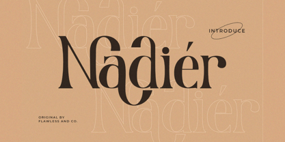 Nadier is a Modern Serif Font that made with a classic style in each character, so it's fitted for some wedding invitation display. There's some connected letters and some alternates that suitable for any graphic designs such as branding materials, t-shirt, print, business cards, logo, poster, t-shirt, photography, quotes .etc This font support for some multilingual. Also contains uppercase A-Z and lowercase a-z, alternate character, numbers 0-9, and some punctuation. If you need help, just write me! Thanks so much for checking out my shop!
 - Alaya Roza by Supfonts,
$15.00 Alaya Roza supports both Cyrillic and Latin layout. You can write an attractive invitation or issue menu. It is of a classic style that will fit perfectly into any project. Шрифт поддерживает как кириллическую так и латинскую раскладку. Вы можете писать привлекательные приглашения или оформлять меню. Классическое начертание идеально впишется в любой проект :) Test it out below to see how it could look for your next project! Includes: Regular Script Latin languages support Cyrillic languages support Uppercase and lowercase Numbers and punctuation Ligatures Check out my blog: https://www.instagram.com/di.zigner pinterest.com/dmitriychirkov7 Enjoy
 - Frakto by Linotype,
$29.99Frakto is a two-weight family of calligraphic Fraktur-style typefaces designed by Julius de Goede. One of the main categories of Blackletter typefaces, Fraktur was developed around 1517, and was used throughout Germany and Northern Europe well into the 20th century. With Frakto, Julius de Goede has re-applied the written element of the script back into the Fraktur style, rejuvenating and reinvigorating it for 21st century display use. Frakto is the perfect fit for certificates and newsletter headlines. We recommended using it in point sizes from 12-pt on up. - Wild Mango by KA Designs,
$12.00 Wild Mango is a chic + modern serif font. This font is perfect for branding, logos, social media, prints, stickers, shirts, svg files and more! Wild Mango is unique as it can be used for a variety of design styles. It fits in wonderfully for free-spirited, boho designs and also for more classy editorial looks! There are a lot of fun stylistic alternates available to use with this font. These letters are embedded into the font file and easily accessible in programs such as photoshop and illustrator. Thank you!
 - ASTYPE Ornaments Accolades C by astype,
$40.00 Accolades C and C2 share the same main ornaments but differ in finishing. Accolades C uses pearls and diamonds, C2 does not. Accolades CX is an additional fitting set of borders. All fonts are available in two variations. A clean one and a distressed, grungy version (old). The layout samples from the PDF-specimen are included in the font packages and stored in InDesign CS3 format. Mostly all of the featured fonts of the specimen are available on MyFonts, too. Have a look at Secca Art Std, Secca Saloon Std, Gracia, Battista and Prillwitz.
 - Renaf by Flawlessandco,
$9.00 Renaf is a Groovy Retro Font that made with an additional shiny mode in each character, so it's fitted for some retro project. There's some connected letters and some alternates that suitable for any graphic designs such as branding materials, t-shirt, print, business cards, logo, poster, t-shirt, photography, quotes .etc This font support for some multilingual. Also contains uppercase A-Z and lowercase a-z, alternate character, numbers 0-9, and some punctuation. If you need help, just write me! Thanks so much for checking out my shop!
 - Qulio by Khoir,
$15.00 Qulio is a bold serif style font. lifting a groovy style with a touch of modern serif so that it becomes a unique font. Qulio fits perfectly into modern vintage style. like logos, quotes, greeting cards, posters, branding. They all come with unique shapes and alternative fonts when combined, so what are you waiting for ! What's included? Uppercase Characters Lowercase Characters Support 75+ Language So what are you waiting for? immediately purchase this font, feel free to comment, or send me my PM or email at khoirtypework@gmail.com Thank you for seeing
 - Kuniku by ArimaType,
$18.00 Kuniku is an unconventional sans serif font that sticks to the rules. These can easily fit into a very large set of projects, so add them to your creative ideas and see how they make them stand out. Each character is uniquely crafted and would be amazing to complement any project you're working on. Use it to create beautiful titles, beautiful invitations, stunning logos and more!! Perfect for displays, headers, invitations, save the date, weddings and more! This font is PUA encoded which means you can access all the glyphs and sweeps easily!
 - Urban Maxim 3d Graffiti by Sipanji21,
$15.00 Urban Maxim" is a graffiti font that features three different layers: solid, shadow, and inner shadow. By using this combination of layers in your design, you can create a three-dimensional (3D) effect on your text. Fonts like this are often used in street art, posters, or other designs that aim to add depth and dimension to their typography. With "Urban Maxim," you have the flexibility to create text that looks distinct and more pronounced by using the various layers. This allows you to customize the appearance of your text to fit your design aesthetics.
 - Galaktik by ExFour,
$19.00 Galaktik is a fresh embodiment of the monospace font. Born out of creative ideation, it attempts to pay homage to a long history of display fonts while exhibiting contemporary, playful accents. This balance of geometric shapes and creative expression allows Galaktik to feel both familiar and yet unique. Features Numerals Punctuations Special Characters Galaktik's freshness fits modern typographic schemes, futuristic logos, and even command-line consoles. The limits are boundless. Thank you for your purchase! Feel free to reach out for any issues or if need any assistance.
 - Anicon Sans by NREY,
$19.00 Anicon Sans font family consist of 18 weight: from Thin to Black, each weight paired by italic. Also including Latin & Cyrillic language support with more than 35 languages. Anicon is a superfamily, semi condensed sans serif and slab serif with humanistic forms in the characters. This font was crafted with the intention to present clean, legible, multipurpose characters that are easy to read wether it's on screen or print. Fit for all purposes; text, display, headline, print, corporate identity, logo, branding, product, infographic, photography and other applications and medium.
 - Easy Peasy by Supersemarletter,
$10.00 Easy Peasy is a cute and playful display font. Relaxed and a little bit quirky, this font is the perfect fit for all of your logos, branding, posters, and crafty DIY projects. Honestly it works perfectly for headlines, logos, posters, packaging, T-shirts and much more. Font Features : • Regular version • Character set A-Z in uppercase and lowercase • Numerals & Punctuation • Accented Characters • Multiple Languages Supported • Format File: OTF Recommended to use in Adobe Illustrator or Adobe Photoshop. If you have questions, just send me a message and I'm glad to help. Best Regards, Supersemar Letter
 - Schnebel Slab Pro by URW Type Foundry,
$35.99 The refreshingly clear Antiqua Schnebel Slab is a refreshingly clear and strong interpretation of a contemporary Antiqua with subtle contrast and firm serifs, which offer excellent readability at very small size, and, at the same time, provide a lot of expression for use in headlines. The italics, drawn specifically for this purpose, contribute to a harmonious picture, which never loses creative tension, thanks to its aesthetics. The careful addition of ligatures, small caps, and proportional and old-style figures allows for well-proportioned typesetting. The condensed and expanded variants, which also come in 6 weights each, offer plenty of freedom to design with numerous combinations. Schnebel Slab Pro combines especially well with Schnebel Sans Pro.
 - Store Clerk JNL by Jeff Levine,
$29.00 The cover of the 1929 sheet music from the First National/Vitaphone picture “The Girl from Woolworth’s” had its title (“Someone”) hand lettered. This single word title was the model for Store Clerk JNL, which is available in both regular and oblique versions as well as solid and solid oblique versions (without an inline). A bold, casual sans serif with rounded ends and an inline, Store Clerk JNL is perfectly suited for projects where a strong, yet playful title is necessary to grab the reader’s attention. For those old enough to remember, Woolworth’s was a leading “Five and Dime” store chain, especially in the days when a nickel or a dime actually could purchase something.
 - Postale by Dear Alison,
$24.00 I recently came across an old travel journal I’d misplaced, and in it was a really rough sketch of an Italian post office. The sign lettering caught my eye while flipping through the pages, and while not my forte, I thought I’d take my stab at recreating sans-serif lettering as a font. The Postale family recaptures that old post signage and the vintage flair that appeals to me. A little reminiscing is always a good thing. You’ll find the Stylistic Alternates feature changes up the retro styled letters to a more modern sans serif styling for a handful of letterforms, if the vintage style of certain letters isn’t your cup of tea.
 - VLNL Hollandsche Nieuwe by VetteLetters,
$20.00 Raw herring is the Dutch sashimi. Every year at the beginning of the summer a new batch of freshly caught herring arrives at Holland’s quays. Fishing boats actually race each other to be the first boat bringing it home. The fresh herring is called ‘Hollandsche Nieuwe’ (Holland’s new). This typeface, designed by Donald Roos, is based on the typography of Dutch fish shops and stalls. Inspired by lettering from the 30’s and 40’s, infused with some ‘techno’ flavour, Hollandsche Nieuwe is the brand new fresh fishy type flavor on your computer! It is traditionally eaten with sliced onions and pickles. Simply pick up the fish by the tail, open your mouth and take a bite! Enjoy!
 - Grauna by Typeóca,
$40.00 Graúna is Typeóca’s first ‘serious typeface’. The idea was to produce a revival of Block Heavy, removing the ‘rough’ texture from its outline. Though other revivals existed, most of them approached the Block family as a whole, leaving aside the idiosyncrasies that make the Heavy weight so unique. In the early stages of its development, however, we realized that a lot of its quirkiness is only possible precisely because of the ‘rough’ texture we were trying to remove. That way, we started going further and further away from the original model, and thinking about the typeface in its own terms, resulting in an impactful yet friendly sans serif, ideal for logos and short titles.
 - Bodiam by Hanoded,
$15.00 Two years ago I went on a camping holiday in England with my wife and (then two) small children. The first stop was a nature campsite near the village of Bodiam in East Sussex. My son wanted to see a real castle, so I figured Bodiam Castle was the 'realest' of them all! He loved it, as the castle had a moat, crenellated walls, a bunch of towers and a guy dressed up as a knight. Bodiam font is a rough didone-ish affair. It is all caps, but you can freely mix upper and lower case. It would be ideal for book covers, posters and maybe even for castles. Comes with a treasure chest of diacritics.
 - Figgins Sans by Shinntype,
$79.00 The first sans serif types were made in London in the early 19th century. They were severely modern, all caps and bold. The Figgins foundry, inventor of the term sans serif, showed a ?ne example in its specimen of 1836. The extra bold weight of Figgins Sans is a close revival of the original, with the addition of a lower case which retains its partly geometric, partly grotesque quality. The family is rounded out with other weights and an italic, and extended into Cyrillic and Greek, all executed in what is assumed to be as authentic a manner as possible, given the hypothetical nature of the exercise. Together with Scotch Modern, comprises The Modern Suite of matched fonts.
 - Old Kharkiv by Bohdan Hdal,
$24.00 Old Kharkiv was inspired by the first half of the 20th century photo with a signage on the building of the Ivan Kotlyarevsky Kharkiv National University of Arts. During the development, the font has acquired unique features not from the original signage, for example, drops in uppercase were replaced with sharp serifs. This font contains the letters of all the main European languages, Cyrillic and basic special characters. Some uppercase letters (where allowed their form) have decorative elements (swashes) to use them as drop caps or initials. There are stylistic alternatives for some Ukrainian letters. Also, as a bonus, this font contains up to a dozen graphic elements that you can use in your layout.
 - Aretha by Lafontype,
$25.00 Aretha is a classy and beautifully designed sans serif. The main idea of Arteha is to combine the sans serif humanist font style with traditional styles so as to provide a pleasant atmosphere for the reader. The horizontal side of Aretha is designed with a slightly thinner so that the counter can look wider and also looks stiff in some parts to give a firm impression on the letters. Not only for display size, Aretha also works well in text size. Represents multilingual and is equipped with several Open Type features such as tabular figures and stylistic alternates in letters a, g, t and y, so this is very suitable to complement your various design needs.
 - Rusticana by Linotype,
$29.99Rusticana is a part of the 1990 program Type before Gutenberg, which included the work of twelve contemporary font designers and represented styles from across the ages. Linotype offers a package including all these fonts on its web page, www.fonts.de. Rusticana was designed by Adrian Frutiger and appeared with Linotype in 1993. Its historical roots go back to the Roman Capitalis, the all caps engraved writing of ancient Rome which reached its peak in the first century. From this style evolved other Roman forms, and one, Rustica, proved particularly good for text on bronze, as opposed to in stone. The Rusticana of Frutiger has open, seemingly irregular forms which lend a distinctive rhythm to text. - VLNL Neue Sardines by VetteLetters,
$35.00 Sardines is a project by Jacques Le Bailly aka Baron von Fonthausen. It first saw the light as a student project for a monospaced font and eventually grew into Vette Letters’ largest font family. We saw its potential and expect it to be a million seller, just like our other typefaces. VLNL Sardines comes in 42 different variations, like rough and clean cuts, regular and condensed widths (condensed is the exactly half of the regular width). Sardines is an eclectic mash of classic curves and mathematical measurements, leaving a very distinct typographic flavor. While most of our type is market-fresh, this one comes out of the can, but it’s delicious nonetheless. And it’s great for adventurous BBQ-ing!
 - Nutcase by ArtyType,
$29.00 Nutcase is a perfect example of a font that principally designed itself. I created a hexagonal template (the most economical form in nature by the way) and took out the center to increase the decorative element. I played around with it, creating some pleasing characters at first but it soon became clear it would translate into a complete alphabet, so I set to work applying the idea to both upper and lower cases. It wasn't all straight forward though, avoiding awkward characters and retaining legibility took a little perseverance but it eventually paid off. I thought of this primarily as a decorative display face but having tested it out, found it reads surprisingly well as body copy too.
 - Neuro X by Sawdust,
$35.00 Neuro X is a narrow sans serif typeface consisting of three weights with additional rounded versions and matching italics. It was first drawn as an exploration for a headline font and later expanded on to become a full typeface family. Neuro X explores the extremities of narrow proportions whilst also allowing for eccentric cuts. The typeface has been tightly monospaced and intended for use at larger sizes as a display but can also work at smaller scales for the more courageous among us. This 339 glyph font has language support for 26 languages: Afrikaans, Albanian, Catalan, Croatian, Czech, Danish, Dutch, English, Estonian, Finnish, French, German, Hungarian, Icelandic, Italian, Lithuanian, Maltese, Norwegian, Polish, Portuguese, Slovak, Slovenian, Spanish, Swedish, Turkish, Zulu.
 - BD Micron Font by Typedifferent,
$10.00 The BD Micron Font is the first typedifferent variable font. It is a very technical looking typeface great for use in sci-fi, science and electronic music related projects. The BD Micron Font alphabet designed together with H1reber was initially created as the display typeface for the communication and visual identity of the TechnoCulture 2 festival in Fribourg, Switzerland summer 2019. The technologic yet playful looking font shall break boundaries between technology, science, fiction and art. Creating characters, hence little robots out of the shapes found in the BD Micron Font glyphs and the variable font technology helped breathing live into the BD Micron Robots which is also availabe here at MyFonts
 - Circuity by Din Studio,
$29.00 Circuity is a display font designed in a racing theme which provides a unique yet modern capital letter font. Each stroke shows a firm brave character. Due to its shape and size, it is suitable to apply for a large-sized text such as titles. Enjoy the interesting features to maximize the design projects. Features: Multilingual Supports PUA Encoded Numerals and Punctuation Circuity is definitely proper to use in any design projects such as posters, banners, logos, book covers, headings, printed products, merchandise, social media, and so on. Find out more ways to use this font by taking a look at the font preview. Thanks a lot for purchasing our font. Happy designing.
 - Accia Flare by Mint Type,
$39.00 Accia Flare is an elegant glyphic typeface with large x-height and low contrast. Its subtle curviness will create a tender but notable image in packaging applications. The font family contains 8 weights from Thin to Extra Bold, with matching true italics. It supports extensive language support including Cyrillic, as well as numerous OpenType features such as small caps, ligatures, several sets of figures, case-sensitive punctuation, ordinals. Accia Flare is a member of Accia Type System. It encompasses five typefaces ranging from sans-serif to expressive serif, giving you the possibility to create sophisticated cohesive designs. Accia Type system consists of Accia Sans, Accia Flare, Accia Piano, Accia Moderato, and Accia Forte.
 - Universal College by Fontscafe,
$39.00 If there is one Fonts Café specially-priced pack that deserves the title "TEAM" it's "Universal College." Together, these two vintage, college-style fonts: the original CLASSIC, and our latest "DRAFT" pick, are the no-sweat, first line players for all your varsity design challenges and goals. Classy enough for every sport, season or celebration, and casual enough for any campus clothing creation. "Universal College" typefaces are also available individually: our original classic version has the handcrafted, retro feel that Fonts Café best-selling typefaces are world famous for. "Draft" has the edge that designers worldwide have come to expect from fontscafe.com and that you can find in many of our other retro and vintage typefaces.
 - Classicismo by IKIIKOWRK,
$19.00 Introducing Classicismo - Gentleman Type, created by ikiiko. Classicismo is inspired by typography of classic motorcycle brand. The letters are bold serif fonts with a classic swashes type. This font has a characteristic serif font that is firm and sturdy but still has flexibility. This typeface is perfect for an vintage vehicle logo, motorcycle enthusiast, manly product, magazine cover, poster & flyer design for automotive event, and also good for vintage product, or simply as a stylish text overlay to any background image. What's included? Uppercase & Lowercase Number & Punctuation Alternates & Swashes Multilingual Support Get also a good offer & FREEBIE at our site : www.ikiiko.com Enjoy our font and if you have any questions, you can contact us by email : ikiikowrk@gmail.com
 - Cloister Initials by GroupType,
$29.00 Cloister Initials™ have become FontHaus's most popular decorative initials font since we began selling it in 1993. First released in 1919 for ATF, Goudy's "Cloister Initials", sometimes called Goudy Initials is recognized as "one of the most beautifully designed set of initials ever made". We agree. Our digital revival is historically accurate because it was referenced from the actual ATF 144-point brass matrices acquired at the now legendary and final ATF auction in Elizabeth, New Jersey in 1993. The exquisite design of each character inspire it's use. Perfect for holiday invitations, elegant note pads, as drop caps or in period design. We've even sold these initials for use as company logos.
 - Caslon Bold by ParaType,
$30.00 The Bitstream version of Caslon Bold of the American Type Founders, 1905. Based on William Caslon I’s first English Old Style typefaces of 1725. Caslon modeled his designs based on late 17th century Dutch types, but his artistic skills enabled him to improve those models, bringing a variety of forms and subtlety of details. Strokes in Caslon fonts are somewhat heavier than in earlier Old Style fonts, serifs are thicker and a bit stubby. Italic letters have uneven slope. A text set in Caslon looks legible and aesthetically appealing. Caslon is a favorite font of English printers for setting of classical literature. Cyrillic version was developed for ParaType in 2002 by Isay Slutsker and Manvel Shmavonyan.
 - Gilman Sans by Miller Type Foundry,
$29.00 Gilman Sans is the family member of Gilman, the serif that it was derived from. The idea for Gilman started simple enough, a serif typeface that works well for large amounts of text. However, after many struggles creating a quality typeface digitally, I decided to first draw the complete alphabet by hand on paper, and then trace that digitally. The result is a unique workhorse typeface with a subtle “human touch” that is very rare in this modern technological age. Gilman Sans has extensive language support and comes with many opentype features like true small caps, tabular lining figures, stylistic alternates, ligatures and more. Gilman Sans and Gilman are excellent compliments and work together harmoniously on the page.
 - Tremendo by The Ampersand Forest,
$20.00 Tremendo is a gothic sans serif superfamily with a large number of widths and weights that make it a great choice for versatility, clarity, and dynamism. Built with both grotesque and geometric principles in mind, it's remarkably useful for everything from print copy to the largest display applications. If you're looking for a family that will serve your needs, and be noticed Tremendo is it! A note on the name: "Tremendo" is Italian for "too much, insufferable, awful." It's a tongue-in-cheek moniker for a family that's rather monstrous in size and forceful in impact. Give it a try and you'll see that it's much more of a workhorse than it may at first seem to be!
 - Great Copper by Pixesia Studio,
$19.00 Introducing Great Copper - An Old Handcraft Display Font With a perfect combination of its unique yet classic shapes, Great Copper greatly portrays the familiar feeling that you are looking for. This typeface suits the nostalgic feeling you want to evoke through words. It comes as if Great Copper is written personally as letters to deliver good news. As splendid it curves in delivering the sweet vibe, Great Copper comes also with its firm shape to emphasize how valuable the messages and stories that it brings. Enchanting yet emphatic, Great Copper typeface will be perfect to depict the great story about the past you'd be delighted to tell and share. Hope you Like it. Thanks.
 - Applied Sans by Monotype,
$57.99 The Applied Sans™ family is a reinterpretation of the first sans serif typefaces used in what was then called, “jobbing or trade” work – typefaces like Venus and Ideal Grotesk. While built on the foundation of these late 19th and early 20th century designs, Applied Sans adds to it all the required features for modern typographic communication. The design benefits from a large x-height, open counters, generous apertures and a subtle modulation in stroke weight. These ensure character legibility and make for a design that is inviting and easy to read. Applied Sans family’s wide range, precise gradation of weights and extensive language support guarantees the design’s effectiveness in a wide and varied range of uses.
 - Nimrod Paneuropean by Monotype,
$92.99Nimrod was released by Monotype in 1980. Designed for current newspaper technology, the Nimrod font family evolved as a result of extensive examination of newspaper industry needs. Nimrod retains many of the features of the traditional newspaper Ionics, but some of the fussier detailing has been replaced by the more sober forms of the old styles, such as Plantin. A highly legible font family, especially in smaller sizes, its clear unambiguous character shapes make easily readable blocks of text. Nimrod also withstands the degradation encountered in newspaper production and printing. First used for body text in the Leicester Mercury newspaper, the Nimrod font family has subsequently become a popular choice in newspapers for text and headlines. - Linotype Gujarati by Monotype,
$103.99 The Linotype® Gujarati typeface was originally developed in 1983 by the Linotype letter-drawing studio under Fiona Ross’s art direction. This revival was designed by Gunnar Vilhjálmsson and Kalapi Gajjar with Fiona Ross as a consultant. The family has five weights from Light to Black. It is a traditional design, optimized for setting lengthy text copy for print projects or for use on screens. While faithful to the original design, Linotype Gujarati introduces many design improvements, additional weights, and an extended character set. This new Linotype Gujarati is part of a project to refresh the pivotal Linotype Bengali and Linotype Devanagari typefaces and make them available for the first time in the popular OpenType font format.