10,000 search results
(0.035 seconds)
- Mandy William by Allouse Studio,
$16.00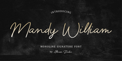 Proudly presenting Mandy William, a Monoline Signature Font with all the ligatures to fulfill your needs. Mandy William is perfect for any titles, logo, product packaging, branding project, magazine, social media, wedding, or just used to express words above the background. Mandy William also comes with Multi-Lingual Support.
 - Decano by Rex Face,
$19.99 Decano is a modern sans serif, ALL-CAPS, display font. Using a ten-sided polygon, or decagon for the usually circular characters and employing similar angles for the rest of the character set gives us some strong and interesting word forms. It’s great for branding, headlines, and signage.
 - Aspire to Inspire by Tlatous Type,
$19.00 Introducing Aspire to Inspire Font by Tlatoustype Aspire to Inspire is a cursive display Font. This font is perfect for book cover, product packaging, branding project, megazine, social media, wedding, or just used to express words above the background.This font includes TTF and OTF, This font also multilingual support.
 - Golfmind by Timurtype,
$14.00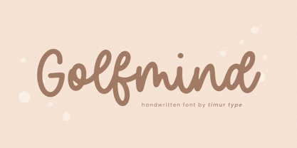 Introducing by Timur type Proudly Present, Golfmind Golfmind A Handwritten Script Font Golfmind is perfect for product packaging, branding project, megazine, social media, wedding, or just used to express words above the background. Golfmind also multilingual support. Embelish your designs with our original fonts.Enjoy the font,Thank you!
 - Qiunels by Almarkha Type,
$35.00 Hello Introducing, Qiunels - Elegant Luxury Display Serif is an unique font that uses line to describe the impression of elegance and modern. Perfect for adding a unique twist to word-mark logos, monograms or pull quotes. Qiunels has 21 Alternate can be turned off if required standard writing needs.
 - Ebura by preussTYPE,
$25.00 Ebura is a funny and fashionable sansserif (or semi-serif?) type. Extended Latin, extended figures and SmallCaps are supported in OpenType. OpenType features: Ebura contains 740 Glyhps Standard Ligatures Discretionary Ligatures Denominators Ordinals Scientific Features Superscript Slashed Zero Small Capitals Old Style & Lining Figures Proportional Numerals & Tabular Figures
 - Kingdoms by Timurtype,
$14.00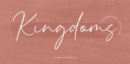 Introducing by Timur type Proudly Present, Kingdoms Kingdoms A Handwritten Script Font Kingdoms is perfect for product packaging, branding project, megazine, social media, wedding, or just used to express words above the background. Kingdoms also multilingual support. Embelish your designs with our original fonts.Enjoy the font,Thank you!
 - Ysleta NF by Nick's Fonts,
$10.00Here's a faithful rendering of an old face from the James Conner's Sons specimen catalog of 1888, alternately known as Aetna or Painter's Gothic. Its compact descenders allow for tightly-spaced headlines. Both versions of the font contain the complete Unicode Latin 1252 and Central European 1250 character sets. - Seaglass by Atlantic Fonts,
$26.00 Seaglass is decorative, feminine, and strong. Its whimsical curls and handmade form make a crafty statement in all-caps, and its expressive lower case invites in young and old alike - not unlike the gems found on secluded beaches. Let Seaglass transform your next packaging, poster, or book project.
 - AZ Dude by Artist of Design,
$20.00 AZ Dude font was inspired from many miscellaneous hand written slogans on a school text book covers. This font utilizes an "old look" to the line work which is designed to have a "worn feel" to it. Ideal for use as headline or sub-head text in you design.
 - Ghostink by Timurtype,
$14.00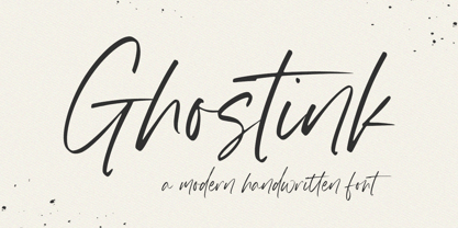 Introducing by Timur type Proudly Present, Ghostink Ghostink A Handwritten Script Font Ghostink is perfect for product packaging, branding project, megazine, social media, wedding, or just used to express words above the background. Ghostink also multilingual support. Embelish your designs with our original fonts.Enjoy the font,Thank you!
 - Wishfancy by Timurtype,
$14.00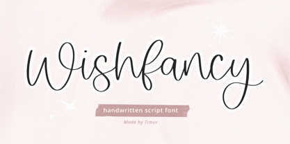 Introducing by Timur type Proudly Present, Wishfancy Wishfancy A Handwritten Script Font Wishfancy is perfect for product packaging, branding project, megazine, social media, wedding, or just used to express words above the background. Wishfancy also multilingual support. Embelish your designs with our original fonts.Enjoy the font,Thank you!
 - Rightwood by Timurtype,
$14.00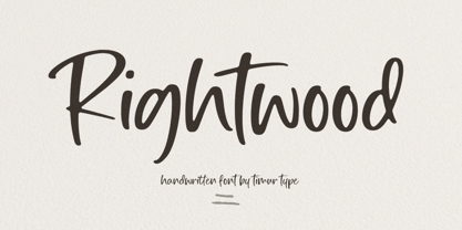 Introducing by Timur type Proudly Present, Rightwood Rightwood A Handwritten Script Font Rightwood is perfect for product packaging, branding project, megazine, social media, wedding, or just used to express words above the background. Rightwood also multilingual support. Embelish your designs with our original fonts.Enjoy the font,Thank you!
 - Sales Event JNL by Jeff Levine,
$29.00 Sales Event JNL is an inline sans that was modeled from examples of old wood type. Its casual, cheerful style well suits point-of-sale signage or banners, fun headlines and relaxed themes. The font is available in both the regular inline version and the black (solid) version.
 - Sathya Script by Gian Studio,
$14.00 Introduce Sathya Script in beautiful handwritten style. Equipped with 600 glyphs. Sathya Script is perfect for branding projects, home appliance design, product packaging, use in business cards, invitation cards, etc. Just as a stylish text overlay onto a background image or anything else that needs a touch of elegance. Available in the Satya. To enable the OpenType Stylistic alternative, you need a program that supports OpenType features such as Adobe Illustrator CS, Adobe Indesign & CorelDraw X6-X7, Microsoft Word 2010 or a later version. There are additional ways to alternate/swash, using the Character Map (Windows), Nexus Font (Windows), Font Book (Mac) or a software program such as PopChar (for Windows and Mac). How to access all alternative characters, using Windows Character Map with Photoshop: https://www.youtube.com/watch?v=Go9vacoYmBw How to access all alternative characters using Adobe Illustrator: http://youtu.be/iptSFA7feQ0 How to use the font style set in Microsoft Word 2010 or later versions: https://youtu.be/x1A_ilsBsGs Thanks for checking! I really hope you enjoy it. Regards Designers: Afri Giani Publisher: Gian Studio
 - 99 Names of ALLAH Minimal by Islamic Calligraphy75,
$12.00 We have transformed the “99 names of ALLAH” into a font. That means each key on your keyboard represents 1 of the 99 names of ALLAH Aaza Wajal. The fonts work with both the English and Arabic Keyboards. We call this Calligraphy "Minimal" because of the minimal decoration and simplistic design. The first "Alef" has a "hamzit wasel", this indicates that the name can be pronounced both as "AR-RAHMAAN" or "R-RAHMAN" (in the zip file you will find a pdf file explaining the differences in the "harakat", pronunciation and spelling according to the Holy Quran). This calligraphy is not only minimal in its design but easy to read, very few letters overlaps and the decorative symbols are at minimum. Decorative letters used in this calligraphy: "Mim, Aain, Sin, HHe, He & Saad". Purpose & use: - Writers: Highlight the names in your texts in beautiful Islamic calligraphy. - Editors: Use with kinetic typography templates (AE) & editing software. - Designers: The very small details in the names does not affect the quality. Rest assured it is flawless. The MOST IMPORTANT THING about this list is that all the names are 100% ERROR FREE, and you can USE THEM WITH YOUR EYES CLOSED. All the “Tachkilat” are 100% ERROR FREE, all the "Spelling" is 100% ERROR FREE, and they all have been written in accordance with the Holy Quran. No names are missing and no names are duplicated. The list is complete "99 names +1". The +1 is the name “ALLAH” 'Aza wajal. Another important thing is how we use the decorative letters. In every font you will see small decorative letters, these letters are used only in accordance with their respective letters to indicate pronunciation & we don't include them randomly. That means "mim" on top or below the letter "mim", "sin" on top or below the letter "sin", and so on and so forth. Included: Pdf file telling you which key is associated with which name. In that same file we have included the transliteration and explication of all 99 names. Pdf file explaining the differences in the harakat and pronunciation according to the Holy Quran. Here is a link to all the extra files you will need: https://drive.google.com/drive/folders/1Xj2Q8hhmfKD7stY6RILhKPiPfePpI9U4?usp=sharing ---------------------------------------------------------------------------------------------------------------------------
 - Lust Stencil by Positype,
$39.00 When you hear that name, you likely ask yourself, ‘why?!’ I did too, but the number of requests could not be ignored. Once I finally decided to move forward with it, the only way to solve the offering would be to adhere to the same theme of indulgence, I planned for the same number of optical weights AND Italics. Yeah, italic stencils… ok, why not? It’s not a new concept. One thing to note and a creative liberty I assumed during the design. Lust Stencil would not be just a redaction or removal of stress to produce a quick stencil. To do that, would just be a cheap solution. Strokes had to resolve themselves correctly and/or uniquely to the concept of the stencil format. And, it had to be heftier. For it it to look correctly, it needed about 8% additional mass to the strokes for it to retain the effervescent flow of the curves and the resolute scalloped lachrymals. The Lust Collection is the culmination of 5 years of exploration and development, and I am very excited to share it with everyone. When the original Lust was first conceived in 2010 and released a year and half later, I had planned for a Script and a Sans to accompany it. The Script was released about a year later, but I paused the Sans. The primary reason was the amount of feedback and requests I was receiving for alternate versions, expansions, and ‘hey, have you considered making?’ and so on. I listen to my customers and what they are needing… and besides, I was stalling with the Sans. Like Optima and other earlier high-contrast sans, they are difficult to deliver responsibly without suffering from ill-conceived excess or timidity. The new Lust Collection aggregates all of that past customer feedback and distills it into 6 separate families, each adhering to the original Lust precept of exercises in indulgence and each based in large part on the original 2010 exemplars produced for Lust. I just hate that it took so long to deliver, but better right, than rushed, I imagine. It would have taken even longer if not for font engineer and designer, Potch Auacherdkul. Thanks Potch.
 - 99 Names of ALLAH Subhanahu by Islamic Calligraphy75,
$12.00 We have transformed the “99 names of ALLAH” into a font. That means each key on your keyboard represents 1 of the 99 names of ALLAH Aaza Wajal. The fonts work with both the English and Arabic Keyboards. We call this Calligraphy "Subhanahu Wa Ta'ala" because we have added "Subhanahu Wa Ta'ala" to each and every name. The first "Alef" has a "hamzit wasel", this indicates that the name can be pronounced both as "AR-RAHMAAN" or "R-RAHMAN" (in the zip file you will find a pdf file explaining the differences in the "harakat", pronunciation and spelling according to the Holy Quran). The calligraphy is rectangular shaped, and the "fatha" is big and covers almost the entire name, in most of the names. Decorative letters used in this calligraphy: "Mim, Aain, Sin, HHe, He, Ta, Kaf & Saad". Purpose & use: - Writers: Highlight the names in your texts in beautiful Islamic calligraphy. - Editors: Use with kinetic typography templates (AE) & editing software. - Designers: The very small details in the names does not affect the quality. Rest assured it is flawless. The MOST IMPORTANT THING about this list is that all the names are 100% ERROR FREE, and you can USE THEM WITH YOUR EYES CLOSED. All the “Tachkilat” are 100% ERROR FREE, all the "Spelling" is 100% ERROR FREE, and they all have been written in accordance with the Holy Quran. No names are missing and no names are duplicated. The list is complete "99 names +1". The +1 is the name “ALLAH” 'Aza wajal. Another important thing is how we use the decorative letters. In every font you will see small decorative letters, these letters are used only in accordance with their respective letters to indicate pronunciation & we don't include them randomly. That means "mim" on top or below the letter "mim", "sin" on top or below the letter "sin", and so on and so forth. Included: Pdf file telling you which key is associated with which name. In that same file we have included the transliteration and explication of all 99 names. Pdf file explaining the differences in the harakat and pronunciation according to the Holy Quran.
 - 99 Names of ALLAH Kids by Islamic Calligraphy75,
$12.00 We have transformed the “99 names of ALLAH” into a font. That means each key on your keyboard represents 1 of the 99 names of ALLAH Aaza Wajal. The fonts work with both the English and Arabic Keyboards. We call this Calligraphy "Kids" because it looks as if a child is writing the names. The first "Alef" has a "hamzit wasel", this indicates that the name can be pronounced both as "AR-RAHMAAN" or "R-RAHMAN" (in the zip file you will find a pdf file explaining the differences in the "harakat", pronunciation and spelling according to the Holy Quran). Some of the letters in the calligraphy are unusually big, they look as a child is writing them. No decorative letters are used in this calligraphy. Purpose & use: - Writers: Highlight the names in your texts in beautiful Islamic calligraphy. - Editors: Use with kinetic typography templates (AE) & editing software. - Designers: The very small details in the names does not affect the quality. Rest assured it is flawless. The MOST IMPORTANT THING about this list is that all the names are 100% ERROR FREE, and you can USE THEM WITH YOUR EYES CLOSED. All the “Tachkilat” are 100% ERROR FREE, all the "Spelling" is 100% ERROR FREE, and they all have been written in accordance with the Holy Quran. No names are missing and no names are duplicated. The list is complete "99 names +1". The +1 is the name “ALLAH” 'Aza wajal. Another important thing is how we use the decorative letters. In every font you will see small decorative letters, these letters are used only in accordance with their respective letters to indicate pronunciation & we don't include them randomly. That means "mim" on top or below the letter "mim", "sin" on top or below the letter "sin", and so on and so forth. Included: Pdf file telling you which key is associated with which name. In that same file we have included the transliteration and explication of all 99 names. Pdf file explaining the differences in the harakat and pronunciation according to the Holy Quran.
 - Hontana by Attract Studio,
$12.00 INTRODUCING Hontana is a Stylish Modern Calligraphy Font with Casual Style that is absolutely great for your next creative project such as logos, printed quotes, invitations, cards, product packaging, headers, Logotype, Letterhead, Poster, Apparel Design, Label, and etc. This Versatile Font includes also support a Multilingual Characters. Making this Font a Swiss Army knife in your Font Library. It's extremely fun to use as each word can be transformed to your liking. What are the main Features on This Fonts : Uppercase & Lowercase letters Numbering and Punctuations Multilingual Support Simple Installation Works Well on PC or Mac Support Adobe Illustrator, Adobe Photoshop, Adobe InDesign, also works on Microsoft Word. Please kindly message us for any question or issue about our product. Hope you love it and Happy crafting!
 - 1913 Typewriter by GLC,
$38.00 This font was patterned after a few characters on a genuine old 1913 small portable typewriter. It looks like those early typescripts, rough, irregular and eroded, suggestive of mythical famous authors, such as Hemingway, as well as “serie noire” movies or anonymous state employee working in a gloomy Kafkaesque office. It is a complete alphabetic full font. It can be used as web-site titles, poster design, or book editing. It may be preferable, if possible, when printing, to choose a pale color a little rather than condensed - dark grey instead of heavy black, for example - to give the best appearance and to benefit from the full details. The old typewriter character size is 11 to 12 points, but this font easily supports enlargement.
 - Adora Bella by PeachCreme,
$20.00 We're excited to unveil our new beautiful script font, "Adora Bella." "Adora Bella" was inspired by clean handwriting with a natural flow and works well for various designs, including wedding stationery, Instagram quotes, modern logos, packaging, websites, and many more. "Adora Bella" features fabulous beginning and ending lowercase swashes as well as lowercase heart swashes. A connecting heart swash may be used to tie two words or letters together; however, it is important to remember that this is intended to be used for joining lowercase words.
 - Gloomie Saturday by Timurtype,
$14.00 Introduced by Timurtype Studio! Gloomie Saturday is a Bubbly Handwritten Font this font captures the charm of handcrafted elegance with our cheerful handwritten font collection – where every word dances with personality. Enhance your designs and captivate your audience with custom lettering art. Let your words sparkle with the magic of authenticity. Explore our cheerful fonts and make your message stand out! Gloomie Saturday Font also supports multilingualism. Enhance your designs with our original fonts, feel free to comment or provide feedback, Enjoy the fonts 😊 Thank You
 - Bradrock by Arterfak Project,
$19.00 Introducing Bradrock, a vintage slab serif typeface. Inspired by old-school cowboy design, and circus-style. Bradrock has a more decorative typeface by adding bold bifurcated serif on the letterforms. This font is a perfect choice for vintage or old-school themes. Bradrock is an all-caps font, which represented strength, confidence, and an old-school aesthetic. You can use this font for many purposes such as vintage logos, mugs, embroidery, prints, display, short text, packaging, cards, emblem, signage, and many more! Equipped with special characters to get your design more powerful. TTF & OTF in a zip file including : Uppercase Small-caps Numbers & punctuation Accented characters Stylistic alternates Stylistic set 01-03 That's all, folks! Thank you for visiting.
 - TT Fellows by TypeType,
$39.00 TT Fellows useful links: Specimen | Graphic presentation | Customization options There can't be too many universal fonts! Meet TT Fellows, a new workhorse whose functionality allows you to comfortably use the font in a variety of projects. Calm and neutral at first glance, the mood of TT Fellows can change. Working with the typeface, you can reveal its soft and friendly nature, or even the brutal one, for example, by typing the text exclusively in capital letters in the bold style. TT Fellows is easy to use and perfect for setting large text arrays. Thanks to the font's uniwidth and versatility, the font is ideal for use on websites or in periodicals. Bold styles will work harmoniously in headlines or as accents in print or on packaging. TT Fellows is a humanist sans serif with a mechanical touch. With its open shapes, the friendly neutral character of thin weights and an even softer character in bold weights, the new typeface differs in character from the classic TT Norms® and TT Commons sans serifs, while still offering the same functionality. Calm regular styles differ from bold, deliberately display and more expressive ones. By the way, TT Fellows is a unwidth typeface. It was important for us that the user could change the styles, knowing that the layout will not suffer. The typeface features equal width proportions, open apertures, and slightly squared ovals, which associatively brings it closer to other popular modern fonts. Since the idea of the typeface was focused on it being a uniwidth typeface, we needed to fit the bold styles into the regular em squares, which led to interesting graphic solutions that are noticeable, for example, in the k and ж characters, in which the branches are cut directly into the stems. TT Fellows consists of 19 styles: 9 upright, 9 italic and 1 variable, each with over 700 glyphs. The font has 26 useful OpenType features. For example, there is a switch to single-part versions of letters a and y, fractions, tabular characters, case versions of punctuation, and localized versions of characters for different languages. There is a ligature for a combination of two characters of a complex design fl. TT Fellows font field guide including best practices, font pairings and alternatives.
 - Sanserata by TypeTogether,
$49.00 Dr. Gerard Unger expands the concept of Sanserata to a sans type family with Sanserata, adding specific characteristics which improve reading. Sanserata’s originality does not overtly present itself at text sizes. Rather, at those sizes, it draws upon its enormous x-height, short extenders, and articulated terminals to improve readability, especially on screens. Having articulated terminals means characters flare as they near their end, but readers likely won’t notice. What they would notice is that their ability to take in more content in a line of text is improved because the lettershapes are more defined. Articulation also makes clearer text from digital sources, where rectangular endings tend to get rounded by the emission of light from the screen. Lately there seems a whispered discontent with the lack of progress in the sans serif category. Designs can either stretch too far beyond what is accepted or be too bland to be considered new. Sanserata’s strength is in being vivid and unique without being off-putting. This bodes well for designers of paragraphs and of branding schemes since, with Sanserata’s two flavors, it is well able to capture attention or simply set the tone. Sanserata’s first voice is a generous, friendly, and even cheerful sans serif. But when using the alternate letterforms its voice becomes more businesslike, though still with nice curves, generous proportions, and a pleasant character. Sanserata comes in seven weights with matching italics, covers the Latin Extended character set, and is loaded with extras. Its OpenType features allow for the implementation of typographic niceties such as small caps, both tabular and proportional lining and oldstyle figures, ligatures, alternate characters, case-sensitive variants, and fractions. The complete Sanserata family, along with our entire catalogue, has been optimised for today’s varied screen uses. Dr Unger worked with Tom Grace on the production of Sanserata. For extended branding use with Sanserata, check out Sanserata, the contemporary, eclectic typeface drawn from roots in Romanesque Europe.
 - Industrial Spill by Saja TypeWorks,
$12.00 “Safety first!” claimed the sign. The janitor huffed, and continued mopping up the nuclear sludge from the floorboards. Just another day in the wasteland. Industrial Spill is available in three destructive styles: - Regular (great for those warning signs that everyone ignores when rummaging for salvage) - Ooze (reminds you to always clean up after contaminated muck covers the floor) - Wasteland (gives that wonderful feel of wandering around a desolate landscape) Please note that Industrial Spill Wasteland is highly detailed, realistic texturing. It may render slowly in older applications. Each font includes: - A complete set of uppercase and lowercase letters, basic punctuation, numerals and currency figures, and diacritics - Stylistic Opentype Alternates to avoid letter crashing - Punctuation shifts in All-Caps scenarios for better placement - Western Europe language support Need an extended license? Simply email us at hello@sajatypeworks.com and we’ll be happy to help! A collaboration between Dave Savage of Savage Monsters and Aaron Bell of Saja Typeworks. Get in touch: We’re here to help! If you have any questions or need assistance, please DM or contact us via hello@sajatypeworks.com Languages supported: Abneki, Afaan Oromo, Afar, Albanian, Alsatian, Amis, Anuta, Aragonese, Aranese, Arrernte, Arvanitic (Latin), Asturian, Aymara, Basque, Bikol, Bislama, Breton, Cape Verdean Creole, Cebuano, Chamorro, Chavacano, Chickasaw, Cofán, Corsican, Dawan, Delaware, Dholuo, Drehu, English, Faroese, Fijian, Filipino, Folkspraak, French, Frisian, Friulian, Galician, Genoese, German, Gooniyandi, Guadeloupean Creole, Haitian Creole, Hän, Hiligaynon, Hopi, Ido, Ilocano, Indonesian, Interglossa, Interlingua, Irish, Italian, Jamaican, Javanese (Latin), Jèrriais, Kala Kagaw Ya, Kapampangan (Latin), Kaqchikel, Kikongo, Kinyarwanda, Kiribati, Kirundi, Klingon, Latin, Lojban, Lombard, Makhuwa, Malay, Manx, Marquesan, Meriam Mir, Mohawk, Montagnais, Murrinh-Patha, Nagamese Creole, Ndebele, Neapolitan, Ngiyambaa, Norweigan, Novial, Occidental, Occitan, Oshiwambo, Palauan, Papiamento, Piedmontese, Portuguese, Potawatomi, Q’eqchi’, Quechua, Rarotongan, Romansh, Rotokas, Sami (Southern Sami), Samoan, Sango, Saramaccan, Sardinian, Scottish Gaelic, Seri, Seychellois Creole, Shawnee, Shona, Sicilian, Slovio (Latin), Somali, Sotho, Spanish, Sranan, Sundanese (Latin), Swahili, Swazi, Swedish, Tagalog, Tetum, Tok Pisin, Tokelauan, Tshiluba, Tsonga, Tswana, Tumbuka, Tzotzil, Uzbek (Latin), Volapük, Walloon, Waray-Waray, Warlpiri, Wayuu, Welsh, Wik-Mungkan, Wiradjuri, Xhosa, Yapese, Yindjibarndi, Zapotec, Zulu.
 - Lust Sans by Positype,
$39.00 Lust Sans is the penultimate exploration of producing a high-contrast sans wholly influenced by its bracketed ancestor. The aspect of this endeavor I enjoyed the most was finding sneaky ways to infuse warmth and whimsy into the letterforms when you least expect it. The result, however, is subtle and uniquely balances against Lust and Lust Didone without becoming cold and overbearing. To accomplish this, Lust Sans has 6 weights. What I found during development was, based on any setting where Lust or Lust Didone were in the same layout, the amount of contrast shown with Lust Sans needed to be adjusted. Expanding the weight offering, produces opportunities for Lust Sans to modulate the rhythm of the layout comfortably while keeping contrast—this is even more obvious with the Italics. I love those. You will too. If you don’t, you do not have a soul. Not sorry. The Lust Collection is the culmination of 5 years of exploration and development, and I am very excited to share it with everyone. When the original Lust was first conceived in 2010 and released a year and half later, I had planned for a Script and a Sans to accompany it. The Script was released about a year later, but I paused the Sans. The primary reason was the amount of feedback and requests I was receiving for alternate versions, expansions, and ‘hey, have you considered making?’ and so on. I listen to my customers and what they are needing… and besides, I was stalling with the Sans. Like Optima and other earlier high-contrast sans, they are difficult to deliver responsibly without suffering from ill-conceived excess or timidity. The new Lust Collection aggregates all of that past customer feedback and distills it into 6 separate families, each adhering to the original Lust precept of exercises in indulgence and each based in large part on the original 2010 exemplars produced for Lust. I just hate that it took so long to deliver, but better right, than rushed, I imagine.
 - 99 Names of ALLAH Linear by Islamic Calligraphy75,
$12.00 We have transformed the “99 names of ALLAH” into a font. That means each key on your keyboard represents 1 of the 99 names of ALLAH Aaza Wajal. The fonts work with both the English and Arabic Keyboards. We call this Calligraphy "Linear" for obvious reasons. The first "Alef" has a "fatha", this indicates that the name can be pronounced only one way, "AR-RAHMAAN". (in the zip file you will find a pdf file explaining the differences in the "harakat", pronunciation and spelling according to the Holy Quran). This calligraphy is very clear and no letters overlap. Decorative letters used in this calligraphy: "Mim, Aain, Sin, HHe, He, Kaf, Ta & Saad". Purpose & use: - Writers: Highlight the names in your texts in beautiful Islamic calligraphy. - Editors: Use with kinetic typography templates (AE) & editing software. - Designers: The very small details in the names does not affect the quality. Rest assured it is flawless. The MOST IMPORTANT THING about this list is that all the names are 100% ERROR FREE, and you can USE THEM WITH YOUR EYES CLOSED. All the “Tachkilat” are 100% ERROR FREE, all the "Spelling" is 100% ERROR FREE, and they all have been written in accordance with the Holy Quran. No names are missing and no names are duplicated. The list is complete "99 names +1". The +1 is the name “ALLAH” 'Aza wajal. Another important thing is how we use the decorative letters. In every font you will see small decorative letters, these letters are used only in accordance with their respective letters to indicate pronunciation & we don't include them randomly. That means "mim" on top or below the letter "mim", "sin" on top or below the letter "sin", and so on and so forth. Included: Pdf file telling you which key is associated with which name. In that same file we have included the transliteration and explication of all 99 names. Pdf file explaining the differences in the harakat and pronunciation according to the Holy Quran.
 - JP MultiColour by jpFonts,
$29.90 Multicolored Fonts Many years ago, when Xerox Corporation still had its own font department, I came to Los Angeles in 1985 to train the IKARUS program. One day Bill Kienzel, head of the Xerox font department at the time, said we should go to the Hollywood Hills together; he knew people there who were experimenting with multicolored fonts. After a little wandering through the winding streets of the many hills, we reached a somewhat overgrown, simple family house standing under trees. A group of very inspired designers were waiting for us there. They immediately showed us the works they created using photomechanical tricks. They were fascinating. The American colors and the whole look seemed noble and enchanting. The problem was that this process was very difficult to implement and required a lot of effort on individual letters. They dreamed of a colored font that could be used for normal typesetting. We thought back and forth about how to save the individually colored letters in a common font, but soon gave up because we didn't see a technical option. So this idea and the memory of the time in Hollywood lay dormant in the back of my mind for many years, until at the beginning of this year 2023 I received an order to produce an outline typeface and the story came back to me. Suddenly I knew how to solve the problem from back then: if only the areas that should have the same color in all letters were saved in their own separate fonts, they could be colored independently of each other and later placed on top of each other. I implemented this in the 5 fonts that are now available with the 3 variants “Outside”, “Middle” and “Inside”. Together with the background, 4 colors can be combined with each other. This method works in text programs such as Word or InDesign. In Photoshop or Illustrator, the individual surfaces can also be colored by converting them into paths if the additional “Complete” variants (which contain all 3 contours) are used. There is also a “Basic” variant that can be used to achieve special effects such as overlay, bleed, etc. The first 5 fonts in this series are all based on the principle of contouring. Anyone who claims that you don't need any special fonts because they can be created automatically from any font using common programs is wrong or is only telling only half the truth. Anyone who has ever dealt with this knows that many individual adjustments to the design are necessary after contouring. This has happened in the 5 fonts that are now available and have very different styles. The dream from back then has come true. The user can set any text, long or short, in multiple colors, freely design the color scheme and apply all the usual typographic settings. Volker Schnebel, November 2023
 - Aphrodite Slim by Typesenses,
$57.00 Aphrodite Slim Pro is not just a lighter version of its sister Aphrodite Pro. Aphrodite Slim Pro has duplicated the quantity of characters of its partner, and that means more than 500 new glyphs, reaching a total of more than 1000. More delicate and meticulous, Aphrodite Slim Pro is once more a new typography with deep calligraphic ideals: We immersed ourselves into the world of each calligraphy ductus and each calligraphy masters by studying from decoration to lettering books. This was the key for the logic of Aphrodite Slim’s behavior. The new concept of Aphrodite Slim Pro was to join diverse styles of calligraphy in one in order to achieve an autonomous expressiveness, in fact, this is what calligraphy aims to, and we agreed to bring those ideals to the world of typography: It is justifiable to be inspired in hundred-year-old calligraphies, but it is even better if the results you obtain have a plus. A personal plus. During the creation process we were wondering whether it was possible to mix certain strokes of such rigid styles as uncial, (Li·n’s favourite style), with strokes of the copperplate, (Sav’s favourite style), and also to take and mix cualities of cancelleresca cursiva, formata and moderna; finally giving our creation a roman-transition italic look. So Aphrodite Slim takes ideals and aspects from those formal styles, following its own logic though, and emphasizing the fact of being a decorative typography. Calligraphy masters of our past are who we are in debt with. They are the cause we have lovely letters now. They have been spontaneous at the moment of creation, what differs from the type-designers of nowadays, whose spontaneity is more limited. Digital faces that we are used to see these days are a result of long hours of optical adjustments, grids, macros and inspirations of other existing typography, but without personal contributions. Aphrodite Slim wants to refute this. Its mission is to rescue de spontaneity of the artesanal lettering in order to obtain unique words; those which only calligraphy masters of our past or lettering artists of our present could give us. We have worked hard to achieve this, making Aphrodite the most universal font we could: It was necessary to study the most common words, focalizing more in the ones referring to “sensitivity”, of four of the most spoken languages in the world. Aphrodite Slim has an enormous quantity of decorative characters and special ligatures for phrases and words in English, French, Spanish and German. (See English, Français, Español, Deutsch PDF in the gallery section). We promise there is no existing type that decorates/ligates glyphs and words like Aphrodite Slim does: It is the first time a font like this really considers its purpose. -The way glyphs are ligated is insane- : Aphrodite Slim rescues some ideals of persons like Jan van den Velde (Italian cancilleresca writing of XVI Century) who understands ascenders and descenders as possibilities to beautify the lines of writing with curved strokes that seem to be dancing above and below of the words. This master also creates ascenders and descenders even where they are not necessary, on letters that do not actually need them: Aphrodite Slim takes this ideal. The font counts with a wide range of glyphs that seem not to be satisfied with its more primitive form and prefer to extreme their parts to be decorative. It also existed masters of calligraphy like José de Casanova of XVII Century, who, with a magnificant skill and a really personal mark, had the particularity of ligating words that were actually separated with spaces. This is another innovative feature in Aphrodite Slim. An investigation of the most common beginnings and endings words of the English language was done. Having that feature activated (discretionary ligatures), common words will start to ligate or to be decorated even when they are separated by spaces. Impossible to forget Francesco Periccioli of XVII Century and our experience us designers to face with works of him: His letters, that today are included in the group of cancellerescas modernas, have been a direct inspiration to the oldstyle figures and historical forms variables in Aphrodite Slim. Giovanni Antonio Tagliente (XVI Century) and his particular way of making tails and diagonals longer than usual, qualities that our creation reflects too. Finally, our adventures in Biblioteca Nacional and Barrio San Telmo, Buenos Aires, were essential for us to make Aphrodite Slim more complete and interesting: Sav did an excellent work when studying how the decorative miscellanea and swirls of early XX century were. She also investigated what particularities made those roman titling characters look antique so she could rescue some ideals for the oldstyle figures and historical forms variables. This also leaded her to create the ornaments variable in Aphrodite Slim. We are really proud of presenting Aphrodite Slim Pro, a typography that was the result of days and nights of working hard, because we do love what we do; and we are glad we are living in a present that gives us the possibility to spread this kind of art, because that is the way we consider our job: Aphrodite Slim Pro is Art. Hope you can appreciate the enormous work this type has. Features. Aphrodite Slim Pro is the most complete variable. It includes more than 1000 glyphs. Thanks to the Open-Type programming, it counts with a easy way to change/alternate glyphs if the application in which the font is used supports this. The variables contained in Aphrodite Slim Pro are also offered separately. Aphrodite Slim Text: It is the variable for lines and paragraphs. Thus it is the least ornamental and the most accurate to achieve a satisfying legibility. It has the Standard Ligatures feature in order to improve the possible conflicts some glyphs could have by others. Aphrodite Slim Contextual: It is the one that makes emphasis in decorating. It has the particularity of ligating/decorating words of common use in English, French, Spanish and German. It also has the quality of ligating common beginnings and endings of the common words in English. Aphrodite Slim Stylistic: With similar features of Slim Contextual. It includes a set of decorative numbers for a display use. Aphrodite Slim Swash: This one has special beginnings and endings to decorate words. Aphrodite Slim Endings: It makes words look as a signature. Aphrodite Slim Historical: It adds an antique look to the written word. It also has the special historical ligature function. Aphrodite Slim Titling: This one is the most decorative. Its copperplate inspired ornaments give words a special color, in order to handle the quantity of decoration, it comes with the standard ligature feature, which has the most common ligatures plus others that make decorative swirls not to be conflictive. Aphrodite Slim Ornaments: A set of 52 ornaments. Aphrodite Slim Pro includes all this features plus the Stylistic Set 1; Stylistic Set 2 and the possibility of Slashed Zero. We recommend you to check out the gallery in order to see all these features in action.
 - Cast Iron - Unknown license

- Pure evil 2 - Personal use only

- Alaturka by Bülent Yüksel,
$19.00 ABOUT FAMILY: What makes "Alaturka" elegant, friendly and contemporary is its very rounded curves with very open terminals. "Alaturka" has been designed with a higher "x-height" than other fonts in its class to make tiny readability more obvious in any use situation. It will be ideal for use in small sizes such as business cards or mobile applications. This typeface is also equipped with powerful OpenType features to satisfy the most demanding professionals. It has solid features like case sensitivity, small, true capitals, full ligatures, tabular figures for tables, old-style figures to elegantly insert numbers into your sentences, and more alternative characters to give personality to your projects. FEATURE SUMMARY: - 2 style: 1From 1923 To 2023 - 8 weights: Thin, Extra Light, Light, Regular, Medium, Bold, Extra Bold, and Black. - 3widths: Normal, Narrow, and Condensed. - Matching italics (12º) for all weights and widths. - Matching small caps for all weights and widths. - Lining and old-style figures (proportional and tabular). - Some alternate characters - Unlimited fractions. - Automatic ordinals (1st, 2nd, 3rd, etc.). - Extended language support: Most Latin-based scripts - Extended currency support. You can enjoy using it.
 - Ongunkan Ogham by Runic World Tamgacı,
$50.00 This font is a latin based version of the ogham alphabet used in the writing of the old irish language. It can be used on Latin keyboards. I will make a unicode font version of this font in the future. Ogham (/ˈɒɡəm/ OG-əm, Modern Irish: [ˈoː(ə)mˠ]; Middle Irish: ogum, ogom, later ogam [ˈɔɣəmˠ] is an Early Medieval alphabet used primarily to write the early Irish language (in the "orthodox" inscriptions, 4th to 6th centuries CE), and later the Old Irish language (scholastic ogham, 6th to 9th centuries). There are roughly 400 surviving orthodox inscriptions on stone monuments throughout Ireland and western Britain, the bulk of which are in southern Munster. The largest number outside Ireland are in Pembrokeshire, Wales. The vast majority of the inscriptions consist of personal names. According to the High Medieval Bríatharogam, the names of various trees can be ascribed to individual letters. For this reason, ogam is sometimes known as the Celtic tree alphabet. The etymology of the word ogam or ogham remains unclear. One possible origin is from the Irish og-úaim 'point-seam', referring to the seam made by the point of a sharp weapon.
 - Foxtale by Gabe Silverstein,
$29.00 Foxtale was inspired by an ancient Hebraic scriptural style, boasting flared seraphs, classic structures and dramatic shapes. Foxtale is perfectly suited for impactful word marks or subtext. A fully featured typeface with upper and lowercase, Latin characters, numbers, symbols, currency and alternatives - Foxtale will surely excite your next design adventure!
 - Omoshiroi by TEKNIKE,
$55.00 Omoshiroi is a display monospace handwriting font. The typeface is a distinct hand drawn font using a marker pen. The Omoshiroi name is derived from the Japanese word omoshiroi (おもしろい) meaning "interesting" or "amusing". Omoshiroi is great for display work, invitations, writing, architecture, posters, labels and headings.
 - Broadsheet by Three Islands Press,
$29.00 A full-featured typeface that simulates old newspaper text from the 1700s, Broadsheet gives you all the “long s” ligatures you could ever dream of. Wonderfully authentic in either display type or long blocks of body copy. Includes a couple of printer’s flourishes. (Based on antique publications from 1728 and 1776.)
 - Bloomilife by Timurtype,
$14.00 Introducing by Timur type Proudly Present, Bloomilife Bloomilife A Handwritten Script Font Bloomilife is perfect for product packaging, branding project, megazine, social media, wedding, or just used to express words above the background. Bloomilife also multilingual support. Embelish your designs with our original fonts. Enjoy the font 😉 Thank you!
 - Tufan by Samir Chajia,
$12.00 Tufan is a dynamic Arabic typeface abstracted from Kufi Arabic typescript, manifest a strong contrast between bold and thinner strokes, giving it a stylistic overview suitable for title and retro posters. Tufan is an Arabic word meaning flood or typhoon, it represents the boldness and the power of the font.

