10,000 search results
(0.29 seconds)
- Fishtail by Gleb Guralnyk,
$15.00 Hi, introuducing a vintage display font = Fishtail. It's an old school font set with thin decorative shape. Fishtail typeface has narrow characters for small letters and wide shape for capital letters. Also lots of ligatures will help you to create an original lettering compositions (Make sure that “Standard Ligatures” feature is supported & enabled in your software).
 - Millano Script by MJB Letters,
$17.00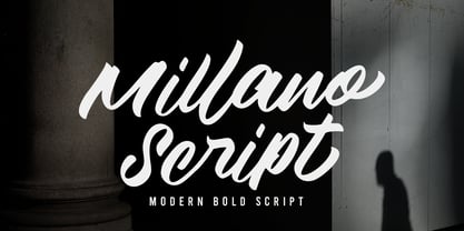 Millano Script is a bold script font, with a strong and masculine style that is equipped with some unique ligatures and alternates so that it can provide an interesting look Works on PC & Mac Simple installations Accessible in the Adobe Illustrator, Adobe Photoshop, Adobe InDesign, even work on Microsoft Word. PUA Encoded Characters – Fully accessible without additional design software
 - Mic 32 New by moretype,
$25.00 Mic32 New is a revival of the of the original Mic32 released in 2004. Keeping its futuristic appeal, this popular font has been re-drawn from the ground up, with new spacing and kerning. A range of Opentype features have been added, and the new version includes small caps, tabular, proportional and old style numerals and ligatures.
 - Eckhardt Poster Deco JNL by Jeff Levine,
$29.00Eckhardt Poster Deco JNL is a continuation of a series of sign painter's fonts, and was modeled from a lettering example found within the pages of an old sign design manual. It is named, as always, in honor of the late Albert Eckhardt, Jr., the owner of Allied signs in Miami, Florida and Jeff Levine's good friend. - Art Deco Neue by Mom,
$49.00 ArtDeco Neue was design to give a strong characteristic to the titles of the Portuguese Art Magazine. From classic sans fonts (usual used by artists and galleries) this font developed with the double geometric lines of Art Deco architecture creating a contemporary design. The final result of each word depends of the choices the designer makes for each glyph.
 - Barbary Coast by Solotype,
$19.95In one of our yearly type hunts, we came across the ancestor of this font, much wider and more decorative, with fine outside shading. Condition was poor so we did the obvious, cutting out the excess decoration and condensing the face optically. It reeks of dancing girls and drunken sailors and other colorful attributes of Old San Francisco. - Eat More Fruit JNL by Jeff Levine,
$29.00 Eat More Fruit JNL is an odd name for a typeface, but then again the lettering style of the font is just as unusual. Named for a 1940s-era poster espousing "Put more pep in your step... eat more fruit", the lettering (although Art Deco in nature) also evokes images of 1960s and 1970s hippie-era concert posters.
 - WOODTYPE Collection by Borutta Group,
$19.00 WOOD TYPE COLLECTION from Mateusz Machalski is a set of wonderful, warm, and weathered hand made typefaces designed by Mateusz Machalski. The Inspiration for this collection comes from a wooden letter blocks and other old technologies used for printing. WTC supports 40 different languages and contains over 300 glyphs per style. The Family consists of 20 typefaces. ENJOY!
 - Dez Petranian by Dezcom,
$40.00 Dez Petranian is a story-telling fantasy friendly family of fonts. It is a warm face that looks like the spoken word, perfect for tall tails, fantasy-world adventure books, creative writing, and poetry. Dez Petranian includes multiple language support, nearly 1,200 glyphs, stylistic sets, and many alternates. Think of it as a warm souvenir of real story writing.
 - Adria Slab by FaceType,
$- Adria Slab is a smooth slab serif typeface that comes in seven weights and charming upright italics. Try combine it with its super friendly family member Adria Grotesk. Enjoy making great typography with a vast choice of lining, tabular and old style figures, numerators, denominators, tabular figures, fractions, ligatures, some sweet symbols and even alternate arrows.
 - PAG Syndicate by Prop-a-ganda,
$19.99Prop-a-ganda offers retro-flavored fonts inspired by lettering on retro propaganda posters, retro advertising posters, retro packages all the world over. This is perfect font for your retrospective project. PAG Syndicate is rectangle and rather narrow font. This font has squarish face designed only by straight line, it spices up even the short words. - Adria Grotesk by FaceType,
$- Adria Grotesk is a superfriendly and sunny humanist typeface that comes in 7 carefully crafted weights and charming upright italics. Try combine it with its stylish family member Adria Slab. You will find a fine choice of lining, tabular and old style figures, numerators, denominators, tabular figures, fractions, ligatures, some sweet symbols and even alternate arrows.
 - Divenire by CAST,
$45.00 Divenire is derived from a custom typeface designed for the Partito Democratico (Italian Democratic Party), it is used in their political communication. It has variation of tension in its design, alternating curved and almost straight elements. The glyphlist includes many alternatives like a set of odd punctuation marks: the famous "interrobang" and others, starting from Hervé Bazin's work.
 - Adlibitum by Zetafonts,
$29.00 Adlibitum is a display typeface designed as a contemporary restyling of old textura medieval script characters. It features a strong vertical accent and a geometric design, with 45 degrees angles and soft round corners. It comes in three weights and features an extended character set with support for European languages, and open type support for ligatures.
 - Wile by Monotype,
$29.99This exclusive Monotype design by Cynthia Hollandsworth is named after a popular executive, Don Wile of Agfa Compugraphic as a gift on his retirement. Agfa Wile is a classic Old Style font with wedge-shaped serifs and open proportions, and is suitable for both text and display uses. Agfa Wile's capital letters are influenced by inscriptional forms. - Carbonium by Paweł Burgiel,
$38.00 Carbonium (with lining figures) and Carbonium OSF (with Old Style figures) is a cursive (upright and oblique) typeface. Its character set support Latin, Cyrillic and Greek scripts. Contain fraction- and scientific numerals, standard ligatures, currency symbols and popular recycling symbols used for packaging. Kerning is prepared as single ('flat') table for maximum possible compatibility with older software.
 - Ornata G by Wiescher Design,
$39.50 Ornata G is the seventh of a series of old ornaments that I am trying to save from oblivion. I am completely redesigning the ornaments from scratch. These ornaments have been designed around 1890, I think by someone at the Enschede foundry in Holland. These have a lot of nice swings. Your digitizing type-designing savior, Gert Wiescher
 - Picadyll by T4 Foundry,
$21.00 Picadyll is a sanserif that flirts with the 1920s Art Deco tradition but adds a modern touch. The sober letter design brings old movie posters and packaging to mind. Picadyll is a sophisticated and fun font from Swedish type designer Bo Berndal and the T4 font foundry. It is an OpenType creation, for both PC and Mac.
 - Kage Retro by Sakti Avellin,
$15.00 Kage Retro is a fun and retro font, it's perfect for designs that need a playful, cheery accent. Kage Retro is suitable for book covers, posters, packaging, merchandise, logotypes, and many more! -standard glyph -Works on PC & Mac -Accessible in Adobe Illustrator, Adobe InDesign, it even works in Microsoft Word. PUA Encoded Characters – Fully accessible with no add-ons.
 - Hollandia by Typehead Studio,
$20.00 Introducing our new exploration Hollandia, another vintage-inspired font . Collected from many references such as vintage signage, logo, badges, and old fashioned graphics. Hollandia font made carefully crafted with a high ornamental taste. Hollandia is perfect for many display purposes. You can use this font for poster, label, logo, signboard, t-shirt, book cover, decoration, merchandise, and more.
 - ITC Farmhaus by ITC,
$29.99ITC Farmhaus is the work of British designer Tim Donaldson and is, in his own words, Neil Young meets Paul Renner." Donaldson borrowed the perfect circles and clean lines of Renner's drawings for Futura and gave them jagged edges and uneven, thick strokes. Farmhaus contains one set of capitals and two sets of lower case letters." - Asbury Park JNL by Jeff Levine,
$29.00 In the 1930s the WPA (Works Progress Administration) sponsored a Federal art project. Many posters were produced that featured government-sponsored cultural events, health and safety tips and various other topics. One such poster from Pennsylvania has the words “Work with Care” in a hand-lettered inline sans design. This became the basis for Asbury Park JNL.
 - Shamant by Hazztype,
$20.00 Shamant is a cursive handwriting style that gives you a modern vintage vibe. It has a hand-drawn monoline font look, an excellent choice for old-school-inspired designs and modern adaptations with a handwriting look. So for all the vintage-inspired branding, logos, wedding invites, book covers, etc., this authentically flowing font is your one-stop place.
 - Debusen by Typodermic,
$11.95 Introducing Debusen—the perfect typeface for those who want to add a little doughy goodness to their designs! With its rounded, soft edges, Debusen is the ideal choice for anyone who wants to make their words feel safe and harmless. Whether you’re designing a fun, playful logo or creating a warm and welcoming message, Debusen’s fluffy softness will help you convey your ideas with a gentle touch. With its soft, rounded curves and gentle letterforms, Debusen is the perfect choice for a wide range of applications. Whether you’re designing a cute and cuddly children’s book or creating a warm and inviting brand identity, Debusen’s tender expressiveness will help you connect with your audience in a meaningful way. So why wait? Whether you’re a professional designer or just starting out, Debusen is the perfect choice for anyone who wants to add a little extra sweetness to their designs. Try it today and see for yourself just how delicious your designs can be! Most Latin-based European writing systems are supported, including the following languages. Afaan Oromo, Afar, Afrikaans, Albanian, Alsatian, Aromanian, Aymara, Bashkir (Latin), Basque, Belarusian (Latin), Bemba, Bikol, Bosnian, Breton, Cape Verdean, Creole, Catalan, Cebuano, Chamorro, Chavacano, Chichewa, Crimean Tatar (Latin), Croatian, Czech, Danish, Dawan, Dholuo, Dutch, English, Estonian, Faroese, Fijian, Filipino, Finnish, French, Frisian, Friulian, Gagauz (Latin), Galician, Ganda, Genoese, German, Greenlandic, Guadeloupean Creole, Haitian Creole, Hawaiian, Hiligaynon, Hungarian, Icelandic, Ilocano, Indonesian, Irish, Italian, Jamaican, Kaqchikel, Karakalpak (Latin), Kashubian, Kikongo, Kinyarwanda, Kirundi, Kurdish (Latin), Latvian, Lithuanian, Lombard, Low Saxon, Luxembourgish, Maasai, Makhuwa, Malay, Maltese, Māori, Moldovan, Montenegrin, Ndebele, Neapolitan, Norwegian, Novial, Occitan, Ossetian (Latin), Papiamento, Piedmontese, Polish, Portuguese, Quechua, Rarotongan, Romanian, Romansh, Sami, Sango, Saramaccan, Sardinian, Scottish Gaelic, Serbian (Latin), Shona, Sicilian, Silesian, Slovak, Slovenian, Somali, Sorbian, Sotho, Spanish, Swahili, Swazi, Swedish, Tagalog, Tahitian, Tetum, Tongan, Tshiluba, Tsonga, Tswana, Tumbuka, Turkish, Turkmen (Latin), Tuvaluan, Uzbek (Latin), Venetian, Vepsian, Võro, Walloon, Waray-Waray, Wayuu, Welsh, Wolof, Xhosa, Yapese, Zapotec Zulu and Zuni.
 - Rahere Roman Display by ULGA Type,
$30.00 Rahere Roman Display is an elegant design with flared stems and subtle old style features, influenced by Berthold Wolpe’s wonderful Albertus font and (to a lesser extent) fonts based on Roman square capitals. It’s a classic design for the modern age, appealing to serious typographers, graphic designers and anyone looking for a beautiful, multipurpose font that also offers value for money. Originally conceived as a display companion for the Rahere Sans typeface family, Rahere Roman harmonizes perfectly with its sans counterpart: use it for headings, sub-headings or pull-out quotes. Want an eye-catching introduction? The small caps have been sized to optically align with the x-height of Rahere Sans or start a paragraph with a swash drop cap. There are also ornaments and devices on hand to spice things up. Of course, Rahere Roman Display works beautifully as a standalone font too. Although predominantly a display font, with a quick flick of its lowercase switch, Rahere Roman transforms effortlessly into a readable text font. Like a Swiss Army Knife, this is a hugely versatile font, capable of conveying different messages from classic and romantic to historical and modern. It’s suitable for a wide range of applications including: branding, posters, advertising, packaging, labels, signage, wedding stationery, museums, art galleries and book covers. Weighing in at well over 2,000 glyphs, Rahere Roman contains a myriad of alternative characters (mostly capitals) including two sets of small caps that allow certain letter combinations - such as RO, LA, LI, TY, etc. - to mimic ligatures. The advantage of this is that if letter spacing is increased or decreased, the letter combinations aren’t fixed and can move too, which helps the space between letters to remain even. However, for lovers of ligatures there is still a bucketload of goodies to play with, including the obligatory ‘OO’ ligature. If that’s not enough, the font also contains start & end swashes, alternative numerals, seven ampersands, ornaments and devices. .ss01 - Initial swash capitals .ss06 - Superior small capitals (aligned to the cap height) .ss07 - Small capitals (sitting on the baseline)
 - Marintas by insigne,
$22.00 Marintas is a sleek upright italic that offers you a modern look and feel. This elegant sans serif comes across as lively, yet comfortable. Some semi slab characteristics of the font give it a face-forward momentum. These semi slabs, even with their geometric construction, are fluid shapes with a soft hint of brushstroke. The soft curves of Marintas paired with its playful but geometric semi slabs or ending strokes give the face its spirited--though friendly--eye-catching appearance. The Marintas family is comprised of 8 variants, ranging from Thin to Ultra. Its incredible versatility ranges from the delicate hairline to the extreme ultra weight. The heavier weights show some similarity to Antique Olive, and the face has an exuberant South American or Latin feel. This type of family is well-suited for advertising, retail, food and beverage products as well as for use in magazines, logotypes, and books. The fonts lend themselves to display settings, but are still very usable for longer copy. Because of its large x-height, the typeface is legible at very small sizes and as a webfont. Marintas has support for extended Latin character set. A wide range of Western languages are also supported, including Central, Eastern and Western European languages. In all, Marintas supports over 40 languages that use the extended Latin script, making Marintas a great choice for multi-lingual publications and packaging. All insigne fonts are fully loaded with OpenType features. Marintas is also equipped for complex professional typography and includes ligatures, alternate characters and fractions. The face includes a number of numeral sets, including old-style and lining figures with superiors and inferiors. OpenType-savvy applications such as Quark or the Adobe Creative Suite can take full advantage of the automatically replacing ligatures and alternates. This family also includes the glyphs to support a wide range of languages. Check out the informative .pdf brochure to see these features in action.
 - Sofia Pro Condensed by Mostardesign,
$25.00 A geometric sans for space saving typography Sofia Pro Condensed is the condensed version of the popular Sofia Pro font family. This typeface was completely drawn with the look of the original normal-width version. Sofia Pro Condensed contains 16 styles from Ultra Light to Black (Ultra Light, Extra Light, Light, Regular, Medium, Semi Bold, Bold and Black) with an alternative glyph set to improve its use in different graphic contexts. This typeface will be suitable for many projects such as titles, subtitles, long editorials, brand building, mobile applications, ebooks, websites or company signage. Its contemporary aspect and its condensed style will also be suitable for editorial projects who needs to save space. Sofia Pro Condensed also has many powerful OpenType features such as case sensitivite forms, old style and tabular figures, ligatures, capital spacing, fractions and alternative characters to give personality to graphic design projects. Designed also for complex editorial content, this typeface has a powerful home kerning system called “Pro Kerning”. With more than 1500 pairs of glyphs in many languages, Pro Kerning optimizes headlines, subtitles, texts as well as long paragraphs in real time. In addition to all the features of its kind, Sofia Pro Condensed is part of a very complete “type system” with style variants such as the normal-width-version (Sofia Pro), the soft version (Sofia Soft) or the rough version (Sofia Rough). With all these typefaces, you have more than 40 styles to make your own vibrant and professional graphics or web creations while maintaining consistency in your creations. The OpenType features of Sofia Pro Condensed have an extended character set to support Central and Eastern European as well as Western European languages, Cyrillic and Greek. For more info about the powerful opentype features and the complete character map of Sofia Pro Condensed, download the PDF specimen to get a detailed view of all features.
 - Ambiguity by Monotype,
$50.99 Ambiguity is a type family with five distinct personalities or ‘states’, created as a tool for coaxing designers and brands out of their comfort zone. It embraces both tradition and radicality, as well as generosity and thrift, encouraging us to question our beliefs about the intersection of style and meaning. The family is designed by Charles Nix, who describes Ambiguity as “as much thought experiment as typeface.” Its five states—Tradition, Radical, Thrift, Generous and Normate—each express or subvert different aspects of typographic tradition. Tradition is conservative, relying on historical letter shapes. Radical rejects inherited ideas of proportion, making typically slender letterforms wide, and wide letterforms slender. “It’s contrarian,” says Nix. Thrift cherry picks the condensed shapes from Tradition and Radical, while Generous does the same for wide forms. Normate sits at the center, a synthetic blend of all of the others. “Tradition is very comforting,” says Nix. “It’s the mask of conservatism. It’s calming because it delivers the proportions we expect. With Thrift more fits into a smaller space, so it’s great where words want to get large, like gigantic headlines, or text needs to cram in, like small screen type. You get a sense of carefree and luxury from the Generous cut. One would expect the Radical to be used in a sort of Dadaist way, but in a classic context it provides an enjoyable jolt.” Ambiguity is a litmus test. Designers could spend hours trying on typefaces that offer just one of these voices. Ambiguity provides five different personalities—ideas—beliefs—each of which also work seamlessly together. “It’s a palettea, like idea cards,” he says. “It’s a way of making yourself see differently. My hope is that traditionalists will try on radical clothes and vice versa. It’s a way of exploring outside your comfort zone, breaking out of the doldrums, by stepping through a variety of voices.”
 - Meastro by Ferry Ardana Putra,
$39.00 It's been a while... more than three months we developed our brand new font. We call them "Meastro". Fun fact though, we want to call it "Maestro", but you know... we were afraid of the copyright thing. Meastro Script is a fun, bold, luscious, retro display script font. We crafted this font very carefully and make them very smoothly attach to each other. Especially, on the script version. You can see every character's tail beautifully connected one to another without using ligatures' help. This font takes full advantage of the Open Type format with several automatic ligatures that occur as you type for your preferred design. Moreover, the manual stylistic alternates allow you to choose the letters you prefer. Alternates occur automatically as you type in supported programs when you have "Ligatures" or "Stylistic Alternates" turned on. Meastro is Created with a ton of stylistic alternates, swashes, and ligatures, and also comes with layerable fonts to recreate the effect without uncomfortable overlaps of the extruded shadow effect. On this pro pack, you will also get the Meastro Display font! On this font you will meet the unique blocky and squared design, making your design feel classic and retro-like. Combine them and “boom”, you will be the “Maestro” of the vintage design! This retro typeface is perfect for logotypes, t-shirts, vintage badges, retro quotes, branding, packaging, posters, signboards, social media needs, etc. ——— Meastro features: A full set of uppercase and lowercase characters Layered Style Numbers and punctuation Multilingual language support PUA Encoded Characters OpenType Features +553 Total Glyphs (Script) +235 Total Glyphs (Display) +238 Stylistic Alternates +30 Ligatures +69 Swashes and more (Shiny and Graffiti Spray Effect Included!) ——— ⚠️To enable the OpenType Stylistic alternates, you need a program that supports OpenType features such as Adobe Illustrator CS, Adobe InDesign & CorelDraw X6-X7, Microsoft Word 2010, or later versions. There are additional ways to access alternates/swashes, using Character Map (Windows), Nexus Font (Windows), Font Book (Mac), or a software program such as Pop Char (for Windows and Mac).
 - Sancoale Softened by insigne,
$22.00 Sancoale Softened is the new rounded companion to Sancoale. While the original Sancoale is crisp and defined, its delicate forms also lend themselves well to a lighter, more rounded version. The stems of Sancoale Softened are blunted, and its corners have been carefully rounded, avoiding the “sausage” look seen with some rounded fonts. This blend of definition and delicacy makes the Sancoale Superfamily versatile and appropriate for a variety of applications. The design minimizes the characters to their essence, leaving a default set of simple characters without notches or spurs. However, the typeface family’s slightly technological feel still appears friendly and approachable to the reader. It’s slightly condensed proportions and tall x-height also make the design readable at a wide range of sizes, which works especially well for web pages. These softer letterforms give Softened its unique, futuristic look--great for distinguishing your text or display. There are six weights with true italics. All insigne fonts are fully loaded with OpenType features. Sancoale Softened is also equipped for complex professional typography, including alternates with stems, small caps and plenty of alts, including “normalized” capitals and lowercase letters. The face includes a number of numeral sets, including fractions, old-style and lining figures with superiors and inferiors. OpenType capable applications such as Quark or the Adobe suite can take full advantage of automatically replacing ligatures and alternates. You can find these features demonstrated in the .pdf brochure. The Sancoale family also includes the glyphs to support a wide range of languages, including Central, Eastern and Western European languages. In all, Sancoale Softened supports over 40 languages that use the extended Latin script, making the new addition a great choice for multi-lingual publications and packaging. Sancoale Softened continues with Sancoale’s successfully simple, geometric and legible structure. With its suitability for a wide range of uses, the Sancoale superfamily is a very economical and versatile addition to any designer’s font collection.
 - Tussilago by Typodermic,
$11.95 In a world full of conventional typefaces, Tussilago stands out with its sturdy and extended sans-serif design that defies standard geometric models. This mid-twentieth-century typeface exudes a distinct personality that speaks volumes through its wide letterforms and unique details. Tussilago’s robust letterforms offer a cool-headed but unabashed voice of power that can elevate any message. Whether you’re designing a poster, a logo, or a website, Tussilago’s seven weights and italics will provide you with the perfect blend of sophistication and modernity. But that’s not all. Tussilago’s versatility is evident in its offering of two numeral options—lowercase (old-style) or lining—for each weight and style. This feature makes Tussilago an excellent choice for any project where numbers play a crucial role. With Tussilago, you’re not just choosing a typeface; you’re choosing a design that speaks to your audience with an erudite voice. So, whether you want to make a bold statement or convey a subtle message, Tussilago is the perfect choice for designers who want to stand out from the crowd. Most Latin-based European writing systems are supported, including the following languages. Afaan Oromo, Afar, Afrikaans, Albanian, Alsatian, Aromanian, Aymara, Bashkir (Latin), Basque, Belarusian (Latin), Bemba, Bikol, Bosnian, Breton, Cape Verdean, Creole, Catalan, Cebuano, Chamorro, Chavacano, Chichewa, Crimean Tatar (Latin), Croatian, Czech, Danish, Dawan, Dholuo, Dutch, English, Estonian, Faroese, Fijian, Filipino, Finnish, French, Frisian, Friulian, Gagauz (Latin), Galician, Ganda, Genoese, German, Greenlandic, Guadeloupean Creole, Haitian Creole, Hawaiian, Hiligaynon, Hungarian, Icelandic, Ilocano, Indonesian, Irish, Italian, Jamaican, Kaqchikel, Karakalpak (Latin), Kashubian, Kikongo, Kinyarwanda, Kirundi, Kurdish (Latin), Latvian, Lithuanian, Lombard, Low Saxon, Luxembourgish, Maasai, Makhuwa, Malay, Maltese, Māori, Moldovan, Montenegrin, Ndebele, Neapolitan, Norwegian, Novial, Occitan, Ossetian (Latin), Papiamento, Piedmontese, Polish, Portuguese, Quechua, Rarotongan, Romanian, Romansh, Sami, Sango, Saramaccan, Sardinian, Scottish Gaelic, Serbian (Latin), Shona, Sicilian, Silesian, Slovak, Slovenian, Somali, Sorbian, Sotho, Spanish, Swahili, Swazi, Swedish, Tagalog, Tahitian, Tetum, Tongan, Tshiluba, Tsonga, Tswana, Tumbuka, Turkish, Turkmen (Latin), Tuvaluan, Uzbek (Latin), Venetian, Vepsian, Võro, Walloon, Waray-Waray, Wayuu, Welsh, Wolof, Xhosa, Yapese, Zapotec Zulu and Zuni.
 - Chrome Slab by Ferry Ardana Putra,
$19.00 Introducing Chrome Slab, our brand new aesthetic semi-condensed serif font that embodies a perfect balance of elegance and versatility. With its captivating uppercase characters and exquisite design, this font is set to elevate your design projects to new heights. Chrome Slab boasts up to 45 beautiful ligatures, meticulously crafted to add a touch of sophistication and uniqueness to your typography. These ligatures seamlessly blend letterforms together, creating fluid and visually pleasing connections that enhance the overall aesthetic appeal of your text. *Make user to use capital letters to activate ligature features. In addition to its stunning ligatures, this font supports multilingual language, making it an ideal choice for projects with diverse linguistic requirements. Whether you're working with English, Spanish, French, German, or any other language, Chrome Slab ensures seamless integration and legibility across different typographic needs. The semi-condensed structure of Chrome Slab optimizes space utilization, allowing for efficient and impactful designs without sacrificing readability. Its compact yet elegant proportions make it perfect for a wide range of applications, including editorial designs, branding materials, packaging, and digital displays. With Chrome Slab, you'll have a powerful tool at your disposal, enabling you to create visually striking and professionally polished designs. Its aesthetic appeal, versatile ligatures, and multilingual support make it a must-have font for designers seeking to make a lasting impression. ——— Chrome Slab features: A full set of uppercase Numbers and punctuation Multilingual language support PUA Encoded Characters OpenType Features +279 Total Glyphs Up to 45 Aesthetic Ligatures ——— ⚠️To enable the OpenType Stylistic alternates, you need a program that supports OpenType features such as Adobe Illustrator CS, Adobe InDesign & CorelDraw X6-X7, Microsoft Word 2010 or later versions. There are additional ways to access alternates/swashes, using Character Map (Windows), Nexus Font (Windows), Font Book (Mac) or a software program such as Pop Char (for Windows and Mac). ⚠️For more information about accessing alternative, you can see this link: http://adobe.ly/1m1fn4Y
 - Nipsey by Putracetol,
$28.00 Introducing Nipsey - a unique display font inspired by vintage albums and posters from 1970s music bands. With its classic typeface and groovy impression, Nipsey brings a fun and retro vibe to your designs. What sets Nipsey apart is the combination of various alternates, such as swashes, stylistic sets, stylistic alternates, contextual alternates, and ligatures, making this font even more distinctive and versatile. Nipsey is perfect for a wide range of display purposes, including album covers, posters, labels, t-shirts, apparel, signage, quotes, logos, greeting cards, logotypes, and more. Its eye-catching design adds a touch of nostalgia and personality to any project, making it stand out in a crowd. To access the alternative characters in Nipsey, you can use OpenType savvy programs such as Adobe Illustrator, Adobe InDesign, Adobe Photoshop, Corel Draw X version, and Microsoft Word. The OpenType features allow you to easily switch between uppercase and lowercase letters, as well as apply alternates and ligatures to create unique and customized lettering compositions. In your zip package, you'll find the Nipsey font files in otf, ttf, and woff formats, providing versatility for different design projects. The font includes uppercase and lowercase letters, numerals, punctuation, and symbols, ensuring that you have all the elements you need for your designs. Nipsey also offers multilingual support, making it accessible for designers around the world to create designs in different languages. Whether you're designing for English, Spanish, French, or any other language, Nipsey has got you covered. If you have any questions, feedback, or comments, feel free to reach out to PutraCetol Design Studio via PM or email. The team is happy to assist you in your creative endeavors. In conclusion, Nipsey is a unique and versatile display font that brings a fun and retro vibe to your designs. With its alternative characters and multilingual support, Nipsey offers endless possibilities for creating eye-catching designs for various display purposes. So, let your creativity flow with Nipsey and elevate your design projects to the next level! Thanks for choosing Nipsey from PutraCetol Design Studio. Happy Creating!
 - Neudoerffer Fraktur by Linotype,
$29.99Johann Neudörffer the Elder's 1538 writing manual fascinated the German designer Helmut Bomm for years. Together with Albrecht Dürer and Hieronymus Andreä, Neudörffer helped create Fraktur, perhaps the most Germanic of all the blackletter styles. As a tribute to this master, and bringing its letterforms to a 21st century public, Boom released the Neudoerffer Fraktur family through Linotype in 2009. Neudoerffer Fraktur's appearance is based very much in handwriting, and Bomm had already begun using letters from prototype versions of this typeface as early as the 1990s. For years, Neudoerffer Fraktur'sletters would appear secretly and seductively in design projects like historical sign restorations or heraldry pieces. The sources that Bomm used while drawing the typeface were images from Jan Tschichold's Treasures of Calligraphy" and Albert Kapr's "Schriftkunst." The Neudoerffer Fraktur family has four separate fonts. Any user of Adobe CS applications should consider licensing Neudoerffer Fraktur Regular (the font without any numeral suffixes). This font contains three different OpenType stylistic sets. Users can pick and choose which versions of the letters that they would like to set. Anyone using Quark XPress, Microsoft Word, or other applications without support for Stylistic Sets should license Neudoeffer Fraktur Regular 1, Neudoeffer Fraktur Regular 2, and Neudoeffer Fraktur Regular 3. Each of these three fonts has letters with slightly different style of flourish, and all three may be combined with each other. Neudoerffer Fraktur Regular 1 is optimal for longer texts; Neudoerffer Fraktur Regular 2 contains alternate letters, and well as more ornamented capitals; Neudoerffer Fraktur Regular 3's letters have a stronger calligraphic accent." - Averta by Intelligent Design,
$15.00 Bringing together features from early European grotesques and American gothics, Kostas Bartokas’ Averta (Greek: ‘αβέρτα’ – to act or speak openly, bluntly or without moderation, without hiding) is a new geometric sans serif family with a simple, yet appealing, personality. The purely geometric rounds, open apertures, and its low contrast strokes manage to express an unmoderated, straightforward tone resulting in a modernist, neutral and friendly typeface. Averta is intended for use in a variety of media. The central styles (Light through Bold) are drawn to perform at text sizes, while the extremes are spaced tighter to form more coherent headlines. The dynamism of the true italics adds a complementary touch to the whole family and provides extra versatility, making Averta an EXCELLENT tool for a range of uses, from signage to branding and editorial design. Take advantage of Averta’s extended OpenType features including alternate glyphs, small caps, fractions, case sensitive forms, contextual alternates, oldstyle and lining (proportional and tabular) numerals, small cap numerals, numerators/denominators, superiors/inferiors, and a variety of symbols. Averta comes in eight weights with matching italics and supports over two hundred languages with an extended Latin, Cyrillic (Russian, Bulgarian, and Serbian/Macedonian alternates), Greek and Vietnamese character set. It ships in three different packages offering different script coverage according to your needs: Averta PE (Pan-European: Latin, Cyrillic, Greek), Averta CY (Latin and Cyrillic), and Averta (Latin and Greek). Averta's Cyrillic have received the 3rd Prize in the 2017 Granshan Awards in the Cyrillic Category.
 - Franca by René Bieder,
$29.00 Franca is a neo-grotesk family in nine weights plus matching italics. The inspiration for the design came through the constant interest in new interpretations of the classic grotesk model and a study of "neutral“ typefaces like Helvetica, Univers or Normal Grotesk. During the studies, additional attention was given to the American representatives of the genre, resulting in the initial impetus for a reinterpretation, combining both paths into one contemporary design. This is reflected in the name, blending together the names of the most popular typefaces of each genres, (Fran)klin and Helveti(ca). Due to its large x-height and plain design, the family is perfectly suited for all kinds of text. Its mid-weights are optimized for usage in long paragraphs, while the bolder weights, due to a short descender and ascender, create a compact and confident look in headlines or short copy. In order to create strong and dynamic italics, the oblique glyph shapes come with a faint calligraphic hint, defined by a higher stroke contrast and a steeper connection between stems and arcs in, for example, h n m and u. This is followed by different standard shapes for a and y, supporting the dynamic movement of the lowercase in general. A wide range of OpenType features such as ligatures, old style figures, fractions, case-sensitive shapes and many more, are available for professional and contemporary typesetting. This is completed with eleven alternative glyph sets, enabling a quick customization of the typeface. The family supports up to 92 languages and comes with 500+ glyphs per font.
 - Francisco by Homelessfonts,
$49.00 Homelessfonts is an initiative by the Arrels foundation to support, raise awareness and bring some dignity to the life of homeless people in Barcelona Spain. Each of the fonts was carefully digitized from the handwriting of different homeless people who agreed to participate in this initiative. Please Note: these fonts include only the latin alphabet; no accented characters, no numbers or punctuation. MyFonts is pleased to donate all revenue from the sales of Homelessfonts to the Arrels foundation in support of their mission to provide the homeless people in Barcelona with a path to independence with accommodations, food, social and health care. The world is a very big place, the world is for travelling. And that’s what Francisco did, travel. Though born in Spain, he was raised in Brazil, where he worked as a graphic designer. He spent years hitchhiking round South America, his eagerness to see and learn new things preventing him from settling in one place. He returned to Spain an old man, to find his roots. Francisco never dreamed he’d end up in the street: “The experience of the street has taken away my vanity,” or that he would grow as a person there. “The only thing I’ve learnt in life is that in life you have to learn, because if you spend your life without learning you haven’t lived.” In Barcelona, the street changed his life and taught him just how tough it can be. Tough, but full of good people. He says that’s the best thing about the street.
 - ALS Scripticus by Art. Lebedev Studio,
$63.00 There are many script typefaces but there is only one Scripticus. Scripticus is like a chameleon: In whatever surroundings you put it, it adapts itself and looks like it couldn't be anywhere else. Be it a sales advertisement, a music Website, a comic strip or a journal with complex chemical formula – Scripticus always solves the problem in a natural and leisurely way. And it never makes compromises concerning clarity. But where does Scripticus come from? … From the good old high school blackboard! Blackboards have become almost obsolete in teaching, but be it a black or white background – clear, strong characters placed on the board while the facts are explained are still one of the best ways to make and keep things understandable. Scripticus is dedicated to my high school chemistry teacher who was an expert in just this. While the letterforms come from different inspirations, its aim is the same as the pedagogical aim of my teacher: Combining clarity with a strong personality. Scripticus has a special trick to give it its natural look: Four alternates for each letter and each number plus rotation coding make the glyphs appear in lively melodic flow. In this way even mathematic equations look nice! Scripticus has a lot of OT-features that help it do its job. They are: capital spacing, localized forms, subscript, scientific inferiors, superscript, numerators, denominators, fractions, ordinals, tabular figures, historical forms, ligatures, stylistic alternates, stylistic set and ornaments. Finally, as is my general goal in type design – Scripticus supports close to one hundred languages from Latin extended to Cyrillic extended.
 - Technical SCRIPTURE by MMC-TypEngine,
$19.00 ‘Technical Scripture’ 2015-2021 A manuscript look, Pixel labyrinthine Display Type System… Plus, an Optical “Layered Game”, Retro Futuristic Sci-Fi Digital interface evolving placeholder… Now with 3D Styles! It was designed as a pair to its brother font ‘Technical Signature’ a Small Caps Font, both inspired by antique Greek, mosaics zig-zag ornaments “ancient times computer” intentionally as a Romanic variation with same metrics... Searching for Technical Solutions, it resulted in many combined styles by matching the primary ones so there’s plenty variations for multi-purpose texting like layered typesetting or simply monochromatic designs… Plus got accurate streaming resolution, therefore some sub-families like Stamp and Texture implicates greater points for minimum size as Regular and Light is appropriated to Small Optical Text reductions. *The New 3’s Upgraded Edition Improvements consisted of Correct ‘Font Info’ (verified data-debugging) rescaled glyphs, quick design review, better style linking with correspondent renamed fonts, addition of automatic OT features encoding, 3D Styles and Italics. Ps. This actual Typeface was quickly re-edited for technical reasons and hasn’t yet reached the intended design, it will soon receive a more tangible redesign upgrade, mainly in lowercases to enhance cursive style. Due to other priorities. Tip: Give preference to THE LYSERGIC UPPERCASES! Multilanguage Support: Western & Eastern European, Baltic, Turkish, Greek, and Cyrillic. This Type is pleasant to Technician Compositions, Such as Briefs layouts manuscript, Old Engineering & Crafts Logos or Support Text, Op-Art Posters, Stamps, Labels, movies and Cartoons Ludic Scripts, sites and of course Video Games! Try ‘Technical Scripture’ & Have some Power to the Pixel! Padang!
 - Mono Spec by Halbfett,
$30.00 Mono-Spec is a monospaced family of sans-serif type. At least in default settings, all characters across the typeface share a common width. That fixed setting is condensed, and the aesthetic style of Mono-Spec’s letterforms is very industrial. A sister family, called Mono-Spec Stencil, is also available. Its design strays away from the mechanical nature of Mono-Spec, and it channels the spirit of resistance and street culture. Mono-Spec ships in two different formats. Depending on your preference, you can install the typeface as a single Variable Font or use the family’s five static OpenType font files instead. Those weights run from Light through Bold. While the static-format fonts offer a good intermediary-step selection, users who install the Variable Font have vastly greater control over their text’s stroke width. The Mono-Spec Variable Font’s weight axis allows users to differentiate between almost 1,000 possible font weights. That enables you to fine-tune your text’s exact appearance on-screen or in print. Whatever format you choose, the Mono-Spec fonts are equipped with several OpenType features. The most striking of these can be activated via a Stylistic Set. That will replace several letters – like “B”, “E”, “F”, “H”, and “I” with double-width alternates. Those alternates take up as much space as two characters placed next to each other otherwise word. The effect of Mono-Spec’s double-width alternates is striking, and their use strikes a strong chord in any display typography applying them.