10,000 search results
(0.068 seconds)
- Frankest by Letterhend,
$14.00
- Dustismo Roman - 100% free

- Dustismo - Unknown license

- Framealot by Ingrimayne Type,
$14.95
- Action Jackson - Unknown license

- Hydrogen - Unknown license

- Zinc Boomerang - Unknown license

- I suck at golf - Unknown license

- May Queen - Unknown license

- Winterflows by Fargun Studio,
$12.00
- Shorthalt by Brittney Murphy Design,
$8.00
- DB Doodledeedoo by Illustration Ink,
$3.00 - Rushfiel by Rotterlab Studio,
$10.00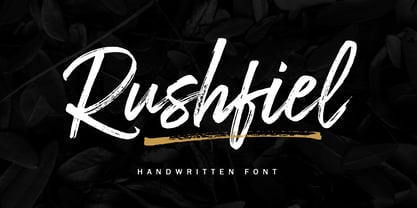
- Violette Brush by Fargun Studio,
$12.00
- Wavely JNL by Jeff Levine,
$29.00 - Last Ninja by Freaky Fonts is an evocative and character-rich typeface that captures the essence of mystery and agility associated with the ancient warriors it is named after. At first glance, Last N...
- The Tschich font, crafted by the skilled and prolific typographer Manfred Klein, is a unique and intriguing typeface that captures the essence of creativity and whimsy. Klein, known for his extensive...
- Venus Rising is a distinct and futuristic font that captures the attention of those who encounter it. Conceptualized and meticulously crafted by the talented typeface designer Ray Larabie, a figure w...
- Railyard Stencil JNL by Jeff Levine,
$29.00 - Anele Pro by Ole Sondergaard,
$14.28
- Life Cinema Screen by Andrey Ukhanev,
$-
- Ratatouille by Jonahfonts,
$40.00
- Jubel by Sine,
$15.00
- Magellan by Monotype,
$29.99 - Syntax by Linotype,
$29.99
- Appelsin by Bogstav,
$15.00
- Hermaphrodite by Volcano Type,
$29.00 - Summerhaven JNL by Jeff Levine,
$29.00 - Spacelord by Die Typonauten,
$25.00
- Eingrantch Mono by Harmnessless Type,
$30.00
- Kareemah by Sea Types,
$19.00
- Fleurons Two by Wiescher Design,
$39.50 - Diva Doodles Too by Outside the Line,
$19.00 - Ventana by Hanoded,
$15.00
- Plumero Script by Sudtipos,
$39.00
- TheAntiqua by LucasFonts,
$49.00
- Moister by Ilham Herry,
$35.00
- Fleurons V by Wiescher Design,
$39.50
- Compliment by profonts,
$39.99 - National Parks JNL by Jeff Levine,
$29.00


