10,000 search results
(0.029 seconds)
- Nearo Rounded by Digitype Studio,
$20.00 Nearo Rounded features five high-contrast font styles and thick and thin round shapes making this font unique. Nearo Rounded can be applied to various formal projects, including logos, magazines, books, packaging, fashion, cosmetics, invitations, novels, labels, greeting cards, and other advertising.
 - Votrag Texture by Putracetol,
$20.00 Introducing Votrag - 10 Modern Font Collection, a versatile typeface set that encompasses a spectrum of design possibilities. With five distinct weights - thin, light, regular, semibold, and bold - each accompanied by both clean and textured versions, Votrag offers a total of ten unique fonts.
 - Frykas by Edyta Demurat,
$24.00 Frykas is warm and friendly, hand-drawn font. It has a simple form with subtle irregularities, but no swashes or ornaments. This condensed font family with five styles will be a great solution for posters, titles, short sentences or whenever you need impact.
 - Eckhardt Freehand JNL by Jeff Levine,
$29.00Eckhardt Freehand JNL is the fourth font based on the lettering of sign painters and show card writers. Jeff Levine has chosen to name this “mini series” of fonts in honor of his friend Albert Eckhardt, Jr., a talented sign man who ran Allied Signs [in Miami, Florida] from 1959 until his passing in 2005. - Iamblock by wearecolt,
$- Free Font Iamblock is a super heavy display font that makes a statement. In the family, you get a monospace and a naturally spaced version of Iamblock. Iamblock was developed with the rave and party scene in mind, with lots of bright, bold colors mixed with blacks and whites... it's about the heavy contrast.
 - Blured Stroke by Ditatype,
$29.00 Blured Stroke is a beautiful script font. Every letter in this font looks like it was created with a skillfully swung brush. The subtle and soft brush strokes are clearly visible at every angle and bend, giving the entire font an artistic and expressive feel. The ends of each letter tend to be rounded, giving it a soft and elegant touch. This font is designed with detail and a perfect balance between thick and thin strokes. The thicker lines bring out strength and firmness, while thinner lines add softness and elegance to this font. The perfect combination of these differences creates an eye-catching visual harmony and expresses a unique writing style. The colors used in this font can vary, but to maintain a soft impression, bright colors would be the right choice. The letters remain legible and understandable because they have clear outlines. Enjoy the various features available in this font. Features: Ligatures Multilingual Supports PUA Encoded Numerals and Punctuations Blured Stroke fits best for any design projects that want to convey tenderness, friendliness and creativity. This font can be used in the invitations, greeting cards, brand logos, promotional materials, and many other design projects that require a warm artistic touch and are full of personality. Find out more ways to use this font by taking a look at the font preview. Thanks for purchasing our fonts. Hopefully, you have a great time using our font. Feel free to contact us anytime for further information or when you have trouble with the font. Thanks a lot and happy designing.
 - Aqren by Product Type,
$17.00 Welcome to the world of Aqren, where the beauty of handwriting combines with the dynamics of display. This font comes with five graduated styles that include Regular for a classic look, Outline for a touch of clear contours, Blur for a soft effect, and Distort for an experimental feel. Aqren Specialty: Five Tiered Styles: Explore a variety of five Aqren style variants to create a unique and attractive design according to your wishes. A Touch of Handwritten Vulnerability: Every character in Aqren exudes a touch of handwritten vulnerability, creating an air of authenticity and humanity in every line. Aqren is the perfect choice for projects that want a beautiful handwritten touch and a variety of tiered styles. From promotional materials to greeting cards, this font brings an unmatched personal element. Do not miss this opportunity! Get Aqren Handwriting Font for Display now and watch how every word becomes a valuable work of art.
 - Akserant Display by Din Studio,
$23.00 Akserant Display Font is an amazing display font. The font is suitable for any project like branding , lettering , tshirt print and many others. Included Files : Accents (Multilingual characters) 10 Ligatures 113 Alternates and swashes PUA encoded Numerals and Punctuation (OpenType Standard) Features with Clean and Rough Version.
 - Gorizon by Mightyfire,
$15.00 Looking for a font that has clean, modern yet unique looks? Gorizon is the answer! With firm lines, this font has an attractive appearance for the readers. This font is suitable for magazines, books, posters or other creative artworks. Enjoy and have fun in using Gorizon!
 - Tahillia by Canden Meutuah,
$27.00 Tahillia is a beautiful handwritten font. this font is so simple that i write very carefully. Even though it looks simple, this font still looks cool and stylish. Handwritten script font. Available to you in TTF/OTF/WOFF format. This Fonts are perfect for: logos, branding, wedding invitations, business cards, greeting cards, posters, magazines, social media, proliferate fonts, planner prints and websites. Get creative with their unique fun, and use them to brighten up any craft project! Get this font now and boost your creativity with it! If you have any questions, before or after your purchase, don't hesitate to contact us. Thank You
 - Vianova Serif Pro by Elsner+Flake,
$59.00 The font superfamily Vianova contains each 12 weights of Sans and Slab and 8 weights of the Serif style. The design from Jürgen Adolph dates back into the 1990s, when he studied Communication Design with Werner Schneider as a professor at the Fachhochschule Stuttgart. Adolph started his carrier 1995 at Michael Conrad & Leo Burnett. He was responsible for trade marks as Adidas, BMW, Germanwings and Merz. He has been honored as a member of the Art Directors Club (ADC) with more than 100 awards. On February 26, 2014, Jürgen Adolph wrote the following: “I was already interested in typography, even when I could not yet read. Letterforms, for instance, above storefronts downtown, had an irresistible appeal for me. Therefore, it is probably not a coincidence that, after finishing high school, I began an apprenticeship with a provider of signage and neon-advertising in Saarbrücken, and – in the late 1980s – I placed highest in my field in my state. When I continued my studies in communications design in Wiesbaden, I was introduced to the highest standards in calligraphy and type design. “Typography begins with writing” my revered teacher, Professor Werner Schneider, taught me. Indefatigably, he supported me during the development of my typeface “Vianova” – which began as part of a studies program – and accompanied me on my journey even when its more austere letterforms did not necessarily conform to his own aesthetic ideals. The completely analogue development of the types – designed entirely with ink and opaque white on cardboard – covered several academic semesters. In order to find its appropriate form, writing with a flat nib was used. Once, when I showed some intermediate designs to Günter Gerhard Lange, who occasionally honored our school with a visit, he commented in his own inimitable manner: “Not bad what you are doing there. But if you want to make a living with this, you might as well order your coffin now.” At that time, I was concentrating mainly on the serif version. But things reached a different level of complexity when, during a meeting with Günther Flake which had been arranged by Professor Schneider, he suggested that I enlarge the offering with a sans and slab version of the typeface. So – a few more months went by, but at the same time, Elsner+Flake already began with the digitilization process. In order to avoid the fate predicted by Günter Gerhard Lange, I went into “servitude” in the advertising industry (Michael Conrad & Leo Burnett) and design field (Rempen& Partner, SchömanCorporate, Claus Koch) and worked for several years as the Creative Director at KW43 in Düsseldorf concerned with corporate design development and expansion (among others for A. Lange & Söhne, Deichmann, Germanwings, Langenscheidt, Montblanc.”
 - Vianova Slab Pro by Elsner+Flake,
$59.00 The font superfamily Vianova contains each 12 weights of Sans and Slab and 8 weights of the Serif style. The design from Jürgen Adolph dates back into the 1990s, when he studied Communication Design with Werner Schneider as a professor at the Fachhochschule Stuttgart. Adolph started his carrier 1995 at Michael Conrad & Leo Burnett. He was responsible for trade marks as Adidas, BMW, Germanwings and Merz. He has been honored as a member of the Art Directors Club (ADC) with more than 100 awards. On February 26, 2014, Jürgen Adolph wrote the following: “I was already interested in typography, even when I could not yet read. Letterforms, for instance, above storefronts downtown, had an irresistible appeal for me. Therefore, it is probably not a coincidence that, after finishing high school, I began an apprenticeship with a provider of signage and neon-advertising in Saarbrücken, and – in the late 1980s – I placed highest in my field in my state. When I continued my studies in communications design in Wiesbaden, I was introduced to the highest standards in calligraphy and type design. “Typography begins with writing” my revered teacher, Professor Werner Schneider, taught me. Indefatigably, he supported me during the development of my typeface “Vianova” – which began as part of a studies program – and accompanied me on my journey even when its more austere letterforms did not necessarily conform to his own aesthetic ideals. The completely analogue development of the types – designed entirely with ink and opaque white on cardboard – covered several academic semesters. In order to find its appropriate form, writing with a flat nib was used. Once, when I showed some intermediate designs to Günter Gerhard Lange, who occasionally honored our school with a visit, he commented in his own inimitable manner: “Not bad what you are doing there. But if you want to make a living with this, you might as well order your coffin now.” At that time, I was concentrating mainly on the serif version. But things reached a different level of complexity when, during a meeting with Günther Flake which had been arranged by Professor Schneider, he suggested that I enlarge the offering with a sans and slab version of the typeface. So – a few more months went by, but at the same time, Elsner+Flake already began with the digitilization process. In order to avoid the fate predicted by Günter Gerhard Lange, I went into “servitude” in the advertising industry (Michael Conrad & Leo Burnett) and design field (Rempen& Partner, SchömanCorporate, Claus Koch) and worked for several years as the Creative Director at KW43 in Düsseldorf concerned with corporate design development and expansion (among others for A. Lange & Söhne, Deichmann, Germanwings, Langenscheidt, Montblanc.”
 - Vianova Sans Pro by Elsner+Flake,
$59.00 The font superfamily Vianova contains each 12 weights of Sans and Slab and 8 weights of the Serif style. The design from Jürgen Adolph dates back into the 90th, when he studied Communication Design with Werner Schneider as a professor at the Fachhochschule Stuttgart. Adolph started his carrier 1995 at Michael Conrad & Leo Burnett. He was responsible for trade marks as Adidas, BMW, Germanwings and Merz. He has been honoured as a member of the Art Director Club (ADC) with more than 100 awards. On February 26, 2014, Jürgen Adolph wrote the following: “I was already interested in typography, even when I could not yet read. Letterforms, for instance, above storefronts downtown, had an irresistible appeal for me. Therefore, it is probably not a coincidence that, after finishing high school, I began an apprenticeship with a provider of signage and neon-advertising in Saarbrücken, and – in the late 1980s – I placed highest in my field in my state. When I continued my studies in communications design in Wiesbaden, I was introduced to the highest standards in calligraphy and type design. “Typography begins with writing” my revered teacher, Professor Werner Schneider, taught me. Indefatigably, he supported me during the development of my typeface “Vianova” – which began as part of a studies program – and accompanied me on my journey even when its more austere letterforms did not necessarily conform to his own aesthetic ideals. The completely analogue development of the types – designed entirely with ink and opaque white on cardboard – covered several academic semesters. In order to find its appropriate form, writing with a flat nib was used. Once, when I showed some intermediate designs to Günter Gerhard Lange, who occasionally honored our school with a visit, he commented in his own inimitable manner: “Not bad what you are doing there. But if you want to make a living with this, you might as well order your coffin now.” At that time, I was concentrating mainly on the serif version. But things reached a different level of complexity when, during a meeting with Günther Flake which had been arranged by Professor Schneider, he suggested that I enlarge the offering with a sans and slab version of the typeface. So – a few more months went by, but at the same time, Elsner+Flake already began with the digitilization process. In order to avoid the fate predicted by Günter Gerhard Lange, I went into “servitude” in the advertising industry (Michael Conrad & Leo Burnett) and design field (Rempen& Partner, SchömanCorporate, Claus Koch) and worked for several years as the Creative Director at KW43 in Düsseldorf concerned with corporate design development and expansion (among others for A. Lange & Söhne, Deichmann, Germanwings, Langenscheidt, Montblanc.”
 - Mayfest by pentagonistudio,
$17.00 Mayfest Is An Elegant Display serif Inspired By Luxury and Elegant Character. FAQ's : Where are the OTF's? They are included in a download link( in a text file) in your main download file. 1 user 2 computers installation (Desktop License) You may NOT use for broadcast or Cinema/Motion Picture. You may NOT resell this font in any platform without further permission from designer. Do NOT embed font files in app/game/e-pub (for desktop license) You may NOT use the fonts in templates for sale/free. ( web/print/app ) For other license use please contact us. SOFTWARE REQUIREMENTS : Fonts and alternate : No special software required they may be used in any basic program /website apps that allows standard fonts That's it folks! You can go ahead and get cracking :) Follow My Shop For Upcoming Updates Including Additional Glyphs And Language Support. And Please Message Me If You Want Your Language Included or If There Are Any Features or Glyph Requests, Feel Free to Send me A Message. Have a Good Day !
 - Interite by Harvester Type,
$20.00 Interite is an antique font that is based on square elements that give it an unusual look. Square serifs and unusual shapes of ovals create a solid character and make the font fresh. More language support, ligatures, and alternative characters will increase the font's usability. 450 glyphs, 282 languages of the Latin group, 12 alternative characters, 14 ligatures, a capital set and more than one day spent for kerning-create a great potential for this font. Text, covers, posters, prints, titles, interfaces, web, book covers, packaging, logos, and much more where you can apply this font. If you find an error in the font, kerning, or just want to add something or suggest something, then write to me: bunineugene@gmail.com
 - Lilla Letter Lover by Letterground Foundry,
$11.99 "Lilla Letter Lover" is a captivating font designed specifically for children's books. This delightful typeface brings an element of playfulness to reading, while also enhancing phonemic awareness. The font's remarkable strength lies in bridging the gap between handwritten and printed letters. For early readers, this transition can be challenging, but "Lilla Letter Lover" simplifies the process. It merges the familiar aspects of handwritten letterforms with the clarity of printed text, providing a seamless reading experience. This feature ensures that children can comfortably navigate both forms of writing, enhancing their overall literacy skills. The whimsical charm of "Lilla Letter Lover" instantly captures young readers' imaginations. Each letter is thoughtfully designed with basic shapes and simplicity in mind, for an experience where letters come to life, fostering a love for reading and storytelling. Additionally, "Lilla Letter Lover" offers a unique opportunity for sight-based spelling learning. The visually distinctive presentation of words helps young readers to develop a strong visual memory of spelling patterns. This visual association enables them to recognize and recall words with ease, strengthening their reading and writing proficiency. In summary, "Lilla Letter Lover" is not just a font; it is an enchanting gateway to make reading a joyous adventure for children of all ages.
 - First Responder JNL by Jeff Levine,
$29.00 First Responder JNL is a back slanted version of Catalog JNL, and is intended to be used for graphics on police and fire vehicles to emulate "forward" movement, which is a popular theme on such vehicles. It is also useful in conveying the same image in print applications and web design.
 - Denominary by Balibilly Design,
$19.00 Denominary typeface is about precision, beauty, and refinement. It's crafted with care and attention to detail for professional creative people who value quality and distinction. The Denominary typeface has an advanced feature that sets it apart from others: auto-active contextual alternates. Our font engineer writes this feature to minimize kerning between characters automatically, making it very convenient and easy to use, especially for web purposes where minimal kerning means a smaller font size. The feature adjusts the kerning based on the specific characters being used, ensuring optimal spacing between letters. Contextual alternates will push your typography project to a balanced form. We designed the letterform by considering the white space and contrast to get a natural voice and fluid, and of course, this will happen in a legible and stylish. Denominary typeface offers extensive language support and stylistic variations, thanks to its 482 glyphs. It also has discretionary ligatures, case-sensitive forms, and slashed zeroes for added typographic options. The condensed style saves space, and seven weights will provide more options. Denominary typeface brings refinement, exclusivity, and sophistication to any design project. It's a typeface that tells a story of precision, beauty, and distinction. Go ahead with the game in terms of its advanced auto-active contextual alternates feature, giving you a competitive edge in the design field.
 - SarahfSlob by Ingrimayne Type,
$9.95 SarahfSlob is a crudely drawn, serifed typeface that abhors straight lines and smooth curves. It comes in five weights and ten styles. It is very legible and is suitable when a funny, informal font is desired.
 - Grabag by Differentialtype,
$10.00 Grabag is a bold vintage display font that comes with four styles. It will look great for headlines, branding, magazines, logos, and more. Grabag will add a masculine and firm impression in every design you make.
 - 1917 Stencil by GLC,
$38.00 We have created this family inspired by the old-fashioned stencil letters like those the French army used during the WWI to write on soldiers' clothes, blankets, signals, ammunition, supplies and so on. This is a Didone-style font. We offer two variants for the same font: monospaced or proportionally spaced. Our Open Type specification allows automatic substitution of letters to avoid repeating the same glyph when a letter is repeated (for example “ee” or “bb”)(Not available with accented characters and a few others like “Q” that are never repeated in common use).
 - Salom by Schriftlabor,
$44.00 Salom was designed by Austrian type designer Igor Labudovic during his year at Reading University. Besides Latin, it originally included Arabic and Hebrew. The peaceful coexistence of both writing systems in his fonts led him to combine the words Salaam and Shalom to the font family name. Salom’s sibling, Salom Sans, features the same letter proportions and therefore allows a rich spectrum of diverse typography, yet keeping the harmony between all styles. The sans has an additional light weight, while the serif comes with an expressive stencil style.
 - The Black Knight by IKIIKOWRK,
$17.00 Introducing The Black Knight - Classic Blackletter, created by ikiiko. The Black Knight is inspired by the typeface in the era of the old European empire, with a lettering style but with a modern touch. The Black Knight has several choices of unique letter alternates as in classic writing. This font is perfect for an logo, poster event, flyer, magazine layout, fashion stuff, quotes, and so much more. What's included? Uppercase & Lowercase Number & Punctuation Alternates Multilingual Support Enjoy our font and if you have any questions, you can contact us by email : ikiikowrk@gmail.com
 - Asly Brush by Artisan Studio,
$12.00 Asly Brush is the font style handmade dancing and then live trace to have Grungy brush and unique forms of calligraphy, the writing style is very natural. The Features of this fonts is: Standart ligatures Stylistic Alternates Stylistic sets PUA Unicode (Private Use Areas) Can be used for various purposes.such as headings, logos, wedding invitation, t-shirt, letterhead, signage, labels, news, posters, badges etc. To enable the OpenType Stylistic alternates, you need a program that supports OpenType features such as Adobe Illustrator CS, Adobe Indesign & CorelDraw X6-X7
 - STCO Prescissa by Shaltype Co,
$15.00 Prescissa is inspired by Textualis, also known as textura or Gothic bookhand, which was the most calligraphic form of blackletter, and today is the form most associated with “Gothic”. Written manually by hands, and reform into clean Typeface. Natural stroke from original handwriting. It can be used for just Title or even writing. In this font, you will get : Over 449 Glyphs 12 OpenType features Multilingual languages. Get Prescissa now! It will best use for any design requirement, many fonts will coming with a unique concept. Thank you! Best Regards, FM-STCO.
 - Nimble by Twinletter,
$14.00 Nimble carries a strong, unique, cute, elegant, and formal character theme with a different touch, giving a new impression. beautiful, harmonious, relaxed but still formal. This font is rich in uniqueness in various characters in each letter, especially uppercase letters. you can alternate calls in each uppercase letter to create a new and captivating look in writing a name or trademark or something else. This font is perfect for strong text with displays for a wide variety of branding, advertising, posters, banners, packaging, news headlines, magazines, websites, logo design, and more.
 - Koriyah by Flawlessandco,
$9.00 Introducing Koriyah, a stunning Arabic font that combines elegance with modernity. With its captivating design and exquisite details, Koriyah is sure to make a lasting impression on your audience. An Original typeface that suitable for any graphic designs such as branding materials, t-shirt, print, business cards, logo, poster, t-shirt, photography, quotes .etc This font support for some multilingual. Modern Sweet Retro that contains uppercase A-Z and lowercase a-z, alternate character, numbers 0-9, and some punctuation. If you need help, just write me! Thanks so much for checking out my shop!
 - Manova by Flawlessandco,
$9.00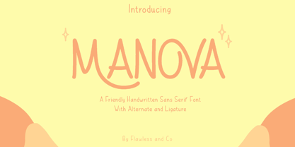 Introducing "Manova" - a friendly and approachable handwritten sans serif font that adds a touch of warmth and authenticity to your designs. There's some connected letters and some alternates that suitable for any graphic designs such as branding materials, t-shirt, print, business cards, logo, poster, t-shirt, photography, quotes .etc This font support for some multilingual. Also contains uppercase A-Z and lowercase a-z, alternate character, numbers 0-9, and some punctuation. If you need help, just write me! Thanks so much for checking out my shop!
 - Ephemera Egyptian by Ephemera Fonts,
$20.00 Egyptian ephemera is a typeface inspired from basic block lettering, widely used in art and craft of sign writing. 5 styles available from light to bold. and for the first time it is also available as variable fonts. One of the uniqueness of this font is the small spur on each stem, and the terminal, which intends to simulate an entry and end brush stroke. OpenType features support such as Smallcaps, Tabular Figure, Superscript, and 2 alternate of ampersands. This typeface was created for Display needs, such as headlines, signage, logotype, badges design, packaging, etc.
 - Fuggles by TypeSETit,
$59.95 Take a little Inspiration, mix in some Sassy Frass and a splash of Waterfall; add hundreds of alternate forms and you have the recipe for a versatile hand writing font. This fun, scribbly little font can fool you. At first glance it looks crude and simple. But, with over 1600 glyphs, combine the right character pairs and suddenly Fuggles is a powerful script that can be used for sophisticated commercial design. Some characters are quirky, some are swashy, some are scribbly and others are elegant. So take a look at the world of Fuggles.
 - Azqad by Flawlessandco,
$9.00 Azqad is an elegant Arabic-style font that combines traditional elements with a touch of modernity, with its graceful curves and intricate details. An Original typeface that suitable for any graphic designs such as branding materials, t-shirt, print, business cards, logo, poster, t-shirt, photography, quotes .etc This font support for some multilingual. Modern Sweet Retro that contains uppercase A-Z and lowercase a-z, alternate character, numbers 0-9, and some punctuation. If you need help, just write me! Thanks so much for checking out my shop!
 - Secret Memories by Flawlessandco,
$9.00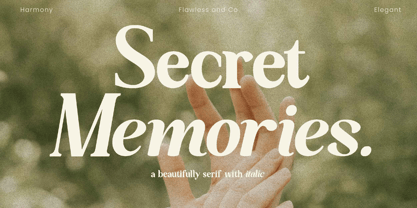 Secret Memories is a Serif Italic Font with a classy and elegant style in each character, so it's fitted for some wedding invitation display. There's some connected letters and some alternates that suitable for any graphic designs such as branding materials, t-shirt, print, business cards, logo, poster, t-shirt, photography, quotes .etc This font support for some multilingual. Also contains uppercase A-Z and lowercase a-z, alternate character, numbers 0-9, and some punctuation. If you need help, just write me! Thanks so much for checking out my shop!
 - Palmbell by Letterhend,
$13.00 Palmbell is a pair of fonts that bring a classy yet casual feel at the same time. The classic sans combined with the natural hand-writing script are the perfect match for you who needs a typeface for headlines, logotype, apparel, invitations, branding, packaging, advertising, and more. This typeface is comes in uppercase, lowercase, punctuation, symbols, numerals, stylistic set alternate, ligatures, etc also support multilingual. We hope you enjoy the font, please feel free to comment if you have any thoughts or feedback. Or simply send me a PM or email me at letterhend@gmail.com
 - Bartley by Flawlessandco,
$9.00 Introducing Bartley, a striking blackletter font that merges tradition with a modern edge. This exquisite typeface is meticulously crafted to bring a touch of Gothic elegance to your designs. An Original typeface that suitable for any graphic designs such as branding materials, t-shirt, print, business cards, logo, poster, t-shirt, photography, quotes .etc This font support for some multilingual. Modern Sweet Retro that contains uppercase A-Z and lowercase a-z, alternate character, numbers 0-9, and some punctuation. If you need help, just write me! Thanks so much for checking out my shop!
 - Kilometro Display by Hueso,
$20.00 Kilometro Display is a Font Family inspired by the chrome car emblems of the auto industry. In the early 1950s Car manufacturers started using this sort of joint-lettering (script) to write their brand or model on their cars. The trend quickly made it’s way to other industries like electric appliances and it lasted for a good 30 plus years. Today only a handful of brands still uses this font style for their products. This geometric script re-lives a bold past all the way through 5 styles to a thin future.
 - Hurdagif by Twinletter,
$14.00 Hurdagif is a feminine typeface that is lovely, graceful, and appealing. includes a range of letterforms integrated into OpenType alternatives, making your job more efficient. Let’s use this typeface to make your project seem great. This font is designed with a natural touch of handwriting which is refined to create a portion and composition that suits your needs. So this font is suitable for craft, children’s writing, adventure posters, food banner titles, wedding invitations, product packaging logos, quotes, social media page covers, furniture banner headlines, book covers, and much more.
 - Rollbox by Owl king project,
$37.00 Rollbox Rollbox is a font inspired by the development of technological modernization in the world of the digital visual industry, By adopting a modern style and a little combined with the beauty of the monospace style that can be found in small letters, Rollbox with 20 font weights & the addition of several alternative letters, this will be more enriching & more extensive exploration. Not only that rollbox letters can also be used in logo characters, writing short paragraphs will all work well with beautiful combination portions. Let's start design. With love & be happy.
 - Young Finesse by Doyald Young,
$50.00Young Finesse is a light, two-weight, announcement face with a large x-height whose characters contain only a few straight lines. It is based on the titling font that I designed for the dust jacket of my book Fonts & Logos. Its inspiration comes from Hermann Zapf’s Optima, a serifless roman text face, based on Renaissance inscriptions.Young Finesse italic has a set of elaborate swash caps that reference 16th-century writing hands. Both Young Finesse and Home Run include Richard Isbell’s “interrabang,” appropriately used for statements that are both interrogative and exclamatory. - Nestapha by Flawlessandco,
$9.00 Nestapha is an elegant Arabic-style font that is perfect for a variety of design applications, for example those related to Ramadan. There's some connected letters and some alternates that suitable for any graphic designs such as branding materials, t-shirt, print, business cards, logo, poster, t-shirt, photography, quotes .etc This font support for some multilingual. Also contains uppercase A-Z and lowercase a-z, alternate character, numbers 0-9, and some punctuation. If you need help, just write me! Thanks so much for checking out my shop!
 - Delusoid by Flawlessandco,
$9.00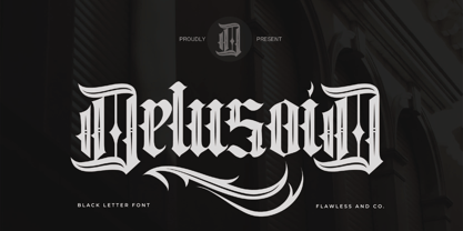 Delusoid, a Blackletter font with an authentic and unique style on each character that gives a bold touch to any design you create. There's some connected letters and some alternates that suitable for any graphic designs such as branding materials, t-shirt, print, business cards, logo, poster, t-shirt, photography, quotes .etc This font support for some multilingual. Also contains uppercase A-Z and lowercase a-z, alternate character, numbers 0-9, and some punctuation. If you need help, just write me! Thanks so much for checking out my shop!