4,764 search results
(0.018 seconds)
- Scotch Modern by Shinntype,
$79.00 Sporting pot-hook serifs and a tiny aperture, the Scotch Modern was an evolution of the Didone and Scotch Roman classifications, becoming the default type genre of the 19th century. Recontextualizing the 10-point type of a scientific report published in 1873, Nick Shinn has produced sleekly refined, micro-detailed vector drawings by eye, without the assistance of scans, of this magnificent classic. A beautiful genre of type, so popular in books, magazines and advertisements during the Victorian era and much of the 20th century, the Scotch Modern was derided by advocates of both the Arts & Crafts movement and 20th century modernists, and was never been properly adapted to hot metal, phototype, or digital media -- until now. Now the full range of typographic expression is possible in this style. The OpenType fonts support Western and CE encodings, Cyrillic (with Bulgarian alternates) and Polytonic Greek. There are many special features, including small caps, unicase, italic swash capitals, ten sets of figures per font, and both slashed and nut (vertical) fractions. Together with Figgins Sans, comprises The ModernSuite of matched fonts.
 - Lust Script by Positype,
$49.00 Boom. You asked for more, um, well just ‘more’—more swashes, more options, more weights, more of everything. I cannot give you more weights. The design just won’t allow it and anything else would be a compromise or a bastardization of the exemplars just to make money that I am unwilling to do. But, I did give you an overly indulgent, 90% cacao bar and espresso, Lust Script Fine. The ending strokes on these glyphs will literally draw blood. Enjoy it as much as I have. The Lust Collection is the culmination of 5 years of exploration and development, and I am very excited to share it with everyone. When the original Lust was first conceived in 2010 and released a year and half later, I had planned for a Script and a Sans to accompany it. The Script was released about a year later, but I paused the Sans. The primary reason was the amount of feedback and requests I was receiving for alternate versions, expansions, and ‘hey, have you considered making?’ and so on. I listen to my customers and what they are needing… and besides, I was stalling with the Sans. Like Optima and other earlier high-contrast sans, they are difficult to deliver responsibly without suffering from ill-conceived excess or timidity. The new Lust Collection aggregates all of that past customer feedback and distills it into 6 separate families, each adhering to the original Lust precept of exercises in indulgence and each based in large part on the original 2010 exemplars produced for Lust. I just hate that it took so long to deliver, but better right, than rushed, I imagine.
 - Elektrakution by Comicraft,
$19.00 SHE'S DEAD, FRANK It's the year 1991, BC (Before Comicraft) when REM were still making records and Frank Miller’s memorable run on Marvel Comics’ DAREDEVIL was just over ten years old. Comicraft’s Richard Starkings found himself working in Anaheim, California for Graphitti Designs. Graphitti had produced the first hardcover edition of Miller’s Batman tale, DARK KNIGHT RETURNS and was now putting together the sequel to Miller’s DAREDEVIL — ELEKTRA LIVES AGAIN! Richard was not engaged to letter this book, the pages of Frank’s incredible original art that came through Graphitti’s studio were already lettered by Marvel Stalwart, Jim Novak. However, there were some cover elements that needed to be added, based on the logo originally rendered by Frank’s brother, Steve. Starkings set about the task of creating an alphabet that could be used to develop Steve’s idea for the trade dress -- the cover elements, the back cover copy and credits on the interior pages. This was long before Macintosh computers and font programs made this work considerably easier, so Rich sat down with a pencil and a sheet of vellum and rendered an alphabet that could be used as the basis for the text that was needed... Those sketches have languished in a drawer for nearly thirty years, but now, finally, Comicraft’s John Roshell has dusted off those old letterforms and Elektrakuted a font based on those designs, a font we HAD to call ELEKTRAKUTION! As for Elektra; she’s dead, Frank. Features: Ten weights (Light, Regular, Bold; Rough Light, Regular & Bold; Inline, Inline Rough, Outline & Outline Rough) with upper & lowercase characters, Western & Central European accents and Greek characters.
 - Deadfall by Mofr24,
$11.00 Discover Deadfall, the ultimate horror display font that will send shivers down your spine! What sets Deadfall apart is its unique blend of fear-inducing aesthetics and multilingual capabilities. This Monospace typeface exudes a captivating dripped and splash style, adding an extra layer of terror to your designs. Notably, Deadfall supports the Cyrillic alphabet, making it an ideal choice for a global audience. Deadfall offers both regular and italic variations, granting you even more creative possibilities. Whether you're designing posters, crafting marketing materials, conjuring chilling movie titles, creating Death metal logotypes, or working on Halloween-themed crafts, Deadfall will infuse your projects with a bone-chilling atmosphere. To ensure versatility, consider pairing Deadfall with related font families or other typefaces that complement its macabre charm. Its functional aspects include an extensive character set and special features, making it suitable for a wide range of applications. The design concept behind Deadfall revolves around the idea of capturing the essence of horror. The font's distinctive dripped and splash style adds a sense of chaos and unease to any composition, immersing the viewer in a world of terror. The inclusion of the Cyrillic alphabet reflects our commitment to providing a font that caters to diverse audiences, bringing fear to every corner of the globe. We created Deadfall to meet the demand for a truly spine-tingling font that conveys a sense of horror and foreboding. Whether you're a graphic designer looking to evoke fear or a Halloween enthusiast seeking to amplify the spooky atmosphere, Deadfall is here to unleash terror in your designs. Get ready to embrace the darkness with Deadfall - the ultimate font for all things haunting and macabre!
 - Conspired Lovers by Harald Geisler,
$39.00 Conspired Lovers is based on five years of love-letter writing. A font to capture the intentions of love letters more than any other font. How did the Project start? In the last five years I wrote love letters with two persons. I became used to the joy of handwriting with ink and nib on fine paper. Through practice a experimentation my style continuously refined. As life moves on, suddenly I found myself with no one to write love letters to. It's a luxury to have someone to write letters to. Missing the joy of writing and listening to Gregory Porter’s “Be Good”, the decision was made to take this 5 years of writing and make this dance on paper a font. A handwritten typeface for everyone to use. This font was created in July, 2012 and named Conspired Lovers. A font to capture and convey your message in a special way to the beloved one close to your heart. With a long practice of writing crafted into the unique design I hope that you and the recipient of your writing will soon enjoy this design. The Open-type version features 350+ glyphs including alternates and ligatures. All lowercase and most uppercase letters are connected, to create a realistic hand-writing-calligraphy on your creations. Conspired Lovers is international and supports a wide range of eastern european languages with accented letters to reach everyone in Sweden, France, Hungary and almost everywhere around the globe. A trailer for Conspired Lovers can be seen here: http://vimeo.com/haraldgeisler/conspired-lovers If you're looking for more heart related fonts also check out my other fonts.
 - Xmas by Linotype,
$29.99Christmas cookies have already slowly crept onto your local supermarket's shelves -- the Linotype Xmas Fonts just can't wait any longer! Ravishingly friendly and universally applicable: Fuenfwerken -- a design studio from Wiesbaden, Germany -- is proud to present its latest Fun Font Family. Bringing variety to the dry Christmas card genre, these fonts can also be used on posters to spread holiday cheer at home. No limits are placed on your creativity here! The family has three different fonts, each with more than 60 symbols inside: Xmas Story includes the whole figure palette necessary for a classical Christmas story. From a cute little Baby Jesus to the Three Wise Men and woolly Aramaic sheep and everything that one needs to add special flair to a letter to grandma, or to set up a Nativity Scene at home for the kids is included. Customers who aren't searching for a biblical font should check out Xmas Essentials. This font contains typical non-denominational end-of-the-year holiday ornaments, such as snowflakes, decorated Christmas trees, nutcrackers, and stars. Last but not least is the Xmas Modern font. Just as global warming poses severe risks to snowmen, this font will make recipients of your holiday and New Year's cards melt. Glyphs such as Santa Claus riding on a Vespa -- complete with iPod -- speed away from normal, stuffy holiday seriousness, and signal that the Fun Generation has arrived! The best choice, of course, is to treat yourself to all three fonts this Christmas. Then you'll be prepared for every situation. Happy Holidays! - Holy Type by The Ocean Studio,
$15.00 HOLY TYPE FONT a handwritten font inspired and dedicated or consecrated to God or a religious typeface , meaningful of type. You can get special characters by access Character Map for Windows user, and Font Book for MAC user. Download tutorial below : How to Access special characters, You can Download the link for Support you http://www.mediafire.com/file/o3sml68hxp6h6yd/Access_Spesial_Characters.pdf/file This is information and tutorial how to use ligatures in Adobe Illustrator, Adobe Photoshop, Microsoft Word (Windows and Mac). And Enable alternates characters in other apps. Download the guide here : http://www.mediafire.com/file/edm9sjjwx9g1vi2/How_to_Active_Ligature.pdf/file if you get a trouble on our font kerning : http://www.mediafire.com/file/9e0q5sjzx97e06m/how_to_slove_trouble_kerning.pdf/file
 - Village by Font Bureau,
$40.00 David Berlow undertook the revival of Frederic W. Goudy’s Village family in the early ’90s as the first real step in the successful redesign of Esquire magazine. Goudy originally cut Village No. 2 in 1932 to bring early ideas up to date, adding the italic a year or two later for his own satisfaction. Font Bureau expanded Village, the model for Goudy’s mature style, into a ten-part series designed for Esquire’s use in text and display; FB 1994
 - Dalle by Stawix,
$40.00 Dalle was designed in 2012 by Stawix Ruecha, and has been continued to develop over the last two years in order to keep pace with the changing trends and to apply for different uses. Dalle comes with a large font family and is ideally suited for body texts and also display. This typeface has OpenType features including multi-ligatures support and tabular figures. Add Dalle (Sans) in your font menu and spice up your layouts with this new flavour!
 - Lualaba Snake by Scholtz Fonts,
$19.00Lualaba Snake is a bold display font, characterized by the snake-like decoration used in each letter. The design of the font was inspired by the legend of the Lualaba River in Central Africa. Snakes enjoy a special status in Africa, as they are reputed to be messengers of the ancestors, and are therefore good. Near the Lualaba river is a pool in which a big snake called Kabwe lives. Our ancestors are thought to communicate through this snake. - Orchard Trees by Supfonts,
$15.00 Hello dears! I fulfilled my old dream and drew (wrote it to whom as you like :) a font in the Modern Calligraphy style. Also I added Ligatures and Swashes, have fun :) Orchard Trees will look beautiful on holiday invitations, wedding invites and stationery, logos, and more. Test it out below to see how it could look for your next project! Includes: Uppercase and lowercase Numbers and punctuation Foreign language support Check out my blog: https://www.instagram.com/zloillev pinterest.com/dmitriychirkov7
 - Back Groove Outline by Gatype,
$9.00 The Back Groove font is smooth in totality and elegance. One of the best releases earlier this year, drawn with pinpoint accuracy. Back Groove has the perfect simplicity and refinement for your next project. Back Groove It perfectly represents a precise and vintage aesthetic. Because it's guided by Outlen's Back Groove I recommend this font for your next celebrations, logos, invitations, and home decor projects that need a touch of compact alternative combinations! Check it out and enjoy!
 - Forgotten Playbill by Lauren Ashpole,
$15.00 Years ago, I came across a vintage playbill and was struck by its lettering. The detailed floral pattern surrounded by thick outlines stayed in my mind even though the play's name and cast have faded. I finally tried to recreate the style from memory and Forgotten Playbill is the result. While all letters are actually capitals, the uppercase rotate slightly counterclockwise and the lowercase slightly clockwise. I suggest alternating between the two to reproduce my mystery inspiration.
 - MC Skitsy by Maulana Creative,
$16.00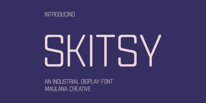 Skitsy is an industrial tech genre sans display font. With regular stroke, fun character with a bit of ligatures and alternates. To give you an extra creative work. Skitsy font support multilingual more than 100+ language. This font is good for logo design, Social media, Movie Titles, Books Titles, a short text even a long text letter and good for your secondary text font with script or serif. Make a stunning work with Skitsy font. Cheers, Maulana Creative
 - Black Barbwire by Maxim Plekhov,
$19.00 The Black Barbwire font is memorable and extraordinary. Was created for bold and aggressive headlines. Black Barbwire is perfect for design of a music cover, horror movie, detective, flyer, poster or a magazine. It combines characteristics such as aggression, mysticism, as well as fresh youthful maximalism and audacity. Using the Black Barbwire font, you will get the effect of mystery, horror and fear. Black Barbwire is designed to shape your individual style. Black Barbwire contains 223 characters including Cyrillic.
 - Modesto by Parkinson,
$25.00 Modesto is a loose-knit family based on a signpainters lettering style popular in the late-19th and early-20th centuries. It evolved from the lettering I used for the Ringling Bros. and Barnum & Bailey Circus Logo. The Modesto family was not planned. It just happened, a few fonts at a time over about fifteen years. In 2014 four new Italic fonts were added. There is a downloadable MODESTO USER MANUAL PDF in the Gallery section for this family.
 - La Jefa by Lauren Ashpole,
$15.00 A short font for short people* La Jefa is very, very loosely based on a Christmas card I received years ago from my boss at the time. Designed to capture that personalized touch, it's a hand lettered font with a short x-height and ample spacing. Although all of the letters are lowercase, the uppercase provides a unique set of characters that can be mixed in for a more natural handwritten feel. *also people of tall or average height
 - Borrowdale by Hanoded,
$20.00 Borrowdale is a valley and civil parish in the English Lake District. In the 16th century a major deposit of graphite was discovered near Seathwaite, which kickstarted the pencil industry. Borrowdale font was made with one of my son's coloring pencils (which probably does not contain a single molecule of graphite). It is a very legible and easy-on-the-eye font, ideal for children's books, texts and product packaging. Comes with a mother lode of diacritics.
 - Coliseum Pro by Red Rooster Collection,
$60.00 Coliseum Pro is a five-weight compressed spur serif font family. ITF’s original Coliseum family, released in 1992, was designed by Julie Hopwood and Pat Hickson. Steve Jackaman completely redesigned, redrew, and improved the Coliseum family over a two-year period, and two additional lighter weights have emerged: Light and Book. Coliseum Pro is inspired by Roman display typefaces, and is powerful and eye-catching at any size. Two sister typefaces, Clydesdale and Torpedo, were born from Coliseum’s redesign.
 - Milanello by Mevstory Studio,
$25.00 Milanello is a strong sans serif font with medium contrast. Inspired by the High Octane Rock genre and modern-classic fashion. Carefully designed with a short ascender to give a solid look, also the sharp serif makes the letters look more strong. Milanello is a display-type which perfect for a headline, sub-headline, and short body text for magazine, books, fashion, quotes, hipster t-shirt, signboards, logo, and etc. A great choice for a brave concept!
 - Californian FB by Font Bureau,
$40.00 In 1938, Frederic W. Goudy designed California Oldstyle, his most distinguished type, for the University of California Press. In 1958, Lanston Monotype issued it as Californian. Carol Twombly digitized the roman 30 years later for the University of California; David Berlow revised it for Font Bureau with italic and small caps; Jane Patterson designed the bold. In 1999, assisted by Richard Lipton and Jill Pichotta, Berlow designed the black and the text and display series; FB 1994–99
 - Tangient by Galapagos,
$39.00Designed primarily for display use, Tangient is serviceable down to the larger text sizes. It presents an idiosyncratic profile, with a tight fit, clearly proportionally spaced, yet having the texture of a monospaced design. Its shapes leap out from the page, where well behaved characters would make a more subdued statement. The calligraphy from which Tangient GD was electronically "cut" originally appeared in a series of personal greeting cards prepared by the Zafaranas in celebration of the New Year. - Greene Designs by Woodside Graphics,
$19.95This font consists of 26 design elements derived and adapated from various architectural works of Charles and Henry Greene who created hundreds of designs for houses, furniture and decorative arts in their own unique interpretation of the "Arts & Crafts" style in the early years of the 20th Century, mostly in Pasadena, California. Many of the picture elements are designed to form distinctive borders, and the variety of designs contained in this font encourages their use in many creative ways. - DIN Mittel EF by Elsner+Flake,
$35.00The typeface DIN Mittel, offered by Elsner+Flake, is based on the DIN 1451 used in Germany since 1931. The DIN 1451 which was primarily seen in the areas of technology and traffic had to adhere to the so-called DIN Norms. Variations of the DIN 1451 are also employed in Austria, Eastern Europe, Greece and the Near East. With its new release Elsner+Flake has expanded the DIN Mittel with the characters EuropaPlus and Cyrillic. - Linotype Astrolo by Linotype,
$29.99Born in Fulda, Germany, Martina Theisen studied communications design in Mainz. She spent many years working for the television company, SWR Mainz. Now she works as a designer and illustrator. She creates fonts, as well as illustrates children's books and school textbooks. For Linotype Typentypo (2002, part of TakeType 4), she designed the display faces Linotype Creatures, Linotype Improfil Outline and Black (profiles of funny faces), Linotype Smileface, Linotype Maenneken and Linotype Astrolo (hand-drawn astrological symbols). - Template Sans by Jeff Levine,
$29.00 The Wright-Regan Instrument Company (Wrico) was one of the leading manufacturers of lettering templates for many years. Aside from their own line of products, they also did custom manufacturing. A series of lettering guides called “Mimeostyle” for the A. B. Dick Company of Chicago (produced for use in making mimeograph machine printing stencils) featured an art Deco squared letter design with rounded corners. This is now available digitally as Template Sans JNL, in both regular and oblique versions.
 - Siarog by Linecreative,
$16.00 Looks simple and powerful. This is the reason why we want to offer you the Siarog font. This font gives off a clean, powerful and very elegant feel. This font is perfect for use in headlines, posters, branding, titles, and other graphic designs. What you get dear, you will get : Siarog- A clean San serif font including Upper & Lowercase characters(ALL CAPS), Stylistic alternates Character (11 Character) Supports Multi linguage (Latin Western Europe), Numbers and Punctuation
 - Torpedo by Red Rooster Collection,
$60.00 Torpedo is a five-weight rounded, compressed sans serif font family. It was designed by Steve Jackaman over a several-year period, and was released in 2017 alongside its sister typefaces Coliseum Pro and Clydesdale. Torpedo, whose name was inspired by round torpedo warheads, is a visually sturdy font that maintains excellent legibility. Torpedo is flexible in its applications, like its violent namesake; it is explosive at large sizes, and still works efficiently at low profiles.
 - Empire State Gothic by Comicraft,
$19.00 Empire State Gothic is, from basement to spire, an exultant, soaring skyscraper of a font, distinguished by its high arches, steel-framed construction and the glory and pride of Comicraft's fine woodwork and stonework! You might find it surprising, then, that this tall, lanky font was something of a loner during its teenage years, mingling with others of its kind in the shadowy corners of coffeehouses, nurturing feelings of belittlement while craving attention it may not have rightly deserved.
 - Posterizer KG by Posterizer KG,
$40.00 This slab serif font is inspired by European industrial, machine-made letters. It looks rational and geometric, but optically corrected and balanced. As the name says this font face is designed to be used by mostly for posters, headlines, visual identities and short texts. Font was created for Celebration of the 5 year anniversary of Design Studio Box from the city of Kragujevac (KG), the industrial city of Serbia. Posterizer KG contains all the Latin and Cyrillic glyphs.
 - Bulldog Slab by Club Type,
$36.99 Figgins and Caslon may be names familiar to many as Type Founders. Indeed they are, but they are perhaps less well known for the emergence of Sans Serif type styles which have become part of our lives since 1889. The first hundred years of this style is celebrated with this design by Adrian Williams, completed in 1989. It echoes many features of the Gothic, Grotesque and Sans Serif models of the period, based particularly on the 1870 Figgins.
 - The Story So by Comicraft,
$19.00 Trapped in a world they never made, the characters in our Story So Far have been engaged in final battle with their Arch Enemies... the characters known only as ToBeContinued. One of our characters will win, one will die, at least two of them will be engaged in a Clash of Titans. Face Front, True Believer, This One's Got it All! The Story So Far & Near complete family includes eight weights with support for Western & Central Europe.
 - Springwood by Hanoded,
$12.00 Spring is in the air! At least, where I live. My two pear trees are in bloom, bees are buzzing and everything turns a brighter shade of green. Time for a new and fresh font package with a spring-inspired name! Springwood is a handmade set of fonts, ranging from a fat display font to a messy script font. Use it for your freshest ideas, your coolest designs or just anything that needs a bit of springtime.
 - Ramsey by Associated Typographics,
$39.00 Ramsey is stout and warm, rectangular with rounded edges, and dynamic with swift cuts. Ranging from thin and condensed to extended and black, Ramsey has seen applications in sports teams to movie titles and even art magazines. Through the years, Ramsey has proven itself to be a true workhorse of a font. This version has a lot of minor updates to the form and spacing, and we now see an extended family to complete it’s legacy. A true workhorse.
 - Professor by Three Islands Press,
$39.00 My father is retired from teaching after a distinguished career as a professor at the University of Texas (and other colleges). He's also retired from writing in longhand, ever since I digitized his script several years ago. Professor is a slightly modified version of my ol' dad's cursive hand -- a good, strong, helpful, friendly, personable hand, much like the man. Use Professor for all your casual handwriting needs: my father doesn't mind. Comes in a single, medium-weight style.
 - Wittingau by Storm Type Foundry,
$39.00 Wittingau is the original German expression for “Třeboň”, which is a beautiful town near my studio in South Bohemia. I love it for its calm and inspiring atmosphere and rich cultural past dating from the 12th century. The present typeface family is released as homage to Třeboň in the style of its greatest glory – Gothic Revival with classicistic decorativeness. Wittingau is excellent for music covers, book and catalogue jackets, invitations and posters. Contains many ornaments for creating decorative wallpapers.
 - Bauen by Tipo Pèpel,
$22.00 Bauen (worker in German) is a tribute to the Bauhaus school that has just completed its first centenary and whose ideas are still relevant. It is a geometric typeface inspired by the sans serif typefaces prevailing in those years, and whose cradle resides in the Bauhaus school. It has a wide language coverage, and a generous range of OpenType functionalities, to make it an all-rounder for our day to day, and especially for corporate use.
 - Nostromo by Great Scott,
$12.00 Imagine the year 2099 and a merger between two multinational conglomerates dabbling in space colonization and research - maybe Nostromo would be their typeface of choice for branding. Inspired by all-time favourite dirty space movies where it would look natural in a setting with green glowing CRT screens on a rundown and dirty space ship. Nostromo is a futuristic / science fiction display typeface in several weights and styles. Nostromo also comes with stylistic alternatives on several letters.
 - Stonecrop by Andrew Harper Fonts,
$5.00 Stonecrop is a font unified by bold, imposing lines as well as its use of rounded rectangles as the central stylistic shape. Stonecrop loosely conforms to the monospaced font style, with near-equal widths for all letters and numbers (but not all symbols/punctuation), however it does incorporate kerning for all types of glyphs where appropriate to aid in legibility. A perfect font for usages that demand consistency and precision, while still maintaining a quirky and stylized handwritten effect.
 - Clydesdale by Red Rooster Collection,
$60.00 Clydesdale is a five-weight compressed sans serif font family. It was designed by Steve Jackaman over a several-year period, and was released in 2017. Clydesdale, much like its sister typefaces Coliseum and Torpedo, was inspired by authoritative Roman display typefaces. The font family excels in displays, but is a great performer in all text sizes. It is perfect for users who enjoy the impressiveness of Coliseum Pro and Torpedo, and need a complementary sans serif typeface.