8,432 search results
(0.019 seconds)
- Lianhua by Quatype,
$15.00 Lianhua is a handwritten font with a soft touch, given by a Chinese ink brush. There are lots of Chinese western fonts having a strong, sharp visual feeling, like the strokes of Chinese characters, so I decide to do the opposite: soft. Because except for Yang, there is also Yin in Chinese culture. The name 'Lianhua' means lotus in Chinese. This font is flexible and widely-used, it's suited for book titles, posters, brochures, flyers, even for menus of a Chinese restaurant. The total glyphs in this font is 351, including basic Latin letters and symbols, Latin-Expand A, 10 ligatures and 2 alternate letters, which are the letter g and letter y.
 - Bolívar by César Puertas,
$39.95 Bolívar is a contemporary display typeface inspired in the handwriting of one of the most prominent personalities of the Latin American 19th century: Simón Bolívar, “the liberator". The typeface intends to capture the passion of handwritten letterforms and to translate it into type. Among the characteristics that best contribute to its strong personality, are the impressive length of ascenders and descenders as well as the more than 45 degrees of slant. Bolívar mimics certain aspects of handwriting such as the slightly different baseline for each letter and ink clogs in the counters of some letters. Use Bolívar whenever you need to add passion to a piece of text, from logos or single words to sentences and captions.
 - Blossomed Script by Zane Studio,
$18.00 Blossomed Script is a new, modern script font with an irregular base line. Since it is trendy and feminine, Blossomed Script looks beautiful in wedding invitations, thank you cards, quotes, greeting cards, logos, business cards, and more. Perfect for use in ink or watercolors. Including beginning and end letters, alternatives and support for many languages. To activate the OpenType Stylistic alternative, you need a program that supports OpenType features such as Adobe Illustrator CS, Adobe Indesign & CorelDraw X6-X7, Microsoft Word 2010 or newer versions. There are additional ways to access alternatives / swashes, using Character Maps (Windows), Nexus Fonts (Windows), Font Books (Mac) or software programs such as PopChar (for Windows and Mac).
 - Caprizant by Laura Worthington,
$29.00 Caprizant is a lively, upright script based on letters inked with a pointed pen. For display settings, titles, and identity work, Caprizant shines with even more energy and elegance. Customize it using one of the 337 swashes, three sets of capitals, and 20 ornaments. Alternates of every letter create a fully connected or unconnected look, plus dozens of ligatures, and contextual alternates provide a convincingly human variation. See what’s included! http://bit.ly/1RGYIl1 *NOTE* Basic versions DO NOT include swashes, alternates or ornaments These fonts have been specially coded for access of all the swashes, alternates and ornaments without the need for professional design software! Info and instructions here: http://lauraworthingtontype.com/faqs/
 - Sultania by URW Type Foundry,
$39.99 Sultania is a harmonic synthesis of the old characters’ suppleness and the resolute, clean design of modern typography. The rich in contrast calligraphic approach with thick and thin strokes is still visible and you can almost feel traces of ink on paper while it’s shapes in general, without serifs and any embellishments, proclaim its up-to-dateness swinging between roundness and rigor. Elegant, noble, yet still affected by traces of the handwritten script, Sultania is reminiscent of power, wealth, mind and culture. Sultania’s historical roots and it’s originality remind of oriental colors. A close Orient, at the gates of Europe, in which Latin characters are mixed with distant sounds. The Byzantium of the Sultans.
 - Barnette by Black Studio,
$15.00 Barnette Script is a new modern script font with an irregular baseline. Feminine style and style.Barnette Script looks beautiful on wedding invitations, thank you cards, quotes, greeting cards, logos, business cards and more. Perfect for use in ink or water-colour. Includes start and end letters, alternatives and support for many languages. To activate the OpenType Stylistic alternative, you need a program that supports OpenType features such as Adobe Illustrator CS, Adobe Indesign & CorelDraw X6-X7, Microsoft Word 2010 or a later version. There is an additional way to access alternatives / swashes, using the Character Map (Windows), Nexus Fonts (Windows), Font Book (Mac) or a software program such as PopChar (for Windows and Mac).
 - Mike Wieringo by Comicraft,
$29.00 SPIDER-MAN! THE HULK! THE FANTASTIC FOUR! BATMAN! SUPERMAN! Superstar artist Mike Wieringo has worked with the most well-known characters in comic books, and just a few short years ago Comicraft teamed up with Mike and writer Todd DeZago in the pages of their creator-owned comic book fantasy adventure series, TELLOS! At Mike's request, we created a special Wieringo font which incorporated Mike's distinctive, slick-and-easy, backward-sloping letters, as well as a slightly heavier font -- carrying just a little more ink -- for the Shadow Jumper characters featured in the first TELLOS story arc. Now the Mike Wieringo font can be yours as it joins our ever growing library of Masters of Comic Book Art fonts.
 - Walklike by Cerulean Stimuli,
$17.00 You've searched for "Egyptian" but, thanks to a quirk of type jargon history, much of what you found is not what you had in mind for the voice of Thoth in your comic book, or the hints in your Mummy's Tomb game. And you don't want to fall back on You-Know-What. Fear not; now there's Walklike! Pyramids, reeds, the Eye of Horus, and other recognizable symbols inspire the letterforms of Walklike to create the feel of Ancient Egyptian hieroglyphs while remaining fully legible. The strokes are casual but careful, at home in ink or stone alike, and kept interesting and natural-looking automatically with ligatures and some contextual alternates. The air of ancient mystery is unmistakable!
 - 1610 Cancellaresca by GLC,
$38.00 This font was inspired by the “Cancellaresca moderna ” type, which was calligraphed by Francesco Periccioli (published in 1610 in Siena, Italy). It was entirely handwritten by the designer for each circumstance, using quill pen and medieval ink on a rough paper, with added characters as accented ones and a lot of ligatures with respect for the original design. This font includes “long s” and also a lot of ligatures as “ff”, “ffi” “fij” “pp”... It can be used for web-site titles, posters and flier designs, editing ancient texts or greeting cards, or as a very decorative and elegant font. This font retains its qualities and beauty over a wide range of sizes.
 - Baby Basley by Youngtype,
$18.00 Baby Basley is a hand brushed font made with brush and ink. This typeface is ideal for use in bold watercolor designs or handwritten styles, such as blog titles, posters, wedding elements, t-shirts, clothing, book covers, business cards, greeting cards, branding, merchandise, etc. Contains full set: Uppercase Lowercase Alternative Ligature Punctuation Number Multilingual support. And also Baby Basley Alternates and Underlines, working in sync with Baby Basley Regular to create incredible typographic creations. Get inspired by the preview above. How to access all alternative characters, using the Windows Character Map with Photoshop: https://www.youtube.com/watch?v=Go9vacoYmBw How to access all alternative characters using Adobe Illustrator: https://www.youtube.com/watch?v=XzwjMkbB-wQ
 - Augsburger2009 by Proportional Lime,
$24.95 This typeface was inspired strongly by one of Ernhardt Ratdolt’s (1442-1528?) many beautiful typefaces. Mr. Ratdolt was a printer from the city of Augsburg, who had also worked for several years as a printer in Venice. He made many advances in printing technique and technology, including the decorated title page. Early books have a mysterious rhythm to the appearance of the text, due to small variances in letters caused by casting irregularities and ink transfer from the press. This supposed defect, which is present in this typeface, gives a pleasing effect when compared to the sterile regularity of modern printing technology. This font has been released as version 2.0 with over two hundred additional characters and improved metrics.
 - Bakeshop by Melvastype,
$29.00 Bakeshop is a casual script font family. It is drawn with rounded marker so the contrast is quite low. It has bumps at the end of strokes where the pen has stopped and the ink has spread. Bakeshop includes three weights and has both connecting and non-connecting versions. Connecting Bakeshop versions has OpenType features like Final Forms, looping connections with lowercase e, high connecting stroke with ascenders and plenty of discretionary ligatures. You can enable Final Forms either enabling Final Form feature or Contextual Alternates. If you want to use the high connection strokes with ascenders enable Stylistic Alternates or Stylistic Set 2. And if you like to use the ligatures just enable Discretionary Ligatures feature.
 - Forgotten Dream by Hanoded,
$15.00 I had a really weird dream the other night, but when I woke up, I had forgotten it. I had the feeling it was about something important, but I cannot, for the life of me, recall what I dreamt about! Forgotten Dream is a horror brush font, which I made with a brushy brush and Chinese ink. It looks like something right out of a nightmare, but you can also use it for something important. Like a ‘keep your distance’ poster, or a sign about the importance of washing ones hands. But then again, if you play in a death metal band, then Forgotten Dream font could be exactly what you need for your album cover!
 - Mellnik Text by ParaType,
$25.00Mellnik is a sans serif of humanist style (in a way) that was developed by Oleg Karpinsky and released by ParaType in 2006. The type family contains 9 styles with a number of alternate characters in each ones. For use as a text font in long text passages of advertising booklets, catalogues or magazines, as well as for accident setting. Mellnik may be also applied as a corporate typeface. Giant ink traps (or something like that) produce an original image of the family. Five condensed styles were added in 2007 by the same designer. Mellnik Text in 12 styles (added in 2008) has more narrow proportions and it is rather appropriate for text setting. - Glamela Script by Gatype,
$10.00 Glamela Script Script Modern Calligraphy, the newest you can get now! With an updated hand calligraphy model with special glyphs that have been given a combination of fantasy and handwritten ink. This font will look beautiful on all designs, Wedding designs, branding materials, blog titles, quotes and invitations, business cards. Open Type includes: - Alternative Style - Set style To enable the OpenType Stylistic alternative, you need a program that supports OpenType features such as Adobe Illustrator CS, Adobe Indesign & CorelDraw X6-X7, Microsoft Word 2010 or later. There are additional ways to access the alternative/swash, using the Character Map (Windows), Nexus Font (Windows), Font Book (Mac) or a software program such as PopChar (for Mac and Window).
 - Kondes by Tour De Force,
$25.00 Kondes is our "101 Dalmatians" – it's 101th release in our catalog! And it is the 1st one that belongs to variable typefaces. Kondes (which is made up word as mixture of "condensed" and "kondezovan" on Serbian) is simple, compact, straight-in-your-face sans serif family with 9 weights and 9 Italics. It was designed with purpose to serve and to be use in any project, from editorial to website. For example, Black weight could be used effectively as poster type, in big sizes while Regular fits perfectly as main webfont. Stem joining is done with generous ink trap that divides and opens letter contours, so letter breaths in smaller sizes. Contains extended Latin character set. Enjoy!
 - Senko Hanabi by Hanoded,
$15.00 Senko Hanabi (線香花火 - Japanese: incense-stick fireworks) is a type of Japanese sparkler. These traditional sparklers are said to evoke “mono no aware” - “an empathy toward things”; the flash of sadness when reminded of the fleeting nature of life. I am always a bit melancholic this time of the year, so when I created this font, I wanted to give it a suitable name. Senko Hanabi was made using a brush and Chinese ink. It is a beautiful font, which comes with stylistic alternates, discretionary ligatures and a sparkling amount of diacritics. Remains for me to wish you all a very happy new year. Let’s do our best to make it one worth remembering!
 - Once upon a time in the vast, colorful world of typography, Shanghai arose, a font that whispers tales of the Orient with a flirtatious wink to the Art Deco era. Crafted by the dynamic duo known as M...
- John Sans by Storm Type Foundry,
$49.00 The idea of a brand-new grotesk is certainly rather foolish – there are already lots of these typefaces in the world and, quite simply, nothing is more beautiful than the original Gill. The sans-serif chapter of typography is now closed by hundreds of technically perfect imitations of Syntax and Frutiger, which are, however, for the most part based on the cool din-aesthetics. The only chance, when looking for inspiration, is to go very far... A grotesk does not afford such a variety as a serif typeface, it is dull and can soon tire the eye. This is why books are not set in sans serif faces. A grotesk is, however, always welcome for expressing different degrees of emphasis, for headings, marginal notes, captions, registers, in short for any service accompaniment of a book, including its titlings. We also often come across a text in which we want to distinguish the individual speaking or writing persons by the use of different typefaces. The condition is that such grotesk should blend in perfectly with the proportions, colour and above all with the expression of the basic, serif typeface. In the area of non-fiction typography, what we appreciate in sans-serif typefaces is that they are clamorous in inscriptions and economic in the setting. John Sans is to be a modest servant and at the same time an original loudspeaker; it wishes to inhabit libraries of educated persons and to shout from billboards. A year ago we completed the transcription of the typefaces of John Baskerville, whose heritage still stands out vividly in our memory. Baskerville cleverly incorporated certain constructional elements in the design of the individual letters of his typeface. These elements include above all the alternation of softand sharp stroke endings. The frequency of these endings in the text and their rhythm produce a balanced impression. The anchoring of the letters on the surface varies and they do not look monotonous when they are read. We attempted to use these tricks also in the creation of a sans-serif typeface. Except that, if we wished to create a genuine “Baroque grotesk”, all the decorativeness of the original would have to be repeated, which would result in a parody. On the contrary, to achieve a mere contrast with the soft Baskerville it is sufficient to choose any other hard grotesk and not to take a great deal of time over designing a new one. Between these two extremes, we chose a path starting with the construction of an almost monolinear skeleton, to which the elements of Baskerville were carefully attached. After many tests of the text, however, some of the flourishes had to be removed again. Anything that is superfluous or ornamental is against the substance of a grotesk typeface. The monolinear character can be impinged upon in those places where any consistency would become a burden. The fine shading and softening is for the benefit of both legibility and aesthetics. The more marked incisions of all crotches are a characteristic feature of this typeface, especially in the bold designs. The colour of the Text, Medium and Bold designs is commensurate with their serif counterparts. The White and X-Black designs already exceed the framework of book graphics and are suitable for use in advertisements and magazines. The original concept of the italics copying faithfully Baskerville’s morphology turned out to be a blind alley. This design would restrict the independent use of the grotesk typeface. We, therefore, began to model the new italics only after the completion of the upright designs. The features which these new italics and Baskerville have in common are the angle of the slope and the softened sloped strokes of the lower case letters. There are also certain reminiscences in the details (K, k). More complicated are the signs & and @, in the case of which regard is paid to distinguishing, in the design, the upright, sloped @ small caps forms. The one-storey lower-case g and the absence of a descender in the lower-case f contributes to the open and simple expression of the design. Also the inclusion of non-aligning figures in the basic designs and of aligning figures in small caps serves the purpose of harmonization of the sans-serif families with the serif families. Non-aligning figures link up better with lower-case letters in the text. If John Sans looks like many other modern typefaces, it is just as well. It certainly is not to the detriment of a Latin typeface as a means of communication, if different typographers in different places of the world arrive in different ways at a similar result.
 - The ScribbledFraktur-XHeavy font, designed by the prolific and creative type designer Manfred Klein, is a distinctive and striking typeface that stands out for its unique blend of historical roots an...
- As of my last update in April 2023, the described font name "(afGiHmtV)" is not recognized as part of standard font collections or widely known typefaces. This name seems unconventional and doesn't f...
- As of my last update in April 2023, HEX Font may refer to a specific typeface design or could be a general reference to a font that is stylized in a way that aligns with the aesthetic or functionalit...
- Midnight Hour - Personal use only

- Peanuts - Unknown license

- Tall Paul - Unknown license

- KleinsAmazon - 100% free

- stamPete - Unknown license

- 1610_Cancellaresca_lim - Unknown license

- Artshow by BeJota,
$24.00 Artshow is the updated and rounded version of "Galeria", a slab font inspired by monospaced typefaces, organic architecture, and contemporary art galleries. The union between pronounced curved and straight shapes results in a typography with strong character. This font family comes with 18 styles and is ideal for editorial design, branding and posters.
 - Nossible by Gassstype,
$25.00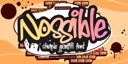 Introducing Nossible It's Simple Graffiti Font is a Natural Style and Authentic classy style, this font is great for your creative projects such as watermark on photography, and perfect for logos & branding, invitation,advertisements,product designs, stationery. It also features a wealth of special features including You can activate 11 Ligatures OpenType panel.
 - Haru by HB Font,
$20.00 Haru is a high-contrast, decorative typefamily with 18 fonts. This family provides an advanced typographical support with features such as Proportional Figures, Tabular Figures, Case-Sensitive, Numerators, Denominators, Superscript, Scientific Inferiors, Subscript, Fractions, Standard Ligatures and Discretionary Ligatures. Its unique shape and various combination will contribute to your impressive and distinctive title.
 - Aligarh by NamelaType,
$23.00 Aligarh is a semi-slab serif font formed with a smooth rounded bracket whose edges end with unique shapes, an exploration of combining unique styles in a typefaces. Designed to be used in a variety of media both print and digital media. 18 fonts built from 9 sizes and supported by open types.
 - Grown by Din Studio,
$29.00 Grown is a modern and clean display font. The design of typeface will make your design more beautiful and inspiring. This font will suitable for any project, like branding, print template, logo and more. Features : Accents (Multilingual characters) 18 Ligatures 19 Alternates PUA encoded Numerals and Punctuation (Open Type Standard) Full Support
 - Suhail by GHEEN Studio,
$15.00 Multilingual font includes more than five languages, including (Arabic, Latin, Persian and Urdu) with a solid base characterized by simplicity and letters with a geometric Kufic character The line has 18 weights for both types (normal, exbanded) The font also has the properties of OpenType, variable letters, and most of the symbols
 - Cacko by Edyta Demurat,
$29.00 Cacko has a functional look with an elegant touch. The family is available in 18 weights with complementary italics. Cacko is very readability so is ideally suited for books, magazines, catalogs, posters, invitations as well as web design. Its simplicity with elegance details will also look great in logo, titles and short sentences.
 - ClickBits by Fonthead Design,
$25.00ClickBits is a comprehensive set of web-related icons for online and print applications. The ClickBits system is made up of 792 icons and arrows in 11 fonts. Whether you need a web 2.0 starburst, icons for your blog, or graphics for your e-commerce application, ClickBits will have what you need. - Costa Std by Typofonderie,
$59.00 A mediterranean style sanserif in 4 styles The original idea of Costa was to create a contemporary mediterranean typeface style. Costa is a synthesis of the purity, as found on Greek capitals, and softness, found in Renaissance scripts. First thing was the design concept that take its roots on the Chancery script. Such writing style appeared during Italian Renaissance. Later few typefaces have been developed from such cursive models. Today most serifed typeface italic take their roots on such triangular structure we can find on gylphs like the n, p, or d. The Costa capitals remains close to pure sanserif models when the lowercases features an ending serif on many letters like the a, n, d, etc. This ending serif being more like a minimal brush effect, creating a visual contrast and referencing the exoticness of the typeface. Knowing that the Costa typeface family began life in the 90s as a bespoke typeface for Costa Crociere, an Italian cruise company — it suddenly makes sense and explains well why Jean François Porchez focused so much on Italian Chancery mixed to a certain exotism. The curvy-pointed terminals of the Costa n can obviously get find on other glyphs, such as the ending of the e, c and some capitals. So, the sanserif looks more soft and appealing, without to be to pudgy or spineless. The general effect, when set for text, remains a sanserif, even not like Rotis Semiserif. Costa is definitly not a classical typeface, or serif typeface which convey past, tradition, historicism as Garamond does beautifully. Because of the Costa crocieres original needs, Costa typeface was designed to be appropriate for any uses. Anytime you’re looking for good mood, qualitative effects, informal tone, cool atmosphere without to be unconvential or blowzy, Costa will convey to your design the required chic and nice atmosphere, from large headlines sizes, brands, to small text sizes. It’s a legible typeface, never boring. A style without neutrality which doesn’t fit comfortably into any typeface classification! Does it proves the novelty of its design and guarantees as well as its originality? Its up to you to be convinced. Barcelona trip Originally not planned, this need appeared because of a trip to Barcelona at the time of the project, where Jean François was giving a lecture. He wanted to pay an homage to that invitation to create something special. So, he designed during his flight some variations of the Spanish Ch, following ideas developed by the Argentinian type designer Rubén Fontana for his typeface called Fontana ND (published by the Barcelona foundry Bauer). Then, he presented during his lecture variations and asked to the audience which design fit the best to their language. They selected the design you can find in the fonts today. Read more about pairing Costa Type Directors Club 2000 Typographica: Our Favourite Typefaces 2004
 - Narrow Way by Ingrimayne Type,
$9.00 NarrowWay is a family of 18 condensed and ultra-condensed sans-serif typefaces. The family started with the ultra-condensed widths, then the condensed and regular widths (the regular is still quite condensed) were added. All widths have three weights and each weight has an italics style. These 18 styles lack a true lowercase but rather have a set of alternative characters, some based on lower-case forms, on the lower-case keys. Some alternative letters can be reached with the OpenType feature of stylistic sets. The character spacing in most of the styles is quite loose and it can be tightened with an application's character spacing if needed. These typefaces are display faces that can be useful for squeezing tall lettering into tight spaces. They are not readable at small point sizes.
 - Rogik by holyline design,
$19.00 Rogik by Holyline, Rogik is a expressive serif font family, This font very elegant, unique , has a strong and sharp character. This font comes in nine weight with italic so there are a total of 18 fonts and support variable for upright and italic. It's very unique, playful, elegant and very easy to combine with your design style. Rogik also inspire by metal, pop, punk and street ware, fashion brand. Rogik perfect for headline, sub headline ,custom logo, packaging, quote, merchandise, sticker, badges, social media posts, label, album cover and anything for your creativity. Rogik is perfect font if you want something new with your project, you can play the 18 fonts style, and you can pairing this font with the weight, its very satisfy. So happy creating!
 - KT Nirma by Kotivoro Lab,
$14.00 KT Nirma Sans Nirma is a typeface with 9 Weight Sans Serif from thin to Black, inspired by Founders Grotesk, This project start from April 2022 and start from the stretch until shaped the solid character to represent the Dynamic Sans Serif. Nirma has total 462 glyph and 218 Support language. Nirma support Latin Basic, Latin-1 Supplement, Latin Extended A-B, Spacing Modifier Letters, and Combining Diacritical Marks. The Solid Character has multi function Display Sans & Body text based on Display Grotesk. Especially in te Thin to Regular is more legible for body text and the black one good for Display Sans, with dinamyc shape and more wide.


