10,000 search results
(0.031 seconds)
- Chocolate Banana by madjack.font,
$15.00 Chocolate Banana Script is a modern calligraphy design including Regular. This typeface is casual and beautiful with grids. Can be used for various purposes. such as logos, product packaging, wedding invitations, branding, headlines, signage, labels, signatures, book covers, posters, quotes, and much more. Chocolate Banana Script includes OpenType language styling changes, binding and international support for most Western languages. To enable alternative OpenType features, you need a program that supports OpenType features such as Adobe Illustrator CS, Adobe Indesign & CorelDraw X6-X7, Microsoft Word 2010 or later versions. How to access all alternate characters using Adobe Illustrator: https://www.youtube.com/watch?v=XzwjMkbB-wQ Chocolate Banana Script is encoded with Unicode PUA, which allows full access to all additional characters without having to have special design software. Mac users can use Letter Book, and Windows users can use Character Maps to view and copy any additional characters to attach to your favorite text editor/application. How to access all alternate characters using Windows Character Map with Photoshop: https://www.youtube.com/watch?v=Go9vacoYmBw If you need help or have any questions, let me know. I'm happy to help :) Thank you & Happy Designing!
 - Wonderful September by Kotak Kuning Studio,
$17.00 Wonderful September is a lovely modern script font with a natural & stylish flow. Perfect for making elegant stylish statements - or adding a touch of class to your designs. This script has a multitude of lovely alternates characters in its OpenType features - making the font look a beautiful Wonderful September is perfect for many different projects such as logos & branding, invitation, stationery, wedding designs, social media posts, advertisements, product packaging, product designs, label, photography, watermark, special events, or anything. I highly recommend using a program that supports OpenType features and Glyphs panels such as Adobe Illustrator, Adobe Photoshop CC, Adobe InDesign, or CorelDraw, so you can see and access all Glyph variations. This font is encoded with Unicode PUA, which allows full access to all additional characters without having special design software. Mac users can use Font Book, and Windows users can use Character Map to view and copy one of the extra characters to paste into your favorite text editor/application. We hope you enjoy the font, please feel free to comment if you have any thoughts or feedback. Or simply email me at kotakkuningstudio@gmail.com. Thanks for purchasing and have fun!
 - Trigomy by Markus Reiter,
$24.90 Trigomy is a proportional pixel font designed on a 5 pixel grid. It is intended for either very small text or as huge display font for posters and the like. To get a crisp look this font should be used at 10 pt or multiples of 10 pt. (A tip for Adobe Creative Suite applications is to change the standard anti-aliasing method from “sharp” to “crisp” and to align the text to whole pixels. Also avoid centered text.) To get started with type design I thought it was best to start with a pixel font because you don't have to focus much on the design itself, but rather have to focus on how kerning and spacing works and the various features you can implement with OpenType. And of course I wanted to have a pixel font that had all that I was missing from other pixel fonts. We were learning trigonometry at the time I started designing Trigomy, and most of the time I misspoke it “trigometry”. So, when I had to come up with a name for my first font I thought: "Why not go with Trigomy?"
 - Rachel Lovelyn by Kotak Kuning Studio,
$17.00 Rachel Lovelyn is a lovely bouncy script font with a natural & stylish flow. Perfect for making elegant stylish statements - or adding a touch of class to your designs. This script has a multitude of lovely alternates character in its OpenType features - making the font look a beautiful Rachel Lovelyn is perfect for many different projects such as logos & branding, invitation, stationery, wedding designs, social media posts, advertisements, product packaging, product designs, label, photography, watermark, special events or anything. I highly recommend using a program that supports OpenType features and Glyphs panels such as Adobe Illustrator, Adobe Photoshop CC, Adobe InDesign, or CorelDraw, so you can see and access all Glyph variations. Rachel Lovelyn is encoded with Unicode PUA, which allows full access to all additional characters without having special design software. Mac users can use Font Book, and Windows users can use Character Map to view and copy one of the extra characters to paste into your favorite text editor/application. We hope you enjoy the font, please feel free to comment if you have any thoughts or feedback. Or simply email me at kotakkuningstudio@gmail.com. Thanks for purchasing and have fun!
 - Jenson Old Style by ITC,
$29.00In 1458, Charles VII sent the Frenchman Nicolas Jenson to learn the craft of movable type in Mainz, the city where Gutenberg was working. Jenson was supposed to return to France with his newly learned skills, but instead he traveled to Italy, as did other itinerant printers of the time. From 1468 on, he was in Venice, where he flourished as a punchcutter, printer and publisher. He was probably the first non-German printer of movable type, and he produced about 150 editions. Though his punches have vanished, his books have not, and those produced from about 1470 until his death in 1480 have served as a source of inspiration for type designers over centuries. His Roman type is often called the first true Roman." Notable in almost all Jensonian Romans is the angled crossbar on the lowercase e, which is known as the "Venetian Oldstyle e." Jenson Old Style™ was designed by Freda Sack and Colin Brignall for Letraset in 1982. Because of its darkness, this version is best used for display designs that call for a sense of old-world elegance and solidity." - Ambicase Fatface by Teeline Fonts,
$48.00 Most fonts include uppercase and lowercase letters. Some experimentally-minded designers have proposed unicase typefaces as well: rather than having two different forms for a given letter, unicase fonts have one, chosen from the upper- or lowercase forms. Ambicase Fatface takes the next step, offering not "either/or", but rather "both/and". Each letter in Ambicase Fatface is a combination of its traditional upper- and lowercase forms, in an extra-bold style. Its inventive, hybrid forms are a bolder take on those of its 2010 sibling typeface, Ambicase Modern. Ambicase Fatface stands out as a carefully crafted experimental font: its eccentric forms do not hinder its readability. It is suitable for high-style display settings. Ambicase Fatface offers a large character set and extensive OpenType features. Most notably, in modern OpenType-aware applications, Ambicase Fatface can be set in swash mode, which features sophisticated decorative flourishes that differ depending on whether the letter is at the beginning, middle, or end of a word. Ambicase Fatface is available in two optical sizes: Regular and Poster. At very large sizes, the Poster cut, with its finer details, is recommended.
 - Beauty Dina by Aldedesign,
$19.00 Beauty Dina // Playful Script Font is a stunning font with a stylish and lovely font that features a varying baseline, smooth line, modern, and with a depth of love. For those of you who need a touch of love and modernity for your designs or branding, it can be used for various purposes such as headings, weddings, invitations, signatures, logos, branding, t-shirt, letterhead, signage, labels, news, posters, badges, etc. We have a special font namely "Beauty Dina // Playful Script Font ". The font design looks simple without losing its elegance and warmness. The function of the font is to show that you have a modern spirit to serve high-quality products and services. We design this font with Open Type features to give an artistic touch to it. This font is also applicable for numbers, punctuation, and other languages. It is also a multi-functions font where you can use for a business logo, branding, wedding invitation, and anything you want. We have more great and artistic fonts. Just check my font collection by visiting Our Profile. Then, pick your most favorite font and use it to reach your goals.
 - Asmelina Harley by Kotak Kuning Studio,
$15.00 Say hello to Asmelina Harley, an elegant calligraphy script font. Perfect for making elegant stylish statements - or adding a touch of class to your designs. This script has a multitude of natural looking ligatures in its OpenType features - making the font look as close to natural handwriting as possible. Asmelina Harley is perfect for many different project such as logos & branding, invitations, stationery, wedding designs, social media posts, advertisements, product packaging, product designs, label, photography, watermark, special events or anything. I highly recommend using a program that supports OpenType features and Glyphs panels such as Adobe Illustrator, Adobe Photoshop CC, Adobe InDesign, or CorelDraw, so you can see and access all Glyph variations. Asmelina Harley is encoded with Unicode PUA, which allows full access to all additional characters without having special design software. Mac users can use Font Book, and Windows users can use Character Map to view and copy one of the extra characters to paste into your favorite text editor/application. We hope you enjoy the font, please feel free to comment if you have any thoughts or feedback. Or simply send me a PM or email me at kotakkuningstudio@gmail.com. Thanks for purchasing and have fun!
 - Ozana Pro by Mostardesign,
$99.00 Ozana Pro is a bracketed serif font family adapted to the professional requirements of graphic designers, web designers and mobile app developers. Comprised of 24 styles including 12 styles designed especially for headlines and 12 styles for text and long paragraph design, Ozana Pro is a very versatile family of fonts that can be used in many projects such as editorial design, branding or corporate identity creation, design of posters or logos, the creation of websites or the development of mobile applications. This serif font family, with a resolutely modern aspect, also hides a unique typographic design since it has 2 distinct styles (Roman and Display) which have 2 different optical sizes in order to graphically differentiate the appearance of titles, subtitles and long paragraphs. With this design of glyphs differentiated by the optical size according to the styles, the titles have a very graphic aspect while the long texts have a more classic design in order to keep an optimal readability in all cases. Ozana Pro is also equipped with powerful OpenType features such as case sensitivity, true small caps, ligatures, tabular figures, old styles figures, numbers circled. Ozana Pro is also available as a variable font family.
 - Bridgerton Outline by Hrz Studio,
$19.00 Bridgerton Outline is a calligraphy font that comes with exquisite changing characters, a kind of classic decorative copper script with a modern touch, designed with high details to bring out the elegance of the style. Bridgerton Outline Font is attractive because the typeface is smooth, clean, feminine, sensual, glamorous, simple and very easy to read, because of the many luxurious letter connections. I also offer a number of viable style alternatives for many letters. The classic style is very suitable to be applied in various formal forms such as invitations, labels, restaurant menus, logos, fashion, make up, stationery, novels, magazines, books, greeting/wedding cards, packaging, labels or all kinds of advertising purposes. . Bridgerton Outline Font is encoded with Unicode PUA, which allows full access to all additional characters without having to have special design software. Mac users can use Font Book, and Windows users can use Character Map to view and copy any of the additional characters to paste into your favorite text editor/application. If you need help or have any questions, let me know. I'm happy to help. Thank you & Happy Designing!
 - Standard CT by CastleType,
$59.00 CastleType was commissioned in 1991 by San Francisco Focus magazine to digitize three members of the Standard family. This is a Continental lineale that was popular in Switzerland in the 1950s and later in the United States. A cousin to the classic sans serifs, Standard is an alternative that is considerably warmer and a bit more idiosyncratic. In 2008, CastleType released additional members of the Standard CT family to make it a complete typographic solution with three widths (normal, condensed, extended) of four weights each (Regular, Medium, Bold, and Extra Bold). Some of the original Standard fonts, particularly Standard Regular, appear to have been hastily designed (or perhaps too closely imitated Helvetica); these have been greatly improved in the CastleType versions with more harmonious proportions and other refinements. The three lighter weights of the Extended subfamily were designed from scratch based on the new Standard CT Regular and Standard CT Extended Extra Bold. More recently, four light weights (Light, Extra Light, Ultra Light, and Hairline) have been added to each of the three widths. The entire Standard CT family includes support for most European languages, OpenType features, arbitrary fractions, and a collection of geometrics, dingbats & fleurons.
 - Breyhana by Kotak Kuning Studio,
$15.00 Breyhana is a lovely bouncy script font with a natural & stylish flow. Perfect for making elegant stylish statements - or adding a touch of class to your designs. This script has a multitude of lovely alternates character in its OpenType features - making the font look a beautiful Breyhana is perfect for many different projects such as logos & branding, invitation, stationery, wedding designs, social media posts, advertisements, product packaging, product designs, label, photography, watermark, special events or anything. I highly recommend using a program that supports OpenType features and Glyphs panels such as Adobe Illustrator, Adobe Photoshop CC, Adobe InDesign, or CorelDraw, so you can see and access all Glyph variations. Breyhana is encoded with Unicode PUA, which allows full access to all additional characters without having special design software. Mac users can use Font Book, and Windows users can use Character Map to view and copy one of the extra characters to paste into your favorite text editor/application. We hope you enjoy the font, please feel free to comment if you have any thoughts or feedback. Or simply email me at kotakkuningstudio@gmail.com. Thanks for purchasing and have fun!
 - Bridgerton Script by Hrz Studio,
$19.00 Bridgerton Script is a calligraphy font that comes with exquisite changing characters, a kind of classic decorative copper script with a modern touch, designed with high details to bring out the elegance of the style. Bridgerton Script Font is attractive because the typeface is smooth, clean, feminine, sensual, glamorous, simple and very easy to read, because of the many luxurious letter connections. I also offer a number of viable style alternatives for many letters. The classic style is very suitable to be applied in various formal forms such as invitations, labels, restaurant menus, logos, fashion, make up, stationery, novels, magazines, books, greeting/wedding cards, packaging, labels or all kinds of advertising purposes. . Bridgerton Script Font is encoded with Unicode PUA, which allows full access to all additional characters without having to have special design software. Mac users can use Font Book, and Windows users can use Character Map to view and copy any of the additional characters to paste into your favorite text editor/application. If you need help or have any questions, let me know. I'm happy to help. Thank you & Happy Designing!
 - Ambicase Modern by Teeline Fonts,
$48.00 Most fonts include uppercase and lowercase letters. Some experimentally-minded designers have proposed unicase typefaces as well: rather than having two different forms for a given letter, unicase fonts have one, chosen from the upper- or lowercase forms. Ambicase Modern takes the next step, offering not "either/or", but rather "both/and". Each letter in Ambicase Modern is a combination of its traditional upper- and lowercase forms, in a modern (didone) style. The inventive, hybrid forms that result are intriguing and handsome. Ambicase Modern stands out as a carefully crafted experimental font: its eccentric forms do not hinder its readability. It is suitable for high-style display settings. Ambicase Modern offers a large character set and extensive OpenType features. Most notably, in modern OpenType-aware applications, Ambicase Modern can be set in swash mode, which features sophisticated decorative flourishes that differ depending on whether the letter is at the beginning, middle, or end of a word. Ambicase Modern is available in two optical sizes: Regular and Poster. At very large sizes, the Poster cut, with its finer details, is recommended. For an extra bold variant, see its sibling typeface, Ambicase Fatface.
 - Essonnes by James Todd,
$40.00 Made up of sixteen individual weights and spread over three different optical sizes, Essonnes is designed to bring utility back to the Didot genre. It’s a common belief among designers that Didones don’t work for text. This wasn’t true in 1819 and it isn’t true today. Like its forbearers, Essonnes is a truly optical family—not just a study in adjusting contrast. The text and display weights have been designed from the ground up for their intended roles. This means that everything from the height of the uppercase & lowercase letters have been specifically tuned for their intended purpose. Like many typefaces, Essonnes started after falling in love with a piece of history. In this case, it was the eccentric forms of Pierre Didot’s Type and the evolution of the High contrast Didone throughout the 19th century. It was out of curiosity and love for these forms that led to the first draft of what would become Essonnes back in 2011. These unique situations—screens, modern printing methods, the previous 200 years of typographic innovation since the original design, my own life experiences—have led to a typeface that, while based on history, is not stuck in it.
 - Kimilove by Aldedesign,
$17.00 Kimilove // Monogram Script font is a stunning font with a stylish and lovely font that features a varying baseline, smooth line, modern, and with a depth love. For those of you who need a touch of love and modernity for your designs or branding, it can be used for various purposes such as headings, wedding, invitation, signature, logos, branding, t-shirt, letterhead, signage, labels, news, posters, badges, etc. We have a special font namely "Kimilove // Monogram Script font". The font design looks simple without losing its elegance and warmness. The function of the font is to show that you have a modern spirit to serve high-quality products and services. We design this font with Open Type features to give an artistic touch on it. This font is also applicable for numbers, punctuation, and other languages. It is also a multi-functions font where you can use for a business logo, branding, wedding invitation, and anything you want. We have more great and artistic fonts. Just check my font collection by visiting Our Profile. Then, pick your most favorite font and use it to reach your goals.
 - TessieOddsNends by Ingrimayne Type,
$9.00 A tessellation is a shape that can be used to completely fill the plane—simple examples are isosceles triangles, squares, and hexagons. Tessellation patterns are eye-catching and visually appealing, which is the reason that they have long been popular in a variety of decorative situations. These Tessie fonts have two family members, a solid style that must have different colors when used and an outline style. They can be used separately or they can be used in layers with the outline style on top of the solid style. For rows to align properly, leading must be the same as point size. To see how patterns can be constructed, see the “Samples” file here. TessieOddsNEnds contains shapes that did not fit into the other Tessie fonts: TessieStandingBirds, TessieFlyingBirds, TessieMoreBirds, TessieXtraBirds, TessieSpinners, TessiePuzzlePieces, TessieAnimals, TessieBugs, TessieMiscellaneous, and TessieMoreStuff. (Earlier tessellation fonts from IngrimayneType, the TessieDingies fonts, lack a black or filled version so cannot do colored patterns. The addition of a solid style that must be colored makes these new fonts a bit more difficult to use but offers far greater possibilities in getting visually interesting results.)
 - Colorado by Juliasys,
$- Nature is fond of stripes. Animals have them, plants have them and the rainbow has them. Besides being beautiful, stripes in nature have various origins and functions. But only Homo sapiens gave them symbolic meaning. In the American flag, the 13 stripes symbolize the 13 colonies that declared independence from Britain. In the French “Tricolour” flag, they represent Paris and the king of France. And in Russia’s “Georgiyevskaya lenta,” they symbolize the death and resurrection of St. George, the dragon-slayer. The font family COLORADO , named after the beautifully striped Colorado potato beetle, can be used to construct all kinds of symbolic or just beautiful messages. And thankfully, you need no OpenType diploma to do this. To get your texts multi-striped and multicolored, follow this simple procedure: Write the message with one of the COLORADO fonts and apply a color. Then copy and paste in place, and apply a second font and color. Repeat this again if wanted – and the masterpiece is done. COLORADO ’s language support covers about 100 languages. It has a Western European, a Central European and an Extended Cyrillic character set.
 - Sottalica by Mightype,
$17.00 Sottalica Script is a modern calligraphy font with the current handwriting style, this font is perfect for branding, wedding invites, magazines, mugs, business cards, quotes, posters, and more, you can try first if you want to buy this font. Sottalica Script is equipped with 315 glyphs. and by having many of these glyphs there will be able to choose the letters according to your likes, lots of variations and options for each letter, so you can customize on your design choices. with pleasure and happiness, in this font package you will get: Sottalica Script OTF to use a variety of flying machines, you need a program that supports OpenType features such as Adobe Photoshop Cs / Adobe Photoshop CC, Adobe Illustrator CS / Adobe Illustrator CC, Adobe Indesign and Corel Draw and many more programs that support OpenType. If you do not have a program that supports OpenType, you can access all the alternate glyphs using Font Book (Mac) or Character Map (Windows) if you have any question, do not hesitate to contact me by email mightype89@gmail.com Thanks and happy designing :-) Thank You for purchase!
 - Blissful Script by Romie Creative,
$19.00 Blissful Classic is a calligraphy font that comes with exquisite changing characters, a kind of classic decorative copper script with a modern touch, designed with high details to bring out the elegance of the style. Blissful Classic Calligraphy Font is attractive because the typeface is smooth, clean, feminine, sensual, glamorous, simple and very easy to read, because of the many luxurious letter connections. I also offer a number of viable style alternatives for many letters. The classic style is very suitable to be applied in various formal forms such as invitations, labels, restaurant menus, logos, fashion, make up, stationery, novels, magazines, books, greeting/wedding cards, packaging, labels or all kinds of advertising purposes. . Blissful Classic Calligraphy Font is encoded with Unicode PUA, which allows full access to all additional characters without having to have special design software. Mac users can use Font Book, and Windows users can use Character Map to view and copy any of the additional characters to paste into your favorite text editor/application. If you need help or have any questions, let me know. I'm happy to help. Thank you & Happy Designing!
 - Ambulance Shotgun Pro by CheapProFonts,
$10.00 Another grungy masterpiece from Guillaume - this one with a woodprint touch. I have made the lowercase letters different from the uppercase by removing the cross-shaped counters and flipping where possible. Even the numbers have solid variants - available as OpenType "Stylistic Alts". Enjoy the new flexible possibilities! ALL fonts from CheapProFonts have very extensive language support: They contain some unusual diacritic letters (some of which are contained in the Latin Extended-B Unicode block) supporting: Cornish, Filipino (Tagalog), Guarani, Luxembourgian, Malagasy, Romanian, Ulithian and Welsh. They also contain all glyphs in the Latin Extended-A Unicode block (which among others cover the Central European and Baltic areas) supporting: Afrikaans, Belarusian (Lacinka), Bosnian, Catalan, Chichewa, Croatian, Czech, Dutch, Esperanto, Greenlandic, Hungarian, Kashubian, Kurdish (Kurmanji), Latvian, Lithuanian, Maltese, Maori, Polish, Saami (Inari), Saami (North), Serbian (latin), Slovak(ian), Slovene, Sorbian (Lower), Sorbian (Upper), Turkish and Turkmen. And they of course contain all the usual "western" glyphs supporting: Albanian, Basque, Breton, Chamorro, Danish, Estonian, Faroese, Finnish, French, Frisian, Galican, German, Icelandic, Indonesian, Irish (Gaelic), Italian, Northern Sotho, Norwegian, Occitan, Portuguese, Rhaeto-Romance, Sami (Lule), Sami (South), Scots (Gaelic), Spanish, Swedish, Tswana, Walloon and Yapese.
 - PF DIN Stencil Pro by Parachute,
$65.00 DIN Stencil Pro on Behance. DIN Stencil Pro: Specimen Manual PDF. Despite the fact that over the years several designers have manually created stencil lettering based on DIN for various projects, there had never been a professional digital stencil version of a DIN-based typeface until 2010 when the original DIN Stencil was first released. The Pro version was released in 2014 and adds multiscript support for Cyrillic and Greek. DIN Stencil Pro was based on its original counterpart DIN Text Pro and was particularly designed to address contemporary projects, by incorporating elements and weights which are akin to industries such as fashion, music, video, architecture, sports and communications. Traditionally, stencils have been used extensively for military equipment, goods packaging, transportation, shop signs, seed sacks and prison uniforms. In the old days, stencilled markings of ownership were printed on personal possessions, while stencilled signatures on shirts were typical of 19th century stencilling. Two companies dominated the market in the mid-twentieth century: the Marsh Stencil Machine Company in the United States and the Sächsische Metall Schablonen Fabrik in Germany. Ever since the late 1930s, it was the German Sächsische Metall Schablonen Fabrik which used heavily the new DIN 1451 standard font (introduced in 1936), attempting to overthrow the reign of the Didot-style modern roman which was at the time the most common stencil letter in Germany. These letters were manufactured mainly as individual zinc stencils which could be ordered in sizes between 10 and 100mm. The DIN Stencil family manages to preserve several traditional stencil features, but introduces additional modernities which enhance its pleasing characteristics which make it an ideal choice for a large number of contemporary projects. Furthermore, the spacing attributes of the glyphs were redefined and legibility was improved by revising the shape of the letterforms. The DIN Stencil Pro family is an enhanced version of the popular DIN Stencil. It consists of 8 diverse weights from the elegant Hairline to the muscular Black and supports Latin, Cyrillic, Greek, Eastern European, Turkish and Baltic. The new version 3.0 includes several additions such the recently unicode encoded character of the German uppercase Eszett (ẞ), the Russian currency symbol for Rouble (₽), Ukrainian Hryvnia (₴), Azeri and Kazakh letterforms.
 - Noort by TypeTogether,
$51.60 Juan Bruce’s Noort is not a type family for wayfinding or mapmaking alone, but for clarifying information and engaging readers along their own journey. The information designer’s role is to bring clarity and style to overwhelming amounts of information, which fortunately is Noort’s purpose as well. Hierarchies submit to its will and layering colour only adds more presence to its active posture. Noort’s design uses the proven editorial text features of a large x-height, ample spacing, and low contrast to check all the boxes for paragraph text use. But it’s the long serifs, wide characters, and overall typographic presence that make it resilient and ease the task of reading in small point sizes. These details mean Noort is able to demonstrate importance not only with its five pitch-perfect weights, but with its brindled colour within a layout. Noort’s roman and italic styles play off each other by transplanting their design features. The roman style’s serifs are transferred in substance but expectedly increased in speed in the italic styles. And the italic’s inktraps and separated strokes are echoed amidst the roman’s upright structure. Where digitisation could have removed the influence of the hand, Noort retains the analogue nature of its creation. This antiphonal seeding of details creates a cohesive family that is as fascinating as it is functional. Noort’s axis and serifs have a slightly varying ductus — the directional flow that aids reading and character clarity. Its latent obviousness in text sizes immediately becomes its signature style when bumped up to subhead sizes. And since Noort’s counters are so wide and welcoming, its heavier weights can expand more within themselves than along their exterior edges. Noort’s ten total fonts cover the Latin A Extended glyph set to bring its unbordered, globetrotting sensibilities to your projects. OpenType features include ligatures, fractions, and several figure styles, along with mature-rather-than-overbearing swashes. Aligned with TypeTogether’s commitment to produce high-quality type for the global market, the complete Noort family can set digital and printed works with ease, capitalising on the dual needs of clear information and fascinating textual artistry.
 - Madurai Slab by insigne,
$24.00 Chennai’s market-tested type styles have taken new form once again. The geometric forms of Chennai and its derivant Madurai, both successful in web-based applications and logotypes, have now been adapted for the superfamily Madurai Slab, a potent, square slab serif ideal for headlines and posters. Under the surface of Madurai Slab’s straightforward geometric structure, the font’s exaggerated vertical serifs provide the face with an extra chunk that commands the reader’s attention and gives the font more impact in its heavier styles. The extra-fortified forms are anything but monotonous, though. The bolder structure of the slab is instead rational, diligently thought-out, with minimally contrasting strokes, making the sturdier look particularly legible in shorter textual content blocks. This child of Madurai contains a comprehensive range of nine weights--slender to black--and features condensed and extender selections for a complete set of fifty-four fonts. All users of the Madurai Slab collection can access numerous OpenType alternates. Madurai Slab is furnished for experienced typographers, together with alternates, compact caps and many alts like “normalized” capitals and lowercase letters that come with stems. The typeface also contains a range of numeral sets, together with fractions, old-style and lining figures with superiors and inferiors. OpenType-capable programs including Quark or the Adobe suite allow quick changes to ligatures and alternates. Previews of these options can be found in the .pdf brochure. Madurai Slab also features the glyphs to enable all Central, Eastern and Western European languages. In all, Madurai Slab supports around forty languages that utilize the prolonged Latin script, making it an excellent option for multi-lingual publications and packaging. This richness of options makes this the best slab serif family for websites as well as for print, motion graphics, logos, t-shirts and the like. Madurai Slab is a great choice when looking for a Neo-Grotesque slab serif font. In the hands of a learned designer, this new slab offers the potential for beautiful and well-blended layouts. With its widths adjusting to compact and extended content blocks, this typeface is perfect for the headings, captions and other brief, immediate messages that you need to drive your message home.
 - FS Jack by Fontsmith,
$80.00 a, g, k and y It was a forensic examination by Jason Smith of his existing designs that laid the groundwork for FS Jack. Jason made a list of unique characteristics that would give the sans serif font its typographic thumbprint, which included an unusually large x-height and slightly off-the-wall letters like the lower-case “a”, “g”, “k” and “y”. “I wanted to make something that was slightly uncomfortable,” says Jason, “and in doing so simplify the quirkiness down to a few letters.” Fernando Mello did “the rest of the cooking”, filling the design out and making the additional weights. Tipos Latinos Upon its release in 2010, FS Jack was submitted by Fernando, who is Brazilian, for the esteemed type design biennial, Tipos Latinos, where it was selected as a winner in the Families category. It went on to be selected for type exhibitions throughout Latin America and around the world. “FS Jack is a workhorse,” says Fernando, “but also very ownable and distinctive, and available in a good range of weights, crafted by Jason and I.” Corporate “FS Jack took a couple of years to get noticed and is still fairly underused,” says Jason, “which is good in a way, for our Brandfont clients that have adopted it.” FS Jack was chosen as the signature font for The Shard in London, from its signage down to business cards. Fontsmith also worked with Lloyds Bank to customise FS Jack into a bespoke font for the bank’s updated brand identity – part of Fontsmith’s Brandfont service, which you can read about here. Fat Jack Included in the FS Jack family – just – is FS Jack Poster, the super-heavy weight of the range. “That was a last minute addition,” says Fernando, “after Jason and I started talking about how much we liked Gill KO, a typeface that is almost comically fat.”
 - Ardena by Julien Fincker,
$34.99 About the design: Ardena is a modern sans-serif typeface family. While neutral and clear at first glance, it can be characterized as both pleasant and confident due to its open, rounded forms and vertical terminals. It can be used in both a restrained and expressive way. The thinner and thicker weights are particularly suitable for strong headlines, while the middle weights can be used for typographic challenges and body text. Completed with an extensive character collection, it becomes a real workhorse. A versatile allrounder that is up to all challenges – for Corporate Identity, Editorial, Branding, Orientation and Guidance systems and much more. Features: The Ardena family has a total of 20 styles, from thin to heavy with matching italics. With over 1064 characters, it covers over 200 Latin-based languages. It has an extended set of currency symbols and a whole range of Open Type Features. There are alternative characters as stylistic sets, small caps, automatic fractions – just to name a few. Arrows and numbers: In particular, the extensive range of arrows and numbers should be highlighted, which are perfectly suited for use in orientation and guidance systems. Thanks to Open Type Features and an easy system, the various designs of arrows and numbers can also be simply "written" without first having to select them in a glyph palette. The principle is easily explained: If a number is placed in round or square brackets, it will automatically be displayed in an outlined circle or square. If you add a period to the number, it is displayed in a full circle or square. The same principle also applies to the arrows. The arrows themselves are combinations of greater/less symbols with the various slashes or hyphens. Get the Variable Font here: https://www.myfonts.com/fonts/julien-fincker/ardena-variable/
 - Avenir Next Cyrillic by Linotype,
$49.00 The original Avenir typeface was designed by Adrian Frutiger in 1988, after years of having an interest in sans serif typefaces. The word Avenir means “future” in French and hints that the typeface owes some of its interpretation to Futura. But unlike Futura, Avenir is not purely geometric; it has vertical strokes that are thicker than the horizontals, an “o” that is not a perfect circle, and shortened ascenders. These nuances aid in legibility and give Avenir a harmonious and sensible appearance for both texts and headlines. In 2012, Akira Kobayashi worked alongside Avenir’s esteemed creator Adrian Frutiger to bring Avenir Next to life, as a new take on the classic Avenir. The goal of the project was to take a beautifully designed sans and update it so that its technical standards surpass the status quo, leaving us with a truly superior sans family. Since then, Monotype expanded the typeface to accommodate more languages. Akira’s deep familiarity with existing iterations of the Frutiger designs, along with his understanding of the design philosophy of the man himself, made him uniquely suited to lead the creation of different language fonts. Avenir Next World family, the most recent release from Monotype, is an expansive family of fonts that offers support for more than 150 languages and scripts that include Latin, Cyrillic, Greek, Hebrew, Arabic, Georgian, Armenian and Thai. Avenir Next World contains 10 weights, from UltraLight to Heavy. The respective 10 Italic styles do not support Arabic, Georgian and Thai, since Italic styles are unfamiliar in these scripts/languages. Separate Non-Latin products to support just the Arabic, Cyrillic, Georgian, Hebrew and Thai script are also available for those who do not need the full language support.
 - Avenir Next World by Linotype,
$149.00 The original Avenir typeface was designed by Adrian Frutiger in 1988, after years of having an interest in sans serif typefaces. The word Avenir means “future” in French and hints that the typeface owes some of its interpretation to Futura. But unlike Futura, Avenir is not purely geometric; it has vertical strokes that are thicker than the horizontals, an “o” that is not a perfect circle, and shortened ascenders. These nuances aid in legibility and give Avenir a harmonious and sensible appearance for both texts and headlines. In 2012, Akira Kobayashi worked alongside Avenir’s esteemed creator Adrian Frutiger to bring Avenir Next to life, as a new take on the classic Avenir. The goal of the project was to take a beautifully designed sans and update it so that its technical standards surpass the status quo, leaving us with a truly superior sans family. Since then, Monotype expanded the typeface to accommodate more languages. Akira’s deep familiarity with existing iterations of the Frutiger designs, along with his understanding of the design philosophy of the man himself, made him uniquely suited to lead the creation of different language fonts. Avenir Next World family, the most recent release from Monotype, is an expansive family of fonts that offers support for more than 150 languages and scripts that include Latin, Cyrillic, Greek, Hebrew, Arabic, Georgian, Armenian and Thai. Avenir Next World contains 10 weights, from UltraLight to Heavy. The respective 10 Italic styles do not support Arabic, Georgian and Thai, since Italic styles are unfamiliar in these scripts/languages. Separate Non-Latin products to support just the Arabic, Cyrillic, Georgian, Hebrew and Thai script are also available for those who do not need the full language support.
 - Avenir Next Hebrew by Linotype,
$79.00 The original Avenir typeface was designed by Adrian Frutiger in 1988, after years of having an interest in sans serif typefaces. The word Avenir means “future” in French and hints that the typeface owes some of its interpretation to Futura. But unlike Futura, Avenir is not purely geometric; it has vertical strokes that are thicker than the horizontals, an “o” that is not a perfect circle, and shortened ascenders. These nuances aid in legibility and give Avenir a harmonious and sensible appearance for both texts and headlines. In 2012, Akira Kobayashi worked alongside Avenir’s esteemed creator Adrian Frutiger to bring Avenir Next to life, as a new take on the classic Avenir. The goal of the project was to take a beautifully designed sans and update it so that its technical standards surpass the status quo, leaving us with a truly superior sans family. Since then, Monotype expanded the typeface to accommodate more languages. Akira’s deep familiarity with existing iterations of the Frutiger designs, along with his understanding of the design philosophy of the man himself, made him uniquely suited to lead the creation of different language fonts. Avenir Next World family, the most recent release from Monotype, is an expansive family of fonts that offers support for more than 150 languages and scripts that include Latin, Cyrillic, Greek, Hebrew, Arabic, Georgian, Armenian and Thai. Avenir Next World contains 10 weights, from UltraLight to Heavy. The respective 10 Italic styles do not support Arabic, Georgian and Thai, since Italic styles are unfamiliar in these scripts/languages. Separate Non-Latin products to support just the Arabic, Cyrillic, Georgian, Hebrew and Thai script are also available for those who do not need the full language support.
 - Burpology by Typodermic,
$11.95 Hey, cats and kittens! Dig this groovy font we got for ya—Burpology! It’s the perfect typeface for all your cartoon headline needs. With its heavy weight, small counters, and tight spacing, you’ll be making a visual footprint that’ll knock ’em out! And that’s not all, daddy-o! Burpology comes equipped with automatic shuffling of three letter and numeric variations in OpenType-savvy apps, giving your words that cool, hand-drawn vibe. It’s like having your very own in-house cartoonist! So, if you want to add some serious pow and pizzazz to your headlines, just hit up your application’s contextual alternates or standard ligatures option and watch the magic happen. Don’t be a square, man—get Burpology and let your words do the talkin’! Most Latin-based European writing systems are supported, including the following languages. Afaan Oromo, Afar, Afrikaans, Albanian, Alsatian, Aromanian, Aymara, Bashkir (Latin), Basque, Belarusian (Latin), Bemba, Bikol, Bosnian, Breton, Cape Verdean, Creole, Catalan, Cebuano, Chamorro, Chavacano, Chichewa, Crimean Tatar (Latin), Croatian, Czech, Danish, Dawan, Dholuo, Dutch, English, Estonian, Faroese, Fijian, Filipino, Finnish, French, Frisian, Friulian, Gagauz (Latin), Galician, Ganda, Genoese, German, Greenlandic, Guadeloupean Creole, Haitian Creole, Hawaiian, Hiligaynon, Hungarian, Icelandic, Ilocano, Indonesian, Irish, Italian, Jamaican, Kaqchikel, Karakalpak (Latin), Kashubian, Kikongo, Kinyarwanda, Kirundi, Kurdish (Latin), Latvian, Lithuanian, Lombard, Low Saxon, Luxembourgish, Maasai, Makhuwa, Malay, Maltese, Maori, Moldovan, Montenegrin, Ndebele, Neapolitan, Norwegian, Novial, Occitan, Ossetian (Latin), Papiamento, Piedmontese, Polish, Portuguese, Quechua, Rarotongan, Romanian, Romansh, Sami, Sango, Saramaccan, Sardinian, Scottish Gaelic, Serbian (Latin), Shona, Sicilian, Silesian, Slovak, Slovenian, Somali, Sorbian, Sotho, Spanish, Swahili, Swazi, Swedish, Tagalog, Tahitian, Tetum, Tongan, Tshiluba, Tsonga, Tswana, Tumbuka, Turkish, Turkmen (Latin), Tuvaluan, Uzbek (Latin), Venetian, Vepsian, Võro, Walloon, Waray-Waray, Wayuu, Welsh, Wolof, Xhosa, Yapese, Zapotec Zulu and Zuni.
 - Sagittarius by Hoefler & Co.,
$51.99 A typeface with lightly-worn futurism, Sagittarius is equally at home among the beauty and wellness aisles, or the coils of the warp core. The Sagittarius typeface was designed by Jonathan Hoefler in 2021. A decorative adaptation of Hoefler’s Peristyle typeface (2017), Sagittarius’s rounded corners and streamlined shapes recall the digital aesthetic of the first alphabets designed for machine reading, a style that survives as a cheeky Space Age invocation of futurism. Sagittarius was created for The Historical Dictionary of Science Fiction, where it first appeared in 2021. From the desk of the designer: Typeface designers spend a lot of time chasing down strange valences. We try to figure out what’s producing that whiff of Art Deco, or that vaguely militaristic air, or what’s making a once solemn typeface suddenly feel tongue-in-cheek. If we can identify the source of these qualities, we can cultivate them, and change the direction of the design; more often, we just extinguish them without mercy. Sometimes, we get the chance to follow a third path, which is how we arrived at Sagittarius. During the development of Peristyle, our family of compact, high-contrast sans serifs, I often found myself unwittingly humming space-age pop songs. Nothing about Peristyle’s chic and elegant letterforms suggested the deadpan romp of “The Planet Plan” by United Future Organization, let alone “Music To Watch Space Girls By” from the ill-advised (but delicious) Leonard Nimoy Presents Mr. Spock’s Music from Outer Space, but there they were. Something in the fonts was provoking an afterimage of the otherworldly, as if the typeface was sliding in and out of a parallel universe of high-tech spycraft and low-tech brawls with rubber-masked aliens. It might have had something to do with a new eyeglass prescription. But I liked the effect, and started thinking about creating an alternate, space-age version of the typeface, one with a little more funk, and a lot more fun. I wondered if softer edges, a measured dose of seventies retrofuturism, and some proper draftsmanship might produce a typeface not only suitable for sci-fi potboilers, but for more serious projects, too: why not a line of skin care products, a fitness system, a high-end digital camera, or a music festival? I put a pin in the idea, wondering if there’d ever be a project that called for equal parts sobriety and fantasy. And almost immediately, exactly such a project appeared. The Historical Dictionary of Science Fiction Jesse Sheidlower is a lexicographer, a former Editor at Large for the Oxford English Dictionary, and a longtime friend. He’s someone who takes equal pleasure in the words ‘usufructuary’ and ‘megaboss,’ and therefore a welcome collaborator for the typeface designer whose love of the Flemish baroque is matched by a fondness for alphabets made of logs. Jesse was preparing to launch The Historical Dictionary of Science Fiction, a comprehensive online resource dedicated to the terminology of the genre, whose combination of scholarship and joy was a perfect fit for the typeface I imagined. For linguists, there’d be well-researched citations to explain how the hitherto uninvented ‘force field’ and ‘warp speed’ came to enter the lexicon. For science fiction fans, there’d be definitive (and sometimes surprising) histories of the argot of Stars both Trek and Wars. And for everyone, there’d be the pleasure of discovering science fiction’s less enduring contributions, from ‘saucerman’ to ‘braintape,’ each ripe for a comeback. A moderated, crowdsourced project, the dictionary is now online and growing every day. You’ll find it dressed in three font families from H&Co: Whitney ScreenSmart for its text, Decimal for its navigational icons, and Sagittarius for its headlines — with some of the font’s more fantastical alternate characters turned on. The New Typeface Sagittarius is a typeface whose rounded corners and streamlined forms give it a romantically scientific voice. In the interest of versatility, its letterforms make only oblique references to specific technologies, helping the typeface remain open to interpretation. But for projects that need the full-throated voice of science fiction, a few sets of digital accessories are included, which designers can introduce at their own discretion. There are alternate letters with futuristic pedigrees, from the barless A popularized by Danne & Blackburn’s 1975 ‘worm’ logo for NASA, to a disconnected K recalling the 1968 RCA logo by Lippincott & Margulies. A collection of digitally-inspired symbols are included for decorative use, from the evocative MICR symbols of electronic banking, to the obligatory barcodes that forever haunt human–machine interactions. More widely applicable are the font’s arrows and manicules, and the automatic substitutions that resolve thirty-four awkward combinations of letters with streamlined ligatures. About the Name Sagittarius is one of thirteen constellations of the zodiac, and home to some of astronomy’s most inspiring discoveries. In 1977, a powerful radio signal originating in the Sagittarius constellation was considered by many to be the most compelling recorded evidence of extraterrestrial life. Thanks to an astronomer’s enthusiastically penned comment, the 72-second transmission became known as the Wow! signal, and it galvanized support for one of science’s most affecting projects, the Search for Extraterrestrial Intelligence (SETI). More recently, Sagittarius has been identified as the location of a staggering celestial discovery: a supermassive black hole, some 44 million kilometers in diameter, in the Galactic Center of the Milky Way. <
 - Havin Bride by Letterhend,
$17.00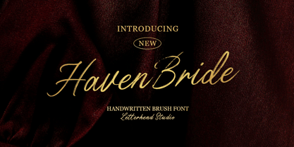 Haven Bride is the beautiful brush script font that perfectly captures the casual of a handwritten. With its natural feel and casual, chic style, it's the perfect choice for branding, logos, and the other various formal forms such as invitations, labels, logos, magazines, books, greeting / wedding cards, packaging, fashion, make up, stationery, novels, labels or any type of advertising purpose where a personal touch is needed. Features : Uppercase & lowercase Numbers and punctuation Alternates & Ligatures Multilingual PUA encoded
 - Phaserwave by Mysterylab,
$22.00 Part of the wave of modern explorations expanding on the 50+ year-old traditions of groovy psychedelic typography, Mysterylab brings you Phaserwave. With an intriguing fusion of pillowy shapes and sharp stroke ends, this font cooks up a heady mélange of whimsical flow and high precision. We've applied our usual meticulous attention to great kerning, extensive character set, and seamless functionality, so this font's ready to rock your designs any way you might want to do it.
 - FS Olivia Paneuropean by Fontsmith,
$90.00Antwerp On a visit to Belgium and the Netherlands while still an MA student at Reading University, Eleni Beveratou made some important discoveries. First, there was the letter ‘g’ from the Didot family seen at Plantin Moretus Museum in Antwerp, which seemed “almost like a mistake”. Then there were strange details such as the serifs on the “l”, “h”, “k”, “b” and “d” in Egmont Cursive and other typefaces by Sjoerk Hendrik de Roos, found in volumes of poetry she picked up from a chaotic bookshop in Amsterdam. These were characters that stood out from the text but seemed to blend harmoniously with the rest of the letters. “And there it was, the spark. I decided to design a typeface that would capture the details of the process of writing.” A guiding hand Eleni shared her initial thoughts with Phil Garnham and Jason Smith. They liked what they saw in her tentative first sketches, and gave her the chance to develop her ideas further. Phil, in particular, provided valuable input as FS Olivia took shape. Eleni’s main influence – the handwritten – would give the font its character. “When creating a typeface,” says Eleni, “it’s fair to say that it reflects some of the designer’s personality. And that’s certainly the case with FS Olivia. “Although technology is part of my everyday life. I am a great admirer of traditional graphic design where you can touch and feel paper and ink.” Irregular “What I particularly like,” says Eleni, “is that a printed item can develop its own personality sometimes as a result of imperfections in the print. “FS Olivia has some of these characteristics as it’s inspired by handwriting, and yet it also includes some very modern features.” Feminine and fascinating, FS Olivia captures the expressive twists and turns of (the poet’s?) pen on paper, with low junctions, deep top serifs and semi-rounded edges. Round outstrokes contrast with the rough corners of the instroke, while strong diagonals and inclined serifs create a richly textured pattern. Polytonic It’s only fitting that there should be a version of this poetic font for one of the birthplaces of poetry and song. Eleni, who hails from Athens, developed an extensive range of glyphs that could be used for the Greek language, in both modern and ancient texts. For the latter, there is a version of Olivia for displaying polytonic Greek (a system that utilises a range of accents and “breathings”), which brings the 21st century technology of OpenType to the presentation of poetic texts from Ancient Greece. Just think what Homer could have done with that. - FS Olivia by Fontsmith,
$70.00 Antwerp On a visit to Belgium and the Netherlands while still an MA student at Reading University, Eleni Beveratou made some important discoveries. First, there was the letter ‘g’ from the Didot family seen at Plantin Moretus Museum in Antwerp, which seemed “almost like a mistake”. Then there were strange details such as the serifs on the “l”, “h”, “k”, “b” and “d” in Egmont Cursive and other typefaces by Sjoerk Hendrik de Roos, found in volumes of poetry she picked up from a chaotic bookshop in Amsterdam. These were characters that stood out from the text but seemed to blend harmoniously with the rest of the letters. “And there it was, the spark. I decided to design a typeface that would capture the details of the process of writing.” A guiding hand Eleni shared her initial thoughts with Phil Garnham and Jason Smith. They liked what they saw in her tentative first sketches, and gave her the chance to develop her ideas further. Phil, in particular, provided valuable input as FS Olivia took shape. Eleni’s main influence – the handwritten – would give the font its character. “When creating a typeface,” says Eleni, “it’s fair to say that it reflects some of the designer’s personality. And that’s certainly the case with FS Olivia. “Although technology is part of my everyday life. I am a great admirer of traditional graphic design where you can touch and feel paper and ink.” Irregular “What I particularly like,” says Eleni, “is that a printed item can develop its own personality sometimes as a result of imperfections in the print. “FS Olivia has some of these characteristics as it’s inspired by handwriting, and yet it also includes some very modern features.” Feminine and fascinating, FS Olivia captures the expressive twists and turns of (the poet’s?) pen on paper, with low junctions, deep top serifs and semi-rounded edges. Round outstrokes contrast with the rough corners of the instroke, while strong diagonals and inclined serifs create a richly textured pattern. Polytonic It’s only fitting that there should be a version of this poetic font for one of the birthplaces of poetry and song. Eleni, who hails from Athens, developed an extensive range of glyphs that could be used for the Greek language, in both modern and ancient texts. For the latter, there is a version of Olivia for displaying polytonic Greek (a system that utilises a range of accents and “breathings”), which brings the 21st century technology of OpenType to the presentation of poetic texts from Ancient Greece. Just think what Homer could have done with that.
 - The Goldoni font is an elegant and classic display serif typeface, suggesting a theme of luxury or high-end fashion. The characters are tall and slender with fine strokes, giving the font a sophistic...
- As of my last update in early 2023, the specific font named "Cartoo Nature" by Tokokoo may not be widely recognized or might be an emerging or niche font in the vast landscape of typography. However,...
- Planet Adventure by Putracetol,
$28.00 Introducing PLANET ADVENTURE - SCIFI FONT. This font is inspired by techno circuit boards, combined with the scifi font type. PLANET ADVENTURE is great for any kind of display purpose from logos, Tshirt, apparel, product packaging, tittle header, poster, merchandise, social media, labels, branding. The alternative characters were divided into several Open Type features such as Swash, Stylistic Sets, Stylistic Alternates, Contextual Alternates, and Ligature. The Open Type features can be accessed by using Open Type savvy programs such as Adobe Illustrator, Adobe InDesign, Adobe Photoshop Corel Draw X version, And Microsoft Word. This font is also support multi language.
 - White Heart by Ivan Rosenberg,
$16.00 White Heart is a hand brushed font with multilingual support. It is ideal for t-shirts, magazines, phone covers, social media, restaurant menus, greeting cards, invitations, weddings, headers and many more. This brush font comes with a complete set of lowercase and uppercase characters, a large range of punctuation ligatures, numerals, lowercase alternates and and multilingual support. White Heart, Upper and Lowercase characters with automatic ligatures, numerals, lot of punctuation glyphs and 1 alternate for lowercase characters. For access to Stylistic Alternates is required software with glyphs panel like Photoshop, llustrator, Inkscape etc. Ligatures shows up automatically.
 - Saya Satpol by Dumadi,
$20.00 Saya Satpol – Sketched Typeface made with a sketch-themed application that gives a relaxed and cool feel. Saya Satpol is perfect for design, logo, social media, branding, advertising, product design, handwritten quotes, product packaging, headers, posters, merchandise, and other designs. What’s Included : + Saya Satpol + Standard glyphs + All Caps + Multilingual Accent + Works on PC & Mac, Simple installations Accessible in Adobe Illustrator, Adobe Photoshop, Adobe InDesign, even work on Microsoft Word. PUA Encoded Characters – Fully accessible without additional design software. Fonts include multilingual support + Image used: All photographs/pictures/vectors used in the preview are not included, they are intended for illustration purposes only. Thanks