10,000 search results
(0.03 seconds)
- Midsole SC by Grype,
$16.00 Geometric/Technical style logotypes have been developed for car chrome labels since the early 1980’s, but automobile companies don't monopolize the style by any means. Shoe companies have a foothold in the geometric sans serif styles as well, and range from straightforward to full of techno styled play. Nonetheless, these logotypes all lack an expansive family which shows off all the logotypes are and what they "could" be and do. And that's where we come in. The Midsole SC Family finds its origin of inspiration in the CONVERSE shoe company logo, or an older version of their logo, and from there we expanded it into a 40 font family of weights, widths, and obliques. Midsole pays homage to the styling of the earlier logotype, including unicase variations to match the original look, while further evolving beyond the brand inspiration to yield a family that pulls on modern and historical styles. It adopts a sturdy yet approachable and recognizable style with its uniform stroke forms and curves, and goes on to include smallcaps, numerals, and a comprehensive range of weights, creating a straightforward, uncompromising collection of typefaces that lend a solid foundation and a broad range of expression for designers. Here’s what’s included with the Midsole SC Family bundle: 489 glyphs per style - including Capitals, SmallCaps, Numerals, Punctuation and an extensive character set that covers multilingual support of latin based languages. (see the 10th graphic for a preview of the characters included) Stylistic Alternates - alternate characters and unicase variants for a less standardized text look. 4 weights in the family: Light, Regular, Medium & Bold. 4 obliques in the family, one for each weight: Light, Regular, Medium & Bold. Here’s why the Midsole SC Family is for you: - You’re in need of stylish sans font family with a range of weights and obliques. - You’re love that older CONVERSE letter styling, and want to design anything within that genre. - You’re looking for an alternative to Eurostile & Handel Gothic. - You’re looking for a clean techno typeface for your rave poster designs. - You just like to collect quality fonts to add to your design arsenal.
 - Metroblack #2 by Linotype,
$29.00American graphic designer William Addison Dwiggins' (W.A.D. for short) first typefaces were the Metro family, designed from 1927 onward. The project grew out of Dwiggins' dissatisfaction with the new European sans serif typefaces of the day, such as Futura, Erbar, and Kabel, a feeling he expressed in his seminal book Layout in Advertising. Urged by Mergenthaler Linotype to create a solution for the problem, Dwiggins began a professional relationship that would span over the next few decades. The first Metro family typeface to be released was Metroblack, brought to market by Linotype in 1929 (Metroblack #2™ the only one of the two versions that Mergenthaler Linotype eventually put into production which is available in digital form). With more of a humanist quality than the geometric styles popular in Europe at the time, Dwiggins drew what he believed to be the ideal sans serif for headlines and advertising copy. Metroblack has a warmer character than the Modernists' achievements, and the type is full of mannered curves and angled terminals (Metroblack also has an astoundingly beautiful Q). The weights of the Metro family, Metromedium #2™ and Metrolite #2™, were each designed by Mergenthaler Linotype's design office under Dwiggins' supervision. In 2012 Toshi Omagari reworked the Metro family as "Metro Nova" with many weights into a modern type family that even contains the alternate characters from the origin Metro family from Dwiggins. Despite having been created more than three-quarters of a century ago, the Metro family types have aged well, and remain a popular sans serif family. Although spec'd less often than other bestsellers, like Futura, Metro continues to find many diverse uses. The typeface has appeared throughout Europe and the North America for decades in newspapers and magazines, and can even help create a great brand image when used in logos and corporate identity. Dwiggins ranks among the most influential graphic designers and typeface designers of the 20th Century. He has several other quality fonts in the Linotype portfolio, including the serif text faces Electra™ and New Caledonia™, as well as Caravan™, a font of typographic ornaments. - FF Infra by FontFont,
$50.99 FF Infra™ is a fresh take on the robust sans serif typefaces of the early 20th century. Drawn by Gabriel Richter, it’s a friendly, inviting – and multi-talented family. Whether long blocks of editorial text, or snackable copy in web pages and blog posts, FF Infra’s 20 typefaces are easy on the eyes in both print and digital environments. The design also performs as well at petite sizes, as it does at supersized display settings. Pair FF Infra with an old style or Didone serif design and you’ll have powerful and distinctive typographic pages! FF Infra is available in 10 weights, ranging from a delicate light to a commanding black, each with an italic companion. OpenType® Pro fonts of FF infra have an extended character set supporting most Central European and many Eastern European languages, in addition to providing for the automatic insertion of ligatures and fractions. Each font also contains four sets of figures and a bevy of arrows that are ideal for wayfinding and similar info-graphic projects. A generous lowercase x-height, open counters and subtle graduations between family weights, make for a family that is at home in a wide range of sizes, and comfortable in everything from large signage, content for mobile apps, product manuals and full-scale branding projects. In addition, to provide design diversity, Richter drew alternate designs for the a, G and ß. Richter first became interested in fonts and the art of creating typefaces while studying communication design at Düsseldorf University of Applied Sciences. His first designs were experimental, but these lead a position at FontShop International in 2013, where he developed his typeface design skills. A strong background in font production, hinting and font marketing were also part of his FontShop experience. Richter worked as freelance graphic and type designer until he founded übertype in 2017. He also invests back into the type community through the type design courses he teaches at his alma mater. FF Infra is Richter’s first commercial design for Monotype. We’re sure that you’ll find it as versatile and powerful as we do.
 - Go by Canada Type,
$24.95 Five years into the 21st century and the promise of nanotechnology, high-end popular culture design seems to thrive on combining opposites and drawing a fine line between traditionally contradictory ideas. This is seen in modern society's usual cultural frontrunners - like consumer electronics, fashion items, music packaging and publications, where it is evident that traditionally complex marketing statements of fashionability and lifestyle are attempted with simple minimalism. But at the typographic end of this realm, the creative majority still uses old faces that help the modern statement only in passing. Some of the more adventurous creative professionals actively seek new elements to emphasize contemporary impact in their modern design. To those adventurous types (pun intended), Canada Type presents this new face called Go. It is very much a child of the new millennium, inspired by the unmistakable minimalist style of modern 21st century corporate logos, recent design shifts in electronic music and club-marketing collateral, and disc jockeys who have enthusiasm, energy, precision and total control of each and every vibration traveling from mixer to speakers. Go is an original modern techno-lounge face that offers the eyes pleasing collages of friendly minimal forms that give the words an impression of simplicity and depth at once. This is a font that prides itself on its precise grouping of elements and just enough original creativity in combining those elements. The precision builds the sharp edge sought for modern statements, while the creativity keeps the message rejuvenated, clear and interesting. Go's character set consists of a versatile and unexpected, yet mild mix of the uppercase and lowercase forms, with multiple variations on the majority of the letters. The e being a vertical mirror of G is only the first of the pleasant surprises. More than 30 alternates are inside the font. All the accented characters in Go have been meticulously (perhaps obsessively) drawn to be unusual for logos and short statements. Take a look at the character map and be ready for a space-age surprise. To borrow a Star Trek cliché, this font can Go where no font has gone before.
 - ITC Stepp by ITC,
$29.99When Hal Taylor saw the 1930 logo for the Stetson Shoe Company of Weymouth, Massachusetts, he didn't run out and buy a pair of loafers. Instead, he seized on this striking example of an Art Deco logotype as the basis for a new typeface design. “I was impressed with the delicate and sophisticated letter forms,” Taylor recalls, “particularly the enlarged cap S -- in any other case it would have seemed unbalanced, but in the context of this logo, it worked perfectly.” All the letters in the original all-caps Stetson Shoe logo were rendered with condensed proportions except the O, which was a perfect circle. While the prominent O added visual interest to the logo, Taylor knew that such a character would limit his typeface to display applications. For versatility's sake, he drew his O for ITC Stepp with the same proportions as the rest of the alphabet. Taylor also gave the logotype's inverted S a more traditional design, but kept the original as an alternate character in the OpenType font. Taylor's toughest challenge during the design process was creating a lowercase. “A good type design tells you what it wants to be,” he says, “and after a little while the Stepp caps began to tell me what the lowercase should look like.” Taylor's lowercase is slightly more conventional than the caps. The jaunty g" and almost upside-down "s" add subtle charm, while the capital letters provide the broader gestures of Stepp's personality. Together, they create a versatile and distinctive typeface design. One of Hal Taylor's first jobs was as a photo-lettering typographer in Philadelphia, setting headlines and creating custom lettering. This was followed by a stint doing finished lettering for John Langdon, whose ambigrams appear in Dan Brown's best-selling novel, Angels & Demons. Today, Taylor works as a graphic designer in the publishing industry, but he still finds time to create an occasional hand-lettered book jacket, and draw handsome typeface designs. ITC Stepp is available in four weights, ranging from Light to Ultra Bold. All four weights have companion italics, and the lightest three weights also offer a suite of small caps." - Connected Neon by Ditatype,
$29.00 Connected Neon is a mesmerizing display font that encapsulates the vibrant glow of neon lights, fusing it with a unique twist of connected letterforms. With its bold and uppercases design, this typeface commands attention, drawing the viewer into a captivating visual experience. The defining feature of Connected Neon lies in its elegant lines that seamlessly connect each letter, creating a unified and harmonious composition. These delicate lines flow effortlessly from one character to the next, accentuating the connectivity between them. As a result, the letters appear to dance with an electric energy, forming an enchanting tapestry of illuminated artistry. The neon-inspired style of Connected Neon is a nod to the retro-futuristic aesthetics of the 80s, reminiscent of the vibrant signage that adorned the bustling city streets. The font's luminous glow radiates with an otherworldly aura, casting a vivid hue that is both nostalgic and contemporary, evoking a sense of vibrant energy and modernity. Each character in Connected Neon has been meticulously crafted to strike the perfect balance between legibility and decorative flair. The bold letterforms boast a sleek, sans-serif design, ensuring clarity even in the midst of the dynamic interplay of lines. The seamless connections between letters create a sense of continuity and fluidity, enhancing the visual appeal without compromising readability. Enjoy the various features available in this font. Features: Multilingual Supports PUA Encoded Numerals and Punctuations Connected Neon is ideal for a range of creative projects that demand a touch of charismatic flair. From eye-catching headlines on posters and advertisements to striking branding elements, this font adds a touch of electrifying allure to any design. Whether you're designing a captivating logo, crafting an attention-grabbing title, or bringing a digital artwork to life, Connected Neon will effortlessly infuse your creations with a radiant glow and a sense of interconnectedness. Find out more ways to use this font by taking a look at the font preview. Thanks for purchasing our fonts. Hopefully, you have a great time using our font. Feel free to contact us anytime for further information or when you have trouble with the font. Thanks a lot and happy designing.
 - Midsole by Grype,
$16.00 Geometric/Technical style logotypes have been developed for car chrome labels since the early 1980’s, but automobile companies don't monopolize the style by any means. Shoe companies have a foothold in the geometric sans serif styles as well, and range from straightforward to full of techno styled play. Nonetheless, these logotypes all lack an expansive family which shows off all the logotypes are and what they "could" be and do. And that's where we come in. The Midsole Family finds its origin of inspiration in the CONVERSE shoe company logo, or an older version fo their logo, and from there expanded it into a 40 font family of weights, widths, and obliques. Midsole pays homage to the styling of the earlier logotype, including unicase variations to match the original look, while further evolving beyond the brand inspiration to yield a family that pulls on modern and historical styles. It adopts a sturdy yet approachable and recognizable style with its uniform stroke forms and curves, and goes on to include a lowercase, numerals, and a comprehensive range of weights, creating a straightforward, uncompromising collection of typefaces that lend a solid foundation and a broad range of expression for designers. Here’s what’s included with the Midsole Family bundle: 489 glyphs per style - including Capitals, Lowercase, Numerals, Punctuation and an extensive character set that covers multilingual support of latin based languages. (see the 10th graphic for a preview of the characters included) Stylistic Alternates - alternate characters and unicase variants for a less standardized text look. 4 weights in the family: Light, Regular, Medium & Bold. 4 obliques in the family, one for each weight: Light, Regular, Medium & Bold. Here’s why the Midsole Family is for you: - You’re in need of stylish sans font family with a range of weights and obliques. - You’re love that older CONVERSE letter styling, and want to design anything within that genre. - You’re looking for an alternative to Eurostile & Handel Gothic. - You’re looking for a clean techno typeface for your rave poster designs. - You just like to collect quality fonts to add to your design arsenal.
 - TT Firs Neue by TypeType,
$39.00 TT Firs Neue useful links: Specimen | Graphic presentation | Customization options TT Firs Neue is reborn! We have rethought the font to introduce the next-generation typeface. After analyzing each contour and graphic element, we rebuilt the font, preserving its best features while making any necessary adjustments. We have created a flawless and modern sans serif using the new technical capabilities of the studio. TT Firs Neue is a Scandinavian sans serif that combines expressive graphic elements with the versatility of use. In the latest 2023 edition, the font's display elements have become even more attractive, while the overall font balance has also been improved. This is the result of the visual research we did before working on the update. Here is what has changed. The visual elements of the font are now logically coherent. We got rid of the ones that did not suit the font's concept and kept the most attractive ones. The changes affected letters with diagonal strokes "M, N, И", and figures "2, 3, 6, 9". All round characters' shapes have been standardized for all font styles. In the previous version, all glyphs looked different: more square or oval, depending on the font's weight. We made the shapes consistent for the font to feel more integral. Glyphs containing bowls have also changed. We have worked on the balance, altering the height and shape of the bowls. Like rounded ones, we aspired to make the glyphs more balanced for all font styles. The shapes of the letters "J, M, N, S, W, З, И" and Black font style characters have changed. The individuality of these glyphs was slightly different from the whole set, which became apparent in larger sizes. We have improved the shapes and made them more suitable for the font's style. Letters with diagonal strokes and triangular glyphs, such as "A, V, Y, D". We have brought the characters to a consistent logic in their shapes by refining the angles and weight of diagonals in different font styles. The glyphs' terminals follow the same logic in the new version. We have preserved and perfected the old shapes. Ligatures and stylistic sets have been updated entirely and expanded. We have researched Scandinavian languages and designed ligatures and diacritical sets that would definitely be useful for designers. We have redesigned diacritical marks, figures, and punctuation marks. Now all characters follow the same logic and contribute to a well-balanced impression of the font. The character set in each font style has been increased from 934 to 1719, and the number of OpenType features—from 24 to 40. The new font includes 23 font styles: 11 roman, 11 italic, and 1 variable font. The variable font has also become a significant technological advancement for TT Firs Neue. We retained a warm sentiment towards TT Firs Neue's previous success while redesigning the font and implementing substantial alterations. The 2023 font has been developed according to new technical standards that have become significantly higher in the past 5 years. TT Firs Neue is a font well-suited for a wide range of contexts. It can be used for headings, text fragments, visual merchandising and building decoration, and the web. The font is visually aesthetic on podcast and video covers and is an ideal choice for packaging design and brand identity. TT Firs Neue OpenType features: aalt, ccmp, locl, subs, sinf, sups, numr, dnom, frac, ordn, tnum, onum, lnum, pnum, case, dlig, liga, c2sc, smcp, ss01, ss02, ss03, ss04, ss05, ss06, ss07, ss08, ss09, ss10, ss11, ss12, ss13, ss14, ss15, ss16, ss17, ss18, ss19, ss20, calt. TT Firs Neue language support: English, Albanian, Basque, Catalan, Croatian, Czech, Danish, Dutch, Estonian, Finnish, French, German, Hungarian, Icelandic, Irish, Italian, Latvian, Lithuanian, Luxembourgish, Maltese, Moldavian (lat), Montenegrin (lat), Norwegian, Polish, Portuguese, Romanian, Serbian (lat), Slovak, Slovenian, Spanish, Swedish, Swiss German, Valencian, Azerbaijani, Kazakh (lat), Turkish, Uzbek (lat), Acehnese, Banjar, Betawi, Bislama, Boholano, Cebuano, Chamorro, Fijian, Filipino, Hiri Motu, Ilocano, Indonesian, Javanese, Khasi, Malay, Marshallese, Minangkabau, Nauruan, Nias, Palauan, Rohingya, Salar, Samoan, Sasak, Sundanese, Tagalog, Tahitian, Tetum, Tok Pisin, Tongan, Uyghur, Afar, Asu, Aymara, Bemba, Bena, Chichewa, Chiga, Embu, Gikuyu, Gusii, Jola-Fonyi, Kabuverdianu, Kalenjin, Kamba, Kikuyu, Kinyarwanda, Kirundi, Kongo, Luba-Kasai, Luganda, Luo, Luyia, Machame, Makhuwa-Meetto, Makonde, Malagasy, Mauritian Creole, Meru, Morisyen, Ndebele, Nyankole, Oromo, Rombo, Rundi, Rwa, Samburu, Sango, Sangu, Sena, Seychellois Creole, Shambala, Shona, Soga, Somali, Sotho, Swahili, Swazi, Taita, Teso, Tsonga, Tswana, Vunjo, Wolof, Xhosa, Zulu, Ganda, Maori, Alsatian, Aragonese, Arumanian, Asturian, Belarusian (lat), Bosnian (lat), Breton, Bulgarian (lat), Colognian, Cornish, Corsican, Esperanto, Faroese, Frisian, Friulian, Gaelic, Gagauz (lat), Galician, Interlingua, Judaeo-Spanish, Karaim (lat), Kashubian, Ladin, Leonese, Manx, Occitan, Rheto-Romance, Romansh, Scots, Silesian, Sorbian, Vastese, Volapük, Võro, Walloon, Walser, Welsh, Karakalpak (lat), Kurdish (lat), Talysh (lat), Tsakhur (Azerbaijan), Turkmen (lat), Zaza, Aleut (lat), Cree, Haitian Creole, Hawaiian, Innu-aimun, Lakota, Karachay-Balkar (lat), Karelian, Livvi-Karelian, Ludic, Tatar, Vepsian, Guarani, Nahuatl, Quechua, Russian, Belarusian (cyr), Bosnian (cyr), Bulgarian (cyr), Macedonian, Serbian (cyr), Ukrainian, Kazakh (cyr), Kirghiz, Tadzhik, Turkmen (cyr), Uzbek (cyr), Lezgian, Abazin, Agul, Archi, Avar, Dargwa, Ingush, Kabardian, Kabardino-Cherkess, Karachay-Balkar (cyr), Khvarshi, Kumyk, Lak, Nogai, Rutul, Tabasaran, Tsakhur, Buryat, Komi-Permyak, Komi-Zyrian, Siberian Tatar, Tofalar, Touva, Bashkir, Chechen (cyr), Chuvash, Erzya, Kryashen Tatar, Mordvin-moksha, Tatar Volgaic, Udmurt, Uighur, Rusyn, Montenegrin (cyr), Romani (cyr), Dungan, Karakalpak (cyr), Shughni, Mongolian, Adyghe, Kalmyk.
 - PLASTIC PILL - Personal use only

- Sunmood by Seemly Fonts,
$12.00 A distinctive display font is called Sunmood. This font looks great on stationary, logos, t-shirts, papers, print designs, website headers, picture frames, flyers, album covers, posters, and image sliders, among other things.
 - Bralyo by Tadiar,
$14.00 Bralyo Bubble Font is friendly style font designed for such areas as Entertainment, Music, Y2K, Techno, Games & Applications etc. with Multilingual support (Latin Extended). Works well as Header, Title on posters and packages!
 - Leader Santa by Seemly Fonts,
$12.00 Leader Santa is a brand new display font. Leader Santa is perfectly suited for stationery, t-shirt, paper, print design, website header, photo frame, flyer, music cover, poster, image slider, and much more.
 - Malo Aino by Maulana Creative,
$14.00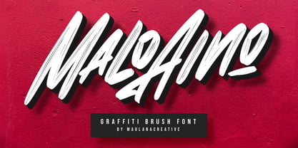 Give your designs an authentic handcrafted feel. "Malo Aino Graffiti Brush Font" is perfectly suited to signature, stationery, logo, typography quotes, magazine or book cover, website header, clothing, branding, packaging design and more.
 - Quaint 235 by Bejeletter,
$16.00 Quaint 235 is a regular and slant font with a modern concept with a bold typeface, good for products and very suitable for use as a display font and also as a header.
 - Wascer by Maulana Creative,
$12.00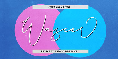 Give your designs an authentic handcrafted feel. "Wascer Modern Script Brush Font" is perfectly suited to signature, stationery, logo, typography quotes, magazine or book cover, website header, clothing, branding, packaging design and more.
 - Darkening by Seemly Fonts,
$12.00 Darkening is a brush display font. This font works well for many different things, including stationary, logos, t-shirts, papers, print designs, website headers, picture frames, flyers, album covers, posters, and image sliders.
 - Sasparillo by Greater Albion Typefounders,
$16.00 Sasparillo is an "extreme" Tuscan face, with reversed emphasis, by which we mean the horizontals are far heavier than the verticals. Recreate the spirit of the "Wild West" with a sense of fun!
 - Luruh by Sebeningjingga,
$5.00 Luruh are inspired by the flow of running and melting water. Luruh is guaranteed to make your text stand out - perfect for logos, printed quotes, invitations, cards, product packaging, and headers. Publisher: Sebeningjingga
 - Lovesome by Seemly Fonts,
$14.00 Lovesome is a brand-new, brushed display font. Lovesome is perfectly suited for stationery, logos, t-shirts, paper, print designs, website headers, photo frames, flyers, music covers, posters, image sliders, and much more.
 - Saikon by Graphicfresh,
$14.00 Saikon - A Handwritten Sans Serif, every single letter has been carefully crafted to make your text looks beautiful. it's perfect for logos, name card, magazine layouts, invitations, headers, or even large-scale artwork.
 - Ingenue by Seemly Fonts,
$14.00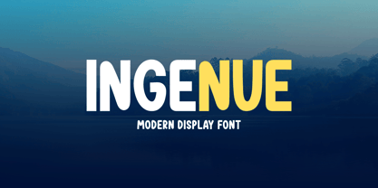 Ingenue is a friendly and simple display font. It is perfectly suited for stationery, logos, t-shirt, paper, print design, website headers, photo frames, flyers, music covers, posters, image sliders, and much more.
 - Sragera by ffeeaarr,
$14.00 Sragera is a rounded and bubbly display font offering you lots of creative space! You can use it to design outstanding titles, posters, book covers, magazine headers, product packaging, and so much more
 - Syl by Intellecta Design,
$28.90 A classic and antique font design remastered by the type foundry Intellecta Design. Great display face for headers and antique-like projects. Contains a limited amount of letter designs, all uppercase letter designs.
 - Conscious Valentine by Seemly Fonts,
$14.00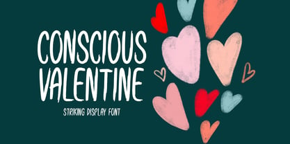 Conscious Valentine is a brushed display font. Conscious Valentine is perfectly suited for stationery, logos, t-shirt, paper, print designs, website headers, photo frames, flyers, music covers, posters, image sliders, and much more.
 - Keep Me by Seemly Fonts,
$12.00 Keep Me is a brand new display font. Keep Me is perfectly suited for stationery, t-shirt, paper, print design, website header, photo frame, flyer, music cover, poster, image slider, and much more.
 - P.I. by Hanoded,
$20.00 As he eyed the bloody corpse of Lefty Jones in the hallway, Mac figured the crook had it coming: he always seemed to end up in the wrong place at the wrong time. Mac sighed, his head heavy with last night's alcohol; this meant another day behind his desk, typing endless reports and drinking the bureau's poor excuse for coffee…
 - Valute by Authentype,
$12.00 Valute is a custom font with variable typeface, but at first glance it looks very mischievous. Very thincontrasting lines are very legible with heavy use of paragraph text. We made Valute with 9 weights that include ligatures and are multilingual. We will make language and feature updates in the future as this is a long-term project that we will be building on.
 - Backstage Pass NF by Nick's Fonts,
$10.00Turn on the mirrored ball, and haul out the gold chains and white suits! This Disco dazzler is a new take on Bass Rainbow, designed by Saul Bass in the 1970s. Hip, hot and heavy, this typeface is ready to get down. This font contains the complete Latin language character set (Unicode 1252) plus support for Central European (Unicode 1250) languages as well. - Jeames by Kyle Wayne Benson,
$6.00 Jeames brings familiarity to the often detached feeling extended serif genre. The curved, heavy, joints let the letters bounce along while the proportions and contrast keep your eyes grounded. This mid century inspired family of three weights is intended for large titles and display. The set includes language support, opentype fractions, and other fun glyphs. You can learn more about its development here.
 - Lolapeluza by RodrigoTypo,
$45.00 Inspired by the logo from “Lollapalooza”. The intention was to design a cheerful, entertaining typeface. Lolapeluza works perfectly for designs for children and youth. 4 variants are also included: -Regular: Basic set -Black: Heavy -line. Lolapeluza can run over or behind a text -Shadow. A Cyrillic alphabet is also included to enhance but the typography is more a set of alternatives.
 - Stop by Linotype,
$29.99Stop is a heavy futuristic sans serif display font, designed by the famed Italian type designer Aldo Novarese. Stop's forms are vaguely stencil-like, and some of them only read as letters when used in combination with each other. Nevertheless, Stop has a real computer-technology" feel to its design. It should be used exclusively for headlines or logo work." - Quiky by Scratch Design,
$10.00 Introducing our Quiky! A playful, hand lettered font. It has smooth lines, a heavy weight, sweet curves and a lot of character that you can name it. Quiky suits for your design such as invitation design, stationery, branding, blog design, advertising design, card, art quote, home decor, book title, special events and more. This font also includes Latin Characters for language support.
 - Sensor by Tour De Force,
$25.00 Square "robocap" typeface containing some little bit of experimental letters such as "t" or "f". Designed by Dusan Jelesijevic who wanted to make a font that would look heavy as building construction printed on your shirts. Even if it looks strong and stable, it is surprisingly very readable at small sizes which make it perfect for titles, posters or logotypes.
 - ALS Heino by Art. Lebedev Studio,
$63.00 Heino is a decorative face with two font styles that was inspired by an old magazine lettering. Its original features include heavy serifs and tight spacing, particularly if you take the Black version. The bouncing letters create a cheerful impression, and would look nice in children’s books and magazines, on candy and food packages, holiday and circus posters and flyers.
 - Zanderley by Greater Albion Typefounders,
$15.00 Zanderley was inspired by a small, almost random sample from a turn-of-the-last- century calligrapher’s instructional manual. It’s a bit Roman, mixed with a little blackletter and a lot of random decorative fun.The family consists of two typefaces- Zanderley regular is a heavy, friendly an d fun display face. They are well complimented by Zanderley initials. Try them out soon!
 - Hebrew Moses Std VF by Samtype,
$120.00 his is a beautiful, modern, and super readable font. You can use it in any kind of text, from folders to prayer books. This font is especially good for school and kid's books. This font also has modern punctuation: shevana, kamats katan, dagesh hazak, and holam chaser. This is a Variable font! One font with 5 styles (Regular, Medium, SemiBold, Bold, Heavy)
 - Calgary Script by Sudtipos,
$99.00 Calgary Script was mostly inspired by a brush script on a Welcome To Calgary sign in, you guessed it, Calgary. Though now, after it's finished, I can easily tell the influence is evident of all the books on American sign painting I have absorbed over the years. The overall effect of the font is similar to something that Fonzied itself, big hair and leather jackets and all, out of the early 1980s, but the feeling really dates back to a few decades earlier. Heady caps and free-flowing lowercase make for a speedy, determined, and instinctively organized buffalo herd of a typeface. This is a packaging font with a true supermarket sign spin, with OpenType features including ligatures, alternates, and ordinals specifically made to follow numbers.
 - Heavy Heap, designed by the talented Ray Larabie, is a font that truly stands out in the dynamic world of typography. Its design channels the bold spirit of the 1960s and '70s, particularly drawing i...
- Gratitude Script by Sudtipos,
$59.00 The quality or feeling of being grateful or thankful. An appreciation for the world around us. Gratitude for being a part of it all. No matter what’s happening in our lives, there’s always something to be grateful for. When we have an appreciation for all we have, life gives us more to feel grateful for. It’s a naturally occurring cycle. Some of the most profoundly grateful times in our lives can be felt when we find ourselves surrounded by beauty: in art, nature, music, special places, the seasons, family, loving relationships, a cozy home, meaningful work; in doing what brings us joy, comfort, and feelings of deep love and satisfaction. There is beauty everywhere, and creating beauty is an artist’s mission. We all have the ability to create and experience beauty. In this high-tech, fast paced world of strict, unbending rules, we give you Gratitude Script: A celebratory font that’s deeply rooted in tradition letterforms but with a modern, updated twist; a casual, whimsical, fun look that is also elegant and versatile! Partnering with Ale Paul is seasoned wedding calligrapher Kathy Milici, who is well known for her passionate writing style and highly ornamental pen flourishing. With its signature hand-written look, flowing lines, graceful curves and flourishes, Gratitude Script’s space saving, vertical style is perfect for small printing areas as well as large format presentations. An extended variety of alternates makes it a perfect and versatile addition to your font repertoire.. These are tender times. Long hours and work pressures add to our stress. Time spent with family and friends is more valuable than ever before, as we try to balance it all. It’s important to mark time with special, happy events in our lives that we can all appreciate and enjoy. Let’s be grateful for it all! Hooray for Gratitude, and Gratitude Script! About the font: Gratitude Script is an OpenType font that contains more than 1400 glyphs icluding ligatures, alternates, endings , a wide range of latin languages and a set of ornaments and words specially designed to use in stationery for weddings, birthdays, etc. There is a smooth version of Gratitude Script too. To access to all the extra characters you will need to use software that actually supports OpenType like Adobe CS apps or later where we recommend the use of the Glyph palette. About the presentation: Every time we publish a new typeface we love to invite an artist to collaborate. Vero Scherini, an argentinian and very talented designer and illustrator, fits perfectly with Gratitude.
 - Bunaero Pro by Buntype,
$33.50 Buntypes Bunaero™ combines classical and contemporary characteristics to a unique and distinctive font family with extravagant but also harmonious appearance. The characters are clear, open and sometimes bellied. Especially the caps have a very high waistline. Based on this, four main states with different moods have been composed: The original Bunaero™, the more conservative “Classic”, the elegant and curvy “Up” and the matching ”Italic”. All states offer weights from a considerably thin „Hair“ to a real fat „Heavy“, so the family consist of 34 Styles, all with rather narrow width and very good legibility. The font was manually hinted and contains extensive handcrafted kerning tables to ensure flawless appearance in all media. It supports at least 99 languages incl. Vietnamese and provides ligatures, alternative glyphs, special localized forms and even more enjoyable OpenType® features. This Pro version of Bunaero also includes a lot of features for sophisticated users: Lining figures for headline setting; Intermediate linings and oldstyle figures for text setting; Tabular versions of all figures; Superiors, inferiors, numerators, denominators and automated fractions; Language specialities like a capital Eszett for the german language and extra characters with a polish kreska instead an acute; And many more. Further information: Bunaero™ Pro Specimen PDF Bunaero™ Pro OpenType® Quickguide Feature Summary*: -4 Moods: Normal, Classic, Up and Italic -9 weights: Hair, Light, Thin, SemiLight, Regular, SemiBold, Bold, ExtraBold and Heavy -Supports at least 99 Languages incl. eastern european and vietnamese languages -Overall width: Narrow or Space-Saving -Advanced f- ligature set including fb -Discretionary s- and c- ligatures -Alternative Characters: a, e, f, g, i, k, l, t, v, w, y, J, K, Q, R, and more -6 sets of figures: -Capital sized figures, oldstyle figures and intermediate figures, each in proportional and carefully adjusted tabular versions -Superiors, inferiors, numerators and denominators -Circled and negative circled figures -Capital German Eszett -Extra characters with Polish Kreska -Catalan Punt Volat -Extra characters with alternate minmalistic Cedille -Arrows -Automated feature for fractions as well as extended fraction character set -More than 1000 characters per font * Some features may only be available in OpenType®-savvy applications
