8,993 search results
(0.024 seconds)
- MohoBis Pro by John Moore Type Foundry,
$36.00 MohoBis is a fancy font based on the multiplication of a source in many strokes way to create a texture called kinetic. This can mean substantial savings in printing ink. Parallel serves to create unusual headlines and prominent texts that provides an attractive modern typeface, ideal for packaging, editorial design and logos.
 - Beast Sketch by 38-lineart,
$19.00 "Beast Sketch" is an extraordinary handwritten font created with bold, untamed strokes using ink and a bamboo pen. It boasts a masculine aesthetic, an organic, natural feel, and extensive Latin character support. Perfect for book titles, magazine covers, logos, and more, it adds a raw, authentic, and compelling vibe to your projects.
 - Raguki by Saga Studio,
$20.00 Raguki is a sans serif display font with a modern and unique style. Aesthetic letterforms with stylistic ink traps make this font have bags of personality. Raguki has open-type features (salt and ss01) that enable the user to transform the letterforms to create different designs. We hope you enjoy it. Saga Studio
 - Gallows Hill by Hanoded,
$15.00 I am creating new fonts for my Halloween collection and Gallows Hill is the latest one. It was made using a cheap brush, gouache mixed with Chinese ink and paper. The result is a very messy, rough and scary font. As a bonus, I have added double letter ligatures for the lower case.
 - Frelline Script by Soft Creative,
$14.00 Frelline looks beautiful on wedding invitations, thank you cards, quotes, greeting cards, logos, business cards and more. Perfect for use in ink or watercolors. Including beginning and end letters, alternative support and many languages. I made this font very carefully so that each letter looked very unique and had various beautiful alternatives.
 - Nouveau Nights JNL by Jeff Levine,
$29.00 The deep well of creativity that is the era of the hand lettered sheet music title page brings forth Nouveau Nights JNL. Re-drawn from a period example of the 1920s, this titling font perfectly captures the warm "human" look of pen and ink lettering, long before the advent of "perfect" digital type.
 - Murisa Rania by Murisa Studio,
$10.00 Murisa Rania is our next very attractive font. Have you ever imagined a font that is formed from brush strokes whose ink is almost dry? That's what this font is made of. Murisa Rania combines elements of art and high technique in its creation to create a unique, attractive and beautiful font.
 - Jesitta Signature Swash by Mega Type,
$10.00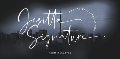 Jesitta Signature Font is a modern and elegant signature style script font with magical ink strokes. Jesitta Signature is a great choice for watermarks on photography, advertising, logos & branding, watermarks, weddings, invitations, product design, labels and other design projects. Please contact us if you have any questions, we are happy to help you!
 - LP Harmonia by URW Type Foundry,
$35.99 LP Harmonia arose from its designer’s private life. As a type designer, Peter Langpeter was often asked by friends or relatives to write a greeting on a birthday card or create a good looking invitation. Over the years, he used ink and a soft feather to form his personal handwriting: LP Harmonia.
 - Dragonblood by Hanoded,
$20.00 Dragonblood is quite an unusual font: it was made with Parker ink and a Chinese fur brush. When all the glyphs had been vectorized, and I saw them in a text for the first time, the only appropriate name I could think of was Dragonblood. Dragonblood comes with a realm of diacritics.
 - Katalina by Shape Studio,
$12.00 Katalina Font is a new modern script calligraphy font with an irregular baseline. Trendy and feminine style.Katalina Font Script looks lovely on wedding invitations, thank you cards, quotes, greeting cards, logos, business cards and more. Perfect for using in ink or watercolour. Including initial and terminal letters, alternates, ligatures and multiple language support.
 - Greatness Serif by Shape Studio,
$14.00 Greatness font is a new modern serif calligraphy font with an irregular baseline. Trendy and feminine style.Greatness font looks lovely on wedding invitations, thank you cards, quotes, greeting cards, logos, business cards and more. Perfect for using in ink or watercolour. Including initial and terminal letters, alternates, ligatures and multiple language support.
 - Fat Inker by Hanoded,
$10.00 For once the name of this font corresponds with the way it looks: Fat Inker is a fat, inky font. I made it with a Chinese brush and ink, Fat Inker is a nice poster font and it comes with extensive language support and some cool discretionary ligatures for double letter combinations.
 - Tropical Asian by Konstantine Studio,
$16.00 Tropical Asian, inspired from the summer vibes and the fun of careless brush and ink play in paper. Perfectly fit for welcoming summer and your casual fun branding projects. Teamed up with the Stylistic Alternates for each Uppercase and Lowercase letters, Multilanguage Support, and Vector Illustration pack to vibin' up this font.
 - Better Step by Siwox Studios,
$13.00 Better Step is a handmade font with stunning characters. Made with a brush and high-quality water-based ink. Ideal for name tags, handwritten quotes, product packaging, merchandise, social media, greeting cards, etc. To make your designs look even more naturally handwritten, Better Step has 1 extra set of alternate lowercase letters.
 - P22 Stickley Pro by IHOF,
$39.95 Stickley Optical Family is an expansion of P22 Stickley Text, a humanist, Oldstyle-rooted design with a contemporary execution and full OpenType abilities. The font contains ten distinct cuts across four optical masters—in addition to Text for page content, the optical family includes Display for titling; Headline for emphasis; and Caption for footnotes and small sizes. Typefaces were originally designed for the physical size at which they were to be printed, with subtle variations in proportion, detail, contrast, and visual weight to ensure they were as clear at 6 pt. as they were elegant at 68 pt. This created a unified design as the various sizes were set together on a page. Text is the foundation of this typeface family and is built for use in extended reading. Its proportions are carefully balanced for visual clarity while retaining its character; designed for use at 9 to 13 pt. Caption is a sturdy, simplified interpretation of the Text letterforms, with ink traps, generous letters and spacing, and hefty proportions to give balance to the smallest content on a page; designed for use at 5 to 8pt. Headline is a complement to the Text master size. It is a gently modified version with larger small caps to add visual strength and has a greater delicacy; designed for use at 14 to 26 pt. Display is an elegant refinement with stylized details. It harmonizes with the smaller optical masters as a more intricate manifestation of the typeface. Designed for use at 34 pt. and above. Opentype features include ligatures, oldstyle and lining figures, alternates, Central European characters and diacritics, and Swash Caps for the Italics. Stickley Optical Family is a feature-rich workhorse with international functionality.
 - Dingos by Antipixel,
$18.00 Dingos is a display typeface specially handcrafted for potent usage. It is compact, solid, and dense, with a heavy-built structure, tight internal space, and a versatile touch. Dingos is perfect for large settings due to its precise shapes. The 'Display' and 'Display Outline' styles have sharp and clean paths with angular ink traps, while 'Stamp' and 'Stamp Outline' have round ink traps and irregular, soft, curvy outlines optimized to ensure high-quality contours. Stamp textured styles have three sets of alphabets that slightly differ from one another. Thanks to the Contextual Alternates, these alphabets are automatically alternated to avoid repeating the same curvy textures. Some of Dingos' features are ligatures, discretionary ligatures, stylistic sets, numerators, fractions for any number combinations, arrows, special decorative characters, and a glyph coverage that ensures extended language support.
 - Univers Next Cyrillic by Linotype,
$49.00 Linotype Univers is a completely reworked version of the original Univers typeface family designed by Adrian Frutiger in 1957. After a long process of painstakingly detailed revision, Frutiger and the design staff at Linotype completed this large joint project in 1997. The result: a brilliant and cohesive font family of 63 weights and styles including the 4 monospaced typewriter weights. All the existing weights were completely redrawn, with careful attention paid to making the proportions more consistent with each other and improving fine details such as curves and thick-to-thin stroke ratios. The family was expanded from 27 to 63 weights, providing a much larger framework to graphic designers for choosing just the right style. The bold and condensed weights were reworked for improved legibility and on-screen application. The stroke weights were revised for consistency within each face as well as in relationship to the other weights. By following Frutiger's original designs, the humanist character of the sans serif Univers now comes through more distinctly. The systemized numbering system has also been updated. With its sturdy, clean forms Univers can facilitate an expression of cool elegance and rational competence. In fact, the strong familial relationships between all the styles and weights make it a serviceable choice for large graphic design projects that require versatility with consistency. Frutiger was successful in staying true to his initial aims; the new Linotype Univers does indeed work in longer texts as well as for display settings. In 2010 the typeface family was extended and renamed into a more logical naming of "Univers Next" to fit better in the Platinum Collection naming.
 - Ashemore Softened by insigne,
$32.00 Following the success of the Ashemore family, it became clear that a rounded version of Ashemore would be a great addition to the product line that would allow designers even more design choices. Ashemore Softened’s rounder forms compliment the face well as the original font eschewed straight lines. The rounded terminators give the face a sense of friendliness that is unsurpassed. The distinct and flamboyant style of Art Nouveau and the Arts and Crafts style remain, but the blunted terminators give the face a more technological and contemporary look and feel. The Ashemore Softened family has a full range of six weights from thin to black and includes condensed and extended options for a total of 36 fonts. The typeface also includes some unique OpenType alternates that make the superfamily even more versatile. Ashemore Softened is equipped for complex professional typography, including alternates, small caps and many alternate characters. The face also has a number of numeral sets, including tabular figures, fractions, old-style, lining figures and superiors and inferiors. OpenType-capable applications such as Quark or the Adobe Suite can take full advantage of automatic ligatures and alternates. You can find these features demonstrated in the .pdf brochure. Ashemore Softened also includes the glyphs to support a wide range of languages, including Central, Eastern and Western European languages. In all, Ashemore Softened supports over 40 languages that use the extended Latin script, making the new addition a great choice for multi-lingual publications and packaging. The original Ashemore was designed by Jeremy Dooley with production assistance from Lucas Azevedo and Marcelo Magalhaes. Kerning assistance from iKern.
 - Univers Next Paneuropean by Linotype,
$89.00 Linotype Univers is a completely reworked version of the original Univers Univers typeface family designed by Adrian Frutiger in 1957. After a long process of painstakingly detailed revision, Frutiger and the design staff at Linotype completed this large joint project in 1997. The result: a brilliant and cohesive font family of 63 weights and styles including the 4 monospaced typewriter weights. All the existing weights were completely redrawn, with careful attention paid to making the proportions more consistent with each other and improving fine details such as curves and thick-to-thin stroke ratios. The family was expanded from 27 to 63 weights, providing a much larger framework to graphic designers for choosing just the right style. The bold and condensed weights were reworked for improved legibility and on-screen application. The stroke weights were revised for consistency within each face as well as in relationship to the other weights. By following Frutiger's original designs, the humanist character of the sans serif Univers now comes through more distinctly. T he systemized numbering system has also been updated. With its sturdy, clean forms Univers can facilitate an expression of cool elegance and rational competence. In fact, the strong familial relationships between all the styles and weights make it a serviceable choice for large graphic design projects that require versatility with consistency. Frutiger was successful in staying true to his initial aims; the new Linotype Univers does indeed work in longer texts as well as for display settings. In 2010 the typeface family was extended and renamed into a more logical naming of "Univers Next" to fit better in the Platinum Collection naming.
 - Conthey Inline by ROHH,
$29.00 Conthey Inline™ is your new retro-display best friend! The one and only, unique IN-AND-OUT typeface with strong personality and outstanding flexibility. This display sans features amazing variable fonts letting you adjust not only width of the letters, but also let you fluently transition from thin inline styles to thin outline ones. This mechanics opens a world full of layering possibilities as well as a great fine-tuning ability. The family consists of 39 OpenType fonts - 18 pure inline/outline styles in 3 widths (Narrow, Condensed, Normal) and 21 styles carefully prepared and tuned for layering. For even greater flexibility 3 variable fonts are included in the set. In addition to flexible width and inline-outline transitioning, this playful typeface features 4 different inline styles to spice up things even more! All styles were meticulously crafted with the highest attention to detail in the letterforms as well as spacing. Conthey Inline is a sibling of Conthey, a display unicase family as well as Lutschine, a versatile modern narrow display typeface. Conthey Inline composes perfectly with its family members, covering a very broad range of design scenarios. All these typefaces are a part of big type system containing also a workhorse sans serifs such as Rothorn and Montreux Grotesk. You will have a lot of success using Conthey Inline for any kind of playful, vintage/retro, organic, friendly and stylized designs. Especially, industries such as food & beverage, travel, hospitality, fashion, healthcare, sports, lifestyle, music, art, entertainment and products for youth are perfect areas to make Conthey Inline shine with all its charm.
 - Torcao by insigne,
$24.00 Torcao is one of the sporks of the font universe, a useful and functional outlier. Half square, half circle, this uncommon squircle of a family with its asymmetry of curved and angular shapes drives through headlines and body copy with forward velocity. The robust, technical appearance is light-hearted and inviting, and its organic nature plays off of its one-of-a-kind kinks and hybrid forms. Torcao is not merely an experimental font, though. The figures have been crafted and refined into a functional, hard-working typeface that lends itself to many sizes and environments. The font family features a tall x-height and light modulation, which give the typography its unique color highly effective in headlines but still quite legible in longer text. This family contains a comprehensive range of nine weights--slender to black--and features condensed and extender selections for a complete set of forty-eight fonts. The font has been decked out for experienced typographers, together with swash alternates and simplified titling. The typeface also contains a range of numeral sets, together with fractions and old-style figures. OpenType-capable programs including Quark or the Adobe suite allow quick changes to ligatures and alternates. Previews of these options can be found in the .pdf brochure. Torcao also features the glyphs to enable all Central, Eastern, and Western European languages. In all, the font supports around forty languages that utilize the prolonged Latin script, making it an excellent option for multi-lingual publications and packaging. Simple, technical, and open, the Torcao type family could just be the perfect choice for your web type or print project.
 - Mono Spec Stencil by Halbfett,
$30.00 Mono-Spec Stencil is a monospaced family of sans-serif type. At least in default settings, all characters across the typeface share a common width, which is immediately noticeable for its condensed nature. Mono-Spec Stencil is a sibling of a non-stencil family, simply named Mono-Spec. Characters in each are just as wide, allowing Mono-Spec Stencil to be used together with Mono-Spec, as a secondary typeface. As a typeface whose characters are stencil-shaped, this design channels the spirit of resistance and street culture. When you look at the family, remember that it ships in two different formats. Depending on your preference, you can install the typeface as a single Variable Font or use the family’s five static OpenType font files instead. Those weights run from Light through Bold. While the static-format fonts offer a good intermediary-step selection, users who install the Variable Font have vastly greater control over their text’s stroke width. The Mono-Spec Stencil Variable Font’s weight axis allows users to differentiate between almost 1,000 possible font weights. That enables you to fine-tune your text’s exact appearance on-screen or in print. Whatever format you choose, the Mono-Spec Stencil fonts are equipped with several OpenType features. The most striking of these can be activated via a Stylistic Set. That will replace several letters – like “B”, “E”, “F”, “H”, and “I” with double-width alternates. Those alternates take up as much space as two characters placed next to each other otherwise word. The effect of Mono-Spec Stencil’s double-width alternates is striking, and their use strikes a strong chord in any display typography applying them.
 - Gimbal Egyptian by AVP,
$19.00 Gimbal Egyptian is a richly-featured font family providing many style options across a broad range of languages. It is twinned with Gimbal Grotesque, a sans-serif family with an identical range of weights and features. Originally conceived as a small webfont family, the letterforms have been revitalised to put a spring in their step and the family has been extended to create a versatile multi-script text face equally at home on the printed page. Carefully crafted at all weights, Gimbal also lends itself to headlines and display applications such as posters, exhibitions and signage while resolving well on-screen for general document creation and web-based applications. The letters are spaced for best readability on-screen and in the usual printed body text ranges but are tolerant of tracking adjustment to suit other uses. The styles are divided by width into four families (Compressed, Condensed, Normal, Extended), each family possessing six weights plus corresponding italics. Within each family, the 'regular' and 'bold' weights are style-linked, and all upright forms have an italic counterpart. The full opentype character set includes latin, greek and cyrillic scripts with appropriate local variants (also as stylistic sets) for Turkish, Polish and Romanian (latin) and Russian, Bulgarian and Serbian (cyrillic). All fonts contain small capitals for all scripts, superscript for latin and commonly used greek together with the usual numeral style, size and positioning options. The default numerals are 'proportional lining'. Other opentype features include case-sensitive marks, fractions, and some discretionary ligatures. A set of circled numerals and circled latin capitals is included, along with an unusual feature that composes 2-character country codes.
 - Gimbal Grotesque by AVP,
$19.00 Gimbal Grotesque is a richly-featured font family providing many style options across a broad range of languages. It is twinned with Gimbal Egyptian, a slab-serif family with an identical range of weights and features. Originally conceived as a small webfont family, the letterforms have been revitalised to put a spring in their step and the family has been extended to create a versatile multi-script text face equally at home on the printed page. Carefully crafted at all weights, Gimbal also lends itself to headlines and display applications such as posters, exhibitions and signage while resolving well on-screen for general document creation and web-based applications. The letters are spaced for best readability on-screen and in the usual printed body text ranges but are tolerant of tracking adjustment to suit other uses. The styles are divided by width into four families (Compressed, Condensed, Normal, Extended), each family possessing six weights plus corresponding italics. Within each family, the 'regular' and 'bold' weights are style-linked, and all upright forms have an italic counterpart. The full opentype character set includes latin, greek and cyrillic scripts with appropriate local variants (also as stylistic sets) for Turkish, Polish and Romanian (latin) and Russian, Bulgarian and Serbian (cyrillic). All fonts contain small capitals for all scripts, superscript for latin and commonly used greek together with the usual numeral style, size and positioning options. The default numerals are 'proportional lining'. Other opentype features include case-sensitive marks, fractions, and some discretionary ligatures. A set of circled numerals and circled latin capitals is included, along with an unusual feature that composes 2-character country codes.
 - Mayonaise - Personal use only

- Ornata E by Wiescher Design,
$39.50 Ornata E is the fifth of a series of old ornaments that I am trying to save from oblivion. I am completely redesigning the ornaments from scratch, trying in this one to keep the rough "letterpress" character. These ornaments were designed around 1910, I could not find out by whom. This set is perfect to design flowery frames since it has an enormous amount of flowery things. Your digitizing type-designing savior, Gert Wiescher
 - Goondocks PB by Pink Broccoli,
$14.00 HEY YOU GUYS! Goondocks PB is a faithful recreation of the titling font from 1985 film, "The Goonies". This was a lot of fun to recreate and flesh out, and it has that purposefully awkward appeal that a lot of Pink Broccoli fonts are imbued with. With a pseudo unicase styling, wonky blockish style lettering, and that visceral tieback to the 80's, Goondocks brings back fond memories, perfect for those unorthodox creative designs.
 - SF Change Pro by Sultan Fonts,
$19.99 Change is An Arabic and Latin text typeface for desktop applications. This Font Family development and extension of the Old sultan font "change" Here you will find a change in many letters, along with two types of regular and bold fonts, as well as a change in all Latin letters. The font includes a matching Latin design and support for Arabic, Persian, Kurdish, and Urdu. Designer: Sultan Maqtari Design date: 2020 Publisher: Sultan Fonts
 - Result by Cloud9 Type Dept,
$55.00 Result, a grotesque sans-serif, is a typeface well-suited for multiple purposes. It’s easy to find a suitable weight of Result for all kinds of needs, being very suitable for packaging and identity design, magazine and newspaper headlines, signage, you name it. Result fonts have an extended character set to support Central and Eastern European as well as Western European languages, as well as OpenType features such as fractions and ligatures.
 - Bloemgracht by Hanoded,
$15.00 In the old Amsterdam neighborhood of 'De Jordaan', you will find a canal called Bloemgracht (Flower Canal). For many years, a coffee store called Schildmeijer could be found here. Their paper coffee bags and advertisements sported a hand made font which I have tried to recreate and the result is Bloemgracht typeface. It is an all caps art deco font, quite angular, but very legible and distinct. Bloemgracht comes with extensive language support.
 - Angelina Script by Din Studio,
$25.00 Introducing Angelina Script - Beautiful Handwritten. It's made with a naturally handwritten and modern style. Angelina font best use for wedding, branding, logotype and quotes. This includes both a Regular version and a Dots version. How to access alternate glyphs? you can see it on this link ( http://goo.gl/1vy2fv) I hope this font can meet your design needs. Fell free to contact me in message or direct email donis4design@gmail.com. Happy Design :) Thank You, Donis
 - Convey by Wannatype,
$30.00 The convey typefont family merges essential features of classical serifs and sans-serifs and creates a character with a contemporary, open appearance. The elements of an antiqua typeface are formally reduced to a minimum, still supporting the eye in keeping lines and maintaining outstanding reading properties. The font was created as a cooperation project with media theorists and was designed and perfected through analyses, reading tests and the application of media psychological and sociological findings.
 - Hillania Script by Barland Studio,
$9.00 Introduce Hillania Script is modern script font, every single letters have been carefully crafted to make your text looks beautiful. With modern script style this font will perfect for many different project ex: quotes, blog header, poster, wedding, branding, logo, fashion, apparel, letter, invitation, stationery, etc. Feature : - Hillania Script If there is anyone who download and find a problem, do not hesitate to let me know. contact me by email. Thank You
 - Gregean Brush by Gatype,
$16.00 Gregean Brush is a relaxed brush font with a fine grit texture. This font has an irregular treatment between characters to give it a more realistic look. Suitable for use on title designs such as book titles, stationery designs, quotes, branding, logos, clothing, invitations, greeting cards, t-shirts, packaging designs, posters, and others. The Gregean Brush has the texture of a dry brush pen and the Solid is a slightly cleaner version. Thank You! - Gatype
 - Boleo by Salsipuedes,
$19.00 Boleo is a typeface designed to work in short texts such as headlines, banners, logos, signs, packaging and posters. It is a display font but has a good legibility thanks to well-proportioned shapes which let it works fine both on paper and screen. Boleo’s shapes remind to ribbons in motion, so that its lines, all curved, can be traced all at once. Boleo displays in three weights: regular, bold and black.
 - Care Dairy by Gatype,
$14.00 Care Dairy is a cute and fun display font with an original comic style. Use these display fonts to add to your design library in an easy way to find custom comic display variations on any design idea you can think of! Great for any type of logo, Sticker, Packaging design, Cricut Project, headlines, brand identity, t-shirt or apparel industry, posters, magazines, books, YouTube, Instagram, websites or your creative design projects. Enjoy!
 - Baby Garland by Rotterlab Studio,
$14.00 Baby Garland is a beautiful script font with a modern and elegant feel. It has a classy look that can be used for logos, branding, invitations, stationary, cards, wedding designs, social media posts, and any other design that requires a handwriting touch. This font is PUA encoded which means you can access all glyphs and swash easily! It features varied base lines, fine lines, beautiful flying machines and incredible alternatives. Thank you
 - Alaca by Plasebo Studio,
$10.00 Alaca typeface was designed, based on its octagonal form, as contemporary, dynamic and modern font family. While designing Alaca typeface each glyph was given a form to link with other glyphs. As such, the harmony between the letters was carried to an advanced level. Alaca font family consists of 6 weights and italics matching those weights. It can be used typographically as a logo, title and text font up to certain sizes.
 - Konnect by Adam Ladd,
$25.00 Konnect is a geometric sans serif featuring a blend of modern, classical, and playful characteristics. The simple, clean forms and classically-inspired proportions give it a timeless quality and interesting rhythm. A large x-height, closed apertures, and horizontal/vertical terminals create a distinct appearance. It includes a wide range of weights, from fine and functional Hairline to hefty and confident Black, each with italics, all ideal for branding, advertising, logos, magazines, and more.
