3,872 search results
(0.015 seconds)
- Trajan Sans by Adobe,
$35.00Since its initial release in 1989, Trajan has risen to international popularity as a distinctive and versatile display typeface. First released as a Roman, and later a contemporary and stylish sans. - Christy Marie by Elemeno,
$25.00Christy Marie likes fun fonts. This was the first font to meet with her approval. It's bouncy, teenage girl sort of font and would do well at parties or the mall. - LD Old Country by Illustration Ink,
$3.00This old fashion font looks like it belongs on a saloon sign. If you've got old west style photos, finish up your scrapbook page with title and journaling done in this cool font. It's perfect for lettering on western themed invitations, newsletters, sign, flyers, even menus. - Hawker Display by Webhance,
$4.00 Hawker is a beautiful modern display font family. Hawker carries a powerful, unique, cute, artistic, and social character line with a premium finish, giving a new impression. Hawker is perfectly crafted for logos, magazines, advertisements, websites, headlines, titles, captions, UIs, games, apps, films, apparel and more.
 - Egyptian 505 by Bitstream,
$29.99This face was designed by Andre Guertler’s class in room 505 at the Kuenstgewerbeschule in Basel. It follows the principles of Frutiger’s Egyptienne, and won the first of the VGC type competitions. - Missiva by DSType,
$20.00The first inspiration for Missiva was a sixteen century letter from S. Francisco Xavier (St. Francis Xavier) but then I adapted my own handwriting in order to have the basic character set. - Wordless Script by Sudtipos,
$59.00 We are very happy to announce the release of our first collaboration with master calligrapher, designer and illustrator Gabriel Martínez Meave from México. The first in the series of new designs is Wordless Script, an emotional calligraphic typeface published by Sudtipos. Speechless. Breathless. Wordless. There are letters that transcend simple functionality and sheer legibility, to be recognized instead by their style, their charm, their emotion. It’s like when we don’t remember the exact sentences, but we recall the tone of the voice of a loved one: it just doesn’t matter WHAT he or she said, but HOW he or she said it. Wordless Script is the font of choice for writing those things that go beyond words. Based on the connected-scripts of late 18th-century England, this typeface preserves the irregular finish and gestural strokes of the pointed nib. It is, so to speak, a personal rendition of the English roundhand as originally executed with the bird’s quill. Imbued with a Rococo, neoclassical, romantic spirit, Wordless radiates the gallantry of a time when the celebrated «douceur de vivre» that Talleyrand was so fond of was still alive and well; echoes of which still haunt us in our eclectic 21st-century, which has once again come to appreciate these magnificent styles of old. Wordless features alternate variants of most letters, ligatures and multiple calligraphic endings, ideal for elegant labels, high-end packaging and personalized stationery, as well as compositions for selected brands, exquisite titlings, verses, letters and short texts, like those meant to be read with the eyes only or intended for whispering into someone’s ear.
 - George Town by FoxType,
$12.00 Introducing George Town new generation Typeface with 6 Weights. George Town Typeface created with the vision of to attract the audience to your brand . The finest details of this typeface are methodically and mathematically created. George Town is created with all the tasks of a corporate font and also for the usage in a variety of projects, including branding, logos, titles, headlines, servers, screens, display, digital ads, and everything else. We are putting a lot of effort on this font as a long-term project. The Typeface includes Six Weights. Thin, ExtraLight, Light, Regular, Medium, and SemiBold Features: Numerals, extended punctuation & Basic Symbols(200+ Glyphs). Expert kerning and quality crafting. Uppercase Letters & Lowercase Letters 24x7 Support Thank you for taking the time to look into the font.
 - North Bay Grotesk by FoxType,
$16.00 Introducing NorthBay Grotesk new generation Typeface with 5 Weights. NorthBay Typeface created with the vision of to attract the audience to your brand . The finest details of this typeface are methodically and mathematically created. NorthBay is created with all the tasks of a corporate font and also for the usage in a variety of projects, including branding, logos, titles, headlines, servers, posters, screens, display, digital ads, and everything else. We are putting a lot of effort on this font as a long-term project. The Typeface includes Five Weights. Light, Regular, Medium, SemiBold and Bold Features: Numerals, extended punctuation & Basic Symbols(200+ Glyphs). Uppercase Letters & Lowercase Letters 24x7 Support Thank you for taking the time to look into the font.
 - ITC Manhattan by ITC,
$29.99Manhattan was designed in 1970 for ITC by Tom Carnase, who also created Avant Garde Gothic. The distinguishing characteristic of this designer's work is found in the emphasis on the thick-thin constrast. In this case, Carnase approached the border of the impossible. The heavy vertical strokes stand opposite the finest of lines and the thick columns dominate the overall look. The basic forms are strictly constructed, as are those of Morris F. Benton's Broadway of 1925, to which many parallels can be found. Manhattan is best used for applications which will not be placed too far from the viewer, as at too great a distance the fine lines can no longer be seen. It should be used exclusively for headlines in medium point sizes. - Brant Ford by FoxType,
$16.00 Introducing BrantFord new generation Typeface with 5 Weights. BrantFord Typeface created with the vision of to attract the audience to your brand . The finest details of this typeface are methodically and mathematically created. BrantFord is created with all the tasks of a corporate font and also for the usage in a variety of projects, including branding, logos, titles, headlines, servers, screens, display, digital ads, and everything else. We are putting a lot of effort on this font as a long-term project. The Typeface includes Five Weights. Light, Regular, Medium, SemiBold and Bold Features: Numerals, extended punctuation & Basic Symbols(200+ Glyphs). Expert kerning and quality crafting. Uppercase Letters & Lowercase Letters 24x7 Support Thank you for taking the time to look into the font.
 - Zaatar Arabic by Boharat Cairo,
$20.00 Zaatar is a dynamic Arabic typeface abstracted from a mixture of Arabic Ruq’ah and Nastaliq, the slanted baseline with a geometrical contemporary touch, manifest a strong contrast between thick and thin strokes, present a retro-futuristic impression yet an Arabic calligraphic seriousness. and it comes with five stylistic sets giving it a variety of typographic possibilities. Zaatar means thyme, which was first cultivated in Mediterranean Levant, then used by ancient Egyptians for embalming. That's why we found it a perfect name for the first collaboration between Boharat (Cairo) and Hey Porter! (Jordan).
 - Foundry Old Style by The Foundry,
$90.00 Foundry Old Style was the first typeface to be released by The Foundry. Inspired by the incunabula typefaces of Nicolas Jensen, the letterforms were first created as calligraphy, with the aim of retaining the structure and free form of the pen stroke in the final drawing development. The resulting face is a contemporary translation that retains the classical tradition of the transitional roman style. Originally conceived as a text face, with a small weight range for good book work, Foundry Old Style is a versatile design that contrasts and compliments Foundry Sans.
 - Koch Schrift by Ingo,
$42.00 A heavy blackletter; Rudolf Koch’s first type from 1909. On an old page full of type specimen from the 1930s, the type is described as ”Schwabacher (used by the Deutsche Reichsbahn [German Imperial Railway]).“ As a matter of fact, it is the first print of the Offenbach script master Rudolf Koch, who came out with this typeface in 1909. At that time, it was given the name ”Neudeutsch“ (New German). Later, it became very popular under the name Koch-Schrift, and was at times the official typeface of the Deutsche Reichsbahn (German Imperial Railway).
 - Sistina by Linotype,
$29.99Sistina, designed by Hermann Zapf in 1950 was first named Aurelia Titling. It is a heavy supplement to the Michelangelo Titling based on studies of inscriptions in Rome. First release in hotmetal at D. Stempel AG, Frankfurt in 1951. Sistina was originally an all caps font. The digital version from Linotype contains small caps. Hermann Zapf together with Akira Kobayashi, type director from Linotype had made a new revised version of Sistina now named as Palatino Imperial" in the Palatino nova type family, a Platinum Collection product from Linotype." - Thorowgood by Linotype,
$29.99Thorowgood was originally released by the Stephenson Blake typefoundry in the UK. The types were first cut by the English typefounder Robert Thorne, predecessor of William Thorowgood, and first shown in his specimen books in the early nineteenth century. The fat face was revived in roman (1953) and italic. The S and the C appear to be smaller than the other capitals. Most serifs are flat and thin horizontals. In the italic the main strokes of h, k, m, n, and r are curved inwards at the foot. - Azorath by Sryga,
$22.00 Introducing Azorath, a groundbreaking typeface that marries the bold, unyielding lines of brutalist architecture with graceful fluidity and gentle curves. Azorath's unique design defies convention, capturing attention with its juxtaposition of strength and elegance. Each glyph, meticulously crafted, tells a story of innovation and versatility, making it perfect for both powerful headlines and delicate text. Azorath is your canvas for creating captivating narratives that leave a lasting impression. Elevate your projects with Azorath, where raw power meets graceful finesse in the world of typography.
 - Humanex by Sébastien Truchet,
$40.00 Humanex is the first text typeface of Sébastien Truchet. He created it during the year of postgraduation ‘Systèmes graphiques, typographique & language' in Amiens. The beginning stages of the font development involved calligraphic research based on humanistic ductus. Sébastien’s goal was to introduce modules in a lineal structure. Downstrokes and upstrokes are homogeneous. Links between stem and curve are straight. It gives solidity and thickness to the typographical composition. The first version was a Semi Bold version and its italic. This typeface gave a blackest text. You can see the first display typeface, Humanex Ultralight. Sébastien kept the Semibold structure in order to make a thin typeface. Its goal is to give support to the Semibold version. It is a good typeface in big sizes. In order to add a better legibility, Sébastien built a Book version to have a brightest grey of text. The reading is more comfortable.
 - Cosmic Alien - Unknown license

- CS Silly by Cocomilk Studio,
$10.00 SILLY is Cocomilk Studio's first homegrown typeface. This typeface, made by Cocomilk designer, Yas Liamco, features curvy, drooping forms and rounded edges that add a sense of fun and silliness to any project!
 - Moon Corps by Vic Fieger,
$13.99Moon Corps was designed as a simplistic approach to the Japanese katakana script. Though the look of the font is supposed to evoke futurism, the primary intent was always to put legibility first. - Qundeasy by Tanya Savchenko,
$12.00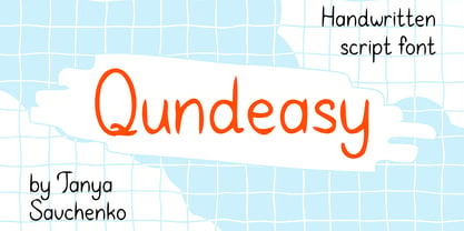 Qundeasy is a sloppy and cute handwritten font. First of all, it is suitable for handmade style design. Сan create interesting logos, posters, banners, social media creatives, postcards and greetings with this font.
 - Mirror Display Bold by Mom,
$19.00 Mirror Display is based on the condensed sans. Developed to 'double view' to give readers the same feeling they have when looking to a work of art they don't understand at first glance.
 - Americana by Bitstream,
$29.99 An original design by Richard Isbell for ATF; in exaggerating the tapered stroke introduced eleven years earlier in Hermann Zapf’s Optima, Isbell created the first flareserif to achieve popularity in the United States.
 - Subeve by Subtitude,
$10.00 Subeve was first made for a young fashion designer in Montreal. We used the silhouettes of her models to create nice icons for her website. Feel free to play with these nice women !
 - FF Infra by FontFont,
$50.99 FF Infra™ is a fresh take on the robust sans serif typefaces of the early 20th century. Drawn by Gabriel Richter, it’s a friendly, inviting – and multi-talented family. Whether long blocks of editorial text, or snackable copy in web pages and blog posts, FF Infra’s 20 typefaces are easy on the eyes in both print and digital environments. The design also performs as well at petite sizes, as it does at supersized display settings. Pair FF Infra with an old style or Didone serif design and you’ll have powerful and distinctive typographic pages! FF Infra is available in 10 weights, ranging from a delicate light to a commanding black, each with an italic companion. OpenType® Pro fonts of FF infra have an extended character set supporting most Central European and many Eastern European languages, in addition to providing for the automatic insertion of ligatures and fractions. Each font also contains four sets of figures and a bevy of arrows that are ideal for wayfinding and similar info-graphic projects. A generous lowercase x-height, open counters and subtle graduations between family weights, make for a family that is at home in a wide range of sizes, and comfortable in everything from large signage, content for mobile apps, product manuals and full-scale branding projects. In addition, to provide design diversity, Richter drew alternate designs for the a, G and ß. Richter first became interested in fonts and the art of creating typefaces while studying communication design at Düsseldorf University of Applied Sciences. His first designs were experimental, but these lead a position at FontShop International in 2013, where he developed his typeface design skills. A strong background in font production, hinting and font marketing were also part of his FontShop experience. Richter worked as freelance graphic and type designer until he founded übertype in 2017. He also invests back into the type community through the type design courses he teaches at his alma mater. FF Infra is Richter’s first commercial design for Monotype. We’re sure that you’ll find it as versatile and powerful as we do.
 - Unquiet Spirits - 100% free

- BrushtipTerrence by JOEBOB graphics,
$19.00 A spontaneous, fresh, honest and non-doctored brush script font with an almost complete set of extra characters. Excellent for people that want to put their statement on the wall, but don't have the hand for it, but it's also great for use in poster design, bookcovers and scrapbooking.
 - ITC Leawood by ITC,
$29.99 ITC Leawood was begun by designer Les Usherwood and finished by his talented staff at Typsettra in Toronto, Canada, after his untimely death. A similar calligraphic series to ITC Usherwood, following alternative options, the typeface features small, well-defined serifs which aid legibility and allow for close spacing.
 - Givens Antiqua by Monotype,
$29.99Drawn by George Ryan and named after Robert Givens, the co-founder and first president of Monotype Imaging, the Givens Antiqua™ typeface speaks with elegance and subtle authority. The design's open proportions, generous x-height and soft serifs lend Givens Antiqua a gracious quality that invites reading. I didn't work from any single design model," Ryan recalls. "The face grew out of my experimenting with several characters from a hand-lettered headline in a magazine. I worked on the shapes and forms for some time before I put the drawings in a drawer." At that point Ryan had finished the basic alphabet in two weights, but had not yet tackled the italics. A new project came along that demanded his full attention, and it was two years before he revisited the drawings. He liked what he saw and decided to finish the job. "The italics were the most problematic designs in the family," says Ryan, "but once I had their basic shapes and proportions, the rest was basically a production project." Another year of sketching, testing, editing and reworking characters ensued before Givens Antiqua was ready for release. The result is a four-weight family of roman designs and small caps, with complementary italics for the lightest three weights and a suite of swash caps for the italic designs. Givens Antiqua and Givens Antiqua Light show a modest stroke weight stress and a light, even text color. Givens Antiqua Bold is an effective emphasizer for text copy and an authoritative communicator at display sizes. The Black weight performs best at large sizes and makes a powerful statement without shouting, while the italic swash capitals possess enough vitality to serve as standalone initial letters." - Anubis by DSType,
$19.00Anubis, the first DSType font at MyFonts is back in an improved Pro version. AnubisPro, a slab serif font with a contemporary feel, with Central Europe diacritics, swashes and ligatures, available in OpenType format. - Subelek by Subtitude,
$28.00 First developped for a logo that was rejected we made a font of it! It is an old-style techno but still modern new font (what a mix!). It is simply playful and fashionable.
 - St Transmission by Stereotypes,
$19.00 St Transmission was one of the first ambitious projects for Stereotypes. Building a complete family with a lot of weights along with the italics. Transmission supports extended Latin character set, plus Cyrillic and Greek.
 - Anniversary Seals by Gerald Gallo,
$20.00 Anniversary Seals is composed of a seal design reminiscent of the embossed foil seals used in commemorating company anniversaries. The font contains 100 consecutive characters from the first anniversary through the one-hundredth anniversary.
 - Nevins Hand by Scriptorium,
$24.00Nevins Hand is our first release of a new collection of fonts based on the designs of Peter Nevins, a San Francisco poster artist who does hand-lettered fonts in the Art Nouveau tradition. - ArgonType by Vic Fieger,
$26.99ArgonType is the first commercial font produced by Vic Fieger. It features thick vertical strokes, soft curves, and incomplete loops. It was designed to be used as an alternative for serif fonts where appropriate. - ITC Caslon No. 224 by ITC,
$40.99 The Englishman William Caslon (1672-1766) first cut his typeface Caslon in 1725. His major influences were the Dutch designers Christoffel van Dijcks and Dirck Voskens. The Caslon font was long known as the script of kings, although on the other side of the political spectrum, the Americans used it as well for their Declaration of Independence. The characteristics of the earlier Renaissance typefaces are only barely detectable. The serifs are finer and the axis of the curvature is almost or completely vertical. The overall impression which Caslon makes is serious, elegant and linear. Next to Baskerville, Caslon font is known as the embodiment of the English Baroque-Antiqua and has gone through numerous new interpretations, meaning that every Caslon is slightly different. ITC Caslon 224 was designed by Edward Benguiat and appeared with ITC in 1982. It is the text font which expanded upon the title font ITC Caslon 223. The alterations in the proportions of the letters make this Caslon 224 a noticeable departure from the original, but make the font overall more legible.
 - Strikt by NaumType,
$25.00 Strikt is a variable modular font family with 2 axes, build on a 3x3 grid. It was designed by Peter Bushuev and released in August of 2020. It was inspired by the idea of utilizing the variable font technology to make a font with build-in animation potential. Strikt has 2 variable axes: weight and animation. The first one is self-explanatory, but the animation axis is the main feature of the font. It allows you to morph any glyph to a 3x3 dot array and back. In Strikt Plus modification, this array is the same for each letter, which gives the possibility to transform one glyph to the other. Strikt is also a very sturdy and unique display font. In "Plus" modification it gives even more sci-fi and techno vibes. And in light weights, Strikt becomes more architectural and gives the possibility to make unusual ornamental layouts. Get Strikt to jazz up your design! Try variable versions for kinetic typography and motion graphic. Strikt is a bold choice for posters, album covers, experimental identity and packaging, games, and editorial design.
 - !Sketchy Times - Unknown license

- !Futurelic - Unknown license


