10,000 search results
(0.027 seconds)
- Kine Lariwa by Imoodev,
$20.00 Kine Lariwa is a soft serif font with visual elegance, smooth curves, and beautiful ligatures clear, making your work look true and attractive. A versatile font that works in both large and small sizes. This font is suitable for a wide variety of projects such as invitations, logos, branding, magazine, photography, card, product packaging, mugs, quotes, poster, labels, signatures, and more. A font that is perfect for all business sectors including personal projects, studio, corporate, creative agency, industrial, company, etc.
 - Fire Wisdom by Arendxstudio,
$13.00 Fire Wisdom - Blackletter Display Font is a display font that is inspired by gothic and horror style because its shape is very unique and is perfect for any project that you will use with this theme. Fire Wisdom with opentype features such stylistic alternates, stylistic sets & ligatures good for logotype, poster, badge, book cover, tshirt design, packaging and any more. Features : 1.Uppercase & Lowercase 2.Multilingual support 3.Number 4.Symbol 5.Punctuation. 6.Extra Dingbat 7.Support in Mac and Windows OS -Support in design application (photoshop, illustrator, and more)
 - America Line by Kustomtype,
$30.00 Since its foundation in 1901, the iconic building in the Rotterdam neighborhood Kop van Zuid, is shining. Where previously the Holland America Line was housed, you will now find Hotel New York. A building with a tremendous history. We’re glad to take you back in time with captivating memories. In 1991, catering entrepreneurs Daan van der Have, Hans Loos and Dorine de Vos refurbished the at the time vacant property into a hotel/restaurant. To honor its 25 years existence, we celebrate this happening with a brand-new font, ‘America Line’. A tribute to Wim ten Broek, the multi-talented Dutch Graphic Designer. As early as the 1930’s before the Second World War, Wim ten Broek made the famous posters for the Holland-America Line. The influence of A.M. Cassandre here in, is clearly recognizable. Wim ten Broek also worked for HAL with large surfaces and fixed lines in which primary colors dominate, accentuated with shadows acquired by spraying technique. He also made graphic works for, among others, the World Exhibition in New York, the Dutch railway company ‘Werkspoor’ and the royal Dutch steel factory ‘Hoogovens’. His drawings and lettering gave me a love for the trade and naturally gave me a completely different view on fonts. That’s how I slowly but surely made my way to the trade. Based on the letters I had at my disposal from the Holland – America Line poster, I started to complete the alphabet in the same style as the original text. I digitized everything in order to acquire a usable and modern font. The Holland America Line Font comes with uppercase and lowercase with all the needs of modern times to create a good digital font and to be able to use it for all graphic purposes. The font is ideal for headtext, posters, logos, etc... Don't hesitate and use this unique historical font! It will give your work that glamour that you will find in few fonts. Enjoy the Holland America Line. The Holland America Line Font comes with uppercase, lowercase, numerals, punctuations so you can use the Holland America Line font to customize all your designs. The Holland America Line font is designed by Coert De Decker in 2018 and published by Kustomtype Font Foundry. The Holland America Line Font can be used for all graphic purposes. It is ideal for headtext, posters, logos, logos, letterhead, apparel design, package design, label design etc... Don't hesitate any longer and enjoy this unique historical font! It will give your work the glamour that you will only find in a few fonts. Enjoy your journey with the Holland America Line!
 - Kids Line by Sakha Design,
$10.00 Kids Line is a cute and friendly handwritten font. Whether you’re using it for crafts, digital design, presentations, or making greeting cards, this font has the potential to become your favorite go-to font, no matter the occasion!
 - Pine Nuts by Jonahfonts,
$42.00 Pine Nuts is very suitable for a variety of designs, packaging and quick statements. For a connected version please visit Pine Nuts United.
 - Vivala Line by Johannes Hoffmann,
$16.00 Vivala Line is a real italic, and it was inspired by old Polish children's books with its charming hand drawn lettering titles. Fields of application are posters, magazines, packaging design, books, corporate design up to consolidating reading.
 - Stink Lines by AdultHumanMale,
$10.00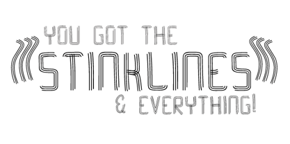
- HGBGalaxo Line by HGB fonts,
$23.00 HGB Galaxo is a tribute to Othmar Motter (1927–2010), the Vorarlberg graphic artist and typeface designer, who designed very individual and perfectly crafted typefaces in the 1970's and later. (Motter Ombra, Motter Tectura ...)From a Motter sketch of 5 letters for a logogram, I derived a simplified letterform and developed all the necessary characters. Working on these glyphs and delving deeper into Motter's letterforms, the respect for the accuracy with which he drew his letters (in ink) grew more and more. The spiral resembles the shape of a galaxy, hence the name Galaxo. The font is suitable for retro, poster and logo design.
 - The King Maker by Letterara,
$19.00 The King Maker is a modern serif font family with a unique style. It has a modern and vintage look. this font is suitable for many projects, modern or even retro vintage design, branding, crafting, sticker, sublimation, wedding invitation, advertising, vintage mood boards, logotype, packaging, titles, editorial design, and many more. This font is PUA encoded, which means you can easily access all of the glyphs and swashes!
 - Story Maker GT by Gartype Studio,
$10.00 Inspired by slow and slanted handwriting style, we present to you Story Maker, a handwritten font with slow and slanted characters that was comes with alternates and multilingual glyphs to help people around world with that unique accent with this font. Story Maker is very suitable like as text, cover book, poem, handwritten style, and more.That way easily change the glyphs to make more unique glyphs.
 - Sign Maker JNL by Jeff Levine,
$29.00In 1948, Joseph Struhl pioneered an innovative do-it-yourself sign kit for retail merchants. Die-cut letters and numbers made from flexible sheets of vinyl with the ability to adhere to smooth surfaces by static electricity; his "Magic Master Interchangeable Sign Kits" became a great success. Jeff Levine has paid tribute to this innovative method of in-store advertising with Sign Maker JNL. Because of their die-cut shapes, the design style of the static cling letters have unique characteristics. Companion fonts (based on other Struhl sign kits) are Cling Vinyl JNL and Cling Vinyl Clear JNL. - Stencil Maker JNL by Jeff Levine,
$29.00 The type design which inspired Stencil Maker JNL comes from a 1920s-era machine used in movie theaters of the day. It rendered tiny punched out letters (some characters solid and some in stencil form), enabling the user to make projection slides of important messages or general notices for the theater audience to read.
 - KR Bite Your Lip! - Unknown license

- Fine And Dandy JNL by Jeff Levine,
$29.00 Fine and Dandy JNL comes from the hand lettered title of the 1929 movie "Isle of Escape"; found on the sheet music for its theme song "My Kalua Rose". An engraved and fancy Roman, the style combines elements of Western, Art Nouveau and Art Deco into one attractive type design; available in both regular and oblique versions.
 - KR Hip Star - Unknown license

- Top Speed Outline - Unknown license

- Top Speed Heavy - Unknown license

- PT Chocolate Dip - Unknown license

- Ego trip Fat - Unknown license

- Ego trip Skew - Unknown license

- WIP Macho Man by WIP Fonts,
$49.00WIP Macho Man depicts the handwriting of man with a strong need for independence combined with spontaneity and high potential. The (lower case) characters are joined as it is usual in German speaking countries. Originally designed in 1995 the font has been extended by a lot of new characters such as accented characters, punctuation, symbols and currency symbols. - Dusk Til Dawn by Scholtz Fonts,
$19.95 As with Nocturne, Dusk til Dawn recalls the romantic, sophisticated Zeitgeist of the early 20th century, that nostalgic time "between the wars". It as a number of attractive ligatures and upper-case alternates. I have used Nocturne as a basis for Dusk til Dawn, given the font really bold down-strokes, reduced the width of some upper case characters and changed the shape of many lower case characters. Dusk til Dawn comes in two styles: Dusk til Dawn Regular, which uses the Art Deco convention of small x height, and long ascenders. This Display style is perfect for headers, posters, labels etc. Dusk til Dawn Book, which, with its higher x-height and slightly wider characters, is extremely legible and suitable for longer passages of smaller size text.
 - Top Billing JNL by Jeff Levine,
$29.00Sometimes the simplest ideas yield more than one result. The basic “dot matrix” design of aligned circles that was the basis for Transactive JNL also yielded Zera JNL (connected rings) and Pillow Puff JNL (fluffy and cloud-like lettering). One more design was originally cast aside. A separate file is available for filling in the letters with a colored background, however minute adjustments may be needed due to the fact that each drawing or design software program has its own characteristics and quirks. NOTE: DO NOT purchase the fill font as a “stand alone” type face because of the difference in spacing and alignment. For the dot matrix look in your work, please purchase Transactive JNL. - Top Tune JNL by Jeff Levine,
$29.00 The 1955 British edition of the sheet music for Frank Sinatra's hit "I'm Walking Behind You" had its title hand lettered in a sans serif design straight out of the Art Deco era. This bold, condensed type style is now available as Top Tune JNL; in both regular and oblique versions.
 - Dip Pen JNL by Jeff Levine,
$29.00 Answer Songs have been around for [probably] just as long as there have been songs. 1917's "If I Catch the Guy Who Wrote Poor Butterfly" was the answer to the 1916 hit "Poor Butterfly" [by Raymond Hubbell and John Golden], which in turn was inspired by the Puccini opera "Madame Butterfly". "Poor Butterfly" was so popular that this "answer" tune had as part of its lyrics "That melody haunts me in my sleep; it seems to creep." Nonetheless, the sheet music for William Jerome and Arthur Green's comic lament had the title hand lettered with an oval nib lettering pen and is now availably as a digital type face called Dip Pen JNL.
 - WIP Sugar Baby by WIP Fonts,
$49.00WIP Sugar Baby depicts the handwriting of a young woman with opulent curves that spread juvenile charm and warms the hearts of all of us. The (lower case) characters are joined as it is usual in German speaking countries. Originally designed in 1995 the font has been extended by a lot of new characters such as accented characters, punctuation, symbols and currency symbols. - Tin Stencil JNL by Jeff Levine,
$29.00 Tin Stencil JNL was modeled from examples of an antique metal stencil letter and number set.
 - Top Kick NF by Nick's Fonts,
$10.00Schriftatlas: Alphabete von A bis Z strikes again with this dazzling display of geometry at play, originally named Concentra. Best used at larger sizes for maximum impact. Both versions contain the complete Latin 1252, Central European 1250 and Turkish 1254 character sets. - Tiap Liap 4F by 4th february,
$25.00
- AF Zip Code by ACME Collection,
$44.00 - Hip Pop NF by Nick's Fonts,
$10.00Type designer Friedrich Poppl is perhaps best known for his classic text faces and elegant scripts, but it seems he had a playful side as well. This frisky face is based on Dynamische Antiqua, which Poppl did for the Stempel foundry in 1960, but which was never released. Bright, bold and bouncy, it’s the perfect choice for headlines with impish impact. Both versions of this font include the complete Unicode Latin 1252 and Central European 1250 character sets. - WIP First Lady by WIP Fonts,
$49.00WIP FirstLady depicts the handwriting of a young woman with a consequent stroke representing ambition, open mindedness and talent. The (lower case) characters are joined as it is usual in German speaking countries. Originally designed in 1995 the font has been extended by a lot of new characters such as accented characters, punctuation, symbols and currency symbols. - Tap Water JNL by Jeff Levine,
$29.00 A WPA (Works Progress Administration) poster for the Rural Electrification Administration’s promoting of running water for rural areas is the basis for Tap Water JNL. A condensed slab serif, it is available in both regular and oblique versions.
 - WIP The President by WIP Fonts,
$49.00WIPEU The President depicts the handwriting of a versatile and energetic man of vision at the highest stage. The (lower case) characters are joined as it is usual in German speaking countries. Originally designed in 1995 the font has been extended by a lot of new characters such as accented characters, punctuation, symbols and currency symbols. - WIP Grand Ma by WIP Fonts,
$49.00WIP Grand Ma depicts the handwriting of an old woman, representing the kindness and reliability that we appreciate of our grandma. The (lower case) characters are joined as it is usual in German speaking countries. Originally designed in 1995 the font has been extended by a lot of new characters such as accented characters, punctuation, symbols and currency symbols. - Tim Sale Brush by Comicraft,
$19.00 These handletterered brush fonts were created by Tim Sale and fontmeister JG Roshell for our bestselling book, TIM SALE: BLACK AND WHITE!
 - Tin Lizzie JNL by Jeff Levine,
$29.00 One of the most unusual sets of antique stencils spotted for sale online comprises a set of twenty-four classic logos of early 20th Century automobile companies. For whatever purpose that is now lost to time, these stencils represented the logos of many of America's finest auto manufacturers; most now just historical memories. The logos were painstakingly redrawn, maintaining the distinctive look of the hand made cutting, although it was an exacting process - some of the images were taken at an angle, and a bit of artistic license had to be used as a compensatory factor. It is to be noted that any and all of the logos presented in this font are the intellectual property of the companies, successors or assignees that may still hold the rights to these symbols. No endorsements by such corporate entities are either expressed or implied. Additionally, it is advised that any use of these logos be restricted to historical or hobby purposes, and they should not be used in a way that would construe any authorized reproduction of the logos in a commercial fashion.
 - Top Hat JNL by Jeff Levine,
$29.00Top Hat JNL is an new treatment given to Jeff Levine's Art Lover JNL capturing the classic look of Art Deco at its boldest. - Tipo Movin CDMX by Ixipcalli,
$- La versión propuesta por la SEMOVI (Secretaria de Movilidad) es un estilo más angosto y ortográfico, creadó con la finalidad de aligerar las aplicaciones tipográficas del sistema. Se emplea oficialmente en todas las aplicaciones del sistema de Movilidad Integrada de la Ciudad de México. El creador de la tipografía es Lance Wyman. En esta edición, los tipos minúsculas son una adaptación “no oficial” para el Tipo Movin CDMX, enriqueciendo la tipografía a un estilo visual de altas y bajas, por lo que se prescinde del diseño base como trabajo propio para enfatizar los tipos minúsculas exclusivamente, además de que se han añadido algunos caracteres de acentuación extendiendo su uso a otros lenguajes. Los tipos son una nueva propuesta por Ixipcalli en el presente año 2023. The version proposed by SEMOVI (Secretary of Mobility) is a narrower and more orthographic style, created with the purpose of lightening the typographic applications of the system. It is officially used in all the applications of the Integrated Mobility system of Mexico City. The creator of the typeface is Lance Wyman. In this edition, the lowercase types are an “unofficial” adaptation for the Tipo Movin CDMX, enriching the typography to a visual style of highs and lows, so the base design is dispensed with as my own work to emphasize the lowercase types exclusively, In addition, some accentuation characters have been added, extending their use to other languages. The types are a new proposal by Ixipcalli in the current year 2023.
 - Tipo Metro CDMX by Ixipcalli,
$- La tipografía “Tipo Metro CDMX” fue desarrollada por Lance Wyman como parte del proyecto “Metro” desde los años setenta, y es uno de los elementos clave de la cultura visual del transporte del Sistema de Transporte Colectivo Metro (STC Metro). Este estilo se ha convertido en el icónico fundamental del trasporte público para los residentes de la Ciudad de México. En esta edición, los tipos minúsculas son una adaptación “no oficial” para el Tipo Metro CDMX, enriqueciendo la tipografía a un estilo visual de altas y bajas, por lo que se prescinde del diseño base como trabajo propio para enfatizar los tipos minúsculas exclusivamente, además de que se han añadido algunos caracteres de acentuación extendiendo su uso a otros lenguajes. Los tipos son una nueva propuesta por Ixipcalli en el presente año 2023. The “Tipo Metro CDMX” typeface was developed by Lance Wyman as part of the “Metro” project since the 1970s, and is one of the key elements of the visual culture of transportation of the Metro Collective Transportation System (STC Metro). This style has become the iconic fundamental of public transportation for the residents of Mexico City. In this edition, the lowercase types are an “unofficial” adaptation for the Tipo Metro CDMX, enriching the typography with a visual style of highs and lows, so the base design is dispensed with as my own work to emphasize the lowercase types exclusively, In addition, some accentuation characters have been added, extending their use to other languages. The types are a new proposal by Ixipcalli in the current year 2023.


