10,000 search results
(0.042 seconds)
- Crockstomp by Aah Yes,
$4.95Crockstomp imitates misprinted, distressed or degraded type, containing internal distress and a degraded outline. It's probably best at larger sizes where the imperfections becomes more apparent. Also there are two "special effects" varieties. - Good Taste by Grummedia,
$24.00Inspired by early 20th century hand lettered display advertising, Good Taste is a traditional, elegant roman face best used at larger sizes where its well rounded character can be shown off to advantage. - Handprint by Turtle Arts,
$20.00Handprint was inspired by a set of old metal alphabet stamps, with a few modifications. Stamped in a sketchy manner, these metal stamps made the basis for a very interesting alphabet and font. - Chen Xing by Pelavin Fonts,
$25.00 Chen Xing, literally “morning star”, a font both futuristic yet mystifyingly ancient is cast in contemporary forms on the cutting edge of the present moment, but harkens back centuries to endless cultural heritage.
 - Mad Cash by PizzaDude.dk,
$20.00Mad Cash is punked, grunged and shattered - all at the same time! When viewed at a small scale, the font seems grungy - but the larger you view it, the more shattered details appears! - Surf Bum by Jeff Levine,
$29.00 The term “Surf Bum” was a slang phrase used to casually describe anyone who spent as much of their time as possible at the beach catching waves in the 1960s. The Revell Company was a well-established maker of plastic model kits such as military airplanes, monsters from Universal horror films and other such items when it hooked up with custom car designer Ed “Big Daddy” Roth to develop a model kit line capitalizing on the surfing fad that was sweeping the West Coast at the time. A number of crazy-looking hot rods, dune buggies and what-have-you were turned out, and one such kit (“Surfite”, with Figure) featured a futuristic one-person dune buggy. It was on the box for the model that the words “with Figure” appear in a casual, brush design type face. Those few letters were the inspiration for creating a new retro type face entitled Surf Bum JNL, which is available in both regular and oblique versions.
 - !Sketchy Times - Unknown license

- !MISQOT - 100% free

- Mrs Eaves XL Serif by Emigre,
$59.00 Originally designed in 1996, Mrs Eaves was Zuzana Licko’s first attempt at the design of a traditional typeface. It was styled after Baskerville, the famous transitional serif typeface designed in 1757 by John Baskerville in Birmingham, England. Mrs Eaves was named after Baskerville’s live in housekeeper, Sarah Eaves, whom he later married. One of Baskerville’s intents was to develop typefaces that pushed the contrast between thick and thin strokes, partially to show off the new printing and paper making techniques of his time. As a result his types were often criticized for being too perfect, stark, and difficult to read. Licko noticed that subsequent interpretations and revivals of Baskerville had continued along the same path of perfection, using as a model the qualities of the lead type itself, not the printed specimens. Upon studying books printed by Baskerville at the Bancroft Library in Berkeley, Licko decided to base her design on the printed samples which were heavier and had more character due to the imprint of lead type into paper and the resulting ink spread. She reduced the contrast while retaining the overall openness and lightness of Baskerville by giving the lower case characters a wider proportion. She then reduced the x-height relative to the cap height to avoid increasing the set width. There is something unique about Mrs Eaves and it’s difficult to define. Its individual characters are at times awkward looking—the W being narrow, the L uncommonly wide, the flare of the strokes leading into the serifs unusually pronounced. Taken individually, at first sight some of the characters don’t seem to fit together. The spacing is generally too loose for large bodies of text, it sort of rambles along. Yet when used in the right circumstance it imparts a very particular feel that sets it clearly apart from many likeminded types. It has an undefined quality that resonates with people. This paradox (imperfect yet pleasing) is perhaps best illustrated by design critic and historian Robin Kinross who has pointed out the limitation of the “loose” spacing that Licko employed, among other things, yet simultaneously designated the Mrs Eaves type specimen with an honorable mention in the 1999 American Center for Design competition. Proof, perhaps, that type is best judged in the context of its usage. Even with all its shortcomings, Mrs Eaves has outsold all Emigre fonts by twofold. On MyFonts, one of the largest on-line type sellers, Mrs Eaves has been among the 20 best selling types for years, listed among such classics as Helvetica, Univers, Bodoni and Franklin Gothic. Due to its commercial and popular success it has come to define the Emigre type foundry. While Licko initially set out to design a traditional text face, we never specified how Mrs Eaves could be best used. Typefaces will find their own way. But if there’s one particular common usage that stands out, it must be literary—Mrs Eaves loves to adorn book covers and relishes short blurbs on the flaps and backs of dust covers. Trips to bookstores are always a treat for us as we find our Mrs Eaves staring out at us from dozens of book covers in the most elegant compositions, each time surprising us with her many talents. And Mrs Eaves feels just as comfortable in a wide variety of other locales such as CD covers (Radiohead’s Hail to the Thief being our favorite), restaurant menus, logos, and poetry books, where it gives elegant presence to short texts. One area where Mrs Eaves seems less comfortable is in the setting of long texts, particularly in environments such as the interiors of books, magazines, and newspapers. It seems to handle long texts well only if there is ample space. A good example is the book /CD/DVD release The Band: A Musical History published by Capitol Records. Here, Mrs Eaves was given appropriate set width and generous line spacing. In such cases its wide proportions provide a luxurious feel which invites reading. Economy of space was not one of the goals behind the original Mrs Eaves design. With the introduction of Mrs Eaves XL, Licko addresses this issue. Since Mrs Eaves is one of our most popular typefaces, it’s not surprising that over the years we've received many suggestions for additions to the family. The predominant top three wishes are: greater space economy; the addition of a bold italic style; and the desire to pair it with a sans design. The XL series answers these requests with a comprehensive set of new fonts including a narrow, and a companion series of Mrs Eaves Sans styles to be released soon. The main distinguishing features of Mrs Eaves XL are its larger x-height with shorter ascenders and descenders and overall tighter spacing. These additional fonts expand the Mrs Eaves family for a larger variety of uses, specifically those requiring space economy. The larger x-height also allows a smaller point size to be used while maintaining readability. Mrs Eaves XL also has a narrow counterpart to the regular, with a set width of about 92 percent which fulfills even more compact uses. At first, this may not seem particularly narrow, but the goal was to provide an alternative to the regular that would work well as a compact text face while maintaining the full characteristics of the regular, rather than an extreme narrow which would be more suitable for headline use. Four years in the making, we're excited to finally let Mrs Eaves XL find its way into the world and see where and how it will pop up next.
 - Aisle Seats JNL by Jeff Levine,
$29.00The Redikut Letter Company of Hawthorne, California specialized in die-cut cardboard display letters used by sign makers to achieve a three-dimensional effect on show card and display work. A set of these letters purchased by Jeff Levine brought back memories of classic movie houses with their fancy display and lobby cards, and thus was created "Aisle Seats JNL". - Hosperity by Letterhanna Studio,
$19.00 Introducing "Hosperity" – a captivating handwritten script font that blends artistic elegance with modern flair. Crafted by a talented font maker from Indonesia, this font is a testament to creativity and precision. With its flowing strokes and unique character, "Hosperity" adds a touch of personal charm to your designs. Whether you're designing invitations, branding materials, or any creative project, "Hosperity" is your ideal choice.
 - Rare Bird Specimen VI by Rare Bird Font Foundry,
$200.00 Specimen VI is a refined hand by artist Aileen Fretz of Plume Calligraphy: thoroughly modern yet absolutely timeless. We have our sights set on this one becoming an instant classic. OBSERVATIONS Specimen VI takes its inspiration from the old world, while remaining thoroughly contemporary. It is unique while maintaining legibility. DEFINING CHARACTERISTICS At 2,580 characters, we dare say it is one of the most robust script fonts on the market today. The font includes extensive Opentype programming that authentically replicates Aileen’s unique handwriting pattern. As you type, watch the letters automatically adjust between connected and disconnected forms. Specimen VI also features formal titles, prepositions, social media wordart, and web navigation wordart, serif and sans serif Roman numerals, in and out-stroked letterforms at beginning and end of words, multiple alternate lowercase t cross-strokes, realistic double-letter ligatures, seamlessly connecting calligraphic letters, multiple styles of alternate capital letters, including swashes, and basic Latin encoding. Specimen VI is a typesetters’ dream. POTENTIAL SIGHTINGS In the pages of your favorite wedding tome; the signage, robe embroidery, and dinner menus of that coveted boutique hotel on the Italian Riviera, the labels of an artisanal hand-poured candle line, your new favorite Rosé, hand-crafted Belgium chocolate truffles, the indie cosmetic line fit for royalty, in any instance that you may be in need of a refined modern script.
 - Magola by Andinistas,
$39.95 Magola is a creamy flavor font family whose purpose is to season with emotions the reading of words and phrases formed by puffy glyphs coated with a caramel of empty spaces external and internal. Independently or in groups, members of the family serve to decorate and organize packaging or advertising material in letters apparently crafted for food or entertainment contexts. Its starting point was to draw letters like a ballon fish evolved into a black version with empty areas and microscopic contrasted with colorful inflated and filled areas. Then the challenge was based on the sum transferred between full and empty into a lighter caliber. In that vein, its overall design adapted skeletons of italics and Roman calligraphy. Therefore, its regular, bold and black files have great height "x" with upwards and downwards extremely short and large internal counterblocks to facilitate reading. In this regard, to strengthen its objective and capture the reader's attention, its kind of contrast and simulated auctions flat tip brush strokes, and amount of contrast between thick and thin in the black version is slightly inverted. Its sizes, smooth strokes and irregular lines reinforce its traditional spirit, so it is favorable to shine the information on posters or large-format media. In short, its optical conformation based on a non-literal way, in metrics similar in all family members to be easily exchanged without changing the ìxî height. It is therefore a striking and versatile tool, that besides being useful in large sizes, can be used in small sizes as well. And more importantly, its general concept is more profitable when its members are mixed to nest headings, subheadings and short paragraphs, designed according to size, position, color and location in logos, covers, posters, ads and flyers.
 - Pagnol by Typorium,
$15.00 The Pagnol typeface has been designed with a principle developed by A. M. Cassandre in 1937, when the great French designer created the Peignot typeface following paleographic studies on the evolution of letterforms. Researches in the history of writing have proved that the lowercase "a" is at its origin nothing but the "A" shape transformed through centuries by scribes until the invention of printing. A large number of lowercases meanwhile kept their original shapes. If the scribes’ hand didn’t find the necessity to simplify them, it is only because these letters could be easily written. Integrating the classical shapes of capitals to the lowercases has already been used, keeping the lowercases which are only a deformation of capitals. Nevertheless, the respect of readability imposes to keep ascendants and descendants from traditional lowercases which serve as optical focus points in a text and make reading easier. The particularity of Pagnol is to use rounded shapes on top and bottom of pointed capital letters to make them fit with corresponding lowercases (Aa, Mm, Nn, Vv, Ww, Zz). Lowercases proportions are wide, to be in tune with classic lowercase shapes in order to optimize readability. Five weights in roman and italic have been designed to offer a wide palette of typographic possibilities in all sizes and all paper and screen supports.
 - Gans Radio Lumina by Intellecta Design,
$1.00See also other font families inspired by Gans' original typefaces: Gans Tipo Adorno , Gans Lath Modern , Gans Titular Adornada , Gans Ibarra , Gans Antigua , Gans Antigua Manuscrito and Gans Fulgor . - Ann’s Valentines by Dingbatcave,
$15.00Ann's Valentines are heart-shaped dingbats that are perfect for web design as well as print that you'll use 'til your heart's content. A dingbat to fall in love with. - Miserichordia by Device,
$29.00 Miserichordia evolved from photographs taken on a trip to Venice and instigated a sharp turn left into more idiosyncratic and decorative serif fonts. Something of a new direction for Device.
 - My Left Foot by Rocket Type,
$14.00 Don’t let the name fool you! My Left Foot was made by hand. Alts, ligatures and Vietnamese all included in this whimsical typeface. Go ahead and dip your toes in!
 - Equality Serif by Mans Greback,
$69.00 Equality Serif is a font that radiates classiness and luxury. This beautiful serif font features delicate and intricate details that add finesse and sophistication to any design. Designed with an aristocratic feel, this font is perfect for high-end projects that require a touch of elegance and refinement. With its clean lines and precise angles, Equality Serif is the epitome of top class design. This uppercase font is perfect for headlines, logos, and branding projects that demand attention and make a statement. The font also features a set of ligatures that add a touch of fluidity and grace to your designs. Whether you're working on a wedding invitation or a high-end fashion project, Equality Serif is the perfect font for adding a touch of class and elegance to your work. Equality Serif is available in two styles: Regular and Italic. The font is built with advanced OpenType functionality and has a guaranteed top-notch quality, containing stylistic and contextual alternates, ligatures and more features; all to give you full control and customizability. It has extensive lingual support, covering all Latin-based languages, from Northern Europe to South Africa, from America to South-East Asia. It contains all characters and symbols you'll ever need, including all punctuation and numbers.
 - Bandelwerk by 2D Typo,
$32.00 Collection of ribbon geometrical ornaments, that were popular in Europe in the 16th and 17th centuries in the age of Mannerism. The given ornaments can be attributed to the styles of strapwork of bandelwerk.
 - Sketchwriter by Baseline Fonts,
$24.00 Sketchwriter™ is a terribly fun hand-drawn typeface designed with many uses in mind. At small point sizes, it's a little grungy. The larger the display, the more interesting the stroked glyphs become.
 - Splinters JNL by Jeff Levine,
$29.00Splinters JNL is a fun, hand-drawn font emulating letters formed from pieces of wood. Use at larger point sizes for best results. Please note: There is no kerning and a limited character set. - Aparcero JNL by Jeff Levine,
$29.00 Vintage sheet music with the title of "Aparcero" lettered in a bold, Art Deco sans is the basis for Aparcero JNL. The title is a Spanish word that translates to "tenant farmer" or "sharecropper".
 - Chisel Brush by A New Machine,
$14.00 Chisel Brush is a handmade font created with a, um, chisel brush... It has a casual handmade feel that works well at larger sizes in headers or titles. Also works great in branding applications.
 - Klainy by Identity Letters,
$29.00 An unadorned Grotesque with a refreshingly personal touch. If “Grotesque” mainly means “industrial, mechanical, anonymous typeface” to you, Klainy might redefine your image of the genre. Yes, it’s a Grotesque—but with a contemporary look and a lot of personality. Klainy’s apertures are more closed at the top and more open at the bottom, creating an informal rhythm that sets Klainy apart: a confident, optimistic voice with a clean appearance. Terminals are subtly back-bent: these quaint “hooks” make Klainy a bit more personal, a bit friendlier. (You can find them in the a, c, f, and r.) Just like its old-style Grotesque ancestors, Klainy is optimized for display sizes and short texts. There, its unobtrusive quirks can be wholly appreciated. However, the familiar Grotesque appearance makes sure that the typeface is comfortable to read in smaller sizes, as well. Use Klainy whenever a basically classic sans-serif typeface with a modern and individual twist is called for. This font family comes in eight weights ranging from Thin to Black, each with a matching italic style. More than 500 glyphs and a bunch of Open Type Features make it a reliable companion for all of your projects. You can fine-tune the flavor of Klainy with Stylistic Alternates such as a one-story a and a two-story g. Their simple construction blends perfectly with the design concept of this typeface. Klainy is a seasoned blue-collar worker that surprises you with wit and team spirit. It’ll be a great addition to your font library.
 - SexyRexy - Unknown license

- Brazza by Scholtz Fonts,
$17.00Brazza is a a font that fuses the look of handwriting, brush and comic script. It is loose, very versatile and informal, yet it is very readable. Suggestions for use: - music video marketing - greeting cards - valentines day media - comic books - captions The font is fully professional: carefully letterspaced and kerned. It contains over 235 characters - (upper and lower case characters, punctuation, numerals, symbols and accented characters are present). - Tieban by WNGSTD,
$10.00 Tieban font family is composed of 14 styles that perfectly complement each other. You can use them to create a logo or use for your business, branding, t-shirts, book covers, stationery, marketing, blogs, magazines, and more. Language support 29 languages: Afrikaans, Albanian, Basque, Belarusian, Danish, Dutch, English, Estonian, Faroese, Filipino, Finnish, French, Galician, German, Icelandic, Indonesian, Irish, Italian, Macedonian, Malay, Mongolian, Norwegian Bokmål, Portuguese, Russian, Serbian, Spanish, Swahili, Swedish, Zulu
 - Melgard by Larin Type Co,
$15.00 Melgard this amazing handwritten font is light and elegant, will emphasize your personality in any project and will charm you with its signature. This font includes alternates for Uppercase and Lowercase, make your signature with them. You can use it to create logos, branding, t-shirts, book covers, stationery, marketing, blogs, magazines, cosmetics, signage, and more. This font is easy to use has OpenType features, and supports PUA encoding.
 - Puffy Slushy by Fauzistudio,
$9.00 Here it is! the most cheerful font on the market, besides being cheerful font, on the other hand, this font can also make your project even more attractive to look at, this font is suitable for those of you who want to make stickers, logos, quotes, or something else, what are you waiting for, choose Puffy Slushy so that your project will be even better and more pleasant.
 - Avangard by Larin Type Co,
$12.00 Avangard - a new hand drawn script font in 2 styles. These fonts are ideal for branding and will decorate any of your projects. You can also use them to create a logo or use for small businesses, t-shirts, book covers, stationery, marketing, blogs, magazines, and more. Also I made alternates, ligatures and swash, with their help you can make your project more beautiful and unique. Enjoy using!
 - West Carabao by Mofr24,
$14.00 Introducing West Carabao, a versatile vintage font that effortlessly blends modern and old-school aesthetics. With a range of styles from thin to bold, including italics and a captivating shadow effect, this font offers creative freedom for various design projects. Its multilingual support makes it a global choice. Perfect for posters, marketing materials, titles, T-shirt designs, games, art, and more. Elevate your projects with the timeless charm of West Carabao.
 - Bambus by URW Type Foundry,
$49.99 LP Bambus is another new handwriting script written with bamboo from German designer Peter Langpeter (lp-design.de). LP has been running his own design studio since 1995, working as a typeface and logo designer, as a calligrapher, cartographer and illustrator. During this time LP created a large number of excellent new typeface designs. Now, we are extremely happy that LP has chosen to let URW digitally produce and market his designs.
 - Swash by Paul O'Connell,
$9.95 This innovative styled swash font was created to suit various design applications within the typeface market and is aimed at people looking for a sharp styled brush script typeface that doesn't fit in with the regular trends of hand written fonts. Designed and produced by Paul O'Connell of POCT, it is a strong pointed styled typeface with sharp edges and curves, but still manages to retain a subtle hand drawn feel.
 - Royal Grande by Subqi Studio,
$20.00 Introducing our first old english black letter Royal Grande. Quite basic anatomy not the contemporary style. With this not too complicated black letter that make this font good for general display projects. We also make it a black letter family because we rarely see this kind of option in the market. Another good news , we also offer the variable format this time for the new font enthusias community.
 - Jester Script by Paul O'Connell,
$9.95This comical styled Jester Script font was created to suit various design applications within the typeface market and is aimed at people looking for a clown styled brush script typeface that is very unconventional indeed. Designed and produced by Paul O'Connell of POCT, it is a distinct styled font script, loosely drawn with irregular rounded edges and curves to create a free flowing handwritten font that will appeal to everyone. - Foucher by Larin Type Co,
$14.00 Foucher - this beautiful font is light and elegant, will emphasize your individuality in any project. You can also use them to create a logo or use for small businesses, branding, t-shirts, book covers, stationery, marketing, blog, magazines, and more. This font includes a basic set of letters and a complete set of alternatives set as well as numbers, fractions, and basic punctuation. This font supported PUA encoded.
 - Viktor by Librito.de,
$10.00 The design for the font "Viktor" is based on original woodcut letters I purchased on a Flea Market. I handprinted the letters and converted the result into a font. The font preserves the rough and handmade character of the printed letters. To make the font more useful especially for packaging I designed in addition to the original font an outline version, a shadowed version and a striped font.
 - Goldwings by Supfonts,
$12.00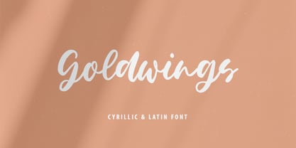 Goldwings will be perfect for wedding lettering, beautiful frame for your home, book covers, greeting cards, logos, marketing, magazines or anything that requires cute handwritten lettering :) Goldwings идеально подойдет для свадебного леттеринга, рамки для вашего дома, обложек книг, поздравительных открыток, логотипов, маркетинга, журналов или всего, что требует симпатичных рукописных надписей :) What's inside: Goldwings.otf Multilingual support Кириллица Cricut support If you have any questions, please contact me directly or in instagram @superdizigner
 - Fremont by Larin Type Co,
$16.00 Fremont This is a beautiful and elegant hand drawn font, will underline your individuality in any project. Its relaxed feel makes this font incredibly versatile, fitting a wide range of designs. You can also use them to create a logo or templates, invitations, blog, branding, marketing, book covers, magazines, advertising, stationery, logo design and much more. This font is easy to use has OpenType features, and supported PUA encoded.


