10,000 search results
(0.029 seconds)
- Tecna Dark Left Triangle BNF by Descarflex,
$30.00 The Tecn@ Dark&Light Triangle Background Nomenclature Font family is differentiated by the direction of the triangle tip in the 4 cardinal points. The family were designed to head, enumerate, indicate or highlight writings or design plans, for this reason, the characters are available only in capital letters and some signs or symbols that can serve such purposes. A triangle or empty character is included so that the user can use it overlaying any character of his choice or to be used alone.
 - Sangkhamonthon by Jipatype,
$17.00 Sangkhamonthon, a distinctive headline typeface, captivates audiences with its enchanting and sacred essence, highlighted by a sharp 45-degree tip. This font is specifically crafted for use in headlines across a myriad of media platforms, where the emphasis lies in communicating messages related to belief and faith. Whether employed in digital or print media, Sangkhamonthon adds a touch of mystique and reverence, making it a compelling choice for content that seeks to evoke a sense of magic and spiritual significance.
 - Tecna Light Right Triangle BNF by Descarflex,
$30.00 The Tecn@ Dark&Light Triangle Background Nomenclature Font family is differentiated by the direction of the triangle tip in the 4 cardinal points. The family were designed to head, enumerate, indicate or highlight writings or design plans, for this reason, the characters are available only in capital letters and some signs or symbols that can serve such purposes. A triangle or empty character is included so that the user can use it overlaying any character of his choice or to be used alone.
 - Proach by Grontype,
$10.00 Poarch is a clean and modern condensed font, the font well designed as a sans serif font with all caps. It has round tip angle and different style as a sans font in common. The font is perfect for any project such as Brochure/Magazine Header, Logo Tagline, Flyer Titles and it also can be a paragraph text font. Features: Uppercase and Lowercase Regular, Light and Italic Version Numeral and Punctuation Ligatures Multilingual Support Modern Look Thankyou for Choosing This font Regards, Grontype
 - Tecna Light Up Triangle BNF V1.0 by Descarflex,
$30.00 The Tecn@ Dark&Light Triangle Background Nomenclature Font family is differentiated by the direction of the triangle tip in the 4 cardinal points. The family were designed to head, enumerate, indicate or highlight writings or design plans, for this reason, the characters are available only in capital letters and some signs or symbols that can serve such purposes. A triangle or empty character is included so that the user can use it overlaying any character of his choice or to be used alone.
 - Edward Peters by Maulana Creative,
$16.00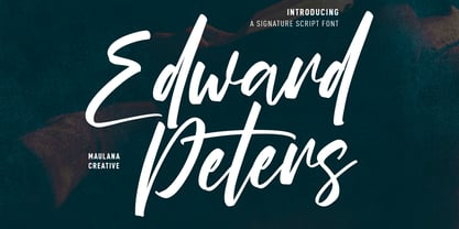 Edward Peters is a stunning modern signature script font. With high contrast felt-tip stroke, fun character with a bit of ligatures and alternates. To give you an extra creative work. Edward Peters font support multilingual more than 100+ language. This font is good for logo design, Social media, Movie Titles, Books Titles, a short text even a long text letter and good for your secondary text font with sans or serif. Make a stunning work with Edward Peters font. Cheers, MaulanaCreative
 - Astavilla by Maulana Creative,
$11.00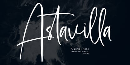 Astavilla handwritten script font, with contrast felt-tip stroke, uprights and fun character. It has Opentype features ligatures of character and alternate lowercases, To give you an extra creative work. Astavilla script font support multilingual more than 100+ language. This font is good for logo design, Social media, Movie Titles, Books Titles, a short text even a long text letter and good for your secondary text font with sans or serif. Make a stunning work with Astavilla font. Cheers, MaulanaCreative
 - The Impostor by Maulana Creative,
$15.00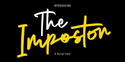 The Impostor is a regular casual script font. With sharp felt-tip stroke, slant and fun character with a bit of ligatures. To give you an extra creative work. The Impostor font support multilingual more than 100+ language. This font is good for logo design, Social media, Movie Titles, Books Titles, a short text even a long text letter and good for your secondary text font with sans or serif. Make a stunning work with The Impostor font. Cheers, MaulanaCreative
 - Fit Fleet by Maulana Creative,
$11.00 Fit Fleet is a casual script font, with a light felt-tip stroke, slanted and fun character. It has Opentype features ligatures of character, To give you an extra creative work. Fit Fleet script font support multilingual more than 100+ language. This font is good for logo design, Social media, Movie Titles, Books Titles, a short text even a long text letter and good for your secondary text font with sans or serif. Make a stunning work with Fit Fleet font. Cheers, MaulanaCreative
 - MFC Klaver Monogram by Monogram Fonts Co.,
$299.00 The source of inspiration for Klaver Monogram is a delightfully elegant initial letterset adorned with clover tipped flourishes from a vintage embroidery publication. Originally intended to adorn handkerchiefs and other linens, this digital revival opens it up to a whole new realm of possibilities. This is one of many monogram designs from the late 1800's to early 1900’s that is loaded with panache. Download and view the MFC Klaver Monogram Guidebook if you would like to learn a little more.
 - ZF Gently by ZooFont,
$22.00 Gently, newly released by ZooFont, is a sans serif typeface that harmoniously combines straight lines and curves in a clean form. The stable form, which has its origins in handwriting, and the look of analog sensibility are enough to inspire confidence. Gently has a total of 9 weights, so it can be used freely anywhere, from body text to headlines. In addition, the height of the letters is economically calculated to achieve a reasonable line spacing, ensuring comfortable readability in various digital media. A cool breeze blows, a soft smile spreads across your lips, When I'm with you, the love in my heart seems to awaken. Your sweet whispering voice makes my heart flutter. Gently has the following features: 9 weights (from Ultra light to Ultra Black) extended latin 450+ glyphs fixed width numbers The Latin extension offers more than 130 languages with extensive multilingual Latin support for Western, Central, and Southeastern Europe.
 - Silver Streak by Swell Type,
$20.00 Inspired by the streamlined lettering of trains, cars and advertisements from the 1930s and 1940s, Silver Streak is a font family that combines Art Deco elegance with refined craftsmanship and modern features. Silver Streak's contrasting strokes and tastefully rounded corners conjure an era of refined, vintage elegance. An extravagant palette of 25 weights — from gracefully tall and thin to commandingly wide and heavy, along with a variable font for unlimited options between — provide unforgettable branding possibilities for luxury items ranging from jewelry, clothing and perfume to the sleek badges of high performance sports cars. Features: Five widths from Compressed to Extended Each with five weights from Light to Heavy Complete family includes a Variable font for precise control of weight and width Support for 223 languages, including Western & Central Europe, Russian Cyrillic, Serbian/Macedonian, Ukranian and Vietnamese Alternate hook-cornered capitals (accessible as Opentype Discretionary Ligatures) Alternate round-topped A in two versions, each with international accents (accessible as Stylistic Alternates)
 - Bihext by Ingrimayne Type,
$10.00 The letters of Bihext fit into the trapezoids formed by bisecting hexagons from the top corner to the bottom corner. Because these trapezoids have two orientations, there are two sets of characters and the typeface was designed assuming that the user would want to alternate these two character sets. The alternating of characters is done automatically with the OpenType feature of contextual alternatives (calt) in applications that support it. The typeface is monospaced with very tightly letter spacing. If the letter spacing seems too tight, consider alternating colors to make the individual letters stand out as an alternative to loosening the letter spacing. Almost certainly the user will need to adjust line spacing if more than one line of text is used. The family includes an outline style that can be used in a layer above the filled style. A decorative, display face, Bihext is too difficult to read to be used for long text.
 - Manometer by Fontador,
$18.99 Manometer is a pneumatic ultra-black slab serif typeface with soft corners and fine counters.
 - JAF Lapture by Just Another Foundry,
$59.00 Lapture is based on the Leipziger Antiqua by Albert Kapr, released in 1971 by the East German foundry Typoart. It has been extended and carefully redesigned by Tim Ahrens in 2002-05. The strong calligraphic characteristics are a result of the design process: "The size of the counters and the width of individual characters at small optical sizes were analysed with a steel pen while the letter shapes were designed in larger size with a specially trimmed reed pen. Sometimes the hand is more innovative than the head alone," says Kapr. A unique feature of this font is the introduction of gothic shapes into a latin typeface. "The basic concept is to string together narrow white hexagons as counters and inter-letter spaces, defined by vertical stems and triangular serifs. The interior spaces are at least as important as the strokes that make up the characters." Lapture is an ideal choice if a reference to gothic style is desired, as true black letter types are often too eye-catching and not as legible as latin fonts for unfamiliar readers. "The last few years have seen a number of very elegant typefaces based on the mellow and feminine renaissance model. However, sometimes we require a font that is strong and robust, harmonic yet rigid," says designer Tim Ahrens. JAF Lapture is provided in OpenType format. Each font contains more than 600 glyphs, including true small caps, nine sorts of figures, contextual and stylistic alternates and accented characters. This means that you only need to purchase one font whereas in other families you would have to buy two or three fonts in order to get the same. Technically, they follow the Adobe Pro fonts and provide the same glyph set and OpenType functionality. JAF Lapture Basic is provided in OpenType format. Each font contains the standard sets of both MacOS and Windows. In contrast to JAF Lapture they do not provide any advanced OpenType features and no extended glyph set.
 - HWT Bon Air by Hamilton Wood Type Collection,
$24.95 Bon Air was one of a series of script typefaces cut into wood by the Hamilton Manufacturing Company for the Morgan Sign Machine Co. (makers of the Line-o-Scribe showcard press) in the mid 20th Century. These were some of the last new designs cut into wood by Hamilton until the museum revival in the early 2000s. Bon Air was created in 1958 and trademarked in 1961. The wood type made for Morgan was used largely in department stores to make their own signage. The script styles are reminiscent of sign painters alphabets and evoke a Mad Men era advertising aesthetic. The font was only cut in four sizes: 12, 18, 36 and 72 line. It was distributed by Morgan for use in their presses, but as type high wood type, it could be used on any press. The font was issued with several alternate letters and ligatures to simulate the effect of hand lettering. Its lively strokes and odd details give it an exotic flavor suitable for advertising display work. The digital version includes all of the original alternates plus new characters to fill out a full European character set.
 - Renner Antiqua by Linotype,
$29.99First published in 1939 by Stempel, Renner Antiqua is a classic serif text typeface. Designed by Paul Renner, the father of Futura, this design stands out as strikingly different from his other designs. The letterforms are relatively compact and space saving and the strokes have a strong contrast to look as if made by a pen. This design is extremely distinctive and individualized, but without being overly distracting. Notice many of the small details such as the serifs on the uppercase C, E, and L and the bar at the top of the uppercase A. Also observe the special curve in the bowl of the lowercase b, the dot of the i, and the tail of the y. This design is wonderful for extended amounts of text at 10pt, but the subtle details will be fully appreciated when used larger for titles and display settings. - Opal by Linotype,
$29.99 Opal Pro is a text family designed by Hannes von Döhren in 2008. It gives every text a noble character. The typeface has long ascenders that clearly rise above the capital letters and a low x-height. Opal’s letters sport inktraps at stroke junctions, which on one hand create a cutout feeling and on the other hand strengthens the image in larger point sizes. In total, the letterforms have clear emphasis on their verticals and horizontals; they do not fear the weight on their curves. In addition to the Italic and Bold, the Opal type family includes a Script face, whose letterforms include connections, similar to handwriting. On top of that, the typeface possesses swash letters for italic and script, small caps, many ligatures and borders & ornaments. With a little bit of care, designers will be able to create the finest of traditional, elegant work with this family.
 - Scholle by Tour De Force,
$25.00 Characterized as inline display font family with childish manners, Scholle offers positive (Shadow) and negative (Regular) weights grouped by bouncing rhythm of its characters.
 - Spleeny by Galapagos,
$39.00A gentle breeze on a warm summer's day. A cozy gathering of friends and family around a crackling fire. The sweet aroma of freshly baked cinnamon bread. A slow walk in the autumn woods, light sparkling down through the multi-colored leaves. Billowing white clouds against a stark azur sky, leisurely floating past the tops of palm trees. What do these idyllic scenes all have in common? A: Most people can never find the time to enjoy any of them. B: These are just some of the things you would never try to describe using a crankish font like Spleeny Decaf GD. Just as ITC Fontoon was designed to be used with the many critters that populate the "Toonie" series of fonts, Spleeny Decaf GD was created by Steve Zafarana for use in the balloned dialogue portions of a new panel cartoon feature currently under development. Spleeny Decaf GD is the first completed font in a family that ranges from the jittery san serif Spleeny Espresso GD to the sedate and serifed Spleeny Asleep GD. Each font in the series appears a little more relaxed and staid than its predecessor. None of them however, will find themselves being used for the text of any legal documents. Spleeny Decaf GD is the perfect font to use when the weight of the message is leaning towards the light and jocular side of things. So remember, if your documents are starting to put you on edge, it may be time to switch to decaf. Spleeny Decaf GD that is. - ITC Panache by ITC,
$29.99Typefaces, like most other works of art, provide a small window into the personalities and sensibilities of the artists who create them. ITC Panache not only provides this window, it is also aptly named. Mr. Edward Benguiat the dreator of ITC Panache, has all the dash, verve (and panache) hinted at in the design, Creative, capable and prolific, Ed Benguiat has drawn hundreds of exciting and popular typeface designs. Benguiat's design goal was to create a sans serif typestyle that is versatile, utilitarian - and distinctive. We think he has succeeded admirably. ITC Panache's three weights mix exceptionally well to complement each other or provide emphasis where necessary. Extensive testing at text sizes and design fine-tuning has produced a typeface family which is remarkably homogenous and consistent in color. Text set in ITC Panache is inviting without dissapointment. It is exceptionally easy to read, even in long text blocks of copy or small point sizes. When set in larger sizes or used for headlines, ITC Panache's character traits becomes more apparent and pronounced to the reader. They help to create graphics with distinction and style. Big or small. a little or a lot. it's hard not to use ITC Panache well. If you could pigeonhole ITC Panache, it would probably be classified as a stressed sans", but this would not completely describe, or do justiceto, the design. There is a slight contrast in stroke weight, which becomes more pronounced as the familiy weight increases; but there is a more to distinguish ITC Panache from ather sans serifs. Perhaps most obvious is its high waist and correspondingly slight condensation of the top half of the "round" capitals. Both of these traits link ITC Panache with the sensuous forms of art nouveau creations. In contrast are the typicall old style "e" found in designs like Cloister and ITC Berkeley Old Style, and the two storied "g" common to the early 20th century sans serif designs. The capital "A" even has the cupped top found in Caslon designs. Part of the beauty of ITC Panache is that all of these seemingly unrelated desig traits are melded into a design of exceptional continuity." - Prolexia by Dyslexica,
$10.00 Prolexia is designed to make the font friendly towards those with dyslexia. All the characters are unique with no rotation or mirroring, this makes it harder for the mind to mix up similar glyphs. The characters are made with the illusion of perspective: this helps orient characters in the correct direction to make mental reorientation harder. Finally the o shape is somewhat flattened, this also helps to counteract mental rotation of characters.
 - Farckenzlabb - 100% free

- Gobbledegook - 100% free

- Kompakt by Linotype,
$29.99 Kompakt is one of the early typefaces of type designer Hermann Zapf, whose Palatino has long been a standard in almost every area of application. Kompakt consists of a single weight and was designed in 1952, two years after Palatino. It was produced by the foundry D. Stempel AG in Frankfurt am Main, Germany, where Zapf was at the time in the artistic department. The figures of this extremely strong and heavy typeface are decidedly those of a broad tipped pen. When enlarged, the sharp outlines of the characters can be clearly seen. The unique dynamic of the alphabet is a result of its strong serifs, which on the lower case letters almost connect the letters in a line. Together with the slight slant to the right, this gives Kompakt the character of handwriting, making it look like it is always striving to go forward. Kompakt is an excellent choice for advertisements, especially for posters which should display a hint of nostalgia, and should be used only in headlines.
 - Grotesca by GroupType,
$19.00 Grotesca Extra Condensed™ defines the term ""extra condensed"". With some unusual design quirks, this sturdy design has roots in styles popular in 1920s Germany. First brought to market by the Fundicion Tipografica Richard Gans type foundry (1888-1975) in Spain, the designer of Grotesca is unknown and the font was formerly sold only in Spain.
 - Shutterday by Heinzel Std,
$20.00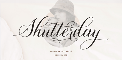 Shutterday is a beautiful and refined script font, featuring a lovely flow. It has a classy, elegant and modern look that can be used for logos, branding, invitations, stationery, wedding designs, social media posts, materials marketing and much more! This font is PUA encoded which means you can access all of the amazing glyphs and ligatures with ease!
 - Handmade Dropshadow JNL by Jeff Levine,
$29.00 Handmade Dropshadow JNL was modeled from lettering found on a vintage silk screened metal sign used for point-of-sale marketing. Before the advent of computers and modern techniques, silk screens were hand cut using material called frisket and knife tools, and the lettering reflected the human inconsistencies of cutting these lettering into the template surface for transfer.
 - FX Neofara by Differentialtype,
$10.00 FX Neofara is a sans serif font family that comes with 9 weights, 9 italics, and an outline. It’s perfect for documents, font logos, blogs, social media, marketing campaigns, and many other projects! FX Neofara masterfully designed to become a true favorite, this font has the potential to bring each of your creative ideas to the highest level!
 - Lovia Peach by Archer Wood,
$10.00 Use this font in your branding to showcase your personality. It's clean, professional and bold. Each letter is its own character. Perfect for use on social media posts and other marketing materials. Make your business stand out by writing in a way that’s unique to you. Use our handwriting font and give your brand a distinctive look.
 - Tequila by BA Graphics,
$45.00 A revival from the past this animated letter will fit right into todays market. With its subtle flair and Latin feeling it will surely give a feeling of pure fun. This style was very popular in the 40s and 50s then it was reborn in the 60s and 70s once again it is coming back and becoming popular again.
 - Kaffe by Jolicia Type,
$20.00 Kaffe is a display typeface inspired by the retro and psychedelic typefaces out. with a bold style and we provide a combination outline style that fits both of them to make it look very trendy and more standout.. easy to use for branding, logo, digital marketing, and any more. Features : Uppercase & Lowercase Outline Number Multilingual Support Punctuation
 - Movie Night JNL by Jeff Levine,
$29.00 Movie Night JNL was modeled from one of a number of ceramic home movie titling kits on the market that were popular during the 1950s and 1960s. The camera buff would set up the letters against a colored background and photograph clever titles to describe their 8mm home movies of vacations, sightseeing or their darling children (or grandchildren).
 - Loredana by Larin Type Co,
$10.00 Loredana - a new handwritten font duo will give you the opportunity to make amazing compositions. These fonts fit into any project, due to its simplicity. Use those fonts for branding or to create a logo, a beautiful frame for your home, or use them for book covers, stationery, marketing, a blog, magazines, for your business and much more.
 - Selatine by Larin Type Co,
$10.00 Selatine - a handwritten bold brush font with streaked. Fall in love with its incredible charm, and turn any design idea into a stunner. Use this font for branding or create a logo, beautiful frame for your home, decorate your any project. Or just use for your small business, book covers, stationery, marketing, blog, magazines and more.
 - Every Cloud by HOHOHtype,
$25.00 ‘Every Cloud’ is a cute hand-drawn type family. The family has 4 different weights and a matching inline style. It has a tall x-height, and the edges are rounded and soft. It was designed with applications such as advertising and packaging, editorial and publishing, logo, branding and creative industries, poster and social media, and marketing in mind.
 - Monalissa by Yoga Letter,
$12.00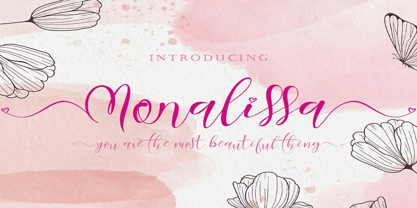 Monalissa is a very beautiful, high-quality font that is made with great love. This font can make your work more beautiful and elegant. This font is perfect for marketing your products, promoting your business, making quotes, weddings, invitation cards, logos, branding and status updates on social media, can also be used to beautify your beautiful moments, and others.
 - PM Endora by Paper Moon Type & Graphic Supply,
$17.00 A new magical, mystical font family from Paper Moon Type & Graphic Supply. PM Endora was inspired by hand-lettered Mid-Century Modern movie titles and posters. Its mystical side makes it perfect for halloween and winter holiday marketing. Its casual side makes it a go to choice for weddings, specialty packaging, cosmetics, and modern lifestyle branding.
 - Lost Wind by Larin Type Co,
$16.00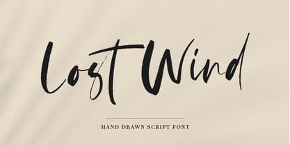 Lost Wind - a beautiful and elegant hand drawn font - will emphasize your individuality in any project. This font also contains alternates lowercase and ligatures which gives you the opportunity to diversify your design. You can use this font to create a logo or for your businesses, branding, t-shirts, book covers, stationery, marketing, blogs, magazines, and more.
 - Avignon by Larin Type Co,
$15.00 Avignon script - a new casual font. This font is light, airy and elegant, perfect for wedding invitation, ideal for branding, blog and to decorate any project. Also with their help, you can create a logo or beautiful frame for your home. Or just use for your small business, notebook, stationery, marketing, magazines and more. Enjoy using!

