10,000 search results
(0.028 seconds)
- SarahfSlob by Ingrimayne Type,
$9.95 SarahfSlob is a crudely drawn, serifed typeface that abhors straight lines and smooth curves. It comes in five weights and ten styles. It is very legible and is suitable when a funny, informal font is desired.
 - Textan Round - Unknown license

- Snatched by Cititype,
$16.00 'Snatched' is a spontaneous handwriting. This name is taken from the slang term in the 2022 era to describe someone or something in a positive manner. This font consists of the same uppercase and lowercase, often referred to as 'all capital letterform', complete with numerals and punctuation. Composed in tends to widen form which is more like the typical handwriting of architects. This font looks like it was written with a marker or technical pen, very bold stylish and legible. For designers this is an interesting thing, the design looks very natural and rhythmic to beautify presentations and blue prints. Can be installed for CAD programs, Sekthup and other applications. This font is very suitable for various media related to handmade, craft businesses, logos, quotes, prints, social media posts, indie business, outdoor sports and other applications to strengthen the impression of handwriting and demand attention.
 - Cling Vinyl JNL by Jeff Levine,
$29.00The Joseph Struhl Company of Long Island, NY pioneered the use of cling vinyl in the field of reusable signs. Along with sets of die-cut letters and numbers, one of their main products for many years was a set of letters and numbers silk screened onto vinyl panels for larger window displays. Cling Vinyl JNL is Jeff Levine's tribute to this sign kit and its innovative contribution to retail marketing. The font comes in two styles: Cling Vinyl JNL has white characters on a black background and Cling Vinyl Clear JNL has black characters on an open (clear) background. For those wanting a "panel" space between words, there are two different width ones on the < and > keys. Please note: limited character set. - Odin by ITC,
$29.00The extravagant Odin was designed by Bob Newman in 1972. Its figures display constructed basic forms and when set into words, the typeface builds closely set lines. The strong serifs catch the reader's eye and draws it horizontally across the page. The forms of the capital letters are particularly distinctive. In the upper third, the stroke beginnings seem to form a roof over the body of the letter, fragmented by a fine white line that lends them independence and dominance. Odin is best used for headlines in display point sizes. - Linden by Journey's End,
$12.00I hope that you enjoy the "Linden" font. The basis for this new font is my Leaf font. As much as I love the Leaf font, however, I felt (and still feel) the desire to have a larger font, for three reasons: 1. I enjoy customizing my internet browser to show different fonts. The original "Leaf" font was a bit too small for that. The new "Linden" font is perfect for this function. 2. Some of the fonts that I use in writing e-mails look their best at sizes 24 or 36. That’s fine for me, but unless I want to go to the trouble each time of changing the size, then the recipients oft my e-mails get wolloped with an enormous-sized font. When I use "Linden" for my e-mails, it’s automatically a perfect size at 12 or 14, solving this problem. 3. I also enjoy customizing the font in which I read my e-mails. Unfortunately, there are only a few which are legible in the tiny size in which this is configured. Again, "Linden" is configured to be large enough automatically so that it can easily be read by anyone. I am pleased to offer a pleasant font for use in any or all of the scenarios; I love fun solutions and hope that you will enjoy the "Linden" font. (Just a tip: when printing out documents using the "Linden" font, I love it best in font size 11!) - Murrx - 100% free

- Kolkata Hotelroom by Hanoded,
$10.00 Hotel rooms in Kolkata don't top the list of 'luxurious habitations'. They are dingy, fly-ridden, dirty and noisy. But if you look really hard, you will find traces of long gone grandeur. This font is all of the above and more: it is sloppy and messy, it spikes and sags, but it does give your designs that extra oomph you are looking for.
 - Caldicote by Aah Yes,
$12.00Caldicote is a formal and conventional serif typeface, with slightly broadened verticals. The Tab version is the same as the ordinary version, EXCEPT the Tab version has monospaced numerals and zero kerning between numbers - useful where you might like columns of numbers all vertically aligned in a Tabular display. The zip files contain both OTF and TTF versions of the font - install one version only. - Showbiz by Studio K,
$45.00 An all singing, all dancing performer, Showbiz is the perfect font for those who want to sprinkle a little stardust on their typography and give a sense of occasion to their special announcements. It's an in-line version of Studio K's Red Top, Export Drive and Soft Rock, with which it shares the same basic outline and metrics. Mix and match them to stunning effect!
 - Haarlem Nights NF by Nick's Fonts,
$10.00A 1920 Dutch poster for Public Placement Services by Johan Dijsktra provided the inspiration for this crisp geometric typeface. Instead of the normal underscore (_), this font features a set of parallel lines flush to the tops of the caps and small caps, which offers some intriguing design possibilities. Both versions of this font include the complete Unicode 1252 Latin and Unicode 1250 Central European character sets. - Beatgh by Skiiller Studio,
$20.00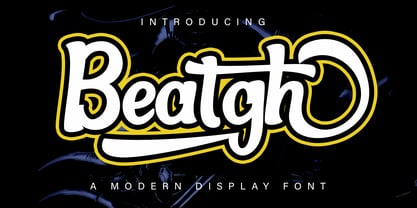 Beatgh is a modern, cool, beautiful, and very suitable display font to support your presentation and support in marketing your products and business
 - Dope Jam - Unknown license

- Jon - Unknown license

- Londoner by Motokiwo,
$10.00 Londoner is a handwritten font with a dry brush texture. It was created directly with my marker vector brush, the whole process is digitalized. Londoner is suitable for logo, product branding, or for text overlay to any background image. Londoner comes with ligatures, swashes, multilingual support, and PUA Encoded.
 - Trashbone by Arterfak Project,
$18.00 Introducing Trashbone, a playful marker font, designed with an additional rusty effect applied to the strokes. This font represented courage, youth, spirit, freedom, that recommended for many themes such as sports, dark, teen, movement, adventure, etc. Equipped with ligatures, alternates, and multilingual support! Thank you for visiting and enjoy!
 - Rainclouds by Hanoded,
$15.00 I was doodling away with a sharpie pen on a rainy day. Hey… wait a minute. A rainy day, a font called Rainclouds… Yep, that’s right, it is called Rainclouds for that reason! ;-) Rainclouds is a fat marker font with a lot of texture and a lot of mouth.
 - Lid by One Fonty Day,
$15.00 Lid is a handwritten, versatile typeface. The non-cursive script is uncomplicated, unpretentious and easy to read. The typeface comes in three different styles; Pen, Brush and Marker. Each style has a different touch, but all three styles come together perfectly. Most of the european languages are supported.
 - India Echo by Vic Fieger,
$6.99India Echo was simply derived from doodling on a whiteboard with a dry erase marker. The aim of the exercise was to create a string of writing that looked foreign enough to be an alien script, angular enough to appear to be futuristic, and familiar enough to be legible. - Shopie by Hendra Pratama,
$19.00 Shopie is a handmade script made with a marker pen. It is useful for a variety projects such as quotes, book covers, t-shirt designs, magazine titles and much more. Features: 370 Glyphs Uppercase Lowercase Symbols & Punctuation Support more than 62 Languages Support OpenType Features Support PUA Unicode
 - 1543 German Deluxe by GLC,
$38.00 This family was inspired by the sets of fonts used in 1543 by Michael Isengrin, printer in Basel (Germany) to print the splendid New Kreüterbuch...(New herbal...), with numerous nice pictures, the masterpiece of Leonhart Fuchs, father of the modern botany. It is a Schwabacher pattern, with three different sets of fonts, small (± 4mm for the upper case) in the main text, larger for titles (± 8mm for the upper case) and large Initials or lettrines (five lines of main text). This font contains standard ligatures and German historical ligatures (German double s, long s, tz, ch,...) and diacritics (special umlaut "e superscript" and "∞" unstead of dieresis with letters a, o and u,) naturally, we have added numerous letters lacking in the original to permit a contemporary use of the font. It can be used in complement with 1538 Schwabacher or/and 1534 Fraktur.
 - BrushtipTravis by JOEBOB graphics,
$19.00 Slightly slanted brush tip handwriting script that looks both elegant and streetwise, very suitable for all your poetry, lyrics and memoires. The font comes with a couple of swashes to use as you please and includes all eastern European, Baltic, Scandinavian and Turkish characters.
 - Guadalajara JNL by Jeff Levine,
$29.00 Hand lettered, the title on the sheet music for a 1940s hit song "Ti-Pi-Tin" inspired Guadalajara JNL. The melody and original Spanish lyrics were written by Maria Grever, one of Mexico's first successful female composers, with English lyrics supplied by Raymond Leveen. This decorative and fun type face brings to mind fiestas South of the border, and emanates the charm of Mexico's music, dance and colorful costumes.
 - Brigette by insigne,
$21.99 This frilly script has been acid dipped, scratched and destroyed for use in grungy design jobs or any other use that calls for a ragged script. Three different degrees of deconstruction are available. The Alternate Two variant is highly distressed, and when rasterised by many programs at smaller point sizes appears almost illegible, but prints just fine. OpenType features include 64 OpenType ligatures that can be used to extend the natural appearance of the lettering oldstye figures and ending swashes. Brigette works great in conjunction with insigne Splats!
 - Farthing by Device,
$39.00 "Classy eccentricity" — Farthing evokes elegant traditional serif styles, playful but poised. Farthing is a serif face in five weights, with alternate characters and both lining and old style numerals. Suitable for both headline and short paragraphs of text.
 - Blippo by Linotype,
$40.99Blippo Black with its constructed style is a typical headline typeface. Its robust figures with their even strokes were composed using the basic forms of the circle and rectangle. Its curves are often not completely closed. The figures of Blippo Black form dark, heavy lines, making the typeface suitable only in middle and larger point sizes. Blippo Black will make an impression when used for flyers and correspondence. - SpiroFace - 100% free

- Coastly by Design A Lot,
$14.00 Meet Coastly, a handwritten font that makes you think about vacation, summer, holidays, friends and family. It’s a calm and relaxing font that works great headlines, posters, product design, quotes, branding, marketing materials and more. This font supports latin alphabet with its accents and glyphs. It also covers the most used punctuation marks and glyphs. Coastly is your friendly go to font. We made it thinking of the Amalfi Coast in Italy and its lemons, explaining its name and colour palette. Thinking of limoncello, lemonade from fresh squeezed lemons, granita, ice cream, beach and ferry trips. But we’ve also associated Coastly with your yearly holidays as: Christmas, Thanksgiving, Easter, New Years Eve, Mothers Day and so on. It’s a celebration of life and what its delights.
 - Informational Gothic JNL by Jeff Levine,
$29.00 The Wood-Regan Instruments Company (Wrico) of New Jersey manufactured for decades a line of lettering kits called the Wrico Sign Maker. With only special ink pens, plastic templates and a template guide anyone could letter clean, clear signs, posters and notices. Based on the same principles of architectural templates, the lettering was [for the most part] utilitarian and functional. Few templates were of stylized or decorative lettering. Informational Gothic JNL and its oblique version are based on the four inch high lettering templates from one of those kits.
 - Tora Caligraphy by Samtype,
$39.95 This font is a new fresh type of caligraphy hebrew font. The opentype features are much better then those are in the font market.
 - Awesome - Personal use only

- Johto by Superpencil,
$32.00 Finally, a font that’s ready for your pixel adventures. Johto is a hand-crafted, pixelated font that captures the excitement of 1990s Tokyo for today’s developers, designers, and video-game makers. We all love the pixelated games we played as kids. Now, as programmers, video makers, and creators of side projects that make our hearts pound with passion, there is nothing more satisfying than imagining ourselves in the shoes of the people that inspired us. We want to feel like we're right back there in the excitement of 1990s Tokyo, as an artist or engineer. Johto was created because of our disappointment with the pixel fonts we found online. And for people like us, who care deeply about the quality of our work - especially the work we do for ourselves - we realized we needed a high-quality pixel font to give our work the look it deserves. With over six hundred characters plus support for dozens of languages, including Japanese, tons of fun hand-crafted ligatures to get the look right, Johto is an authentic nostalgia trip. It has all those missing details you didn't notice, but your brain did.
 - Ondine by Linotype,
$29.99 Ondine is one of the early typefaces of Adrian Frutiger. It looks as though it were written with a broad tipped pen, however, Frutiger actually cut the forms out of a piece of paper with scissors. The forms of Ondine are reminiscent of the humanist period, the high point of the Italian Renaissance text typefaces of the 15th century. This movement was centered in Florence, the base of the Humanist movement overall, and the home of a famous type school of the time. The main goal of the educated writers was to faithfully recreate the writing of the admired literary works, whose aesthetic was as important as their content. Ondine displays a regular and open character. Texts set in this typeface give the impression of being hundreds of years old. Ondine should be used in point sizes of 12 and larger and is best for short texts and headlines.
 - Amrys by Monotype,
$65.00 There's an appealing quirkiness about Amrys, which offers a confidently unusual alternative to more conventional designs. Its charm lies in its tapering tips, flexing stems, and unexpected notches, which combine to suggest something of the chiseller's tool at work. As a modulated serif, its letter shapes live between serif and sans serif, lending the design a sense of pleasing irregularity – something that's really highlighted at larger sizes. However this is also a typeface that works for text, injecting rhythm and texture into reading. “It's distinctive, idiosyncratic, and weird,” says its designer, Ben Jones. He started designing Amrys while studying an MA at Reading University, creating it in response to a brief for a magazine typeface. Amrys features an extensive and impressive character set. In addition to Latin, Amrys covers several scripts including Cyrillic, Greek, Arabic and Armenian. The family consists of 8 weights, from Light to Black, with matching italics.
 - Boho by Latinotype,
$39.00 Boho is inspired by a bohemian girl who is a free soul and creative spirit. She is a city girl, but she loves spending a lot of time outdoors and being close to nature. She loves art and going to the antiques and organic food markets. She is a wild and free spirit who knows no bounds. Boho is Coto Mendoza’s first Script font family, which is based on gestual calligraphy with Cola pen. A first exposure to gestual strokes applied to font design can be seen in her previous work, Macarons. Boho consists of 4 subfamilies: Script, Line, Sans and Serif. Each subfamily comes in 4 weights: Regular, Bold, Italic and Bold Italic. Script and Line versions include a teardrop terminal variant. Dingbats and ornaments are also included. Boho. Love and creative spirit!
 - Prosper Rules by Nathatype,
$29.00 Prosper Rules is a distinguished serif font that exudes sophistication and refinement. With its timeless serifs and carefully crafted extended lines, this typeface brings an air of elegance to your designs. The defining feature of Prosper Rules lies in its extended lines, gracefully integrated into select letters. These extended lines add a touch of distinction and visual interest, elevating the font's overall composition. Each letter is meticulously designed to strike the perfect balance between tradition and modernity. Inspired by classic typographic elements, Prosper Rules captures the essence of timeless beauty. The serifs, with their subtle flares, provide a sense of stability and sophistication. The extended lines offer a contemporary twist, infusing the font with a touch of creativity and uniqueness. The uppercase letterforms of Prosper Rules are meticulously crafted, showcasing clean lines and well-balanced proportions. The extended lines, thoughtfully placed in specific letters, create a sense of flow and purpose. Features: Ligatures Stylistic Sets Multilingual Supports PUA Encoded Numerals and Punctuations Prosper Rules fits for headings, titles, logos, and any design project that seeks to make a refined and memorable statement. Whether you're working on editorial layouts, branding materials, invitations, or any project that demands a touch of sophistication, this font will lend a sense of timeless beauty. It is particularly well-suited for applications related to luxury, fashion, fine arts, and high-end products. Find out more ways to use this font by taking a look at the font preview. Thanks for purchasing our fonts. Hopefully, you have a great time using our font. Feel free to contact us anytime for further information or when you have trouble with the font. Thanks a lot and happy designing.
 - Quendel by URW Type Foundry,
$39.99 Quendel has been expanded to become Quendel Happy Family. Apart from the new Bold weight for easy distinction and emphasis, there are now four other very exciting variants, rendering different writing tools and writing materials. The basic form of Quendel was written with a Japanese bamboo tip and therefore embodies a form letter of natural flow. The new versions show other features that provide the feel of written scripts. While the styles Wood and Crayon include some alternate characters, Q Marking Pen and Q Fingertip, due to their apparently more complex enacted forms, do not need additional alternates without looking stiff or boring. The wood relief of Quendel Wood was created by a freehand wood relief drawn with oiled chalk. Quendel Marking Pen seems to be written with a felt-tip pen soon depleted. At the same time it is also reminiscent of the blooming effect, which we know from photography. The name of Quendel Fingertip suggests what can be seen - someone seems to have written with the finger in a grainy material. One would like to try it himself. The effect of broken lines which can be gained by writing with chalk as reflected in Quendel Crayon. Almost like parched sandy soil, the writing material seems to crumble.
 - Almoneda by Sudtipos,
$49.00 Almoneda: Sale at public auction of movable goods, generally used. And also: private and voluntary sale of jewelry and junk that is made without the intervention of justice. Formerly, it was nothing more than the market or sale of things and spoils won from the enemy in war. Nowadays, the almoneda is practically associated with spaces where the sale of "old things" takes place and, in Madrid, they are usually concentrated in the area of El Rastro, an open-air market that is set up on Sundays and some holidays in the center of Madrid. There, you can find everything and, if you walk around a lot and look hard enough, great typographic finds. It is there where I find a large number of elements (usually from the late nineteenth and early twentieth century) such as boxes, posters, books, etc.. in which appear uppercase letters with a variety of shapes, letters embedded, rare ligatures ... In addition, many elements extracted from street signs, tiles from bars and commemorative elements of Madrid have been used to complete this font design made with care and patience. Thus was born Almoneda, a modern typeface with a marked axis and great contrast, and an uppercase with several sets of characters to play with and enjoy. It also includes a large number of ligatures and discretionary ligatures. A Variable font is included with the full package license. Almoneda, a typeface that will not leave you indifferent. They take it out of my hands, hey!
 - Spring Season JNL by Jeff Levine,
$29.00 Spring Season JNL is a decorated and stylized Art Deco slab serif design from1935 which is based on the hand lettered title on the sheet music for “Paris in the Spring”. The characters are cut through with both a straight line and a wavy, spoked line which looks something like a thorny vine. Spring Season JNL is available in both regular and oblique versions.
 - Allioideae by URW Type Foundry,
$49.99 This fine lined display type face was named Allioideae because of the ascenders of the lower cases. They are rising upright with a single stroke and are ending - depending on the font style - into a spherical blossom. The name was chosen concerned to the plant allium, that forms an umbel at the top of a leafless stalk, when it is blooming. Allioideae is the name of a subfamily of monocot flowering plants in the family Amaryllidaceae. The name is derived from the generic name of the type genus, Allium. The wide and round capital letters are showing a nice contrast to the lower cases and giving the font a kind of female feeling. That provides a functional and lovely use in headlines for all beauty and cosmetics issues.The typeface appears in 4 different styles. a plain style – Allioideae, a stencil style - Allioideae Stencil, a (dotted) style for both - Allioideae Dot and Allioideae Stencil Dot. It supports multi language as it covers all the latin diacritics and a cyrillic character set. Lots of numbers as monospaced, lining figuers, old styles, sub- and superscript and many fractions in two different styles are giving a nice finish to that font. Also some matching ornaments are included.


