10,000 search results
(0.036 seconds)
- Wetricia by IbraCreative,
$17.00 Wetricia is a captivating monoline script font that effortlessly blends elegance with modern style. Its sleek, single-weight line design exudes a sense of sophistication, making it a perfect choice for projects that demand a refined aesthetic. The fluidity of its curves and the uniformity of its strokes create a harmonious balance, resulting in a graceful and timeless script. Wetricia’s individual characters flow seamlessly into one another, producing a cohesive and smooth appearance. Whether used for invitations, branding, or any design endeavor seeking a touch of class, Wetricia stands out as a chic monoline script font that adds an air of sophistication to any typographic composition.
 - Benchmark2 by Alphabet Agency,
$30.00 Benchmark2 is a super cool serif font developed from the popular original Benchmark font. This version has been remastered in the latest font developing software and now the new version includes a lot of additional characters that are not available in the original. The original font has been used worldwide, used in Hollywood films and in products in popular clothing lines. The font works well in a variety of themes including tattoo, rebellious, street, western and vintage, to name some. The font was initially designed for use on Baseball jerseys in an effort to developed ways of creating new looks in the field of sports related graphic design.
 - Octopuss by ITC,
$29.99Octopuss is an energetic titling typeface designed in 1970 by Colin Brignall for Letraset dry transfer sheets. Brignall expanded the basic alphabet with an outline variation with a shadow, which makes the typeface look three dimensional, almost like it is floating. Octopuss font displays the unmistakable signs of the typefaces of the 1970s, as do Countdown and Harlow, also designed by Brignall. The circular strokes of the capitals that drop well under the base line are striking and unique. Because of the small white spaces of its lower case letters, the rounded, robust Octopuss is meant exclusively as a headline font and should be set in large point sizes. - Ranmor by Arterfak Project,
$24.00 Ranmor is a vintage slab serif typeface. Inspired by vintage logos & design, Ranmor gets the more strong typeface by adding the grunge feels, and inky effect on the letterforms. This font is a perfect choice for vintage or old-school themes. Ranmor represented strength, confidence, and an old-school aesthetic. You can use this font for many purposes such as vintage logo, mug, embroidery, prints, display, short text, packaging, cards, emblem, signage, and many more! Equipped with special characters to get your design more powerful. TTF & OTF in a zip file including : Uppercase Lowercase Numbers & punctuation Accented characters Stylistic alternates Stylistic set 01-02 That's all, folks! Thank you for visiting.
 - Karimshine by Nathatype,
$29.00 Introducing Karimshine, a captivating display font that seamlessly merges the artistry of Arabic script with modern design principles. Karimshine draws its inspiration from the graceful curves and strokes of Arabic calligraphy. It captures the essence of this artistic tradition, infusing each character with the timeless beauty of Arabic writing. The font retains the integrity of Arabic script while prioritizing readability through consistent proportions and low contrast. In addition, enjoy the features here. Karimshine fits in headlines, logos, posters, flyers, branding materials, print media, editorial layouts, and many more designs. Find out more ways to use this font by taking a look at the font preview.
 - Mero by Deltatype,
$49.00 Mero inspired by the Roman Capital Proportions which we have seen in Trajan Inscription. With different widths; There are applied each letter to visual proportion. Mero inspired by this measurement method and would like to create the primary typeface in terms of simple form. This sans serif typeface designed to use for any media with a little notice from designer eyes. You won't notice much about style, but something will let you feel extraordinary and trust. Mero has supported over 30 languages and come with nine weights for a complete family. With the standard of CSS font-weight, Mero complete family will map beautifully for your digital layout.
 - Baltica by ParaType,
$30.00Designed at Polygraphmash type design bureau in 1951-52 by Vera Chiminova, Isay Slutsker, et al. Based on Candida of Ludwig&Mayer, 1936, by Jakob Erbar. This typeface has the characteristics of slab-serif, but serifs are much thinner. The capitals are of generous width, x-height is large. Good legibility in small sizes makes this typeface useful in newspaper and magazine typography, while strong character shapes provide for pleasant display lines. The digital version in 3 weights was designed at Polygraphmash by Alexander Tarbeev in 1988. Small capitals, additional Bold, Extra Bold, and Extra Condensed styles were developed by Manvel Shmavonyan and released by ParaType in 2008. - The Carpenter by Fenotype,
$35.00 The Carpenter is an elegant and versatile connected script family of three weights. The Carpenter also has a set of ornaments, patterns and pictograms designed to support the script font. The Carpenter has plenty of OpenType features: To activate the alternates click on Swash, Contextual, Stylistic or Titling Alternates or Lining Figures in any OpenType Savvy program or manually choose from even more alternate characters from Glyph Palette. The Carpenter is an effective and easy to use font for creating ambitious headlines, logos & posters with a custom-made feeling. The Carpenter is loosely based on Fenotypes earlier release Mercury Script. For the best price purchase the complete The Carpenter Family.
 - Linotype Go Tekk by Linotype,
$29.00Linotype Go Tekk is a part of the Take Type Library, selected from the contestants of Linotype’s International Digital Type Design Contest. The font was designed by the German artist Critzler and is available in three weights, thin, medium and black. Go Tekk is a cool, constructed with unusual cross strokes, appearing in almost every character at exactly the same height. The capital letters do not end on the baseline, rather drop even farther down than the descenders of the lower case letters, making it necessary to allow for generous line spacing. Linotype Go Tekk is a relatively static font designed exclusively for headlines and displays. - Beneta by Linotype,
$29.99Karlgeorg Hoefer designed Beneta in 1991, inspired by the Littera beneventana, the script of the Benedictine scribes from the 10th to the 12th century. During this time, scribes began to use wider pens and set them at a 45 degree angle to the paper, which caused their scripts to have radical stroke contrasts. This script was mainly used for books and certificates but disappeared by the end of the 13th century. Beneta revives the characteristics of this historic script, changing a line of text into an almost ornamental space. Beneta should be used in middle to larger point sizes for shorter texts and headlines. - Kidsglow by Good Java Studio,
$22.00 Kidsglow is the perfect font for all your fun designs. The font file is equipped with ordinary characters (A-Z, a-z, 0-9, ligature and lots of punctuation), as well as more than 350 glyphs to support most Latin-based languages. Plus, it comes with super fun ligature! Everything is made with the same brush, and everything is the same size as Kids, so you can be sure they will work well together! It is suitable for you to use in making t-shirt design, quote, label, packaging, logo type, or long writing. Because we have compiled kerning and matrices that are tailored to your needs.
 - Salsero by Plau,
$49.00 Cabrón, listen. Nosotros made a new fuente (only one file, cabrón, not super family – it can be variable, you just have to stretch it). Compra te, just buy it, or get it via Adobe Fonts. Go for it, amigo. Salsero hablas spanish en primero lugar, pero many other languages. German, english, french and most gringo languages tu cabeza can think of. Salsero has contraste invertido and all kinds of crazy curves, curvas locas, amigo. If you compreende this text, then you surely have compatibilidade, compatibility with Salsero, cabrón. No doubt you will like this fuente full of happy and not so happy mistakes, erritos.
 - Kursivfraktur by RMU,
$25.00 Inspired by Rudolf Engelhardt's Journal-Kursiv, released by Ludwig Wagner, Leipzig, in 1913, Kursivfraktur was freshly drawn and redesigned, and comes as one of those rare beautiful italic blackletter fonts. This font contains the letter long s which can be reached in two ways. Either you use the OT feature historical forms, or you type the integral sign [ ∫ ] on your keyboard. There are two graphic elements implemented, a corner element and a straight element for framing. The corner element lies on the Product sign [ ∏ ], the straight element you will find on the pi-key [ π ]. Furthermore it is recommended to activate the discretionary ligatures OT feature.
 - Bornholm Tejn Low by Trine Rask,
$25.00 Bornholm Tejn is named after a village »Tejn« on the only rocky island in Denmark »Bornholm« Bornholm Tejn Low is the lowercase variant of Bornholm Tejn, released in 2012, the first face in a series of rough stone cut typefaces, that shares proportions, but differs in any other aspect like different pieces of rock. It is a powerful face, but still very friendly. Good for very big sizes, but can be used for small texts, movie titles, cartoons … Bornholm Tejn Low has a large x-height which supports the heavy and black look of the typeface. It contains tabular and proportional old style and lining figures.
 - The Ralston by Gloow Studio,
$13.00 Introducing The Ralston, A Retro Bold Script font. It was inspired by retro typography designs in 70's. There are more than 432 glyphs in this font including Multilanguage Support. OpenType features with Stylistic Alternates, Contextual Alternate and ligatures in some characters that allows you to mix and match pairs of letters to fit your design. The Ralston is perfectly suitable for made to be applied especially in logo, and the other various formal forms such as invitations, labels, logos, magazines, books, greeting / wedding cards, packaging, fashion, make up, stationery, novels, labels or any type of advertising purpose. Files Include: Multilanguage Support Thank You very much, hope you enjoy this fonts !
 - Yom Tov by Jonahfonts,
$42.00 YomTov is a whimsical hebrew font. Traditional in design with a free spirit and slightly bounced. Hebrew alphabets contain 22 Hebrew letters along with five final letters which are automatically activated when used in Applications such as Apple Pages® and MicroSoft Word®. The Hebrew Letters do not contain cantillation marks very much used in everyday modern Hebrew. Designed with acomplete latin font that mirror the Hebrew letterforms. Latin lower-case letters have been replaced with smaller caps. You may also be interested in my other Hebrew fonts, NEWMARK Hebrew, HEBRON Hebrew, PAGEANTRY Hebrew and a Hebrew Script font KOMUNIDAD Script. YomTov requires OpenType-aware software.
 - Risbeg by Craft Supply Co,
$20.00 Risbeg – Elegant Serif Font: A Font for Impactful Titles Timeless Elegance Meets Modern Design Risbeg Elegant Serif Font blends classic serif features with a modern twist, creating a stylish and engaging visual experience. Its well-crafted curves and distinct serifs make it perfect for titles that demand attention. Each character in Risbeg is designed with precision, ensuring a harmonious balance in your designs. Versatile and Readable Risbeg stands out for its versatility, adapting seamlessly to various design needs. Whether it’s for branding, editorial layouts, or digital media, this font maintains readability across different mediums. Its clear, crisp lines make reading effortless, even in dense text blocks.
 - GRINdS by Omotu,
$22.00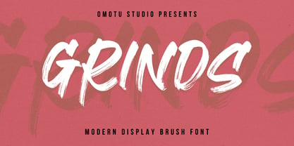 SEPHIRO! A handwritten display brush font. SEPHIRO font is suitable for branding, logotype, apparel, T-shirt, Hoodie, product packaging, quotes, flyer, poster, book cover, advertising, etc. Whats Include? Opentype support Multilingual support PUA encoded Features: Uppercase, lowercase, numerals, punctuations, and ligatures Accessible in the Adobe Illustrator Glyphs panel, or under Stylistic Alternates in the Adobe Photoshop OpenType menu, Adobe InDesign, Corel Draw, even work on Microsoft Word TTF, OTF, and WOFF files Please message me if you're unsure of any language support. Thanks for looking, and I hope you enjoy it! Please don't hesitate to drop me a message if you have any issues or queries.
 - Kawa Sans by Factory738,
$20.00 Introducing Kawa Sans - the ultimate level of flexibility in sans-serif fonts. Kawa Sans seamlessly blends classic elegance with current flare and comes in a variety of weights, from delicate hairline to dominating heavy, making it suited for any design demand. Its simple lines and precise curves ensure readability while also projecting sophistication, making it an excellent choice for a variety of design tasks. Aside from its visual attractiveness, Kawa Sans has important international language support, making it suitable for a global audience. Elevate your ideas with confidence, knowing that Kawa Sans embodies the ideal blend of classic charm and contemporary elegance, offering excellence in a variety of design projects.
 - Wildrace by Din Studio,
$29.00 Get ready to be bold and elegant at the same time. It’s time to see Wildrace, a display font created in capital letters with the racing theme. The font’s character is the thick letters formed similar to rectangles to give strong impressions. Therefore, it will be more noticeable and match the large-sized texts. Wildrace also provides interesting features to enjoy. Features: Multilingual Supports PUA Encoded Numerals and Punctuation Use Wildrace for any design projects such as posters, banners, logos, book covers, headings, printed products, merchandise, social media, etc. Find out more ways to use this font by taking a look at the font preview. Purchase now. Happy designing.
 - Makenn01 by giftype,
$20.00 Font Makenn01 is inspired by Asen Petrov’s Perfograma font , based on in the IBM Harvard Mark 1 machines the first electromagnetic computer presented by Howard Aiken this november 84 years ago ,in fact this basic technology received its instructions and data trough punched tapes . It is therefore an interpretation in wich circumferences have been used instead of circles linked with a line , and the name used also refers to Mark 1 calling it Makenn 01 , giving a touch of identity since this name resembles , Carmen my name , the 01, is like a restart of 0 , with the 1 of the Mark 1. It has Greek and Cyrillic characters.
 - Emmeline by Dear Alison,
$19.00 There's something about the endless variations of handwriting, the tactile process of pen, pencil or brush to paper, and the personal and ephemeral quality as a whole. I recently came across some old handwritten letters from when my younger sister was going to college, and as soon as I saw them, a flood of memories came back to me. All just from seeing her handwriting. That's just one thing handwriting can do. I hope you find enjoyment in my sister's handwriting as much as I still do. This font is complete with alternates that will auto-typeset via the ligature feature to give a more handwritten feel.
 - Mero Thai by Deltatype,
$59.00 Mero inspired by the Roman Capital Proportions which we have seen in Trajan Inscription. With different widths; There are applied each letter to visual proportion. Mero inspired by this measurement method and would like to create the primary typeface in terms of simple form. This sans serif typeface designed to use for any media with a little notice from designer eyes. You won't notice much about style, but something will let you feel extraordinary and trust. Mero has supported over 30 languages and come with nine weights for a complete family. With the standard of CSS font-weight, Mero complete family will map beautifully for your digital layout.
 - Melister by Cooldesignlab,
$10.00 Melister font is the new elegant font! This font is specially made for those of you who need an elegant touch to design your next project with perfect and stunning results. Melister is equipped with lines such as hand strokes which are very suitable for various purposes. Such as title, signature, logo, correspondence, wedding invitation, letterhead, nameplate, label, newsletter, poster, badge, Branding, Greeting Card, etc. So beautiful on invitations like greeting cards, and more!!! Melister includes alternate glyphs and beautifully renders fonts including set styles, ligatures, etc. The Open Type feature can be accessed using intelligent Open Type programs such as Adobe Illustrator CS, Adobe Indesign & CorelDraw X6-X7 and Microsoft Word. And this font has provided PUA unicode (custom code font). so that all alternative characters can be easily accessed in full by craftsmen or designers. If you don't have a program that supports OpenType features such as Adobe Illustrator and CorelDraw X Version, you can access all the alternative glyphs using Font Book (Mac) or Character Map (Windows). Thanks and love designing :-)
 - Hiatus by Stephen Rapp,
$59.00 Hiatus bridges the gap between formal scripts used for invitations and more classic settings and casual scripts that exude a warmer tone. Like many formal scripts, Hiatus is fully connecting. Its low body height combined with generous letterspacing adds an elegant profile to lines of text. Like casual scripts, Hiatus has a warm, hand-lettered appearance with great rhythm. Solid in structure; Hiatus also sets well at smaller sizes. Type enthusiasts will enjoy the variety of options. For optimal text flow, both letters and ligatures have alternate versions programmed to come in at the appropriate place for both beginnings and endings as well as in various contextual settings. In addition, there are variations and flourished versions of almost every letter and ligature. Some ligatures have as many as 12 variations. Also included are fractions, a set of old-style numbers, and a set of ornamental flourishes. Hiatus is a unique contemporary script with the strength of a time-tested classic. Please note that this version supports a wider range of languages compared with the lower-priced version available through other channels.
 - Bazaruto by Stiggy & Sands,
$29.00 Our Bazaruto family was inspired by an old fashioned specimen from “Letters and Lettering” by Carlyle & Oring, but you'll find the inspiration has been greatly expounded upon. What began as an all Capitals specimen has been fleshed out to an extended full character set with many features and variants from the original design. Bazaruto has been an exercise in typographic evolution. The original Art Deco style spawned an Engraved version, then a Bodoni-esque text style, and then a monoline version of that text style (both of the latter complete with Obliques). But after that is when the real interpretations of form began with the development of the Iron fonts, playing off the original specimen having a visual flavor of wrought ironwork in them, and blending that into the Bodoni-esque typestyles. Lastly, a fast and loose hand drawn version of the Iron fonts and an ornaments font were created to add more variety and spunk to the family. The Bazaruto family is a visual grab bag of styles which all have an underlying harmony.
 - TXT101 by 101 Editions,
$19.00 TXT101 is a fresh, friendly typeface for mock text and borders. As a retro-cool digital successor to the pencil marks that were hand-drawn as placeholder text in the analog era, TXT101 includes 52 styles, from Arch to Zigzag, with a couple of loops, several slants, and a swell set of waves. If your final copy is TBD, use TXT101 to mock up roman, bold, italic or light. TXT101 looks GR8 and is EZ to set. BWTM! Corner pieces make TXT101 a complete and charming bordering typeface. All patterns come in four weights, so you can make frames and borders for everything from little labels to big broadsides. Corners (north, south, east, west) are TTLY a snap to select from their own stylistic sets. DIY: MIX & MATCH TO CREATE COOL PATTERNS! Many styles have aligning baselines, so glyphs will connect. Single- and double-line variations abound, and you can combine weights (light, regular, bold, black) as well as styles. BTW, feel free to insert word spaces or leave them out.
 - Filiya by Anastasia Kuznetsova,
$19.00 Say hello to 'Filiya'! This is a funky hand-drawn handwritten font, perfect for all your holiday designs!! Add some retro fun using the 'Filiya' font inspired by the 70s font! This font is perfect for all your retro designs, procreate designs, social media, shirts, stickers, branding, logos, prints, Cricut designs, svg designs and more! This font includes a basic set of retro letters from A to Z, as well as some fun festive Christmas themed letters. Create, enjoy and create your own unique image! 'Filiya' is available in five versions! The kit includes - regular, contour, shadow, luminous and doodle!! Font Features: - A-Z; a-z character set; - 1 language (English); - numbers and punctuation marks, symbols. Fonts can be opened and used in any software that can read standard fonts, even in MS Word. No special software is required to get started. It is recommended to use it in Adobe Illustrator or Adobe Photoshop. Made with love and magic ♡ Thank you for reading it, and do not hesitate to send me a message if you have any questions! ~ Anastasia
 - Telepath by Coniglio Type,
$19.95 TELEPATH Telepath by Coniglio Type, first appeared in 1998. It is now in opentype .otf as of 2021. Telepath is a master sampling of a Royal office typewriter of industrial strength provided by the Miller Furniture store, of Dunkirk, New York. It had a baseline set of numbers to make accounting practices easy and line up nicely on the statements. (No gentile old fashioned numerical ascenders and descenders.) Yet, for a a rather old and stolid machine, it was very luxurious and built to definitely take the test of time. Cudo's for Royal Typewriter Company, is all I can say. The set of images were very carefully gathered and has fallen into the preferred category for a typewriter font that has it all. The font has exceptional value as a text font -and- a display font. It contains a great deal of graphic information and doesn't spike at higher sizes. Telepath presents a strikingly handsome typewriter font with a uniquely intuitive difference. Unlike the original source material—scans of monospaced typewriter copy, every font is painstakingly hand kerned for your most demanding copy fitting work in justified or casually ragged settings for print or the web. All Coniglio Type fonts are 100% embeddable. It will get you there.
 - Doris by Fontsphere,
$16.00 Introducing DORIS: A Sweet Handwritten Font Family. DORIS is a stunning new font designed to add a touch of sweetness and charm to your designs. It was originally created for a series of children's books, then it was expanded with additional glyphs and additional thicknesses were added.. --- Key Features:. Handwritten Charm: DORIS captures the beauty and warmth of handwritten lettering, bringing a personal and intimate feel to your designs. Its imperfect lines and organic shapes radiate authenticity and evoke a sense of genuine connection. . Versatile Usage: Whether you're designing coloring books, creating beautiful illustrations, making invitations, or crafting nicely-made quotes, DORIS adapts beautifully to various applications, providing endless creative possibilities. . Feminine and Playful: With its soft curves and whimsical strokes, DORIS exudes a feminine and playful essence. It is a font that effortlessly brings a touch of joy to any design, making it perfect for creating illustrations, invitations, and other projects aimed at capturing a sense of happiness. . Multiple Thickness Options: The availability of five different thicknesses in the DORIS font family allows you to choose the perfect stroke weight for each project. Whether you need a delicate touch or a bold statement, DORIS has you covered. . --- Usage Recommendations:. Children's Books and Illustrations: DORIS is an excellent choice for children's books, illustrations, or any other project targeting a young audience. Its playful and friendly aesthetics will capture the hearts of kids and adults alike. . Invitations and Greeting Cards: Create stunning invitations and charming greeting cards with DORIS. Its sweet and friendly style sets the right tone for special events, celebrations, or heartfelt messages. . Nicely-Made Quotes: Give your quotes a personal and endearing touch with DORIS. Whether it's motivational quotes, lovely sayings, or inspiring messages, DORIS will add warmth and authenticity to every word. . Personal Branding: Incorporate DORIS into your personal branding materials, such as business cards, logos, or website headers, to showcase your unique personality and create a lasting impression. . --- Let DORIS bring a touch of sweetness and handwritten charm to your designs. With its delightful handwritten style, multiple thickness options, and endless usage possibilities, DORIS is the perfect companion for creating projects that are full of happiness and joy.
 - Quota by Ryan Williamson,
$- Quota is an investigation into the modularity of the Cyrillic alphabet. Unlike Latin and Greek, the Cyrillic alphabet owes much of its form to its development in early industrious printing and movable type. This lead the Cyrillic alphabet to be dominated by hard edge and straight lines, giving it a much more modular overall construction. The forms within the Cyrillic alphabet therefor allow for all the characters themselves to have somewhat unified side bearings without compromising ease of reading. Within Quota the default character set has only unified side bearing, giving a more relaxed mono-spaced appearance. While the first stylistic set unifies the entire character set with the same character width, creating a true mono-spaced typeface. Quota was initially designed in Cyrillic, catering to all languages using the alphabet. While the Latin was designed after, and is loosely based of the forms present within the Cyrillic alphabet.
 - Nanami Rounded by Thinkdust,
$10.00 Nanami Rounded is a heavily engineered follow up to the hugely successful Nanami, which debuted at MyFonts #1 Hot New Fonts for over 2 weeks. Nanami Rounded is a carefully engineered take on the original Nanami family. We kept the curve very slight in order to keep the clean corporate balance, and not to go into a style that was too friendly. Nanami Rounded consists of 18 weights ranging from Thin through to Black. It has also extensive support for over 50 languages, and as a font family that works well both in headlines and bodycopy, Nanami Rounded is the perfect choice for a whole variety of creative briefs. The gentler, softer follow-up to the popular Nanami, Nanami Rounded is also motivated by the artistry of Japan. Smoothing the hard lines and definite corners of its predecessor just slightly, Nanami Rounded is still clearly defined and crisp enough to work in whatever context you need. If Nanami is a battle hardened Samurai, Nanami Rounded is the lotus blossom favour handed to him as he leaves his home village to go to war. If Nanami Rounded isn't quite floating your boat why not check out it’s counterparts Nanami and Nanami Handmade.
 - Basenji by Typodermic,
$11.95 Basenji is a flowing headline typeface influenced by the modular geometric design trend of the 1970s. Herbert Bayer published his highly influential Universal Alphabet in 1924, which was based on circles and straight lines and had a modern, industrial appearance. Jan Tschischold’s typography popularized this simple, unconventional style but by the late 1950s, it had fallen by the wayside. Type designers Joe Taylor and Herb Lubalin inaugurated the 1970s with fresh takes on an old concept. These new typefaces were more practical than the original, and their blend of futuristic curves and funky curls fit the zeitgeist. The popularity of these types spawned a flood of similar designs like Pink Mouse, Bauhaus, Pump, and Harry. These typefaces were popular throughout the decade then fell out of favor by the mid-1980s, making a comeback in the year 2000. Many contemporary font designs have drawn inspiration from the beginnings of the Universal Alphabet, but Basenji is unique. This typeface amplifies of the 1970s elements of Rondo, Pump, Bauhaus and Blippo, and packs them into a practical, versatile design toolset. Basenji comes in nine weights and italics. Most Latin-based European, Vietnamese, Greek, and most Cyrillic-based writing systems are supported, including the following languages. Afaan Oromo, Afar, Afrikaans, Albanian, Alsatian, Aromanian, Aymara, Azerbaijani, Bashkir, Bashkir (Latin), Basque, Belarusian, Belarusian (Latin), Bemba, Bikol, Bosnian, Breton, Bulgarian, Buryat, Cape Verdean, Creole, Catalan, Cebuano, Chamorro, Chavacano, Chichewa, Crimean Tatar (Latin), Croatian, Czech, Danish, Dawan, Dholuo, Dungan, Dutch, English, Estonian, Faroese, Fijian, Filipino, Finnish, French, Frisian, Friulian, Gagauz (Latin), Galician, Ganda, Genoese, German, Gikuyu, Greenlandic, Guadeloupean Creole, Haitian Creole, Hawaiian, Hiligaynon, Hungarian, Icelandic, Igbo, Ilocano, Indonesian, Irish, Italian, Jamaican, Kaingang, Khalkha, Kalmyk, Kanuri, Kaqchikel, Karakalpak (Latin), Kashubian, Kazakh, Kikongo, Kinyarwanda, Kirundi, Komi-Permyak, Kurdish, Kurdish (Latin), Kyrgyz, Latvian, Lithuanian, Lombard, Low Saxon, Luxembourgish, Maasai, Macedonian, Makhuwa, Malay, Maltese, Māori, Moldovan, Montenegrin, Nahuatl, Ndebele, Neapolitan, Norwegian, Novial, Occitan, Ossetian, Ossetian (Latin), Papiamento, Piedmontese, Polish, Portuguese, Quechua, Rarotongan, Romanian, Romansh, Russian, Rusyn, Sami, Sango, Saramaccan, Sardinian, Scottish Gaelic, Serbian, Serbian (Latin), Shona, Sicilian, Silesian, Slovak, Slovenian, Somali, Sorbian, Sotho, Spanish, Swahili, Swazi, Swedish, Tagalog, Tahitian, Tajik, Tatar, Tetum, Tongan, Tshiluba, Tsonga, Tswana, Tumbuka, Turkish, Turkmen (Latin), Tuvaluan, Ukrainian, Uzbek, Uzbek (Latin), Venda, Venetian, Vepsian, Vietnamese, Võro, Walloon, Waray-Waray, Wayuu, Welsh, Wolof, Xavante, Xhosa, Yapese, Zapotec, Zarma, Zazaki, Zulu and Zuni.
 - Bibliophile Script by Sudtipos,
$79.00 A friend once jokingly told me that what I really do is mine extinct arts for parts to use in modern things, like going to the scrapyard to pick up bumpers, quarter-panels and dashboards off of Datsuns and Ponies to build a shiny new Ferrari. I still kind of grin at that, but I certainly do spend a lot of time looking at old things and imagining ways they would work today. This shiny new Ferrari here is called Bibliophile, and it contains scrap heap parts from various pages by Louis Prang, the Prussian-American printer and publisher who inspired my Prangs fonts. This is my second engagement with the late 19th century man, and it’s quite a bit more intricate than just an italic Didone with a connected lowercase. Bibliophile marries Round Hand calligraphy with Italian capitals, two styles not often relayed in the same alphabet, but work together beautifully when combined well. When you combine them well with a few long-practised tricks of the trade, then mix in a few trusted features from my previous work over the years, you get my usual crazy exuberance, like 17 different shapes for the d, 21 different forms for the y, endings, beginnings, swashes, ornaments, and so on. It’s no secret that I can get carried away when I’m so consumed by an idea. — Bibliophile comes in 2 weights, each of them with over 900 glyphs covering all the latin languages. Bibliophile also comes with a bold weight, something I’m always reluctant to do with something as adventurous and complex as the structure of this historical mashup. But I couldn’t chase away the idea of increasing the contrast while maintaining the hairlines in a lowercase this narrow. Part of it was the curiosity about the outcome, and part was the sheer challenge of it. I think it turned out OK. Words set in either weight will show delicateness and elegance, and the more time you spend inside the font and micro-manage the setting, the more ways you will find to magnify either. Bibliophile can be as muted or luxurious as you want it to be. This is the kind of alphabet that fits well in fashion marketing and high-end packaging, from the very subdued to the super-exquisite. Enjoy the gleaming new vehicle made with freshly polished old parts.
 - Rostrum by Canada Type,
$24.95The Rostrum fonts are a revival and expansion of a type called Oleander, designed in 1938 by Julius Kirn for the Genzsch & Heyse foundry in Hamburg. Many of the original uppercase letters had some blackletter remnants tacked onto them, so in this digital version they were relegated to the Rostrum Two font, while more contemporary forms were designed for the Rostrum One font. Characters from both fonts are interchangeable via software programs' font menus and glyph palettes in the Postscript and True Type versions, while the OpenType version takes advantage of the Ligatures, Contextual Alternates and Stylistic Alternates features to perform character substitutions. Rostrum finds the middle ground between italic and brush script, which makes it quite usable in all-caps settings. Its majuscules have a very distinct curl that makes the typeface effect-ready and very appealing in packaging design. Plenty of alternates and ligatures are sprinkled throughout the character set. - Goordy by Gilar Studio,
$16.00 Goordy - Modern Serif Family Goordy is a classic style serif typeface that has been modernised with its unique curves and cut-ins making it one of the most memorable caps fonts on the market. Already matched up and ready to be used together for your next design! For those of you who are needing a touch of elegant, stylish, classy, chic and modernity for your designs, this font was created for you! Goordy is perfect also Suitable for Logo, greeting cards, quotes, posters, branding, name card, stationary, design title, blog header, art quote, typography, art, modern envelope lettering or book design,craft design, any DIY project, book title, or any purpose to make your art/design project look pretty and trendy. The OpenType features can be very easily accessed by using OpenType-savvy programs such as Adobe Indesign, Adobe Illustrator CS, Adobe Photoshop CC, and Corel Draw (You can also access most most of these features in Microsoft Word and other similar programs, but you'll need to get comfortable with the advanced tab of Word's font menu. If you need help with this, ask me!) If you need to access all glyphs with a character map, you will need to contact me after purchase for a special file. Features: 4 Style Font Family All caps Stylistic Alternates & Ligatures Numerals & Punctuation Format File: OTF Accents/Multilingual characters (AÀÁÂÃÄÅCÇDÐEÈÉÊËIÌÍÎÏNÑOØÒÓÔÕÖUÙÜÚÛWYÝŸỲŸÆŒßÞ) Check my other Font here : https://gilarstudio.com/
 - Novel Sans Pro by Atlas Font Foundry,
$50.00 Novel Sans Pro is the humanist grotesque typeface family within the largely extended award winning Novel Collection, containing Novel Pro, Novel Sans Pro, Novel Sans Hair Pro, Novel Sans Condensed Pro, Novel Mono Pro, Novel Sans Rounded Pro and Novel Sans Office Pro. Novel Sans Pro has a carefully attuned character design and a well balanced weight contrast. Classic proportions and the almost upright italic makes Novel Sans Pro being a modern humanist with the calligraphic warmth of a real italic. Many similarities with the other typeface families within the Novel Collection enable designers to combine the families and reach highest quality in typography. Novel Sans Pro [1020 glyphs] comes in 6 weights and contains small caps, an extra set of alternate glyphs, many ligatures, lining figures [proportionally spaced and monospaced], hanging figures [proportionally spaced and monospaced], small caps figures [proportionally spaced and monospaced], positive and negative circled figures for upper and lower case, superior and inferior figures, fractions, extensive language support, arrows for uppercase and lowercase and many more OpenType™ features.
 - Novel Sans Rounded Pro by Atlas Font Foundry,
$50.00 Novel Sans Rounded Pro is the humanist grotesque typeface family within the largely extended award winning Novel Collection], also containing Novel Pro, Novel Sans Pro, Novel Sans Hair Pro, Novel Sans Condensed Pro, Novel Mono Pro, Novel Sans Rounded Pro and Novel Sans Office Pro. Novel Sans Rounded Pro has a carefully attuned character design and a well balanced weight contrast. Classic proportions and the almost upright italic makes Novel Sans Pro being a modern humanist. Many similarities with the other typeface families within the Novel Collection enable designers to combine the families and reach highest quality in typography. Novel Sans Rounded Pro [1020 glyphs] comes in 6 styles and contains small caps, an extra set of alternate glyphs, many ligatures, lining figures [proportionally spaced and monospaced], hanging figures [proportionally spaced and monospaced], small caps figures [proportionally spaced and monospaced], positive and negative circled figures for upper and lower case, superior and inferior figures, fractions, extensive language support, arrows for uppercase and lowercase and many more OpenType™ features.
 - Novel Sans Condensed Pro by Atlas Font Foundry,
$50.00 Novel Sans Condensed Pro is the humanist grotesque typeface family within the largely extended award winning Novel Collection, containing Novel Pro, Novel Sans Pro, Novel Sans Hair Pro, Novel Sans Condensed Pro, Novel Mono Pro, Novel Sans Rounded Pro and Novel Sans Office Pro. Novel Sans Condensed Pro has a carefully attuned character design and a well balanced weight contrast. Classic proportions and the almost upright italic makes Novel Sans Condensed Pro being a space saving, modern humanist with the calligraphic warmth of a real italic. Many similarities with the other typeface families within the Novel Collection enable designers to combine the families and reach highest quality in typography. Novel Sans Condensed Pro [1020 glyphs] comes in 6 weights and contains small caps, an extra set of alternate glyphs, many ligatures, lining figures [proportionally spaced and monospaced], hanging figures [proportionally spaced and monospaced], small caps figures [proportionally spaced and monospaced], positive and negative circled figures for upper and lower case, superior and inferior figures, fractions, extensive language support, arrows for uppercase and lowercase and many more OpenType™ features.
 - Novel Sans Office Pro by Atlas Font Foundry,
$50.00 Novel Sans Office Pro is the humanist grotesque typeface family optimized for office environments within the largely extended award winning Novel Collection, also containing Novel Pro, Novel Sans Pro, Novel Sans Condensed Pro, Novel Mono Pro and Novel Sans Rounded Pro. Novel Sans Office Pro has a carefully attuned character design and a well balanced weight contrast. Classic proportions and the almost upright italic makes Novel Sans Office Pro being a modern humanist with the calligraphic warmth of a real italic. Many similarities with the other typeface families within the Novel Collection enable designers to combine the families and reach highest quality in typography. Novel Sans Office Pro [1020 glyphs] comes in 6 weights and contains small caps, an extra set of alternate glyphs, many ligatures, lining figures [proportionally spaced and monospaced], hanging figures [proportionally spaced and monospaced], small caps figures [proportionally spaced and monospaced], positive and negative circled figures for upper and lower case, superior and inferior figures, fractions, extensive language support, arrows for uppercase and lowercase and many more OpenType™ features.