10,000 search results
(0.059 seconds)
- Cita Pro by XdCreative,
$29.00 About Cita Pro Hi there please say hello to "Cita Pro" the latest collection from @faldykudo, Cita Pro is a serif typeface with a taste of old style, its very beautiful with a timeless aesthetic and has a very wide range for various design situations. Cita Pro is perfect for both display and body text because it has a very good readability. Cita Pro has 14 style and 7 weights, - from Thin to Bold and Matching calligraphic italic. Cita Pro also has special alternate characters in complete uppercase from A-Z . it is to give a different look for your display design. thanks, hope you would like and accept "Cita Pro" as part of your family. thank you in advance
 - Qatora Faux by Twinletter,
$15.00 QATORA is a display font with a Japanese motif. Each letter in this font is distinct, resulting in harmony and beauty when composed into a word or sentence. When you use this font, your entire project will be beautiful and perfect; your audience will be fascinated; your project will be distinctive; and, of course, you will win the audience’s heart with a unique project appearance thanks to this font. Logotypes, food banners, branding, brochure, posters, movie titles, book titles, quotes, and more may all benefit from this font. Of course, using this font in your various design projects will make them excellent and outstanding; many viewers are drawn to the striking and unusual graphic display. Start utilizing this typeface in your projects to make them stand out
 - WTF Bokytime by Wasabib Type Foundry,
$17.00 Bokytime is a display script font is a typeface that exudes elegance and sophistication with its flowing, timeless, minimalistic yet impactful sweeping letterforms. It captures attention and adds a touch of artistic flair to any design project. The ornate and decorative nature of display script fonts makes them ideal for creating a memorable impact in logos, headlines, invitations, and other creative applications. Bokytime is also bold and commanding, with thick, substantial letterforms. It conveys a strong presence and demands attention. Thick fonts are commonly used in headlines, posters, and other design projects where the goal is to make a bold statement. The weightiness of the strokes adds a sense of strength and solidity to the typography, creating visual impact and enhancing readability.
 - Takox by John Moore Type Foundry,
$7.00 Takox is a display typeface based on a synthesis of righteousness extreme, futuristic spirit leads us to a way of plotting the words in a new way and in line with trends and technology synthesis century. Extreme music. Takox is provided with style forms to small caps, in both Regular and Italic. What was the inspiration for designing the font? Takox is the result of my own research in finding straight shapes of great simplicity. What are its main characteristics and features? Display font witn straight shapes of great simplicity. Usage recommendations: This letter design is ideal for use 3D extrusions, ideal to represent natural forms of cristals, metal or mechanical things. Fits indiustriales representations and aerospace, also for extreme music and avant garde.
 - Berkin by Craft Supply Co,
$20.00 Berkin – Display Font is a captivating sans-serif typeface that breaks free from monotony with its playful and eye-catching design. Its stems and letterforms carry a dynamic and non-uniform style that instantly grabs attention, making it perfect for display purposes. Berkin’s unique design adds a sense of energy and spontaneity to your projects, ensuring that they stand out in a crowd. Whether you’re creating eye-catching headlines, signage, or branding materials, Berkin injects a distinctive and lively personality. This font is like a burst of creativity in the world of typography, making it an exceptional choice for projects that demand a playful and attention-grabbing aesthetic. Berkin’s playful and non-conformist approach ensures your designs are unforgettable and exude an enthusiastic and dynamic vibe.
 - Ventella by Kereatype,
$12.00 Ventella is a beautifully nostalgic upper and lowercase typeface that works best as a focal display text (think logos, headers, pretty quotes, calls to action, etc.). Featuring an elegant upright serif, light and clean italic, this duo brings a splendid, clean visage to websites, logos, brand identities, quotes, and anything else you can think of! Ventella serif is a versatile font that gives your projects a modern and minimalist look. Ventella is a classy and supremely legible font that stands out in both large and small designs be it a display or body text. Ventella comes with adorable 89 quirky ligatures and alternates for a custom typography look. All duo fonts provide a full set of uppercase and lowercase letters, numerals, and punctuation.
 - Didot Headline by Canada Type,
$24.95 In spite of its name, this font family embodies the ultimate classic modern advertising typeface, rather than concern itself with revivalism or Didone authenticity. Naturally the spirit of the original Didot faces still exists in this family, but over twelve years of work on it have made it more fitting to the luxurious expression of our day and age, rather than nineteenth century Europe. Upscale and stylish, Didot Headline is an essential tool for any designer involved in magazines, books, tasteful music, or overall luxury packaging that requires clean and large classic typography with an unmistakable modern spin. We recommend the use of Didot Headline between 12 and 48 points. For larger display use, check out its sister family, Didot Display.
 - Tag Hand Graffiti Trash by TypoGraphicDesign,
$1.00 CHARACTERISTICS The fresh and unique character of the typeface are awesome BOOM! The letter-forms are associated urban graffiti tags and pieces. Many Dingbat symbols like microphone, tape deck, ghetto blaster, vinyl, etc. make this font really fresh n HOT! APPLICATION AREA The handwritten, sloppy, square, shaky and fresh urban script font »Tag Hand Graffiti Trash« BANG! would look good at display size for headlines in magazines or websites, movie posters, music covers artworks or music webbanner. TECHNICAL SPECIFICATIONS Headline Font | Display Font | Fancy Font – Tag Hand Graffiti Trash OpenType Font with 393 glyphs - alternative letters and ligatures like Mr, Mrs, Ltd, Co, Dr, Mc, Dj etc. (with accents & €) & 2 styles (regular & fat) + dingbats like diamant, tape deck, microphone, vinyl etc.
 - One United Font by TypoGraphicDesign,
$9.00 The typeface One United Font is designed from 2020 for the font foundry Typo Graphic Design by mäd • madeleine maros × Manuel Viergutz as a political statement #leavenoonebehind The display font is inspired in the past and present. 3 font-styles (Bubble, Bubble Behind, Outline) + 1 icon-style with 390 glyphs (Adobe Latin 1) incl. 100+ decorative extras like icons, arrows, dingbats, emojis, symbols, geometric shapes (type the word #LOVE for ❤ or #SMILE for ☺ as OpenType-Feature dlig) and stylistic alternates (3 stylistic sets). For use in logos, magazines, posters, advertisement plus as webfont for decorative headlines. The font works best for display size. Have fun with this font & use the DEMO-FONT (with reduced glyph-set) FOR FREE!
 - Rift by Gassstype,
$25.00 Introducing Rift - All Caps Display Font latest display typeface called Rift a unique Fonts with vintage taste can make your logotype become more interesting. Best Vintage font with multilingual support. inspired by the decorative arts and architecture movement. Rift fonts is perfect for your project and allows you to create designs, headlines, posters, logos, badges, and many more that are beautiful. It is also best used for posts, posters, and more. Beautiful inspired by the famous minimalist logo, perfect for the purposes of designing templates, brochures, videos, advertising branding, and more. Perfect for adding a unique twist to word-mark , monograms or pull quotes.punctuation making it super fantastic,strong modern appearance, magazine's headers, signs or gift/post cards,cafe's and weddings.
 - Breakers by Kostic,
$40.00 Breakers is a sans serif originally conceived to be a display typeface. Works great in text also, but the diversity in weights is its strong point. It is easy to achieve that high contrast using thin against the ultra weight, but setting tall and lean capitals against the compact and heavy small caps can make really diverse compositions for all kinds of display design. With small caps included, and over 600 glyphs in each weight, it should prove itself useful in finding the right combination for any typographic setting. Breakers has a character set to support Western and Central European languages, and an extended set for monetary symbols. Each weight includes small caps, ligatures, proportional lining and oldstyle numbers, tabular figures, fractions and scientific superior/inferior figures.
 - Stempel Sans Print Neo by TypoGraphicDesign,
$9.00 The typeface Stempel Sans Print Neo is designed from 2022 for the font foundry Typo Graphic Design by Manuel Viergutz. The display font based on a original set of 29 old rubber stamps (6 cm height). Digitized via hand-stamped, a scanner and Glyphs app. 3 font-styles (Rough, Misprint, Black) with 321 glyphs incl. decorative extras like icons, arrows, dingbats, emojis, symbols, geometric shapes (type the word #LOVE for ♥︎or #SMILE for ☻ as OpenType-Feature dlig) and stylistic alternates (6 stylistic sets). For use in logos, magazines, posters, advertisement plus as webfont for decorative headlines. The font works best for display size. Have fun with this font & use the DEMO-FONT (with reduced glyph-set) FOR FREE! Font Specifications ■ Font Name: Stempel Sans Print Neo ■ Font Styles: 3 font styles (Rough, Misprint, Black) + DEMO (with reduced glyph-set) ■ Font Category: Display Script for headline size ■ Glyph Set: 321 glyphs (incl. decorative extras) ■ Language Support (36 languages): Asu Bemba Bena Chiga Cornish English German Gusii Indonesian Kalenjin Kinyarwanda Luo Luyia Machame Makhuwa-Meetto Makonde Morisyen North Ndebele Nyankole Oromo Rombo Rundi Rwa Samburu Sangu Shambala Shona Soga Somali Swahili Swiss German Taita Teso Uzbek (Latin) Vunjo Zulu ■ OpenType features (16): aalt calt case ccmp dlig liga lnum onum ss01 ss02 ss03 ss04 ss05 ss06 mark mkmk ■ Design Date: 2022 ■ Type Designer: Manuel Viergutz
 - Rhetoric by Monotype,
$25.00 Rhetoric is a friendly display typeface that’s full of personality. The fonts are defined by their roman characters which could be described as “upright italic” – the style traditionally associated with a cursive character set has been applied to the roman glyphs. Rhetoric embraces its curves –exemplified by the voluptuous caps for /A/M/U/V/W/X/Y/ which further enhance this typeface’s quirky nature. This 18-font type family has weights from Hairline to Ultra in both roman and italic. Western European languages are covered in its basic character set, but there are a number of alternates and discretionary ligatures that allow you to embellish your typographic designs. Designed for branding purposes, headlines and short runs of text, Rhetoric will be a worthy addition to your type collection.
 - Esperanto by Linotype,
$29.99Franko Luin, Esperanto's designer, on this typeface: Esperanto has a lot in common with classic typefaces, and newer interpretations of the classics. The italic reminds of the lettering idea of the Renaissance and their manuscripts. This typeface's name refers to the international language Esperanto, of course. The font is not compatible with the character set of the Esperanto language - Baldufa Paneuropean by Letterjuice,
$139.00 Baldufa is a charming typeface with strong personality, which looks very comfortable in text. There is a search to obtain complicated curves and detailed features, which gives the typeface a touch of beauty and elegance. However, this is also a self-conscious design that claims through the rounded serifs and irregular vertical stems appreciation for quirkiness and human imperfection. The letterforms are inspired by the slight distortions and idiosyncrasies that came with old printing methods. It has distinct, features such as rounded serifs, irregular vertical streams, ink traps and extremely thin junctions. In the Italic, serifs have been removed to enhance movement and expressivity. These experiments in form have not come at the cost of legibility: The typeface remains suitable for both small and display text. Baldufa Paneuropean covers Eastern and Western Latin, Greek and Cyrillic Extended.
 - Arkais by Logitype,
$25.00 Introducing Arkais, a glyphic serif typeface inspired by the rhythmic construction of Gothic architecture. This unique typeface is characterized by slightly broken shoulder and bowl shapes, offering a fresh and classic feel. With contrasting brackets, consistent barb, and beak shapes, Arkais brings a touch of elegance to any project. Arkais features five weight variants—light, regular, medium, bold, and extra—as well as three width options: condensed, normal, and expanded. Each font family also includes italic styles, providing even greater versatility. Equipped with OpenType features, Arkais offers multiple character alternatives, ligatures, small caps, and more, ensuring a tailored look for your designs. Designed as an alternative to current trends, Arkais is perfect for creating strong headers or captivating display text. The typeface supports over 500 basic Latin glyphs, making it suitable for a wide range of projects.
 - Baldufa Greek Ltn by Letterjuice,
$78.00 Baldufa is a charming typeface with strong personality, which looks very comfortable in text. There is a search to obtain complicated curves and detailed features, which gives the typeface a touch of beauty and elegance. However, this is also a self-conscious design that claims through the rounded serifs and irregular vertical stems appreciation for quirkiness and human imperfection. The letterforms in the Latin are inspired by the slight distortions and idiosyncrasies that came with old printing methods. It has distinct, features such as rounded serifs, irregular vertical streams, ink traps and extremely thin junctions. In the Italic, serifs have been removed to enhance movement and expressivity. These experiments in form have not come at the cost of legibility: The typeface remains suitable for both small and display text. Baldufa Greek Ltn covers Greek and Latin.
 - Geogrotesque by Emtype Foundry,
$69.00 Geogrotesque is a semi modular with a subtle rounded finish typeface. All the characters are based in the same formal principle with its corresponding optical adjustments in order to adapt the system to an alphabet for texts. Although the type family has a geometric or “technological” construction, the rounded finish provides it a warm appearance, making the typefaces nicer and nearby. Geogrotesque has been conceived to be used as a display typeface in publications or intermediate length texts, most of all the Thin and Ultralight weights which were meant to be used in big sizes. The type family consists of 14 styles, 7 weights (Thin, UltraLight, Light, Regular, Medium, SemiBold and Bold) plus italics and it’s available in Open Type format. For more details see the PDF. Related: Geogrotesque Stencil, Geogrotesque Condensed, Geogrotesque Expanded, Geogrotesque Slab and Geogrotesque Sharp.
 - HS Almisk by Hiba Studio,
$50.00 HS Almisk is a display typeface. It can be used for titles, logos and graphic projects, which support Arabic and. It has been created based on modern kufi style. It enjoys flexibility between sharp and curved lines in the structure of characters. This supports with a beautiful appearance and wonderful geometric structure. The sharp endings in the bottom of character also give an aesthetic addition to the character. (8) Weights has been created for this typeface between the Light weight and Black weight. Besides, those three additional weights which can be used in headline, has baseline parts are thicker than the vertical parts. One has a regular form and the others has a stencil form in the middle using various styles. This typeface with its diversity of (8) weights is intended to be an attempt for a good addition to Arabic typography.
 - Bluset Now Mono by Elsner+Flake,
$35.00 Bluset Monospaced enlarges the re-worked and expanded text- and headline typeface family Bluest Now with 6 new cuts. The concept for Bluest Now was based, in its original form, on a corporate design typeface by Elsner+Flake in 2004, ordered by the Landor Agency for a large German energy corporation. Regularly re-worked and brought up to modern standards, the typeface is still used to this day. Because of its large x-height and its well-balanced appearance, Bluset Now Mono is also excellent for use in small typesizes. The three Roman cuts, Regular, Medium and Bold, and the corresponding obliques, allow a clear differentiation of base- and display applications for every typesize. The character complement has been created for 72 Latin-based language areas and thus allows a neutral text exchange across language borders. Translation Inga Wennik
 - Column Sans by Campotype,
$25.00 Column Sans, talking about space efficiency. The character set that condensed can maximize the use of limited space without losing good legibility aspects. The typeface is very appropriate to be used as a text in a small column widths, display text, caption, title, author credit on the film, etc. Column Sans is available in OpenType format in the three weights Light, Regular, and Bold, whereby there are corresponding italics for all variants. In the same narrow italic versions, the "a" has a closed form while the "f" has a descender. Besides of standard ligature, this typeface is also equipped with some additional ligature and deligature like "fr", "tt", "cb", "ch", "ck" and so on as well as three "stylistic ligature": "the", "Mr" and "Mrs". Please find more information about the OpenType Manual of this typeface on the gallery page (pdf) if possible.
 - Harfang Pro by PSY/OPS,
$45.00 My goal for Harfang was to create a serif typeface that would be easy to read at text sizes, while having a strong personality at larger sizes. The initial design had a purely rounded style, but with each development pass I introduced some angularity. The final result is a typeface that is easy to read in long texts, advertising copy, annual reports and the like; but one that also provides a crisp and stylish appeal in more prominent display settings. I choose the name Harfang (Harfang des neiges — Snowy Owl or Great White Owl) because after my first typeface, Migration, I wanted something with a thematic relation. On a more personal level, Harfang is the official bird of Québec, a province with a long winter and a wonderful, white landscape, and the place I call home. —André Simard
 - Fragment Pro by (v) design,
$49.00 Fragment Pro is a part of a larger OpenType font family (see also Fragment Pro Inline). It is an elegant, soft and decorative typeface built on classical proportions. Its outlines have been carefuly crafted with a high attention to detail, so it could be used even at very large sizes. Fragment Pro is derived from the separately sold layered Fragment Pro Inline, however it has been significantly optimized for standalone use. Fragment has been conceived to be used as a display typeface in publications, titles, logotypes etc., but it is surprisingly legible even in smaller print sizes. Thanks to its strictly onefold oulines, Fragment can be also used as a stencil typeface. Fragment supports many OpenType features and offers great multilingual support for most of the Latin-based languages. Feel free to download the detailed PDF Specimen.
 - Northstream Wind by Monotype,
$-Northstream is a Neo-Grotesque in motion. The typeface was inspired by an attempted photograph of an interesting shop sign that was interrupted by a passing truck. The resulting effect was a blur of movement and designer, Hendrik Weber, wanted to capture that feeling within the typeface. The result is a whirlwind of a design and the shadow behind the letterforms creates a very interesting effect. This typeface is meant for graphic designers to enjoy and play around with, and it is best suited for display text and large sizes such in posters and billboards. Northstream was designed as part of the Font Marathon that was run at the Monotype London office in November 2016. This version is available for free and because of the short time frame is supporting a Basic Latin character set and a few alternates. - Einer Grotesk by Designova,
$15.00 Einer Grotesk is a timeless sans-serif typeface family of 16 fonts, made with perfection in every aspect of design. Created with a special focus on readability and visual aesthetics, this typeface can transform your design projects to another level of craftsmanship. Handcrafted and designed with powerful OpenType features in mind, each weight includes extended language support, including Western European & Central European sets. A total of 294 glyphs are included. Einer Grotesk is a perfect choice for graphic design, text presentation, web design, print, and display use. The typeface can be an amazing option for beautiful branding, logo/logotype design projects, marketing graphics, banners, posters, signage, corporate identities as well as editorial design. Adding extra letter-spacing for the Caps will make this font perfect for minimal headlines and logotypes as shown in promo images here.
 - Otama by Tim Donaldson,
$49.00 From the dainty light weight through to the striking UltraBold, Otama raises the bar to a new level of dangerous sophistication. Although easily classified alongside Modern typefaces such as Didot and Bodoni, Otama was purposely developed with minimum reference to these two visual heavy weights. In search of something more than a mere historical revival, Otama instead draws proportional reference from popular 20th century Transitional and Garalde typefaces with visual inspiration coming from calligraphic studies. Many characteristics from Tim Donaldson’s 2010 display face Pyes Pa were directly passed on in execution of Otama — The shoelaced k, e and a being the most obvious examples of this family relation. Refined over 2 years with well over 8,000 characters over 28 styles, Otama certainly deserves its place as a comprehensive and versatile typeface in any designer’s font library.
 - Thorben by Studio Buchanan,
$18.00 The old Norse legend of Thorben Odinson is a cautionary tale. And this typeface, like the nebulous kingdom he ruled, is something of a cloudy concoction. Thorben the typeface is something of an inspiration-hybrid, pulling aspects from multiple sources and combining them into a typeface that strangely seems to work (or not – depending on your point of view). What started as a redrawing of some old carvings (on a castle wall in deepest, darkest Suffolk), is now something entirely different. Part Nouveau curves and Celtic script, topped with a few sprinkles of modernism, darkness and some quirky ideas – Thorben absorbs it all, creating a display face that feels antiquated and current at the same time. Each style also comes pre-loaded with a handful of pictograms and icons perfect for adorning your designs with extra Thorben-ness.
 - Zzzap by Comicraft,
$19.00 Run your hand under the tap and then thrust your fingers in the electrical outlet nearest to you* and you'll get the same effect that our latest release, ZZZAP will have on comic book readers everywhere when Electro, The Shocker, Black Lightning, Storm and Darth Sidious turn the dark side of the force on them. *The management accepts no responsibility for any adverse effects experienced by comic book font users who stick moistened digits into the power supply after installing this font for the purposes of comparison (it's probably best to just take our word for it). Batteries not included, void where prohibited.
 - Angkora Volk by Skinny Type,
$18.00 Angkora Volk - a stylish OpenType rich serif with letters that seem to dance and swirl in harmony - to form a unique & elegant typographic design. A large selection of interwoven Opentype binders and replacements, meaning lots of choice and variety in your final look. To access these OpenType features, you need Opentype-enabled software such as: Word, Textedit, Photoshop, Sketch, Pages, Keynote, Numbers, iBooks Author, QuarkXPress, Indesign and Illustrator. A wide variety of useful glyphs are included - see preview images of all glyphs. Angkora Volk also includes the full set: -uppercase and lowercase letters -multilingual symbols -number -punctuation -alternative style -fastener
 - Victory Script by CozyFonts,
$25.00 Victory Script is the sixth font family created by American Graphic Designer Tom Nikosey. Tom specializes in Lettering, Typographic Design, Illustration for Branding and Trademarks. CozyFonts Foundry is Tom's intro into the world of font design. Aladdin Family is the first font, Skratchbook Family is the second & Noodlerz Family is the third, Toms Finger Family is the fourth, Posterface Family is the fifth & Introducing Victory Script Family as the sixth with 2 fonts: Victory Script & Victory Script Aged. Please visit www.TomNikosey.com or Google Tom Nikosey for more info on his illustrious career. CozyFonts is Tom's intro into the world of font design.
 - Mollen by Eko Bimantara,
$19.00 Mollen is sans serif font family that designed to be functional. Each glyphs are shaped by geometrical form with specific visual structure: Simple and clean form with low contrast stroke, rounded 'o' in the normal width, mix diagonal and straight cuts on terminals and finials. Low capitals, with flat top and low descenders. With this personality, Mollen meant be fit for modern, contemporary and technological nuance. Mollen consist of 48 font with 8 weight: From Thin to ExtraBold and 3 width: Condensed, Narrow and Normal. With each matching Italics. It also contain 425 glyphs and several opentype features.
 - Glitter Girl by Comicraft,
$19.00 Glitter Girl is a naive but romantic and flirty face with fragments of tinsel in its hair. Here's a font with a fresh attitude dressed in frilly flowing flower child fabrics sparkling with sequins. If you're looking for a light feminine aesthetic to grace your chic fashionista blog or livejournal, give it a little Glitter Girl Gossip, a safe text with long legs that will treat your thoughts with a twinkle and a touch of magic. These chic, cozy, clean, warm and fuzzy fonts are BFF -- Best Fonts for Facebook statements you want to share with your social network!
 - Blingston Brush Font by madjack.font,
$18.00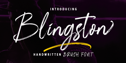 Blingston Brush. is a textured brush font, a contemporary approach to design, with handcrafted and natural underlines and also has alternatives & binders that make your designs more attractive. Suitable for use in title design. Such as clothes, invitations, book titles, stationery designs, quotes, branding, logos, greeting cards, t-shirts, packaging designs, posters, and others. Blingston Brush. equipped with Standard Characters upper and lower case, Punctuation, Numbers. And some glyph variations of OpenType features like Standard Ligatures and Stylistic Sets. Includes multiple multilingual support If you have any questions, feel free to message me :) Thank you so much for watching and enjoying it!
 - Ardiland by Dora Typefoundry,
$17.00 Introducing, Ardiland - a stylish serif with beautiful binders and substitutes! Ardiland is a modern serif font to apply to many graphic or editorial design projects. A classy, unique high contrast, and light binding style for your upcoming projects. for feminine logo signs, fashion & editorial design heads, branding projects, Apparel Branding, packaging, magazine titles, advertisements, T-shirts, postcards and other special occasions. Here's what's included: Alternatives & Ligatures Numbers & punctuation Character with accent Support Multiple Languages PUA encoded This type of family has become the work of true love, making it as easy and fun as possible. I really hope you enjoy it! Thank you
 - Garinstae Script by Pista Mova,
$19.00 Garinstae Script Pro, is modern and classic handwritten calligraphy, so soft, perfect for your next designs, such as logos, printed quotes, invitations, cards, product packaging, headers and anything else from your imagination. Garinstae Script Pro allows you to create custom dynamic text. You can access by turning on; Alternative Styles, Swashes and binders in Photoshop, Adobe Illustrator, Adobe InDesign or via the glyph panel like Adobe Illustrator, Photoshop CC, Let's go from regular characters to alternate characters to get the text with the layout of your dreams. Garinstae Script Pro also includes glyphs, punctuation, numbers and multilingual. Thank you for your visit
 - Shaky Hand Some Comic by TypoGraphicDesign,
$19.00 CHARACTERISTICS The kiddy and warmly character and the cute, huge points (amongst others punctuation), gives the typeface a high recognition value and uniqueness. APPLICATION AREA The warm, child-like, bold and striking sans serif font »Shaky Hand Some Comic« would look good at display size for headlines in magazines or websites, posters, packaging, covers or webbanner. TECHNICAL SPECIFICATIONS Headline Font | Display Font | Sans Serif Font »Shaky Hand Some Comic« OpenType Font with 340 glyphs alternative letters and ligatures (with accents & €) & 3 styles (regular, bold & 3d)
 - Menhart by Monotype,
$29.99Czech designer Oldrich Menhart (1897-1962) devoted his life to making letters. He was a calligrapher, lettering artist, and typeface designer with over twenty faces to his credit. The Monotype typeface, Menhart, was the second of his designs. Menhart began work on the design in the early 1930s and turned over his final artwork to the Monotype Drawing Office in 1934. The first size cut was 14 Didot (Didot points are the traditional European system of type measure, and are roughly equivalent to the point system commonly used by today's digital fonts). The 14D font was followed by 18D and 24D, indicating that the design was considered most suitable for display work. However, a 10D size was later cut from the same master drawings at the request of a Monotype customer. Menhart's design was light and open, with an even color and a slight squareness" to its round shapes. Because the Czech alphabet has 15 accented letters, Menhart included these diacritics as an integral part of his design, not as an afterthought. As a result, accented copy set in Menhart has a cohesive quality rarely seen in other typefaces. Monotype's new digital release of Menhart is the first revival since the hot metal fonts were cut. Menhart Display is based on the original Monotype drawings, while a slightly heavier, re-spaced version has been created for text sizes. Both versions offer the full capabilities of the OpenType format, such as the automatic insertion of old style figures, ligatures and small caps. In addition to English, the extended character set supports most Central European and many Eastern European languages. One of Menhart's lifelong goals was to share the richness of his Czech culture by drawing typefaces that uniquely served Czechoslovakia literature. In his words: "I believe that a Czech style of type comes above all from the spirit in which it was designed, which gives it its 'signature,' and not so much from decorative composition, and even less from the geographic location of its creation." The typeface Menhart is a tribute to his values. Now, Menhart Pro and Menhart Display Pro capture the unique personality of this timeless design while greatly extending its range of use. " - Baritta Script by madjack.font,
$18.00 Baritta is a modern script font made with brushes and ink, thick and irregular lines. It contains the complete set of lowercase, uppercase, alternative, binder, punctuation, numbers, and multilingual support. Get inspiration from the preview above. Baritta is perfect for use in watercolor designs or bold handwriting styles, such as blog headings, branding, t-shirts, weddings, social media, product design, stationery, advertisements, clothing, cover books, business cards, greeting cards, branding, merchandise, invitations and handmade quotes and more. Baritta features alternative OpenType styles, binders and international support for most Western Languages included. To enable the OpenType Stylistic alternative, you need a program that supports OpenType features such as Adobe Illustrator CS, Adobe Indesign & CorelDraw X6-X7, Microsoft Word 2010 or newer versions. How to access all alternative characters using Adobe Illustrator: https://www.youtube.com/watch?v=XzwjMkbB-wQ Baritta is coded with Unicode PUA, which allows full access to all additional characters without having special design software. Mac users can use the Font Book, and Windows users can use the Character Map to view and copy one of the additional characters to paste into your favorite text editor / application. How to access all alternative characters, using Windows Character Map with Photoshop: https://www.youtube.com/watch?v=Go9vacoYmBw If you need help or have questions, please let me know. I am happy to help :) Thank you & Happy Designing!
 - Cooper Screamers by Wordshape,
$- In 1925, at the request of Barnhart Brothers & Spindler, the foundry he worked for, Oswald Bruce Cooper designed a wide selection of "screamers", oversized exclamation points used to grab attention in display advertising. The foundry rushed the screamers into production, much to Cooper's dismay. Cooper was disappointed with the final form of the screamers– they were designed in assorted weights to match the assorted Cooper series of typefaces, as well as in a variety of other formal solutions- squaredoff, incised, wavy, Tuscan, and rounded. Cooper's working design methodology was to re-draw his projects a number of times in order to refine the formal results. However the screamer project was hastily cut by the head of BB&S's matrix engraving room in fourteen sizes from the initial sketches, causing Cooper to fire off a fiery missive stating, "Everything I draw is bum the first half-dozen times I draw it; the trouble with these is that I drew them only once!" This typeface is the result of researching Cooper's original drawings and series of engraved proofs for the screamers, as well as the original Screamer type specimen. Cooper Screamers have never been available before in digital format.
 - Unpredictable by Putracetol,
$28.00 Unpredictable is a display sans font with variations of different heights and baseline position. In this font there are several heights and baselines that you can combine. For height (normal, low, and high), for the baseline (normal, above and below). This tyepeface is unique and very suitable for logos, Tshirt, apparel, quote, handwritten quotes, product packaging, tittle header, poster, merchandise, social media, labels, branding & greeting cards.