10,000 search results
(0.03 seconds)
- Lattolatoo by Zamjump,
$17.00 Lattolatoo is a unique modern display font with a fun and trendy kind of street style twist. From poster designs to t-shirts and packaging, Lattolatoo will give your designs an alternative to the minimal look and supercharge your creative work. Lattolatoo is hand-drawn, having an almost handwritten appearance; the characters skip the baseline giving it a charming yet modern look and feel. Alternative All characters A to Z one alternative. To make your text look less repetitive, you can substitute the letters for something else—this makes your design look more like handwriting. Ligature Lattolatoo has standard ligatures, 7 of them in total. You can activate it through the glyph panel in Adobe applications. The binder makes a huge difference in the look of Beautiful Freak. It switches the order of two popular letters making your design look more individual. opentype Please note: Alternatives and Binders use OpenType features. Therefore, you'll need a design application to access these options—an application such as Adobe Photoshop, Illustrator, or InDesign. Included : - Uppercase glyphs only (This font is unicase) - Punctuation, Symbols, and Numbers - Alternate A-Z characters (1 character) - 7 Ligatures - Support for Central, Western, and Southeast European characters
 - Dx Slight by Dirtyline Studio,
$39.00 Dx Slight a new fresh & modern Sans with a Ultra Condensed style. The font it’s look good in posters, it is ideally suited for setting titles. However, the font has gained wide popularity among designers, and now you can find Dx Slight on the covers of magazines, on restaurant signs and on the main pages of websites. Dx Slight Display Typeface is the part of a strong and modern display family. This typeface both impressive at display sizes and easily readable in text size, while the sharp shapes of the triangular sans and the distinctive letter shapes show their strength in logo design and impressive editorial use. Dx Slight comes with elegant style, strength, and contrasts, with features an extended Latin character set of 366 glyphs covering over 88 languages. It has been designed as a variable font to give lots of options and access to unique type looks, however, it also includes nine weights, three axis H-height and Slant to give just as much access to creativity to those without access to variable supporting software. Its distinctive character and many variables make it a versatile, stylish workhorse, great for interfaces and design.
 - Boister Black Pro by CheapProFonts,
$10.00 I loved the look of this font so much that I couldn't resist reworking it - although it probably had the most basic character set I've ever used as a starting point. But here it is in its complete, professional, multilingual state. I hope this wonderful swashbuckling font now finds many new users and uses. Celebrate! ALL fonts from CheapProFonts have very extensive language support: They contain some unusual diacritic letters (some of which are contained in the Latin Extended-B Unicode block) supporting: Cornish, Filipino (Tagalog), Guarani, Luxembourgian, Malagasy, Romanian, Ulithian and Welsh. They also contain all glyphs in the Latin Extended-A Unicode block (which among others cover the Central European and Baltic areas) supporting: Afrikaans, Belarusian (Lacinka), Bosnian, Catalan, Chichewa, Croatian, Czech, Dutch, Esperanto, Greenlandic, Hungarian, Kashubian, Kurdish (Kurmanji), Latvian, Lithuanian, Maltese, Maori, Polish, Saami (Inari), Saami (North), Serbian (latin), Slovak(ian), Slovene, Sorbian (Lower), Sorbian (Upper), Turkish and Turkmen. And they of course contain all the usual "western" glyphs supporting: Albanian, Basque, Breton, Chamorro, Danish, Estonian, Faroese, Finnish, French, Frisian, Galican, German, Icelandic, Indonesian, Irish (Gaelic), Italian, Northern Sotho, Norwegian, Occitan, Portuguese, Rhaeto-Romance, Sami (Lule), Sami (South), Scots (Gaelic), Spanish, Swedish, Tswana, Walloon and Yapese.
 - Pristine Pro Slab by AZCRTV Studio,
$23.00 Meet Pristine Pro, the epitome of elegance and precision in typography. This Slab Serif font, meticulously developed with a humanistic touch, promises unparalleled sophistication for your projects. Its 18 versatile font families, ranging from Thin to Black, offer a tailored solution for every design need. Explore the seamless blend of clean lines and firm structure that defines Pristine Pro. This font isn't just a typeface; it's a statement of modernity and style. With support for 89 international languages, including English, French, Spanish, and German, Pristine Pro caters to a global audience, ensuring your designs communicate effectively worldwide. Desire perfection in your designs? Pristine Pro delivers. Craft compelling branding, striking posters, or editorial layouts with confidence. Its immaculate precision and extensive language support empower your creativity. Your desire for flawlessness finds its match in Pristine Pro, promising visuals that captivate, leaving a lasting impression on any audience. Ready to elevate your designs? Take action now. Download Pristine Pro and witness your creativity flourish. Unleash the power of clean Slab Serif typography with international appeal. Dominate the digital space, ensuring your projects rank high and capture attention. Seize this opportunity and transform your designs into timeless masterpieces.
 - NorB ARCHITECT LINE by NorFonts,
$35.00 NorB Architect Line architectural fonts will add a beautiful architectural hand-lettering style to all your CAD project drawings. Architects have always wanted their CAD drawings to look more like they were drawn by hand, rather than by a CAD program. These AutoCAD fonts are the first step in bringing back that “artistic hand-drawn” feel to your CAD drawings or any graphic design project that can use true type fonts. They even can be used with any word processing program for text and display use, print and web projects, apps and ePub, comic books, graphic identities, branding, editorial, advertising, scrapbooking, cards and invitations and any casual lettering purpose… or even just for fun! NorB Architect Line is a retracing from scratch of my "NorB Architect" font coming in a sharp and round look, featuring small caps with some long stems of the following letters: b, d, f, h, k, l so resulting in more dynamic lettering font. It comes with 8 weights: Regular Italic Bold Bold Italic Round Round Italic Bold Round Bold Italic Round Note: The Italic versions are intentionally set to 20° rather to 12° for more dynamic lettering look.
 - Quirky by Fine Fonts,
$29.00 The origin of Quirky lay in the Duke Ellington number It don't mean a thing if it ain't got that swing. For some time I had wanted to create a font from expanded stroked lines. I wanted to produce a light-hearted font, but with some classic touches. One day, whilst doodling in Adobe Illustrator, Quirky’s letterforms just appeared on screen as if from nowhere. First I drew the test word ‘hamburgefonts’ and then just kept going, unable to stop. Character after character appeared as if by magic. From the start, Quirky had a life of its own. The letterforms are rather more sophisticated than merely outlined stroked lines. Subtle adjustments to compensate for optical effects have been been incorporated. For example, horizontal stems have thicknesses slightly less than vertical stems and where stems join together, the thickening effect has been reduced by cutting into the joint. Being almost monoline, Quirky works well reversed out of a solid background and for TV credits. The Quirky fonts are fun fonts, so set, laugh and enjoy! I hope Quirky will give you as much pleasure in using it as I got in creating it! Shortly after the roman version was born, an italic version and then a thin version were created to form a family of three fonts.
 - Yasmine by Arabetics,
$39.00 The Yasmine type family follows the guidelines of the Mutamathil Taqlidi type style. It has one glyph for every basic Arabic Unicode character or letter and one additional, final-position, glyph for each Arabic letter that is normally connected with other letters from both sides in traditional cursive Arabic strings. Yasmine employs four fixed x-height values, two above and two below the x-axis. Values are high to give a slight vertical overall look. Its design uses full curves with equally distributed weight. Yasmine family includes all required Lam-Alif ligatures and uses ligature substitutions, and marks positioning but it does not use any other glyph substitutions or forming. Text strings composed using types of this family are non-cursive with stand-alone isolated glyphs. It employs our “natural Arabic input” method where first glyph is displayed in its non-isolated form. Tatweel (or Kashida) glyph is a zero width space. Keying it before any glyph will display that glyph isolated form. Keying it before Alif Lam Lam Ha will display the Allah ligature. Yasmine family includes both Arabic and Arabic-Indic numerals, all required diacritic marks, Allah ligature, in addition to all standard English keyboard punctuations and major currency symbols. The fonts in this family support the following scripts: Arabic, Persian, Urdu, Pashtu, Kurdish, Baluchi, Kashmiri, Kazakh, Sindhi, Uyghur, Turkic, and all extended Arabic scripts.
 - Amudi by Arabetics,
$39.00 The Amudi type family follows the guidelines of the Mutamathil Taqlidi type style. It has one glyph for every basic Arabic Unicode character or letter and one additional, final-position, glyph for each Arabic letter that is normally connected with other letters from both sides in traditional cursive Arabic strings. Amudi employs four fixed x-height values, two above and two below the x-axis.. Values are high to give a slight vertical overall look. Amudi family includes all required Lam-Alif ligatures and uses ligature substitutions, and marks positioning but it does not use any other glyph substitutions or forming. Text strings composed using types of this family are non-cursive with stand-alone isolated glyphs. It employs our “natural Arabic input” method where first glyph is displayed in its non-isolated form. Tatweel (or Kashida) glyph is a zero width space. Keying it before any glyph will display that glyph isolated form. Keying it before Alif Lam Lam Ha will display the Allah ligature. it Amudi family includes both Arabic and Arabic-Indic numerals, all required diacritic marks, Allah ligature, in addition to all standard English keyboard punctuations and major currency symbols. The fonts in this family support the following scripts: Arabic, Persian, Urdu, Pashtu, Kurdish, Baluchi, Kashmiri, Kazakh, Sindhi, Uyghur, Turkic, and all extended Arabic scripts.
 - Rare Bird Specimen VI by Rare Bird Font Foundry,
$200.00 Specimen VI is a refined hand by artist Aileen Fretz of Plume Calligraphy: thoroughly modern yet absolutely timeless. We have our sights set on this one becoming an instant classic. OBSERVATIONS Specimen VI takes its inspiration from the old world, while remaining thoroughly contemporary. It is unique while maintaining legibility. DEFINING CHARACTERISTICS At 2,580 characters, we dare say it is one of the most robust script fonts on the market today. The font includes extensive Opentype programming that authentically replicates Aileen’s unique handwriting pattern. As you type, watch the letters automatically adjust between connected and disconnected forms. Specimen VI also features formal titles, prepositions, social media wordart, and web navigation wordart, serif and sans serif Roman numerals, in and out-stroked letterforms at beginning and end of words, multiple alternate lowercase t cross-strokes, realistic double-letter ligatures, seamlessly connecting calligraphic letters, multiple styles of alternate capital letters, including swashes, and basic Latin encoding. Specimen VI is a typesetters’ dream. POTENTIAL SIGHTINGS In the pages of your favorite wedding tome; the signage, robe embroidery, and dinner menus of that coveted boutique hotel on the Italian Riviera, the labels of an artisanal hand-poured candle line, your new favorite Rosé, hand-crafted Belgium chocolate truffles, the indie cosmetic line fit for royalty, in any instance that you may be in need of a refined modern script.
 - Parisi by Eurotypo,
$34.00 The Parisii was a small Gallic people settled in the current Paris region, which gave its name to the city of Paris. According to Caesar (53 BC.), their main town (oppidum) was Lutetia (Paris). Parisii was born of inspiration to be leafing through some old magazines on the terrace of a cafe in the beautiful city that is Paris. Parisi is like the city: casual, youth, romantic, free spirited and, at the same time, sophisticated, elegant and classic. The Parisi family font is a lovely and casual handlettering script, which is based on gestual calligraphy. Parisi has a slight bounce and intentional irregularity giving your words a wonderful flow. Fat and thin stroke in this font impresses the harmony. Parisi consists of 3 subfamilies: Regular, Italic and Condensed. This font includes Parisi font has OpenType features such as Stylistics and Contextual alternates, swashes, Standard and Discretional Ligatures, stylistic sets and ornaments that allow you to mix and match pairs of letters to fit your design. This will help your creativity and make it easier to make the impressive and elegant typographic work. This OpenType features may only be accessible via OpenType-aware applications, a Central European language support. Parisi looks lovely on wedding invitations, greeting cards, logos, business-cards and is perfect for using in ink or watercolour based designs, fashion, magazines, food packaging and menus, book covers and more!
 - Snowdrop by Supfonts,
$17.00 Thanks for checking out Snowdrop Script! A fabulously fun yet elegant script font with tons of energy, allowing you to create beautiful hand-made typography in an instant. With extra bouncy curves & alternates, Snowdrop Script is guaranteed to make your text stand out - perfect for wedding invitations, printed quotes, cards, product packaging, headers and whatever your imagination holds. By the way, you can make your own design IN ANY language What's really awesome is that Snowdrop Script comes with a complete set of lowercase alternates, which allows you to create even more authentic custom-feel text. Another great feature is the bonus ornaments font, which allows you to add some really unique and elegant finishing touches to your script text. Here's what you get in the download: 1. Snowdrop Script - A handwritten script font containing upper & lowercase characters, numerals and a large range of punctuation. Fully support of all Latin and Cyrillic languages 2. Snowdrop Swirls - The set of small letters with swirls at the beginning and end of the letter. You can use A-Z and A-z to get to them 3. Snowdrop Alt - The set of small letters with special endings + a set of letters with special curls for the middle of words Fonts are provided in TTF / OTF / WOFF formats. You do not need a special design program. Font easy and convenient to use.
 - Recolors by Din Studio,
$29.00 It can be a time-consuming, difficult process to find an elegant font to present classic impressions to your audience despite the abundant options available for you. Moreover, it takes the risks to disappoint and to leave bad impressions to your audience without having the right font. Therefore, let us introduce you to our serif font, Recolor. It is a capitalized serif font to help you create elegant, classic nuances on your designs. Our serif font has tiny lines to add formal, professional touches on each quality, consistent letter to ease the reading process. However, such capitalized font designs are eligible to apply for big text sizes for a legibility reason. Additionally, you can enjoy the available features here. Features: Multilingual Supports PUA Encoded Numerals and Punctuations Recolor fits best for various design projects, such as brandings, posters, banners, headings, magazine covers, quotes, printed products, merchandise, social media, etc. Find out more ways to use this font by taking a look at the font preview. Thanks for purchasing our fonts. Hopefully, you have a great time using our font. Feel free to contact us anytime for further information or when you have trouble with the font. Thanks a lot and happy designing.
 - KG Like A Skyscraper by Kimberly Geswein,
$5.00 This mixed-case handwritten font is young, fun, and uniquely styled after a teenage girl's handwriting.
 - Blankeny by Patria Ari,
$15.00Blankeny is a strong script font inspired from Vintage baseball sport design with touches of fun. - DB Borders Birthday by Illustration Ink,
$3.00DB Borders Birthday is a DoodleBat with plenty of Birthday fun. Celebrate with this festive DoodleBat! - Beachday by RahagitaType,
$25.00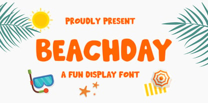 Inspired by vacations, Beachday is a super fun and playful display font with a whimsical feel!
 - KG Dark Side by Kimberly Geswein,
$5.00 This thick and thin mixed handwriting is perfectly legible and neat but still full of fun!
 - Yoyo by Funk King,
$5.00 Yoyo is a fun and fluid dot font that swirls and curves to deliver your message.
 - Quiny by Nestype,
$17.00 Quiny is built with bold and curvy characters, Perfect if you need fun for your projects.
 - LD Sidewalk Chalk by Illustration Ink,
$3.00LD Sidewalk Chalk is a fun, child-friendly font resembling the style of wacky sidewalk chalk. - Lovers Quarrel by TypeSETit,
$24.95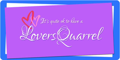 A playful calligraphic style, Lovers Quarrel is great for scrapbooking, cards, invitations and other fun things.
 - Gower Gulch JNL by Jeff Levine,
$29.00Gower Gulch JNL was inspired by some antique gold shirt pins spotted on an internet auction. - Naguel by RodrigoTypo,
$25.00 With only 2 pesos, this font can be the most fun! multilanguage and special for titles!
 - ITC Panache by ITC,
$29.99Typefaces, like most other works of art, provide a small window into the personalities and sensibilities of the artists who create them. ITC Panache not only provides this window, it is also aptly named. Mr. Edward Benguiat the dreator of ITC Panache, has all the dash, verve (and panache) hinted at in the design, Creative, capable and prolific, Ed Benguiat has drawn hundreds of exciting and popular typeface designs. Benguiat's design goal was to create a sans serif typestyle that is versatile, utilitarian - and distinctive. We think he has succeeded admirably. ITC Panache's three weights mix exceptionally well to complement each other or provide emphasis where necessary. Extensive testing at text sizes and design fine-tuning has produced a typeface family which is remarkably homogenous and consistent in color. Text set in ITC Panache is inviting without dissapointment. It is exceptionally easy to read, even in long text blocks of copy or small point sizes. When set in larger sizes or used for headlines, ITC Panache's character traits becomes more apparent and pronounced to the reader. They help to create graphics with distinction and style. Big or small. a little or a lot. it's hard not to use ITC Panache well. If you could pigeonhole ITC Panache, it would probably be classified as a stressed sans", but this would not completely describe, or do justiceto, the design. There is a slight contrast in stroke weight, which becomes more pronounced as the familiy weight increases; but there is a more to distinguish ITC Panache from ather sans serifs. Perhaps most obvious is its high waist and correspondingly slight condensation of the top half of the "round" capitals. Both of these traits link ITC Panache with the sensuous forms of art nouveau creations. In contrast are the typicall old style "e" found in designs like Cloister and ITC Berkeley Old Style, and the two storied "g" common to the early 20th century sans serif designs. The capital "A" even has the cupped top found in Caslon designs. Part of the beauty of ITC Panache is that all of these seemingly unrelated desig traits are melded into a design of exceptional continuity." - Metroblack #2 by Linotype,
$29.00American graphic designer William Addison Dwiggins' (W.A.D. for short) first typefaces were the Metro family, designed from 1927 onward. The project grew out of Dwiggins' dissatisfaction with the new European sans serif typefaces of the day, such as Futura, Erbar, and Kabel, a feeling he expressed in his seminal book Layout in Advertising. Urged by Mergenthaler Linotype to create a solution for the problem, Dwiggins began a professional relationship that would span over the next few decades. The first Metro family typeface to be released was Metroblack, brought to market by Linotype in 1929 (Metroblack #2™ the only one of the two versions that Mergenthaler Linotype eventually put into production which is available in digital form). With more of a humanist quality than the geometric styles popular in Europe at the time, Dwiggins drew what he believed to be the ideal sans serif for headlines and advertising copy. Metroblack has a warmer character than the Modernists' achievements, and the type is full of mannered curves and angled terminals (Metroblack also has an astoundingly beautiful Q). The weights of the Metro family, Metromedium #2™ and Metrolite #2™, were each designed by Mergenthaler Linotype's design office under Dwiggins' supervision. In 2012 Toshi Omagari reworked the Metro family as "Metro Nova" with many weights into a modern type family that even contains the alternate characters from the origin Metro family from Dwiggins. Despite having been created more than three-quarters of a century ago, the Metro family types have aged well, and remain a popular sans serif family. Although spec'd less often than other bestsellers, like Futura, Metro continues to find many diverse uses. The typeface has appeared throughout Europe and the North America for decades in newspapers and magazines, and can even help create a great brand image when used in logos and corporate identity. Dwiggins ranks among the most influential graphic designers and typeface designers of the 20th Century. He has several other quality fonts in the Linotype portfolio, including the serif text faces Electra™ and New Caledonia™, as well as Caravan™, a font of typographic ornaments. - BD Megatoya by Balibilly Design,
$25.00 Overview of BD Megatoya Consists of 41 fonts, including nine upright, nine italics, nine extended, nine extended italics, all in nine weights from thin to black. 4 outline version in black weight. 1 variable with three axes (weight, width, slant). 1,470 glyphs in each font. Opentype features include small caps, stylistic alternates, ligatures, complete numeral figures, ordinal, case-sensitive forms. language support: Western European, Central European, and Southeastern European. About BD Megatoya Taking a geometric sans serif approach, we designed the letterform with details on round characters to pursue harmony and leave a slightly boxy feel to the extended style. The stylistic alternate is one of our concentrations to make them versatile yet still preserve consistency in stem and metrics to provide good readability in small text. Overall, the various treatments for each character will encourage each other to dynamic colours, flexible, and functional impressions in their application. Slicing edges The edge of the letter slice in 45 degrees will give the impression of a sparkle of light when you look at them for the first 2 seconds (our experience). This is what we did a few years ago when working on automotive branding. The word-mark logotype with slicing form gives an exclusive and different impression from its crowds. If you agree with us, does BD Megatoya deserve to be called a problem solver in branding projects? Jump over to .ss07, .ss08, .ss09, and .ss10 to find them! The Features BD Megatoya font family includes 41 great fonts in nine weights, an extended character set of over 1400 glyphs, multilingual support such as Southeastern Europe, Central Europe, Western Europe. Also advanced & useful open-type features: case-sensitive forms, small caps, standard and discretionary ligatures, stylistic alternates, ordinals, fractions, numerator, denominator, superscript, subscript, circled number, slashed zero, old-style figure, tabular and lining figure. Use BD Megatoya BD Megatoya is very suitable for branding projects and many designs purpose like advertising, posters, invitations, branding, logos, magazines, merchandise, presentations, etc. It's a FREE Get one weight from the BD Megayoya family for Free! Apply to your amazing projects and enlarge your creative tools by adding the complete BD Megatoya family to your font library.
 - Bourton Text by Kimmy Design,
$25.00 Bourton Text is a modern sans-serif typeface family perfect for both text type settings and display purposes. While it’s not a layering type family like its brother, Bourton, it come packed with features, extras and over 2,000 characters that make it stand on its own. HISTORY Bourton Text is a new take of the Bourton family that was one of the best-selling and favorite fonts of 2016. After countless requests for lowercase alphabet, or suggestions for a font pairing with Bourton, this new text setting family is based on the original shapes of Bourton. DESIGN & CREATION In taking Bourton Base was the starting point as they narrowest width and boldest weight. From there, lowercase shapes were designed that matched the aesthetic and details of the popular capitals. As Bourton was a heavy display font, some small tweaks were done to make it more fitting for smaller text settings, including reducing the letter-spacing and reworking some counters. Some areas needed complete reconstruction, such as the figures. The design of those began anew with a style that worked with the capitals and lowercase but also as a standalone set. Currency shapes were updated to match the numerals. Punctuation was also reimagined to work better in smaller type settings. Diacritics and extended language support was also updated and expanded to include full Latin plus language support for 219 latin based language spoken in 212 countries. Once the basic alphabet for Bourton Text Bold Narrow was formed, the font was expanded in both weight and width. Taking the weight from Bold down to Hairline, it allowed for more range in use. The typeface needed to be expanded in order to reach better as a book weight and width, in addition to a regular width, a wider version was create as well. FEATURES Once the extremes were set in place, small capital forms were designed for text and display purposes. These also allow for nested capital letters, lifted small caps and other display features offered in the typeface. One of the most popular fonts in the Bourton layering font family is Bourton Line. This led to an experimentation with rounded Bourton Text completely and thus a complete set of duplicated characters with rounded terminals. By using the Opentype Panel, a rounded font is a single click away. Every feature has been carefully thought out and updated across the entire font. In total, Bourton boasts over 2,300 glyphs, 42 font files with 3 widths and 7 weights in upright and italic.
 - Bounties by Balpirick,
$15.00 BOUNTIES is a Fun & Rounded Handbrushed Font. Bounties is a fun, round, hand-brushed, and handwritten font that has an innocent and clean style. It is perfect for product packaging, branding project, magazine, social media, wedding invitations and so much more! BOUNTIES also multilingual support. Enjoy the font, feel free to comment or feedback, send me PM or email.
 - Bodynote by Balpirick,
$15.00 Proudly Present, BODYNOTE Font. BODYNOTE is a Fun Handbrushed Font. Bodynote is a fun and playful display font. This font is perfect for children themed designs, especially when combined with bright colors. This font includes TTF and OTF, BODYNOTE also multilingual support. Enjoy the font, feel free to comment or feedback, send me PM or email. Thank you!
 - Fat Ink by High Peak,
$20.00 This handwritten font is as juicy as the strokes from a fat marker! Unpredictable but harmonious, the lines and shapes give this font a fun, funky vibe. Perfect for creating logos, charts, pricing, and more. Full uppercase and lowercase, it supports several languages, lots of discretionary ligatures, and alternatives that combine with each other. Have fun! High Peak
 - For Real by KA Designs,
$12.00 For Real is a fun mix of bubbly and retro.. you could say it's a little groovy too! Each letter is hand-drawn giving this font a unique and fun look! For Real boasts big bubbly letters that are perfect for all of your retro designs, t-shirt designs, branding, packaging, advertisements, social media, posters and more!
 - Tropical Orange by Balpirick,
$15.00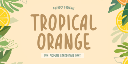 TROPICAL ORANGE is a Fun Modern Handdrawn Font. Tropical Orange is a fun handwritten font. This font is perfect for product packaging, branding project, megazine, social media, wedding, or just used to express words above the background. TROPICAL ORANGE also multilingual support. Enjoy the font, feel free to comment or feedback, send me PM or email. Thank you!
 - Gromvies by ahweproject,
$10.00 Gromvies feels playfully nostalgic and delivers an incredible vintage retro aesthetic. Inspired by unique retro themes, this fun typeface is suitable for any vintage theme concept, Illustration posters, stickers, fun graphics, and more. Masterfully designed to become a true favorite, this font has the potential to bring each of your creative ideas to the highest level!
 - Seventies by Lián Types,
$37.00 'Meeeeoooow'! Seventies is another of my 'funkadelic' attempts (1) to fill the existing gap of seventyish looking fonts. In my opinion, that decade has a hidden treasure regarding type that remains unexplored: Only very few fonts rescue its 'groovy' essence, its ‘colourful’ qualities. But, don't have a cow man , and keep on truckin! With Seventies, my new foxy mama , your projects will stand out among the rest. Since there’s not much information available about this kind of lettering I had to get ideas from other styles: Nowadays it’s easy to find all kind of books or guides to understand and practice how different styles of calligraphy and lettering should be done. However, for some reason, 60s and 70s letters seemed to ignore/be free of rules... Was this suggesting the birth of postmodernism? I incorporated some ideas of the copperplate style of calligraphy: The ductus of its forms may be compared to the way letters are made in snell/engrosser’s script. Obviously, this is just the idea behind; the delicacy of thins is replaced here with the graceful imprint of really thick thicks with a brushy look and tons of good vibe . Seventies will work awesome in posters, brands, magazines, book-covers of any kind, due to its modern look adapted to our century. Well, catch you on the flip~side ! STYLES To make you more psyched , Seventies is a layered font! See examples in the posters using Seventies Shade, Seventies Shine and Seventies Printed. NOTES (1) My first one was with Beatle in 2014.
 - Grafical by Halbfett,
$30.00 Grafical is a contemporary take on 19th-century sans serifs. In this family, the amount of geometry inherent within the letterforms has been amped up. Many shapes have received further streamlining, too. All the geometric forms you see have been optically corrected, ensuring their delivery of better legibility. Grafical ships in two different formats: depending on your preference, you can install the typeface as two Variable Fonts or use the family’s 16 static OpenType font files instead. The static fonts offer eight weights, running from Extralight through Black. Each weight has an upright and an italic font available. While the static-format fonts offer a good intermediary-step selection, users who install the Variable Fonts have vastly greater control over their text’s stroke width. The Grafical Variable and Grafical Variable Italic font’s weight axes allow users to differentiate between almost 1,000 possible font weights. That enables you to fine-tune your text’s exact appearance on-screen or in print. Grafical is the perfect tool for a range of design uses, including text on the web, text in print, and text in motion graphics. Its fonts are typographic workhorses – not just from their legibility perspective but also because of the amount of OpenType features they include. There are ligatures, for instance, as well as proportional and tabular lining and oldstyle figures, fractions, numbers placed inside circles, and even Roman numerals. Users can also substitute alternate versions of the “a”, “g”, “i”, “j”, “y”, “G”, and “Q” into their work.
 - Hernández Niu by Latinotype,
$29.00 In the typedesign industry the terms ‘nova’, ‘neue’, ‘next’, ‘new’ are often used to refer to a typeface that has been modified in different ways: redesign, technical readjustments, greater number of characters, etc. At Latinotype we are now starting to use the word ‘niu’ to refer to these kinds of typefaces. Niu is an adaptation of the original word ‘new’, i.e., we have adapted this English word to the phonology and spelling of our own language but keeping the original meaning. Race mixing, diversity, change and adaptation are part of the essence of Latin American culture and, at Latinotype, we are all constantly expressing these elements in everything we do. Latin Power! Hernández Niu was designed by César Araya and Daniel Hernández. The font is based on the design of Hernández Bold: the thickest weight has been adapted to fit small text better. Five new styles have been added, ranging from neutral to more expressive fonts. Hernández Niu is a display slab serif font of thickened serifs, functional expressive ink-traps and true italics. Detailed forms and counterforms allow this typeface to be used in very large sizes. Hernández Niu is well-suited for publishing, small text and headlines. A wide variety of weights make the font a perfect choice for hierarchical type-setting, branding, logotypes, magazines, etc. This font consists of 6 weights, ranging from Extra Light to Heavy, each with matching true italics. Hernández Niu comes with a set of 397 characters, making it possible to use the font in 212 different languages.
 - Serling Galleria by Mans Greback,
$39.00 Serling Galleria is a classy, classic serif font that exudes an air of fine art and high-end creativity. With its clear, legible letterforms and modernist inventiveness, Serling Galleria brings a touch of strict creativity to your designs, making them stand out in sophistication. This versatile font family is perfect for projects that require a refined, elegant aesthetic. With its variable font feature, you have the flexibility to fine-tune the font to your specific needs and create a truly bespoke typographical experience, or use the pre-defined font styles: Thin, Thin Italic, Extra Light, Extra Light Italic, Light, Light Italic, Regular, Regular Italic, Medium, Medium Italic, SemiBold, SemiBold Italic, Bold, Bold Italic, Extra Bold, Extra Bold Italic, Black, Black Italic The diverse styles in the Serling Galleria font family provide unmatched versatility, allowing you to adapt your typography to various design contexts and moods seamlessly. With this array of weights and styles at your fingertips, you can effortlessly create a visual hierarchy, emphasize key elements, and establish a cohesive, engaging design language across your creative projects. Also includes a variable font! Only one font file, but the file contains multiple styles. Use the sliders in Illustrator, Photoshop or InDesign to manually set any weight and width. This gives you not only the predefined styles, but instead more than a thousand ways to customize the type to the exact look your project requires. Built with advanced OpenType functionality, Serling Galleria ensures top-notch quality and provides you with full control and customizability. It includes stylistic and contextual alternates, ligatures, and other features to make your designs truly unique and tailored to your needs. Serling Galleria offers extensive lingual support, covering all Latin-based languages, from Northern Europe to South Africa, from America to South-East Asia. It contains all the characters and symbols you'll ever need, including all punctuation and numbers.
 - Duckface by Raditya Type,
$15.00 Duckface. Fun display font. A cartoon font. Fonts for cheerful and explosive mood. Duckface consists of three font styles. Regular, outline and black. Bold and fun font display with lots of impact! Use it as a comic book font. Use it as a cartoon font. It's fun and powerful. Suitable for children's and children's equipment but still cool and unique for products with character bags. And impact! Create your own fantastic design! Perfect for designs including comic fonts or cartoon fonts. That's good!!! Multilingual Fonts Full uppercase characters. It is also multilingual and contains all standard Western, Central and Southeast European language support.
 - Valeson by insigne,
$34.00 Feel the funk with the retro-inspired Valeson. This groovy mix of the ‘70s and ‘80s has an upbeat rhythm of its own that will make your project boogie. It’s loads of fun with its swashy, calligraphic twist. Push it to the max with plenty of weights. Denser weights are brawny and robust, fantastic for headlines, while medium weights are swell for short bits of text. With all its options, this fun, throwback personality is still streamlined and plenty useful for today’s jobs. It’s loads of fun with its swashy, calligraphic twist. Production assistance by Lucas Azevedo and ikern.
 - Pantera by Lián Types,
$39.00 ROARRR! THE STYLES -Pantera Pro is the most complete style, and although its default look is mono-rhythmic it gets really playful and crazy like the examples of the posters by just activating the Decorative Ligatures button in the Open-type Panel of Adobe Illustrator. However, I recommend using also the Glyphs Panel because there you'll find much more variants per letter. Pantera Pro is in fact, coded in a way the combination of thicknesses will always look fantastic. -Pantera Black Left, and Pantera Black Right are actually “lite” versions of Pantera Pro: They have very little Open-Type code, so what you see here is what you get. Pantera Black Left has its left strokes thick, while Pantera Black Right has its right strokes thick. -Pantera White is a lovely member in this family that looks lighter and airy, hence its name. With the feature Standard Ligatures activated (liga) the font gets very playful. -Pantera Caps is based on sign painters lettering and since it follows the same pointed brush rules as the other styles, it matches perfectly. -Pantera Claws like its name suggests, is a set of icons that were done by our dear panther. THE STORY It is said that typography can never be as expressive as calligraphy, but sometimes it can get close enough. I tend to think that calligraphic trials, in order to work well as potential fonts, need first to go through very strict filters before going digital: While calligraphy is synonym of freedom (once its rules are mastered), type-design, in the other hand, has its battlefield a little tighter and tougher. When I practice pointed brush lettering, there are so many things happening on the paper. And most of them are delicious. The ones who know my work may see that although many of my fonts are very expressive, my handmade brush trials are much more lively than them. With that in mind, this time I tried to go further and rescue more of those things that are lost in the process of thinking type when first sketches are calligraphic. I wondered if I could create something wild, hence its name Panther, by understanding the randomness that sometimes calligraphy conveys and turning it to something systemic: With Pantera, I created an ordered disorder. Like it happens a lot in many kinds of lettering styles, in order to enrich the written word the scribe mixes the thickness of the strokes and the width of the letters. Like one of my favorite mentors say (1), they make thoughtful gestures Some lively strokes go down with a thick, while some do that with a thin. Some letters are very narrow, meaning some of them will need to be very wide to compensate. Why not?. The calligrapher is always thinking on the following letters, and he/she designs in his head the combination of thicks and thins before he/she executes them. He/she knows the playful rhythm the words will have before writing them. It takes time and skill to master this and achieve graceful results. Going back to the font, in Pantera, this combination of varying thicknesses and widths of letters were Open-Type coded so the user will see satisfactory results by just enabling or disabling some buttons on the glyphs panel. I'm very pleased with the result since it’s not very easy to find fonts which play with the words' rhythm like Pantera does, following of course, a strong calligraphic base. I believe that if you were on the prowl for innovative fonts, this is your chance to go wild and get Pantera! NOTES (1) Phrase by Yves Leterme. In fact, it’s the title of a book by him. EPILOGUE Esta fuente está dedicada a mi panterita