10,000 search results
(0.054 seconds)
- Manises by Eurotypo,
$32.00 Located in the Valencian Community, Spain, Manises is very famous for its pottery. In the Middle Ages and the Renaissance, Manises was the most important production center for Spanish-Moresca ceramics, which was exported throughout Europe. At the beginning of the 16th century, Manises tiles were very commercially successful, especially of the heraldic type. Much appreciated by the Aragonese crown, Manises ceramics was also exported to France, Italy, and especially to Naples. As a big fan of Paterna and Manises ceramics, Naples influenced other Italian courts. Calixto III and Alejandro VI continuously commissioned Valencian pieces and tiles for the halls of the Vatican. The export also extended to Sicily, Venice, Turkey, Cyprus and even Flanders and the Baltic countries. The palaces of all the courts of Europe were enriched with this art. Many painters reproduced it in his paintings. It can be seen in the work of Hubert and Jan Van Eyck, and in the central panel of a triptych by Hugo Van der Goes (Uffizi Gallery, Florence). In this city there are also some frescoes by Domenico Ghirlandaio in which the Arabic-Valencian earthenware appears. Manises font is inspired by a text written on a 16th century tile, but adapting it to our times and giving it a very modern air. It is characterised by being able to combine uppercase and lowercase letters in a conventional manner, or use only capitals, or only lowercase letters, or, a random combination of both. It comes with an extra of many ligatures, stylistic alternates, and a set of very useful catchwords, to give more modernity to your text. This OpenType features may only be accessible via OpenType-aware applications, or the Character Map to view and copy any of the extra characters to paste into your favourite text editor/app. Manises looks lovely on wedding invitations, greeting cards, logos, posters, labels, t-shirt design, logos, children's material, in ink or water-colour based designs, fashion, magazines, food packaging and menus, book covers and whatever your imagination holds!
 - Biome by Monotype,
$29.99 In the sketches that formed the basis for his typeface Biome, Crossgrove experimented with inner and outer shapes in different styles, adapted letters to the form of the super-ellipse, and added curves only to remove these again. His challenge was to find a harmonious and coherent approach that provided sufficient contrast with existing fonts. Biome is essentially in the sans serif tradition and the letters exhibit only minor variations in terms of line thickness. There is still a suggestion of the super-ellipse at many points, but this never becomes the predominant design factor. While most of the terminals of the vertical strokes are only slightly rounded, the horizontals and diagonals have pronounced arches and it is these that basically determine the round and soft character of the typeface. The more unconventionally shaped letters, such as the lowercase 'g' with its two semi-open counters and the 'k' and 'x' with their crossbars, provide Biome with an individual personality. And this effect is emphasized by the generously rounded links in the 'v' and 'w' and the uppercase 'M' and 'N'. Biome has been designed as a typeface super-family. From the near hairline Extra Light to the amply proportioned Ultra, there are seven clearly differentiated weights and three tracking widths. There are oblique italic versions of all variants. The range includes small caps and numeral sets containing lowercase and uppercase digits. With its available range of characters, Biome can be used to set texts in all Eastern European languages. Although the remarkable individuality of Biome is most clearly apparent in the larger point sizes, this typeface is not just suitable for producing headlines and logos. Biome's elegant visual effects mean that it is equally comfortable in short texts while its large x-height and generous counters make it readily legible even in the small font sizes. Biome is a contemporary typeface that employs mid-20th century futurist elements which ironically give it a retro feel.
 - FS Neruda by Fontsmith,
$80.00 A literary font FS Neruda takes its name from Chilean poet Pablo Neruda, described as “the greatest poet of the 20th century in any language”. As such, it’s a font that references the very best literary typeface traditions. Smart, sharp and classical, FS Neruda bridges the gap between the classical and the offbeat. This font started life in the world of newspapers and books and is the perfect storytelling typeface for savvy, inquiring readers whether in printed journals, hard news, short online missives or poetry. Idiosyncratic precision FS Neruda is clear and legible in body text, while also being a space-saver fitting in more characters on each line than the typefaces that inspired it. In larger sizes it becomes a different beast – livelier, quirkier, but no less sharp. This is a truly classic typeface designed with long text setting in mind, thanks to its large x-heights, and short ascenders and descenders. FS Neruda mixes suave, sharp confidence with a sense of fragility and quirkiness. It’s knowledgeable, informative and idiosyncratic; one for readers and enquiring minds. Subtle weight modifications The construction and details of the letterforms differ across each of the five weights, with each cut separately to evoke different flavours: Thin is typewriter-like, Light is classy, Regular is canonical, Bold is robust, Black is magazine-esque. FS Neruda also boasts a radiant italic companion, a wide set of small caps, lower and uppercase ligatures, case punctuation and spacing, four sets of figures, and some ageless typographic symbols such as manicules, fleurons and teardrop crosses. Suggestive simplicity “The key to success in the current type design landscape is to design a typeface which looks conventional at text sizes but has a few small, suggestive touches visible at bigger sizes that make it distinct,” says designer Pedro Arilla. “Another thing we wanted to achieve with this typeface is simplicity.” FS Neruda is available in ten carefully crafted styles: it’s designed to work perfectly at text sizes, but still glows as a display typeface.
 - Allioideae by URW Type Foundry,
$49.99 This fine lined display type face was named Allioideae because of the ascenders of the lower cases. They are rising upright with a single stroke and are ending - depending on the font style - into a spherical blossom. The name was chosen concerned to the plant allium, that forms an umbel at the top of a leafless stalk, when it is blooming. Allioideae is the name of a subfamily of monocot flowering plants in the family Amaryllidaceae. The name is derived from the generic name of the type genus, Allium. The wide and round capital letters are showing a nice contrast to the lower cases and giving the font a kind of female feeling. That provides a functional and lovely use in headlines for all beauty and cosmetics issues.The typeface appears in 4 different styles. a plain style – Allioideae, a stencil style - Allioideae Stencil, a (dotted) style for both - Allioideae Dot and Allioideae Stencil Dot. It supports multi language as it covers all the latin diacritics and a cyrillic character set. Lots of numbers as monospaced, lining figuers, old styles, sub- and superscript and many fractions in two different styles are giving a nice finish to that font. Also some matching ornaments are included.
 - Abril Titling by TypeTogether,
$35.00 Abril is an extension of the Abril typographic system that was engineered as a response to a very specific requirement from the editorial design community: a low contrast typeface for head- lines. Given its broad range of styles though, Abril deserves to be considered a separate font family on its own. Based on the original text styles of Abril, the letter shapes are sturdy, very legible, and deliver a newsy and trustworthy feel. The accented editorial style of the Scotch Roman finds continuity in this new type family, but some of the details have been ironed out for improved performance in headline, both in print and on screen. The family is conceived as four series of different widths, with four weights in each series plus matching italics, a total of 32 fonts. This wide range of styles allows for setting titles at almost any size. The wider series are aimed for smaller point sizes while the con- densed weights can deliver a striking and cohesive appearance as front cover headlines. Abril was designed as a versatile tool for those graphic and web designers looking for a workhorse with high impact. It is also an excellent companion for the rest of the Abril type family: Abril Titling and Abril Narrow.
 - TessiePuzzlePieces by Ingrimayne Type,
$9.00 After exploring tessellations for several years, I decided to see how many ways I could tessellate puzzle pieces. I began with a square template and used the same asymmetrical shape for all four edges. By flips or rotation each edge could be fitted in four ways. Eventually I discovered that, given this way of forming tiles, there were 15 distinct shapes that tessellate and these shapes can take a total of 96 orientations. (A note in the November 2016 issue of Mathematical Gazette has the proof for the 15 shapes.) This typeface contains those 15 shapes and 96 orientations. A pdf note here shows some of the tilings possible using only one shape in a pattern. An unlimited number of patterns are possible if shapes are mixed. There are two members of the family, a solid style that must have different colors when used and an outline style. They can be used separately or they can be used in layers with the outline style on top of the solid style. For rows to align properly, leading must be the same as point size. (Earlier tessellation fonts from IngrimayneType, the TessieDingies fonts, lack a black or filled version so cannot do colored patterns.)
 - Pata Slab by In-House International,
$10.00 Pata Slab: the ultra-heavy optimism we all need in 2020 Pata Slab is the type equivalent of a catwalk stomp down a city sidewalk, a font that’s assertive, funky and more than a little sexy. Named after a colloquialism for ‘feet’, Pata features ultra-heavy slabs and contrasting hairline centers that rise from its chunky footprint. The resulting, retro-inspired vertiginous curves add instant attitude to any design. Developed in 2020, Pata is a type of its time.Pata is all upside, as it is a typeface with no descenders — one that elevates all characters to grow upward from the baseline (because, c’mon, we could all use something uplifting right now!) All uppercase characters were built to fit precisely inside a square, so they’re all the same width and height. The lowercase alphabet, eñes, cedillas, punctuation, numbers and symbols all follow the same height restrictions. Despite all that confinement, Pata sports standard-height terminals that connect seamlessly so there’s nearly endless options for modular ligatures. The upshot of all this meticulous awesomeness is that laying out, customizing and stacking text super simple. Pata Slab was created by In-House International, designed Alexander Wright in collaboration with Rodrigo Fuenzalida. It's available for Opentype format (.otf) compatible with Mac and PC.
 - Funtrude by Colllab Studio,
$9.00 "Hi there, thank you for passing by. Colllab Studio is here. We crafted best collection of typefaces in a variety of styles to keep you covered for any project that comes your way! When you have a project that needs a fun, unique font to make it pop, you can’t go wrong with Funtrude. Funtrude comes in three styles: Basic, Extrude, and Hole. Each style has more than 350 of the most beautiful glyphs you could ever dream of seeing. The Extrude style is great for titles, headings, and any other text where you want to use a bold font but don’t want it to be overly bold; the Basic style will work great for things like product names or subheadings; and the Hole style is perfect for anything else! Each individual style comes with its own swashes—so your fonts can look just as beautiful when they’re all capitalized as they do when they’re in normal text. What makes us so excited about this product is how much we love to use it ourselves. When we saw Funtrude for the first time, we couldn’t believe our eyes—it was everything we had ever wanted in a font, plus it was super affordable. GET IT NOW....!!! A Million Thanks Colllab Studio www.colllabstudio.com
 - Dog Days by Fenotype,
$45.00 Dog Days is an American hand lettering style brush script family. Dog Days is swift, strong and full of bursting energy. Due to its clean features it’s legible even in small sizes. Dog Days is great for any display use -from poster to packaging and logo to t-shirt. Dog Days is also great for lettering works. Dog Days Brush boasts with more than 700 glyphs and plenty of OpenType features: Keep Standard Ligatures on - it adds variety in hand lettering style and keeps the flow steady. If you need more action try turning on Swash, Stylistic or Titling Alternates in any OpenType savvy software. Dog Days Brush is also equipped with Old Style Numerals if you need your numbers to fit more into text. Dog Days Brush uppercase letters are designed to work as initials so if you need to write all caps you might want to use Dog Days Caps or Dog Days Small Caps. Dog Days Caps can also be used as uppercase letters for the script. Dog Days Extras is a set of badges, swashes and swirls designed to play with the font. Dog Days is inspired by a hand lettering sample in a vintage American swimsuit advertisement.
 - Nautilus Text by Linotype,
$29.99Hellmut G. Bomm first released his Linotype Nautilus typeface in 1999. Ten years later, he updated and expanded the design. Now users have two additional families at their disposal: Nautilus Text and Nautilus Monoline. Nautilus Text bears more similarities to the original Linotype Nautilus. The letters shows a high degree of contrast in their stroke modulation. Bomm's intention was to create a clear, highly legible face. While the even strokes of most sans serif types eventually tire the eyes in long texts, the marked stroke contrast of Nautilus Text lends the face its legibility. The characters were drawn with a broad tipped pen. Like serif typefaces, the forms of Nautilus Text display a variety of elements. Its characters are narrow, with relatively large spaces between them. This helps create an overall open appearance, and allows a large quantity of text to fit into a small space. Nautilus Monoline's letters share the same overall proportions as Nautilus Text's. But as their name implies, they are monolinear. Their strokes do not have the calligraphic modulation that Nautilus Text features. This allows them to set another sort of headline, making Nautilus Monoline a refreshing display type choice to pair with body text set in Nautilus Text. - Webdings Windows compatible by Microsoft Corporation,Webdings™ is a symbol font designed in 1997 as a response to the need of Web designers for a fast and easy method of incorporating graphics in their pages. Webdings contains a wide variety of Web-related images of the kind found in common use across the Web, as well as some more unusual drawings. User Interface icons suitable for creating page navigation elements are also included. Webdings is ideal for enriching the appearance of a Web page. Because it is a font, it can be installed on the user's system, (or embedded in the document itself) is fully scaleable and quick to render. It's a perfect way of including graphics on your site without making users wait for lots of graphic files to download. Each Webding has been fine-tuned to ensure high quality and clarity on the screen, regardless of the complexity of the individual symbol. Character Set: Picture/Symbol This version of Webdings is the licensable equivalent to the font versions coming preinstalled with Microsoft Windows® since version 8. It is identical regarding font name, language coverage and other font behaviour and is perfect for document exchange with machines that are not running the Windows® operating system.
- Peridot Devanagari by Foundry5,
$9.00 Mesmerised by the sparkling greenish-yellow mineral called Olivine hidden within the black basalt of Lanzarote's lava fields, we named the gem of our library after this natural beauty. Peridot is not just another typeface – it's a multifaceted sans serif type system crafted with passion and precision by Foundry5. Painstakingly developed through long hours and a keen focus on every minute detail, this typeface boasts a high-quality 10 weight family with matching italics in 6 widths, and the highly versatile variable format. Brimming with character, Peridot invites you to experiment with its various stylistic variants, allowing you to tailor the typographic tone to fit your creative vision perfectly. The diverse range of widths and styles in Peridot offers a dynamic typographic toolbox, ready to inspire and captivate even the most innovative designers. Peridot Devanagari supports Devanagari and Latin and covers over 330 languages. It includes all required localised variants, tabular numerals and currencies, fractions, clever discretionary ligatures and many more features. Peridot performs in varied environments – from branding, display, corporate use, editorial, advertising, poster, web, screen usage etc. Think of any other use case as well, and Peridot will perform. Peridot Devanagari comprises 20 static fonts, family package, and variable support. It is the gem you ought to have in your collection.
 - Crayond by Dora Typefoundry,
$15.00 - Elegan / Bergaya / Modern - Introducing a beautiful and classy Crayond modern san serif typeface with lots of alternative styles to choose from, planting it firmly in a modern design. It is a careful collaboration between beauty and function. The beautiful modern Crayond sans serif is available in 3 regular and Italic weights including Light, Regular, and Bold. The style of the font family stems from the classic Didone, but makes steps to simplify and modernize some letterforms and make Didone feel more contemporary. If you want to get that classic Haute Couture look - Crayond Sans is a great choice. It is the perfect choice for fashion logos, headlines, short text, magazines, because its simplicity looks great in big typography, branding, identity, website design, album art, covers, posters, advertisements, etc. This purchase includes: Crayond - San serif typeface containing upper and lowercase characters, numbers 0-9, as well as a series of punctuation marks and symbols as well as an alternative style. If you have trouble finding a certain character, you can access it via the glyph panel. You can see all the characters available in the screenshot above, and you can try the font below. Please let me know if you have any questions, leave a comment!
 - Nautilus Monoline by Linotype,
$29.99Hellmut G. Bomm first released his Linotype Nautilus typeface in 1999. Ten years later, he updated and expanded the design. Now users have two additional families at their disposal: Nautilus Text and Nautilus Monoline. Nautilus Text bears more similarities to the original Linotype Nautilus. The letters shows a high degree of contrast in their stroke modulation. Bomm's intention was to create a clear, highly legible face. While the even strokes of most sans serif types eventually tire the eyes in long texts, the marked stroke contrast of Nautilus Text lends the face its legibility. The characters were drawn with a broad tipped pen. Like serif typefaces, the forms of Nautilus Text display a variety of elements. Its characters are narrow, with relatively large spaces between them. This helps create an overall open appearance, and allows a large quantity of text to fit into a small space. Nautilus Monoline's letters share the same overall proportions as Nautilus Text's. But as their name implies, they are monolinear. Their strokes do not have the calligraphic modulation that Nautilus Text features. This allows them to set another sort of headline, making Nautilus Monoline a refreshing display type choice to pair with body text set in Nautilus Text. - Happy Kids by Beary,
$12.00 Happy Kids embodies fun, quirkiness and authenticity. It features gorgeous and fun characters that will brighten up your crafting projects. It will elevate a wide range of design projects to the highest level, be it branding, comic design, children's books, headings, invitations, labels, and much more
 - Pillow Fort by Fromletterel,
$12.00 Pillow Fort is a quirky handwritten font to energize your designs, this font really fits cute and casual concept. Others than that Pillow Fort also fits the degins that need magical fantasy vibe. This font will be suitable for branding, greeting cards, quotes and other beautiful projects.
 - Mochita Display by Sign Studio,
$15.00 Mochita Display is indeed a font made to give a fun, funny and cute impression. Even so, it still maintains good detail and balances the negative space. This font would be perfect for logo designs, titles, product names, labeling, or anything with a fun design theme.
 - Norwich Aldine ML by HiH,
$12.00 Norwich Aldine ML is a all-cap typeface with enlarged serifs, designed and produced in wood by William Hamilton Page of Norwich, Connecticut in 1872. Norwich Aldine ML is a fine example of the strength of decorative wood types: large, simple type forms that provide the visual boldness sought by advertisers of the Victorian period. While our marketing has gotten so very sophisticated, there is always a place for a simple, visually strong typeface. Although about 14 miles inland, Norwich, Connecticut lies at the head of the Thames River. The river is both wide and deep, and therefore was not bridged in the early 20th century. Until then, if you wanted to get from Groton on the west bank to the whaling port of New London on the east bank by land, you had to go by way of Norwich. Because of its size, the Thames is navigable all the way from Norwich to New London. Docks were built in Norwich around 1685 and the city became Connecticut’s 2nd largest port by 1800. With the construction of the Norwich & Worcester Railroad in 1835, Page could easily ship his wood type north by rail or south by coastal schooner. Included with our font, Norwich Aldine ML, are two 19th century printer’s ornaments of sailing ships similar to those that sailed up the Thames to Norwich. Reference: Moon’s Handbooks, Connecticut 2nd Edition (Emeryville CA 2004) The family has expanded from one to four fonts: 1. Norwich Aldine ML: the concept font, computer-sharp corners and smooth curves, as we imagine it was designed. 336 Glyphs including some reduced-width alternatives for better letter spacing. 2. Norwich Aldine Worn ML: the way actual wooden type would look after have been used for a while. 332 Glyphs 3. Norwich Aldine Distressed ML: the way the wooden type would look after it had really been used, perhaps abused. Alternatives to the more popular letters reflect the damage that typically occurs on a well-wormn font, with nicks, cuts and scratches and the overall wear that reduces the overall height and leads to uneven inking due to varying heights in the chase. A couple of bullets look like bullet holes. 345 glyphs. 4. Norwich Aldine Cyrillic: Cyrillic includes alll English and Cyrillic letters for MS Windows Code Page 1251, ISO 8859-5 and MacOS Cyrillic. 235 glyphs. We did Cyrillic because is was fun and we felt the basic design cried out for Cyrillic. While obviously subjective, we hope you will agree.
 - Antique by Storm Type Foundry,
$26.00The concept of the Baroque Roman type face is something which is remote from us. Ungrateful theorists gave Baroque type faces the ill-sounding attribute "Transitional", as if the Baroque Roman type face wilfully diverted from the tradition and at the same time did not manage to mature. This "transition" was originally meant as an intermediate stage between the Aldine/Garamond Roman face of the Renaissance, and its modern counterpart, as represented by Bodoni or Didot. Otherwise there was also a "transition" from a slanted axis of the shadow to a perpendicular one. What a petty detail led to the pejorative designation of Baroque type faces! If a bookseller were to tell his customers that they are about to choose a book which is set in some sort of transitional type face, he would probably go bust. After all, a reader, for his money, would not put up with some typographical experimentation. He wants to read a book without losing his eyesight while doing so. Nevertheless, it was Baroque typography which gave the world the most legible type faces. In those days the craft of punch-cutting was gradually separating itself from that of book-printing, but also from publishing and bookselling. Previously all these activities could be performed by a single person. The punch-cutter, who at that time was already fully occupied with the production of letters, achieved better results than he would have achieved if his creative talents were to be diffused in a printing office or a bookseller's shop. Thus it was possible that for example the printer John Baskerville did not cut a single letter in his entire lifetime, for he used the services of the accomplished punch-cutter John Handy. It became the custom that one type founder supplied type to multiple printing offices, so that the same type faces appeared in various parts of the world. The type face was losing its national character. In the Renaissance period it is still quite easy to distinguish for example a French Roman type face from a Venetian one; in the Baroque period this could be achieved only with great difficulties. Imagination and variety of shapes, which so far have been reserved only to the fine arts, now come into play. Thanks to technological progress, book printers are now able to reproduce hairstrokes and imitate calligraphic type faces. Scripts and elaborate ornaments are no longer the privilege of copper-engravers. Also the appearance of the basic, body design is slowly undergoing a change. The Renaissance canonical stiffness is now replaced with colour and contrast. The page of the book is suddenly darker, its lay-out more varied and its lines more compact. For Baroque type designers made a simple, yet ingenious discovery - they enlarged the x-height and reduced the ascenders to the cap-height. The type face thus became seemingly larger, and hence more legible, but at the same time more economical in composition; the type area was increasing to the detriment of the margins. Paper was expensive, and the aim of all the publishers was, therefore, to sell as many ideas in as small a book block as possible. A narrowed, bold majuscule, designed for use on the title page, appeared for the first time in the Late Baroque period. Also the title page was laid out with the highest possible economy. It comprised as a rule the brief contents of the book and the address of the bookseller, i.e. roughly that which is now placed on the flaps and in the imprint lines. Bold upper-case letters in the first line dramatically give way to the more subtle italics, the third line is highlighted with vermilion; a few words set in lower-case letters are scattered in-between, and then vermilion appears again. Somewhere in the middle there is an ornament, a monogram or an engraving as a kind of climax of the drama, while at the foot of the title-page all this din is quietened by a line with the name of the printer and the year expressed in Roman numerals, set in 8-point body size. Every Baroque title-page could well pass muster as a striking poster. The pride of every book printer was the publication of a type specimen book - a typographical manual. Among these manuals the one published by Fournier stands out - also as regards the selection of the texts for the specimen type matter. It reveals the scope of knowledge and education of the master typographers of that period. The same Fournier established a system of typographical measurement which, revised by Didot, is still used today. Baskerville introduced the smoothing of paper by a hot steel roller, in order that he could print astonishingly sharp letters, etc. ... In other words - Baroque typography deserves anything else but the attribute "transitional". In the first half of the 18th century, besides persons whose names are prominent and well-known up to the present, as was Caslon, there were many type founders who did not manage to publish their manuals or forgot to become famous in some other way. They often imitated the type faces of their more experienced contemporaries, but many of them arrived at a quite strange, even weird originality, which ran completely outside the mainstream of typographical art. The prints from which we have drawn inspiration for these six digital designs come from Paris, Vienna and Prague, from the period around 1750. The transcription of letters in their intact form is our firm principle. Does it mean, therefore, that the task of the digital restorer is to copy meticulously the outline of the letter with all inadequacies of the particular imprint? No. The type face should not to evoke the rustic atmosphere of letterpress after printing, but to analyze the appearance of the punches before they are imprinted. It is also necessary to take account of the size of the type face and to avoid excessive enlargement or reduction. Let us keep in mind that every size requires its own design. The longer we work on the computer where a change in size is child's play, the more we are convinced that the appearance of a letter is tied to its proportions, and therefore, to a fixed size. We are also aware of the fact that the computer is a straightjacket of the type face and that the dictate of mathematical vectors effectively kills any hint of naturalness. That is why we strive to preserve in these six alphabets the numerous anomalies to which later no type designer ever returned due to their obvious eccentricity. Please accept this PostScript study as an attempt (possibly futile, possibly inspirational) to brush up the warm magic of Baroque prints. Hopefully it will give pleasure in today's modern type designer's nihilism. - Quinoline - Unknown license

- Altemus Corners by Altemus Creative,
$11.00 A collection of 174 corner deco, geometric, fan, palm and arc designs.
 - DB Animal Occasion by Illustration Ink,
$3.00DB Animal Occasion is a collection of fun animal sketches and doodles. - Dollbats by FaceType,
$10.00 Fat Arrows, Symbols and Numbers that fit perfectly with Doll from FaceType.
 - Estilo Text by DSType,
$26.00Estilo Text is the best companion to the multi award-winning Estilo. - Picuxuxo by Intellecta Design,
$16.90Picuxuxo is a slab fun font, good to kid's story tale books. - Toothpaste by Funk King,
$5.00 Toothpaste is a fun swirly font with lots of pizzazz and energy.
 - Licorice by TypeSETit,
$24.95 Handwritten letters are great for scrapbooking, cards, invitations and other fun things.
 - Janda Closer To Free by Kimberly Geswein,
$5.00 This chunky serif handwriting is fun but still completely legible for children.
 - Janda Silly Monkey by Kimberly Geswein,
$5.00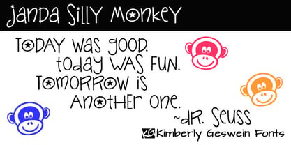 Cute and fun handwriting inspired by the playful antics of a child.
 - Compiler by Identity Letters,
$39.00 Legible, technical, clear—with a hint of retro: Compiler is a no-frills font family straight from the heart of a microprocessor. Inspired by console typefaces, the humanist sans serif typeface combines a large x-height with striking serifs on certain letters such as i and l. Those serifs evoke the aesthetics of monospace typefaces for programming. Even though Compiler is a proportional typeface, this detail improves glyph recognition and helps differentiate between individual letters. Combined with vertical stroke ends, which allow for particularly even spacing, the serifs make for an extremely legible typeface. (Even in small sizes.) Brand recognition guaranteed: Compiler is ideal for applications that require a mechanical flavor without appearing offish. You can use it for websites, apps, branding, corporate design, annual reports, signage, and many other areas with perfect results. Compiler consists of two font families; the second one is Compiler Plain. In Compiler Plain, the signature letters lose their serifs and the forms of "a" and "g" are simplified. This way, the shapes are neutralized. The technical impression recedes into the background. Both families can be combined smoothly: you might use the standard Compiler fonts for display sizes and Compiler Plain styles for body copy. For total design control, you can toggle each of the defining design elements individually from Compiler to Compiler Plain and vice versa. Just use Stylistic Sets to fine-tune your Compiler fonts. Compiler provides you with 8 weights in 4 variations: Upright, Italics, Plain Upright and Plain Italics. That's a total of 32 fonts. Each style contains more than 860 glyphs, including advanced typographic tools such as proportional and tabular figures (both lining and old-style) or small caps—something you'll rarely find in this genre. Other glyphs are optimized for display sizes, such as circled figures and various arrows. There's also a set of glyphs designed for web use: with symbols for shopping carts, hamburger menus or checkboxes, you can implement your web projects elegantly and consistently without relying on third-party tools (like an external icon font). Powered by highly productive OpenType functions, Compiler is an intermedia workhorse straight from cyberspace.
 - Oita by insigne,
$- Oita might be a carefully crafted typeface family, created by a meat-bag human. Or, it might have been made by a supremely clever sentient robot. Found in the dark recesses of a top secret spy agency’s quantum computer, this font came with this somewhat unusual description, which is presented without comment. "To conquer, we cannot simply overcome. Success is found in supremacy--in the dominance of Oita. While looking for the right tool for this success, our research has led us to the finely executed forms found of military domination throughout history. In our labs, we've used our specialized machines to harness these forms' power and refined their impact through elements of contemporary and computer design. The structure proves to be robotic and squared on its edges. However, the chutzpah of this technical face still allows it to pass as if created by human hands. Our resulting payload, Oita, is modern and sturdy. While based on a practical, octagonal structure, make no mistake; this new instrument will drive forward the energy you want to push through your projects. Oita has 42 cuts certain to encompass your designs on world domination. Each font contains the glyphs to support over 52 languages. The font also includes tabular and lining figures, numerous ligatures, and selected advanced Opentype options, including stencil and experimental options to bring out the dynamic characteristics that have already been crafted into Oita. Early tests have found that the new instrument is easily scalable to smaller dimensions without reducing its impact. The font remains highly readable across a variety of applications. We speculate from our findings that it will be successful for sporting and technical applications. So for you who venture to use Oita, use it boldly. Don't just overcome. Dominate. Go and conquer mightily with Oita. We'll be watching." We may never know whether Oita hails from mind or mechanism. What we do know is that, should you choose to take on Oita, you'll be acquiring a dynamic poster and packaging face, a minigun-toting bad robot of a font that exudes pace and power.
 - Polias by Esintype,
$23.00 Polias is an all-caps uniwidth typeface inspired by an ancient inscription carved on a monoblock stone in hybrid characters — between no-contrast linear sans to low-contrast flared serif. The inspiring inscription is the dedication by Alexander the Great, discovered in the Temple of Athena Polias in the ancient Ionian city of Priene. Stanley Morison mentioned this inscription in one of his lectures: “The distinctive feature of this inscription consists of a consistent thickening towards the ends of perpendiculars and horizontals.” … “We have not the right to say that the serif was invented for Alexander the Great's inscription, only that this is its first datable appearance.” The letter proportions are almost identical to the original, but the stroke features have been reinterpreted and characterized. Serif-like nodes at the end of the strokes are subtle extensions that serve to accentuate rather than break its monoline elegance. With an analogy, they are not flowers, but like blooming buds. Polias is a flared sans typeface which is closer to sans-serif forms on the spectrum between sans and serif. It’s especially light looking by design to convey rather thin and white typographic color of its original monumental look. It comes in eight weights and a variable font, scaled from Thin to Bold. It is multiplexed, so the weights do not affect text lengths. Light weights are closely based on the actual carving of the inscription. Thicker weights can be used on smaller typesettings to compensate for the weight difference of larger letters’ strokes, and to keeping the monoline appearance of the entire text block intact. This method can be used for any purpose, such as setting a hierarchy between the lines or to justify their lengths. Some of the original letterforms have been preserved and stylistic alternatives such as Ionic four-bar Sigma, dotted Theta, palm Y are provided as open type feature. Some of the other ancient forms, such as the three-bar Sigma (S), the pointed U, were also added for both the Greek and Latin scripts. Polias is preferable for big type settings such as logos and headlines as a modern representation of perennial classical forms. Its a fine fit for product branding, movie posters, book covers, packaging materials, and more, which require an epic look to attracting attention with a distinctive elegance. Polias can be considered for distinctiveness wherever Roman Capitals work. As a noun, Polias is one of the epithets of Athena / Minerva, and in this case referring to her role as the protector of the city of Priene. Polias is one of the seven typeface designs in Esintype's ancient scripts of Anatolia project, Tituli Anatolian series.
 - Brewery No 2 Paneuropean by Linotype,
$103.99An entry in the Second Linotype Design Contest, Linotype Brewery, designed by Gustavs Andrejs Grinbergs, became part of the TakeType Collection in 1997. Brewery No 2 represents a significantly improved version of its precursor, and the typeface has been both extended and enhanced. When asked about prototypes, Grinbergs cites German typefaces of the early 20th century. It is thus not surprising that the characters of Brewery™ No 2 are based on geometrical forms. However, this is no mere synthetic Grotesque-derived typeface. It has significant contrasts in line thickness and triangular line terminals that are not unlike serifs, placing it in the middle ground somewhere between a Grotesque and serif font. The contrast between the features of a synthetic Grotesque and an Antiqua gives the characters of Brewery No 2 their distinctive charm and is the distinguishing attribute of this contemporary typeface. Additional vibrancy is provided by bevelled line endings (as in the case of the 'E' and the 'F'), the circular punctuation marks and the slight curve of the descending bar of the 'k'. Thanks to a generous x-height and its open counters, Brewery No 2 is also highly legible in small point sizes. Only in its bolder versions is another aspect of Brewery No 2 apparent; Grinbergs has here made the linking elements more rectangular and has emphasized the counters, so that the Bold variants of Brewery No 2 exhibit elements typical of a broken typeface. Brewery No 2 is available in seven finely graduated weights, ranging from Light to Black. Every variant has a corresponding, slightly narrower Italic version. In addition, the lowercase 'a' is given a closed form, the 'e' is more rounded and the 'f' has a descender. The character sets of Brewery No 2 leave nothing to be desired. In addition to small caps and ligatures, there are various numeral sets with old style and lining figures for setting proportional text and table columns. In its most extensive form (the Pan-European variant), Brewery No 2 can be used to set texts in many languages that employ the Latin alphabet and also texts in international languages that use Cyrillic or monotonic Greek orthography. Although some of the features of Brewery No 2, such as the tiny serifs, are only evident in the larger point sizes, this typeface is not just at home when used to set headlines. Brewery No 2 also cuts a good figure in short or medium length texts. This contemporary typeface with its formally elegant quality looks good, for example, on posters, in newspapers and promotional material. It can also be used for websites as it is also available as a web font. - Brewery No 2 by Linotype,
$40.99 An entry in the Second Linotype Design Contest, Linotype Brewery, designed by Gustavs Andrejs Grinbergs, became part of the TakeType Collection in 1997. Brewery No 2 represents a significantly improved version of its precursor, and the typeface has been both extended and enhanced. When asked about prototypes, Grinbergs cites German typefaces of the early 20th century. It is thus not surprising that the characters of Brewery™ No 2 are based on geometrical forms. However, this is no mere synthetic Grotesque-derived typeface. It has significant contrasts in line thickness and triangular line terminals that are not unlike serifs, placing it in the middle ground somewhere between a Grotesque and serif font. The contrast between the features of a synthetic Grotesque and an Antiqua gives the characters of Brewery No 2 their distinctive charm and is the distinguishing attribute of this contemporary typeface. Additional vibrancy is provided by bevelled line endings (as in the case of the 'E' and the 'F'), the circular punctuation marks and the slight curve of the descending bar of the 'k'. Thanks to a generous x-height and its open counters, Brewery No 2 is also highly legible in small point sizes. Only in its bolder versions is another aspect of Brewery No 2 apparent; Grinbergs has here made the linking elements more rectangular and has emphasized the counters, so that the Bold variants of Brewery No 2 exhibit elements typical of a broken typeface. Brewery No 2 is available in seven finely graduated weights, ranging from Light to Black. Every variant has a corresponding, slightly narrower Italic version. In addition, the lowercase 'a' is given a closed form, the 'e' is more rounded and the 'f' has a descender. The character sets of Brewery No 2 leave nothing to be desired. In addition to small caps and ligatures, there are various numeral sets with old style and lining figures for setting proportional text and table columns. In its most extensive form (the Pan-European variant), Brewery No 2 can be used to set texts in many languages that employ the Latin alphabet and also texts in international languages that use Cyrillic or monotonic Greek orthography. Although some of the features of Brewery No 2, such as the tiny serifs, are only evident in the larger point sizes, this typeface is not just at home when used to set headlines. Brewery No 2 also cuts a good figure in short or medium length texts. This contemporary typeface with its formally elegant quality looks good, for example, on posters, in newspapers and promotional material. It can also be used for websites as it is also available as a web font.
 - GOBAH by Product Type,
$15.00 Welcome to Gobah, a font that presents the future atmosphere in an amazingly modern and futuristic style. Are you looking for the perfect solution for modern, futuristic, sci-fi, and future-themed projects? Gobah is the right choice. Gobah is a font that transports you to an extraordinary world with a unique look that reflects a sophisticated future feel. Each letter is uniquely designed, giving your project a modern, innovative, and charming look. With Gobah, you can steal the show and create an unforgettable impression. The main benefit of Gobah is its ability to deliver stunning styles. Each letter has an exclusive design, creating an eye-catching futuristic look. This font will give your projects a strong visual appeal, reinforcing the message you want to convey. Gobah also supports multilingualism, allowing you to display text in multiple languages without a hitch. This flexibility ensures that you can easily reach a global audience and convey your message with consistent clarity across cultural contexts. Take a step forward in your design with Gobah. This font will give a stunning modern and futuristic twist, creating a memorable impression on your logos, posters, and web presence. Let Gobah be the right choice for your vibrant, modern, futuristic, sci-fi, and future projects.
 - Martie by Canada Type,
$25.00From the heart of the Blue Ridge Mountains, by way of Toronto, comes Martie's handwriting. Martie Byrd is a school teacher in Roanoke, Virginia, and a friend of Canada Type's Rebecca Alaccari. After years of admiring the cheer and clarity of Martie's handwriting, we asked her to write out full alphabets for some cool font treatment. The intent was to do three different versions of her writing in two different pens, then use the auto-magic of OpenType to determine letter sequences and rotate character sets on the fly when the fonts are in use. A successful endeavor it was. Take a look at the images in the MyFonts gallery to see the character rotation in action, along with a visual explanation of why Martie is not just another handwriting font. Unlike other available felt tip and ballpoint handwriting fonts, the regular and bold variations are style-based, not weight-based. They are the handwritten expressions of two different Sharpie pens: The fine point one (Martie Bold), and the ultrafine one (Martie Regular). The style-based variation considerably helps the realism needed in design pieces that take advantage of the contrast of two different handwriting fonts. Weight thickening in handwriting is an obvious mechanical effect that only happens with computers. Weight changing by replacing pens is what happens in the real world. Martie Pro and Martie Pro Bold each contain three different character sets in a single font. Language support includes Western, Central and Eastern European languages for all three sets. This translates into each Pro font containing over 750 characters. Add OpenType code and stir, and you have true handwriting fonts with versatility unavailable out there in anything else of the genre. A software program that supports OpenType features is needed to use the randomization coded in Martie Pro and Martie Pro Bold. Current versions of QuarkXpress and Adobe applications (Photoshop, Illlustrator, InDesign) do contain support for the randomization feature. But if you don't have one of these apps, you can still use the interchangeable Type 1 or True Type fonts and change the characters manually to achieve the appearance of true handwriting. The Martie fonts come in a variety of price packages, from the affordable single fonts to value-laden complete sets. All the proceeds from these fonts received by Canada Type will be donated 50/50 to two primary schools: One in Roanoke (where Martie teaches), and one in Toronto (where the 10-year old, real Canada Type boss goes). So next time a design project needs a handwriting font, do the write thing and use Martie to keep it real. - Somn by Mix Fonts,
$13.00 Mix Somn is the perfect font for adding charm to your children’s products. Its thin, tall, and dainty style is both stylish and legible, making it perfect for labeling baby clothes, toys, and other items. The digitally handwritten sans serif font was created with an iPad Pro and Apple Pencil, using the Poppy Brush from my Procreate Brush Bundle. Its delicate strokes and sweet, soft appearance make it the perfect choice for any project you might find in your little bundle of joy’s nursery. Mix Somn includes the following characters: ABCDEFGHIJKLMNOPQRSTUVWXYZ abcdefghijklmnopqrstuvwxyz 0123456789 !@$#%^&*() `~♥M• ÷+=[]:;’”,.\|/?{}<>“”‘’-–—_…©®™«»°¡¿₱¢€£¥ ÁÀÂÄÃÅĂĄÆĆČÇÐÉÈÊËĘÍÌÎÏŁŃÑÓÒÔÖÕØŐŒŚŠȘȚÚÙÛÜŰÝŸŹŽŻÞ áàâäãåăąæćčçðéèêëęíìîïłńñóòôöõøőœśšșțúùûüűýÿźžżþ
 - Blue Sheep by Hanoded,
$15.00 It's been a while since I named a font after a sheep, so I figured it was about time. The Blue Sheep, or Naur (Pseudois nayaur), is actually an existing species of sheep. It is found in the Himalayas and is a major food for the very rare snow leopard. Peter Matthiessen wrote a book about it called The Snow Leopard. My Blue Sheep font is not rare, nor threatened. It is an uplifting text font. It is very legible and fun to use and will keep you bleating for more. Comes with a flock of diacritics.
 - Compose by Arkitype,
$18.00 Compose is a clean modern and minimal font family. It has nine weights each with an oblique version. Compose has alternate "a" and "y" options as stylistic sets, circled numerals, arrows and more to make up the extensive character set. Suited for graphic design and display use. It is an excellent editorial typeface option as well as a perfect fit for web, signage, corporate and branding. With a higher x-height Compose had great legibility in smaller sizes, it is versatile typeface and a great addition to your font library, a typeface that can easily become a go to font option.
 - Chewies by Letterhend,
$19.00 Chewies is a quirky bold font with unique letterform. You can playaround to fit the form using uppercase and lowercase mode. This font perfectly made to be applied especially in logo, and the other various formal forms such as invitations, labels, logos, magazines, books, greeting / wedding cards, packaging, fashion, make up, stationery, novels, labels or any type of advertising purpose. Features : uppercase & lowercase numbers and punctuation multilingual PUA encoded We highly recommend using a program that supports OpenType features and Glyphs panels like many of Adobe apps and Corel Draw, so you can see and access all Glyph variations.
