10,000 search results
(0.027 seconds)
- Etnier by Ahmad Jamaludin,
$17.00 Introducing Etnier – A brand-new modern family with a unique! Etnier is a modern variable font. Essentially, it's a sans-serif font with a sturdy and squared appearance, ensuring excellent legibility. It offers various widths and italics that provide versatility for your designs. The bolder, the stronger – this defines Etnier. Its bold and robust qualities, especially in the italic version, make it ideal for UI/UX-related designs. In total, there are 14 font styles available, or even more if you use the single files variable. You have the flexibility to slide through the weight and width options to find the sweet spot for Etnier. shape! What's Included? Etnier Main File 14 fonts family with Weight and Oblique options Instructions (Access special characters in all apps, even in Cricut Design) Accessible in Adobe Illustrator, Adobe Photoshop, Microsoft Word even Canva! PUA Encoded Characters. Fully accessible without additional design software Language Support: Danish, English, Estonian, Filipino, Finnish, French, Friulian, Galician, German, Gusii, Indonesian, Irish, Italian, Luxembourgish, Norwegian Bokmål, Norwegian Nynorsk, Nyankole, Oromo, Portuguese, Romansh, Rombo, Spanish, Swedish, Swiss-German, Uzbek (Latin) Come and say hello over on Instagram! https://www.instagram.com/dharmas.studio/ Have a great day! Dharmas Studio
 - Garbata by Zetafonts,
$39.00 Garbata was designed in 2020 by Francesco Canovaro, looking for an approach to sans serif design that ignored the over-exploited grotesque and modernist models. It takes its skeleton from old style typefaces like Windsor or Cooper, keeping the quirky sloped shapes of some letters and adding to the historical smooth shapes a flat brush calligraphic sensibility. The result of these different historical influences is a humble yet distinctive sans serif typeface, developed in a wide range of weights, with finely-tuned differences between the medium, text-oriented cuts (with wider tracking and more regular design) and the more extreme, display-oriented weights. This play on subtlety allows Garbata to be surprising in all uses: humble and readable when set in body text, it shows all its elegant, whimsical qualities in logo design and display use. Equipped with all advanced OpenType features you expect from a production typeface, Garbata comes with an extended character set covering over two hundred languages with latin and Cyrillic glyphs. Designed with an Italian sensibility mixing craftsmanship and artistry, Garbata is ready to help you make your designs timeless, elegant and unusual.
 - Moskau Pattern by Letter Edit,
$49.00 The design of the typeface Moskau Grotesk and Moskau Pattern is based on the signage created for the Café Moskau in Berlin by the graphic artist Klaus Wittkugel in the beginning of the 1960s. The Café Moskau, across from the Kino International on Karl-Marx-Allee in Berlin Mitte was one of the prestige edifices of the former DDR (German Democratic Republic). Built in the early 1960s, it advanced over the years and changing social developments to a trademark building of the capital. The lettering display on the roof was created by the graphic artist Klaus Wittkugel (October 17, 1910 – September 19, 1985). He had been Professor at the School for Applied Arts in Berlin, and, in addition to the creation of many posters, book covers and postage stamps, he was responsible for the signage of the Kino International as well as for the complete graphic treatment for the Palace of the Republik. The signage for the Café Moskau with the words »RESTAURANT«, »CAFÉ«, »KONZERT« and »MOCKBA« set in capital letters, becomes the basis for the Moskau Grotesk which was developed by Björn Gogalla in 2013. This face should not be seen as an imitation. A few shortcomings were »fixed«. In favor of maintaining the core characteristics some unique features were, however, not relinquished. Lower case letters and the missing capital letters were designed from scratch. It is not surprising that the plain, unassuming geometrical direction of the basic character style forms a bridge to the architecture of the 1960s. Inspired by the then favored, diverse possibilities inherent in the architectural example and wall reliefs, two complimentary pattern fonts emerged.
 - Moskau Grotesk by Letter Edit,
$39.00 The design of the typeface Moskau Grotesk is based on the signage created for the Café Moskau in Berlin by the graphic artist Klaus Wittkugel in the beginning of the 1960s. The Café Moskau, across from the Kino International on Karl-Marx-Allee in Berlin Mitte was one of the prestige edifices of the former DDR (German Democratic Republic). Built in the early 1960s, it advanced over the years and changing social developments to a trademark building of the capital. The lettering display on the roof was created by the graphic artist Klaus Wittkugel (October 17, 1910 – September 19, 1985). He had been Professor at the School for Applied Arts in Berlin, and, in addition to the creation of many posters, book covers and postage stamps, he was responsible for the signage of the Kino International as well as for the complete graphic treatment for the Palace of the Republik. The signage for the Café Moskau with the words »RESTAURANT«, »CAFÉ«, »KONZERT« and »MOCKBA« set in capital letters, becomes the basis for the Moskau Grotesk which was developed by Björn Gogalla in 2013. This face should not be seen as an imitation. A few shortcomings were »fixed«. In favor of maintaining the core characteristics some unique features were, however, not relinquished. Lower case letters and the missing capital letters were designed from scratch. It is not surprising that the plain, unassuming geometrical direction of the basic character style forms a bridge to the architecture of the 1960s. Inspired by the then favored, diverse possibilities inherent in the architectural example and wall reliefs, two complementary pattern fonts emerged.
 - Funky Style by Olivetype,
$18.00 Get ready to add a whole new level of funkiness to your designs with Funky Style - a bold and fun display font that is here to make a statement. With its eye-catching and vibrant personality, this font is perfect for those looking to inject some life into their logos, posters, or any other creative project. Whether you're creating brand identities or simply want to jazz up your social media posts, Funky Style has got you covered with its versatility and ability to convey messages in an exciting way. Embrace the spirit of fun and unleash your creativity like never before with Funky Style! Funky Style Font includes : Standard Latin Uppercase & Lowercase Numbers, symbols, and punctuations Multilingual Support. Fully accessible without additional design software Simple Installations Works on PC & Mac Thank You.
 - Corner by URW Type Foundry,
$35.99 A unique kind of type by Michael Herold: The 14 cuts of Corner are equally distributed to the two style variants A and B. From Thin to Extra Bold, variant A comes with technical and pure forms while B appears with a soft, more personal character. In combination, the two variants add up to a highly versatile family which is very well suited for branding purposes, thanks to its diverse forms of expression. Eine besondere Schriftfamilie von Michael Herold: Die 14 Schnitte der Corner sind auf die beiden Stilvarianten A und B verteilt. Von Thin bis Extra Bold kommt die Corner im Stil A mit technischen, reinen Formen und im Stil B mit weichem, persönlicherem Charakter. Als Kombination ergibt sich eine sehr vielfältige Familie, die sich mit ihren verschiedenen Ausdrucksformen besonders fürs Branding eignet.
 - Jigger Statz by Poole,
$32.00During the spring of 2006, while creating this typeface, I was reading Praying For Gil Hodges, by Tom Oliphant, who grew up a Brooklyn Dodgers fan. I grew up a Los Angeles Dodgers fan. My mother worked as secretary to the president of the old Triple A LA Angels Baseball Team. In 1952 when she was pregnant with me, she left the team. They gave her an autographed baseball and a puppy named Angel. That's the dog I grew up with. Toward the end of the book the author talks about Gil Hodges' favorite ballplayer, a slugger for the LA Angels, Jigger Statz. I thought, could it be? My mother died two years ago and I got the team baseball. Sure enough, the first name after the dedication to my mother was Jigger Statz. - Chastalia Script by Hrz Studio,
$14.00 Thanks for checking out Chastalia Script A very fun yet elegant script font with lots of energy, allowing you to create beautiful handcrafted typography in an instant. With extra curves & twists, Chastalia Script is guaranteed to make your text stand out - perfect for logos, printed quotes, invitations, cards, product packaging, headers and anything else you can imagine. What's really awesome is that Chastalia Script comes with a full set of lowercase alternatives, which allow you to create more authentic custom-feel texts. This type has become the work of true love, making it as easy and fun as possible. I can't wait to see what you do with Chastalia Script Feel free to use the #Hasrizal tag and the #Chastalia Script font to show what you've done, I really hope you enjoy it! Thank You!
 - Hopfen by Sudtipos,
$39.00 During many years I have been exploring the translation from lettering or calligraphy to type design. Lately I have been designing more big sans and serif families plenty of weight. One of the main things about Hopfen is to bring back the german lettering of Bentele, who also inspired my fonts Semilla and Bowling Script, to a more versatile and useful world. Hopfen has the spirit from the past but with today's flow, it comes in 5 weights, full of swashes, endings and alternates. We imagine it being used from Breweries to book covers, from packaging to movie posters but we prefer to let our costumers to find the better use. When you license the complete Hopfen set we will include the variable version of the set so that you can find the right weight.
 - Karina by Flawlessandco,
$9.00 Introducing "Karina" is a modern playful font. Step into a world of contemporary charm with "Karina," a font designed to infuse your projects with a perfect blend of modern aesthetics and playful whimsy. Karina doesn't just bring letters to life; it introduces a dynamic trio of styles — regular, extrude, and fun — adorned with patterns in fun styles that add an extra layer of delight to your designs. There's some connected letters and some alternates that suitable for any graphic designs such as branding materials, t-shirt, print, business cards, logo, poster, t-shirt, photography, quotes .etc This font support for some multilingual. Also contains uppercase A-Z and lowercase a-z, alternate character, numbers 0-9, and some punctuation. If you need help, just write me! Thanks so much for checking out my shop!
 - Kibrya by Keristyper Studio,
$14.00 Introducing Kibriya font! A playful blend of Serif and Sans-Serif, perfect for adding a touch of fun to your designs. This font is versatile and can be used in a variety of projects, from logos to posters to social media graphics. Its unique combination of classic and modern styles creates a fun and fresh look that will make your designs stand out. Get Kibriya font today and add some playful charm to your next project! Featured: Standard, Uppercase & Lowercase Numeral & Punctuation Multilingual : ä ö ü Ä Ö Ü ß ¿ ¡ Alternate & Ligature PUA encoded We recommend programs that support the OpenType feature and the Glyphs panel such as Adobe applications or Corel Draw, so you can use all the variations of the glyphs. Hope you enjoy our fonts!
 - MC Aloritsa Meligos by Maulana Creative,
$16.00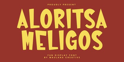 Aloritsa Meligos fun display font. Heavy stroke, fun character with a bit of ligatures. To give you an extra creative work. Aloritsa Meligos fun display font support multilingual more than 100+ language. This font is good for logo design, Social media, Movie Titles, Books Titles, a short text even a long text letter and good for your secondary text font with script or serif. Make a stunning work with Aloritsa Meligos fun display font. Cheers, Maulana Creative
 - Aquawax Pro by Zetafonts,
$39.00 Aquawax Pro PDF Specimen Aquawax Graphic Project on Behance Created as a custom brand typeface in 2008 by Francesco Canovaro, Aquawax is one of Zetafonts most successful typefaces - having been chosen, among the others, by Warner Bros for the design of the logo for the Aquaman movie. Its logo design roots are obvious in the design details, from the blade-like tail of the Q and the fin-like right leg of the K to the intentionally reversed uppercase W, as well as the rounded edges softening the stark modernist lettershapes. While this details make the typeface extremely suitable for logo and display design, especially in the bolder weights, the open, geometric forms of the letters and a generous x-height make it extremely readable at small sizes, making it perfect for body text and webfont use. In 2019 the family was completely redesigned by the Zetafonts team, expanding the original glyph set to include Cyrillic and Greek and adding three extra weights and italics to the original six weights, for a total of 27 weights (including 9 pictograms). The restored and revamped version, named Aquawax Pro, also includes full Open Type features for Positional Figures, Stylistic Alternates, Discretionary Ligatures and Small Caps, and adds to the typeface new alternate glyph shapes, accessible as Stylistic Alternates. Optimized for maximum screen readability, it covers over 200 languages that use the Latin, Cyrillic and Greek alphabet, with full range of accents and diacritics.
 - Bona Nova by Borutta Group,
$- ☞ Bona Nova is a collective revival project of Bona typeface designed in 1971 by the author of polish banknotes Andrzej Heidrich. Besides giving the project a digital font form the aim was to expand the base character set: preparation of small caps, designing the alternative glyphs and multiple opentype features. Working together with the author we designed two new text versions: regular and bold – to give the family a form of a classic script triad. ☞ It is accompanied by three title versions and three contour styles under the name of Bona Sforza. All styles contains over 1200 glyphs. ☞ Bona Nova is an unprecedented typographic adventure for our team. We hope that our work will allow the cultural heritage of Bona and the work of Andrzeja Heidricha to gain new followers and fans. This project connected three generations of graphic designers who graduated the same school – the Academy of Fine Arts in Warsaw. ☞ Bona Nova isn’t only a typeface. We have also prepared a book about the project (including an interview with Andrzej Heidrich, my text about the digitalisation and a font specimen). The Bona Nova release party was a big exhibition (over 1000 guests). I’ve invited 26 graphic designers to prepare their own initials of Bona Nova – they were presented as posters on exhibition too. LINKS Bona Nova WEB Bona Nova FP Bona-Nova-(FREE-FONT) Bona Nova Book BONA NOVA IN THE MEDIA Typeroom Typography Guru Slanted Designalley Stgu Typografie Info Wikipedia Bona Nova is a non-profit project, all founds that we raise we reinvest to develop the Bona Nova project (new styles, Cyrillic & Greek, extend character set).
 - Geometry Script Pro by CheapProFonts,
$10.00 The Geometry Pro family has been designed to be the final word in purely geometric fonts, and this rounded Script sub-family is a nod to the 50s style of connected logomarks. Words set with both the Regular and the Alternate (with its more flourished capitals and alternate stem connections) can be extended by using the underscore character between letters. You can freely mix and match glyphs from both fonts to create a little bit of variety, and finding that perfect combination. For a matching set of capitals (and disconnected lowercase letters): check out the Regular weights of the Geometry Soft Pro family. All the Geometry Pro fonts are strictly geometric (as drawn with a compass and a ruler fixed to 90 and 45 degree angles) but they are not slavishly modular. ALL fonts from CheapProFonts have very extensive language support: They contain some unusual diacritic letters (some of which are contained in the Latin Extended-B Unicode block) supporting: Cornish, Filipino (Tagalog), Guarani, Luxembourgian, Malagasy, Romanian, Ulithian and Welsh. They also contain all glyphs in the Latin Extended-A Unicode block (which among others cover the Central European and Baltic areas) supporting: Afrikaans, Belarusian (Lacinka), Bosnian, Catalan, Chichewa, Croatian, Czech, Dutch, Esperanto, Greenlandic, Hungarian, Kashubian, Kurdish (Kurmanji), Latvian, Lithuanian, Maltese, Maori, Polish, Saami (Inari), Saami (North), Serbian (latin), Slovak(ian), Slovene, Sorbian (Lower), Sorbian (Upper), Turkish and Turkmen. And they of course contain all the usual "western" glyphs supporting: Albanian, Basque, Breton, Chamorro, Danish, Estonian, Faroese, Finnish, French, Frisian, Galican, German, Icelandic, Indonesian, Irish (Gaelic), Italian, Northern Sotho, Norwegian, Occitan, Portuguese, Rhaeto-Romance, Sami (Lule), Sami (South), Scots (Gaelic), Spanish, Swedish, Tswana, Walloon and Yapese.
 - Bodoni Highlight by Image Club,
$29.99Giambattista Bodoni (1740-1813) was called the King of Printers; he was a prolific type designer, a masterful engraver of punches and the most widely admired printer of his time. His books and typefaces were created during the 45 years he was the director of the fine press and publishing house of the Duke of Parma in Italy. He produced the best of what are known as modern" style types, basing them on the finest writing of his time. Modern types represented the ultimate typographic development of the late eighteenth and early nineteenth centuries. They have characteristics quite different from the types that preceded them; such as extreme vertical stress, fine hairlines contrasted by bold main strokes, and very subtle, almost non-existent bracketing of sharply defined hairline serifs. Bodoni saw this style as beautiful and harmonious-the natural result of writing done with a well-cut pen, and the look was fashionable and admired. Other punchcutters, such as the Didot family (1689-1853) in France, and J. E. Walbaum (1768-1839) in Germany made their own versions of the modern faces. Even though some nineteenth century critics turned up their noses and called such types shattering and chilly, today the Bodoni moderns are seen in much the same light as they were in his own time. When used with care, the Bodoni types are both romantic and elegant, with a presence that adds tasteful sparkle to headlines and advertising. This version of Bodoni was done by Morris Fuller Benton for American Typefounders between 1907 and 1911. Although some of the finer details of the original Bodoni types are missing, this family has the high contrast and vertical stress typical of modern types. It works well for headlines, logos, advertising, and text." - Cantoni by Debi Sementelli Type Foundry,
$59.99 I have a new baby sister! Check her out in her crib: Cinque Donne The Cantoni Font family is a hand lettered font with a variety of standard and alternate characters that play together well. And with a total of 1265 glyphs, you can play for as long as you like. Now Cantoni and Cantoni Pro also come in BOLD! Additional features include: Roman numerals, Fractions, Ordinals, Ornate and Old Style numbers, Greek symbols, a set of Flourishes, Ornaments and DIY Wedding Words and Images. It also includes Western and Central European, Romanian and Turkish language support. Named after my large Italian family, the unique variety of letters based on my own fluid upright style of brush lettering, reminds me of every family I know. There are creative and conservative siblings, crazy in a good way cousins, affable aunts and corny joke telling uncles who somehow come together and form one cohesive unit. In the same way, using the Open Type features to insert a “wild t”, begin a name with a “flashy f” or end a word with a “rambling r”, the font comes to life. The party starts. The fun begins. And soon they're all laughing and dancing up and down the baseline. Like a family gathering to celebrate a special occasion, there is a palpable sense of joy expressed through the letters and images, not unlike the sharing of good food, memorable stories and lots of laughter. While Cantoni Basic gets the party started, the Cantoni Font Family Total Design offers a complete package of options for your unique creations. On behalf of the whole Cantoni family, thanks for joining in the fun. I'll see you on the dance floor. Enjoy! Debi Check out my other script fonts Belluccia and Dom Loves Mary offered through the Correspondence Ink Foundry here at MyFonts!
 - Scriptofino by Wiescher Design,
$39.50 Scriptofino is a very fine and elegant script with lots of contrast. It is based on traditional American letterforms of Jefferson's day. Your fine typedesigner, Gert Wiescher
 - Amio by Eko Bimantara,
$14.00 Amio is fun geometrical connected script font family. Consist of 6 styles from light to extrabold. Perfect for branding and suitable for a variety of fun projects.
 - Beat Word by D&K Project,
$15.00 Beat Word a very fun font to use, mixed with alternates and ligatures, and will make your work really fun. This font is really the vintage cartoon style you need combine with ligature and alternate feature the way you want, because it is a very powerful font with a fun alternates and ligatures.
 - Hot Streak PB by Pink Broccoli,
$19.00 If you're looking for something offbeat and animated with an attitude, well, you've found it! Hot Streak is a retro font inspired by an old pulp paperback called Sin on Wheels, and it gives what started as a simple title a lot of life. Let Hot Streak turn up the heat on your designs! You'll find the Standard Ligatures feature changes up double letter combinations, the Stylistic Alternates feature raises up all of the smallcaps to align at the top of the capitals, and the Contextual Alternates feature turns on an automatic bounce feature that brings eve more life and attitude to an already spunky font.
 - Steamy Miracles by Din Studio,
$29.00 Steamy Miracles is a handwritten script font which is a mixture of incredible drama and gracefulness to clearly express a modern design. Each letter’s details show some curvy, sharp strokes on the edges. Due to its great legibility, you may apply this font for either bigger- or smaller-sized texts. Features: Ligatures Stylistic Sets Swashes Multilingual Supports PUA Encoded Numerals and Punctuations Sreamy Miracles fits best for various designs, such as posters, banners, logos, book covers, headings, printed products, merchandise, social media, and more. Find out more ways to use this font by taking a look at the font preview. Thank you for purchasing our font and happy designing.
 - Mastadoni by Eclectotype,
$40.00 Mastadoni is a bold headliner/masthead typeface, with high vertical contrast in a Didone style. That's the starting point at least. There's much more to this font than another modern clone. It is a specialized (only one weight) typeface that comes in five optical grades. Use G1 at very large sizes and G5 at smaller sizes. The grades can be combined so that the thins of type set at different point sizes appear the same thickness - a very useful feature for magazine layouts. Optical grades could also be used in circumstances where a logo needs to be size-specific; the text on your bistro sign can afford to be more delicate than that on your coffee cups. This is a typeface with a big x-height, small cap-height and stubby ascenders and descenders, which contribute to an overall appearance somewhat different from must Didones, and make for some interesting layout possibilities in tight spaces. Mastadoni features a number of useful OpenType features. All fonts include standard ligatures and automatic fractions. In the discretionary ligature feature, you'll find the esoteric "percent off" glyph. Just type '%ff' with dlig engaged and there it is! Case-sensitive forms are available in all the fonts. The contextual alternates feature performs a subtle trick that resolves an optical illusion whereby two ascenders next to each other appear to be different heights. The Roman and Italic styles have a different group of stylistic sets as follows: Roman: SS01 substitutes a less decorative 4; SS02 is a different eszett; SS03 substitues the # with an attractive numero glyph; and SS04 gives an alternate K. Italic: SS01 and SS03 are the same as in the Romans; SS02 gives you more bulbous variants of v, w, and y letters; SS04 is a single storey g; SS05 changes C, G and S to non-ball-terminal varieties; and SS06 changes the swash versions of E, L, N and Q (when the swash feature is engaged). Speaking of the swash feature, the italic fonts feature swash capitals from A to Z, and swash variations for lower case h k m n v w and z. Lastly, the discretionary ligature feature in the italic fonts has vi, wi, KA and RA ligatures. Mastadoni is a typeface that would find itself immediately at home in glossy magazines, while offering a different aesthetic palette from the more standard choices of Didones.
 - Bibliophile Script by Sudtipos,
$79.00 A friend once jokingly told me that what I really do is mine extinct arts for parts to use in modern things, like going to the scrapyard to pick up bumpers, quarter-panels and dashboards off of Datsuns and Ponies to build a shiny new Ferrari. I still kind of grin at that, but I certainly do spend a lot of time looking at old things and imagining ways they would work today. This shiny new Ferrari here is called Bibliophile, and it contains scrap heap parts from various pages by Louis Prang, the Prussian-American printer and publisher who inspired my Prangs fonts. This is my second engagement with the late 19th century man, and it’s quite a bit more intricate than just an italic Didone with a connected lowercase. Bibliophile marries Round Hand calligraphy with Italian capitals, two styles not often relayed in the same alphabet, but work together beautifully when combined well. When you combine them well with a few long-practised tricks of the trade, then mix in a few trusted features from my previous work over the years, you get my usual crazy exuberance, like 17 different shapes for the d, 21 different forms for the y, endings, beginnings, swashes, ornaments, and so on. It’s no secret that I can get carried away when I’m so consumed by an idea. — Bibliophile comes in 2 weights, each of them with over 900 glyphs covering all the latin languages. Bibliophile also comes with a bold weight, something I’m always reluctant to do with something as adventurous and complex as the structure of this historical mashup. But I couldn’t chase away the idea of increasing the contrast while maintaining the hairlines in a lowercase this narrow. Part of it was the curiosity about the outcome, and part was the sheer challenge of it. I think it turned out OK. Words set in either weight will show delicateness and elegance, and the more time you spend inside the font and micro-manage the setting, the more ways you will find to magnify either. Bibliophile can be as muted or luxurious as you want it to be. This is the kind of alphabet that fits well in fashion marketing and high-end packaging, from the very subdued to the super-exquisite. Enjoy the gleaming new vehicle made with freshly polished old parts.
 - Velino Compressed Headline by DSType,
$50.00 Velino is one of our most complete type families. The serif version comes in two packages with three widths: Velino, Velino Condensed, and Velino Compressed. The display package contains high-contrast typefaces, with a modern flair—very feminine but with plenty of character, specially designed for fine print in big text sizes. The text package was designed for any running text. Its proportions and colors make it ideal for text, even in very difficult conditions such as newspaper printing. We also designed the perfect companion to this enormous type system: Velino Poster, a slab serif typeface with only one weight and its respective italic, but with plenty of muscle, for every time some extra strength is needed, such as setting very big text, magazine covers or newspapers’ special sections. Finally, we designed Velino Sans and Velino Sans Condensed to perfectly match the weight and proportions of Velino, all with matching italics.
 - Campeche by Latinotype,
$29.00 Campeche is an expressive yet functional typeface family. Seeking to express its beauty, it twists the conventions of classic typography when necessary. Campeche finds its inspiration in the grotesque typefaces of the late 19th century coupled with a typical Latin American playful sense that gives it a modern freshness. The initial form arises from the idea of expanding Seriguela, evolving along the way, becoming its own system with a unique personality. Campeche is designed for today's requirements. It is available in two styles and three widths, from condensed to extended, with 9 weights each, totaling 54 fonts, in addition to the variable version. Campeche is a comprehensive typographic system that provides versatility for almost any use. It can be used for packaging, editorial, branding... etc. The mix of widths and between the normal and display versions can generate complex graphic parts or systems with different levels of hierarchy, without losing unity.
 - Velino Sans Condensed by DSType,
$55.00 Velino is the most recent of our Premium Typefaces. The serif version comes in two packages with three widths: Velino, Velino Condensed and Velino Compressed. The Display package contains high contrast typefaces, with a modern flair, very feminine but with plenty of character, specially designed for fine print in big text sizes. The Text package was designed for any running text. It’s proportions and colors make it the ideal for text, even in very difficult conditions such as newspaper printing. We also designed the perfect companion to this enormous type system: Velino Poster, a Slab Serif typeface with only one weight and it’s respective italic, but with plenty of muscle, for every time some extra strength is needed, like setting very big text, magazine covers or newspaper’s special sections. Finally we designed Velino Sans and Velino Sans Condensed to perfectly match the weight and proportions of Velino, all with matching italics.
 - Chella Lyfe by Chella Lyfe,
$25.00 Features: Chella Lyfe Print: Uppercase letters, numbers, & extended punctuation We Offer Non-English support for the international designer as well Same stroke thickness with each font, so you don't need to make any time-consuming adjustments to get it looking right! This is such a fun new display font, perfect for creating quotes, logos, or just adding a hand-written touch to any project! While other fonts usually take some size adjusting to look just right, The ChellaLyfe variations in stroke thickness for upper and lower case fonts, so you can so it can display creativity and life in every stroke! Each font also has alternates for each letter, so when you type uppercase or lowercase for each font, the letters will change slightly. For example, tying in all caps with the Script font will connect each letter, whereas typing all lowercase will disconnect each letter.
 - Velino Condensed Headline by DSType,
$50.00 Velino is one of our most complete type families. The serif version comes in two packages with three widths: Velino, Velino Condensed, and Velino Compressed. The display package contains high-contrast typefaces, with a modern flair—very feminine but with plenty of character, specially designed for fine print in big text sizes. The text package was designed for any running text. Its proportions and colors make it ideal for text, even in very difficult conditions such as newspaper printing. We also designed the perfect companion to this enormous type system: Velino Poster, a slab serif typeface with only one weight and its respective italic, but with plenty of muscle, for every time some extra strength is needed, such as setting very big text, magazine covers or newspapers’ special sections. Finally, we designed Velino Sans and Velino Sans Condensed to perfectly match the weight and proportions of Velino, all with matching italics.
 - Margit Variable by Schriftlabor,
$324.00 Margit Variable is the single font file of the type family Margit. Containing two-axis, one for setting the weight and another for the italic, this convenient single font file allows you to explore and mix endless typesetting combinations. You can now precisely choose a unique combination using the two-axis sliders, fitting your exact needs. The complete family is included in Margit Variable, containing all the characters and features in Margit, including Latin and Cyrillic scripts, supporting over 200 languages. Margit's letterforms have a contemporary style with pointy edges and friendly curves inspired by old wood-type specimens. Its bold and unapologetic design will be great to use in poster design, giving the content a stronger voice. This font family can bring a unique look to your packaging projects and modern branding solutions. Explore the extensive range of styles and weights that make this typeface ultra-versatile.
 - Malovely Script by FadeLine Studio,
$10.00 Introduce Malovely Font! This is a beautiful script font made with love. This font comes in a bold, upright style. With this style you can create an attractive, cute, sweet and firm design. So that it will make your work even more fun! With a style like this, this font will be suitable in use for logo's, branding projects, homeware designs, product packaging, mugs, quotes, posters, shopping bags, logo's, t-shirts, book covers, name card, invitation cards, greeting cards, and all your other lovely projects. You can use this font for your job very easily. Because there are many features in it. Contains the complete set of lower and uppercase letters, punctuation, numbers, web fonts, and multilingual support. This font also includes several ligatures and alternative style Stylistic Set For those of you who have software that is capable of working OpenType (Corel Draw / Photoshop / Illustrator / InDesign).
 - Velino Ultra by DSType,
$50.00 Velino is one of our most complete type families. The serif version comes in two packages with three widths: Velino, Velino Condensed, and Velino Compressed. The display package contains high-contrast typefaces, with a modern flair—very feminine but with plenty of character, specially designed for fine print in big text sizes. The text package was designed for any running text. Its proportions and colors make it ideal for text, even in very difficult conditions such as newspaper printing. We also designed the perfect companion to this enormous type system: Velino Poster, a slab serif typeface with only one weight and its respective italic, but with plenty of muscle, for every time some extra strength is needed, such as setting very big text, magazine covers or newspapers’ special sections. Finally, we designed Velino Sans and Velino Sans Condensed to perfectly match the weight and proportions of Velino, all with matching italics.
 - Safe Font by Galapagos,
$39.00Some typefaces are more deserving of the reference "original typeface design" than are others. Such a typeface is Steve's Safefont GD. It is indeed safe to say that this design has caused some controversy. However, the management of Galapagos Design Group believes that the message of the typeface, even before its characters are used to form words in print, is important enough-and the design itself compelling enough-to warrant the risk of any unintended offense it might cause. Safefont GD is made up of condoms, in various shapes and sizes. The design originated as a lampoon of contemporary-punk- and -garagefont- designs of the nineties. It soon evolved into the quintessence of socially conscious design. Steve suggests this typeface could be "useful as a public service font aimed at important health and social issues." In addition, Safefont GD lends itself to a wide range of fun uses. - Blushbutter Whimsy by Blushbutter,
$45.00I've always loved drawing faeries and I love using them in my scrapbooking pages. So after hunting around for a unique decorative fairy font for my crafts I couldn't quite find what I wanted to use, so I decided to create a whimiscal set of fairy drawings and characters that would suffice. I was influenced in the drawing of the fairies by my love of the 3D poser graphics art,several awesome comics, Alphonse Mucha and several Masters of Art. I couldn't really say what influenced me to draw the letter charaters as I did except I just sat down to draw and they appeared on my blank photoshop canvas. These decorative Fairy Uppercase letters would be great to use in fabric crafts,textiles, embroidery patterns, scrapbooking, greeting cards, Rubber stamps, name titles, Calligraphy, the possiblities I feel are endless when thinking of craft applications. - Velino Condensed Ultra by DSType,
$50.00 Velino is one of our most complete type families. The serif version comes in two packages with three widths: Velino, Velino Condensed, and Velino Compressed. The display package contains high-contrast typefaces, with a modern flair—very feminine but with plenty of character, specially designed for fine print in big text sizes. The text package was designed for any running text. Its proportions and colors make it ideal for text, even in very difficult conditions such as newspaper printing. We also designed the perfect companion to this enormous type system: Velino Poster, a slab serif typeface with only one weight and its respective italic, but with plenty of muscle, for every time some extra strength is needed, such as setting very big text, magazine covers or newspapers’ special sections. Finally, we designed Velino Sans and Velino Sans Condensed to perfectly match the weight and proportions of Velino, all with matching italics.
 - Smokey Brown by IKIIKOWRK,
$17.00 Proudly present Smokey Brown - Funky Type, created by ikiiko. Smokey Brown is inspired by the 70's funk & soul vibes. Is a distinctive and vibrant style of typography that emerged during the 1970s, primarily in the context of soul, funk, and disco. One feature that makes this font style distinctive is the use of bold letters with thin lines to form letters. Typography itself is fun and enjoyable. The letters can be played with by being stretched, bent, or distorted in various ways, giving the font a sense of movement and energy. This type is very suitable while used in retro-themed designs or for projects that want to evoke a sense of nostalgia and retro vibes. Like a poster design, magazine layout, movie title, brand logo, quotes, or simply as a stylish text overlay to any background image. What's Included? Uppercase & Lowercase Numbers & Punctuation Multilingual Support Works on PC & Mac
 - Velino Condensed Text by DSType,
$55.00 Velino is the most recent of our Premium Typefaces. The serif version comes in two packages with three widths: Velino, Velino Condensed and Velino Compressed. The Display package contains high contrast typefaces, with a modern flair, very feminine but with plenty of character, specially designed for fine print in big text sizes. The Text package was designed for any running text. It’s proportions and colors make it the ideal for text, even in very difficult conditions such as newspaper printing. We also designed the perfect companion to this enormous type system: Velino Poster, a Slab Serif typeface with only one weight and it’s respective italic, but with plenty of muscle, for every time some extra strength is needed, like setting very big text, magazine covers or newspaper’s special sections. Finally we designed Velino Sans and Velino Sans Condensed to perfectly match the weight and proportions of Velino, all with matching italics.
 - Cosmetiqa by Mysterylab,
$15.00 Here's a posh serif typeface and its matching italic. Glowing with elegance, Cosmetiqa can go head to head with classic evergreens like Bodoni, Didot, or Century. And just like those go-to favorites, Cosmetiqa really shines at the huge, layout-dominating sizes which have been a staple of top-shelf fashion branding and magazine design since at least the mid-1980s. You'll also find this font to be a great workhorse at much smaller sizes and in extended text passages, as the hairline serifs don't disappear in the smaller size ranges. As its title suggests, Cosmetiqa's unique look works perfectly in cosmetics and fashion branding, but also try it with 1990s-style message forward ad headline applications if you're after a retro look with a hint of a modern twist. The semi-condensed proportions and tall x-height make it great for pull quotes, page banners, and logo design.
 - Patent Reclame by HiH,
$10.00 Patent Reclame manages to be light-hearted, while clearly showing its blackletter roots both in the shape of the individual letters and the rhythm of text on a page. The designer is unknown. Schriftgeisserei Flinsch of Frankfurt a.M. cast the face around 1895. Nicolete Gray shows a quite similar face called “Graphic,” from Stephenson Blake in 1896. Personally, I don't think that Patent Reclame looks like an English design, but I do not have any proof one way or the other. The numbers are proportional, intended for posters, not spreadsheets. Two ornaments are included, an art nouveau rose at #172 and a lilypad with long tendril at #177. Great for invitations, posters and flyers announcing fun events. Do not use for obituaries. Quite readable in smaller sizes for short blocks of text. I really like the buoyant quality -- a nice combination of discipline and enthusiasm.
 - Balter Serif by Art Grootfontein,
$19.00 Balter Serif is a hand-drawn layered typeface family inspired by sign painting, 1960’s movie posters and jazz album lettering. It can look fresh and modern or exquisitely vintage. Combine upper, lowercase and alternates to create a handmade custom lettered look, then layer the styles using colors to add value and depth to your designs ! Balter Serif works perfectly in short headlines. It is suitable to create a wide range of projects from posters to branding, logos, packaging, magazines and more. Features Uppercase & Small caps Numbers & Symbols International Glyphs 60 Alternates & swashes 70 Ligatures 30 Letter combinations Quick tip for layered fonts in Adobe Illustrator : Click and drag out a text frame to start (don’t just click with the cursor on the page). Then select the stacked text frames, go to Type in the menu bar > Area Type Options > Offset: First Baseline and select “Fixed”.