10,000 search results
(0.304 seconds)
- Pollen by TypeTogether,
$49.00 This typeface finds a perfect balance between technical excellence, careful design of letter forms for extended reading, and a measured dose of charm and personality. Its informal feel allows for successfully typesetting a wide range of applications, from magazines and fiction books to advertising and websites. Calligraphy, be it done with the broad-edge pen, brush, or other tools, has been fundamental in the development of Pollen. Its influence is clearly visible in the construction of the top serifs contrasting the curved bottom serifs and the fluid aspect of terminals and tails, such as on “g” and “r”. The shapes of the diagonal letters are based on a less formal calligraphic model, but still uses the broad edge pen. The letters were then subject to a further process of pencil drawing and digital re-interpretation, which gave them the final shape. The designs of “e” and “c” are derived from drawings made with only one continuous line, with the pencil always touching the paper. The letters “g” and “y” express the intention to bring informal elements to a typeface intended for long text reading, usually characteristic of casual writing. Pollen consists of 3 basic styles with an extended OpenType Pro character set and large language support, perfectly serving the most common typographic needs.
 - DIY Fantasy Stamp by TypoGraphicDesign,
$19.00 The typeface DIY Fantasy Stamp is designed in 2020 for the font foundry Typo Graphic Design by Manuel Viergutz. The display typeface is inspired by the crafts of 20s and 40s. The basis for this authentic stamp font was a letter case with a rubber stamp from Simplex. This analog character set of 85 stamps, was digitally extended to 500+ glyphs. 5 font-styles (Sharp, Dirty, Rough, Invert, Heavy) with 546 glyphs (Adobe Latin 3) incl. decorative extras like icons, arrows, dingbats, emojis, symbols, geometric shapes, catchwords, decorative ligatures (type the word #LOVE for ❤ or #SMILE for ☺ as OpenType-Feature dlig) and stylistic alternates (4 stylistic sets). For use in logos, magazines, posters, advertisement plus as webfont for decorative headlines. The font works best for display size. Have fun with this font & use the DEMO-FONT (with reduced glyph-set) FOR FREE! Font Specifications ■ Font Name: DIY Fantasy Stamp ■ Font Weights: Sharp, Dirty, Rough, Invert, Heavy + DEMO (with reduced glyph-set) ■ Font Category: Display for headline size ■ Glyph Set: 546 glyphs (Adobe Latin 3) ■ Specials: Decorative extras like arrows, emojis, ornaments, geometric shapes, catchwords, decorative ligatures (type the word #LOVE for ❤ or #SMILE for ☺ as OpenType Feature. dlig) and stylistic alternates (4 stylistic sets) ■ Design Date: 2020 ■ Type Designer: Manuel Viergutz
 - La storia by Abo Daniel,
$15.00 Introducing La storia - a fine tip signature font. Beautiful monoline signature, looking so classy and natural. There are 2 version, - Regular - Bold La storia is perfect for branding, photography, invitations, quotes, watermarks, advertisements, product designs, labels, and more that needs a natural sign feel. Includes number-punctuations and multilingual support. I created 89 ligatures to keep this font looks natural. at ct dt et ft gt ht it jt kt lt mt nt ot qt rt st tt ut vt wt xt zt an in un en on ar ir ur er or aa ant int unt ent ont att itt utt ett ott ii ee oo uu ff rr ss xx zz ll adl idl udl edl odl ald ild uld eld old art irt urt ert ort fl fh fb jl Fr Gr Hr Ir Kr Mr Nr Or Pr Tr Ur Vr Wr Dr space-r Titling and Ending Swash - Quick Access Add underscore 2x before or after a lowercase (you can see this on the presentation posters). For example a_ _ or _ _a Swash Lines make this font complete. Add underscore 2x before numbers from 1 to 9, you'll get 9 variations of swash line (as shown in the posters). For example _ _1 Thank You so Much!
 - Avaline Script by Kimmy Design,
$20.00 Avaline is a super smart script font that was 100% handmade. Inspired by hand lettering doodles, the font family combines a mischievous spirit and cheerful style. Its playful letterforms come in Light, Regular, Bold and Sketch, and it comes with tons of language support and fun alternatives. Packed with OpenType features, Avaline comes together to make a truly authentic hand script family package. Its imperfect hand-drawn style is utilized by contextual alternatives – giving each character 3 subtle variations as well as special styles that appear automatically based on where they appear in a line of text. Stylistic alternatives offer completely different styles for all capital and some lowercase letters. Swashes provide numerous flourish options for ascending & descending letters as well as characters that start or end text lines. Small caps and titling alternatives provide great secondary text options, converting the script letterforms to more proportional small cap ones. Avaline also comes with a massive set of extras, including catchwords, swashes & flourishes, arrows, borders, line breaks, laurels and frames. Together they make for a truly organic script font bundle. Avaline seriously comes with hundreds of alternative options, to see everything you can do with the family and to learn how to access them, please visit http://tinyurl.com/htwhetr
 - Broker by In-House International,
$5.00 Broker is an angular variable display type family that invites carefree experimentation, but is designed to make a statement. With twelve unique styles and variable controls for thickness, decoration, and shape, Broker is a versatile and expressive shape-shifter that adapts to fit your mood. It can go from slim, square mono-weight to edgy stressed angled styles, and full-on style with chunky serif heels. And because it’s drawn on a rectangular frame, it’s modular, making it particularly easy to lay out and stack. Inspired by DIY, cut paper lettering Broker isn’t delicate, elegant or precious—it’s a rough and tumble typeface to play with and make your own. Use the variable control to try different styles to give shape to your words. It’s perfect for creative projects, posters, funky packaging, flyers, cover art, motion displays, and fearless branding. The font family includes uppercase and lowercase alphabets, numbers, punctuation and latin diacritics—fully adaptable as a variable type (.ttf) for designers using compatible platforms. It’s also available as thirteen unique opentype (.otf) fonts that can be mixed and matched. Broker was designed by Alexander Wright and In-House International for the In-House International foundry and developed by Rodrigo Fuenzalida at FragType.
 - Declaration Of Independence by Celebrity Fontz,
$17.99The Signers of the Declaration of Independence font is a collection of all 56 signatures that appeared on America's Declaration of Independence. A must-have for autograph collectors, desktop publishers, lovers of history, or anyone who has ever dreamed of sending a letter, card, or e-mail to a friend or family member "signed" as if by one of the signers of America's Declaration of Independence. This unique font puts every signature on that history-altering document at your fingertips in the form of a high-quality Open Type font. Our fonts behave exactly like any other font on your system and are installed and selected the same way. No special software is needed. Each signature contained in our fonts is mapped to a regular character on your keyboard. Just as with any True Type or Open Type font, you can resize the signature, change its color, etc. Open any Windows application, select the installed font, and type a letter, and you will see the President's signature appear right there on your page where you placed your cursor. Painstaking craftsmanship and an incredible collection of hard-to-find signatures go into this one-of-a-kind font. We're confident you will enjoy it. Please note that this font is intended for entertainment purposes only. - Bird Script by Lián Types,
$24.95 Characterized by quickness, lightness, and ease of movement, Bird Script is a font which challenges many aspects of type-design: every single stroke, comes directly from the author’s hand and tries to reflect not only the tool used, but also his feelings at the moment of writing. Bird Script is a font filled up with the energic gestures of what it’s called gestural calligraphy, a not very explored field in typography, where hardly ever a letter comes the same way two times: When manipulating the pen, the letterer seeks for the beauty of the differences and the grace of a confident execution. Originally done with a flat speedball pen nib nº5 and retouched with pencil for the bolder elements, it turned into a very pleasant to the eyes font which dances between the formal rules of typography and the artistic look of calligraphy. Bird Script Pro and Bird Script Light Pro come with many ligatures, alternates and ornaments. Into the standard ligatures we find lots of pairs of two and three ligated letters so when they are activated the font seems alive. However if none of them are activated, the font gives a really particular text pattern, specially in smaller sizes. Get Bird Script, add rhythm to your work.
 - Lazare Grotesk by Nootype,
$40.00 A dynamic and strong new Grotesk, Lazare Grotesk is a family of 21 styles. The family comprises seven weight, from UltraThin to Black, with not only italic but with backslanted too, which allows to make fun and cool layout. In the black weight the font is particularly contrasted. This family contains many OpenType features, such as Alternates, Proportional Figure, Tabular Figures, Old Styles Figures, Numerators, Superscript, Denominators, Scientific Inferiors, Subscript, Ordinals and Fractions, which make that typeface useful in various projects. The fonts have an extended characters set to support Central, Eastern and Western European languages. Lazare Grotesk supports Latin and Cyrillic, all these languages are covered: Latin language support: Afar, Afrikaans, Albanian, Asturian, Azeri, Basque, Bosnian, Breton, Bulgarian, Catalan, Cornish, Corsican, Croatian, Czech, Danish, Dutch, English, Esperanto, Estonian, Faroese, Filipino, Finnish, Flemish, French, Frisian, Friulian, Gaelic, Galician, German, Greenlandic, Hungarian, Icelandic, Indonesian, Irish, Italian, Kurdish, Latin, Latvian, Lithuanian, Luxembourgish, Malagasy, Malay, Maltese, Maori, Moldavian, Norwegian, Occitan, Polish, Portuguese, Provençal, Romanian, Romansch, Saami, Samoan, Scots, Scottish, Serbian, Slovak, Slovenian, Spanish, Swahili, Swedish, Tagalog, Turkish, Walloon, Welsh, Wolof Cyrillic language support: Adyghe, Avar, Belarusian, Bulgarian, Buryat, Chechen, Erzya, Ingush, Kabardian, Kalmyk, Karachay-Balkar, Karakalpak, Kazakh, Komi, Kyrgyz, Lak, Macedonian, Moldovan, Mongol, Permyak, Russian, Rusyn, Serbian, Tatar, Tofa, Tuvan, Ukrainian, Uzbek
 - Ribfest by FontMesa,
$25.00 Ribfest is a new font based on lettering found on old United States currency from the 1800’s. Named after the Ribfest held in Naperville IL over 4th of July weekend each year, this font will be perfect for your next summer barbecue party. Ribfest offers three Fill fonts that can be layered behind the main open faced fonts, the regular Fill font covers the complete opening on the main fonts while the Fill T for top and Fill B for bottom gives you the option to fill with two different colors for top and bottom. The Fill fonts for Ribfest may also be used as stand alone fonts, the Fill T and Fill B fonts when layered together creates a unique look on its own. Expand your summertime fun with Ribfest and save me some of those rib’s, with extra barbecue sauce please. Special Note: When using the Opentype format of Ribfest, if you experience some letters appearing too bold at point sizes of 36 or above please install the truetype version that came with your purchase. Due to the extra detail in this font some graphics drivers may increase the boldness of the Opentype version of this font, the solution is to uninstall the Opentype and install the Truetype version.
 - American Presidents by Celebrity Fontz,
$19.99The American Presidents font is a collection of the signatures of all 44 U.S. Presidents. A must-have for autograph collectors, desktop publishers, lovers of history, or anyone who has ever dreamed of sending a letter, card, or e-mail to a friend or family member “signed” as if by one of America’s Presidents. This unique font puts the signatures of America’s Presidents at your fingertips in the form of a high-quality Open Type font. Our fonts behave exactly like any other font on your system and are installed and selected the same way. No special software is needed. Just as with any True Type or Open Type font, you can resize the signature, change its color, etc. Each signature contained in our fonts is mapped to a regular character on your keyboard. Open any Windows application, select the installed font, and type a letter, and you will see the President’s signature appear right there on your page where you placed your cursor. Painstaking craftsmanship and an incredible collection of hard-to-find signatures go into this one-of-a-kind font. We're confident you will enjoy it. Please note that this font is intended for entertainment purposes only. - Evoque Text by Monotype,
$40.00 Evoque Text is a humanist serif type family specifically designed for a comfortable reading experience. This has been achieved by optically adjusting the regular weights from my original Evoque family (released November 2021). You will notice a significantly reduced x-height and longer ascenders and descenders, complemented by adjustments to weight and spacing. This makes Evoque Text a perfect choice for any long passages of text. All OpenType features have been retained from Evoque. A plethora of swash alternates and discretionary ligatures enhance Evoque Text, giving you the opportunity to embellish your typography. Simply activate Stylistic Sets to start adding these flourishes to your text. Other useful features include Small Caps at the click of a button, and Old Style Figures are an option to the default proportional figure style. There are 14 fonts altogether over 7 weights in roman and italic, you can also avail of two variable fonts which allow you to fine tune the weight to your exact liking. Evoque Text has an extensive character set (900+ glyphs) that covers every Latin European language. Key features: 7 weights in both roman and italic 80 Alternates 26 Ligatures Small Caps Variable fonts included with full family Full European character set (Latin only) 900+ glyphs per font.
 - Milky River Cyrillic Script by Ira Dvilyuk,
$17.00 Milky River Cyrillic playful childish font contains the uppercase and main & alternative lowercase letters. And also the full set of double letters a large range of numerals and punctuation. The Milky River font will be perfect for use in all your fun design projects be it logos, labels, packaging design, blog headlines. Also, it will look great on mugs, cards, kids' books headlines, or other typographic projects. Milky River Cyrillic playful childish cute font contains the Cyrillic glyphs too. The Milky River symbols are an additional font with 36 hand-drawn doodles, catchwords, arrows, and swashes and can help to make your design more original. Combine and arrange swashes and illustrations to create your own designs and make borders, frames, dividers, logos, and more (just use a-z and 0-9 keys in the included Milky River symbols font). A different symbol is assigned to every uppercase or lowercase standard character so you do not need graphics software just simply type the letter you need. Support for 31 languages: Latin glyphs for Afrikaans, Albanian, Basque, Bosnian, Catalan, Danish, Dutch, English, Estonian, Faroese, Filipino, Finnish, French, Galician, Indonesian, Irish, Italian, Malay, Norwegian Bokmål, Portuguese, Slovenian, Spanish, Swahili, Swedish, Turkish, Welsh, Zulu. And Cyrillic glyphs support for Russian, Belorussian, Bulgarian, and Ukrainian languages.
 - Magiona Display by Dora Typefoundry,
$20.00 Magiona Display - A modern classic serif font, perfect for creating bold & beautiful designs. Magiona Display is classic and sophisticated typography with 2 weights to captivate your next project. A very versatile font that works in both large and small sizes. This font is suitable for a wide variety of projects such as: headlines, logos, labels, branding projects, magazines, homeware designs, product packaging, mugs, quotes, posters, and more. It can also be more expressive and fun, thanks to the many alternatives and binders that combine harmoniously in this font and make it more interesting and versatile. Try to change alternatives, binders and you will get many options for your project which will make it bold & beautiful. Features: • Full set of uppercase, lowercase letters • 55 Ligatures • 245 Alternates • Big range of numbers, symbols & punctuation • Characters with accents • Supports Multiple Languages • PUA Encoded WHAT’S INCLUDED: • Magiona Display – Regular • Magiona Display – Outline This type of family has become a work of true love, making it as easy and enjoyable as possible. I really hope you enjoy it! I can't wait to see what you do with Magiona Display! Feel free to use the #Dora Typefoundry tag and # Magiona Display font to show what you've done visit my Instagram : https://www.instagram.com/doratypefoundry/ Thank You!
 - Palmer Lake by Jen Wagner Co.,
$13.00 Features: Palmer Lake Print: Uppercase letters, numbers, & extended punctuation Palmer Lake Script: Lowercase letters, numbers, & extended punctuation Non-English support for the international designer Same stroke thickness with each font, so you don't need to make any time-consuming adjustments to get it looking right! Palmer Lake Print (uppercase font) letters are the same height as the Script lowercase letters, so making quotes is super easy! This is such a fun new duo, perfect for creating quotes, logos, or just adding a hand-written touch to any project! While other fonts usually take some size adjusting to look just right, Palmer Lake duo has the same stroke thickness for both fonts, so you can set each font to the same size and you're done! Plus, the uppercase letters of the Print font are the same height as the lowercase letters of the Script font (see the samples), so lining them up with one another is a breeze! Each font also has alternates for each letter, so when you type uppercase or lowercase for each font, the letters will change slightly. For example, tying in all caps with the Script font will connect each letter, whereas typing all lowercase will disconnect each letter. Test it out for yourself in the box above!
 - Man Ray by Andinistas,
$29.00 ManRay is a photogenic typefamily of 6 fonts designed by @andinistas, with more than 2600 glyphs distributed in 3 Scripts and 3 Caps. Its shapes are ideal for attention-grabbing and for its eloquent character set, each style is presented with three levels of erosion planned with meticulous dotted texture bézier drawing, diagonal texture, and vertical texture pattern. ManRay Script, Script2, Script3 is based on calligraphy made with a fine tip brush and therefore communicates pleasant and attractive ideas. Its capital letters measure three times the height of the lower case and stand out for its artistic curved lines ideal for writing on photos, logos, labels, packaging, posters, covers of food products, spirits, organic teas, etc. In that order, it also offers other expressive alternate letters that activate spontaneously, and each of the three styles is case-infinite with and without Swash, Stylistic, and Titling Alternates. ManRay Caps, Caps2, Caps3 are inspired by calligraphic Roman letters drawn with a brush with a square tip and are equipped with descending flourishes for word start and end. The core of ManRay mixes the ideas of Ed Benguiat and Ross F. George and its name is a tribute to the Dada hero who changed history a century ago by working against the conventions of art and photography.
 - Pykes Peak by Sentinel Type,
$30.00Pyke's Peak is a spirit type descended from Paeleoflex: The Angel of the Odd. Wraith-like forms mix Roman inscriptional letters with an ar'deco theme for an ethereal graphic art effect. Suitable for magazines and editorial design, book jackets & interiors, posters & broadsides, art & craft objects and other things needing a touch of the extraordinary. Over 500 extra characters give Pyke's Peak unusual range and ability. Mirror capitals, phantom forms, dot phantoms, "superposed" (overlapping) ligatures, capitalized ligatures and fitted pairs for hours of trippy rub-down arcadian magic. Includes hanging numerals, lining numerals, full punctuation, standard math & monetary symbols. Accented characters for Latin 1 and Latin 2 cover the following languages: Albanian, Catalan, Danish, Dutch, English, Estonian, Finnish, French, German, Icelandic, Italian, Norwegian, Spanish and Swedish. Available in OpenType format only. Pykes Peak comes in two versions: (1) Pyke's Peak the full-blown OpenType version with over 500 extra characters, (2) Pyke's Peak Zero, the zero cost version with full Latin 1 & 2 character set but no extra characters. Pyke's Peak Zero is free to download, is licensed for commercial and personal (non-profit) use, and may be embedded on webpages using the CSS @font-face property. This typeface is dedicated to Australian musician James "Jock" Paull, who is a free spirit. - Rogsant Crisp by Mans Greback,
$69.00 Rogsant Crisp is a luxurious sans serif typeface that combines contrasting letterforms with delicate and fine features, creating a beautiful and tasteful appearance. Designed by Mans Greback & Delaga, this clean and clear font exudes professionalism and style, making it perfect for fashion, art, and high-end branding projects. The elegance of Rogsant Crisp lies in its attention to detail and carefully crafted letterforms, which allow for a harmonious balance between sophistication and readability. With its refined appearance, Rogsant Crisp is an ideal choice for both print and digital designs that require a touch of luxury and delicacy. The font is built with advanced OpenType functionality and has a guaranteed top-notch quality, containing stylistic and contextual alternates, ligatures, and more features; all to give you full control and customizability. It has extensive lingual support, covering all Latin-based languages, from Northern Europe to South Africa, from America to South-East Asia. It contains all characters and symbols you'll ever need, including all punctuation and numbers. Mans Greback is a dedicated typeface designer from Sweden, who continually strives to create innovative and unique fonts. His passion for design and typography shines through in his work, earning him recognition from designers around the globe.
 - Pocketknife by Blank Is The New Black,
$13.00 Pocketknife is a simple grid-based titling font on it’s surface, but it has a surprisingly prolific set of features under the surface. The most notable of these features is an abundant set of ligatures that give Pocketknife it’s unique look. There are very few kerning pairs contained within Pocketwatch, and these ligatures fill in most gaps that could be created by letters with more empty space, such as L and T, and also give a more playful look to an otherwise sharp-edged typeface. Pocketknife also contains with 2 full sets of alternate characters, one pairing with the uppercase set and one pairing with the lowercase—available as OpenType stylistic alternates or individually in the Glyphs panel. Pocketknife Regular is designed to be used on it’s own, while the Inline and Base fonts are designed to be used as a simple layered combination. The Base font is nearly identical to Regular, but contains a few specially adjusted characters that better accommodate the Inline style. Pocketknife Outline is a combination of the Inline/Base styles, to be used individually. Pocketknife is sharp, but playful. Simple, but sophisticated. Sporty, technical, and aggressive, yet elegant and fun. Pocketknife, while simple at first glance, is a deceivingly versatile typeface.
 - Brun by Eurotypo,
$34.00 The font family Brun includes two styles Regular & Clean. Brun is a casual, modern and hand brushed font. I've designed Brun carefully with the intention to preserve in its glyphs the original tell-tale dry brush imperfections and a bouncy baseline for a more personalized effect even more authentic. Brun Clean preserves the characteristics of a brush font without being dry brush stroke. As an exclusively Open Type release, with 575 glyphs and 35 ornaments, it has several special alternatives for all letters with lots of possibility an an infinity of combinations. There are plenty of options to allow you to create something unique and special: standard and discretionary ligatures, swashes and stylistics alternates for each letter, beginning and ending letters. These lovely fonts have already an extended character set to support Central and Eastern as well as Western European languages. This will help your creativity and make it easier to make the impressive and elegant typographic work. This font is a perfect choice for greeting cards, posters, labels, t-shirt design, logos, and more. Brun was made to make your project more beautiful and attractive! Have fun with it! To activate the optional glyphs you may click on buttons in any OpenType savvy program or manually choose the characters from Glyph Palette. Enjoy it!
 - Areplos by Storm Type Foundry,
$53.00To design a text typeface "at the top with, at the bottom without" serifs was an idea which crossed my mind at the end of the sixties. I started from the fact that what one reads in the Latin alphabet is mainly the upper half of the letters, where good distinguishableness of the individual signs, and therefore, also good legibility, is aided by serifs. The first tests of the design, by which I checked up whether the basic principle could be used also for the then current technology of setting - for double-sign matrices -, were carried out in 1970. During the first half of the seventies I created first the basic design, then also the slanted Roman and the medium types. These drawings were not very successful. My greatest concern during this initial phase was the upper case A. I had to design it in such a way that the basic principle should be adhered to and the new alphabet, at the same time, should not look too complicated. The necessary prerequisite for a design of a new alphabet for double-sign matrices, i.e. to draw each letter of all the three fonts to the same width, did not agree with this typeface. What came to the greatest harm were the two styles used for emphasis: the italics even more than the medium type. That is why I fundamentally remodelled the basic design in 1980. In the course of this work I tried to forget about the previous technological limitations and to respect only the requirements then placed on typefaces intended for photosetting. As a matter of fact, this was not very difficult; this typeface was from the very beginning conceived in such a way as to have a large x-height of lower-case letters and upper serifs that could be joined without any problems in condensed setting. I gave much more thought to the proportional relations of the individual letters, the continuity of their outer and inner silhouettes, than to the requirements of their production. The greatest number of problems arose in the colour balancing of the individual signs, as it was necessary to achieve that the upper half of each letter should have a visual counterbalance in its lower, simpler half. Specifically, this meant to find the correct shape and degree of thickening of the lower parts of the letters. These had to counterbalance the upper parts of the letters emphasized by serifs, yet they should not look too romantic or decorative, for otherwise the typeface might lose its sober character. Also the shape, length and thickness of the upper serifs had to be resolved differently than in the previous design. In the seventies and at the beginning of the eighties a typeface conceived in this way, let alone one intended for setting of common texts in magazines and books, was to all intents and purposes an experiment with an uncertain end. At this time, before typographic postmodernism, it was not the custom to abandon in such typefaces the clear-cut formal categories, let alone to attempt to combine the serif and sans serif principles in a single design. I had already designed the basic, starting, alphabets of lower case and upper case letters with the intention to derive further styles from them, differing in colour and proportions. These fonts were not to serve merely for emphasis in the context of the basic design, but were to function, especially the bold versions, also as independent display alphabets. At this stage of my work it was, for a change, the upper case L that presented the greatest problem. Its lower left part had to counterbalance the symmetrical two-sided serif in the upper half of the letter. The ITC Company submitted this design to text tests, which, in their view, were successful. The director of this company Aaron Burns then invited me to add further styles, in order to create an entire, extensive typeface family. At that time, without the possibility to use a computer and given my other considerable workload, this was a task I could not manage. I tried to come back to this, by then already very large project, several times, but every time some other, at the moment very urgent, work diverted me from it. At the beginning of the nineties several alphabets appeared which were based on the same principle. It seemed to me that to continue working on my semi-finished designs was pointless. They were, therefore, abandoned until the spring of 2005, when František Štorm digitalized the basic design. František gave the typeface the working title Areplos and this name stuck. Then he made me add small capitals and the entire bold type, inducing me at the same time to consider what to do with the italics in order that they might be at least a little italic in character, and not merely slanted Roman alphabets, as was my original intention. In the course of the subsequent summer holidays, when the weather was bad, we met in his little cottage in South Bohemia, between two ponds, and resuscitated this more than twenty-five-years-old typeface. It was like this: We were drinking good tea, František worked on the computer, added accents and some remaining signs, inclined and interpolated, while I was looking over his shoulder. There is hardly any typeface that originated in a more harmonious setting. Solpera, summer 2005 I first encountered this typeface at the exhibition of Contemporary Czech Type Design in 1982. It was there, in the Portheim Summer Palace in Prague, that I, at the age of sixteen, decided to become a typographer. Having no knowledge about the technologies, the rules of construction of an alphabet or about cultural connections, I perceived Jan Solpera's typeface as the acme of excellence. Now, many years after, replete with experience of revitalization of typefaces of both living and deceased Czech type designers, I am able to compare their differing approaches. Jan Solpera put up a fight against the digital technology and exerted creative pressure to counteract my rather loose approach. Jan prepared dozens of fresh pencil drawings on thin sketching paper in which he elaborated in detail all the style-creating elements of the alphabet. I can say with full responsibility that I have never worked on anything as meticulous as the design of the Areplos typeface. I did not invent this name; it is the name of Jan Solpera's miniature publishing house, in which he issued for example an enchanting series of memoirs of a certain shopkeeper of Jindrichuv Hradec. The idea that the publishing house and the typeface might have the same name crossed my mind instinctively as a symbol of the original designation of Areplos - to serve for text setting. What you can see here originated in Trebon and in a cottage outside the village of Domanín - I even wanted to rename my firm to The Trebon Type Foundry. When mists enfold the pond and gloom pervades one's soul, the so-called typographic weather sets in - the time to sit, peer at the monitor and click the mouse, as also our students who were present would attest. Areplos is reminiscent of the essential inspirational period of a whole generation of Czech type designers - of the seventies and eighties, which were, however, at the same time the incubation period of my generation. I believe that this typeface will be received favourably, for it represents the better aspect of the eighties. Today, at the time when the infection by ITC typefaces has not been quite cured yet, it does absolutely no harm to remind ourselves of the high quality and timeless typefaces designed then in this country.In technical terms, this family consists of two times four OpenType designs, with five types of figures, ligatures and small capitals as well as an extensive assortment of both eastern and western diacritics. I can see as a basic text typeface of smaller periodicals and informative job-prints, a typeface usable for posters and programmes of various events, but also for corporate identity. Štorm, summer 2005 - Maximilian - Unknown license

- Monument - Unknown license

- Urbax by Eko Bimantara,
$16.00 Urbax; Bold expressive script for urban people and urban projects. Fit for Logo, Brand, Titling, Shirt, Hoodie, Products, Signage, Prints and Various Creative Projects. Contain 5 stylistic sets with lot of alternates. Contain basic latin multilanguage support.
 - SDCyberGlitch by Sudezine,
$10.00 SDCyberGlitch is a futuristic cyber-style and dystopian futuristic style font. You can use this font for logos, quotes, invitations, greeting cards, journals, posters, clothing, and more. This font will infuse your designs with playfulness and fun!
 - Be Kind by Seemly Fonts,
$12.00 Be Kind is a sweet and simple handwritten font. Its friendly feel makes this font incredibly versatile, fitting a wide range of contexts. Add it to your creative ideas and notice how it makes them stand out!
 - Square Spray by Blankids,
$22.00 Introducing of our new product the name is Square Spray Graffiti Font, Square Spray inspired by graffiti style with a fun theme very good for graffity poster, Hip Hop music, kids poster, flyer, childrenbook, cartoon, comic etc
 - Animal Paws by Beary,
$14.00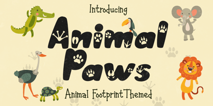 Animal Paws embodies fun, quirkiness and authenticity. This enchanting handwritten font features gorgeous animal-themed characters that will turn any creative idea into a true standout. Get inspired by its unique look and create gorgeous crafting projects!
 - Coconut Milk by Susan Brand Design,
$10.00 Coconut Milk Script is a fun new handwritten font with lots of personality. It contains multi-lingual support with accented characters for international Western European users, as well as a special double "tt" ligature and stylistic alternative.
 - Caramel Sky by Melonaqua,
$8.00 Caramel Sky is a naturally handwritten font that comes with 5 different styles. This design was inspired by blackboard menu penmanships found on coffee shops. A fun and spontaneous typeface suitable for various home or business projects.
 - Bomber Throw by Blankids,
$21.00 Introducing of our new product the name is Bomber Throw Graffiti Font, Bomber Throw inspired by graffiti style with a fun theme very good for graffity poster, Hip Hop music, kids poster, flyer, childrenbook, cartoon, comic etc
 - Tropical Drink by Sronstudio,
$23.00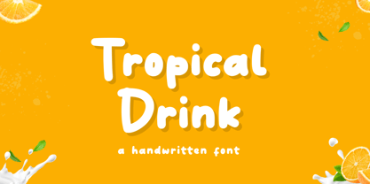 Tropical Drink – Handwritten Font is a fun display Font font, this font Is perfect for product packaging, product designs, label, photography, watermark, special events, or anything. Features: Uppercase and lowercase letters Multilingual, numerals, and punctuation Thank You!
 - Street Lord by Blankids,
$23.00 Introducing of our new product the name is Street Lord Graffiti Font, Street Lord inspired by graffiti style with a fun theme very good for graffity poster, Hip Hop music, kids poster, flyer, childrenbook, cartoon, comic etc
 - Funny munk by Sipanji21,
$15.00 Funny Munk - Cute and Thick display Font, Its friendly for design, kid store, seasonal party or banner, fitting a wide range of contexts. Add it to your creative ideas and notice how it makes them stand out!
 - Cute Lime by Sipanji21,
$10.00 Cute Lime is a bold and colorful display font. Its friendly feel makes this font incredibly versatile, fitting a wide range of contexts. Add it to your creative ideas and notice how it makes them stand out!
 - Aneska Kids by Ditatype,
$29.00 Aneska Kids is a display font. Made with a playful style, it brings a fun and chic typeface. Chalk Brush is best used for card, branding, logotype, and quotes. Features: - PUA Encoded - Multilingual Support - Numerals and Punctuation
 - Heywood by Elemeno,
$25.00Named for Algonquin Round Table wit Heywood Broun, Heywood is bold, but playful. The simplicity of the letters combined with the shifting baseline make this the least formal and most fun of The Algonquin Collection of fonts. - MTF Gosh Darn Trouble Maker by Miss Tiina Fonts,
$12.00 Gosh Darn Trouble Maker is a fresh and fun sans-serif font capable of adding a whimsical touch to your designs. Add it to covers, branding materials, packaging, or anything. You’ll love its fantastic legibility and alternates!
 - Western Wood Type JNL by Jeff Levine,
$29.00 Inspired by a sample of a vintage wood type supplied by a fan of Jeff Levine fonts, Western Wood Type JNL is a traditional Clarendon-style condensed typeface from the era of letterpress and the Old West.
 - MISQOT by !Exclamachine,
$9.99 MISQOT, with beefy proportions and fine details is a titling font with lots of extras: lowercase, international accents and special characters. The 1.1 release features improved inter-weight metrics, additional characters and 9 newly added essential symbols.
 - Boldka Script by Solidtype,
$14.00 Boldka Script is a bold connected script. fresh, casual and fun. Great font for creating headlines, logos & posters and more. Features Open type feature, including stylistic alternates, ligatures and International support for most Western Languages is included.

