10,000 search results
(0.033 seconds)
- DB Doodledeedoo by Illustration Ink,
$3.00DB Doodledeedoo is great for adorning a scrapbook page or adding a nice to touch to a card or invitation. Adds child like art to to give all your creations that fun home and family touch. - Mighty Bastion by Lemonthe,
$13.00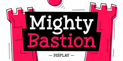 "Mighty Bastion" - an attractive and fun display font. Its classic and dynamic letterforms bring a unique character to your designs, making it ideal for logos & branding, headlines, magazines, posters, quotes, packaging design, labels, and much more!
 - Heavy Pitch by PizzaDude.dk,
$19.00 Fun packed comic style font. Especially made for commercial products such as all kinds of packaging, cereals, video games, candy, kids toys and alike. I added ligatures for double letters to avoid a repeating look. Enjoy!
 - Religiosity by Seemly Fonts,
$12.00 Religiosity is a cute and casual handwritten font. Its friendly feel makes this font incredibly versatile, fitting a wide range of contexts. Add it to your creative ideas and notice how it makes them stand out!
 - Lucky Skirt by Ali Hamidi,
$10.00 Lucky Skirt is a bold, fun, and playful display font. Its well-rounded and slightly chunky characters make this typeface an extremely versatile one! It can elevate the look of almost any of your beautiful creations!
 - Minio by Linecreative,
$16.00 Minio is a cubical mechanic, futuristc display. It's fun and groovy with a bold personality. Perfect for logo, Brand,title or anything your creativity takes you. - Uppercase and lowercase letters - Punctuation - Numbers - Multilingual (Latin Western Europe)
 - Janger by Creativemedialab,
$18.00 Introducing Janger, a bold and fun display font. Janger features a reverse contrast style with a retro and psychedelic look that’s simply ideal for design such as posters, t-shirts, branding, heading, titles and many more
 - Handy Organizer by Ali Hamidi,
$10.00 Handy Organizer is a fun and friendly display font. It can easily be matched to an incredibly large set of projects, so add it to your creative ideas and notice how it makes them stand out!
 - Campland by Magpie Paper Works,
$20.00 Campland from Magpie Paper Works is a rustic, hand-lettered, sans-serif font chock full of summer-camp fun. This Opentype font features decorative glyphs and interlocking borders, as well as a complete uppercase & lowercase alphabet.
 - Baby Pumpkin by Sronstudio,
$15.00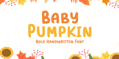 Baby Pumpkin is a fun display Font font, this font Is perfect for lproduct packaging, product designs, label, photography, watermark, special events or anything. Baby Pumpkin comes with uppercase and lowercase letters, multilingual symbols, numerals, punctuation.
 - Queen Anne Hill by Great Lakes Lettering,
$40.00 Queen Anne Hill is an modern Calligraphy style font with upright strokes and bold flourishes. Revealing the styling of fine artist and calligrapher Alissa Mazzenga, this font communicates refinement with a hint of playful artistic individualism.
 - Gray Light by Ali Hamidi,
$10.00 Gray Light is a fun and friendly brushed display font. Whether you’re looking for fonts for Instagram or calligraphy scripts for DIY projects, this font will turn any creative idea into a true piece of art!
 - New Goal by Seemly Fonts,
$14.00 New Goal is a fun and quirky handwritten font. It can easily be matched to an incredibly large set of projects, so add it to your creative ideas and notice how it makes them stand out!
 - Kalash by Tomass Gavars,
$7.00 Kalash is minimalistic monospaced font family. Each glyph has eased 45° angled cut and has the right properties to fit with various styles. Combine multiple weights for best results. Each font includes 230 Glyphs & Latin support.
 - Pixettish by Aah Yes,
$4.95Pixettish is a fun-font, a slightly ornamental sans serif typeface with curls to the upper and lower case characters. The zip files contain both OTF and TTF versions of the font - install one version only. - Things To Remember by Orenari,
$14.00 Things To Remember is a chill and friendly display font. Its natural and unique style makes it incredibly fitting to a large pool of designs. Level up your creative project with this thin yet memorable font.
 - Graffiti Xenoa by Nirmana Visual,
$22.00 Graffiti Xenoa is a fun, urban-style display font. This font is suitable for designs like logos, advertising, apparel, jerseys, sportswear, skateboard designs, and more. Take your concepts to the next level with this stunning font!
 - Snowy Owl by Ali Hamidi,
$10.00 Snowy Owl is a cute, joyful and fun display font. Whether you use it for cartoon related designs, children games or just any creation that requires a lovely touch, this font will be an amazing choice.
 - TXT Personality by Illustration Ink,
$3.00You'll find this the best font to inspire your creativity. It's simple and clever, with tons of personality. It's a good choice for school newsletters, kids' party invitations, and scrapbook pages emphasizing your children's great accomplishments. - Piambis by Aga Silva,
$24.99 Piambis Family has been featured in "Slanted #28 Contemporary Typefaces 2016/17" This handwritten font family that boasts great variety of glyphs - many of which are fancy alternates for standard letters (click on text written in Piambis below, then click on “Glyphs”). This font is designed so the letters are available via standard programs ie. Word. It is recommended however that you use professional software such as Photoshop or Illustrator to make your work easier as there are over 1600 glyphs in each of the fonts included in Piambis family. About the family: The chief difference between the files in the family are finishes to the capital letters (in all languages) and appearance of the lowercase “f”. The fonts support all languages that use latin script - yes - Vietnamese (Tiếng Việt) and Pinyin is also available.
 - Roundhand BT by ParaType,
$30.00 Roundhand was created by Matthew Carter in 1966 on the basis of handwriting by Charles Snell, an English calligrapher of XVII-XVIII known in particular by his "The Pen-man's Treasury Open'd" written in 1694. The typeface has continuous cursive shapes with oval aspect, high contrast emphasized by abrupt transitions from thin to thick and regularity of slope. Its capitals are often used as initials in combinations with other typefaces. The current digital version of the typeface has 3 styles of different weights. Roundhand is clear and easy to read and is well-suited for medium size texts and headlines. It will work well in invitations, menus, packaging, and advertising accentuating elegance and the subtle nature of the content. The Cyrillic version was developed by Vladimir Yefimov and Isabella Chaeva. Released by ParaType in 2013.
 - Eris Pro by DBSV,
$120.00 Rolling gemstones… The name "Eris" is again borrowed from Greek mythology, is related to the myth "the apples of Hesperides" which were gold and one of them got the Erida!!! More about this myth can be found on the web... And in this font (as in one section in the "Cyceon" font) I have mixed in the lower case with the capitals in many letters.I tried here to give a different illustration in lowercase letters, simply because of whims or because the monotony is tiring me!!! One can also mix here with two levels to get a third color depiction using the “ErisPro-Black” with “ErisPro-Strap” or “ErisPro-BlackIt” with “ErisPro-StrapIt” This series is composed and includes twenty-four fonts with 658 glyphs each, with true italics and supports Latin, Greek and Cyrillic.
 - Verse Sans by Hubert Jocham Type,
$39.00 In 2006 the art director of Emotion, a women’s psychology magazine, asked me to design a copy typeface for them. Before I actually got the job I started to work on a serif. I wanted it to be feminine but still clear and modern. On one hand there are the floral round elements and on the other hand the angular serifs. In the composition I wanted the two extremes to work together. All the other elements had to be harmonized. The proportions needed to match the magazine’s requirements. The ascenders and descenders are short enough to work in narrow columns but long enough to work in small sizes. As you can imagine, the emotion-job never happened. In copy you should not get heavier than Heavy. Extrabold and Ultrabold work best in display.
 - Andaluz by Storm Type Foundry,
$38.00 The land of beauteous angels, Andalucia, connects different cultures with a curved arch. Almond trees bloom there in February, and orange trees grow in the heavenly courtyards of Gothic churches. A Catholic cathedral stands in a mosque, Moorish fountains gush with water, and ornate arcades are reflected in the mirrors of the Alhambra pools. Fishing villages have long been busy with tourism, but there are remote pubs where only locals go for fresh fish. Beer is served in wine glasses, and with each one you get a piece of cheese, shrimp, or a few slices of specially smoked ham, sitting on the bar counter. Here, in the off-season, it is possible to gaze into the distance towards the African shores and sketch watercolors for the diary completely undisturbed.
 - Omnibus by Linotype,
$29.99Omnibus is one of my absolute favourites. My intention was to design a typeface as easy to read as Baskerville, without being a copy of it. It is easy to see that I was influenced by Baskerville, e.g. in the open lowercase g. I had in mind to design a Baskerville with the looks of the Baskervilles used in earlier typesetting. I put aside those plans for a while (but fulfilled them later on) and dedicated myself to Omnibus. In both cases my aim was to achieve a typeface with darker looks than the most used Baskerville. The name has nothing to do with buses, it is Latin with the meaning of for all". It is also in the name of Omnibus Typografi. Omnibus was released in 1993. - 1689 GLC Garamond Pro by GLC,
$42.00 This typeface family was inspired by a set of fonts, designed in the Garamond style, used for an edition of Remarques critiques sur les œuvres d’Horace by “D.A.E.P.”, published in Paris in 1689 by two different booksellers: Deny Thierry and Claude Barbin. We can see some differences in comparison with our “pure” Garamond (see our 1592 GLC Garamond), particularly in the lowercase of the Normal style and the uppercase of the Italic. Unfortunately, we know neither the name of the punchcutter, nor that of the printer. This complete font set contains small caps, fractions all the way up to 1999/1999, historical and standard ligatures, and all of the fleurons contained in the edition (Normal style only). The alphabet covers all Western, Eastern and Central European languages (including Celtic diacritics) and Turkish.
 - Martin by profonts,
$41.99 Martin, a condensed semi-serif with rounded edges and friendly serifs, shows its charme best in short, pointed sentences, in headlines set in about 20 to 36 p. The playing with serifs in a condensed, very characteristic type design is attractive and the technical skill is convincing. More styles are planned. The idea was to try to apply a given design criteria (also see Volker Schnebel's Marita and Manuel fonts) to every single character. In other words, start with a character and develop all of the others from it. This is quite easy for some characters but extremely difficult for others. This process generates creativity and the characters move away from the initial constructed sketch. Together in a typeface, the individual characters are now all of a piece and character.
 - Ongunkan Danish Futhark by Runic World Tamgacı,
$40.00 THE DANISH RUNES Prior to 500 AD the 24-rune Elder Futhark was used in Denmark. From 500 AD to 800 AD there were many transitional futharks, reflecting a change from the 24-rune Futhark to the 16-rune Futharks. By the end of this period, the 24-rune Futhark went completely out of use and the 16-rune Futharks had prevailed. From 900 AD some of the runes changed, visually and phonetically. This occurred again about 950 AD and 1100 AD due to language changes. Runes dated to 1300 AD show evidence of being influenced by the Latin alphabet. Runes found in Skåne, Halland and Blekinge in Sweden, and runes found in Schleswig-Holstein in Germany, is counted among Danish runes, because in the Runic period, this was Danish land.
 - Pergamon by URW Type Foundry,
$39.99 The Pergamon series is a creation of Alfons Schneider (1890–1946) and was issued by the foundry of Ludwig Wagner in Leipzig in 1937/1940, though the website of the Klingspor-Museum says that several of the faces were probably produced after the death of Schneider. This digital version is extended with the necessary OT characters and signs, while also the “символы кириллицы” are added. Also, in addition to the members of the family designed by Schneider, regular, italic, bold and bold italic extended versions were produced. The specimens of Ludwig Wagner stated emphatically: “In allen Graden werden beide K K geliefert”, so these two forms are in all the faces, while the two condensed members also have k k, as the specimens said that this alternative character was also in these two faces.
 - Alonzo by Fenotype,
$25.00 Alonzo is a modern cosmopolitan who speaks several languages fluently. Alonzo comes in six weights and two widths, as well as corresponding italics, making a total 24 styles. Alonzo is an elegant, simplistic, high-contrast sans that is at home in high-end fashion and cultural environments, as well as in the world of restaurants and nightclubs. While Alonzo Condensed is more illustrative and works best in display use, headlines, logotypes, labels and all that, Alonzo Regular works in a wider range of contexts, from body text to editorial and catalogs and more. Alonzo is equipped with several OpenType features such as oldstyle figures, small caps, Standard Ligatures, Superior and Inferior Figures. In addition Alonzo has Stylistic Alternate lowercase "a" with round Bowl. Me llamo Alonzo. Mucho gusto, piacere di conoscerti, nice to meet you!
 - Chorus by Soneri Type,
$23.00 Chorus is a collective effort to sing in harmony. Similarly, each letter is designed to reflect harmony when used together to form a letter, sentence or paragraph. Letters like B, D, P and R have curved stroke (instead of straight line) while joining vertical stem. Letter K, k, and R have similar disjoint point in middle and unique plus stylish curve at foot. Letter C and G has distinct horizontal cut at top as compared to other letters in typeface e.g. S. Letter like b, h, m, n, and p have consistent stroke joint style with vertical stem. Ink traps in various letters are designed such that they blend with the letter form at certain degree instead, getting emphasised. The family comes in various styles in weight and width.
 - Nt1972 by Harvester Type,
$20.00 NT1972 is a display font from the future. Font in the era of cyborgs and cyberpunk. This is a sharp, brutal font with futuristic shapes. It combines style and functionality, so the font will look great in your futuristic design in any environment, be it a logo or a merchandize. The angle of inclination in each glyph is 50 degrees, all glyphs also have the same stem sizes to create a good font system. All this is done to get a good futuristic cyberpunk font that will give style to your design, be it a logo, poster, banner, merchandize, title, packaging or product design. In addition to all this, there is support for many languages and alternative characters. In case of any questions, problems or suggestions, please email: bunineugene@gmail.com
 - 1651 Alchemy by GLC,
$38.00 This family is a compilation created from a Garamond set in use in Paris circa 1651, but similar to those, eroded and tired, that were in use during centuries to print cheap publications, as well as in Europe than in America, and from a large choice of printed symbols—all specially redrawn—used for alchemical, pharmaceutical and astrological books, covering 1550 to late 1800s period. Each alphabet is doubled by a slightly different one, and a special OTF encoding allows to give an irregular effect with never the same twin letters in a single word. The Normal style is enriched by small caps, and the Italic style by Swashes. A lot of symbols, too, are given twice with differences. This font may be used with our calendar specialized 1689 Almanach.
 - Ongunkan Khazar Rovas A by Runic World Tamgacı,
$50.00 Khazar, member of a confederation of Turkic-speaking tribes that in the late 6th century CE established a major commercial empire covering the southeastern section of modern European Russia. Although the origin of the term Khazar and the early history of the Khazar people are obscure, it is fairly certain that the Khazars were originally located in the northern Caucasus region and were part of the western Turkic empire (in Turkistan). The Khazars were in contact with the Persians in the mid-6th century CE, and they aided the Byzantine emperor Heraclius (reigned 610–641) in his campaign against the Persians. Although the Khazar Empire had a secular administrative structure, the administrative staff chose the Jewish religion. The Khazars are the only Turkish state that converted to Judaism.
 - Vista Sans by Emigre,
$69.00 The concept for Vista began when I sketched a few characters in a notebook while staying in Sumatra on a one month holiday. I wanted to design a typeface for text and display that would retain some of the characteristics of the idiosyncratic shop signs that surrounded me in Sumatra. - Xavier Dupré The result is a comprehensive family spanning six weights, complete with small caps and lively alternate forms, striking a healthy balance between functionality and expressiveness. Each of the six weights includes alternate, small cap and italic variants for a total of 36 fonts in the family. They are available in a full volume of 36 fonts, or in four packages. The packages are grouped into two sets of contrasting weights, with the alternates and small caps divided into separate packages.
 - Odense by Linotype,
$40.99Franko Luin, Odense's designer, on this typeface: With Odense I entered the field where Optima reigns in royal majesty. The first question I received was, in fact, why I designed another Optima. Look closely: Odense has as much in common with Optima as Garamond with Baskerville. Am I right? Odense Neon is a special variant that can be used for logos or single words. I had the idea for it when I noticed that the neon tubes in a sign over a store only partially followed the characters. The name comes from the Danish town Odense, the town of the famous storyteller Hans Christian Andersen, author of, e.g., 'The Little Mermaid.' Odense is also the place where the first book in the Nordic countries was printed, the 'Breviarium Ottoniense', in 1482. - Fellowship by Canada Type,
$24.95 Named in tribute to the members of the American Typecasting Fellowship, this font is an original expression of Jim Rimmer's left-handed calligraphy. It was designed and cut in 24 p in the early 1980s, then cast as foundry type on Jim's own Thompson typecasting machine. This alphabet exhibits classic semi-italic text tension, with sqaurish minuscules and hybrid renaissance majuscules. Jim's unique sense of restrained but attractive typo-calligraphic creativity puts on quite a show here. Fellowship was updated and remastered for the latest technologies in 2013. It comes with plenty of built-in alternates and ligatures. Its glyphset contains over 420 characters, and supports the majority of Latin-based languges. 20% of this font's revenues will be donated to the GDC Scholarship Fund, supporting higher typography education in Canada.
 - Razom Script by DizajnDesign,
$39.00 Razom Script is a typeface with deep roots in pointed brush calligraphy that takes advantage of current font technology to go beyond handwriting and reach new limits. A successful blend between printed and handwritten letterforms is visible when comparing upper and lowercase. The weight of the typeface evolve in a way that pushes the limits of a script typeface to suggest new uses. Normally, families are developed in weights, not proportions. Also, having several weights in a script family is rather rare. But in Razon Script, as the fonts gain weight, big differences show up in the font outlines: the thin weight looks soft and delicate but as we examine darker variables, they also seem to get broken. The counters of the letters rotate from vertical to horizontal during this process.
 - Vocaloid - Personal use only

- EDB Indians - Unknown license


