10,000 search results
(0.019 seconds)
- Merry Brook by Letterhend,
$19.00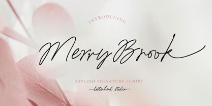 Merry Brook is a beautiful signature script based on manual hand writing. The stylistic alternate, ligatures and the tick and thin stroke kk make this font looks a real hand writing instead of typing a font. This type of font perfectly made to be applied especially in logo, and the other various formal forms such as invitations, labels, logos, magazines, books, greeting / wedding cards, packaging, fashion, make up, stationery, novels, labels or any type of advertising purpose.
 - RT Dyans by Veteran Type,
$14.00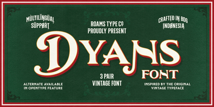 Dyans Font Family is a type of font that is inspired by vintage handwriting art that is often used in signwood, signpainting and others, usually this font is very suitable for manual hand lettering or hand painting art. This font uses the open type feature so you can explore alternative types in certain letters. Enjoyed This font conssist of: Stylistic Set Alternate Character Multilingual Support Math Symbol Numeral & Punctuation Hope your enjoy using this font Thank You.
 - QARVIC by Alit Design,
$12.00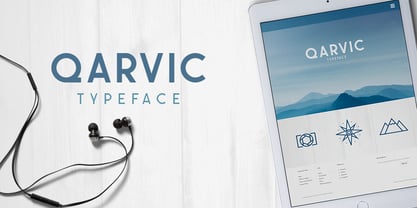 Introducing QARVIC TYPEFACE, a simple and beautiful font made with persistence and passion. QARVIC has a unique character when compared with the others sans serif font, it has two types of letters (plain type and type grunge) and there also has an outline QARVIC icon characters. QARVIC typeface is suitable for simple logo design, website header, wedding design, badges, menu fonts for website, to design fashion and others that have a minimalist and simple concept. Thank you and enjoy :)
 - Catalina Shiba by Suza Studio,
$13.00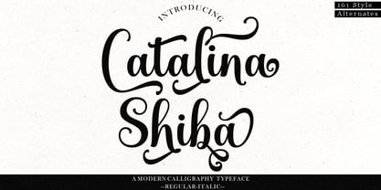 Catalina Shiba with alternative characters is divided into several Open Type features such as Swash, Stylistic Sets, Stylistic Alternate, Contextual Alternate. The Open Type feature can be accessed using Open Type savvy programs such as Adobe Illustrator, Adobe InDesign, Adobe Photoshop version of Corel Draw X, and Microsoft Word. And this Font has provided PUA unicode (custom coded font). so that all alternative characters can be easily accessed in full by a craftsman or designer. Thank You.
 - Parangon by ParaType,
$25.00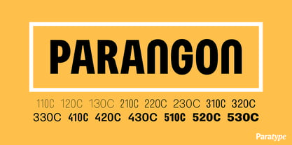 PT Parangon™ was designed in 1986-2002 by Anatoly Kudryavtsev and licensed by ParaType. This type family belonges to Neogrotesque subclass of closed Sans Serif. Letterforms of lower case is based on the tradition of 1710 Civil type and some modern Italic types. The family has a lot of weights and styles including Extra Condensed, Condensed, Regular, Extra Light, Light, Bold, Extra Bold. For advertising and display matter. Also it can be used for texts in advertising magazines.
 - Chartha by Amarlettering,
$30.00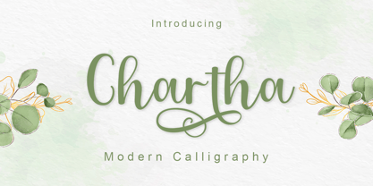 Chartha come with 250+ glyphs. The alternative characters were divided into several Open Type features such as Swash, Stylistic Sets, Stylistic Alternates, Contextual Alternates. The Open Type features can be accessed by using Open Type savvy programs such as Adobe Illustrator, Adobe InDesign, Adobe Photoshop Corel Draw X version, And Microsoft Word. And this font has given PUA unicode so that all the alternate characters can easily be accessed in full by a craftsman or designer. Email : amarlettering@gmail.com
 - Hello Falisha by IM Studio,
$15.00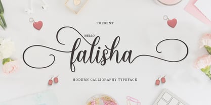 Hello Falisha amazing script comes with 315+ glyphs. Alternative characters are divided into several Open Type features such as Swash, Stylistic Sets, Stylistic Alternates, Contextual Alternates. The Open Type feature can be accessed using programs that understand Open Type such as Adobe Illustrator, Adobe InDesign, Adobe Photoshop Corel Draw X version, and Microsoft Word. And this font has provided PUA unicode (custom coded font). so that all the stunt doubles are easily accessible to the craftsman or designer.
 - Mulidey by Amarlettering,
$15.00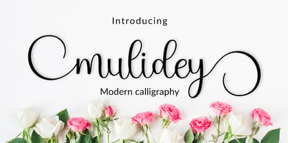 Mulidey come with 200+ glyphs. The alternative characters were divided into several Open Type features such as Swash, Stylistic Sets, Stylistic Alternates, Contextual Alternates. The Open Type features can be accessed by using Open Type savvy programs such as Adobe Illustrator, Adobe InDesign, Adobe Photoshop Corel Draw X version, And Microsoft Word. And this Font has given PUA unicode (specially coded fonts). so that all the alternate characters can easily be accessed in full by a craftsman or designer.
 - Isbellium Pro by No Bodoni,
$35.00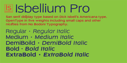 Isbellium is a sans serif version of Dick Isbell’s Americana type, designed in 1967 and the last type cut in metal by the American Type Founders Co. (ATF). Isbellium retains the large x-height, open character, wide stance and elegance of Americana, but with a quieter voice and polite authority. Isbellium is a display face with broad Latin support along with small caps, fraction support and other typographic niceties are included in the ten font family.
 - Calla Script by Great Lakes Lettering,
$30.00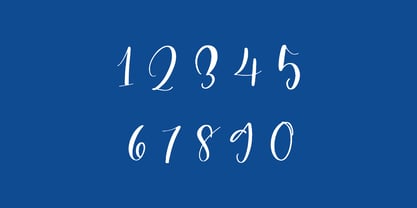 Calla is a scripted typeface with an interesting personality. Each letter was created many times so you can get a truly distinctive look to your designs. Notice when you type with open type feature switched on, your letters will bounce around and change as you type? This feature ensures you get a new version of each letter throughout the words you use! Want to get even more custom? Pair all caps words with your lowercase words to create hierarchy!
 - Airates Script by Maculinc,
$20.00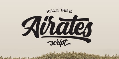 Airates, this is my first font, as the name suggests and because this is my first font that I introduced to the world. Inspired by a film where someone who loses all and returns to struggle to find meaning in life that actually clings to the edge of the world and that's where the beginning of a story seems to be reborn. Airates Script Fonts is a typeface thick and easy to read so comfortable to wear .You can use it as a logo, badge, insignia, packaging, headline, poster, t-shirt/apparel, greeting card, business card, and wedding invitation and more. The flowing characters are ideal to make an attractive messages to your taste. mix and match with a bunch of alternative characters to fit your project.It will be more interesting if you add swash / alternative swash. The alternative characters in this font were divided into several OpenType features such as Stylistic Alternates, Ligature and Ligature Alternates. Mail support : maculinc@gmail.com Thank you! Maculinc
 - Lorette by Stiggy & Sands,
$39.00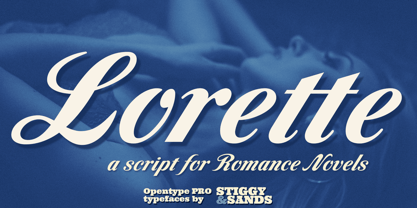 A Vintage Script for Romance Novels. Lorette began as a digitization of a film typeface from LetterGraphics known as "Laurel". The original specimen included standard Capitals, Lowercase, Numerals, and minimal punctuation, for a bare bones character set. We've fleshed out Lorette to include a full standard character set, an extended international set, Stylistic Alternates, Ligatures, Swash Capitals, etc. so it can be a powerhouse script typestyle. See the 5th graphic for a comprehensive character map preview. Opentype features include: - Full set of Inferiors and Superiors for limitless fractions. - Tabular, Proportional, and OldStyle figure sets. - A collection of Ligatures mainly revolving around the f character. - Discretionary Ligatures for ct and st combinations. - 3 Stylistic Alternates for variations of some of the lowercase characters. - a Swash feature for swash alternates of the Capital letters. Approx. 993 Character Glyph Set: Lorette comes with a glyphset that includes standard & punctuation, international language support, and additional features.
 - Pratfall by Jeff Levine,
$29.00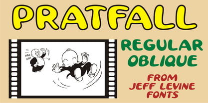 For 138 years, the Milton Bradley Company (of Springfield, Massachusetts) has been the leading producer of board games, toys and educational/instructional materials. The company was acquired by Hasbro in 1984. It was merged with the also-acquired Parker Brothers in 1991 and became Hasbro Games until both brand ID's were dropped in 2009. “The Moving Picture Game” was a 1920s-era board game created by Howard R. Garis (credited as ‘the author of the Uncle Wiggily game’) and capitalized on the still-new motion picture industry. On top of the storage box is the game’s name – hand lettered in a free-flowing Art Nouveau sans serif that more closely resembles the titles found within animated cartoons or in the ‘bubble letters’ a school child doodles on notebook paper. Recreated as a digital typeface, Pratfall JNL (named after the slips, trips and falls taken by silent era film comedians) is available in both regular and oblique versions.
 - Eurocine by Monotype,
$31.99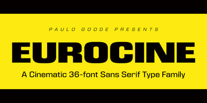 Eurocine is an expansive display typeface – a square sans serif that’s perfect for titling, headlines, logotype and branding. This 36-font family is packed with features to make it supremely versatile. This typeface attempts to capture the mood of movie credits from European Cinema in the 1970s, with a focus on Giallo films in particular. In terms of style, Eurocine sits somewhere between Walter Baum and Konrad Friedrich Bauer’s Folio, and Aldo Novarese’s Eurostile. With Eurocine you get a more versatile typeface by way of its small caps and additional stylistic sets giving you extended caps, extended small caps, and petite caps, as well as upper and lowercase unicase. Creating typographic masterpieces of your own will be so much easier! Key features: • 6 Weights in Roman and Oblique • 3 Widths – Narrow, Regular, Wide • Extended Caps • Small Caps • Extended Small Caps • Petite Caps • Unicase • Old Style Figures • European Language Support (Latin) • 1,200 glyphs per font.
 - Wolfsblood by Monotype,
$29.99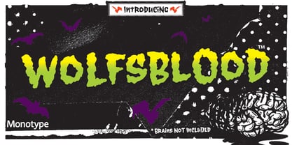 Wolfsblood is a new display face by Jim Ford, adapted from hand-lettered logos spawned by punk rock bands like The Misfits and Bad Brains. The style can be traced back further to Hollywood and the explosion of low-budget exploitation, horror and sci-fi films, which also had an influence in punk rock. Wolfsblood captures this bizarre dark-spirited lettering which has become a staple in the designer‘s work for bands and posters. The Wolfsblood font has an expanded character set with borders, dingbats (yes, Bats!), and contextual ligatures programmed to give the typeface a random appearance by default. As with some of Jim‘s other typographic experiments, Wolfsblood encourages the designer to play with upper and lowercase, and mixed-case settings, to replicate the decisions that a lettering artist might make. Wolfsblood is great for logos, posters, headlines and short bits of text, and will add a fun, aggressive energy to your dark and other-worldly creations.
 - Quandor by Stiggy & Sands,
$29.00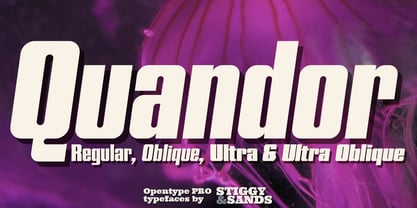 The Quandor Family began as a digitization of a film typeface from LetterGraphics known simply as "Impacta". The original specimen included standard Capitals and Lowercase, as well as a Biform character set. We've fleshed out the original style and added an Oblique to the family, but we just couldn't leave it alone at that, and beefed it up to include an Ultra Black and Ultra Black Oblique style as well, because uber heavyweight font styles are the bees knees. Chocked full of features, including Biform alternates, SmallCaps, and SmallCaps Biform alternates, this family is built to perform. See the 5th graphic for a comprehensive character map preview. Opentype features include: - Full set of Inferiors and Superiors for limitless fractions. - SmallCaps feature. - Tabular and Proportional figure sets. - A small collection of Standard Ligatures. - Stylistic Alternates for Biform alternates and SmallCaps Biform alternates. Approx. 818 Character Glyph Set: Each style of Quandor comes with a glyphset that includes standard & punctuation, international language support, and additional features.
 - Art Nouveau SCF by Scholtz Fonts,
$21.00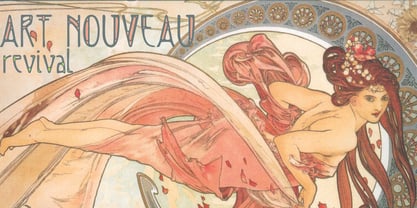 The Art Nouveau styles of the the turn of the 20th century (1890 - 1905) exhibited a bold approach to organic lines and lavish decoration. This new style was spread throughout the world and helped usher in a new era that led to modern art and design. Art Nouveau SCF is strongly influenced by the style of decoration and typography created by Rennie Mackintosh as well as the Art Nouveau movement in general (with particular reference to Gustave Klimt and Alphonse Mucha). However, it differs from much of the art nouveau typography in that it largely avoids the use of straight lines in its letter forms. It is a decorative, romantic font and its subtly curved bolder lines contrast with delicate tracery to create an intricate pattern of organic flowing shapes. Use Art Nouveau SCF for: -- posters -- wedding invitations -- advertising material for clothing and beauty products -- Music CD covers and advertising media -- Film advertising media
 - Hekba by Twinletter,
$17.00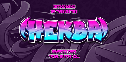 Hekba is a graffiti font with gorgeous shapes and blends that are absolutely one-of-a-kind, as well as a distinctive theme that helps this typeface stand out and be powerful. Use this font to make your project look trendy, cool, and fun. Of course, your audience will remember your project because it looks wonderful. So, what are you waiting for? Get it right away! This graffiti font is great for product logos, poster titles, headlines, packaging, film titles, logotypes, gorgeous writing, and trendy graffiti designs, among other things. Of course, if you utilize this font in your numerous creative projects, they will be perfect and outstanding. Use this typeface right away for your one-of-a-kind and remarkable projects. What’s Included : Standard glyphs Works on PC & Mac Simple installations Accessible in Adobe Illustrator, Adobe Photoshop, Adobe InDesign, even work on Microsoft Word. PUA Encoded Characters – Fully accessible without additional design software. Fonts include multilingual support
 - Horror Graffiti Cholo by Biroakakarati,
$10.99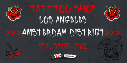 This handwritten font is inspired by the cholo calligraphy of graffiti artists. It has a scary design, which is suitable for horor film posters and at the same time for signs and tattoo designs. It has an original style an effect font also available in a color version with drops of blood or paint to give a more lively touch. Try using it for your halloween party invitations or for your tattoo designs, for scary greeting cards. I used the word "Cholo" because this lettering in inspired by cholo-graffiti culture in Los Angeles in 70's years. The one of the best rappresent is Charles "Chaz" Bojorquez the father of cholo-lettering. Cholo because i think that in 70's in Los Angeles neighborhoods where graffiti-culture grow up there was a persons whit a mixed multicultural connexion and Chaz is one of them. Cholo-graffiti or Cholo-lettering is a specifing style o lettering. I think this is a good keyword for this lettering.
 - Grit Gothic by Baseline Fonts,
$39.00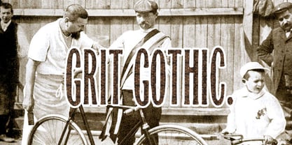 You can hear the wheels of imagination turning within this font - Grit Gothic, from Grit History™ B Series, by Baseline Fonts. Both highly stylized and very legible, the extreme height of this font can give even a goblin vertigo. Extended X heights create lowercase that adventurously reach up through extended shoulders and spines while persistent grunge warns of skinned knees that may result along the climb. It’s easy to envision children’s rallying cries in Grit Gothic, perfect for book titles, film titles, poster headlines, and any other epic that needs a strong font with a dark edge of mystery and wonder. This font is rife with personality, including large and daunting punctuation, whittled wood-look vertical bars that berate and argue with beveled bowls, ascenders that attempt to intimidate one another with their height variances, and tittles that bully one another, as they're a variety of context dependent sizes. Grit Gothic is available in Regular and Bold with full Greek-lettered foreign language support.
 - Saviko Sans by Luhop Creative,
$12.00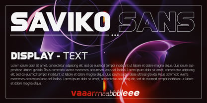 Saviko Sans is a geometric sans font family who dares the modernism and the harmony. with very open terminals that makes this font family elegant, friendly and contemporary. Saviko Sans has been designed with a higher a-height than other fonts in its class to make tiny readability more obvious in any use situation. It will be ideal for use in small sizes such as business cards or mobile applications. The family contains 23 weights from Thin to Extra Black and is ideally suited for film and TV, advertising and packaging, editorial and publishing, logo, branding, music and nightlife, software and gaming, sports as well as web and screen design. Saviko Sans provides advanced typographical support with features such as ligatures, alternate characters, case-sensitive forms, fractions, super- and subscript characters, and stylistic alternates. It comes with a complete range of figure set options – oldstyle and lining figures, each in tabular and proportional widths.
 - Pani Sans by Alessio Laiso Type,
$19.99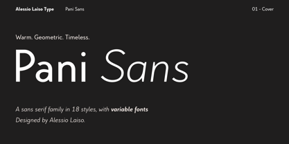 Pani Sans is a contemporary type family in 18 styles designed by Alessio Laiso. It takes inspiration from Italian rationalist and art deco typefaces, bringing them into the present with the mix of its reliable geometric structure and distinctive warm personality. The italics add to the unique character of the family by featuring distinguishing calligraphic touches. Pani Sans is fully equipped for intense professional use for both print and digital applications. It supports 219 languages, covering 100% of the Latin Plus character set, and it ships with powerful OpenType features including beautiful small caps, ligatures, stylistic alternates, fractions, tabular figures, old-style figures, and more. The variable fonts included in the family package allow you to pick the perfect weight, for unlimited design freedom.
 - Gasco by Joelmaker,
$30.00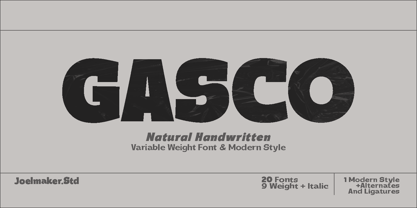 GASCO is a collection of natural handwritten letters inspired by the retro style of the 70s and 80s, the style seems to take us a little back to the manual era, this type of letter is very unique, you can change from modern to retro or vintage style with a combination of a collection of alternates so it is ready to help To make your design look elegant, in the image shown you can see what this letter can do. There is a condensed version and an italic version of the font included 9 Upright and 9 Italic weights, ranging from Sheer to Black, all coming in 1 Outline style. This font also comes with 1 more elegant display style.
 - Scotland Stories by Redy Studio,
$17.00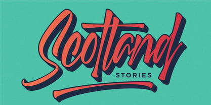 Scotland Stories | Modern Script Scotland Stories is a Modern Script with fast brushstrokes that make it look elegant and unique. It has a signature style that makes it perfect for logos, branding, print, apparel, and much more. There are also 2 different types: regular, which has no variations, and stamp, which includes a pattern as shown above. Scotland Stories is the perfect font to give your projects a very special look. Scotland Stories features: A full set of upper & lowercase characters Numbers & punctuation Ligatures Stylistic alternate Swashes PUA Encoded Characters – Fully accessible without additional design software. Feel free to give me a message if you have a problem or question. Thank you so much for taking the time to look at one of our products.
 - Mixcross by Din Studio,
$29.00 Mixcross is a display font in the capital letters particularly created in a racing theme to express courage and power, which relates to the theme of racing. It is frequently applicable in 1) titles either to highlight the emphasizing phrases or to attract readers’ attention, and 2) large-sized texts owing to the unique sizes and shapes. Additionally, Mixcross provides interesting features to help designers improve their design products. Features: Multilingual Supports PUA Encoded Numerals and Punctuations This font type works best for any design projects, for instance, posters, banners, logos, book covers, headings, printed products, merchandise, social media, and so on. Find out more ways to use this font by taking a look at the font preview. Thanks a lot for purchasing our font. Happy designing.
 - Multipolar by MYSTERIAN,
$9.00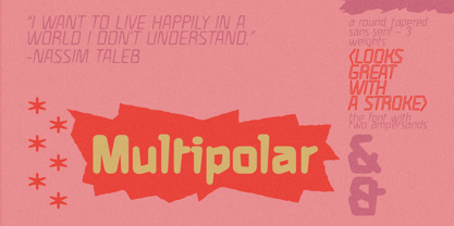 This typeface was designed as the house style by and for design studio Mysterian. It was drafted and completed during most of 2020. The intention of the design of the forms was to develop a unique signification in the mind, but one that could have potential relevant associations such as with sci-fi. The solution, brought along with a fascination with this rarely seen pattern in type, was to taper round forms. The name 'Multipolar' was inspired by the term used by game theorist Daniel Schmachtenberger, which is a kind of event that seemed relevant to the Covid-period in which the font was made. Alternate characters include: Two Ampersands Upper and Lowercase PI Upper and Lowercase Eszett Latin Characters
 - Adelbrook by Vibrant Types,
$36.00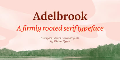 Adelbrook is a dynamic serif typeface that keeps calm. It enriches text with the archaic structure of humanist type, because its characters arrange in a harmonious rhythm with a dynamic stroke, asymmetric serifs and stems that lean in the direction of reading. These characters have gravity and are firmly on the baseline. The tapered stems define a heaviness that end in emphasized foot serifs. Actually all the details are heftier the lower they are. This is particularly evident in a subtle vertical hairline variation, light or unapplied head serifs, and clipped upper dots. The clearness of the semi-serif italics with a brushy nature integrates perfectly in a subtle way. All these details result in a sophisticated text typeface with a sharp contemporary design.
 - Hello Belinda by AF Type,
$10.00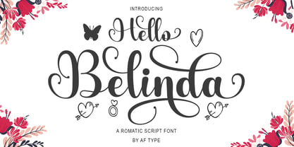 Hello Belinda is a beautiful modern calligraphy typeface, I hope you will be interested in this font, if you want to use it for your work. This font can be used easily and simply because there are many features in it. contains a full set of lowercase and uppercase letters, a wide variety of punctuation marks, numbers, and multilingual support. Hello Belinda is very suitable for the design of today's growing market, this font has a stylish, trendy, natural and soft font, with this font you can take advantage of every opportunity of the moment is a great way to highlight the best party celebrations, because this font will be support for purposes such as wedding invitations, branding, parties, graduations, birthdays, gatherings, etc. Thank You, AF Type
 - Edison Swirl SG by Spiece Graphics,
$39.00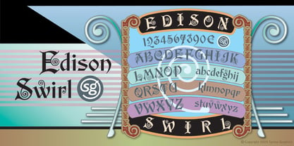 Edison Swirl, with its terminals majestically looping and twirling in a circular fashion, quickly takes us back to the Victorian era of type. This unusual fancy face, which dates back to the early 1900s, distinguishes itself by employing splayed M & N caps. Some letterforms also contain double cross-strokes for added interest. Edison Swirl is full of ornament and detail which creates a truly striking pattern of intrigue and delight. Edison Swirl is also available in the OpenType Std format. Some new characters have been added to this OpenType version. Advanced features currently work in Adobe Creative Suite InDesign, Creative Suite Illustrator, and Quark XPress 7. Check for OpenType advanced feature support in other applications as it gradually becomes available with upgrades.
 - Gemulir by Twinletter,
$18.00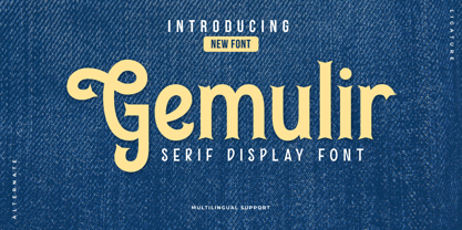 Gemulir is the embodiment of the beauty of classic serif fonts. With smooth lines and elegant character shapes, this font brings a timeless and classy look to any project. Gemulir gives you the ability to create luxurious and memorable documents, promotional materials or web designs. Gemulir's key features include its ability to customize various types of projects. From use in formal documents to use in branding designs, this font always provides a consistent and professional appearance. Gemulir is the perfect choice for those who appreciate classic beauty in design. With the ability to convey messages elegantly and powerfully, this font will take your projects to the next level. So, don't hesitate to choose Gemulir and let your designs shine with classic elegance.
 - Black Drum by Coniglio Type,
$19.95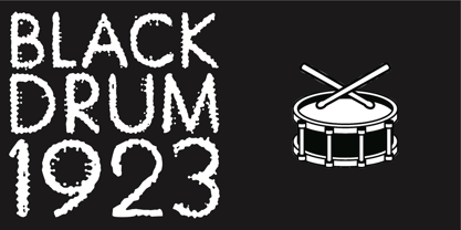 Black Drum is a rare revival typewriter face, made digital from analog samples gathered with great care by Coniglio Type. A time and place; type and life. Black Drum is contemporary designer type, made from the struck steel hammers of an Art Deco Period san serif face transferred from a mechanical 1926 custom editor Royal Portable typewriter. Anna Conroy of Type Heritage, LLC, Philadelphia comments on Black Drum and its new place in time today: “Wow! nice lookin’ face Joseph! —Perfect, somewhere between Cable; [Rudolph Koch, 1927] (which was about the first transatlantic telegraph cable) with its raised x-height; and Futura [Paul Renner, 1928]. Yup, it has that great “Monopoly Game” question mark -- and all on a period-piece typewriter! You should have no trouble grafting that sorely needed Euro symbol.” –And he very well did! Author: Joseph Coniglio Producer: Coniglio Type MyFonts debut: October 2021
 - HWT Artz by Hamilton Wood Type Collection,
$24.95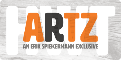 HWT Artz is the newest wood type to be cut at Hamilton Wood Type and Printing Museum. It was designed by venerable type designer Erik Spiekermann exclusively for his own print studio (P98a in Berlin), specifically to be cut into large size wood type. The digital version is being offered to the general public with proceeds of sales to benefit the museum's ongoing operations. HWT Artz evokes bold early 20th century European poster lettering. The design itself is intended to minimize hand-finishing and thus production time with rounded corners rather than sharp interior corners that would normally have to be hand-finished. In keeping with the tradition of naming new Hamilton designs after key figures from the living history of Hamilton (and following Spiekermann's tradition of four letter font names), Artz is named after Dave Artz- Hamilton Manufacturing retiree and master type trimmer.
 - SexyRexy-Smitten - Unknown license

- SF Zero Gravity Condensed - Unknown license

- SF Burlington Script - Unknown license

- SF Cosmic Age Outline - Unknown license

- SF Willamette Extended - Unknown license

- SF Chromium 24 SC - Unknown license

- SF Espresso Shack Condensed - Unknown license

- SF Port McKenzie Extended - Unknown license


