10,000 search results
(0.043 seconds)
- Vallassina by Wilton Foundry,
$29.00 Vallassina is named after Vallassina, a village in the valley of the upper tract of the river Lambro in northern Italy. The most important settlement in the area is the town of Asso, from which the valley takes its name. Spasell is a slang of Insubric language, spoken until 19th century by inhabitants of Vallassina, when they used to go out from the valley for business and they didn't want to be understood by the people. What makes this valley unique is that the locals use a unique whistle language to communicate to each other. Vallasina is confidently irreverent yet curiously attractive. How many ways can you use Vallassina to whistle to your neighbors? Vallasina is available in OpenType format.
 - Transmogrifier by PintassilgoPrints,
$35.00 Inspired on Cuban posters by the talented and prolific graphic artist Eduardo Muñoz Bachs, Transmogrifier was hand painted with a thin brush, using loose, fast strokes. This font is packed with lots of contextual and stylistic alternates that automatically transmogrifies the letters as you write, when using opentype savvy programs. It's also possible to pick the alternates by hand and set the text the way you like better. The choice is yours, and there are really plenty of alternates to choose from and create original handlettered-looking designs. The font also brings a rough set of pictures based in charcoal sketches from Shniedewend & Lee Company, 1888. These were painted with the same thin brush as the letters, making it a natural complement. So let the transmogrification begin!
 - Glotona Black - Personal use only

- Mifelin by Nathatype,
$29.00 Mifelin is a well-defined serif font. Serifs are small ornaments that appear at the ends of the lines of letters, giving them a neater, more structured appearance. The well-defined serifs in this font create an elegant and professional impression. This serif font has a balanced and harmonious proportion of height and width. The proportions ensure that each letter looks proportional and easy to read. The line of letters in this font has a smoothness and clarity that distinguishes each character. Sharp, clear lines give off a professional and organized impression. This clarity also helps strengthen the legibility of the font in a variety of design settings. This serif font with an elegant look has a classic style that remains relevant in modern designs. Despite having strong roots in traditional typographic design, this font is able to adapt to more contemporary design contexts and give it a touch of elegance and class. Even though it has a touch of elegance, this serif font still prioritizes good readability. Each letter is carefully designed to ensure that the text remains easy to read and understand for the reader. Prominent readability is the hallmark of this font. Enjoy the various features available in this font. Features: Stylistic Sets Ligatures Multilingual Supports PUA Encoded Numerals and Punctuations Mifelin is suitable for any designs that require a formal and official impression. This font is can be used in the design of books, magazines, reports, formal invitations, brand identities, and other design projects that require elegance and professionalism. Find out more ways to use this font by taking a look at the font preview. Thanks for purchasing our fonts. Hopefully, you have a great time using our font. Feel free to contact us anytime for further information or when you have trouble with the font. Thanks a lot and happy designing.
 - Old Softy NF by Nick's Fonts,
$10.00The pattern for this friendly face was found within the Keystone Type Foundry's 1884 specimen book, under the rather prosaic name of Round Gothic. This version retains all of the original's warmth and charm, while updating it to twenty-first century standards. Both versions of this font include the complete Latin 1252, Central European 1250 and Turkish 1254 character sets, along with localization for Lithuanian, Moldovan, Romanian and Turkish. - Elisabetha by Unitype Studio,
$29.00 Introducing the "Elizabeth Font" – an exquisite typographical masterpiece that gracefully bridges the realms of modernity and classic elegance. With each letter crafted as if by the stroke of a calligrapher's quill, this font exudes an air of refined sophistication that captivates the eye and enchants the mind. This font comes with a lot of language support, this font is perfect for you. Thanks for purchase and I hope you enjoy it!
 - Calamity Jane NF by Nick's Fonts,
$10.00This typeface is an amalgam of Edwardian and Art Deco letterforms: the lowercase letters come from a turn-of-the-twentieth-century typeface named Amsterdam, and the uppercase letterforms come from a 1930s logotype for the Théâtre Moderne in Paris. Like its namesake, this typeface is not easily overlooked. This font contains the complete Latin language character set (Unicode 1252) plus support for Central European (Unicode 1250) languages as well. - Fireside Chat NF by Nick's Fonts,
$10.00This unusual display face is another in a series of works based on the work of lettering artist Samuel Welo. The sinewy curves and radiant inline decoration give this typeface a cozy, warm and inviting charm. Named after the informal radio addresses popularized by Franklin Delano Roosevelt in the 1930s. Both versions of this font include the complete Latin 1252 and CE 1250 character sets, with localization for Romanian and Moldovan. - RM Luceat by Ray Meadows,
$19.00 With a nod to the Golden Age of children's stories, this delightful font will have many uses. 'Luceat' is the Latin for 'shine' and we arer sure you will agree that this is a shining example of the genre. Due to the modular nature of this design there may be a very slight lack of smoothness to the curves at extremely large point sizes (around 200 pt and above).
 - Shinemoon by Scratch Design,
$14.00 Introducing, Shinemoon, a futuristic font by Scratch Design Shinemoon is a sans-based font with futuristic hi-tech lowercase & uppercase that will make your design look futuristic and modern. This font will be suitable for science-fiction movie posters, advertising, or projects that match with hi-tech, robots, space, future, planet or race. You can mix and match the uppercase and lowercase to make your design more stunning and stand out. This font is also included with ligatures, alternates and multi-language. Enjoy this futuristic font!
 - Bernhard Fashion by Monotype,
$40.99The German-born designer Lucian Bernhard designed Bernhard Fashion in 1929. An American" typeface, Bernhard's original design was created for the American Type Founders (ATF). It bespeaks the spirit of the roaring 20s. The hairline-thin letters exhibit elongated ascenders (but not descenders), and many stylized elements. The capital letters also all descend visibly below the baseline. In text, the extra large capitals seem almost like drop caps. This typeface is best used sparingly in text. Largely set headlines will allow readers to enjoy the fashionable quality of Bernhard Fashion's design." - Guadalupana by JVB Fonts,
$30.00 On October 12th 1976 a new basilica was inaugurated in honor and in gratitude to the Patron Saint, the Virgin of Guadalupe, loved by the Mexican people. This basilica was designed by the Mexican architect Pedro Ramírez Vázquez (died on April 16th 2012). It stands out by its hug spacious interior, generously decorated with bronze elements. The aesthetic value of these items even includes many signs and text inscriptions in a particular typeface and style, of which this font is a reinterpretation. The purpose of this project is to revival this eclesiastical written letter forms in bronze and taking them to digital format. I was inspired to this on my last trip to Mexico in September of 2012.
 - Farela by Asenbayu,
$14.00 The Farela font is a serif ligature font that has an attractive elegant appearance. You can use this font in vintage, classic, and retro designs. This font gives a beautiful, classy and luxurious feel to your designs. This font is perfect for projects such as logos, branding, fashion, magazines, labels, posters, album covers and many more. This font features Open Type Format, Kerning, Ligature Style, Alternative Style, Numeral, Symbol and Multilingual Supports. Note: To use the alternate and ligature features, please look in the Glyph Panel / Character Map in your software to be able to access all the glyphs in this font. The ligature style in this font is simply "Standard Ligature", meaning it appears automatically. To set your desired letter binding, you can block letters or add them from the glyph panel. Thank you!
 - Imperfection by LIGHTDESIGNS,
$9.00 IMPERFECTION Is a hand-written san-serif font inspired by human imperfections (mistakes). This is the first font created by LIGHTDESIGNS. It has no consistency in it's design which made the font looks like a lot of mistakes has been made. But this is done with purpose. With these characteristics, the font is given the name "IMPERFECTION', With surprising font and glyph designs, the intent of this font design is to pass a message that says, "SUCCESS IS NOT THE ACHIEVEMENT OF PERFECTION, BUT THE ACCOMMODATION OF IMPERFECTION™ This font design will be a fit in every design project it is utilised like logos, posters, flyers, magazine, card designs e.t.c. This font can be nicely pairs with script fonts & San serif font.
 - Sewing Patterns 3 by Lauren Ashpole,
$15.00 Sewing Patterns 3 is the latest installment in the Sewing Patterns font series and this time it's all menswear. This dingbat was inspired by men's fashions from the 1920s to the 1960s. Like it's predecessors, the numbers take a quick dive into children's styles from those eras.
 - PF Lindemann Sans by Parachute,
$49.00 Lindemann Sans is an immediately-inviting typeface with a pleasing distinct visual voice grounded by geometry and golden proportions. This modern geometric san serif typeface serves the interpretive needs of modern design through its legibility. This legibility is achieved through proportional balance of each letter based on the golden ratio, open counters, high x-height and wider individual shapes. In addition, a high level of legibility is arrived through distinctive glyphs like a, e, @, and f, which are engaging and add to Lindemann Sans visual voice. Being a modern, spirited, tech-savvy typeface, Lindemann Sans has many of the features demanded by today's designers. These features include 800 characters within each font, many ligatures, full numbers sets, small caps, alternative characters and other niceties found in opentype fonts. Due to Lindemann Sans high legibility, geometric sans tradition, and a large feature set list, it is a very versatile typeface and can be used in replacement of the more commonly used sans. Specifically, Lindemann Sans can be used by technology corporations, architectural firms in their supporting materials, in magazines as headers and key-points, as the typeface for professional keynotes, for the package design industry as a whole, in automotive concept projects, and for cosmetic branding for high class hair products. With its inviting nature it may also be used for liberal arts promotional materials. In addition, this typeface can be used by green industries because of its nature derived proportions. Each style and weight of Lindemann Sans adheres to the same geometric and golden proportions, however, each weight is innately noteworthy. For example, there is a charm that is found in the ultralight weight's elegant geometry and lights impressive use as oversized headlines. It shines with true clarity of vision with the book weight and the versatility of the medium. One cannot overlook the power and pacing of the bold and extra bold weights with its clear counters and restrained letter forms. Within Lindemann Sans family each weight has a distinctive role to play but stays true to its purpose.
 - Plastilin by ParaType,
$25.00 Plastilin type family of two weights obtained its name due to the soft, curved, stroke terminals of characters (J, K, L, R and others) and the little pointed serifs, as if extruded from stroke plastic mass. The character set has a lot of additional Latin and Cyrillic ligatures, as well as several alternate letter forms. Plastilin was designed for ParaType by Oleg Karpinsky in 2005. It is for use both in display setting and short text passages. In 2008 the author added two weights (Light and Black) and improved letterforms of some characters.
 - Bluebell by Fenotype,
$35.00 Bluebell is a modern script type family in the style of copperplate calligraphy. It comes with six weights from extra light to extra bold, all of them maintaining the distinct high contrast. Rich with Open Type features, Bluebell includes Swash & Stylistic alternates, automatic ligatures, old style figures and small caps that work as stand-alone font as well. Each font also comes with a set of ornaments that are found in the glyph palette. Bluebell makes for an elegant, iconic display letter for packaging, books, posters and the like.
 - Kau by Scholtz Fonts,
$21.00 Kau is a quirky, sans serif display font in two weights. Its funky, stencilled outline bursts onto the page with in-your-face energy, just demanding to be noticed. Kau Black is big and bold, specially crafted for posters, headlines, ads and logotypes. Kau Light forms a perfect foil - clear, skinny and edgy. Use the two together, in a contrasting explosion of form, to create exciting contrasts and vibrant designs The font has all the features of a fully professional typeface. Language support includes all European character sets.
 - Vasarely by B2302,
$33.00 VASARELY has famous roots, its name is related to optical arts own Victor Vasarely. Dropping the field of Op-Art, you already know where we have been aiming at. The REGULAR and LIGHT cuts of VASARELY are quite ordinary, rectangular, but legible typefaces, but with the BOLD and EXTRABOLD versions you will be able to build diverse illusive type illustrations and layouts. Being build on a strict grid with same dimensions, the eye-affecting black-and-white contrast should trigger different optical effects. As an extra we build an EXTRUDED version as well. Have fun!
 - Mayblossom by Hanoded,
$15.00 Mayblossom was named after an old French fairytale (The Princess Mayblossom),which is quite similar to the tale of Sleeping Beauty. Mayblossom font is a fairytale font. It was made with a magic wand (with a Unicorn hair core) onto centuries old parchment. The font was then blessed by 12 lovely fairies. Of course, I had the evil thirteenth one kidnapped before she could cast her spell. In other words, if your work requires a certain lightness, a pinch of fairy dust and a sprinkling of magic, then Mayblossom is your best pick.
 - Leksa by Alexandra Korolkova,
$50.00Leksa is an oldstyle, even a bit old-fashioned text family in 12 faces, including six upright and six italic ones, from Light to Black, with both oldstyle and tabular digits and true small caps. The typeface works best in the books of classical style, and looks good in both small and large point sizes. One of the main features of the typeface is its professionally-designed Cyrillic which (together with sans-serif companion Leksa Sans) was awarded for excellence in type design at Modern Cyrillic competition in Superfamilies category. - Nena Serif by DuoType,
$39.00 Nena Serif is a transitional readable typeface, with a contemporary style, designed for extensive reading in books, newspapers and magazines. The font is very legible when used in small body text, with medium x-height and moderate contrast it creates an elegant look on the page and is well suited for stylish headers and various on-screen uses. The Nena Serif family is available in 6 weights, ranging from light to heavy, with matching italics and alternate glyphs. The font contains a character set of 411 characters supporting 206 different languages.
 - Kudos Kaps NF by Nick's Fonts,
$10.00Introducing a series of decorative initials with a twist: each font contains two complete alphabets, A-Z, and numerous border elements in the numeral and shift-numeral positions. Classic, ornate, quaint and exotic, these fonts are essential tools for adding style and charm to your next project. Kudos Kaps Five features Jakob Erbar’s eponymous Initials in the uppercase slots, and Aldo Novarese’s Fontasi in the lowercase AND numeral slots. The font also includes three complete eight-piece borders, a two-piece accent set, two single border elements and an elegant penman dingbat. - Kareny by Craft Supply Co,
$20.00 Introducing Kareny – Brush Script Font A Vibrant Beginning Firstly, let’s dive into the world of Kareny – a delightful brush script font. Bursting with charm, Kareny initiates a journey where each letter dances with playful creativity. Right from the start, its enchanting style captivates the eye, setting a tone of warmth and friendliness. Effortlessly Versatile Moving forward, Kareny’s versatility becomes unmistakably evident. Seamlessly transitioning from one application to another, it proves to be the ideal companion for a multitude of display needs. Consequently, it crafts a space where readability coexists with a distinctive visual appeal.
 - Frequent Flyer by Hanoded,
$16.00 I used to be a frequent flyer; as a tour guide I often had 6 to 10 international flights per year. At the time I didn’t even think about the consequences of flying, as I loved my job and the job was all about travel. Now, with the planet in deplorable state, I try to keep flying to an utter minimum. I guess you call it ’shame of flying’… Frequent Flyer font is a nice, eroded, all caps font. It comes with multilingual support, so you may come across it during your travels.
 - Page No. 508 by HiH,
$10.00 Page No. 508 was designed by William Hamilton Page in 1887 as one of a series of designs for die-cut wood types for the firm of Page & Setchell of Norwich, Connecticut. Page & Setchell was the successor to The William H. Page Wood Type Company and was sold to the Hamilton Manufacturing Company of Two Rivers, Wisconsin in 1891. 508 is a heavy all-caps font designed for headline work. It has a strong presence that reverses out well (light-colored type on a dark background). Great for retro style posters.
 - Revans by Arterfak Project,
$15.00 Revans is a strong serif font with medium contrast. Inspired by the High Octane Rock genre and modern-classic fashion. Carefully designed with a short ascender to give a solid look, also the sharp serif makes the letters look more strong. Revans is a display-type which perfect for a headline, sub-headline, and short body text for a magazine, books, fashion, quotes, hipster t-shirt, signboard, logo, and etc . Available in 5 weights: Light, Normal - Medium - SemiBold and Bold, complete with the slant style. A great choice for a brave concept!
 - Twisted Halloween by Mans Greback,
$79.00 Twisted Halloween typeface embodies the chills and mystique synonymous with a moonlit October night. Out of the norms, its characters undulate freely, rejecting a fixed baseline, giving each word a personality tinged with a blend of spooky and retro allure. Imagine letters that dance like shadows cast by a flickering candle, seemingly sketching tales of witchcraft, mystery, and the eeriness found in episodes of the Twilight Zone. Use asterisk * to make a Halloween cat, or multiple asterisks to make different symbols like pumpkins, demons, skulls. Example: Witch*Craft & Black******Magic
 - American Calligraphic by TypeSETit,
$39.99 In recent years with the popularity of hand written brush styles, there seems to be a relaxation of more formal calligraphic letterforms. Traditional calligraphy has always been a love of mine. American Calligraphic brings the look of hand written italic forms right to your fingertips. Get more customization with the free flowing forms that brings life to your formal designs. Whether you create greeting cards, invitations or simply want to announce a special event in your life, American Calligraphic gives you powerful options when the numerous alternate letterforms are used.
 - Pirates Gold Pro by CheapProFonts,
$10.00 This stylish swashbuckling typeface had a very limited character set, but with the CheapProFonts treatment this buried treasure is ready to be rediscovered. Character map included. "Arrr! Shiver me timbers!" ALL fonts from CheapProFonts have very extensive language support: They contain some unusual diacritic letters (some of which are contained in the Latin Extended-B Unicode block) supporting: Cornish, Filipino (Tagalog), Guarani, Luxembourgian, Malagasy, Romanian, Ulithian and Welsh. They also contain all glyphs in the Latin Extended-A Unicode block (which among others cover the Central European and Baltic areas) supporting: Afrikaans, Belarusian (Lacinka), Bosnian, Catalan, Chichewa, Croatian, Czech, Dutch, Esperanto, Greenlandic, Hungarian, Kashubian, Kurdish (Kurmanji), Latvian, Lithuanian, Maltese, Maori, Polish, Saami (Inari), Saami (North), Serbian (latin), Slovak(ian), Slovene, Sorbian (Lower), Sorbian (Upper), Turkish and Turkmen. And they of course contain all the usual "western" glyphs supporting: Albanian, Basque, Breton, Chamorro, Danish, Estonian, Faroese, Finnish, French, Frisian, Galican, German, Icelandic, Indonesian, Irish (Gaelic), Italian, Northern Sotho, Norwegian, Occitan, Portuguese, Rhaeto-Romance, Sami (Lule), Sami (South), Scots (Gaelic), Spanish, Swedish, Tswana, Walloon and Yapese.
 - RAN by URW Type Foundry,
$35.99 RAN Reformed Typeface for Beginners by Georg Salden - a headstrong and courageous approach to an improved handling of handwriting. Diverse and sometimes irreconcilable theories exist about how beginners are supposed to learn writing and reading. This has led to fierce discussions among experts already. We don’t want to pour more oil on the fire, but hope to create a new awareness for this topic, which is important to everyone of us. For beginners the combination of single characters (sounds) to whole words is essential during the acquirement of reading and writing. In this process they develop the skill to recall entire terms from memory. Therefore, after current practice, every word shall be written in a single stroke without lifting the pen in between. Georg Salden contradicts this postulate and warns, that coercively holding the pen down within a word can easily lead to exaggerated loop formations and a general meandering of the written text. The intellectual process in connecting single sounds to words while writing would happen anyway and the prohibition to lift the pen would often lead to tensions. To still support the necessary connections in general and to simplify the connecting, he teaches to write all round letters like a, e, g, o with inclusion of the connecting stroke, so that the spacing and combining with the next character arise by themselves. By settling the stroke at certain points and with a clear and logical writing method, a conscious and careful contact with the various strokes arises. All this automatically leads, together with a certain deceleration, to an increase of beauty and readability in the handwriting. The repeatedly discussed topic »connected or unconnected« appears to be solved in the most comfortable way as, depending on the particular character combination, both solutions are possible.
 - Dolsáb by Kent Barns,
$20.00 Dolsáb was designed from scratch with uniqueness in mind. The subtle movement from thick to thin and the variants of sharp to rounded make this cutting edge san serif a must have. The inspiration for Dolsab was a simple pairing of a rhombus and calligraphy. While neither of those two elements can be seen in their entirety in any instance, the influence of both is strong. The rhombus can be notice on most ascenders like on the lowercase t & l, for example. And the calligraphy inspiration is most easily captured on the descenders such as the lowercase y & g. The most beautiful characteristics of Dolsab is definitely the calligraphy-influenced movement. These features really stand out on the lowercase a & e. It's almost amusing to let your eye follow the contours of those two letter forms as they travel from thick to thin, sharp to rounded and back again. Users are welcomed to try all font styles of Dolsab in any applique of their choosing. However, it will be quickly noticeable that only Dolsab Air & Demi (the thiner of the styles) will be best suited for body copy. Personally I like to see these letterforms as large as they can be to really showcase the subtle movement, especially in Dolsab Heavy where these movements become much more dramatic. You'll never know what really works best unless you experiment. Dolsab surely isn't the answer to all projects, but it's certainly worth trying. No other typeface moves quite like Dolsáb.
 - Grapple BRK Pro by CheapProFonts,
$10.00 Another very squarish and futuristic font from Brian Kent. This time I've kept the very thin style of the diacritics, but I have redesigned the A and H (and a couple of other letters and glyphs ;) - mostly to give them a little more "meat". And then added the usual plethora of accented letters for our unique language support, of course. Result! ALL fonts from CheapProFonts have very extensive language support: They contain some unusual diacritic letters (some of which are contained in the Latin Extended-B Unicode block) supporting: Cornish, Filipino (Tagalog), Guarani, Luxembourgian, Malagasy, Romanian, Ulithian and Welsh. They also contain all glyphs in the Latin Extended-A Unicode block (which among others cover the Central European and Baltic areas) supporting: Afrikaans, Belarusian (Lacinka), Bosnian, Catalan, Chichewa, Croatian, Czech, Dutch, Esperanto, Greenlandic, Hungarian, Kashubian, Kurdish (Kurmanji), Latvian, Lithuanian, Maltese, Maori, Polish, Saami (Inari), Saami (North), Serbian (latin), Slovak(ian), Slovene, Sorbian (Lower), Sorbian (Upper), Turkish and Turkmen. And they of course contain all the usual "western" glyphs supporting: Albanian, Basque, Breton, Chamorro, Danish, Estonian, Faroese, Finnish, French, Frisian, Galican, German, Icelandic, Indonesian, Irish (Gaelic), Italian, Northern Sotho, Norwegian, Occitan, Portuguese, Rhaeto-Romance, Sami (Lule), Sami (South), Scots (Gaelic), Spanish, Swedish, Tswana, Walloon and Yapese.
 - Swamp Witch - 100% free

- Cybertroops by Maulana Creative,
$12.00 Cybertroops is a square letterform concept as mono handwritten display font. With light mono-line stroke, fun character with a bit of ligatures. To give you an extra creative work. Cybertroops font support multilingual more than 100+ language. This font is good for logo design, Social media, Movie Titles, Books Titles, a short text even a long text letter and good for your secondary text font with sans or serif. Make a stunning work with Cybertroops font. Cheers, MaulanaCreative
 - Mottel Laguna by Maulana Creative,
$14.00 Mottel Laguna is a handwritten display font. With light contrast stroke, upright and fun character with a bit of ligatures. To give you an extra creative work. Mottel Laguna font support multilingual more than 100+ language. This font is good for logo design, Social media, Movie Titles, Books Titles, a short text even a long text letter and good for your secondary text font with sans or serif. Make a stunning work with Mottel Laguna font. Cheers, MaulanaCreative
 - Fraksen by Maulana Creative,
$14.00 Fraksen is a handwritten sans display font. With light consist stroke, fun character with a bit of ligatures and alternates. To give you an extra creative work. Fraksen font support multilingual more than 100+ language. This font is good for logo design, Social media, Movie Titles, Books Titles, a short text even a long text letter and good for your secondary text font with sans or serif. Make a stunning work with Fraksen font. Cheers, Maulana Creative
 - Clifttons by Maulana Creative,
$12.00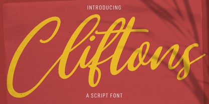 Clifttons is a Beauty yet casual signature font. With light stroke, slanted, unique and fun character with a bit of ligatures. To give you an extra creative work. Clifttons font support multilingual more than 100+ language. This font is good for logo design, Social media, Movie Titles, Books Titles, a short text even a long text letter and good for your secondary text font with sans or serif. Make a stunning work with Clifttons font. Cheers, MaulanaCreative
 - Castella by Maulana Creative,
$14.00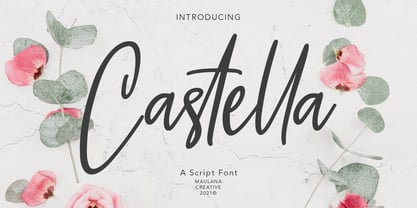 Castella is simply casual script font, with light felt-tip stroke, slant and fun character. It has Opentype features ligatures of character, To give you an extra creative work. Castella script font support multilingual more than 100+ language. This font is good for logo design, Social media, Movie Titles, Books Titles, a short text even a long text letter and good for your secondary text font with sans or serif. Make a stunning work with Castella font. Cheers, MaulanaCreative

