10,000 search results
(0.035 seconds)
- Leopoldo Sans by Tiposureño,
$25.00 Leopoldo Sans is a modern sans serif typeface. He has a small family and its members are: light, regular and bold. Each weight includes small caps, ligatures, and tabular numbers. It could work perfectly in your design, web, editorial and corporate works.
 - Taz by LucasFonts,
$49.00 Although the Taz family was designed for newspapers, it works equally well in many other contexts. The fonts have been used in glossy magazines, sales catalogues and corporate brochures, for instance. Taz is appreciated for its readability in longer texts at medium sizes.
 - Zirphy by ActiveSphere,
$30.00 Zirphy is a rounded geometric display font and works best in display applications, such as posters, headline, magazine, product branding, corporate branding, signage, logos and titles. Each style has a full upper and lower-case, accents, punctuation and a selection of monetary symbols.
 - Gingar by Melli Diete,
$42.00 Gingar – a headline face, playful and classic – a proper font. Gingar includes swash-characters and ligatures in a wide range of weights from UltraLight to ExtraBlack, plus Italics. Typeface for life, fashion, food, wellness, magazines, corporate design projects and more. Rock with Gingar!
 - Leelawadee by Microsoft Corporation,
$49.00Leelawadee is a Thai font licensed from Microsoft Corporation. The Leelawadee font is a legible sans serif that is good for User Interface design and on-screen applications. Leelawadee is a Thai script font and requires an application program that supports Thai scripts. - Stephanie by ActiveSphere,
$30.00 Stephanie is a rounded geometric display font and works best in display applications, such as posters, headline, magazine, product branding, corporate branding, signage, logos and titles. Each style has a full upper and lower-case, accents, punctuation and a selection of monetary symbols.
 - ITC Migrate by ITC,
$29.99George Ryan's ITC Migrate is a highly condensed sans serif display face that effectively complements ITC Adderville. Migrate represents what Ryan calls a “more highly evolved version” of a typeface he designed for Bitstream in 1991 called Oz Handicraft. “Both faces,“ says Ryan, “are based on designs of the popular early 20th-century type designer Oswald Cooper.” His inspiration came from drawing samples found in the Book of Oz Cooper, published in 1949 by the Society of Typographic Arts in Chicago. “Oz worked extensively with the sans serif form long before it became popular in the States, eschewing a popular belief of the time that sans serifs were only skeletons of letters.” Where Oz Handicraft was informal and quirky, ITC Migrate has a more restrained feel. “The uppercase characters and figures, in particular, have been reworked,” says Ryan, ”resulting in a more formal and traditional, compressed sans serif typeface.” - Unison Pro by Type Juice,
$19.00 Unison Pro is an extended sans serif typeface. The family includes 8 fonts with stylised caps and a rounded version for each. Unison has bold and light minimal extended glyphs making it great for headers, logos, posters, titles and much more. The stylised caps included allow users creative control for creating unique typography. 8 Fonts Total 4 Font Styles Stylised Caps Multilingual Over 1700 Glyphs
 - Be Bowtiful by One Line Design,
$19.99 Wrap it up by adding a little sweetness to your words. This is an addition to the Be Me font family, to give it a little flair and charm. Doll up announcements, posters and so much more. Letter alternates available so the placement of the bow is perfect for your word/s. Includes: Basic Latin Latin- 1 Supplement Latin extended-A Latin extended-B
 - Cammron by Creativetacos,
$23.00 Cammron, a modern serif font family, embodies a blend of elegance and boldness. It includes all essential glyphs and a variety of Non-English characters. Perfect for pairing with script or handwriting styles, its features extend to uppercase and lowercase multilingual letters, numbers, punctuation, and Latin Extended A characters. From standard English to diverse special characters, Cammron supports a vast range, enabling dynamic and inclusive typography designs.
 - Octavia VV by STARSsoft,
$10.90 The "Octavia VV" font family includes Regular, Italic, Bold, and Bold Italic fonts. Sans serif font type. The whole font family includes a large set of additional characters and letters with diacritics. Standard and Latin Extended support such languages - English, Danish, Spanish, German, Norwegian, Polish, Portuguese, French, Swedish. Standard and extended Cyrillic are supported by languages - Russian, Belarusian, Bulgarian, Macedonian, Serbian, Ukrainian, Kazakh, Kyrgyz.
 - Mellow Sans by ParaType,
$30.00 Mellow Sans is a soft and friendly rounded sans serif. Its bold styles are great for packages of something tasty, while light and regular ones work well in rather long texts, from a children's book to a reading app, or a family restaurant menu. The typeface was created by Natalya Vasilyeva, an expert in designing text and calligraphic typefaces. Mellow Sans’s forms are based on humanist sans serifs. The nobility and liveliness of Renaissance calligraphy reads beneath its curves and makes the typeface even friendlier, while helping the eye to move along the line. The typeface supports extended Latin, extended Cyrillic (all major languages of the Russia’s peoples) and Greek. It also has old style figures, arrows and non-alphabetic signs. With Mellow Sans as a heading typeface (in that case bold styles fit the best), calm open sans serifs, f.e. Vast or Fact, are its optimal text companions on the screen. Calm serifs, f. e., Octava, Scientia or Aelita, will work as its companions on paper. And to create expressive typography, for example, in packaging, you can match Mellow Sans with quirky rounded serifs — Cooper or Epice.
 - Neue Plak Variable by Monotype,
$344.99A little-known design by Futura designer Paul Renner gets a long overdue update by Linda Hintz and Toshi Omagari, in this reliable and impactful industrial sans serif. Neue Plak offers more weights and widths than the original 1928 design, extending its use for branding, editorial, logos and UIs. The pair based their updated and extended version on the original Plak wood type, uncovering lost details and incorporating them as alternates – including the choice between open or strikethrough counters. Neue Plak's outwardly stubborn personality is counteracted by unexpected details, which make for an unusual juxtaposition of severe and playful. “It felt like we should pay Paul Renner more tribute,” says Hintz, who spent time researching the typeface in Hamburg's Museum der Arbeit. “The forms themselves are partly quirky, partly really fun, but with a German stiffness that makes for a strange mix.” Neue Plak offers 60 weights, including a new text version that pairs well with the display weights, and allows the design to function in print and digital environments, and for a wide range of uses. Neue Plak Text Variables are font files which are featuring one axis and have a preset instance from Thin to Black. - Rothorn by ROHH,
$35.00 Rothorn™ is a modern, minimalist geometric sans with its own personality derived for subtle design details, such as cut diagonal corners, pointed t, very small contrast and closed aperture. The letterforms give the typeface a lot of charisma, keeping a very minimal, clear and well balanced look at the same time. Its powerful and sharp shapes together with the variety of weights from Hairline to Black make it a perfect choice for headlines and branding. Generous x-height, careful spacing and distribution of weights give it a color and legibility great for long paragraphs of text. Rothorn is a geometric member of a large type system including such families as Montreux Grotesk (Swiss-style grotesk), Lütschine (narrow headline family) and Conthey (narrow headline unicase family). The Rothorn family consists of 10 weights with corresponding italic styles, giving a total of 20 styles. Italic styles were hand drawn to get sharp and fine letter shapes. It includes a 2-axis variable font letting you adjust the weight and italic slant to your exact needs. The family has extended latin language support, as well as broad number of OpenType features, such as, case sensitive forms, ligatures, contextual alternates, lining, oldstyle, tabular and circled figures, slashed zero, fractions, superscript and subscript, ordinals, currencies and symbols.
 - Kingthings Serifique Pro by CheapProFonts,
$10.00 This is what you get when you mix monoline rounded letters with some bracketed serifs and finish it off with a sprinkle of ornamental appendages. The result is very readable, rather original and quite charming. I have fixed some inconsistencies in serif designs across the weights, cleaned up the serif connections - and added a fourth weight. But I have kept all the wonky curves and slightly differing stroke thicknesses, as they are so integral to the charm. Kevin King says: "I guess all type designers at some point think 'Well, I'll just have a go at a standard text face...' There is a long story here somewhere, suffice it to say that I started with the thinnest version - typical. I wanted to make a standard serif text face - until I saw it in print and thought "Yuk! it looks like everything else!" - still does really but with twiddles and pooneys..." If you find the "twiddles & pooneys" too much you can tone them down with the OpenType Stylistic Alternate feature (which will make sure they don't appear on three consecutive letters) or remove them completely with the OpenType Swash feature. ALL fonts from CheapProFonts have very extensive language support: They contain some unusual diacritic letters (some of which are contained in the Latin Extended-B Unicode block) supporting: Cornish, Filipino (Tagalog), Guarani, Luxembourgian, Malagasy, Romanian, Ulithian and Welsh. They also contain all glyphs in the Latin Extended-A Unicode block (which among others cover the Central European and Baltic areas) supporting: Afrikaans, Belarusian (Lacinka), Bosnian, Catalan, Chichewa, Croatian, Czech, Dutch, Esperanto, Greenlandic, Hungarian, Kashubian, Kurdish (Kurmanji), Latvian, Lithuanian, Maltese, Maori, Polish, Saami (Inari), Saami (North), Serbian (latin), Slovak(ian), Slovene, Sorbian (Lower), Sorbian (Upper), Turkish and Turkmen. And they of course contain all the usual "western" glyphs supporting: Albanian, Basque, Breton, Chamorro, Danish, Estonian, Faroese, Finnish, French, Frisian, Galican, German, Icelandic, Indonesian, Irish (Gaelic), Italian, Northern Sotho, Norwegian, Occitan, Portuguese, Rhaeto-Romance, Sami (Lule), Sami (South), Scots (Gaelic), Spanish, Swedish, Tswana, Walloon and Yapese.
 - Coffinated by Ingrimayne Type,
$9.00 Coffinated features letters on coffin shapes. This caps-only family has two sets of characters, with one on coffins that are flipped from those in the other set. The OpenType feature contextual alternatives (calt) prevents two characters from the same set being adjacent. The two styles, bold and regular, can be used in layers to add color. There are not a lot of uses for macabre lettering (horror? Halloween?) but Coffinated is available for those who do find a use.
 - Quintet by Lauren Ashpole,
$15.00 Quintet is a narrow, stylized sans serif font made up of thin, looping lines. This font tries to walk the line between retro and modern and to incorporate some hand drawn imperfections without being too obvious about it. I kicked off designing without any particular inspiration in mind but, as time went on, started associating it in my head with an old-timey, swingy jazz aesthetic. So hopefully it captures the spirit of the Jeeves and Wooster throwback theme song and opening credits, the music of Stéphane Grappelli and Django Reinhardt (who the name is a nod to), and countless album covers from that era.
 - Eurostile Candy by Linotype,
$40.99Eurostile Candy is a fun spinoff from Akira Kobayashi's Eurostile Next family. As the name implies, it is based on Eurostile but with many striking new features. Most obviously, the corners and joints have been rounded off to give it a more friendly and softer feel. On top of those changes, the main skeleton of many characters have been modified. Any extra strokes have been removed - such as in the a, s, or t - and joints have been simplified to create even more square shapes - like in the n and r. With these contemporary and futuristic-styled alterations, Eurostile Candy is a cool new design great for many display projects. - Black Oak - Personal use only

- Romance Fatal Goth Premium - Personal use only

- VTC-TribalThreeFree - Personal use only

- Rapscallion - 100% free

- LT White Fang - Personal use only

- Quake3ArenaBats - Unknown license

- SMILE PERSONAL USE - Personal use only

- WATCHER PERSONAL USE - Personal use only

- JASON PERSONAL USE - Personal use only

- Eurocine by Monotype,
$31.99 Eurocine is an expansive display typeface – a square sans serif that’s perfect for titling, headlines, logotype and branding. This 36-font family is packed with features to make it supremely versatile. This typeface attempts to capture the mood of movie credits from European Cinema in the 1970s, with a focus on Giallo films in particular. In terms of style, Eurocine sits somewhere between Walter Baum and Konrad Friedrich Bauer’s Folio, and Aldo Novarese’s Eurostile. With Eurocine you get a more versatile typeface by way of its small caps and additional stylistic sets giving you extended caps, extended small caps, and petite caps, as well as upper and lowercase unicase. Creating typographic masterpieces of your own will be so much easier! Key features: • 6 Weights in Roman and Oblique • 3 Widths – Narrow, Regular, Wide • Extended Caps • Small Caps • Extended Small Caps • Petite Caps • Unicase • Old Style Figures • European Language Support (Latin) • 1,200 glyphs per font.
 - Matteo scary by Scratch Design,
$14.00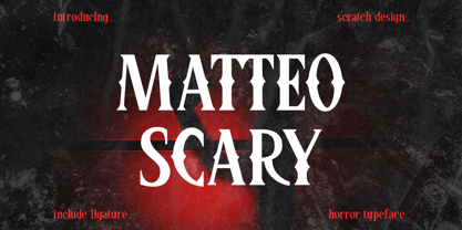 Please Welcome Matteo Scary. Matteo Scary is a horror and creepy font inspired by classic horror movie posters. It gives us the spirit of horror, spooky, frightening and suitable for poster movies, especially Halloween-themed, horror or thriller. This font is perfect also for branding, book cover, magazine header, and others which has horror or spooky vibes. What’s included? Uppercase & lowercase Number & Punctuation Ligatures Multilingual support Enjoy this font!
 - Orbis Pro by RMU,
$35.00 Walter Brudi's elegant shadowed display font brought to life again and carefully extended with Baltic, Turkish and Central European character sets.
 - Cocoro by Okaycat,
$29.50 Cocoro is a rounded textured font. Cocoro is extended, containing West European diacritics & ligatures, making it suitable for multilingual environments & publications.
 - RMU Neptun by RMU,
$25.00 A turn-of-the-century Art Nouveau display font, originally from the Aktiengesellschaft fuer Schriftgiesserei und Maschinenbau, Offenbach, revived and extended.
 - Hollywood MF by Masterfont,
$59.00 High legibility at small sizes. An extended sans serif typeface with rounded endings that provides unique softness appearance without losing legibility.
 - Novia by VladB,
$12.00 Novia is a modern sans serif geometric font, includes upper and lower case characters, Latin, Cyrillic, Latin Extended symbols and other.
 - Mana Hama MF by Masterfont,
$59.00 It is a modern, slightly extended serif typeface with sharp endings that provide a unique aesthetic touch without losing its legibility.
 - Stranger Creature by Putracetol,
$22.00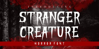 Stranger Creature is a horror style display font. Inspired from horror and thriller movies, this font is designed for Halloween, horror, thriller and scary theme projects. Stranger Creature would be perfect for logos, quotes, apparel, comics, book covers, cards, posters, or anything that requires a horror or scary look to it.
 - Caballero by Fabio Godoy,
$29.95 Typographical Caballero is a family created by Fabio Eduardo Godoy Angel, the concept is inspired by a type with firm and clear, with perfect posture and personality to be used by Graphic Designers and Architects, in terms of print, TV Corporate Identity, Merchandising - Other Projects. Ideal for antetétulos, titles, subtitles, texts from 12 Pts. Caballero Outline and Caballero Outline Italic, are presented as an option for antetétulos, titles and subtitles as well as short texts from 20 Pts. Caballero in his presentation Outline, allows wide range of applications in regard to the use of color, and be combined with Caballero Regular and Caballero Italic. Font Project Caballero, is set with a vertical and horizontal logic calligraphic lines, amount of contrast medium, antlers mullet and its completions are straight.
 - Berkelium Type - Personal use only

- SCSI Port - Personal use only

- Copyright Renewed - Personal use only


