10,000 search results
(0.039 seconds)
- UUeirdie by Ingrimayne Type,
$7.95UUeirdie is weird. The Condensed-Light style was derived from the star-serifed font Asterx by replacing the star serifs with a rounded flare serif. Widening that style resulted in UUeirdie-Regular and the bold was then constructed to complement it. The warped version was a result of play with a font distortion program. Although the glyphs have sharp corners, they do not have straight lines. The UUeirdie faces are rough, irregular, and maybe a bit creepy. - Blue Bridge by Asenbayu,
$14.00 Blue Bridge is a creative decorative sharp serif display font. This font is an experimental font by combining the aesthetic characteristics of serifs and decorative flow shapes. The combination of sharp serif feet and beautifully curved lines presents a new experience in an elegant and attractive class. You can use this font in both modern and vintage designs. This font is suitable for attractive packaging label designs, unique desired logos, trendy poster designs, fashion and many more.
 - MC Filine Qiqah by Maulana Creative,
$13.00 Filine Qiqah heavy sans serif font. With bold stroke, fun character with a bit of ligatures. To give you an extra creative work. Filine Qiqah heavy sans serif font support multilingual more than 100+ language. This font is good for logo design, Social media, Movie Titles, Books Titles, a short text even a long text letter and good for your secondary text font with script. Make a stunning work with Filine Qiqah heavy sans serif font. Cheers, Maulana Creative
 - Pema by Designpiraten,
$65.00 Pema – a contemporary Tibetan sans serif encoded in the Unicode standard. This is the first Tibetan typeface influenced by western sans serif fonts. It was designed especially to match multilingual purposes. The rather calligraphic Tibetan scripts did not match with the design aesthetics of western and Indian fonts and so I came up with the idea to design a “modern” Tibetan sans serif. Pema comes in two weights, Regular and Bold, each equipped with almost 1.300 glyphs.
 - MC Quirtta by Maulana Creative,
$16.00 Quirtta is a semi serif or Flare Serif font. Round SemiBold stroke, fun character with a bit of ligatures and alternates. To give you an extra creative work. Quirtta font support multilingual more than 100+ language. This font is good for logo design, Social media, Movie Titles, Books Titles, a short text even a long text letter and good for your secondary text font with script or serif. Make a stunning work with Quirtta font. Cheers, Maulana Creative
 - The Reading Display by Great Studio,
$19.00 The Reading Display is a new editorial serif with all clean and soft lines, tight curves, and a trendy elegant look. The Reading Display has two versions of the font, namely Regular Serif & Condensed Serif which are equipped with an italic version style, very suitable for your design needs such as very suitable for creating nostalgic designs but still clean and elegant such as headlines, magazines, logos, packaging, editorial, and so on. much more. Cheers, Great Studio
 - Merova by Sarid Ezra,
$13.00 Introducing, brand new serif, Merova - a classic serif with alternates! Merova is a classic and elegant serif with many style. Merova contains a bunch of alternates for each characters that will make your presentation or logo even more stunning and stand out! Merova also support Multi Language. and already PUA Encoded! Features All Uppercase Number & Symbol Multi language Alternates for each characters PUA Encoded Don't hesitate to send me an email at saridezra@gmail.com Happy Creating!
 - Valveto by Maulana Creative,
$16.00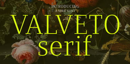 Valveto is a modern display serif. With light and consist serif stroke, fun character with a bit of ligatures and alternates. To give you an extra creative work. Valveto font support multilingual more than 100+ language. This font is good for logo design, Social media, Movie Titles, Books Titles, a short text even a long text letter and good for your secondary text font with sans or serif. Make a stunning work with Valveto font. Cheers, Maulana Creative
 - Kilburn by Talbot Type,
$19.50 Kilburn is a no-nonsense, condensed Gothic sans-serif. For over a century the condensed sans-serif has been the 'go to' font for gravitas and authority. Kilburn continues in the fine tradition of fonts such as Franklin Gothic, News Gothic and Trade Gothic offering a contemporary interpretation of the condensed sans-serif — functionality with personality. Equally at home as both a text and display font, Kilburn is available in five weights from Thin through to Black.
 - Lineare by Tipo,
$35.00 Lineare Serif is an attempt at solving the difficult problem of creating readable text type, seeking new ways to provide readers with some pleasure and rest as they walk along each line, creating a space where there is harmony between man and the printed form. Asymmetric serifs both in their height and width, medium contrast in the stroke, and balanced upward and downward movements make “Lineare Serif” a typeface featuring both attitude and aptitude for editorial purposes.
 - Distinct Style by Set Sail Studios,
$14.00 Get stylish with Distinct Style, a fashionable and contemporary pair of signature & sans fonts designed to perfectly compliment one another. With a fast-flowing script font and a two-weight modern sans serif, the Distinct Style duo offers typographic harmony for your professional design projects, including; logos, branding, magazines, blog posts, social media, advertisements & product designs. Distinct Style includes 4 font files, designed to work as perfect companions or simply as strong standalone typefaces; 1. Distinct Style Script • A classy fast-flowing signature font containing upper & lowercase characters, numerals and a large range of punctuation. 2. Distinct Style Script Alt • This is a second version of Distinct Style Script, with a completely new set of upper & lowercase characters. If you wanted to avoid letters looking the same each time to recreate a custom-made style, or try a different word shape, simply switch to this font for an additional layout option. 3. Distinct Style Sans Light • A stylish, modern sans-serif font containing uppercase only characters, numerals and a large range of punctuation. Creates a perfect pairing contrast with the Disticnt Style Script fonts. 3. Distinct Style Sans Bold • A bolder version of the Distinct Style Sans font. Add some contrast to your text by pairing this with the Sans Light version, or use at smaller sizes. Distinct Style Script contains 64 Ligatures, accessible by turning on 'Discretionary Ligatures' with any software supporting OpenType features. Fonts include multilingual support for; English, French, Italian, Spanish, Portuguese, German, Swedish, Norweigen, Danish, Dutch, Finnish, Indonesian, Filipino, Malay.
 - Almost Love by Forberas Club,
$16.00 Almost Love type is handwriting style. Nice to application for wedding invitation, tees design, cover, writing text, wedding moment, logo photography , signature and many more.
 - Grey Shadow by Forberas Club,
$16.00 This Grey Shadow font is create font special moment like wedding party, wedding invitation, happy party, book cover and something cute moment and lovely moment.
 - SF Old South Arabian by Sultan Fonts,
$9.99Historical Background Old South Arabian Script (OSA) was used before the Islamic era not only in the southwest corner of the Arabian Peninsula, but actually in the entire Peninsula. In addition, samples of OSA have been found as far as Uruk in Mesopotamia, Delos in Greece, and Giza in Egypt. Archaeological finds show that as far back as the 8th century BCE, OSA was used in trade, religious writing, and in civil records. Following the spread of Islam in Yemen, the decline of OSA began in the 7th century CE as it was gradually supplanted by Arabic script. OSA was typically known by the name of the then-dominant peoples in the Southern Peninsula. At various times, it was known as Sabaean, Qatabani, or Hadramite, among others. Although it was used for a variety of languages, OSA is most strongly associated with Sabaean. Many Peninsular languages borrowed OSA before introducing further changes of their own. Prime examples are the Thamudic, Safaitic, and Lihyanite scripts which eventually developed into independent scripts. The westward migration of the Sabaean people into the Horn of Africa introduced the South Arabian consonantal alphabet into the region. The transplanted script formed the roots of the Geez script of Ethiopia, which, in time and under presumably external influences, developed into a rich syllabary unlike any other Semitic script in history. Even a cursory examination of the letter forms of Modern Ethiopic writing reveal a striking similarity to South Arabian Script. OSA inscriptions typically reveal a dominant right-to-left directionality, although there are also many cases of alternating directions, known as boustrophedon writing. Figure 1 is a fine example of this style of writing. OSA inscriptions were discovered early in the 19th century. Soon thereafter, two orientalists, Gesenius and Rödiger, made great strides towards deciphering the script. Styles of Writing Old South Arabian inscriptions have survived primarily on stone, ceramic, and metallic surfaces. Hundreds of artifacts have been found and, to this day, continue to be discovered. Some of the best examples number of inscriptions on softer materials, such as wood and leather, have also been discovered. Although there is a significant difference between the styles of letters on the hard surfaces and those on the soft. Old South Arabian (Musnad) is composed of 29 letters , that is one letter more than the Arabic alphabet, which is between “S” and “Sh”, and names “Samekh”. Aspects of difference between Musnad and the present Arabic writing is that Musnad is written in separate letters, and the shape of the letters do not change according to its place in the word. However, some letters change according to the beginning of the writing. Musnad is either prominent, or deep. Prominent writings are for important writings and deep writings are for ordinary. The material on which the Musnad was written were stones, rocks, wood, and metal. In the course of its development the Musnad use appeared in the “Lehyanite’, “Thamudic”, “Safaitic”, pen to which many changes and amendments were made. And from it “Habashi’ writing was born. As regards his place among the Arabs of the Peninsula , when we look at the internet and its role in cultural dialogue , the Arabs of the Peninsula considered Musnad inscription which was indisputably their national writing until the dawn of Islam. It was used by people in all parts of Arabia in their homeland and abroad . It was their means of chronology and record of their glories and history.2- Features of Musnad Script: 1. It is written from right to left and vice versa. 2. Its letters are not joined. 3. Shape of letters are uniform despite their positions in the word. 4. Words are separated by vertical lines. 5. A letter is doubled in case of assertion. 6. No points and punctuations. 7. Easy to be learned by beginners. My OSA Musnad Font My design and technical work is only a treatment of the OSA Musnad as a symbol of writing. And it is possible to use in computer.. My design is not aimed at demonstrating the linguistic and intellectual structure of the Old South Arabian (Musnad). It is so simple that it could be easy to learn by learners and those who are interested in the OSA Musnad letters in computer. The basis of such importance is that it spares a lot of time and effort for researchers and students in this field. Formerly they used to write the Musnad texts either by handwriting or scan them , But now they can easily write its texts in OSA Musnad by using keyboard directly, so that they can change , amend and fulfill easily and accurately . So, we made use of speed, easiness and accuracy. And anyone interested in the South Arabian history in any part of the world can due to this design read and write OSA Musnad letters most easily. This design will also be used by historians and archeologists. , as well as specialist linguistics . The design also demonstrates the aesthetics of the Himyarit writing. About this font family Old South Arabian is An Arabic, Old South Arabian and Latin typeface for desktop applications ,for websites, and for digital ads. Old South Arabian font family contains two types: Old South Arabian and Old South Arabian serif. The font includes a design that supports Arabic, Old South Arabian and Latin languages. Old South Arabian typeface comes with many opentype features. - Vinyle by Lián Types,
$37.00 Bold, rounded and super cool. Those are the attributes of my latest font “Vinyle”, french for vinyl. In this epoque where all fields of Design are giving a lot of importance and attention to Typography and Lettering, I felt it was my duty to contribute with something that could really stand alone and ‘say something else’ that just words to be read. I've found that lately in the world, regarding a finished piece of design, the role of Typography (and of letters in general) went from being secondary, (like a minor player or a supporting actor) to the most important one. People are starting to understand the beauty of a well-done letter: they want their storefronts with unique scripts, they want to drink coffee surrounded by lettered blackboards, they want to buy books with astonishing covers with swashes ‘por doquier’. I'm more than happy to be alive in a present where even the most unimaginable friends of mine, (who couldn't spot differences between comic sans and helvetica before) are now conscious of the importance of a letter, or let’s say: Of the ‘voice’ of Typography. With Vinyle I tried to make a font with power. Following the nowadays trend of, let me say, “the vintage sans renaissance”. This time I put my brushes and nibs aside and experimented with something new. It wasn't easy, if you will pardon, for me to see swashes all over the place withouth the classic calligraphic ‘thick and thins’, but with after some weeks of work I started to love them. Like I already showed you in other creations (1) let me finish with the phrase: GEOMETRY IS SEXY! TIPS Vinyle has a lot of attitude, it shouts “here I am!” it really can ‘design an entire piece’ for you with just a word or two: It was designed with a 10 degree slant on purpose so the user may rotate it (like on the posters) that amount of degrees in order to see better results. Use Vinyle with the ‘fi’ standard ligatures activates for better kerning and ligatures! NOTES (1) See my font Selfie , the ‘little sister’ of Vinyle.
 - Cigra by Identitype Co,
$19.00 Cigra is a standout display font that is an ode to fashion typography in present day. It's elaborate curves and unique shapes make it perfect for headings, logos & wedding invitations. Cigra is all class so if you want a stylish font that is guaranteed to draw the eye, then this is it! The alternative characters were divided into several features such as Stylistic Sets, Stylistic Alternates, Contextual Alternate, SWASH and Ligature. The Open Type features can be accessed by using Open Type savvy programs such as Adobe Illustrator, Adobe InDesign, Adobe Photoshop Corel Draw X version, And Microsoft Word. And this Font has given PUA unicode (specially coded fonts). so that all the alternate characters can easily be accessed in full What’s Included : Web Font Hundred of glyphs Alternates and Ligatures Punctional Works on PC & Mac PUA Encoded Characters - Fully accessible without additional design software. Simple installations Accessible in the Adobe Illustrator, Adobe Photoshop, Adobe InDesign, even work on Microsoft Word. Fonts include Multilingual Support Extended Latin
 - Naxmos by Twinletter,
$17.00 Naxmos is a futuristic font with upper- and lowercase letters, a set of numbers, and a galaxy alternative and cyberpunk theme. It has a distinctive futuristic design. Use it to create time-traveling movie posters for futuristic or extraterrestrial productions. Fantastic for creating unique cards and artwork for science fiction fans. This font was created to be used for universal events like game competitions, wall advertisements, and poster designs. Your design can look better with a simple combination. Purchase it right away to enjoy using it ahead of the competition. What’s Included : - File font - All glyphs Iso Latin 1 - Alternate, Ligature - Simple installations - We highly recommend using a program that supports OpenType features and Glyphs panels like many Adobe apps and Corel Draw so that you can see and access all Glyph variations. - PUA Encoded Characters – Fully accessible without additional design software. - Fonts include Multilingual support
 - Kejaxi by Twinletter,
$18.00 Kejaxi font groovy is a psychedelic-inspired typeface. It has a fun and bold shape, perfect for all your creative projects that need a retro style. This Groovy font is a free display font with bold and geometric shapes, perfect for branding and editorial design. This font is also ideal for product packaging or even just to add a little flair to your design work. Kejaxi is a contemporary font with geometric shapes and accuracy that will add a touch of elegance to any design. So stop procrastinating and incorporate it into your designs right away! What’s Included : Standard glyphs Iso Latin 1 Simple installations We highly recommend using a program that supports OpenType features and Glyphs panels like many Adobe apps and Corel Draw, so you can see and access all Glyph variations. PUA Encoded Characters – Fully accessible without additional design software. Fonts include Multilingual support
 - Hearts Love Smile by TypoGraphicDesign,
$9.00 The typeface Hearts Love Smile (All We Need Is LOVE) is designed in 2018–2021 for the font foundry Typo Graphic Design by Manuel Viergutz. A font-collection from rough hand-printed old wood letters, rubber-stamps and plastic stamps till clean vectors, photos … 302 glyphs of LOVE. Decorative extras like icons, arrows, dingbats, emojis, symbols, decorative ligatures (type the word LOVE for ♥ or SMILE for ☻ as OpenType-Feature dlig). For use in logos, magazines, posters, advertisement and packaging plus as webfont for decorative headlines. The font works best for display size. Have fun with this font & use the DEMO-FONT (with reduced glyph-set) FOR FREE! ■ Font Name: Hearts Love Smile ■ Font Styles: 1 Icons + DEMO (with reduced glyph-set) ■ Font Category: Display for headline size ■ Glyph Set: 302 glyphs / decorative extras like arrows, dingbats, emojis, symbols ■ Design Date: 2021 ■ Type Designer: Manuel Viergutz
 - Kunex by Twinletter,
$15.00 The display font Kunex was created for outdoor sporting events and many other contemporary sports. A manly aesthetic with a sense of strength and speed may be brought to life with this modern slab shape and graceful tilt. It is perfect for contemporary logos and monograms for vehicles, sports, and other occasions. Kunex has a distinctive vitality in its concise form that, when written, has a rough and bold impression. At the same time, the typeface has been developed to adhere to precise letter-design principles to have a more natural feel than digital textures. What’s Included : - File font - All glyphs Iso Latin 1 - Alternate, Ligature - Simple installations - We highly recommend using a program that supports OpenType features and Glyphs panels like many Adobe apps and Corel Draw, so you can see and access all Glyph variations. - PUA Encoded Characters – Fully accessible without additional design software. - Fonts include Multilingual support
 - Behiner by Twinletter,
$17.00 Behiner is a font created to offer your varied design projects a classic art deco flair. This font is sleek and modern, with simple yet appealing letterforms. The ligature function and its equivalents offer design freedom in character choices. You may use Behiner to provide a retro feel to your commercials, posters, brochures, business cards, and other creative projects. Behiner also supports several languages, allowing you to use it in multilingual projects. Get Behiner now and join a legendary art deco saga with the current and exquisite touch that this font offers! What’s Included : - File font - All glyphs Iso Latin 1 - Alternate, Ligature - Simple installations - We highly recommend using a program that supports OpenType features and Glyphs panels like many Adobe apps and Corel Draw so that you can see and access all Glyph variations. - PUA Encoded Characters – Fully accessible without additional design software. - Fonts include Multilingual support
 - Frau Becker by profonts,
$51.99 Frau Becker is a very dynamic and readable handwriting script that looks great in text sizes. It is a self-confident, expressive and strong character design. How old is Frau Becker? Is she an insurance agent, a surgeon or a designer? We do not know exactly but one thing is for sure: she can be found at any place where special, high-end design in conjunction with a reliable typographic basis is demanded, e.g. for posters, books, ad campaigns or magazines. Frau Becker is different from all other classical scripts – it is outstanding! Due its excellent readability, it is a precious and exceptional text font with styles as regular, bold, and Headline (bold condensed). The character set includes Basic Latin, Basic Latin 1, Latin Eastern Europe, small caps, plenty of ligatures, old style figures, index figures, and some special characters including a skull. Wow!!
 - Shanghai Signature by Cititype,
$19.00 Shanghai Signature is a chic and natural calligraphy with natural impression. this font has a lot of alternate and stunning ligature. each glyph has stylistic alternate and 181 ligature that make you surprise and strengthen natural touch. not only this, we also equipped each lowercase with magical swash beginning and ending. this font is a great choice for modern branding and packaging. perfect for creating signature logos and watermarks for photography studio or wedding invitation and logo signature. you need a program that supports OpenType features such as Adobe Illustrator CS, Adobe Photoshop CC, Adobe InDesign and Corel Draw but don’t worry. if your software doesn't have Glyphs panel, we have parsed each alternate in a separate font.
 - Kpop Vibes by Ronny Studio,
$19.00 Inspired by the emerging Korean culture that grabbing the worldwide actuation in so many realms of the industry. To bridge the vibes and to make it easier to consume, we found the gap to fill with simple things in life that are useful for it, and yes, it's a new day it's a new font. So without any further ado, please welcome Kpop Vibes. series of Korean vibes typefaces. It's a sans-serif font with bold and strong vibes to catch up with today's graphic design trends. 2 Font Style: - Regular - Italic Kpop Vibes Features: - Uppercase - Lowercase - Numbers & Punctuation - Alternate Style - Multilingual Support - Simple installation All features and special characters of this font are included in one file. So that it is easily accessible by using a program or software that supports opentype such as Adobe Illustrator, Adobe Photoshop, and Adobe Indesign). This font is also very easy to use as it is compatible for all supported software even for non-opentype. Please comment us if you have any questions Thank you and have a nice day. Thank You
 - PF DIN Text Universal by Parachute,
$165.00 DIN Text Universal is the most advanced DIN superfamily ever. It combines the powerful DIN Text Pro with DIN Text Arabic bringing the number of glyphs to 3320 per font. In fact, this set of fonts contains the most complete and powerful array of arabic features commercially available. It supports all variations of the Arabic script such as Persian, Urdu and Pashto. It is also enhanced with 30 advanced opentype features and kerning for all languages. The four major scripts Latin, Arabic, Cyrillic and Greek are now matched across the design of the whole family, respecting at the same time each one's modern cultural identity. With its vast array of weights, the extended support for numerous languages, its careful and detailed design, it will prove to be extremely valuable for many complex corporate projects and corporations which operate internationally.
 - Sassafrassy by Emily Lime,
$68.00 Sassafrassy™ is a fun hand-calligraphy font family that includes 2 font styles (Simple & Swash), Map Things & a Pattern set to help you create beautiful custom designs. Written using a flexible steel nib & ink on paper. The Simple version includes an extensive character set designed for ease of use. The Swash version has all of the swash characters and gives the font a different stylistic feel. The Pro version contains all characters from both of these two fonts, over 1000 glyphs in total. Also included in this family is a fun “Map Things” set so you can create your own hand-drawn maps & a Free Pattern Set (some of which were used to create the above banners). Map Things & Patterns aren't recommended for use in Word. Language support includes your standard characters plus Eastern European & Baltic character sets. Happy creating!
 - Gothica by Type Innovations,
$39.00 Say hello to Gothica. It’s a display geometric sans designed with Stencil-like elements and letter cutouts specifically created for visual impact—ideal for logo, branding and advertising purposes. The font includes capitals and capital alternatives in the lower case keystroke positions—it’s like having 2 display fonts in one. In addition, Gothica includes various opentype features that allow graphic designers to tailor the type for custom needs. The development of Gothica started in 1997, inspired by Alex Kaczun’s best selling grotesque font family called Contax Pro. An experimental design, Gothica is specifically introduced as a bold weight, but Alex plans to expand the design to include many weights, styles and alternative design treatments. Stay tuned! If you like Gothica—check out similar gothic alternates like Decrypt 01, Decrypt 02, Decrypt H1 and all of Type Innovations fonts from Alex Kaczun.
 - Messenger by Canada Type,
$29.95 Messenger is a redux of two mid-1970s Markus Low designs: Markus Roman, an upright calligraphic face, and Ingrid, a popular typositor-era script. Through the original film faces were a couple of years apart and carried different names, they essentially had the same kind of Roman/Italic relationship two members of the same typeface family would have. The forms of both faces were reworked and updated to fit in the Ingrid mold, which is the truer-to-calligraphy one. The Messenger package is comprised of two interchangeable fonts that support Western, Eastern and Central European languages, as well as Baltic, Celtic/Welsh and Esperanto. Messenger Pro is a single OpenType font that contains the characters of both Messenger and Messenger Alt, linked by programmed features for stylistic alternates, automatic f-ligatures and class-based kerning.
 - 1726 Real Española by GLC,
$42.00 This family was inspired from the set of fontfaces used by Francisco Del Hierro, to print in 1726 the first Spanish language Dictionary from the Spanish Royal Academy (Real Academia Española, Diccionario de Autoridades). These two Transitional styles are said to have been the first set of official typeface in Spain, like the French “Reale” (take a look at our "[/fonts/glc/1790-royal-printing/ 1790 Royale Printing)". In our two styles (Regular & Italic), fontfaces, kernings and spaces are as closely as possible the same as in the original. This Pro font is covering Western, Eastern and Central European, Baltic and Turkish languages, with standard and “s long” ligatures and twin letters in each of the two styles and a few Italic swashes inspired from the font used in 1746 by the same printer for another edition from the Royal Academy.
 - Filson Soft by Mostardesign,
$25.00 Filson Soft is the rounded version of the popular Filson Pro . At first sight, the main feature of Filson Soft are the distinctive letters ‘K’, ‘Q’ and especially ‘R’ that make the font family very elegant. With its rounded terminaisons, this font family is also perfect for original titles and will give you future creations a nicely friendly aspect. But with all these originals features, Filson Soft is highly legible and quite versatile. Its large x-height, even performs nicely in small sizes. Filson Soft comes in 8 weights - Thin, Light, Book, Regular, Medium, Bold, Black, Heavy with a professional range of Opentype functions such as lining and oldstyle figures, stylistic alternates, case sensitive forms, localized forms, stylistic set, arrows and f-ligatures. For better typographic control, Filson Soft also includes an OpenType class kerning with thousands of kerning pairs.
 - Wishes Script by Typesenses,
$32.00 Plenty of swashes, ligatures, beginning and ending shapes, Wishes is a wit option for invitations, cards, stationery, fashion and apparel, among a wide range of uses. The curves of the cursive style are neither too solemn or pompous, its grace and playfulness are more 1950s than 1750s. This family offers the designer an additional decorative toolkit full of frames, ribbons, hearts, flowers and ornaments, plus a collection of caps and small caps. Wishes Script Pro includes the complete set of Script characters plus Ornaments and Caps. The family offers optically optimized Display and Text styles for each of the weights: Light, Regular and Bold. Use professional software that widely support Open Type features. Otherwise, you may not have access to some glyphs. For further information about features and alternates, see the User Guide Use Wishes to express your greetings!
 - Quase Display by DSType,
$40.00 Quase is a very free interpretation of the types found in the “Specimen of Printing Types” by William Caslon from 1785. We didn’t want to follow any of the models introduced in the Specimens, but rather gather a series of typographic aspects that we found useful and interesting from the several sizes and styles available and then give them consistency and new proportions so they could fit our very own purpose. We wanted to start with Caslon and then transform it into an editorial typeface, hence the increase of the x-height and the radical reduction of the ascenders and descenders. Despite the Display, Headline and Text fonts we also wanted to make a single weight Poster version with, inspired by the mechanical script introduced in the Double-Pica Script, to be used in magazines or as a complementary display typeface.
 - Quase Poster by DSType,
$40.00 Quase is a very free interpretation of the types found in the “Specimen of Printing Types” by William Caslon from 1785. We didn’t want to follow any of the models introduced in the Specimens, but rather gather a series of typographic aspects that we found useful and interesting from the several sizes and styles available and then give them consistency and new proportions so they could fit our very own purpose. We wanted to start with Caslon and then transform it into an editorial typeface, hence the increase of the x-height and the radical reduction of the ascenders and descenders. Despite the Display, Headline and Text fonts we also wanted to make a single weight Poster version with, inspired by the mechanical script introduced in the Double-Pica Script, to be used in magazines or as a complementary display typeface.
 - Quase Headline by DSType,
$40.00 Quase is a very free interpretation of the types found in the “Specimen of Printing Types” by William Caslon from 1785. We didn’t want to follow any of the models introduced in the Specimens, but rather gather a series of typographic aspects that we found useful and interesting from the several sizes and styles available and then give them consistency and new proportions so they could fit our very own purpose. We wanted to start with Caslon and then transform it into an editorial typeface, hence the increase of the x-height and the radical reduction of the ascenders and descenders. Despite the Display, Headline and Text fonts we also wanted to make a single weight Poster version with, inspired by the mechanical script introduced in the Double-Pica Script, to be used in magazines or as a complementary display typeface.
 - Quase Text by DSType,
$40.00 Quase is a very free interpretation of the types found in the “Specimen of Printing Types” by William Caslon from 1785. We didn’t want to follow any of the models introduced in the Specimens, but rather gather a series of typographic aspects that we found useful and interesting from the several sizes and styles available and then give them consistency and new proportions so they could fit our very own purpose. We wanted to start with Caslon and then transform it into an editorial typeface, hence the increase of the x-height and the radical reduction of the ascenders and descenders. Despite the Display, Headline and Text fonts we also wanted to make a single weight Poster version with, inspired by the mechanical script introduced in the Double-Pica Script, to be used in magazines or as a complementary display typeface.
 - Artemis JY by JY&A,
$39.00Mark Geard’s Artemis is a contemporary humanist sans serif. Its flourishes and unusual cuts give the typefaces huge distinctiveness—yet they remain highly legible. Glyphs begin with something that resembles a serif, leading the eye across their body and on to the next letter. - Otsuki Sama by Julmeme,
$19.00 Otsuki-Sama is a sophisticated mix between a serif and sans serif font design. Its elegant balance between heavy contours and subtle lines gives it a modern yet very rich look. Applicable for any type of graphic design, especially for headlines, posters and magazines.
 - Berona Stripes by Alex Camacho Studio,
$18.00 Berona Stripes font family is a variable geometric sans serif based on the solid version of Berona family. A variable geometric sans serif with a modern display purpose. The dynamic sharp edges makes it ideal to be used in a medium and big scale.
 - Heliotype by ITC,
$29.99Heliotype was created by British artist Lee McAuley, who was inspired by Soviet Constructivist designs. Heliotype adds serifs to a sans serif model, allowing the characters to connect to one another. The strong, aggressive geometric appearance of Heliotype make it a great font for experimentation. - Naori by Eotype,
$16.00 Naori is a stylish serif font characterized by contrast between thick and thin lines. This font has a serif style that features a modern-classic blend design. This font has alternate and ligature features that give you access to a unique collection of letters.