10,000 search results
(0.118 seconds)
- Quakeland by ARToni,
$24.00 Quakeland is a cool, modern and stylish display font. Add this trendy font to your web designs, logos or pretty much anything that requires a smart, cool touch.
 - Reader by Fontfabric,
$30.00 Reader is a custom sans font which is applicable for any type of graphic design - web, print, motion graphics etc and perfect for t-shirts and other items.
 - Rogue by Umka Type,
$19.00 Rogue - A Display Font : Rogue is a carefully crafted display font. It has Extended Latin and Cyrillic characters. It created for poster, web, brand and social media designs.
 - Richard Miller Rounded by Miller Type Foundry,
$19.00 Richard Miller Rounded started out as just a logo for a website/business card. It is a modular sans that works well in both print and web design.
 - Balkerious by Kaptype,
$14.00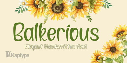 Balkerious is a modern elegant font. Font with a touch of classy elements. Perfect for logos, headlines, cards, invites, paragraphs, cover photos, web design, lettering, and other designs.
 - Optimus by Letterafandi Studio,
$12.00 Optimus is a cool and modern display font. This font is ideal for writing web designs, business cards, or pretty much anything else that requires a unique touch.
 - Oval by Fontfabric,
$19.00 Oval is a custom sans font which is applicable for any type of graphic design - web, print, motion graphics etc and perfect for t-shirts and other items.
 - Megre by JAB,
$16.00The courageous Russian author of the best seller Anastasia, Vladimir Megre, once said that this remarkable woman would inspire creative people around the world to produce their best work. Since I consider myself a creative person who has been deeply touched by her story, I sincerely hope that this will be true for me also. Anastasia talks a lot about God, the wonders of the natural world and how all things have been created so perfectly. This belief in universal perfection, however, is not confined to mystics alone. Many great mathematicians and scientists, including Albert Einstein, were of the same opinion. Having read Dan Brown’s The Da Vinci Code, I became quite fascinated with the so-called Fibonacci series; "a sequence of integers in which each integer (Fibonacci number) after the second is the sum of the two preceding integers; specif., the series 1, 1, 2, 3, 5, 8, 13, . . ." (Webster’s Dictionary). These mysterious numbers, which are said to give divine proportions, are found throughout nature in everything from a rose to a spiral galaxy. Many believe that this reinforces the argument that there is a divine intelligence back of creation. With that in mind, I thought it would be interesting to see if I could somehow create a font using these numbers in the design process. If I have succeeded - even partially - in attaining these mystical proportions, it will definitely have been worth all the hard work. And, I sincerely hope that many will enjoy using this font in producing their own best work. - Sommet Slab Rounded by insigne,
$22.00 Sommet Slab Round is the latest in the Sommet series, designed as a slab serif companion to Sommet Rounded. The typeface features slightly wider counters to accommodate the serifs and this more generous whitespace allows the typeface to display well on-screen and as a webfont. Rounded serifs give the face more warmth than the original Sommet Slab, which is strong, rigid and technical. Sommet Slab Rounded’s serifs are not just blunted, but slightly obliqued, giving the face dynamic forward momentum. This geometric typeface is based on bold and clean rounded rectangles. It’s soft and friendly look lends itself to a number of applications. It would be a fine choice for tech company logotypes, magazine headlines and can be used for body copy. The typeface family also includes some alternate titling forms. These alternates can be accessed by activating OpenType features and style sets. In order to use these OpenType features, you will need a program with advanced typography capabilities such as the Adobe Suite or Quark. These alternates include a group of simplified forms that can be accessed under the swash alternates. Sommet Slab is just the latest in the versatile Sommet superfamily from insigne. Be sure to check out the rest of the design family that includes serif and sans members.
 - Shibui by Artisticandunique,
$38.00 Shibui is a Japanese word that expresses a certain aesthetic of simple, subtle and inconspicuous beauty. Shibui - Sans serif font, character structure is simple alphabet style. It has an elegant appearance with rounded folds. It offers the best solutions in your digital projects with this font which is highly readable in the smallest dimensions. With its modern minimalist stance, this font can meet your needs in all modern or classic creative projects. Absolutely perfect for titles, websites, magazines, books, invitations, logos, packaging design, branding and more! Character Ranges: Basic Latin, Latin-1 Supplement, Latin Extended-A, Latin Extended-B, General Punctuation, Currency Symbols, CJK Symbols And Punctuation, Private Use Area (plane 0), Glyph Count: 463 With this font you can create your unique designs. If you have a question, please contact me. Have a good time.
 - Tahoma by Microsoft Corporation,
$49.00Tahoma™ Family is one of Microsoft's most popular sans serif typeface families. The original Tahoma™ Family consisted of two Windows TrueType fonts (regular and bold), and was created to address the challenges of on-screen display, particularly at small sizes in dialog boxes and menus. In 2010 Ascender Corporation added italics, so now the Tahoma font family contains 4 fonts in total: Tahoma regular, italic, bold and bold italic. The Latin, Greek and Cyrillic characters were designed by world renowned type designer Matthew Carter, and hand-instructed by leading hinting expert, Tom Rickner. The Tahoma fonts set new standards in system font design. Tahoma is ideal for use in User Interface scenarios and other situations requiring the presentation of information on the screen. Character Set: Latin-1, WGL Pan-European (Eastern Europe, Cyrillic, Greek and Turkish). - Francker Paneuropean by Linotype,
$103.99Francker is a sans-serif typeface family based on clean and simple principles of design. The letterforms' curves are inspired by the "super ellipse," a mathematical shape that is about halfway between an ellipse and a rectangle. Francker's lowercase letters appear somewhat reduced, as the a, b, n and u have no spurs. The family is available in nine weights, from Extra Light to Extra Black. Excellent areas of use for Francker signage, posters, magazines, advertisements, or logos; wherever a timeless, modern look is needed. Francker's fonts have a large character set that includes all glyphs in Linotype's W1G specification (World Glyph Set 1). Proportional figures are available as alternatives to the tabular defaults, via an OpenType feature. The Francker type was developed designed by Anders Francker (b. 1972), an engineer and designer living in Denmark. - Rekusen by Product Type,
$15.00 Rekusen is a modern and bold sans-serif display font that stands out with its cleanness. Perfect for branding, headlines, and editorial design, this font is sure to make a statement. The unique combination of thick and thin strokes creates a dynamic and eye-catching appearance that draws attention to your message. In addition to its stylish design, Rekusen also features a wide range of alternate characters and ligatures that allow for creative customization and increased versatility. With alternates and ligatures, this font provides endless possibilities for unique and impactful designs. And with support for multiple languages, it can be used across a variety of projects with ease. Whether you’re designing a logo, creating a poster, or crafting a website, Rekusen is a powerful tool that will help you achieve your design goals with style and sophistication. Its modern, clean, and versatile design makes it a perfect fit for any project that needs a touch of boldness and professionalism. What’s Included : - All glyphs Iso Latin 1 - We highly recommend using a program that supports OpenType features and Glyphs panels like many Adobe apps and Corel Draw, so you can see and access all Glyph variations. - PUA Encoded Characters – Fully accessible without additional design software. - Fonts include Multilingual support
 - BAKRUV by Twinletter,
$17.00 Find the perfect balance between classic and modern with the Bakruv font collection. Coming with a classic serif theme, this font is the ideal solution for projects that require a touch of classic modernism. Each letter is carefully designed, combining beauty and elegance in one package. With ligature and alternate features, Bakruv provides flexibility in creating a unique and attractive appearance. The richness of characters offered allows you to express your creativity more freely. Also, this font supports multilingualism, allowing you to convey your message fluently in multiple languages. Get an unforgettable design experience with Bakruv. Each letter exudes strength and courage, bringing a standout look to your project. Enjoy the high quality of every detail of this font, ensuring an impressive and professional end result. Explore the Bakruv collection now and add an irreplaceable touch of classic modernism to your designs. Make an unforgettable impression with this high-quality font. What’s Included : File font All glyphs Iso Latin 1 Alternate, Ligature Simple installations We highly recommend using a program that supports OpenType features and Glyphs panels like many Adobe apps and Corel Draw so that you can see and access all Glyph variations. PUA Encoded Characters – Fully accessible without additional design software. Fonts include Multilingual support
 - Mather Laord by Twinletter,
$17.00 Mather Laord is the perfect hero font for those who want to create powerful and unforgettable hero branding. Its sharp and pointed serif exudes a sense of strength and precision that is perfect for heroes who wield swords or are ninjas. The font’s 143 alternate characters for uppercase and 34 ligatures offer a wide range of options to create unique and memorable typography designs. Not only does Mather Laord have a stunning appearance, but it also supports multilingual characters, making it a versatile font that can be used globally. Whether designing a logo for a hero-themed brand, creating merch for your favorite hero, or designing a poster for a hero movie, Mather Laord can help you create an impactful and unforgettable design. So, if you want to stand out from the crowd and make a lasting impression on your audience, Mather Laord is the perfect choice for your next hero design project. What’s Included : - File font - All glyphs Iso Latin 1 - Alternate, Ligature - Simple installations - We highly recommend using a program that supports OpenType features and Glyphs panels like many Adobe apps and Corel Draw so that you can see and access all Glyph variations. - PUA Encoded Characters – Fully accessible without additional design software. - Fonts include Multilingual support
 - Roloi by Mayfield Type Foundry,
$15.00 Originally inspired by the numerals on a vintage clock face, Roloi is a layered numbers font in the deco lettering style, and includes a full set of automatic clock symbols. Its geometric forms are typical of the deco style, but stop well-short of pure geometry. The irregular stroke and character widths work together to give the forms a warm and energetic, yet cohesive, feel. Roloi offers two layering styles—the personable Fill and the more dynamic Inline. Designed to be layered over the background Regular style, they both lend the forms an added level of interest. Roloi also includes a clock symbol for any and every time of day, rounded to the nearest five-minutes. The regular weight provides the circular clock background, while the Fill and Inline styles produce the clock hands. If ligatures are activated in your text-editing program, type out any time—such as 9:32, 12:05, etc.—and the proper clock symbol will be automatically substituted. Go ahead, type any time out below! To stop the automatic clock symbol substitution, simply deactivate ligatures. Because the clock symbols are standard ligatures, every major modern browser will support their use on the web. With some programing they could even be used to make a lightweight, text-only clock. In addition to the clock symbols and basic numerals, Roloi’s glyph range covers numeric superiors and inferiors, standard and arbitrary fractions, currency symbols, all of the punctuation and symbols commonly associated with currency, unicode clock Face symbols, the A M P / a m p letters, and alternates of the 1, 2, and 4, accessible by selecting Stylistic Set 1.
 - Braxton by Fontfabric,
$39.00 Braxton - brush flavored script font family includes 5 unique font weights. The font family is characterized by excellent legibility in both - web & print design areas, well-finished calligraphic designs, optimized kerning etc. Braxton is most suitable for headlines of all sizes, as well as for text blocks that come in both maximum and minimum variations. The font styles are applicable for any type of graphic design – web, print, motion graphics etc and perfect for t-shirts and other items like posters, logos.
 - Cicero by Présence Typo,
$36.00Cicero was the first typeface designed by Thierry Puyfoulhoux in 94. It is what could be called a semi-serif. Only the serifs which occur naturally when drawing letters with a flat nib pen have been retained. The absence of certain serifs allows for much tighter spacing. The remaining serifs still stabilize the baseline, although less effectively than a "full-serif" typeface. By borrowing features from both the sans and serif styles, Cicero truly stands at their crossroads. - Madromit by Dharma Type,
$14.99 Madromit(ma-do-ro-mi) is a somewhat nostalgic display font. Do you remember computer advertisements in the 80s and 90s? Yes, it is the most excited period in the history of computer. We call the design in this period Primitive Digital Design. Madromit is, so to speak, the revival or reconstruction of the primitive digital type in the period. The structure and elements of this font are very simple and the key features are geometric shape and simple griddy design with rounded corners, oval bowls, and right‐angled joints which we used to see in the primitive period. In addition to this, Madromit has one more characteristic feature — classic engraving font —. It is called Open Style. Open style is one of the classic method to decorate and emphasize the font. Our aim is the synergy by the mixture of primitive digital design and classic engraving method. This mixture makes new impression we have never seen before. Madromit family consists of 5 styles for stacking color font. Please use Photoshop or Illustrator, or your favorite graphic design apps that can handle layers. Layers are the printing plates of wood type. You should be able to change text color for each layers. Madromit "Standard" style is the base of this font family. You can add open effect by stacking "Fill" layers over the Standard layer. Instruction 1. Type your text as you like. 2. Set font-name "Madromit" and font-style "Standard". 3. Set color of "Standard" layer. 4. Duplicate the "Standard" layer to make "Fill" layer. 5. Set font-style "Half Fill" or "Full Fill" and new color of upper layer. Madromit Standard, Half Open, and Full Open style can be used solely.
 - Bhiver by Maculinc,
$14.00 Bhiver is a san serif font with an angled and curved style in every corner, we made it with a display style that is perfect for making product packaging such as: Coffee Packaging, Ice Cream Packaging, Beauty Packaging, and for Brochures, Templates, Social Media Post, and etc. Bhiver is also equipped with Swash which you can access according to what we have provided, form sentences as you like by combining Swashes to make it look more attractive like the example that I have previewed.
 - Kovanov by Subqi Studio,
$22.00 Introducing Kovanov, a clean latin serif family with swash alternates for more fun purposes. Contains 420+ Glyphs this font also come up with 7 different weights. Our first display 'swashy' font with different weights to be honest. Because we knew in some cases sometimes need either thinner or thicker font or maybe both as companion as a whole. This font will suitable for your any projects such as branding, printing, social media, quotes and whatnot. We give you some glympse with our display preview there.
 - Athina by Rillatype,
$17.00 Introducing our latest font, Athina! Athina is a display serif font that perfect for modern and minimalistic design. This font was carefully designed and we added the swash so this font has the ability to standout among the other! we made up to 6 stylistic character that you can choose to make your design more unique and bloom it's charm. This font is perfect for logom magazine, wdding invitation, fashion, make up, stationary, novel, etc. Features : uppercase & lowercase numbers and punctuation multilingual alternates PUA encoded Thank You!
 - Geiger by WyldType,
$14.99 Geiger is a geometric typeface inspired by type found in the intros of Commodore 64 games, its attention to the grid and its limited set of building blocks. The design of Geiger respects these criteria to create a sturdy alphabet without diagonals, and loosen its grip on the classic limitations to produce a complete character set worthy of today`s high-resolution displays with a retro touch. The properties of classic computing platforms, like their limited memory and low-resolution displays, required that the designers and programmers of the time devise and use certain techniques to produce interesting visual results. These platforms offered limited sets of default building blocks from which to build more complex graphics and type, and some skilled coders would work around these limitations to produce the unexpected. One of the areas that saw experimental digital type flourish is the Commodore 64 intro scene. The Geiger family includes four styles (regular, oblique, bold and bold oblique), all include common ligatures (fi, ff, ffi, fj, fl, jj, tt, Th, TT) and a few stylistic alternates (K, L). A particular attention was paid to the pattern created by the vertical stem and negative spaces of tightly set text, especially for Geiger Bold. Geiger produces good results at a size of 30pt or more, but we suggest using it at higher display sizes.
 - Haakke by Dawnland,
$13.00 Haakke (or Håkke) - a casual, hand drawn (Stabilo OH pen, Fine) font with 4 alternates to all upper and lower case letters (a-z + å ä ö) as well as numbers for a realistic hand written look and feel! “Ligatures” have been created for double letters (TT, tt, ff, ll & LL (open type version of the font and open type compatible layout application required). Of course it holds all(?) the special characters that you will ever need. 451 glyphs... Haakke also includes symbols. Zodiak signs (letter a-l, upper case A-L write the corresponding name of the sign), planet signs (m-z, upper case M-Z write the corresponding name of the planet) triangles, squares and stars (from pentagrams (5 pointed) to Dodecagrams (12 pointed). (Write a 4, or shift-4 ("euro-sign", european keyboard, or "dollar sign", american keyboard) before your star or triangle and you will get a circle around it).
 - Neutraface Display by House Industries,
$33.00 Although better known for his residential buildings, Richard Neutra’s commercial projects nevertheless resonate the same holistic ecology—unity with the surrounding landscape and uncompromising functionalism. His attention to detail even extended to the selection of signage for his buildings. It is no wonder that Neutra specified lettering that was open and unobtrusive, the same characteristics which typified his progressive architecture. House Industries brings the same linear geometry to Neutraface without sacrificing an unmistakably warm and human feel. FEATURES LIGATURES: This feature is on by default. It will substitute a long list of “f” and “t” ligatures. For example, open InDesign or Photoshop and type “ff” or “tt”. NEUTRAFACE DISPLAY ALTERNATES: Neutraface Display contains several stylistic alternate characters useful when a purely geometric setting is desired. Like all good subversives, House Industries hides in plain sight while amplifying the look, feel and style of the world’s most interesting brands, products and people. Based in Delaware, visually influencing the world.
 - Belleson by Haksen,
$14.00 Hello Font Lovers! Introducing my script font called Belleson! Belleson is a luxury script that contains many characters and ligatures that will show elegant taste when you use this font. Belleson has many functions - logos, blogs, websites, and all everything that related to letters! How to use this font if I can’t operation of many software like as Photoshop, illustrator and anything? Please don’t worry about it :) You can use this font in all of software in your computer! With more than 40 glyphs of ligatures in this font, you will fall in love with this font. Belleson provides a handwritten look - natural but elegant in taste. Ligatures contain of : al ah at att ett ott itt ff ll tt il it am an ul th ch nt nl oi ct cl ot ol rr om on oo or ck gh of el ell et st sl ss sh op ee nn ant all ull oll
 - Conte Script Plus by Ingo,
$61.00 A personal handwriting done in pencil. Conté Script is a computer font but has the extraordinary look of handwriting. The typeface is exceedingly lively, diversified and distinct thanks to more than 300 different ligatures, i.e. letter combinations. In addition to the letter combinations in Conté Script, there are also double letters and figures included (aa, ff, AA, MM, 22, 66…) as ligatures with stylistic alternates. Type set in Conté Script appears remarkably similar to a text actually handwritten with a pencil. The typical style of the pencil — crumbliness where pressure lessens and the deep darkness where the pressure of the graphite in it's fullest denseness smudges — is another earmark of Conté Script. The font appears to be written quickly, fleetingly, casually, as if not really to be taken seriously, and as if it would be written one minute and erased the next. Conté Script looks most ”authentic“ around the point size of 18 to 22.
 - Blimone by Degarism Studio,
$40.00 Blimone Inspired from beautiful Art Nouveau styled and pop culture, Blimone approach with geometric shapes and dynamic humanist blends several calligraphic concepts to create a modernist style but with a strong and unique look. The subfamily Blimone ink-traps and the italic characters to appear monumentally "Sharp" in large sizes and jaggedly imperfect in small sizes. The Bilmone font family includes 24 fonts, Support for the variable version of the font, you can choose the individual thickness and the slopes. Support has many fancy ligatures, common standard ligatures are found in some fonts include fi, ff, ffi, fy, ti, tt, ty, tti, ttl , ffk, ft and the discretionary ligatures are gi, ggi, gt, gk, gj, gl, ggl, gh, gti,ct, cti, cty, et, eti, ety, st, and more. all intended to create a natural look that imitates the flow and spontaneous joins of handwriting.OpenType also supports tabular lining numbers, fractions, Numerator and Denominator.
 - Delirian by Andrey Sharonov,
$35.00 Delirian Script & Ornaments Delirian is elegant script with contemporary mood and perfect forms, inspired by immortal classic calligraphy. Not too thin and not too thick, good balanced and variable, born for luxury and beauty. In my examples I show how this script can be used. It's great for logotypes, branding, wedding invitations, romantic cards, alcohol labels, packaging, spelling of names and others. Delirian Script comes with beautiful Uppercase and Lowercase letters, numbers and punctuation. In addition to the main character set, there are 158 alternates characters, 36 ligatures and 10 lengths of end-swashes. You also get Ornament set of 26 elements which harmoniously complements original script. Multilingual Support Script support Western European characters and works with following languages: English, Croatian, Danish, Dutch, Estonian, Faroese, Filipino, Finnish, French, German, Hungarian, Icelandic, Irish, Italian, Norwegian, Polish, Portuguese, Slovenian, Spanish, Swedish, Turkish. OpenType Stylistic Alternates works on the principle of simple combinations with activated Standard Ligatures option in OpenType panel (Adobe Photoshop, Adobe Illustrator). To get alternate just add for example number 2 (two) after any letter. Every Uppercase has 1-2 variations and Lowercase about 3-4 alternate characters. For example: A2 A3 - Uppercase; a2 a3 a4 - Lowercase; a.1 a.2 - Lowercase with underline. _1 _2 _3 - End-swashes Ligatures works with activated Discretionary Ligatures option in OpenType panel. This special features don't work in Microsoft Word.
 - Retail Packaging JNL by Jeff Levine,
$29.00 The retail storage box for a vintage metal numbering stamp manufactured by the American Numbering Machine Company had its brand name hand lettered in an Art Nouveau style that most likely went back to the 1920s, as the company was in existence from 1908 to around 1971. Numbering machines were used in offices, schools, libraries, and anywhere a series of numbers needed to be marked onto printed items. Similar to what was called a ‘crash numberer’ used in letterpress shops, the machines could be set to do a run of digits [for example: 4000, 4001, 4002] or repeat numbers for forms used as carbon copies. As computers took over most forms of printing, the use of numbering machines dwindled, but they are still available. The American Numbering Machine Company was one of several Brooklyn, New York companies that specialized in the manufacture of these machines. Retail Packaging JNL replicates the lettering from their packaging, and is available in both regular and oblique versions.
 - Basic Commercial by Linotype,
$57.99 Basic Commercial is a family of fonts based on historical designs from the hot metal type era. First appearing around 1900, these designs were created by type designers whose names have not been recorded, but whose skills cannot be overlooked. These typefaces were popular among groups and movements as diverse as the Bauhaus, Dadaism, and the masters of Swiss/International-Style typography. They influenced a variety of later grotesque fonts, such as Helvetica and Univers. Basic Commercial was distributed for many years in the United States under the name Standard Series. The typeface worked its way into many aspects of daily life and culture; for instance, it became the face chosen for use in the New York City subway system’s signage. The Basic Commercial family members have a clear and objective design. Their forms exhibit almost nothing unusual, but remain both lively and legible nonetheless. Perhaps for this reason, Basic Commercial’s design has been popular with graphic designers for decades.
 - Chave - Personal use only

- LT Superior - 100% free

- Rakesly by Typodermic,
$- Are you looking for a typeface that exudes style and class? Look no further than Rakesly, the zesty compact grotesque headliner that’s sure to add some piquant charm to your message. Rakesly boasts well-balanced, charismatic letterforms that draw inspiration from a variety of late nineteenth-century and early twentieth-century sans-serif metal typefaces. Its upright styles feature tasty, cherry-picked features, while its italics draw upon the unique industrial essence of the Art Deco era. This stunning typeface is available in six weights and italics, including the wispy and delicate Rakesly Ultra-Light. Plus, Rakesly includes OpenType fractions and numeric ordinals, mathematical symbols, and a wide variety of currency symbols. For those who love a bit of texture in their designs, Rakesly also offers four grainy, letterpress texture styles called Rakesly Iron, which are available in Regular, Italic, Bold, and Bold Italic. And if you want to add a little extra spice to your typography, Rakesly even includes OpenType contextual alternates that automatically shuffle three letter/numeral variations for a more convincing effect. And if you’re a typography pro who likes to get hands-on, the Iron styles contain private use (PUA) encoding that lets you manually access alternate characters via a glyph table or character table. So why settle for a boring historical revival when you can add Rakesly’s peppery blend of classical elements to your typographic spice rack? Try Rakesly today and experience the rare flavor that only this typeface can provide. Most Latin-based European writing systems are supported, including the following languages. Afaan Oromo, Afar, Afrikaans, Albanian, Alsatian, Aromanian, Aymara, Bashkir (Latin), Basque, Belarusian (Latin), Bemba, Bikol, Bosnian, Breton, Cape Verdean, Creole, Catalan, Cebuano, Chamorro, Chavacano, Chichewa, Crimean Tatar (Latin), Croatian, Czech, Danish, Dawan, Dholuo, Dutch, English, Estonian, Faroese, Fijian, Filipino, Finnish, French, Frisian, Friulian, Gagauz (Latin), Galician, Ganda, Genoese, German, Greenlandic, Guadeloupean Creole, Haitian Creole, Hawaiian, Hiligaynon, Hungarian, Icelandic, Ilocano, Indonesian, Irish, Italian, Jamaican, Kaqchikel, Karakalpak (Latin), Kashubian, Kikongo, Kinyarwanda, Kirundi, Kurdish (Latin), Latvian, Lithuanian, Lombard, Low Saxon, Luxembourgish, Maasai, Makhuwa, Malay, Maltese, Māori, Moldovan, Montenegrin, Ndebele, Neapolitan, Norwegian, Novial, Occitan, Ossetian (Latin), Papiamento, Piedmontese, Polish, Portuguese, Quechua, Rarotongan, Romanian, Romansh, Sami, Sango, Saramaccan, Sardinian, Scottish Gaelic, Serbian (Latin), Shona, Sicilian, Silesian, Slovak, Slovenian, Somali, Sorbian, Sotho, Spanish, Swahili, Swazi, Swedish, Tagalog, Tahitian, Tetum, Tongan, Tshiluba, Tsonga, Tswana, Tumbuka, Turkish, Turkmen (Latin), Tuvaluan, Uzbek (Latin), Venetian, Vepsian, Võro, Walloon, Waray-Waray, Wayuu, Welsh, Wolof, Xhosa, Yapese, Zapotec Zulu and Zuni.
 - Fleet Street - Unknown license

- Pegyptienne - Unknown license

- DOCK11 by artill,
$22.00 DOCK11 is a heavy headline typeface with an elegant look. This typeface will work well for headings, short paragraphs, magazines, web, posters, logos and any type of graphic design.
 - Miedinger by Canada Type,
$24.95 Helvetica’s 50-year anniversary celebrations in 2007 were overwhelming and contagious. We saw the movie. Twice. We bought the shirts and the buttons. We dug out the homage books and re-read the hate articles. We mourned the fading non-color of an old black shirt proudly exclaiming that “HELVETICA IS NOT AN ADOBE FONT”. We took part in long conversations discussing the merits of the Swiss classic, that most sacred of typographic dreamboats, outlasting its builder and tenants to go on alone and saturate the world with the fundamental truth of its perfect logarithm. We swooned again over its subtleties (“Ah, that mermaid of an R!”). We rehashed decades-old debates about “Hakzidenz,” “improvement in mind” and “less is more.” We dutifully cursed every single one of Helvetica’s knockoffs. We breathed deeply and closed our eyes on perfect Shakti Gawain-style visualizations of David Carson hack'n'slashing Arial — using a Swiss Army knife, no less — with all the infernal post-brutality of his creative disturbance and disturbed creativity. We then sailed without hesitation into the absurdities of analyzing Helvetica’s role in globalization and upcoming world blandness (China beware! Helvetica will invade you as silently and transparently as a sheet of rice paper!). And at the end of a perfect celebratory day, we positively affirmed à la Shakti, and solemnly whispered the energy of our affirmation unto the universal mind: “We appreciate Helvetica for getting us this far. We are now ready for release and await the arrival of the next head snatcher.” The great hype of Swisspalooza '07 prompted a look at Max Miedinger, the designer of Neue Haas Grotesk (later renamed to Helvetica). Surprisingly, what little biographical information available about Miedinger indicates that he was a typography consultant and type sales rep for the Haas foundry until 1956, after which time he was a freelance graphic designer — rather than the full-time type designer most Helvetica enthusiasts presume him to have been. It was under that freelance capacity that he was commissioned to design the regular and bold weights of Neue Haas Grotesk typeface. His role in designing Helvetica was never really trumpeted until long after the typeface attained global popularity. And, again surprisingly, Miedinger designed two more typefaces that seem to have been lost to the dust of film type history. One is called Pro Arte (1954), a very condensed Playbill-like slab serif that is similar to many of its genre. The other, made in 1964, is much more interesting. Its original name was Horizontal. Here it is, lest it becomes a Haas-been, presented to you in digital form by Canada Type under the name of its original designer, Miedinger, the Helvetica King. The original film face was a simple set of bold, panoramically wide caps and figures that give off a first impression of being an ultra wide Gothic incarnation of Microgramma. Upon a second look, they are clearly more than that. This face is a quirky, very non-Akzidental take on the vernacular, mostly an exercise in geometric modularity, but also includes some unconventional solutions to typical problems (like thinning the midline strokes across the board to minimize clogging in three-storey forms). This digital version introduces four new weights, ranging from Thin to Medium, alongside the bold original. The Miedinger package comes in all popular font formats, and supports Western, Central and Eastern European languages, as well as Esperanto, Maltese, Turkish and Celtic/Welsh. A few counter-less alternates are included in the fonts.
 - Prima Sans by Bitstream,
$29.99Prima is a series of fonts designed at Bitstream by Jim Lyles (Sans and Serif) and Sue Zafarana (Sans Mono), released in 1998. The fonts have been tuned to give exceptionally good quality at low screen resolutions. The fonts are therefore suitable for sustained use in browsers and other applications where users read for long periods from the screen. Of course, Prima looks great printed out too. - Template Shadow by Jeff Levine,
$29.00 A series of lettering guides called “Mimeostyle” for the A. B. Dick Company of Chicago (produced for use in making mimeograph machine printing stencils) were custom manufactured by the Wright-Regan Instrument Company (Wrico). One design featured a sans serif letter produced in Shadow relief, with a touch of Art Deco flair. This is now available as Template Shadow JNL, in both regular and oblique versions.


