9,436 search results
(0.021 seconds)
- Beauty Outside by Pixel Colours,
$22.00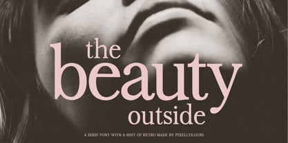 A serif font with a hint of retro. Includes a display font for larger words and a text font optimized for reading. Use them alone or pair them together to create amazing compositions and designs. Beauty Outside Text: a serif font with loose letter spacing suited for reading great for larger blocks of text. Beauty Outside Display: a serif font with with tight letter spacing suited for larger type and headlines. Multilingual
 - Tall And Narrow JNL by Jeff Levine,
$29.00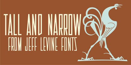 Let Me Call You Sweetheart was one of the most popular songs of the early 20th Century, and a piece of vintage sheet music for this tune had its title hand lettered in a square, narrow block lettering style. With a few adjustments and adaptations, this led to the creation of Tall and Narrow JNL, a digital version of the type design which is a perfect alternate to the more conventional condensed faces.
 - Tuerca by Graviton,
$24.00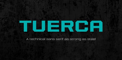 Tuerca font family has been designed for Graviton Font Foundry by Pablo Balcells in 2021. It is a slightly extended sans serif typeface with a strong technical appearence. Its squared, angular shapes provide a futuristic and robust aesthetics. It has been conceived to be most suitable for logos, headlines and display design pieces as well as short length text blocks. Tuerca consists of 8 styles, each containing small caps and glyph coverage for several languages.
 - Binaria by Graviton,
$24.00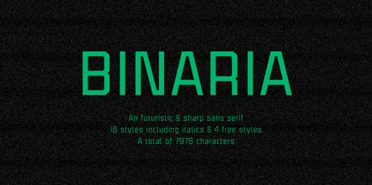 Binaria font family has been designed for Graviton Font Foundry by Pablo Balcells in 2018. It is a sans serif typeface with a mechanic appearence. Its squared, angular shapes provide a futuristic and robust design. It has been conceived to be most suitable for logos, headlines and display design pieces as well as short length text blocks. Binaria consists of 12 styles, each containing small caps and glyph coverage for several languages.
 - HU Sansans by Heummdesign,
$15.00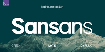 HU Sansans is a San-serif latin alphabet font. It is a solid and trendy full square typeface that contains powerful and bright energy. I created a young and bright feeling by making a blank at the bottom of the first consonant of the initial letter, and the curve of the first part continued the bright feeling of the font. By configuring 4 types of font families, the usability of typefaces has been increased.
 - Hekson by Maulana Creative,
$14.00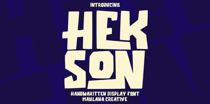 Hekson is a block handwritten display font. With bold stroke, fun character with a bit of ligatures. To give you an extra creative work. Hekson font support multilingual more than 100+ language. This font is good for logo design, Social media, Movie Titles, Books Titles, a short text even a long text letter and good for your secondary text font with sans or serif. Make a stunning work with Hekson font. Cheers, Maulana Creative
 - SoHo Nights BF by Bomparte's Fonts,
$40.00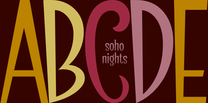 Named after the trendy New York City locale, SoHo Nights BF features sensuous curves and tapering lines that combine to create a unique new look that’s a little bit art deco and a little bit art nouveau. The font also exhibits attributes that can be described as cartoon-like, and even “spooky” when seen in short blocks of large text. Use SoHo Nights BF when your projects require that certain "air of mystique".
 - Technical Forest by Maciej Świerczek,
$-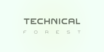 Design style ready to use in headlines, tags and quotes refering to technology, sci-fi, modern economy and more recent themes. The name of this font is connected to its simplicity and combination of its soft and sharp style in lines - just like tree branches and leaves. Also inspired by block form of runes - related to nature in its full floral character. However kept in clear and precisely designed form of technical font.
 - ITC Stoclet by ITC,
$29.99ITC Stoclet is the work of British designer Phill Grimshaw, an offshoot of the research and experimentation which led to the development of ITC Rennie Mackintosh. It is a condensed, angular typeface, and its sharp angles, swooping curves and long forms are reminiscent of Art Nouveau. The font includes a number of alternative characters which enhance its flexibility. ITC Stoclet is ideal for large, ornamental designs as well as short blocks of text. - Mercury Script by Fenotype,
$35.00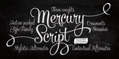 Mercury Script is an action packed type family of three weights. Click on Swash, Contextual or Stylistic alternates in any Open type savvy application for plenty of extra grooviness and combine with Mercury Ornaments for superb results. Turn on Small Caps to activate a complete set of block capitals designed to go with the font. Mercury Script is based loosely on hand lettering found in a vintage lingerie advertisement, only containing the words “light control”.
 - HT Arcadia Grotesk by Hype Type,
$34.00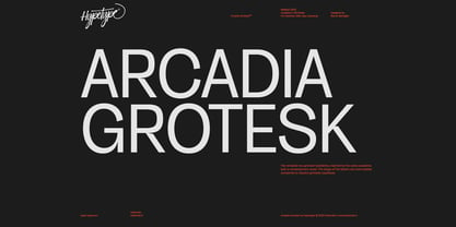 The versatile neo-grotesk typefamily, inspired by the swiss academia with a contemporary mood. The shape of the letters are more pliable compared to classics grotesk typefaces. -- Taking inspirations from classic grotesk letterforms, both from the European tradition (specifically the Swiss school) and the American tradition, HypeType's Arcadia Grotesk is modernized with its shorter ascenders and descenders to give more compact blocks of text and with its more contemporary and dynamic forms. -- hype-type.com // kidstudio.it
 - MC Sloanstone Outline by Maulana Creative,
$13.00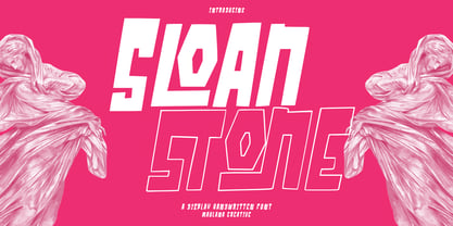 Sloanstone is a handwritten display font. With bold block stroke, fun character with a bit of ligatures. To give you an extra creative work. Sloanstone font support multilingual more than 100+ language. This font is good for logo design, Social media, Movie Titles, Books Titles, a short text even a long text letter and good for your secondary text font with sans or serif. Make a stunning work with Sloanstone font. Cheers, Maulana Creative
 - Afterglow by Vintage Voyage Design Supply,
$18.00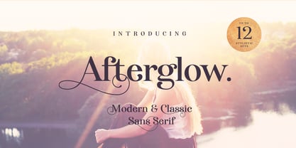 Elegant and so stylish serif typeface full of contrast lines, a lot of Stylistic Alternates with thin swashes. Some letters has up to 12 of them. Use only capitals for headers or quotes, it looks strong and refined, or use Caps with lowercase for block texts, or subheaders. Design your art- or beauty blogs, t-shirts or websites, posters, magazines or cards, and logo's of course. You will return to this font again and again.
 - ABTS Day Of The Dead by Albatross,
$19.95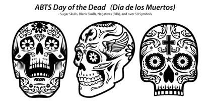 ABTS day of the dead is a highly detailed and meticulously designed symbol font. It’s design is inspired by the Day of the Dead celebration, honoring the deceased. I think The Day of the Dead is one of the greatest reasons anyone should celebrate life, so I decided to make a font honoring that tradition. I'm not even sure If I got all of it right, (traditional symbols and such) but it was a joy to create. There are 2 fonts. The first is the Skulls. This includes uppercase and lowercase A-Z, a-z. There you will find the decorated skulls, blank skulls, and negatives. The second font is the symbols. If you wish to design your own Day of the Dead skull, you should purchase the symbols, as they are designed specifically for adorning the blanks. Purchasing both fonts will give you a discount. Please note, the symbol font will show up in your application of choice as “ABTS Day of the Dead Bold.” This is to avoid software problems with naming the font itself "Symbols." Skulls are awesome!!!
 - Music Sheets by Aah Yes,
$3.50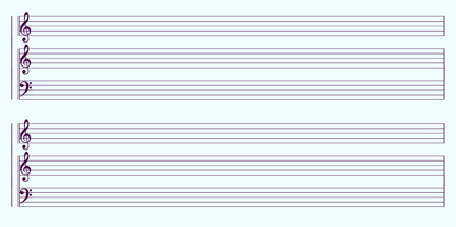 Music Sheets is a font that will produce blank music manuscript sheets, giving the main Clefs, Time Signatures, Stafflines, Guitar Tab, plus other useful symbols - in fact all you need to make simple manuscript of your own design, so you can put in the notation yourself. You can use it with ordinary Word Processors or top-end graphics programs equally easily. Using it is extremely simple - for instance into the text-box below type TBA for Treble Bass Alto Clefs, or 234567 for the basic Time Signatures from 2/4 up to 7/4, or L for the Lines. Essentially it’s a cut-down and slightly modified version of our Blank Manuscript font, (which is fairly comprehensive for more advanced scoresheets but obviously a bit more complex) and uses a similar intuitive method for inputting characters. There’s plenty of examples provided, plus a short guide explaining the character layout, which is extremely easy. Download the zip to get the guide and examples, and only install one version - either OTF or TTF, but not both.
 - Stalker by Canada Type,
$24.95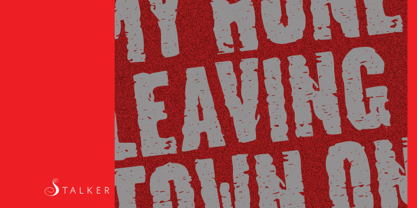 Stalker is one of those necessary fonts in a designer's toolbox: Grungy sans serif caps that are most useful for entertainment project chores. Originally made in the summer of 2003 for set and prop design of an Alliance film, Stalker is now available in retail form for those who are particular about their entertainment design or those who use broken letters in their design as means of social commentary or statement on style.
 - PAG Novembris by Prop-a-ganda,
$19.99Prop-a-ganda offers retro-flavored fonts inspired by lettering on retro propaganda posters, retro advertising posters, retro packages all the world over. This is perfect font for your retrospective project. PAG Novembris is narrow and serif font with art deco look. “A”, “G”, “H” and “M” have different letter form in uppercase and lowercase, and they give decorative accents on your typography. PAG Novembris is perfect font for your retrospective project. - Channel Surfing JNL by Jeff Levine,
$29.00In 1999, Jeff Levine released a freeware font called "Channel Tuning JL" scanned from drawings made with a felt tip marker and designed as if the letters were breaking up due to poor reception such as on pre-digital TV sets. Over a decade later, Jeff has totally reworked the font—giving it cleaner lines, an extended character set and renaming it Channel Surfing JNL to set it apart from the roughly-drawn original. - Janson Text by Linotype,
$29.99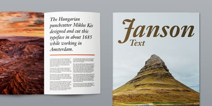 The Janson font was based on the matrices made for the typeface in the 17th century. It originated from the Dutch typeface designer Anton Janson and was cut by Nicholas Kis. The strong main strokes and fine hair strokes were influenced by the art of copper engraving. In 1983, Prof. Horst Heiderhoff led the expansion of the Janson into a font family with various stroke contrasts and gave it the name Janson Text.
 - HiFi by Pelavin Fonts,
$25.00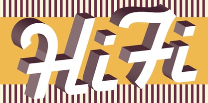 HiFi is a geometric script whose genesis lies in drive-in movie theaters, vintage auto emblems and radio dials. It embraces the stylistic tenets of retro futurism and proposes that the evolution of design styles, rather than being linear, is a circular process, continually revisiting and reshaping itself. It evokes the 40s & 50s and pre-transistor electronics when you turned your radio on and waited patiently for the tubes to warm up.
 - Crowbar by Hanoded,
$15.00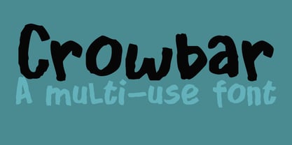 Technically a crowbar is a straight metal rod used for digging. The tool I had in mind when I named this font is called a jemmy or pry bar, but I guess I liked the name crowbar better. Crowbar font, like its namesake, is a very useful tool: its brush-like appearance fits any design, especially if you are aiming for the ‘scary’ look. Comes with a toolbox full of diacritics too!
 - Storyville by Canada Type,
$29.95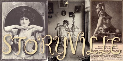 This is the redrawn and expanded version of an alphabet Rebecca Alaccari made back in 2009 as a bespoke font for a tourism agency looking to recapture the appeal of New Orleans after the hurricane Katrina disaster robbed it of its core industries. The brief back then was to "revive the unique spirit of what always made Nola great for new adults, which is the excellent combination of history, romance, food and music." No word of a lie, the brief actually contained "new adults." Storyville contains two interchangeable sets of forms drawn in the doodly, loose and organic way now conspicuously popular with today's young designers, almost every one of whom thinks they will get to design something for a boutique coffee bar somewhere. Well, this whole thing perhaps means freedom, youth, fun, happiness, good stuff like that. But just in case, a little caution doesn't hurt: Use this font only if you know what you're doing. We don't want to go back to the 1990s. Please. We were nearly done for by that exposure the first time around. The ligatures feature in this font does some pseudo-randomization, so the forms in doubled letters don't repeat. Serious fun can be had by also applying the stylistic alternates feature, or picking a letter in the middle of a setting and disabling the ligatures feature. Or various sequences of all that. If you don't like any of that stuff, just forget about it. Uh, wutever.
 - De Fonte Plus by Ingo,
$39.00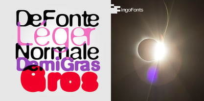 A variation of ”Helvetica according to the blur principle.“ The underlying typeface is ”Helvetica“, the only true ”run-of-the-mill“ typeface of the twentieth century. The distortion principle used simulates the photographic effect of halation and/or overexposure. The light weight, »DeFonte Léger«, nearly breaks on the thin points, whereas on those points where the lines meet or cross, dark spots remain. The characters are ”nibbled at“ from the inner and outer brightness. On the normal and semibold typestyles, »DeFonte Normale« and »DeFonte Demi Gras«, the effect is limited almost exclusively to the end strokes and corners, which appears to be strongly rounded off. The bold version »DeFonte Gros« is especially attractive. As a result of ”overexposure“, counters (internal spaces) are closed in, while characters become blurred and turn into spots; new characteristic forms are created which are astoundingly legible. The fat version »DeFonte Gros« is particularly appealing. “Overexposure” leads to drifted counters, letters blur into spots; new characteristic forms emerge, which are surprisingly easy to read.
 - Maestrale by Catharsis Fonts,
$25.00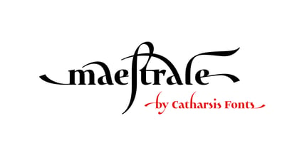 Maestrale is a paradigm-breaking new take on calligraphy, built around a compact, serif-style core and outrageously long, flamboyant extenders. At large sizes, its confident, charismatic lettershapes are ideally suited for branding and decorative uses, whereas longer texts at smaller sizes naturally weave themselves into a flowing texture. The font comprises 1299 glyphs, including many stylistic alternates, ligatures, small capitals, and initial, terminal, and linking forms, and offers extensive OpenType programming to support them. The calligraphic form of Maestrale is complemented by a matching text font (Maestrale Text) with short extenders, available in three cuts (a serif-style Roman, an upright Cursive, and a tilted Italic). Maestrale is all about the lowercase; its capitals are deliberately understated so as not to steal the limelight. In fact, the font works very well when set exclusively in lowercase. Maestrale�s small capitals are fitted into the core space of the lowercase, allowing them to be freely interspersed with lowercase characters. Alternately, an OpenType feature is available to replace a and e in small-caps text with their lowercase equivalents for a fresh unicase look. Since alternates and ligatures play such an important role, Maestrale offers three different modes of use. The most straightforward approach is simply to start typing using Maestrale Pro � the extensive OpenType programming will ensure that collisions between extenders are avoided and attractive ligatures are substituted for common glyph combinations. A more interactive approach is provided by the font Maestrale Manual, which allows the user to manually select alternate forms and ligatures even in typographically unsavvy applications, such as PowerPoint (as long as standard ligatures are supported). Stylistic alternates are simply represented as ligatures of their base forms with one or more instances of the rarely-used by easily-accessed characters "~" (ASCII tilde) and "`" (spacing grave accent); linking forms are built with �_� (underscore), multi-character ligatures with "|" (pipe), and initial and terminal forms with the �less than� and �greater than� characters. For instance, the Maestrale wordmark in the posters above was simply typeset with the string (`ma`est|r_a```l```e)| in Maestrale Manual (The parentheses represent �less than� and �greater than� characters here.) Feel free to type this string into the test line below and see what happens! Make sure Standard Ligatures are enabled. An instruction sheet listing all alternate forms and their accessibility is available from the Gallery tab on this page. The third mode of usage is aimed at professional designers, who make use of sophisticated software with extensive OpenType support. These power users are advised to use the font Maestrale Pro again, where all glyphs are accessible as stylistic alternates. Maestrale Text is a less extravagant but more versatile variation on the design of Maestrale, replacing Maestrale�s swashes with efficiently compact extenders. It is intended to serve as a perfectly matching text companion to Maestrale calligraphy, but constitutes a full-fledged typeface in its own right. It is equally at home at display sizes as it is in pull quotes, titles, and high-impact blocks of text. Maestrale Text comes in three complementary faces: A serif-style Roman, an upright Cursive, and a tilted Italic. Maestrale is the Italian word for �masterful�. It is also the traditional Italian name for the northwesterly mediterranean wind, better known by its French name, Mistral. Acknowledgements: I am grateful to the helpful souls on the Typophile forums for extensive feedback and encouragement on Maestrale, and to the TypeDrawers forum for feedback on Maestrale Text. This font is dedicated to Simone.
 - Passport48 by Coniglio Type,
$19.95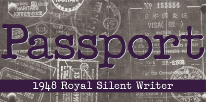 Passport48 exclusively in otf. opentype format, originally debuted in 1997 as Passport, close to the beginning of the indie typographer boom. Almost 25 years have passed since it was introduced at MyFonts as PS1 and later in 2003 in TT TrueType.** It was designed by Joseph Coniglio of Coniglio Type as a revival. Historically, Passport was digitized from a shiny black enamel 1948 Royal Silent Deluxe portable. Kept on the ship of merchant marine, Captain John O’Learn, it was a salty manual typewriter with no intrinsic value as a collectable, even though it is awash as a work horse and a fine communicator of it’s time.. **NOTE: Little Passport family leaves the nest: The old weight variations, styles and formats have been eliminated to allow the original face to be stand alone, on its own attributes. For those purchasing their first typewriter fonts and to our diehard collectors as well, Passport presents a friendly new port-of-entry. A simple set, that is freed of many of the normal distressed points and paths that had made most “typewriters” authentic looking, but difficult to print and manipulate in layouts back in the day. It’s smooth nature comes from its impressions struck directly onto a piece of carbon paper bypassing the silk ink ribbon and going directly from metal to carbon paper transferring to a piece paper with very little tooth. Examine the glyphs to be certain you have what you need from this minimalist set, Passport48 is intended for ease of use and affordability. This is a warm font in a cold cruel world and a real port in the storm! It is versatile in today’s layouts with 24 years of worldwide sales. …Please enjoy the fruits of its travels, hoping your destinations and explorations into graphic design and letter composition are happy ones. -Joe Coniglio, the Pacific Northwest (2021).
 - Sangli by insigne,
$-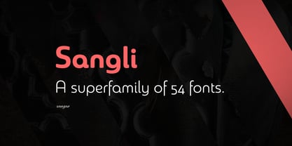 It started in 2007 with Chennai, the first of a three-part series of sans that I envisioned with slab serif counterparts. Each font would differ from the others in how the stem terminals were expressed. The initial font was extremely well received, and a revitalized and remastered Chennai made its appearance two years later, complete with new weights and new, novel OpenType features. Then came Madurai, a variation of Chennai based on the same core, only without the rounded stems. Chennai’s rounded stems made it distinctive and great for headlines but left it lacking appeal as copy--a problem that Madurai easily solved. And now comes Sangli, the final iteration of my original 2007 vision. Sangli is a happy medium. Like Chennai, it’s great for headlines--but not too distinct for copy. Sangli keeps the same core structure as the other two, but new less sharp forms give this latest font a friendlier look that’s more versatile than the original Chennai and less formal than Madurai. The font includes a whole range of six weights from light to black, along with condensed and extended options as well for a total of 54 fonts. There are plenty of OpenType features, including small caps. Alternates include normalized capitals and lowercase letters that include stems for when you want a more traditional look or when you’re writing copy. Sangli also supports over 70 languages that use the extended Latin script. Use Chennai, Madurai, and their slab serif variants interchangeably with Sangli, too, for even more options in your work. All three complement one another well. So when you need a balanced font that stands boldly on the page and commands your reader’s attention, look within and find your Sangli.
 - Menhart by Monotype,
$29.99Czech designer Oldrich Menhart (1897-1962) devoted his life to making letters. He was a calligrapher, lettering artist, and typeface designer with over twenty faces to his credit. The Monotype typeface, Menhart, was the second of his designs. Menhart began work on the design in the early 1930s and turned over his final artwork to the Monotype Drawing Office in 1934. The first size cut was 14 Didot (Didot points are the traditional European system of type measure, and are roughly equivalent to the point system commonly used by today's digital fonts). The 14D font was followed by 18D and 24D, indicating that the design was considered most suitable for display work. However, a 10D size was later cut from the same master drawings at the request of a Monotype customer. Menhart's design was light and open, with an even color and a slight squareness" to its round shapes. Because the Czech alphabet has 15 accented letters, Menhart included these diacritics as an integral part of his design, not as an afterthought. As a result, accented copy set in Menhart has a cohesive quality rarely seen in other typefaces. Monotype's new digital release of Menhart is the first revival since the hot metal fonts were cut. Menhart Display is based on the original Monotype drawings, while a slightly heavier, re-spaced version has been created for text sizes. Both versions offer the full capabilities of the OpenType format, such as the automatic insertion of old style figures, ligatures and small caps. In addition to English, the extended character set supports most Central European and many Eastern European languages. One of Menhart's lifelong goals was to share the richness of his Czech culture by drawing typefaces that uniquely served Czechoslovakia literature. In his words: "I believe that a Czech style of type comes above all from the spirit in which it was designed, which gives it its 'signature,' and not so much from decorative composition, and even less from the geographic location of its creation." The typeface Menhart is a tribute to his values. Now, Menhart Pro and Menhart Display Pro capture the unique personality of this timeless design while greatly extending its range of use. " - Poeta Color by Tarallo Design,
$14.99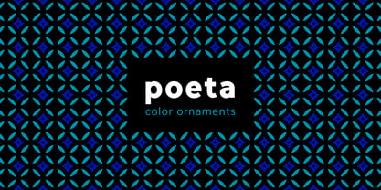 Poeta Color is an ornamental font for making patterns and decorating text. It contains floral and nature motifs. The symbols are versatile enough for simple decoration or thematic seasonal and holiday moods. Designers can use Poeta to make unique lines, fields, borders, or ornamentation within or around text. Try replacing a basic straight line with repeated symbols. Make a background to add visual interest to a design. Use the forms to decorate a chapter title or to mark the end of a magazine article. Replace a letter in a word with a symbol to create a memorable statement. This font began with sketches of patterns seen in ceramic tiles around Sicily. It is named Poeta because Sicily is an island rich in poetry traditions. Below is some helpful technical information. Using this font is simple. Install it and type. Symbols will appear instead of letters. Choose the precise symbols through a software’s glyph palette. Use the type/character menu controls to vary the spacing and density of patterns. All fonts are vector-based, OpenType, and fully scalable. Six of the fonts have different color or grey combinations. One of the fonts (solid) is a standard font. The font previews on this website will only display the font in black. See the slides to get an idea of the colors. Be assured that the colors are present in the files and will appear when loaded on the computer. The colors that are in each font: Primary: red, yellow, blue Secondary: orange, green, purple Tertiary: red-orange, yellow-orange, yellow-green, blue-green, blue-violet, red-violet Diverse: many different warm and cool colors Grey: three different greys from light to dark Gradient: a greyscale gradient Solid: standard font and can be colored normally Software that supports color SVG fonts: Photoshop, since 2017 llustrator, since 2018 InDesign, since 2019 QuarkXPress, since 2018 Pixelmator Sketch
 - Decima Mono by TipografiaRamis,
$39.00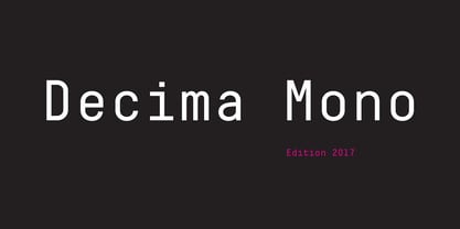 Decima Mono – condensed geometric monospaced Sans Serif typeface, released back in 2009 and quite successful ever since (MyFonts Rising Star, February 2009). This new edition is an upgraded version of Decima Mono and Decima Mono X, combining both into one edition. New version supports more Latin languages with an extension to glyph amounts. Also, six more alternate styles have been added to the original six styles.
 - Vintage Galore by Letterhend,
$12.00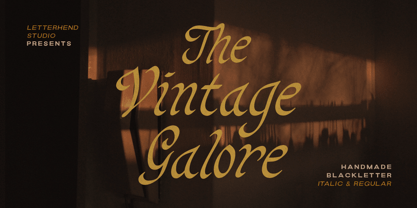 Vintage Galore is a handmade blackletter font font with casual & classic feels. This font will bring you back to 90s feel.This font perfectly made to be applied especially in logo, and the other various formal forms such as invitations, labels, logos, magazines, make up, stationery, novels, labels or any type of advertising purpose. Features : Uppercase & lowercase, Numbers and punctuation, Alternates & Ligatures, Multilingual & PUA encoded
 - Fagetone by Prioritype,
$15.00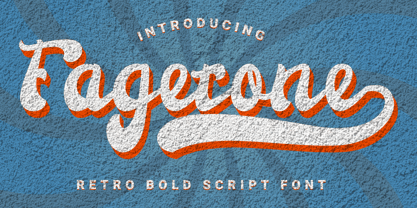 Dating back to the 60s 70s, this retro script font comes in bold bold and thin, perfect for your projects and supports multilingualism and other character additions. Can be applied to various print and digital media such as food packaging, clothing stores, accessories, clothing, creative goods, antique workshops, sports, entertainment and even logos. For reference, see preview. Features: -Uppercase -Lowercase -Numeral -Punctuation -Ligature -Multilingual
 - Syom by Luxfont,
$38.00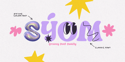 Take a trip back in time with our unique color font family Syom! The rounded and inflated shapes of the letters embody the atmosphere of decades of the last century, while remaining relevant in modern design. Features: - Real 3D effect - Extras - Multilingual - Ability to adapt 3D letters to other languages - Kerning IMPORTANT: - Check the glyphs in the font before buying! - SVG fonts contain raster letters.
 - Poster Casual JNL by Jeff Levine,
$29.00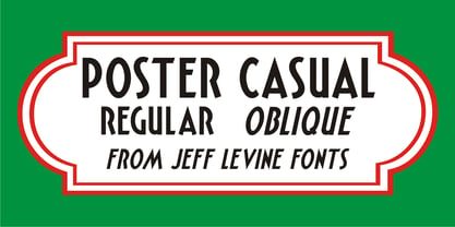 Poster Casual JNL is based on the hand lettered title on the cover of the 1929 sheet music for the song "Give Yourself a Pat on the Back"; touted at the time as being "the cheer-up song of England". Available in both regular and oblique versions, the font is perfect for applications where a less-formal look is desired in headlines or brief text.
 - Sixties Flashback by Mysterylab,
$15.00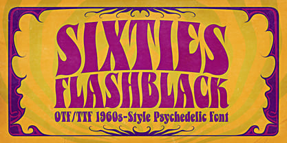 Here's a lettering style that just might be exactly on your wavelength. Add just the right dose of vintage freak-a-delia to your retro graphics with this original psychedelic-style design. Great for music posters, album graphics, book titles, etc. Evoke a warpy, wavy, whimsical vibe that harks back to the carefree 1960s or early 1970s era with Sixties Flashback; it's pure hippie, trippy fun!
 - Pixel Pants by PizzaDude.dk,
$18.00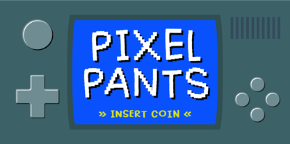 Pixel Pants is my wanna-be 1980-ies pixelfont. Well, it really looks like a pixel font, but it's kid of fake - at larger sizes you will notice the wacky and uneven lines, but it sure do bring back memories of the 80-ies! I've made 5 different versions of each letter - just to break the monotony of the usual pixel font! Insert coin and enjoy!
 - Deco Redux JNL by Jeff Levine,
$29.00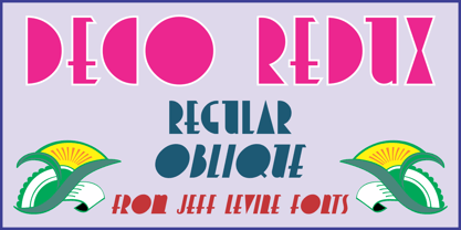 A long-set aside Art Deco typeface design begun (but not completed) may or not have been from a vintage source, but its roots go well back into Art Deco lettering. Taking the existing letters and thickening their weights, removing the counters and ending up with a completely new, solid alphabet design resulted in Deco Redux JNL, which is available in both regular and oblique versions.
 - Nouveau Handlettered JNL by Jeff Levine,
$29.00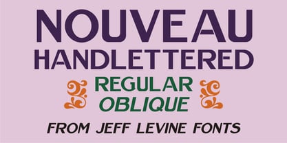 The roots of Nouveau Handlettered JNL go back to the sheet music cover for the 1917 song "(Someday) Somebody's Gonna Get You". This simple style of sans serif titling has the casual, imperfect charm of the pen and ink lettering so prevalent in the decades before metal type and other technical advancements made the craft almost obsolete. The typeface is available in both regular and oblique versions.
 - Perigord by Scriptorium,
$18.00Perigord has mixed origins. It was inspired by Gutenberg’s capitals and by lettering developed by German designer Ernst Bentele, but its calligraphic antecedents go back to French initials of the Carolingian period. The result of this is a formal, attractive and antique look which we hope you'll like. The full version includes alternate forms for many of the letters, as well as numbers and punctuation. - Driven Unicase Extended by Typekirk,
$12.00 Driven Unicase Extended is sleek and modern, yet hearkens back to the first advertising to catch my eye as a kid in the glorious 1970s – automobile ads that captured the thrill of speed, for sports cars I dreamed of experiencing. Driven is available in 6 individual weights or as a family of 6 fonts, plus ornaments. Includes accented characters supporting for many European languages.
 - Hackbot by Typefactory,
$14.00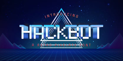 Hackbot is a font which is both retro-inspired and amusing to the eye. The gaps between the letterings allows you to feel vintage and travel back to the old times. It’s a font which uses a sans serif style of writing, but uses a retro design to make an overall unique font. It’s flawlessly suitable for promoting games, creating quotes, retro designs and much more.