1,982 search results
(0.01 seconds)
- Sweet Lemon by Hanoded,
$15.00 Sweet Lemon started off as something completely different, but I screwed up and closed one the the glyphs by accident. I kind of liked it, so I made three distinct fonts, each one with its own Italic style. In short: when a font is called Sweet Lemon, you should use it for Lemonade packaging. Or whatever.
 - Euripedes JNL by Jeff Levine,
$29.00 The Greek-influenced hand lettering on a 1930s WPA (Works Progress Administration) poster for the Federal Theater presentation of "Trojan Incident" inspired Euripedes JNL. The play was based on Homer and Euripedes, and was presented at the off-Broadway St. James Theatre (which opened in 1927 at 246 W. 44th Street on the site of the original Sardi's restaurant).
 - Kitchen Disaster by PizzaDude.dk,
$18.00 Kitchen Disaster is a wordplay, and not really a disaster! I deliberately made the lines a bit off here and there, to mimic bad poster design. In order to make your text even more natural, I added 5 different versions of each letter - and they automatically cycle as you type! Besides that, Kitchen Disaster comes with multilingual support!
 - Pesky Bug by PizzaDude.dk,
$16.00 Pesky Bug is a clean comic and kids font. Initially drawn by hand, but cleaned up digitally, leaving a fresh look - which makes it perfect for anything that has to do with kids products, sports, toys, clothing etc. The x-height, width of strokes and variating baseline are off here and there, and that leaves this active look!
 - Rustic Time by Sakha Design,
$10.00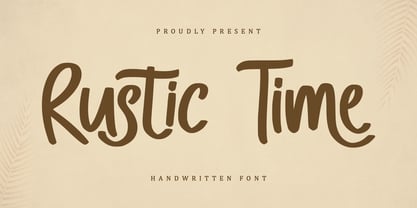 Rustic Time is a modern and casual script font that brings a retro feel to any design. Its imperfect brush strokes and playful curves give off a carefree and effortless vibe. Perfect for advertisements and designs that require a touch of nostalgia and whimsy. This font is PUA encoded which means you can access all glyphs and swashes effortlessly!
 - Decimosexto NF by Nick's Fonts,
$10.00This typeface family includes Spanish Roman letters and “Griffo” style italics, both hand-drawn by Francisco Lucas in Madrid, 1577. The letters, sometimes slightly mismatched in size or off the baseline, capture the look and feel of sixteenth-century printing. Both versions of the font include 1252 Latin, 1250 CE (with localization for Romanian and Moldovan). - Quick On by eyetype,
$16.00 Quick On is a script font with typical handmade, a work that is purely a result of handmade, has a natural characteristic. This is perfect for invitations, signatures, blogs, social media, business cards, product brands. Quick On has Stylistic standard, Stylistic Alternates and ligatures. OpenType features can be accessed by using OpenType smart programs such as Adobe Photoshop, Adobe Illustrator, Adobe Indesign, Corel Draw and Microsoft Office. They can also be accessed through the character map.
 - ITC Motter Sparta by ITC,
$29.99ITC Motter Sparta is the work of Austrian designer Othmar Motter and for its inspiration, he turned to car design. As we all know, trends in car design affect many other fields of design in a way that shapes tastes." At the end of the 1990s, Motter saw the trend moving away from soft lines and toward a tighter, tenser look: "In this latest trend, sharp clearly-defined edges meet broadly-drawn, dynamic curves and cut them off sharply." And so too is ITC Motter Sparta, with each character form distinct, which also creates a typeface instantly recognizable from a single character. "The sharp straight strokes, cut off almost at right angles, and the strong cross-stroke curves, ending in points, form a charged contrast to the vertical and horizontal straight strokes that give Motter sparta its taut framework."" - Tango by ITC,
$40.99Colin Brignall designed the Tango typeface in 1974. A groovy swirl of a font, Tango looks like disco party ready to lift off. Tango is one of many fonts that have come to symbolize the party music of the 1970s, familiar forms can be found on countless album covers from that era. Tango is a child of it's times - flashy, lively, and fun! - Mortal Coil by Hanoded,
$15.00 I was playing around with an old brush I found in our kitchen: it had fallen under the stove and it had probably been hiding there for quite some time! I dusted it off, got my Chinese ink and set to work. The result is a scary-ish font. Mortal Coil comes with discretionary ligatures for double lower case letter combinations.
 - Swagg by Miller Type Foundry,
$29.00 Swagg is a unique and friendly sans that looks great at any size. Originally starting as a branding project, Swagg is now a full fledged family with 5 weights. Swagg is loaded with goodies like old style figures, tabular figures, true italic, arrows and much more. Most proudly Swagg shows off a Greek alphabet, making it an ideal workhorse family for your collection!
 - Eterna by Wiescher Design,
$39.50 Eterna is a very beautiful font with diverse uses. In small sizes it acts like it was a Sans typeface, the swings and points tend to be overlooked. In bigger sizes it works as a very elegant embellished typeface, showing off the rich forms. The capital letters can also successfully be used as Initials. Your designer of very versatile fonts Gert Wiescher
 - Muraba Arabic by NamelaType,
$29.00 Muraba Arabic is the sibling font of Muraba, with the addition of Arabic glyphs; Arabic, Persian, Urdu, Kurdish, and Jawi (Pegon). Muraba Arabic font is a one-of-a-kind, bold vintage serif display typeface, defined by its distinctively thick, squared-off serifs that offer decorative flair. This versatile typeface is ideal for various applications, including logos, headers, and display text
 - Discolicious by Hanoded,
$15.00 Put the needle in the groove and jive baby! Discolicious brings back the golden age of moustaches and sideburns, psychedelic tie-dyes and bell bottoms. Use this ‘bubblegum’ disco font for your product packaging, magazines and party posters and they’ll look off the hook! Comes with a primo amount of diacritics, so you can let it all hang out! Word!
 - Show Biz JNL by Jeff Levine,
$29.00 The lettering style of Show Biz JNL is a classic sanserif with Art Deco influences. Slight variations in some letter shapes set it off from similar releases. The basic inspiration for this font was a set of ceramic letters and numbers used for home movie titling, but a few touches were added to give the font its own style and flavor.
 - Soulfinger PB by Pink Broccoli,
$16.00 Soulfinger PB is a another frisky offbeat typeface from Pink Broccoli, this time inspired by a vintage paperback cover of Patricia Highsmith's "A Pleno Sol". Soulfinger is a flare serif with just enough visual dance to it without going off the rails. It's simply a celebration of the original vintage paperback titling, letting it's freak flag fly, so to speak.
 - Cartesian by Tyler Jamieson Moulton,
$33.00 Cartesian is a modular typeface that gets its namesake from Descartes’s cartesian coordinate plane and Conway’s Game of Life. Each character is composed of cells that each can be considered either on or off (alive or dead.) The Cartesian family includes Cartesian Serif and Cartesian Sans Serif. Furthermore, both Cartesian Serif and Sans Serif letterforms feature two-to-one stroke contrast.
 - Flying Sausage by Remedy667,
$18.00 Flying Sausage. From beyond the stars it comes to take over your designs. Perfect for any science fiction or horror inspired comics, books, event flyers, pulps, rags, movies, logos, shirts… no design is safe, even drive-in theatre menus?!? Includes a textured version for additional layered effects that make it jump off the screen! You’ll scream for Flying Sausage. Available now!
 - Welfords by eyetype,
$20.00 Welfords is another lovely modern calligraphy typefaces, which is combining the style of classic calligraphy with an modern style. combines from copperplate to contemporary typeface with a dancing baseline, modern and elegant touch. Welfords features 500 glyphs and alternate characters Include . The Features of this fonts is; Standart ligatures Swash Alternates Stylistic Alternates Stylistic sets PUA Unicode (Private Use Areas) Programs that support in this font is a Adobe Photo Shop, Adobe Illustrator, Adobe Indesign, Corel Draw and Microsoft Office.
 - Quanika by Artisan Studio,
$17.00 Quanika a work that is purely a result of handwriting, has a natural characteristic. this is perfect for invitations, signatures, blogs, social media, business cards, product brands. Quanikahas Stylistic standard, Stylistic Initial, Stylistic Teminal and ligatures. and includes uppercase and lowercase letters, numbers and punctuation marks. FILE INCLUDE Quanikay (OpenType,PUA) Multilingual Support OpenType smart programs such as Adobe Photo Shop, Adobe Illustrator, Adobe Indesign, Corel Draw and Microsoft Office. special greetings for all, all of us all smoothly in running the routinent
 - Bungehuis by Hanoded,
$15.00 Bungehuis font was modeled on the lettering found on an Amsterdam art deco building from 1931. This building on the Spuistraat, also called "Het Bungehuis", used to house offices, but is now part of the University of Amsterdam. In 2015 it had its brief moment of fame, when students, demanding more democracy at the University, occupied it. Bungehuis is a heavy art deco font and would look great on posters and in headlines. It comes with a rather democratic range of diacritics.
 - Luminum JNL by Jeff Levine,
$29.00In hardware stores across the country are display racks with letters and numbers silk-screened onto self-adhesive aluminum "parallelograms". These handy and durable items have graced countless mailboxes, office doors, hallway signs and automobiles for years. My fellow font designing buddy [Harold Lohner] suggested that I make a font based on this form of lettering as a counterpart to my Mailbox Letters JNL (also based on self-adhesive signage product)... and now his suggestion takes shape as a digital font... Luminum JNL. - Ply by chicken,
$17.00 So the lumber was cheap - just a pile of offcuts - and so was the carpenter… And you couldn't say he was exactly lazy, but he was certainly efficient… mostly he would just cut a couple of planks to size, slice off a corner now and then, once in a blue moon hash up a curve… I guess he didn't have a drill, cos there are no holes… and he sure as hell didn't have a ruler… But he did have some kind of an eye, and until it falls off the wall it'll look pretty OK… Ply comes in six styles, offering differing degrees of neatness and adorned or not with fixings… There are money-saving packages too… It’s uppercase only, with variations between upper and lower case, and OpenType types can switch on Stylistic Set 1 to take the effort out of keeping things varied…
 - 1420 Gothic Script by GLC,
$38.00 This script font was inspired by the type most commonly used during the period 1300s to 1500s. It is a compromise between historic truth and contemporary use. We particularly thank very much the Paris Sorbonne University professor who gave us freely and patiently numerous and valuable advice and criticism for this work. This font includes “long s”, naturally, as typically medieval, a lot of ligatures as “ff, ffi, fi, ft, sd, pp...”, some special glyphs frequently used as abbreviation in Latin texts during the medieval era for replacing letter groups such as “qui, qua, que, quia, quam, per, pri, pre...”, but also a few final and initial characters and final addable loops. Instructions for use, added, helps to identify them on keyboard. It can be used for web-site titles, posters and fliers design, editing ancient texts or greeting cards, all various sorts of presentations, as a very decorative, elegant and luxurious font... This font remains clear and easy to read over a wide range of sizes. Its original medieval size is about 18/24 points.
 - Homogenic by HIRO.std,
$16.00 Homogenic is a new casual modern script font. This font describes about girly, feminist, elegant, dynamic, humanist, easy to use and will bring a good harmony when the letters are connected and paired each other. FEATURES - Support Opentype Features - Support Ligatures - Automatic stylistic alternates bb dd ee ff gg hh ii kk ll mm nn oo pp rr ss tt zz ah ak al am an ar ba bh bl br bt cl ch eh ek el em en gh ght gl gn gr gt ie ih ik il im in ir jt lt nt oh ok ol om on or or ov ow se sh sk sl sn sp sr st ue uh uk ul um un ur ve we wi wo yl yn yt Sl Sh Sk - Uppercase - Lowercase - Numbering and Punctuations - Multilingual Support - Works on PC or Mac USE Homogenic works great in any branding, logos, magazines, apparel, wedding designs, social media posts, advertisements, product packaging, product designs, label, photography, watermark, invitation, stationery and any projects that need handwriting taste.
 - Just Sunday by Ahmad Jamaludin,
$15.00 Introducing! New Elegant Script Font. Just Sunday! Just Sunday is modern feminine font, every single letters have been carefully crafted to make your text looks beautiful. With modern script style this font will perfect for many different project ex: logo, photography, watermark, quotes, blog header, poster, wedding, branding, logo, fashion, apparel, letter, invitation, stationery, etc. Just Sunday also includes Regular and Bold, full set of uppercase and lowercase letters, multilingual symbols, numerals, punctuation. The font has smooth wet ink texture, so would be perfect for all types of printing techniques+you can do embroidery, laser cut, gold foil etc. Just Sunday has beautiful ligature following : Ju Su St af ah ak al am an as at ay ch ck cl ct dd ef eh ek el em en es et ey ff if ih ik im in il is it iy ll nn oo sh sl ss st tt uf uh uk um un ul us ut uy Contact me if you have any questions: dharmasahestya@gmail.com Thanks! dharmas Std
 - Neutraface Text by House Industries,
$33.00 Although better known for his residential buildings, Richard Neutra’s commercial projects nevertheless resonate the same holistic ecology—unity with the surrounding landscape and uncompromising functionalism. His attention to detail even extended to the selection of signage for his buildings. It is no wonder that Neutra specified lettering that was open and unobtrusive, the same characteristics which typified his progressive architecture. House Industries brings the same linear geometry to Neutraface without sacrificing an unmistakably warm and human feel. FEATURES AUTOMATIC SMALL CAPS: If you specify “Small Caps”, InDesign and Photoshop will automatically substitute the true small caps charac- ters as well as the corresponding figures and punctuation for any lowercase characters. NEUTRAFACE TEXT ALTERNATES: Neutraface Text contains several stylistic alternate characters. LIGATURES: This feature is on by default. It will substitute a long list of “f” and “t” ligatures. For example, open InDesign or Photoshop and type “ff” or “tt”. Like all good subversives, House Industries hides in plain sight while amplifying the look, feel and style of the world’s most interesting brands, products and people. Based in Delaware, visually influencing the world.
 - Saturday Champagne by Roland Hüse Design,
$18.00 SATURDAY CHAMPAGNE is a monoline modern calligraphy script. Perfect for titles, headings and logotypes for blogs, ads, quote prints, home decor, book title, invitation, birthday, custom product, lifestyle imagery (like quotes and stuff). This font is written by the amazing hand letterer and fellow artist of mine, Leah Chong, and is a collaboration project. The character set contains Western and Eastern European accents and extra characters, symbols and the following open type features: Ligatures: ff ll oo rr th tt ty Finals: b c d l g p y z Instagram: @leahdesign @rolandhusedesign https://leahdesign.sg https://rolandhuse.com Awesome background image for main poster by Simon Buchou from Unsplash https://unsplash.com/@simon_buchou Background mock ups for Girls Night Out and White Sea Cosmetics are from graphicburger.com http://graphicburger.com The Quote "Reality aligns with your mindset" is my favorite and is from Matt Lopez from the Lambo Goal podcast, picture is taken and photoshopped by me. Thank you I hope you like this font & good luck with your project! Roland
 - Debacle by Reserves,
$39.99 Debacle is a super bold contrastive display face built upon pure geometric shapes. Sharp, angular lines are countered against obtuse rounded forms creating a striking visual discord. Select inner corners are rounded, giving characters dual attributes, while linear round-end counters simultaneously contrast and compliment the square-ended punctuation and symbols. Stylistically, Debacle’s prominent letterforms effortlessly create type-as-image text settings. Its style relates to the lush display typefaces from the seventies, yet is highly contemporary in its refinement and finish. Features include: Precision kerning Basic Ligature set including ‘f’ ligatures (ae, oe, fi, fl, ffi, ffl, ff, fh, fj, ft, tt, th, ct, st, la, aj, fa, ls, es, ev, ew, tz, lv, lw, ti, it, ea, kv, ka, ky, yx, xy, yy, km, yw, wy, yv, vy, kw) Alternate characters (O, Q, _, $, ®, •) Slashed zero Full set of numerators/denominators Automatic fraction feature (supports any fraction combination) Extended language support (Latin-1 and Latin Extended-A) *Requires an application with OpenType and/or Unicode support.
 - An Electronic Display LED LCD LED7 Seg 3 by Fortune Fonts Ltd.,
$15.00 * For when you need the most realistic looking electronic display. * See User Manuals Main advantages: - Spacing between characters does not change when entering a decimal point or colon between them. - Custom characters can be produced by selecting any combination of segments to be displayed. Low cost electronic displays have a fixed number of segments that can be turned on or off to represent different symbols. A digital watch would be the most common example. Fonts typically available for depicting electronic displays are often in the artistic style of these common LED or LCD displays. They provide the look-and-feel, but fall short when technical accuracy is required. Failure to represent an accurate and consistent representation of the real thing can be a cringe-worthy experience for the product design and marketing team, or even the hobbyist for that matter. To solve this problem, Fortune Fonts has released a range of fonts that accurately depict the displays typically found on low cost electronic devices: watches, answering machines, car stereos, alarm clocks, microwaves and toys. These fonts come with numbers, letters and symbols predefined. However, they also allow you to create your own segment combinations for the custom symbols you need. When producing manuals, marketing material and user interfaces, accuracy is an all-or-nothing concept. Instructions in the user manual describe how to turn these fonts into realistic displays according to your own design, in the manner of the images above. If you cannot see a license option for your specific application, such a license may be purchased from here. By purchasing &/or using &/or distributing the fonts the buyer user and distributor (including Monotype Imaging Inc. & Monotype Imaging Hong Kong) agree to (1) indemnify & hold harmless the foundry, for any consequential, incidental, punitive or other damages of any kind resulting from the use of the deliverables including, but not limited to, loss of revenues, profits, goodwill, savings, due to; including, but not limited to, failure of the deliverables to perform it’s described function, or the deliverable’s infringement of patents, copyrights, trademarks, design rights, contract claims, trade secrets, or other proprietary rights of the foundry, distributor, buyer or other parties (2) not use the fonts to assist in design of, or be incorporated into, non-software displays
 - An Electronic Display LED LCD LED7 Seg 2 by Fortune Fonts Ltd.,
$15.00 * For when you need the most realistic looking electronic display. * See User Manuals Main advantages: - Spacing between characters does not change when entering a decimal point or colon between them. - Custom characters can be produced by selecting any combination of segments to be displayed. Low cost electronic displays have a fixed number of segments that can be turned on or off to represent different symbols. A digital watch would be the most common example. Fonts typically available for depicting electronic displays are often in the artistic style of these common LED or LCD displays. They provide the look-and-feel, but fall short when technical accuracy is required. Failure to represent an accurate and consistent representation of the real thing can be a cringe-worthy experience for the product design and marketing team, or even the hobbyist for that matter. To solve this problem, Fortune Fonts has released a range of fonts that accurately depict the displays typically found on low cost electronic devices: watches, answering machines, car stereos, alarm clocks, microwaves and toys. These fonts come with numbers, letters and symbols predefined. However, they also allow you to create your own segment combinations for the custom symbols you need. When producing manuals, marketing material and user interfaces, accuracy is an all-or-nothing concept. Instructions in the user manual describe how to turn these fonts into realistic displays according to your own design, in the manner of the images above. If you cannot see a license option for your specific application, such a license may be purchased from here. By purchasing &/or using &/or distributing the fonts the buyer user and distributor (including Monotype Imaging Inc. & Monotype Imaging Hong Kong) agree to (1) indemnify & hold harmless the foundry, for any consequential, incidental, punitive or other damages of any kind resulting from the use of the deliverables including, but not limited to, loss of revenues, profits, goodwill, savings, due to; including, but not limited to, failure of the deliverables to perform it’s described function, or the deliverable’s infringement of patents, copyrights, trademarks, design rights, contract claims, trade secrets, or other proprietary rights of the foundry, distributor, buyer or other parties (2) not use the fonts to assist in design of, or be incorporated into, non-software displays
 - An Electronic Display LED LCD LED7 Seg Platz by Fortune Fonts Ltd.,
$15.00 * For when you need the most realistic looking electronic display. * See User Manuals Main advantages: - Spacing between characters does not change when entering a decimal point or colon between them. - Custom characters can be produced by selecting any combination of segments to be displayed. Low cost electronic displays have a fixed number of segments that can be turned on or off to represent different symbols. A digital watch would be the most common example. Fonts typically available for depicting electronic displays are often in the artistic style of these common LED or LCD displays. They provide the look-and-feel, but fall short when technical accuracy is required. Failure to represent an accurate and consistent representation of the real thing can be a cringe-worthy experience for the product design and marketing team, or even the hobbyist for that matter. To solve this problem, Fortune Fonts has released a range of fonts that accurately depict the displays typically found on low cost electronic devices: watches, answering machines, car stereos, alarm clocks, microwaves and toys. These fonts come with numbers, letters and symbols predefined. However, they also allow you to create your own segment combinations for the custom symbols you need. When producing manuals, marketing material and user interfaces, accuracy is an all-or-nothing concept. Instructions in the user manual describe how to turn these fonts into realistic displays according to your own design, in the manner of the images above. If you cannot see a license option for your specific application, such a license may be purchased from here. By purchasing &/or using &/or distributing the fonts the buyer user and distributor (including Monotype Imaging Inc. & Monotype Imaging Hong Kong) agree to (1) indemnify & hold harmless the foundry, for any consequential, incidental, punitive or other damages of any kind resulting from the use of the deliverables including, but not limited to, loss of revenues, profits, goodwill, savings, due to; including, but not limited to, failure of the deliverables to perform it’s described function, or the deliverable’s infringement of patents, copyrights, trademarks, design rights, contract claims, trade secrets, or other proprietary rights of the foundry, distributor, buyer or other parties (2) not use the fonts to assist in design of, or be incorporated into, non-software displays
 - An Electronic Display LED LCD LED7 Seg dots 2 by Fortune Fonts Ltd.,
$15.00 * For when you need the most realistic looking electronic display. * See User Manuals Main advantages: - Spacing between characters does not change when entering a decimal point or colon between them. - Custom characters can be produced by selecting any combination of segments to be displayed. Low cost electronic displays have a fixed number of segments that can be turned on or off to represent different symbols. A digital watch would be the most common example. Fonts typically available for depicting electronic displays are often in the artistic style of these common LED or LCD displays. They provide the look-and-feel, but fall short when technical accuracy is required. Failure to represent an accurate and consistent representation of the real thing can be a cringe-worthy experience for the product design and marketing team, or even the hobbyist for that matter. To solve this problem, Fortune Fonts has released a range of fonts that accurately depict the displays typically found on low cost electronic devices: watches, answering machines, car stereos, alarm clocks, microwaves and toys. These fonts come with numbers, letters and symbols predefined. However, they also allow you to create your own segment combinations for the custom symbols you need. When producing manuals, marketing material and user interfaces, accuracy is an all-or-nothing concept. Instructions in the user manual describe how to turn these fonts into realistic displays according to your own design, in the manner of the images above. If you cannot see a license option for your specific application, such a license may be purchased from here. By purchasing &/or using &/or distributing the fonts the buyer user and distributor (including Monotype Imaging Inc. & Monotype Imaging Hong Kong) agree to (1) indemnify & hold harmless the foundry, for any consequential, incidental, punitive or other damages of any kind resulting from the use of the deliverables including, but not limited to, loss of revenues, profits, goodwill, savings, due to; including, but not limited to, failure of the deliverables to perform it’s described function, or the deliverable’s infringement of patents, copyrights, trademarks, design rights, contract claims, trade secrets, or other proprietary rights of the foundry, distributor, buyer or other parties (2) not use the fonts to assist in design of, or be incorporated into, non-software displays
 - An Electronic Display LED LCD LED7 Seg dots1 by Fortune Fonts Ltd.,
$15.00 * For when you need the most realistic looking electronic display. * See User Manuals Main advantages: - Spacing between characters does not change when entering a decimal point or colon between them. - Custom characters can be produced by selecting any combination of segments to be displayed. Low cost electronic displays have a fixed number of segments that can be turned on or off to represent different symbols. A digital watch would be the most common example. Fonts typically available for depicting electronic displays are often in the artistic style of these common LED or LCD displays. They provide the look-and-feel, but fall short when technical accuracy is required. Failure to represent an accurate and consistent representation of the real thing can be a cringe-worthy experience for the product design and marketing team, or even the hobbyist for that matter. To solve this problem, Fortune Fonts has released a range of fonts that accurately depict the displays typically found on low cost electronic devices: watches, answering machines, car stereos, alarm clocks, microwaves and toys. These fonts come with numbers, letters and symbols predefined. However, they also allow you to create your own segment combinations for the custom symbols you need. When producing manuals, marketing material and user interfaces, accuracy is an all-or-nothing concept. Instructions in the user manual describe how to turn these fonts into realistic displays according to your own design, in the manner of the images above. If you cannot see a license option for your specific application, such a license may be purchased from here. By purchasing &/or using &/or distributing the fonts the buyer user and distributor (including Monotype Imaging Inc. & Monotype Imaging Hong Kong) agree to (1) indemnify & hold harmless the foundry, for any consequential, incidental, punitive or other damages of any kind resulting from the use of the deliverables including, but not limited to, loss of revenues, profits, goodwill, savings, due to; including, but not limited to, failure of the deliverables to perform it’s described function, or the deliverable’s infringement of patents, copyrights, trademarks, design rights, contract claims, trade secrets, or other proprietary rights of the foundry, distributor, buyer or other parties (2) not use the fonts to assist in design of, or be incorporated into, non-software displays.
 - An Electronic Display LED LCD LED14 Seg 1 by Fortune Fonts Ltd.,
$15.00 * For when you need the most realistic looking electronic display. * See User Manuals Main advantages: - Spacing between characters does not change when entering a decimal point or colon between them. - Custom characters can be produced by selecting any combination of segments to be displayed. Low cost electronic displays have a fixed number of segments that can be turned on or off to represent different symbols. A digital watch would be the most common example. Fonts typically available for depicting electronic displays are often in the artistic style of these common LED or LCD displays. They provide the look-and-feel, but fall short when technical accuracy is required. Failure to represent an accurate and consistent representation of the real thing can be a cringe-worthy experience for the product design and marketing team, or even the hobbyist for that matter. To solve this problem, Fortune Fonts has released a range of fonts that accurately depict the displays typically found on low cost electronic devices: watches, answering machines, car stereos, alarm clocks, microwaves and toys. These fonts come with numbers, letters and symbols predefined. However, they also allow you to create your own segment combinations for the custom symbols you need. When producing manuals, marketing material and user interfaces, accuracy is an all-or-nothing concept. Instructions in the user manual describe how to turn these fonts into realistic displays according to your own design, in the manner of the images above. If you cannot see a license option for your specific application, such a license may be purchased from here. By purchasing &/or using &/or distributing the fonts the buyer user and distributor (including Monotype Imaging Inc. & Monotype Imaging Hong Kong) agree to (1) indemnify & hold harmless the foundry, for any consequential, incidental, punitive or other damages of any kind resulting from the use of the deliverables including, but not limited to, loss of revenues, profits, goodwill, savings, due to; including, but not limited to, failure of the deliverables to perform it’s described function, or the deliverable’s infringement of patents, copyrights, trademarks, design rights, contract claims, trade secrets, or other proprietary rights of the foundry, distributor, buyer or other parties (2) not use the fonts to assist in design of, or be incorporated into, non-software displays
 - AF LED7Seg 1 by Fortune Fonts Ltd.,
$15.00 * For when you need the most realistic looking electronic display. * See User Manuals Main advantages: - Spacing between characters does not change when entering a decimal point or colon between them. - Custom characters can be produced by selecting any combination of segments to be displayed. Low cost electronic displays have a fixed number of segments that can be turned on or off to represent different symbols. A digital watch would be the most common example. Fonts typically available for depicting electronic displays are often in the artistic style of these common LED or LCD displays. They provide the look-and-feel, but fall short when technical accuracy is required. Failure to represent an accurate and consistent representation of the real thing can be a cringe-worthy experience for the product design and marketing team, or even the hobbyist for that matter. To solve this problem, Fortune Fonts has released a range of fonts that accurately depict the displays typically found on low cost electronic devices: watches, answering machines, car stereos, alarm clocks, microwaves and toys. These fonts come with numbers, letters and symbols predefined. However, they also allow you to create your own segment combinations for the custom symbols you need. When producing manuals, marketing material and user interfaces, accuracy is an all-or-nothing concept. Instructions in the user manual describe how to turn these fonts into realistic displays according to your own design, in the manner of the images above. If you cannot see a license option for your specific application, such a license may be purchased from here. By purchasing and/or using and/or distributing the font, the buyer, user and distributor (including Monotype Imaging Inc. & Monotype Imaging Hong Kong) agrees to (1) indemnify and hold harmless the font foundry and neither the font foundry nor distributor is responsible to the buyer or user or any other party for any consequential, incidental, special, punitive or other damages of any kind resulting from the use of the deliverables including, but not limited to, loss of revenues, profits, goodwill, savings or expected savings, due to; including, but not limited to, failure of the deliverables to perform it’s described function, or the deliverable’s infringement of patents, copyrights, trademarks, design rights, contract claims, trade secrets, or other proprietary rights of the foundry, distributor, buyer or other parties, (2) not use the fonts to assist in design of, or be incorporated into, non-software displays.
 - Osmont by Jorsetype,
$20.00 Osmont a work that is purely a result of handwriting, has a natural characteristic. this is perfect for invitations, signatures, blogs, social media, business cards, product brands. Osmont has Stylistic standard, Stylistic Alternates and ligatures. and includes uppercase and lowercase letters, numbers and punctuation marks. FILE INCLUDE Osmont (OpenType,PUA) OpenType features can be accessed by using OpenType smart programs such as Adobe Photo Shop, Adobe Illustrator, Adobe Indesign, Corel Draw and Microsoft Office. special greetings for all, all of us all smoothly in running the routine
 - Smoothen by Artisan Studio,
$15.00 Smoothen is a font that is purely handmade, has its own characteristics as monoline. It is perfect for invitations, signatures, blogs, social media, business cards, product brands. Smoothen has Stylistic standard, Stylistic Alternate, Stylistic ligatures and includes uppercase and lowercase letters, numbers and punctuation marks. Smoothen (OpenType,PUA) Smoothen (TrueType, PUA) OpenType features can be accessed by using OpenType smart programs such as Adobe Photo Shop, Adobe Illustrator, Adobe Indesign, Corel Draw and Microsoft Office. Special greetings for all of us all smoothly in running the routine.
 - TE Dewani by Tharwat Emara,
$50.00 The Dewani font is a font of original Arabic fonts and is specialized in writing in the offices of the Sultan and the kings of the Arabs. It is also one of the most beautiful Arabic fonts as it has the flexibility to write official graduation certificates, certificates of appreciation, scientific progress and decorations. It is also commonly used in writing posters and sequences for serials, films, medals and decorations on clothes. The Dewani font has its aesthetics derived from its round and interlocking letters.
 - Chaviera by Handpik,
$15.00 Hello, this time we would like to introduce a new product. namely "Chaviera", a Serif display font that has a classic, feminine, and elegant style wrapped with a beautiful Alternate stylist. The Chaviera font is perfect for various projects like logos & branding, invitations, stationery, wedding designs, social media posts, advertisements, printed quotes, product packaging, product designs, labels, photography, watermarks, special events or anything else. Feature Uppercase Lowercase Numeral Functional Ligature Stylistic Multilingual Suitable for use All adobe software Coreldraw Microsoft office Mac Or Windows