10,000 search results
(0.034 seconds)
- Refresh Screen by Arendxstudio,
$18.00 Refresh Screen contains 3 script weights (clean, rough, alternative) and 1 solid display weight. Give your new brand, wedding invitations, and quotes a fresh hand painted look with realistic texture. Refresh Screen was created to give a natural yet stylistic look to your next project! Works Great For: Logos Labels Signage Signature Logo Title Website Etsy Product Quotes Instagram Packaging Business Card & More
 - Aligha by Zane Studio,
$20.00 Introducing the new Elegant Modern Serif!!! Aligha is a modern, elegant and classy serif typeface, best suited for displaying titles, logos, branding, magazines, product packaging and invitations. Shiny comes with clean lines and smooth curves that add an extra touch of class to any project. Aligha is built with OpenType features and includes 110 ligatures, alternatives, numbers, punctuation, and also supports other languages.
 - Mint Monday by Supfonts,
$12.00 Mint Monday is a beautiful handwritten font, fashionable appearance and elegant simplicity of lines. You will fall in love with this font Font is an open type with clean shapes and precise kerning. It includes ligatures encoded by the PUA. Language support: All European languages Don't forget to subscribe so you don't miss out on the new awesome fonts Dima
 - Tavern by FontMesa,
$25.00 Tavern is a super font family based on our Algerian Mesa design, with Tavern we've greatly expanded the usability by creating light and bold weights plus all new for 2020 with the introduction of extra bold and black weights Tavern is now a five weight family. The addition of the bold weight made it possible to go further with the design by adding open faced shadowed, outline and fill versions. Please note, the fill fonts are aligned to go with the open faced versions, they may work with the outline versions, however you will have to apply them one letter at a time. The Tavern Fill fonts may also be used a stand alone font, however, the spacing is much wider than the regular solid black weights of Tavern. In the old days of printing, fill fonts rarely lined up perfect with the open or outline font, this created a misprinted look that's much in style today. To create that misprinted look using two different colors, try layering the outline fonts offset over the top of the solid black versions. Next we come to the small caps and X versions, for a font that's mostly seen used in all caps we felt a small caps would come in handy. The X in Tavern X stands for higher X-height, we've taken our standard lowercase and raised it for greater visibility in small text and for signage where you want the look of a lowercase but it needs to be readable from the street. In August of 2016 I started the project of expanding this font into more weights after seeing the font in use where someone tried creating a bold version by adding a stroke fill around the letters. The result didn't look very good, the stroke fill also caused the shadow line to merge with the serifs on some letters. This lead me to experiment to see if a new bold weight was possible for this font and I'm pleased to say that it was. After the bold weight was finished I decided to type the regular and bold weights together in a first word thin second word bold combination, however the weight difference between the two wasn't enough contrast. This lead me to wonder if a lighter weight was possible for this font, as you can see yes it was, so now for the first time in the history of this old 1908 type design you can type a first word thin second word bold combination. So why the name change from Algerian to Tavern? Since the original font was designed in England by the Stephenson Blake type foundry I decided to give this font a name that reminded you of the country it came from, however, there were other more technical reasons. During the creation of the bold weight the engraved shadow line was sticking out too far horizontally on the bottom right of the serifs dramatically throwing the whole font off balance. The original font encountered this problem on the uppercase E, L and Z, their solution was a diagonal cut corner which was now needed across any glyph in the new bold weight with a serif on the bottom right side. In order to make the light and regular weights blend well with the bold weight diagonal cut offs were needed and added as well. This changed the look of the font from the original and why I decided to change the name, additional concerns were, if you're designing a period piece where the font needs to be authentic then this font would be too new. Regular vs. Alt version? The alternate version came about after seeing the regular version used as a logo and secondary text on a major product label. I felt that some of the features of the regular version didn't look good as smaller secondary text, this gave me the idea to create an alternate version that would work well for secondary text in an advertising layout. But don't stop there, the alternate version can be used as a logo too and feel free to exchange letters between both regular and alternate versions. Where are the original alternates from Algerian? Original alternates from Algerian are built into the regular versions of Tavern plus new alternates have been created. We're excited to introduce, for the first time, all new swash capitals for this classic font, you're going to love the way they look in your ad layout, sign or logo. The best way to access alternate letters in Tavern is with the glyph map in Adobe Illustrator and Adobe InDesign products, from Adobe Illustrator you can copy and paste into Photoshop as a smart object and take advantage of all the text layer style features Photoshop has to offer. There may be third party character maps available for accessing alternate glyphs but we can't advise you in that area. I know what you're thinking, will there be a Tavern Condensed? It takes a lot of hours to produce a large font family such as this, a future condensed version will depend on how popular this standard version is. If you love Tavern we're happy to introduce the first weathered edge version of this font called Bay Tavern available in February 2020.
 - Arable by Heyfonts,
$18.00 Arable Font Is "Unique Display Font" refers to a specific type of typography that is characterized by its distinctive, one-of-a-kind design, and it is typically used for eye-catching and decorative purposes. Here's a detailed explanation of what a unique display font is: -Distinctive Design: Unique display fonts stand out because of their distinct and unconventional design. They often deviate from traditional letterforms and can take on a wide range of creative and artistic shapes. Unlike standard, legible fonts used for body text, display fonts prioritize aesthetics over readability. -Specialized Use: Display fonts are not intended for extended reading. Instead, they are used in small quantities for headlines, titles, logos, posters, banners, invitations, and other design elements where visual impact is essential. Their unique and attention-grabbing design makes them ideal for drawing attention to specific text. -Creative Freedom: Designers have creative freedom when creating unique display fonts. This allows for a wide array of styles, from whimsical and ornate to futuristic and abstract. Some display fonts may be inspired by art movements, cultures, historical periods, or nature, leading to highly original and thematic designs. -Limited Character Set: Display fonts often have a limited character set compared to standard fonts. They typically include uppercase letters, numbers, and basic punctuation marks, but may lack lowercase letters or extended characters. This limitation is due to their specialized use and focus on visual impact. -Customization: Some unique display fonts are custom-designed for specific projects or brands. Designers work closely with clients to create a font that aligns with the brand's identity or the project's theme, ensuring a truly unique and tailored result. -Combination with Other Fonts: In many design projects, unique display fonts are paired with more standard, legible fonts to achieve a balance between visual impact and readability. This combination allows for a harmonious and effective overall design.
 - Neue Haas Unica by Linotype,
$53.99 The Neue Haas Unica™ family is an extended, reimagined version of the Haas Unica® design, a Helvetica® alternative that achieved near mythical status in the type community before it virtually disappeared. Originally released in 1980 by the Haas Type Foundry and designed by Team ’77 — André Gürtler, Erich Gschwind and Christian Mengelt— for phototypesetting technology of the day, the design was never successfully updated for today’s digital environments – until now. Toshi Omagari of Monotype Studio has given this classic a fresh, digital facelift with more weights, more languages and more letters to meet today’s digital and print needs. Available in 18 styles, the Neue Haas Unica family is remarkably appropriate for a wide range of applications, possessing a delicate gradation of weights and clear character shapes. The family's lighter weights are perfect for headlines and other large settings, as well as small blocks of copy at typical text sizes. The regular, medium and bold weights know no boundaries and the heavy and black designs are ideal for when typography needs to be powerful and commanding. Like the Neue Helvetica and Univers Next typefaces, the Neue Haas Unica family can be used just about anywhere – or for any project. In addition to its 9 tailored weights and complementary italics, the Neue Haas Unica family also possesses additional characters for Eastern and Central European, Greek and Cyrillic language support, which did not exist in the original design. A cosmopolitan typeface for today's modern, discerning design needs, the Neue Haas Unica collection is a new classic in the making—one that every designer should surely have at their disposal.
 - Franzi Variable by Wannatype,
$211.00 The new sans-serif Franzi typeface family – as neutral as can be, but at the same time individual and striking. Its unmistakable character lies in the detail, with no effect pushing itself to the fore. As a wide-running typeface with a relatively large x-height, the typeface family is perfectly suited to small text sizes but, with its elegant details, it leaves nothing to be desired in display applications either. Originally designed with constructed, often rectangular elements, Franzi has gradually been rounded during the development process and is now less hard in order to guarantee optimal legibility. Franzi Variable is designed alongside the italic and the weight axes. The italics are softly and elegantly drawn, while the upright characters appear much more severe. The design appeal reveals itself in the two-storey ‘a’ – a tribute to legibility in body copy; however, for those who prefer the geometric in applications, an alternative single-storey ‘a’ is also available. All styles have small caps, superscript and subscript lowercase letters, lining, non-lining and small caps figures, fractions as well as several ligatures, alternative fonts, symbols and arrows. The Latin uppercase letters are also available as discreet swash variants. In addition to the extended Latin alphabet, the typeface family also includes the complete Greek, Cyrillic and International Phonetic Alphabet IPA. Franzi was created as a further development of an order to produce a sign for a therapy practice in Vienna’s Franz-Hochedlinger-Gasse – hence the name, which is more common as an abbreviation for Franziska than as a diminutive for the male name Franz: Franzi is therefore a hybrid typeface name which has female tendencies.
 - Radiate Sans by Studio Sun,
$20.00 Radiate Sans is a Humanist - Geometric Sans Serif fonts, Simple geometric letters shapes, medium contrast character style, It was designed lately 2018. and published on April 2020. Radiate Sans is a neutral typeface, have stroke modulation (strokes that clearly vary in width along their line) or alternating thick and thin strokes. Radiate Sans intended as a display typeface that could be used for posters and advertisements, as well as for the text of documents that need to be clearly legible at small sizes or from a distance, such as book blurbs, timetables and price lists. The family include 5 font weights, with a bonus 4 Widths in the OpenType version. It supports ISO Adobe 2, Adobe CE, Latin Extended characters, Standard Greek, and Standard Cyrillic. OpenType features include small caps, old style figures, superscript and subscript, ordinals, proportional lining figures, and case forms.
 - Xunga by Huy!Fonts,
$17.00 Xunga is a cheerful display typeface. My goal was to design a font able to fit any layout with boldness and playfulness, mixing a sign painter taste in the uppercase and some of my crappy calligraphic reverse contrast explorations with the flat brush for the lowercase. I designed several of widths to fit the page, and though about a different way of expanding the family shifting the horizontal stress axis to move the letter weight in different heights, making a 15 fonts family, suitable for making bold layouts. Xunga has an extended character set for European languages as well as Vietnamese, and shows all its potential with OpenType-savvy applications. Every font includes ligatures, catchwords in discretional ligatures, contextual alternates to avoid conflictive glyph pairs and localized forms to avoid problems with several glyphs and languages.
 - Agathsya by Egha's Studio,
$1.00 A font inspired by Javanese script that has ethnic characters. And this font is also named after the name of my new child born 18 September 2020, whose name is Ganya Agathsya. This font is suitable for logos and some ethnic products. And can be tailored to a variety of needs. Thank you Tahta Ega
 - Mottingham Elegant Calligraphy by Axara Creative,
$49.00 Mottingham Script is handwritten stylish calligraphy font, with a dancing baseline, and classic and elegant touch. Can be used for various purposes.such as headings, signature, logos, wedding invitations, t-shirts, letterhead, signage, labels, news, posters, badges etc. Mottingham Script features 338 glyphs alternate characters. Including initial and terminal letters, alternates, ligatures and multiple language support.
 - Ellis Greatter by madjack.font,
$16.00 Ellis Greatter is an easy to read script that is designed with a vintage look making it bold, classic and fun. It includes OpenType features and alternative styles. It can be used for various purposes such as posters, t-shirts, signage, logos, news, badges and more. International support for most Western languages is included.
 - Aesthetic Romance by Sign Studio,
$15.00 Sign Studio presents a new font which is beautiful and romantic style. Aesthetic Romance is medium thick which means it can be versatile for captioning as well as Title Display. Equipped with beautiful Ligature characters and alternative characters. This font would be perfect for any design of titles, headers, branding, labels, magazines, posters and more.
 - Granny Tales by OKSHUtypeCO,
$12.00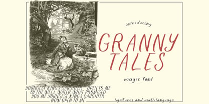 Granny Tales - a new fresh handmade calligraphy font. Very suitable for greeting cards, branding materials, business cards, quotes, posters, and more!This font are perfect for wedding postcard. Or you can create perfect and unique design of your logo, blog, stationery, marketing, magazines and more :) Features : Ligatures UpperCase & Lowercase Numerals & Punctuations Multilingualcharacters(AÀÁÂÃÄÅCÇDÐEÈÉÊËIÌÍÎÏNÑOØÒÓÔÕÖUÙÜÚÛWYÝŸŸ ÆŒßÞàáâãäåæçèéêëìíîïðñòóôõöøùúûüýÿ)
 - Rettrama by Gassstype,
$23.00 Hello Everyone, introduce our new product Font Rettrama This Is Simple Script Display Font .This is a Textured Natural Style and classy style with a clear style and dramatic movement. This font Rettrama is great for your next creative project such as logos, printed quotes, invitations, cards, You can activate 16 Ligatures glyphs OpenType panel.
 - Moreganic by Invasi Studio,
$19.00 Inspired by plants and healthy lifestyles. Introducing Moreganic Font, our new and fun font collection. Combining a hand-drawn style with a modern touch. Moreganic comes with Alternates that you can use to give more options to your projects. Moreganic Font is ideal for branding projects or packaging that need an organic and playful feel.
 - Blueberry Powder by OKSHUtypeCO,
$9.00 About the Product Blueberry Powder FONT DUO - a new fresh handmade calligraphy font. Very suitable for greeting cards, branding materials, business cards, quotes, posters, and more!This font are perfect for wedding postcard. Or you can create perfect and unique design of your logo, blog, stationery, marketing, magazines and more :) Multilanguage sans and script Ligatures
 - Rockless by Fargun Studio,
$16.00 Rockless is handwritten stylish copperplate calligraphy fonts, combines from copperplate to contemporary typeface with a dancing baseline, classic and elegant touch. Can be used for various purposes. such as headings, signature, logos, wedding invitation, t-shirt, letterhead, signage, lable, news, posters, badges etc. Features All Uppercase and Lowercase Number & Symbol Supported Languages Ligatures PUA Encoded
 - InkArt Labels by John Moore Type Foundry,
$24.95 Inkart is a font dingbats, shapes for new labels or frames that the user can supplement according to the requirements and purposes. It consists of a set uppercase containing the forms, and a set is lower case which has areas of the same shapes to be colored by layers. Contains retro and modern styles.
 - Silly Girls by HIRO.std,
$16.00 Silly Girls is a Monoline font. This font describes about girly, feminist, dynamic, easy to use and easy to use and will bring a good harmony when the letters are connected and paired each other. FEATURES - Support Opentype Features - Support Ligatures bb dd ee ff gg kk ll mm nn oo pp rr ss tt st at att et ett it itt ot ott ut utt yt gt lt rt The - Uppercase - Lowercase - Numbering and Punctuations - Multilingual Support - Works on PC or Mac USE Silly Girls works great in any branding, logos, magazines, wedding designs, social media posts, quotes, invitation, stationery, craft and any projects that need monoline handwriting taste. Enjoy using! Thanks. HIRO.std
 - Transat by Typetanic Fonts,
$29.00 Transat is a geometric sans serif typeface, with caps inspired by Art Deco signage — found inside the “Gare Maritime” (literally “sea station”) ocean liner terminals in both Le Havre and Cherbourg, France, in the early 1930s. The name “Transat” is the common shortening of “Compagnie Générale Transatlantique,” the company that operated majestic ocean liners like the SS Normandie out of Le Havre from 1862–1974. (Transat also has a more rational text-friendly companion font, " Transat Text ") Transat includes many OpenType features, such as ligatures (ff/ft/fft), small capitals, case sensitive forms, stylistic alternates, arbitrary fractions, and a full complement of proportional, tabular, and oldstyle figures. Transat is released in 5 weights plus including optically-corrected obliques.
 - Grimoire by Floodfonts,
$29.00 Grimoire on the other hand combines two seemingly contradicting principles — calligraphic and constructive ideas — and makes them work together. The font is based on a modular system but simulates a handwritten typeface. Felix Braden about this concept: "I was so fascinated by this idea, that I have since designed a couple of typefaces following this principle, e.g. the psychedelic Bikini released by Volcanotype. Even my recent work, the multi awarded FF Scuba is inspired by this concept, however with increasing age I have become less interested in experimental typography and more so in designing typefaces which are more versatile in use." For a detailed type specimen have a look at: http://on.be.net/17WyhE6
 - Moguine Serif by Mans Greback,
$69.00 Moguine Serif is a neo-classic serif typeface. With disappearing hair thin lines and weighted vertical strokes, this modern font family is the perfect lettering for a headline. Why not use Moguine Serif for a short poem or quote that requires a neutral but beautifully clean look. Created with pride and care, this type has the optimal appearance of a classic vintage logo but for a modern setting. The font family consists of the styles Regular and Italic. The font is built with advanced OpenType functionality and has a guaranteed top-notch quality, containing stylistic and contextual alternates, ligatures and more features; all to give you full control and customizability. It has extensive lingual support, covering all Latin-based languages, from Northern Europe to South Africa, from America to South-East Asia. It contains all characters and symbols you'll ever need, including all punctuation and numbers.
 - Unitext by Monotype,
$50.99 Created with the needs of branding design in mind, Jan Hendrik Weber's Unitext is a crisp, clean typeface that functions well across print and online use. It blends humanist and grotesque qualities, adopting a style that the designer describes as “neo grotesque”. Narrow spacing is what sets this typeface apart, however it also uses open counters and angled details to boost readability. “The ideal font should work at every touchpoint,” says Weber. “And designers shouldn’t need an introduction or a set of rules on how to handle this typeface. Unitext allows designers to work without explanation.” The Unitext family includes 7 weights, spread across 14 fonts with extensive Western, Central and Eastern European language support. Unitext Variables are font files which are featuring one axis and have 14 names instances: Hairline, Hairline Italic, Extralight, Extralight Italic, Light, Light Italic, Regular, Italic, Semibold, Semibold Italic, Bold, Bold Italic, Black, Black Italic
 - Thenna LV by Miroslav Cunic,
$25.55 ThennaLV Bold is a slightly contrasted and a bit extended (not just basic) font family with two styles suitable for typing headlines in newspapers or magazines, giving the name of a book, composition and more. The font family consists Latin and cyrillic characters.
 - Jeyran by Michael Browers,
$25.00Jeyran is a handwriting font co-developed by Elnara Browers and Michael Browers. Based on Elnara Browers' handwriting, Jeyran is her first font design. Elnara's fluency in multiple languages facilitated the development of an extended character set that includes both Latin and Cyrillic. - Crayon Hand by Letters&Numbers,
$28.00 In absence of oil pastels, charcoal, crayons or time, Crayon Hand is a quick fix to happy type setting. It comes in regular and bold. Enjoy! Crayon Hand is extended, containing West European diacritics making it suitable for multilingual environments and publications.
 - Malte by Deltatype,
$49.00 Malte is a geometric sans-serif typeface, inspired from the modern age. Designed to use as type play, headline, quote and for composition. Malte come with nine weights that mappings to CSS font weights. Malte supported many languages as included extend latin glyphs.
 - The Inlines by Okaycat,
$19.50 The Inlines is available in two styles - inlined, or non-inlined. A distinctive font set for logo creation, titling, and more. Check it out! The Inlines is extended, containing West European diacritics and ligatures, making it suitable for multilingual environments and publications.
 - Vivala Sans by Johannes Hoffmann,
$15.00 The character of Vivala Sans Round is modern and stylish with elegant squarish shapes. The family includes five weights. A large x-height is ideal for titles and body text. The extended character set supports languages like Western, Central European, and Eastern European.
 - CC Angular by Okaycat,
$24.50 Angular is all angular. This font has no curves! Dingbat symbols & icons replace a handful of the generally unused alternate characters, to make this font extra fun & useful. Angular is extended, containing West European diacritics & ligatures, making it suitable for multilingual environments & publications.
 - Larque by Furiosum,
$20.00 Larque is a slab serif text typeface. The tall x-height and the open counters makes the font very legible at small sizes. Larque includes extended latin characters, ligatures, oldstyle figures and Open Type features. It is available in roman and medium weight.
 - Matrice by Studio Sun,
$20.00 Matrice is a sans serif (Semi Extended) display font family in 8 weights plus matching natural italics. support 75+ Languanges (Latin Based) influenced by the grotesk typefaces developed in the early 20th century, perfect for branding (Identity), logotype, headline text, and caption.
 - Dogjaw by Aerotype,
$29.00Dogjaw uses the OpenType ligature feature to automatically substitute a unique pair of distressed characters when any upper or lower case letter is keyed twice in a row. Dogjaw Pro extends the character set to support Eastern European Latin, Baltic, Greek and Turkish. - Mobil Pro by RMU,
$35.00 In 1960 Ludwig & Mayer released this Matheis design which was completely redrawn, digitized and extended for most main European languages, West and East. To take advantage of all ligatures in this font, I recommend to activate both OT features, standard and discretionary ligatures.
 - Timenhor by Evertype,
$25.00Timenhor is a Latin-script font whose glyphs are based on the uncial letterforms of Coptic manuscripts. Timenhor is compliant with Unicode encoding and has an extended character set, supporting Celtic and Eastern European languages. It has both regular and italic styles. - Segmenta by Librito.de,
$15.00Segmenta, a sans serif typeface developed from the gridbased type of the Hamburg S-Bahn (metro). The type is originally used for diplaying informations about the trains. The typeface contains all accents and special letters for extended latin and the baltic languages. - FDI Triumph by FDI,
$29.00 FDI Triumph revives Albert Auspurg’s “Triumph” typeface originally released in 1929 by the type foundry Ludwig Wagner in Leipzig. The forgotten design was carefully digitized from the original wood type font and extended to cover the Western codepages Win 1252 and Mac Roman.
 - ATC Duel by Avondale Type Co.,
$20.00 ATC Duel is a strong, extra heavy multi-width sans-serif display font with sharp edges and an extended horizontal span, inspired by the automotive industry. Font contains 500+ glyphs, full alphabet, ligatures, numberals, accents and punctuation. ATC Duel was released in 2016.
 - ST Titan by ShimanovTypes,
$20.00 ST Titan is a retro futuristic display font with vintage vibes, inspirated by old sci-fi book's headers and posters. It's good for social media, headlines, large-format print, branding, posters, fashion designs and websites. Extended Latin and Cyrillic support. 30+ languages