10,000 search results
(0.09 seconds)
- Galicia by Device,
$29.00 Galicia is a looser calligraphic serif that has unusual forms that are seen to good effect in characters like the lower case a. It is suggested for use where a more formal and classic yet still warm and calligraphic look is appropriate.
 - Bohemio by Wiescher Design,
$39.50 Bohemio was designed in memory of Gunter Böhmer, an artist famous for his many book covers of the 1950s in Germany. The cover I took as an inspiration for this font is that of a book called Stiller (by Max Frisch). Bohemio sounds similar to "Böhmer" (which means the one from Bohemia) and it is also an alliteration to artisty. I thought "Bohemio" to be a nice name for this very strong, almost expressionist design. Yours very artsy craftsy Gert Wiescher
 - PL Radiant by Monotype,
$29.99Radiant font was designed by Robert Hunter Middleton in 1938 and first appeared with the Ludlow Typograph Company. It displays the strong stroke contrast typical of transitional antiquas but has no serifs. It mixes characteristics of the antique style with that of the sans serif and is therefore referred to as a sans serif antiqua. The font Brittanic displays similar characteristics. The slender characters with their high x-heights give Radiant font an elegant, sophisticated look. The finer weights are a good choice for short and middle length texts and the bolder weights are good for headlines. - Radiant by NicePrice Font Collection,
$4.99Radiant font was designed by Robert Hunter Middleton in 1938 and first appeared with the Ludlow Typograph Company. It displays the strong stroke contrast typical of transitional antiquas but has no serifs. It mixes characteristics of the antique style with that of the sans serif and is therefore referred to as a sans serif antiqua. The font Brittanic displays similar characteristics. The slender characters with their high x-heights give Radiant font an elegant, sophisticated look. The finer weights are a good choice for short and middle length texts and the bolder weights are good for headlines. - Boldies by Illushvara,
$14.00 Boldies is a serif font, mixed the modern with the classic concept line serif. The Alternate shape will make your design look like Modern. But don't worry if you need the Design like Classic and Bold Serif, you just put the normal Uppercase and Lowercase. With many ligatures will make your design projects stand out! Add this font to your most creative ideas for Application, Art Gallery Poster or postcard, Architectural Logo Project, Classic Magazine, Product Skincare or Logotype you want to used! Support the Multilingual Language! If you have any question, don’t hesitate to contact me. Happy Designing !!! Thank You, Illushvara Design
 - Revla Sans by Eclectotype,
$40.00 NEWSFLASH! Revla Sans is now available specially tailored for smaller settings. Take a look at Revla Sans Text ! Meet Revla Serif 's dorky younger brother, or should that be brothers? Revla Sans is a grotesque companion to Revla Serif, in four weights. The weights can be used pretty easily as grades, so that text set at different sizes has similar thickness. The contextual alternates engine from its serifed sibling is used to pseudo randomise the text and avoid the monotony of repeating glyphs. Other features include case sensitive forms, standard and discretionary ligatures, stylistic sets and automagic fractions.
 - Romantic SS by Sensatype Studio,
$15.00 Romantic is a Modern Beauty Sans Serif A Sans Serif font that we created special for branding needs with classy shape to add value of your brand. It's so nice to leverage designer or product owner that need solutions to make their design look more classy and fashionable. And specially for Romantic font, We prepared any characters with Elegant shape to help you create classy style of your design. Romantic Modern Beauty sans serif font ready with: Lowercase and Uppercase characters Numbers and Punctuations Preview as a inspirations that you can do with Romantic font Wish you enjoy our font.
 - VTC Optika - Unknown license

- Galdana Caption by Eurotypo,
$28.00 Galdana Caption family contain 4 styles: Regular, Italic, ExtraBlack and ExtraBlack Italic Created to use as main typeface, headline or in combination with the family of fonts Galdana (text) The most important characteristic of the italic style is the slanted angle at seventeen degrees, short ascenders and descenders with dynamic calligraphic flavor. This family is completed with multilingual support and a set of OpenType features such as stylistic alternates, swashes, and ligatures.
 - Praxis Next Variable by Linotype,
$314.99Praxis Next Variable Italic is a single font file that features an italic design with two axes: Weight and Width. For your convenience, the Weight and Width axes have preset instances The Weight axis has a range from Light to Ultra. The Width axis provides a range of condensed values. This Italic font is provided as an option to customers who do not need Roman (uprights), and want to keep file sizes to a minimum. - Belizio by Font Bureau,
$40.00 The eight-part Belizio series updates the first Font Bureau typeface. David Berlow’s family is based on Aldo Novarese’s Egizio, designed in 1955 for Nebiolo. It was first prompted by the popularity of Haas Clarendon, designed by Hoffmann and Eidenbenz, an impeccably Swiss revival of the traditional English letterform. Aldo Novarese was among the first to investigate a true italic designed in the Clarendon style; FB 1987–98
 - Story Tales by Resistenza,
$39.00 A fairy tale, is a folklore genre that takes the form of a short story. Story tale, is a new type family for wonderous, romantic, magical and playful narratives brought to you by Resitenza. The 1970s were wild and whimsical times. Book covers from this time were iconic, innovative and enduring; bold colour and stylised pattern dominated. Story Tales forms were inspired by 70s books covers, and aims to encapsulate the zeitgeist of the time, but the typeface is by no means constrained to revivals of this era. There are nods to 60's flower power & psychedelia, chromatic type and decorative queues from the 1800s and the spirit of post-war era children's almanacks. It is also perfectly suited to inspiring curiosity, imagination and fantasy in today's audiences. Each of Story Tales 8 styles (4 upright and 4 italics) stack on top of one another giving the designer broad aesthetic range. This layering of styles and the ornamental illumination allows striking multi-coloured typography for your book covers, editorial and poster designs.
 - Agmena Paneuropean by Linotype,
$103.99Agmena™ has no historical precursor; it was designed from scratch by Jovica Veljovi? whose aim was to create a new book typeface. Although it generally has certain similarities with the group of Renaissance Antiqua fonts, it is not clearly derived from any of these. Clear and open forms, large counters and a relatively generous x-height ensure that the characters that make up Agmena are readily legible even in small point sizes. The slightly tapering serifs with their curved attachments to letter stems soften the rigidity of the typeface, bringing Agmena to life. This non-formal quality is further enhanced by numerous tiny variations to the letter shapes. For example, there are slight differences to the terminals of the b", the "d" and the "h" and minor dissimilarities in the forms and lengths of serifs of many of the letters. The tittles over the "i" and "j" and those of the German umlauts are almost circular, while the diamond shape that is more characteristic of a calligraphic script is used for the punctuation marks. Although many of these variations are only apparent on closer inspection, they are enough to give Agmena the feeling of a hand-made typeface. It is in the larger point sizes that this feature of Agmena comes particularly into play, and individual characters gain an almost sculptural quality. The italic variants of Agmena are actually real cursives. The narrower and thus markedly dynamically formed lowercase letters have a wider range of contrast in terms of line thickness and have the appearance of having been manually produced with a quill thanks to the variations in their terminals. The lowercase "a" assumes a closed form and the "f" has a descender. The italic capitals, on the other hand, have been consciously conceived to act as a stabilising element, although the way they have been inclined does not produce a simply mechanical effect. This visual convergence with the upright characters actually means that it is possible to use letters from both styles in combination. Agmena is available in four weights: Book, Regular, Semibold and Bold, and each has its matching italic variant. Veljovi? designed Book and Regular not only to provide an optical balance between various point sizes, such as between that used for the text and that used in footnotes, but also to take account of different paper forms: Regular for lined paper and Book for publishing paper. Agmena's range of characters leaves nothing to be desired. All variants include small caps and various numeral sets with oldstyle and lining figures for setting proportional text and table columns. Thanks to its pan-European language support, Agmena can be used to set texts not only in languages that use the Latin alphabet as it also features Cyrillic and Greek characters. The set of standard ligatures has been extended to include special combinations for setting Greek and Serbian. Agmena also has some initial letters, alternative glyphs and ornaments. Agmena is a poetic text font with forms and spacing that have been optimised over years of work to provide a typeface that is ideal for setting books. But its letters also cut a good figure in the larger font sizes thanks to their individual, vibrant and, in some cases, sculptural effects. Its robust forms are not merely suited to a printed environment, but are also at home among the complex conditions on terminal screens. You can thus also use Agmena as a web font when designing your internet page."Agmena has received the Certificate of Excellence in Type Design at the Type Directors Club of New York TDC2 competition in 2013. - Ladronn by Comicraft,
$39.00 Comicraft first created this font, based on the unique European lettering style of Ladronn, for the Marvel X-book CABLE in 1998. It was later upgraded for THE INHUMANS mini-series, and modified again for the HIP FLASK mini-series in 2002. In 2018, we Remastered it for the new LOST IN SPACE series from Legendary, with improved spacing and kerning, an additional Bold weight, and our patented Crossbar I Technology to automatically place the crossbar I in the right spots.
 - Garlic by Java Pep,
$15.00 The proudly present an elegant font that always outstanding in every your project design. Garlic font is a versatile typeface that perfect for designing a headline, title, wedding invitations, logotype, quotes, advertisements, and more. Garlic font offered 4 styles set such as regular, italic, outline regular, and outline italic so you can be combining to make a more elegant and beautiful design. What's included Garlic regular and italic (otf, ttf, and web font) Garlic Outline regular and italic (otf, ttf, and web font) Multilingual, support 17 languages If you have any questions don't hesitate to drop me a message. Stay safe, healthy, and have a nice day
 - Validity Script by Mans Greback,
$29.00 Validity Script is a cute, outlined handwriting font family. The typeface was drawn and developed by Måns Grebäck and Misti Hammers during 2019. With swirly letters and charming wilderness it is perfect for a crafty project or an invitation with a personal touch. It comes in three weights and each weight as Italic, totaling in six styles: Thin, Thin Italic, Regular, Regular Italic, Bold, Bold Italic. Each font of this family is of high-quality and contains OpenType features. The fonts have extensive ranges of glyphs; they support all Latin-based European languages, contain numbers as well as all symbols and characters you'll ever need.
 - Letraset Crillee by ITC,
$40.99Crillee is a family of our styles that was originally produced by Letraset. In 1980, Dick Jones designed Crillee Italic. Jones also designed the family's second style, Crillee Extra Bold Italic, in 1981. Peter O'Donnell designed Crillee Bold Italic in 1986. The fourth style, Crillee Italic Inline Shadow, was completed by Vince Whitlock. At the time of Crillee's development, Jones, O'Donnell, and Whitlock were all employees of the Letraset Type Studio. Crillee's slight lean to the right and geometric forms create a feeling of power and speed. Crillee should be spaced closely in word settings and is perfect for anything which should have a cool, modern appearance. - TT Phobos by TypeType,
$35.00 TT Phobos useful links: Specimen | Graphic presentation | Customization options TT Phobos is a pliable display serif with a soft and gentle character. The features of the typeface are the moderate contrast between bold and thin strokes, pliable visual compensators, and the counter-clockwise bend of internal ovals. In addition to 6 weights and 6 italic, TT Phobos also includes two original decorative fonts, inline and stencil. Despite its pliability and display character, TT Phobos is dynamic enough and is well suited for text arrays even in large text blocks. The serifs of letters are completely asymmetrical and bring in dynamics when reading the text from left to right. Thanks to the harmonious contrast of black and white forms and internal negative spaces of the letters, as well as its broad letter spacing, the typeface is well read in small sizes. In this case, the character of the letters is completely preserved, partially thanks to the exaggerated elegant visual compensators. The ornamental pattern used in TT Phobos Inline varies for capital and lowercase letters. Capital letters implement a more complex double inline with a rhombic element in the middle, and in the lower case features a simplified form of the inline, made in a single movement. Thanks to the original cutting, TT Phobos Stencil stands out for its expression, and the rounded cuts add even more visual style to the font. TT Phobos consists of 14 faces: 6 weights (Light, Regular, DemiBold, Bold, ExtraBold, Black), 6 Italics, inline and stencil. There are 17 ligatures in TT Phobos, including several Cyrillic ones. The typeface has stylistic alternates, which adds an italic effect to the upright fonts, and a little solemnity of the upright version to the italics. In addition, we have not forgotten about the old-style figures and other useful OpenType features, such as ordn, sups, sinf, dnom, numr, onum, tnum, pnum, liga, dlig, salt (ss01), frac, case.
 - Huerto by Stiggy & Sands,
$24.00 A Geometric Angular Sans & Italic with Pizazz The Huerto Family began as a digitization of a film typeface from LetterGraphics known simply as "Horino Bold". The original specimen included standard Capitals and Lowercase, Numerals and limited punctuation. We've fleshed out the original style and added a true italic with swash alternates to the family. Where the original had a feeling of rugged permanence to it, the italic with swashes adds a fleeting dynamic appeal. Opentype features include: - Full set of Inferiors and Superiors for limitless fractions. - A small collection of Standard Ligatures. - A small set of Stylistic Alternates - Swash Capitals for the Italic style only. Approx. 423 Character Glyph Set: Each style of Huerto comes with a glyphset that includes standard & punctuation, international language support, and additional features. Huerto Italic has a 565 character glyphset due to additional swash and alternates.
 - Point Panther by Sarid Ezra,
$13.00 Introducing, A NEW POWERFUL BOLD FONTS WITH ALTERNATES, Point Panther! Point Panther is a headline font with super bold style that contains up to 6 Alternates each characters! You can make a unique branding with this fonts. this powerful bold fonts also included italic and outline style! This fonts suitable to use for poster, branding, merchandise, and any street art style! Also support multilingual. What will you get: Point Panther Regular (Regular, Italic ) Point Panther Bold (Bold, Bold Italic) Point Panther Outline Regular (Regular, Italic ) Point Panther Outline Bold (Bold, Bold Italic) How to access the alternates! If you use PS/AI you can see the tutorial in this : https://helpx.adobe.com/illustrator/using/special-characters.html You can use the PUA for software design that not support Opentype. For another questions, please send a mail to saridezra@gmail.com. Thank You!
 - Montecatini Pro by Louise Fili Ltd,
$35.00 Montecatini takes its cues from the elegant Stile Liberty travel posters of Italy in the early 1900s. In its successful first release by Louise Fili Ltd in 2017, the typeface introduced distinctive ligatures typical of the time when Art Nouveau emerged as a worldwide phenomenon. Now Montecatini has been expanded into 24 alluring styles, spanning 6 weights and 4 widths. With the addition of these new styles, Montecatini has a dynamic capacity for comprehensive use and pairing. Everything looks better in Montecatini, from book jackets to monograms to packaging and logos—and the wide selection of ligatures, weights, and widths makes copyfitting a delight. Montecatini Pro’s ligatures are setup as contextual alternates. If you would like to try out Montecatini Pro’s ligatures or learn more about the font, please visit: https://www.louisefili.com/montecatini-pro
 - Campora by W Type Foundry,
$25.00 This year we attended the Bologna Children’s Book Fair in Italy. In our days off, we went to Piazza Maggiore to see what the city had to offer and luckily for us we saw an incredible store sign saying CAMPORA. We took some pictures of the typed font and later back in the studio we discovered that it was Dynamo. Immediately our minds were blown away by its beauty and thus we decided to design a new font inspired by its sharp and geometric design adding new weights and OpenType features. In the process we realized that both Dynamo and one of our favorite fonts Avant Garde, share a similar structure, so we made a type mashup between these beauties, including the sharpness of Dynamo and the revolutionary ligatures of Avant Garde.
 - Scorno by Rosario Nocera,
$22.99 Scorno is a geometric sans serif that offers a high legibility also in the lighter weights. Scorno is ideal for sports and technology. The shape of its letters makes it different from most geometric fonts, making it suitable for branding, magazines, catalogues and much more. Scorno is available in nine weights, from thin to heavy plus matching italics and it comes with open type features like old style and lining figures, ligatures, numerator, denominator, scientific figures, and fractions. What’s more, it also features the bitcoin symbol in the currencies set.
 - Skapa by Fontoura,
$24.00 Skapa is all about creation (translation from Old Norse: "to create"). It's simply the font I always needed and wanted. A well balanced, modern with delicate round corners sans serif, comprised of 5 weights with matching italics. Great for varied graphic design projects and perfect for logos and headlines, print art, billboards etc. Extended support for Central, Eastern and Western European languages. OpenType layout features: Fractions, oldstyle figures, ligatures, slashed zero, superscript, subscript, numerator, denominator and combining diacriticals (Mark Positioning) plus tabular figures for standard figures ,oldstyle figures & currency symbols. Think. Design. Create.
 - Hercílio by Sea Types,
$25.00 Hercílio is a typographic family without condensed serif, modern and geometric inspired by the architectural forms of the Hercílio Luz Bridge in Florianopolis | Brazi Comprising eleven (11), weights of which ten (10) business are: Five weights Romans: Light, Normal, Regular, Medium and Bold Five Italics weights: Light, Normal, Regular, Medium and Bold And a weight (FREE) Hercílio Decorative Comprising 430 glyphs in each source, brings support for 56 languages (Latin and West, Central and East European) still has features Open Type, ligatures and tabular figures. http://www.cort9.com/wp-content/uploads/2016/05/Specimen_Hercilio.pdf
 - Carelia by My Creative Land,
$29.00 Carelia is a modern multilingual (including cyrillic) serif family with classic forms, enhanced by extended OpenType features. It is well suited for all sorts of design - starting from web, to editorial and branding. Its stylistic alternates, swashes and ligatures (more 1200 glyphs in each font) will make your design even more stylized and unique. Carelia comes in two styles Upright and Italic - each has it's own character but both share the same curves and style. Both fonts are fully unicode mapped - can be used in any application of your choice.
 - Quickly Freehand by Cititype,
$12.00 Quickly Freehand is a sans serif font in a casual handwriting style, this is an alternative font for when you get bored with the formal atmosphere. Comes with two versions, regular and italic, to complement your design needs. You can use this font for product labels, taglines, children's craft, prints on t-shirts, paper bags, headlines, cheerful quotes and even long text writing. This font can be used in various graphics software, even in Microsoft Word. Supports 27 languages allowing Quickly Freehand to be used in the wider world.
 - NuOrder by The Northern Block,
$29.00 NuOrder is a modern-day sans-serif typeface with humanist bones. The design incorporates a dynamic structure with minimal contrast and a natural stroke path to promote easy reading—resulting in a warm well-balanced typeface best suited for a wide range of applications in a hi-tech era. Details include nine weights with matching italics and over 550 characters per style. Opentype features consist of five variations of numerals, including inferiors, superiors, fractions, alternate lowercase a and g, and language support covering Western, South, and Central Europe.
 - Moxtas by holyline design,
$24.00 MOXTAS by Holyline, MOXTAS is a retro serif font family, This font very elegant and unique comes in seven weight with italic. It's very unique, playful, elegant and very easy to combine with your design style. MOXTAS perfect for headline, sub headline ,custom logo,packaging, quote, invitations, watermark,social media posts, label, anything for your creativity and MOXTAS is perfect font if you want something new with your project, you can play the 14 font style, and you can pairing this font with the weight, its very satisfy. Happy creating!
 - Zart by DSType,
$40.00 Zart is a heavy yet delicately sensitive display typeface filled with character, a free interpretation of the classical French styles from the late eighteenth century, reimagined for modern use. While it’s vertical strokes carry the typical weight of this style, the thinness of the horizontal strokes is further extended into the characters with the introduction of large vertical ink traps. This allowed us to design slightly narrower letters which, coupled with shorter serifs, result in a overall darker expression, creating really impactful headlines. Zart is available in three versions: Regular, Italic and Script.
 - Bagoni Type by Attract Studio,
$17.00 Bagoni Type is a very versatile, clean and visually elegant font inspired by the serif typography used in editorial media in the 80s. Bagoni Type with its high contrast and very simple and easily recognizable shape makes it very easy to read, so it also works with small and long text. Great for magazine pictures, for wedding invitations, for branding, poster design and more. Bagoni Type comes in bold and italics that is complemented by various features of open type. Check out Gradia which is a great pair for Bagoni Type.
 - Dx Grove by Dirtyline Studio,
$20.00 introducing Dx Grove, a vintage-inspired font that seamlessly blends nostalgia with elegance, making it the perfect choice for your design projects. This timeless serif font comes in 4 Style regular and Condensed including the italic too. offering you versatility and style for your graphic design, branding, and packaging projects. Capture the essence of the past with Dx Grove free-spirited vintage charm, bringing a touch of yesteryear to your creations. Ideal for wedding invitations, branding, or projects that need nostalgic 90’s font aesthetics, this hand-drawn typeface is bold and versatile.
 - Gilroy by Radomir Tinkov,
$25.00 Gilroy is a modern sans serif with a geometric touch. A younger brother of the original Qanelas font family. It comes in 20 weights, 10 uprights and its matching italics. The Light & ExtraBold weights are free of charge, so you can use them to your heart’s content. Designed with powerful opentype features in mind. Each weight includes extended language support (+ Cyrillic), fractions, tabular figures, arrows, ligatures and more. Perfectly suited for graphic design and any display use. It could easily work for web, signage, corporate as well as for editorial design.
 - Grosen by Hurufatfont,
$23.00 Grosen Typeface Family is designed by Oğuzhan Cengiz in the years 2017-2019. It has a grotesque structure that contains humanistic effect. Although it is designed upon the basic geometric structure, it shows own style with expansion that makes a reference to serif at start and finish of round letters. Grosen Typeface Family has fourteen styles with seven weights and theirs real italics. These have advanced OpenType features; like small capitals, case sensitive signs and math symbols, alternative characters (a, g, M, J, &), automated fractions, oldstyle figures, tabular linings, proportional numbers...
 - Nizzoli by Los Andes,
$19.00 This typeface is a tribute to well-known Italian designer Marcello Nizzoli. Nizzoli is a modern sans serif font that offers a wide range of alternatives—a workhorse type well suited for headlines, posters, corporate identity and advertising campaigns. This modular design is based on geometric shapes and combines straight lines with rounded corners. The whole family is composed of four 7-weight subfamilies: one normal and one alternative plus rounded versions. Each subfamily includes matching italics. This typeface is my own interpretation of those curves and shapes found in Marcello Nizzoli’s designs.
 - Bassidle by Josstype,
$24.00 Bassidle Font is a sans serif font family that is simple but strong, defined by sharp edges with a modern touch. It is designed to exude a sense of strength and toughness as well as optimal readability. t’s a perfect choice for branding, magazines, posters, advertising, packaging, headlines, logos, web, print etc. 14 styles: 7 uprights and matching italics. 222 glyphs. Latin based languages. OpenType features, including ligatures. OTF, TTF files. Variable Font Includes. Thank you for your purchase! and please let me know if you have any questions. via email: joelpopon@gmail.com
 - Marek Slab by Rosario Nocera,
$14.99 Marek is a slab serif font it takes it's name from a football player from the Naples soccer team “Marek Hamsik”. It is composed of 5 weights (thin, light, regular, bold and black with matching italics), it's ideal for big headers as for magazines, t-shirts, branding and much more. It is available in open type format and includes alternative fonts (a,K,k,g), ligatures, oldstyle and linear number. Moreover, it includes the glyph of the new bitcoin currency, supports more than 80 languages and it's composed of 392 glyphs.
 - Vitro by The Northern Block,
$24.95 Vitro is a rectangular sans serif with a pinch of grotesque. The solid technical appearance has been achieved through careful optical adjustment, resulting in a modern and stylish font that stands out in the crowd. Vitro is suitable for a wide range of branding purposes, including brochures, logos, packaging, posters, signage, websites etc. Details include nine weights with italics and over 450 characters per style. Opentype features consist of digital numerals, numerators, denominators, tabular, fractions and language support covering Western, South and Central Europe—remastered to version 2.0 for enhanced OpenType features and usability.
 - Pandtos by dayflash,
$31.99 Pandtos is a clear sans serif typeface based on geometric shapes. Precise lines and accurate curves are the main characteristics of this fresh and modern font family. While unique letterforms constitute Pandtos’ distinctive appearance, extended widths, tall x-heights and clear shapes provide good legibility and nice readability even at smaller sizes. With its contemporary feel, Pandtos is suitable for almost any type of analogue and digital application. The Pandtos font family includes unique letterforms, exclusive ligatures and extensive OpenType features. Pandtos comes in four weights with matching italics.
 - Secret Memories by Flawlessandco,
$9.00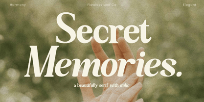 Secret Memories is a Serif Italic Font with a classy and elegant style in each character, so it's fitted for some wedding invitation display. There's some connected letters and some alternates that suitable for any graphic designs such as branding materials, t-shirt, print, business cards, logo, poster, t-shirt, photography, quotes .etc This font support for some multilingual. Also contains uppercase A-Z and lowercase a-z, alternate character, numbers 0-9, and some punctuation. If you need help, just write me! Thanks so much for checking out my shop!
