6,977 search results
(0.016 seconds)
- Jeunesse by Monotype,
$29.99The design of the Jeunesse font family derives from a study of primers which the designer undertook earlier in his career. Jeunesse was designed with the intention of combining excellent legibility and character recognition with the ability to create compact, distinctive words and lines while maintaining basic flourishless letterforms. The sans serif style is pre-dominant in this design, but serifs or rather parts have been added where necessary, mostly at the top left hand parts of the characters, to aid readability. Use Jeunesse as a text and display face. There are also fully sans serif and slab serif versions available which can be used on their own or mixed with each other and the parent fonts. - Kisba Nova by Identity Letters,
$29.00 Kisba Nova – A character actor that turns heads. Spiky serifs, soft ball terminals. All eyes on Kisba Nova: enter a typeface designed to arouse attention. Kisba Nova is that one guest who joins a party, and a murmur goes through the crowd. Kisba Nova is pure charisma. Opposites attract: Kisba Nova combines sharp wedge serifs and spiky spurs with round and soft ball terminals. Infuse this with a neoclassical stroke contrast and you get a thrilling typeface driven by visual extremes. Sure: Kisba Nova is a diva. But it’s a pro, after all. That’s why it comes in two optical sizes: Headline and Text. This makes sure it looks gorgeous in any situation. The Kisba Nova Headline subfamily is flaunts the trademark flamboyant looks and extravagant letters like f and k. They bring you all of the excitement of the showbiz in large applications—use it for sizes of 24 Pt. and more. The extraordinarily designed, thin and monolinear diacritics, punctuation marks, and symbols of Kisba Nova Headline add to this modern and elegant character. Kisba Nova Headline consists of seven weights from Thin to Black, offering plenty of possibilities to set headlines and titles. With about 600 characters per weight, it contains enough functionality for the demands of a skilled typographer. OpenType features, such as a large set of ligatures, extended language support, case-sensitive forms, different sets of figures, and arrows, enable sensational designs both in web & print layouts. The Kisba Nova Text subfamily comes with decreased contrast, more generous letter proportions, and wider spacing. Instead of employing flashy thin and monolinear diacritics, punctuation marks, and symbols, Kisba Nova Text aims for a more even texture on the page. It retains the true, elegant Kisba DNA while allowing you to set legible copy in sizes between 9 and 18 Pt. Nothing will distract your reader–Kisba Nova Text aims to please. Kisba Nova Text consists of seven weights from Thin to Black, offering plenty of possibilities to set body copy and subheadlines. With about 600 characters per weight, it contains enough functionality for the demands of a skilled typographer. OpenType features, such as a large set of ligatures, extended language support, case-sensitive forms, different sets of figures, and arrows, enable sensational designs both in web & print layouts. Kisba Nova celebrates the dual nature of softness and sharpness in a single typeface. It’s a character actor that turns heads.
 - Aire by Lián Types,
$37.00 Aire is what Sproviero would call a < big display family >. We recommend seeing its user’s guide. After his success with Reina, Sproviero comes out with this big family of 7 members: Each of them loaded with lots of sophisticated ligatures, alternates and the entire cyrillic alphabet. The overall impression that the font gives is lightness and delicateness; that’s the reason the designer chose to call it Aire, or Air, in English. "Aire was somehow having a rest from my fat face Reina [...] It started as a really thin style of Reina, but it rapidly migrated from it and grew up alone. And how it grew..." The inspiration came from his own past creations: “The heavy strokes of Reina were shouting for a more delicate thing. Something more feminine. More fragile. Something which had a lot of elegance and fresh air inside”. Aire responds to this: Sproviero found that many of the typefaces of nowadays which are used for headlines (best known as display fonts) have almost always just one, maybe two weight styles. This was his opportunity to try something new. Aire makes it easier for the user to generate different levels/layers of communication thanks to its variety of styles. With this font you can solve entire decorative pieces of design with just one font, and that was the aim of it. Aire was designed to be playful yet formal: While none of its alternates are activated it can be useful for short to medium length texts; and when the user chooses to make use of its open-type decorative glyphs, it can be useful for headlines with dazzling results. On March of 2012, Aire was chosen to be part of the most important exhibition of typography in Latinoamerica: Tipos Latinos 2012. TECHNICAL Aire is a family with many members. In total, the user can choose between almost 6,000 (!) glyphs (1,000 per style). Each member has variants inside, which are open-type programmed: The user decides which glyph to alternate, equalizing the amount of decoration wanted. Every decorative glyph has its weight adjusted to the style it belongs to. Exclusively for decoration, Aire Fleurons Pro is an open-type programmed set of ornaments. And last but not least, remember Aire is delicate. What’s my point? It is not recommended to activate all the alternates at the same time. It is typo-scientifically proved: A maximum of 3 or 4 alternates per word would be more than enough.
 - Crown Jewels by TofinoType,
$120.00 Crown Jewels is a massive Super Pro font like no other. This must be one of the most complex font ideas ever imagined. Based on an original font by George Williams, Crown Jewels takes that original idea to a whole new level. Containing thousands of glyphs, it has the size and complexity for any fancy job. This font is like hundreds of fonts in one. Many OpenType features and sub-styles to give you hundreds of different looks. Every single capital letter has been hand-sculpted into a unique complex shape like no other. Multi-language support for numerous countries including Greece and Russia. It also has advanced Open Type features like converting numbers to Roman Numerals automatically for your art projects. Numbers from 1 to 3,999,999,999 can be converted automatically to two different Roman Numeral styles. This font also comes with a nice large pdf manual explaining every function so please read it in its entirety so you can use this font successfully. There is a optional add-on font of Flourishes containing over 800 complex glyphs that can be used with this font or any font you already own. It will bring your fonts and art projects to life. It also has numerous OpenType features programmed so that each feature simply outputs 94 flourishes at a time to your keyboard. There is also a complete color-coded pdf directory of each and every one so you can find the shape you want fast. Every single one is available in recent versions of Photoshop and InDesign by simply turning on a OpenType feature and hitting a key on the keyboard. There is also a separately programmed ligature feature in case that is the only OpenType feature you have and just with that feature every single glyph can be placed into your documents easily. Crown Jewels is priced so you don't have to lay siege to the tower to afford it. It has a very low cost per glyph and is actually one of the best values here. This font took over nine years to make and it’s still just pennies a glyph. Usage: Photoshop styles, InDesign, Promotion Logos, Monograms & Signatures....That’s where it shines and it’s made for art, cards, fancy documents, really super fancy labels & even notes to Mom. If you have a fancy art project that needs doing this is the font to use.
 - Maestro by Canada Type,
$24.95 Out of a lifelong inner struggle, Philip Bouwsma unleashes a masterpiece that reconciles classic calligraphy with type in a way never before attempted. Maestro takes its cue from the Italian chancery cursive of the early sixteenth century. By this time type ruled the publishing world, but official court documents were still presented in calligraphy, in a new formal style of the high Renaissance that was integrated with Roman letters and matched the refined order of type. The copybooks of Arrighi and others, printed from engraved wood blocks, spread the Italian cancellaresca across Europe, but the medium was too clumsy and the size too small to show what was really happening in the stroke. Arrighi and others also made metal fonts that pushed type in the direction of calligraphy, but again the medium did not support the superb artistry of these masters or sustain the vitality in their work. As the elegant sensitive moving stroke of the broad pen was reduced to a static outline, the human quality, the variety and the excitement of a living act were lost. Because the high level of skill could not be reproduced, the broad pen was largely replaced by the pointed tool. The modern italic handwriting revival is based on a simplified model and does not approach the level of this formal calligraphy with its relationship to the Roman forms. Maestro is the font that Arrighi and his colleagues would have made if they had had digital technology. Like the calligraphic system of the papal chancery on which it is modelled, it was not drawn as a single finished alphabet, but evolved from a confluence of script and Roman; the script is formalized by the Roman to stand proudly in a world of type. Maestro came together on screen over the course of several years, through many versions ranging widely in style, formality, width, slant, weight and other parameters. On one end of the spectrum, looking back to tradition it embodies the formal harmony of the Roman capitals and the minuscule which became the lower case. On the other it is a flowing script letter drawing on the spirit of later pointed pen and engravers scripts. As its original designers intended, it works with simple Roman capitals and serifs or swash capitals and baroque flourishes. The broad pen supplies weight and substance to the stroke which carries energy through tension in balanced s-curves. Above all it is meant to convey the life and motion of formal calligraphy as a worthy counterbalance to the stolid gravity of metal type. The Maestro family consists of forty fonts distributed over two weights. The OpenType version compresses the family considerably down to two fonts, regular and bold, each containing the entire character set of twenty fonts, for a total of more than 3350 characters per font. These include a wide variety of stylistic alternates, ligatures, beginning and ending letters, flourishes, borders, rules, and other extras. The Pro version also includes extended linguistic support for Latin-based scripts (Western, Central and Eastern European, Baltic, Turkish, Welsh/Celtic, Maltese) as well as Greek. For more thoughts on Maestro, its background and character sets, please read the PDF accompanying the family.
 - Gersio by Rosario Nocera,
$16.00 Gersio is a revisiting of a lapidary typeface from the 19th century designed for the horror and thriller genre but thanks to its strong distinctiveness it’s also suitable for branding. Gersio is available in light, regular and bold weights in two versions: solid and Scratched, it also offers a large selection of alternative letters. Gersio is suitable for display works, posters and billboards.
 - Elizabeth ND by Neufville Digital,
$45.25 Elizabeth ND is known for being the first typeface designed by a woman: Elizabeth Friedlander. It was engraved in 1938 by the Bauersche Gießerei. It has two styles: roman and italic. Its grace, delicacy and beauty allow many compositional possibilities, making it an ideal choice for use as a display and headline typeface. Elizabeth is a Trademark of BauerTypes SL
 - Mancho by Ahmet Altun,
$-The Mancho Font was completely created by graphic tablet. This font family comes in two weights; regular and bold. They're all capital but lowercase and capital letters are different from each other. The name “Mancho” comes from Turkish Rock Music Singer "Barış Manço". The Mancho font can be a part of your stylish designs with its free and powerful outlook. - FeggoliteKeyed by Ingrimayne Type,
$9.00 FeggoliteKeyed has letters on rounded rectangles with shadows. The letter shapes are from a decorative, monospaced font called FeggoliteMono. The typeface contains characters that will add color to letters. There are two ways to do this. One uses layers and the other a combination of characters, some with zero-width. A file in the gallery explains the ways that this can be done.
 - Rettisha by Stripes Studio,
$15.00 Rettisha Display is a stylish serif with beautiful ligatures. Available in two styles: Normal and Expanded fonts. Designed with clean and high contrast. Add interest with adding beautiful ligatures to make your typography truly unique. Perfect for anything your creativity. To access the Opentype Ligatures you will need software that supports Opentype features in fonts and also PUA unicodes support for other software.
 - Arazatí by TipoType,
$9.99 Arazatí was inspired by Edward Johnston’s typefaces, although its design is not based on a literal reconstruction. It has 48 variants of 422 glyphs each. In addition, it offers two monospaced variants for free. Arazatí is the name of the place where Johnston was born in 1872, located in San José, Uruguay. This typeface is a tribute to his birthplace.
 - FebDrei by Ingrimayne Type,
$9.95 FebDei is neat, meticulous hand printing in two weights, plain and bold, each with italics. It has little contrast and appears as if it was written with a pencil or ball-point pen. Unlike many other hand-printing fonts, it has tiny serifs. FebDrei was created in the process of making the fonts AllSmiles and BringInTheFrowns and can be used with them.
 - Mezitha by Koray Özbey,
$10.00 Mezitha is display font that has an ethnic view with modern style. It's suitable for branding, packaging, printing, poster designs, natural products etc. Mezitha Ornaments contains 3 groups of symbols. 1- Combining Ornaments 2- Repeating glyphs to create borders with finishes. 3- Single symbols. Most of the glyph has alternates and all of them has two version (thick and thin).
 - Syntho by Gspr one,
$5.00 Syntho is a modular typeface with 18 variants and a Variable Font. Its structure is geometric and modular, but its proportions resemble those of classic grotesque typefaces, giving it a familiar feel to the designer. It also includes two subfamilies, 200 and 300, which are expansions of the typeface in width, providing greater possibilities for the designer in any project.
 - Ziboulateur by Kitchen Table Type Foundry,
$15.00 Ziboulateur is French slang for bottle opener. The word consists of two parts: Zibula (a word from Congo-Brazzaville meaning: ‘to decork’) and the French suffix -ateur. I thought this rather creative word would be a good name for this particular font! Ziboulateur is a handmade, all caps display font. It comes with extensive language support, including Sami and Vietnamese.
 - Parten by Surotype,
$20.00 Parten a typeface inspired by old motel signage. Available in two styles Regular and italic with alternative characters such as Stylistic Alternates, Stylistic Set, and Swash Variant. Parten very suitable to use on many of your design projects such as : Signage, Logotype, Headline, Packaging, and more. To enable the style alternative, you need a program that supports the opentype features.
 - Vantagram by TEKNIKE,
$69.00 Vantagram is a modern display font. The typeface is made from basic square geometry. It is inspired by blackletter typefaces of the medieval period in Europe. The Vantagram name is a combination of two words derived from “vanta” French for boast and “gram” Greek for letter or that which is drawn. Vantagram is great for display work, quotes, titles, headings and posters.
 - Signs Of Yesterday JNL by Jeff Levine,
$29.00Signs of Yesterday JNL brings another twenty-six vintage signs inspired by a series of decals once made by the Duro Decal Company (now Duro Art Industries) of Chicago. This font complements the original twenty-six designs found in Too Much Information JNL. There are two blank sign panels on the parenthesis keys for use in creating custom retro signage. - Midnight by Three Islands Press,
$29.00Midnight is a neon-sign-style font with two "gauges," Light and Bright. Works best when used in reverse against a dark background. The styles have a 2:3 ratio, as do the gauges of the neon "tubing," making both fonts equally useful across a range of applications. An elegant, stylish, wonderfully rendered display font. Comes with a complete character set. - Jorgey by Gatype,
$12.00 Jorgey's casual brush script has a nice texture and flow. Jorgey has many alternatives to make it look like real handwriting; four sets of lowercase and two sets of uppercase. suitable for design projects; logos, branding, posters, quotes, beautiful wedding invitations, beautiful stationery art, eye-catching social media posts, and cute greeting cards and other designs. It is unique, very natural and attractive
 - Cleodify by Namara Creative Studio,
$15.00 Inspired by bold & retro typefaces in the ’90s, Cleodify comes with a retro-ish style. The bold design combined with classical proportions gives a choice for creative work. Cleodify Sans is available in two style : Regular and Rounded. Features : Full Set of standard characters and punctuations. Alternates, ligatures and multilingual support characters. PUA Encoded | no special software needed to access extra characters.
 - LHF Asylum by Letterhead Fonts,
$43.00 A ragged jagged experiment that's sure to fit the needs of any mad scientist or extreme skier dude (you know the type). Features two sets of variations: one set on the uppercase keys and a different set on the lowercase keys. Mix and match them for best effect. No twisted or mangled points in this font. All paths guaranteed technically sound.
 - Calserif by Great Studio,
$19.00 Calserif is a serif font combined with a calligraphy serif font. With its blend of classic elements and contemporary designs, this serif family has two versions, a choice of regular serif styles and italic calligraphy styles. These fonts are perfect for your design needs such as making nostalgic but still clean and elegant designs such as headlines, magazines, logo designs, packaging, editorials, invitations.
 - Sport Lines by Kaer,
$19.00 Typeface for sport labels, business headlines, finance posters, delivery cards etc. Letters made of two parallel lines. I hope you enjoy this font. Follow my shop to receive updates of products and the very hottest news! If you have any question or issue, please contact me: kaer.pro@gmail.com Please request to add additional characters and glyphs if you need! Thank you!
 - Dongo by Larin Type Co,
$16.00 Dongo This is a fun and playful font, which will perfectly fit into children's projects or funny modern designs and logos, with it you can make playful designs by changing styles and combining them with each other. This font includes two styles - regular and outline. Font includes: Full alphabet with Uppercase and Lowercase A-z Numbers, fractions Punctuation and symbols Alternates for lowercase
 - Hamuel Nine Five by LightHouse,
$49.00Hamuel Nine Five was inspired by two sources, both with few letters, and different styles. The first one was a fresco in the el-Transito Synagogue, Toledo, built in 1357 by order of Samuel Abulafia, treasurer to the king of Castile. The second one was a mezuzah cover, Morocco, 19th century. Hamuel Nine Five is an OpenType/TTF Unicode font. - Spacy Avocado by PizzaDude.dk,
$15.00 Due to some grease on a menu, I misread "Spicy Avocado" as "Spacy Avocado" which led me to the name of this font. I love Avocados and I love things that are a bit spacy, and I love the combination of these two! Space Avocado is my handdrawn, layered headline font. Mix the layers or use them as a single font - you choose!
 - Huggy by Typogama,
$19.00 Huggy is a display typeface designed by Michael Parson and inspired by the work of Heinrich Heinz. Full of Art Nouveau flair, this two weight typeface is bold forceful but full of subtle features that give the design a unique personality. With a narrow width and tall aspect, it is perfect for setting text in tight spaces like posters or other titling situations.
 - Chewy Geewy by Agny Hasya Studio,
$12.00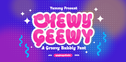 Chewy Geewy is a Playful, Groovy Bubbly, and Fun typeface. Come in 2 (two) styles (regular & slant) and is created with some alternate and ligature. Featured with Uppercase & Lowercase, Numeral & Punctuation, Multilingual Support, Opentype Features Perfect for your design projects like logos, branding, advertising, product designs, magazine designs, book/cover title designs, art quotes, special events, labels, product packaging, and more.
 - Mona by WildOnes,
$12.00 Mona hand lettered font is a hand drawn brush font. It has contrasting thin and bold lines. This is a decorative font, so it works best for short descriptions, logos, identities, packaging design. Also looks great on diferent invitations and posters. The typeface has two styles - regular and bouncy. Boucny is ideal for designs where you need just a little bit more playfulness.
 - Big Moore by Carter & Cone Type Inc.,
$35.00 A 1766 specimen by Isaac Moore, former manager of Joseph Fry’s foundry in Bristol, England, shows many types inspired by John Baskerville’s. But a century later, standardization had foisted inept lining figures and shortened descenders upon these designs. Matthew Carter remedies the tragedy with Big Moore, restoring oldstyle figures, full-length descenders, and historic swashes to this regal serif in two styles.
 - Rashela by Agny Hasya Studio,
$9.00 Rashela is a Decorative Serif Display Font, Modern, Luxury, and Elegant Come with 2 (two) styles (regular & italic) and is created with glyph variations like alternates and ligatures. Perfect for your design projects like logos, branding, advertising, product designs, stationery, photography, art quotes, wedding designs, fashion designs, and more. Featured with Uppercase and Lowercase, Numeral and Punctuation, Multilingual Support, and Opentype Features.
 - Vespertine by Gassstype,
$28.00 Here comes a New font, Vespertine is a Strong Rough Brush Font that is written casually and quickly. comes in two mode = Standart and italic. Letters are made with brushes on Procreate. Then crafted carefully drawn into vector format. That is why Vespertine has Rough and strong characteristic more natural look to your text with a more modern look to your text.
 - Artvod by Tour De Force,
$25.00 The Artvod font family is a graduate project of Dusan Jelesijevic on the topic Museum of Digital Art. The whole project included a 15 minute interactive presentation through building of Artvod Museum, consisting of 15 posters and the font in two weights (Regular and Bold). The Artvod font family also appears in IndexBook's book Homage of Typography by Pedro Guitton.
 - Gio by Fenotype,
$20.00 Gio is a wedge serif with robust geometric features and subtle details. Available in two widths and seven styles each, Gio boasts a generous x-height and straight endings, maintaining generally consistent proportions. This creates an elegant ensemble, ideal for captivating display purposes. Gio excels in magazine layouts, headlines, as a logotype, or in any display use, imparting a sophisticated modern feel.
 - Junge Holiday Cuts NF by Nick's Fonts,
$10.00A charming series of 26 holiday “type warmers” based on the works of Carl S. Junge for the Barnhart Brothers & Spindler type foundry in the 1920s. Single-color cuts are in the uppercase positions, while 13 of the cuts suitable for two-color usage occupy the lowercase in adjacent pairs; e.g., a and b, c and d, and so on. - Yuli by Hanoded,
$15.00 Yuli is my daughter - she was born on February 13th, 2014. I named this font after her, because there are some similarities. Both are bouncy and happy, playful and quirky, funny and happy - and above all: cute and cuddly. Yuli font was loosely based on Bodoni and Spumoni - two typefaces I like a lot. Yuli speaks a lot of languages.
 - Vanrott by Ergibi Studio,
$15.00 Vanrott is an old font with two styles: Regular and Destroyed. Both styles have a bold, prominent, old-fashioned but modern look! Vanrott is perfect for those of you who need fonts for titles, logos, clothing, invitations, branding, packaging, advertisements, and more. Vanrott includes uppercase and lowercase letters, punctuation, symbols, numbers, stylistic sets, alternate, ligatures as well as multi-lingual support.
 - Arazatí by Underground,
$9.99 Arazatí was inspired by Edward Johnston’s typefaces, although its design is not based on a literal reconstruction. It has 48 variants of 422 glyphs each. In addition, it offers two monospaced variants for free. Arazatí is the name of the place where Johnston was born in 1872, located in San José, Uruguay. This typeface is a tribute to his birthplace.
 - Pipetton by Letterhend,
$16.00 This family consist of two fonts, the main script font and complementary sans font which is perfectly matched with the script font. This font is suitable to use as a logotype / wordmark / label, etc with its unique and bold characters makes it stand out from the crowd. This font is comes in uppercase, lowercase, punctuations, symbols & numerals, stylistic set alternate, ligatures, and swashes.