10,000 search results
(0.023 seconds)
- SK Fencer by Shriftovik,
$10.00 SK Fencer™ is a typeface inspired by the fine art of fencing. Its light linear features contrast with the angular thicknesses, creating a unique image of the font and influencing its behavior in the line. Using alternative uppercase characters, you can implement a lot of typographic ideas that will decorate your design. A large selection of weights will also be a great help in your work. The SK Fencer typeface is suitable for both headers and small text arrays, and its widest set of glyphs supports both extended Latin, Cyrillic and many other languages. SK Fencer – elegant, practical, dynamic, unusual!
 - Kageb Bold by Product Type,
$13.00 Introducing Kageb Bold Serif Display Font, a font that exudes boldness and confidence. With its sharp and pointed serifs and thick lines, this display font makes a strong and impactful statement. The font is perfect for creating headings, titles, and logos that demand attention. Kageb Bold Serif Display Font is ideal for designs that require a bold and daring look. The font’s character is unmistakably strong and powerful, making it suitable for branding, advertising, and other marketing materials. It can also be used in editorial design, such as magazine layouts, where the boldness of the font can make a statement. With multilingual support, Kageb Bold Serif Display Font is accessible to a wider audience, enabling designers to reach out to different markets. Whether you’re designing for a fashion brand, a sports team, or an event, this font will give your design a bold and unforgettable presence. What’s Included : - File font - All glyphs Iso Latin 1 - We highly recommend using a program that supports OpenType features and Glyphs panels like many Adobe apps and Corel Draw, so you can see and access all Glyph variations. - PUA Encoded Characters – Fully accessible without additional design software. - Fonts include Multilingual support
 - Tiverton by Adam Fathony,
$15.00 The idea behind this typefaces was to combine something retro and vintage with a style of this century. A reference from Vintage Typography, Art Deco, Neo Deco. With an improvised and create something in between those styling. Tiverton created in Serif, Sans-Serif and Script. Within 3 Style, it more helping and easier for create something without "thinking" the font compartment. Features of Sans Serif and Serif are comes with stylistic alternates and you can activated with Contextual Swash button on Adobe Illustrator or Adobe Photoshop, And Catchword such as the preview above, activated with underscore in the beginning and end of the letters, for example : _ the _ (underscore)the(underscore). Features of Tiverton Script are Ligatures, Contextual alternates, Contextual Swashes. no alternates. but Tiverton Script available with 2 Weight, Light and Regular. For a bonus, I create an Ornament Fonts. Special shout for the ornament fonts are for the borders. on the Number Character 0-9 are created for connected borders. for Beginning and end the lines you can press Shift on the Number Character. For example : type !2222@ on the text preview below and see on the Tiverton Ornament.
 - Blank Manuscript by Aah Yes,
$14.95Blank Manuscript allows you to produce sophisticated musical scoresheets even on basic Word Processors - anything from simple plain staves to complex full-page orchestral scores of your own design, to write in the notation yourself. The basic stuff is really easy and straightforward, but there's some quite advanced things you can do as well. So Copy and Save these Instructions. • The main stuff is simple and tends to follow the initial letter. Treble, Bass and Alto clefs are on upper case T B A (there are more clefs, below). The 5 Lines for the clefs are on L or l. • A small v will give a small vertical line (like a bar line) and a Big U will give a Big Upright - these can start or end a line or piece. • Time Signatures - type the following letters: Think of W for Waltz and it's easy to remember that 3/4 time is on W. Then from that they go up or down together like this: V=2/4 W=3/4 X=4/4 Y=5/4 Z=6/4 Compound Times are on H I J K like this: H=3/8 I=6/8 J=9/8 K=12/8 Common Time and Cut Common symbols can be found on semi-colon and colon respectively (all begin with Co- ). 2/2 3/2 are on lower case a and b, 7/4 and 7/8 are on lower case c and d, 5/8 is on small k (think POL-k-A) • Flat signs are on the numbers. Flat signs on LINES 1 to 5 are on numbers 1 to 5. Flat signs on SPACES 1 to 5 are on numbers 6 to 0 (space 1 being above line 1, space 5 being above the top line of the stave). Sharp signs are on the letters BELOW the long-row numbers. Which is q w e r t for the sharp signs on Lines 1 to 5, and y u i o p for sharp signs on spaces 1 to 5. Doing it this way means it works the same for all clefs, whether Treble, Bass, Alto, Tenor or any other. Sharp and Flat Signs always go in this order, depending on how many sharps or flats your key signature requires: Treble Clef Sharps t i p r u o e Flats 3 9 7 4 2 8 6 Bass Clef Sharps r u o e t i w Flats 2 8 6 3 1 7 = Alto Clef Sharps o e t i w r u Flats 7 4 2 8 6 3 1 • Guitar Chord Boxes are on G and g (G for Guitar) Upper Case G has a thick line across the top Lower case g has an open top, for chords up the fretboard TAB symbols are available: Six-string Tablature is on s & S for Six. Four-string Tablature is on f & F for Four. (Lower case has the "TAB" symbol on it, Upper Case has just the lines to continue.) Five-string tablature, is on lower case "j" (as in BAN-j-O) and of course L or l will continue the 5 lines. •RARE CLEF SIGNS including Tenor Clef, are on various punctuation marks, i.e. dollar, percent, circumflex, ampersand & asterisk, above the numbers 4 to 8. NOTE: The important symbols were kept on the letter and number keys, which are fairly standard all over, but some of the less important symbols are on various punctuation keys, which in different countries are not the same as on my keyboard. If it comes out wrong on your system, all I can say is it's right on the systems we've tried, and they'll be in here somewhere, probably on a different key. CLOSING THE ENDS OF THE LINES and BAR-LINES is done with the 3 varieties of brackets - brackets, brace and parentheses - Left/Right for the Left/Right end of the line. Parentheses L/R () which are above 9, 0 give a clef with a small vertical upright (the same as a bar line). Brace L/R and Brackets L/R (both on the 2 keys to the right of P on my keyboard) will close off a staff line with tall upright bars. Brace gives a double upright - one thick, one thin. Brackets give a single tall upright. A Big Upright is on Big U, (Big U for Big Upright) and a small vertical line is on small v (small v for small vertical). The Big Upright is the maximum height, and the small vertical is exactly the same height as a stave. And there's a tall upright Bar, on Bar (which is to the left of z on my keyboard, with Shift,) which is the same height as the bar on upper case U but twice as broad. • There's a staff intended for writing melodies, which is a little bit higher up than an ordinary treble clef giving a space underneath to put lyrics in - on m and M for Melody line. Lower case has the Treble Clef on, Upper case M has just the higher-up staff lines with no clef. (Use mMMMMMMM etc.) However this clef will be in the wrong place to put in sharp and flat signs, key signatures and so on, so if you use this clef you'll have to write the sharps, flats and key signature yourself. There's also a clef that's smaller (less tall) than the ordinary clef, but with the same horizontal spacing so it will align with other standard-sized clefs - on slash (a plain clef) and backslash (with a Treble Clef). • There are some large brackets for enclosing groups of staves, such as you'd use on large orchestral scores, on Upper Case N O P Q R, which can aid clarity. N and O on the left, Q and R on the right. P is a Perpendicular line to be used on both sides to increase the height of the enclosure, in this way but with the staff lines in between: N Q P P P P P P O R OTHERS —————————————— • Repeat marks are on comma (left) and period/full stop (right). • Hyphen is left as a sort of hyphen - it's a thin line like a single staff line, with the same horizontal spacing as ordinary staff lines - in case you want to draw a line across for a Percussion Instrument, or a Title or Lyric Line. • Space is a Space, but with HALF the width or horizontal spacing as ordinary staff lines, so 2 space symbols will be the same width as a clef symbol or line. • Grave (to the left of 1 on the long row, or hold down Alt and type 0096 then let go) gives a staff line that is one eighth the width of an ordinary staff line. • If you want manuscript in a clef and key which requires a flat or sharp sign in the space underneath the 5 lines, they’re on = equals and + plus . SYMBOLS • Many of these symbols will only be useful if you have worked out in advance which bars will need them, but they are here in case you've done that and wish to include them. • Symbols for p and f (piano and forte) are on 'less than' and 'greater than' < > (above comma and full stop) and m for mezzo is on Question, next to them. They can be combined to make mp, mf, ff, pp, etc. These signs -- and other signs and symbols like Pedal Sign, Coda Sign and so on -- can be found on various punctuation mark keys, including above 1, 2, 3 in the long row, and others around the keyboard. There's a sort of logic to their layout, but in different countries the keys are likely to give different results to what is stated here, so it's probably best to just try the punctuation and see if there's any you might want to use. (But on my keyboard a Coda sign is on circumflex - because of the visual similarity. Pedal sign is on underscore. A "Sign" symbol is on exclamation mark.) They were only included in case you really need them to be printed rather than handwritten. • However, a Copyright symbol is deemed necessary, and also included are a "Registered" symbol and a TradeMark symbol. They are found in the conventional places, and can be accessed by holding down ALT and typing 0169, 0174 or 0153 respectively in the numberpad section and letting go. • Staff lines with arco and pizz. above are on capital C and D respectively ---C for ar-C-o. • An empty circle above a staff line (to indicate sections by writing letters A, B, C or 1,2,3 inside for rehearsal marks) is on n. The actual signs for an A, B, C and D in a circle above the staff line can be produced by holding down ALT and typing 0188, 0189, 0190 and 0191 respectively and letting go. • The word "Page", for indicating page numbers, is on the numbersign key. • The two quotes keys, (quote single and quote double) have symbols representing "Tempo is", and "play as triplets", respectively. • INSTRUMENT NAMES There's a whole lot of Instrument Names built in (over a hundred) which can be printed out above the clef, and you do it like this. Hold down Alt and type in the given number in the numberpad section, then let go. For Piccolo it's 0130, for Flute it's 0131, Cornet is on 0154, Violin is on 0193, and the numbers go up to over 0250, it's a fairly complete set. There's also a blank which is used to align un-named clefs on 0096. Put them at the very beginning of the line for the best results. Here they are: WOODWIND Piccolo 0130 Flute 0131 Oboe 0132 Clarinet 0133 Eng Horn 0134 Bassoon 0135 Soprano Sax 0137 Alto Sax 0138 Tenor Sax 0139 Baritone Sax 0140 Saxophone 0142 Contrabassoon 0145 Recorder 0146 Alto Flute 0147 Bass Flute 0148 Oboe d'Amore 0149 Cor anglais 0152 Pipes 0241 Whistle 0242 BRASS Cornet 0154 Trumpet 0155 Flugelhorn 0156 Trombone 0158 Euphonium 0159 Tuba 0161 French Horn 0162 Horn 0163 Tenor Trombone 0164 Bass Trombone 0165 Alto Trombone 0166 Piccolo Cornet 0167 Piccolo Trumpet 0168 Bass Trumpet 0170 Bass Tuba 0171 Brass 0172 VOICES Vocal 0175 Melody 0176 Solo 0177 Harmony 0178 Soprano 0179 Alto 0180 Tenor 0181 Baritone 0182 Treble 0183 Bass 0197 (see also PLUCKED STRINGS) Descant 0184 Mezzo Soprano 0185 Contralto 0186 Counter Tenor 0187 Lead 0206 BOWED STRINGS Strings 0192 Violin 0193 Viola 0194 Cello 0195 Contrabass 0196 Bass 0197 Double Bass 0198 Violoncello 0199 Violin 1 0200 Violin 2 0201 Fiddle 0252 PLUCKED STRINGS Harp 0202 Guitar 0203 Ac. Gtr 0204 El. Gtr 0205 Lead 0206 Bass 0197 Ac. Bass 0207 El. Bass 0208 Slide Gtr 0209 Mandolin 0210 Banjo 0211 Ukelele 0212 Zither 0213 Sitar 0214 Lute 0215 Pedal Steel 0216 Nylon Gtr. 0238 Koto 0239 Fretless 0244 KEYBOARDS + ORGAN Piano 0217 El. Piano 0218 Organ 0219 El. Organ 0220 Harpsichord 0221 Celesta 0222 Accordion 0223 Clavinet 0224 Harmonium 0225 Synth 0226 Synth Bass 0227 Keyboards 0228 Sampler 0249 PERCUSSION and TUNED PERCUSSION Percussion 0229 Drums 0230 Vibes 0231 Marimba 0232 Glockenspiel 0233 Xylophone 0234 Bass marimba 0235 Tubular Bells 0236 Steel Drums 0237 Kalimba 0240 OTHERS Harmonica 0246 Mouth Organ 0247 FX 0251 Intro 0243 Verse 0245 Refrain 0248 Chorus 0250 un-named 0096 (this is a small spacer stave for aligning clefs without a name) ALSO copyright 0169 registered 0174 TradeMark 0153 Rehearsal marks 0188-0191 (giving A, B, C, D in a circle, an empty circle is on n ) Clef signs for Treble Bass Alto without any staff lines 0253-0255 An Alphabetic List of all signs: a 2/2 time b 3/2 time c 7/4 time d 7/8 time e sharp sign, centre line f Tab sign for 4-string tab g Guitar Chord Box, no nut h half-width stave I sharp sign, third space up j Tab sign for 5-string tab k 5/8 time l Lines - 5 horizontal lines for a stave m Melody Clef - a standard clef but placed higher up, with Treble sign n Stave with an empty circle above o sharp sign, fourth space up p sharp sign, space above stave q sharp sign, bottom line r sharp sign, fourth line up s Tab sign for 6-string tab t sharp sign, top line (fifth line up) u sharp sign, second space up v vertical line (bar-line) w sharp sign, second line up x Fretboard, four strings y sharp sign, first space up z Fretboard, five strings A Alto Clef B Bass Clef C “arco” above stave D “pizz.” above stave E Double Vertical Lines F Four Horizontal lines (for 4-string tab) G Guitar Chord Box with nut H 3/8 time I 6/8 time J 9/8 time K 12/8 time L Lines - 5 horizontal lines for a stave M Melody Clef - a standard clef but placed higher up, plain N Bounding Line for grouping clefs - top left O Bounding Line for grouping clefs - bottom left P Bounding Line for grouping clefs - Perpendicular Q Bounding Line for grouping clefs - top right R Bounding Line for grouping clefs - bottom right S Six Horizontal lines (for 6-string tab) T Treble Clef U tall, thin Upright line V 2/4 time W 3 / 4 time X 4/4 time Y 5/4 time Z 6/4 time 1 flat sign, first line up (the lowest line) 2 flat sign, second line up 3 flat sign, third line up 4 flat sign, fourth line up 5 flat sign, fifth line up (the top line) 6 flat sign, first space up (the lowest space) 7 flat sign, second space up 8 flat sign, third space up 9 flat sign, fourth space up 0 flat sign, space above stave - BD Gitalona Moxa by Balibilly Design,
$19.00 This is an Experimental typeface, a direct descendant of the BD Gitalona font family, which has a supermassive family with Variable technology. However, this version is more on the aesthetic aspect, which is experimental and exploratory. It complements the beauty of the primary typeface that we released separately. If you are a fan of Effectiveness and flexibility, please learn more about BD Gitalona and BD Gitalona Variable! Inspiration The world of entertainment moves non-stop. One by one, figures appeared and left. We expect to create something to entertain previous trends with packaging more relevant to the present. More specifically, we admire and are inspired by some of the world's leading and top singers with a segmented nature. We imagine so many figures that can affect every viewer. However, each artist or singer has a segment because almost all of them have characteristics. The Design The basic design of this typeface begins with a transitional serif shape with sharp, shapeless corners. Then in the middle of the invention, there was an opportunity to explore it further from the readability side by adding an optical variable that can adjust the serif thickness when used together between large, medium to paragraph text sizes for editorials. The shift from serif to sans-serif with the contrast initiated by the shift of the serif family form as a different variable also makes this font richer in terms of the features it contains. Parts are expected to add to the user satisfaction with the complexity of this font. The Features BD Gitalona consists of one sub-family intended for body text with nine weights from Thin(100) to Black(900) and four other display sub-families such as Display serif, Flick, Harmony Sans and Contrast Sans. Each consists of four weights Thin(100), Regular Weight(400), Bold(700), and Black(900). And again, there are also retailed separately; the BD Gitalona Variable font, which is designed to accommodate all Subfamily in 1 font file, and BD Gitalona Moxa, an experimental typeface. A total of 700+ glyphs in each style. Advanced OpenType features functionally and aesthetically, such as Case-sensitive forms, small caps, standard and discretionary ligatures, stylistic alternates, ordinals, fractions, numerator, denominator, superscript, subscript, circled number, slashed zero, old-style figure, tabular and lining figure. Supports multi-languages including Western Europe, Central Europe, Southeast Europe, South America, and Oceania.
 - Yink by Eclectotype,
$40.00 Yink takes big, bulbous, ball terminals up a notch, by repeating the shapes not only in the black but in the white space too. This interplay between black and white shapes is reminiscent of the yinyang symbol in places, which is where the name Yink originates. It's a shamelessly over-the-top font, and should be set large. There's a handful of OpenType features, including ligatures and alternates: Ligatures for ff, fft, ft, tt, gj Alternates are grouped into stylistic sets: 1. An alternate u, possibly more legible, but definitely not as much fun! 2. Again, a more boring version of m, just in case the default is ambiguous. 3. A more exuberant L 4. A blackletter informed T 5. Alternate P and R 6. An alternate 1 (one)
 - Catchy Mager by Sensatype Studio,
$19.00 Catchy Mager is a unique and very elegant font for brand and logo design. Based on our experience as a graphic designer who works for a lot of companies, we often are requested to design a logo in a unique style but with an elegant shape. So, we try to brainstorming and create this font to make the idea is going out. This is perfect for BRANDING and LOGO DESIGN. You will get classy, elegant, and certainly unique logos with this font. To make it look more unique, here we prepared some ligatures: ab ah am an ar ap at cb ch cm cn cr eb eh em en ep er ub uh um un up ur fl fi ff ft ga gi it ai Include Fancy Style on Every Uppercase and Some Lowercase
 - Monotype Courier 12 by Monotype,
$29.99Designed as a typewriter face for IBM, Courier was redrawn by Adrian Frutiger for the IBM Selectric series. Courier is a typical fixed pitch design, monotone in weight and slab serif in concept. The Courier font is used to emulate typewriter output for reports, tabular work and technical documentation. - ITC Leawood by ITC,
$29.99 ITC Leawood was begun by designer Les Usherwood and finished by his talented staff at Typsettra in Toronto, Canada, after his untimely death. A similar calligraphic series to ITC Usherwood, following alternative options, the typeface features small, well-defined serifs which aid legibility and allow for close spacing.
 - Fathoms PB by Pink Broccoli,
$14.00 A totally off-the-wall sans serif font based on the titling from one of ABC's Movie of the Week series from 1969 called Daughter of the Mind. Turn on Contextual Alternates to automatically alternate between Capitals and Lowercase as you type to really make the font dance!
 - Saint Petersburg by Haksen,
$14.00 "Saint Petersburg" fonts were created to look as close to a natural handwritten script as possible by including over 20 ligatures. With built-in OpenType features, this script comes to life as if you are writing it yourself. It's highly recommended to use it in OpenType capable software - there are plenty out there nowadays as technology catches up with design. Other than Photoshop, Illustrator and Indesign, many standard simple programs now come with Opentype capabilities - even the most basic ones such as Apple’s TextEdit, Pages, Keynote, iBooks Author, etc. Even Word has found ways to incorporate it. Your download will receive 4 font files, designed to work as perfect companions or simply as strong standalone typefaces. WHAT'S INCLUDED : 1. Saint Petersburg • A clean, free-flowing script font containing upper & lowercase characters, numerals and a large range of punctuation. 2. Saint Petersburg Alt • This is a second version of Saint Petersburg Script, with a completely new set of upper & lowercase characters. If you wanted to avoid letters looking the same each time to recreate a custom-made style, or try a different word shape, simply switch to this font for an additional layout option. 3. Saint Petersburg Slant • The Slant Version of the point 1. 4. Saint Petersburg Slant Alt • The Slant Version of the point 2. I surveyed mostly common letter combinations and made 20 Discretionary ligatures with following letter combos: aa bb ee ff ll ss tt at et it ot sl st rt ut att ett itt ott utt (in Saint Petersburg & Slant Version) aa bb ee ff ll ss tt at et it ot sl st rt ut att ett itt ott utt (in Saint Petersburg Alt & Slant Version) By using these ligatures, you can give realistic handlettered style, escaping font "pattern" effect.
 - Caroni by Franzi draws,
$- Caroni is a cute handmade typeface, which was originally created in 2018 as a free font. It has a simple and clean look, and works great for longer texts. Caroni has already been used in numerous children's books, so now it was time to extend Caroni's look, and add more styles. The Caroni Family at a glance If you like Caroni, you will love the Caroni font family! Caroni now comes in bold and italic, and it has nine awesome siblings: Avenue (all dressed up with stylish serif strokes) Lime (the skinny version of Caroni) Avenue Lime (the skinny version of Caroni Avenue) Tabanca (dark and heavy, this is Caroni's brush version) Doubles (enhanced with fine lines) Fete (with fun little dots) Coconut (Caroni's outline style) Soursop (Outline with dots, a great display font) Carnival (a quirky and fun all-caps version) Caroni was created while staying with a friend in Trinidad, hence the names :) Languages supported: Afrikaans, Albanian, Asu, Basque, Bemba, Bena, Bosnian, Catalan, Cebuano, Chiga, Colognian, Cornish, Corsican, Croatian, Czech, Danish, Dutch, English, Estonian, Faroese, Filipino, Finnish, French, Friulian, Galician, Ganda, German, Gusii, Hungarian, Icelandic, Ido, Inari Sami, Indonesian, Interlingua, Irish, Italian, Javanese, Jju, Jola-Fonyi, Kabuverdianu, Kalenjin, Kinyarwanda, Kurdish, Latvian, Lithuanian, Lojban, Low German, Lower Sorbian, Luo, Luxembourgish, Luyia, Machame, Makhuwa-Meetto, Makonde, Malagasy, Malay, Maltese, Manx, Maori, Morisyen, North Ndebele, Northern Sami, Northern Sotho, Norwegian Bokmål, Norwegian Nynorsk, Nyanja, Nyankole, Occitan, Oromo, Polish, Portuguese, Romanian, Romansh, Rombo, Rundi, Rwa, Samburu, Sango, Sangu, Sardinian, Scottish Gaelic, Sena, Shambala, Shona, Slovak, Slovenian, Soga, Somali, South Ndebele, Southern Sotho, Spanish, Swahili, Swati, Swedish, Swiss German, Taita, Taroko, Teso, Tsonga, Tswana, Turkish, Turkmen, Upper Sorbian, Vunjo, Walloon, Welsh, Western Frisian, Wolof, Xhosa, Zulu
 - BD Gitalona Variable by Balibilly Design,
$139.00 We introduce our Variable Font from the high-complex BD Gitalona font family. Consisting of 3 axes; weight, optical size, and serif, that will give you a different experience extending the family of BD Gitalona. We don't want to mention how many families can be generated from this variable font. During the development process, we got up to more than 50 families and stopped to allow you to continue to play with the slide buttons. And again, BD Gitalona is filled with an explorative and experimental decorative version that we present separately. Figure out the decorative version BD Gitalona Moxa to make the aesthetic appeal of this whole typeface here! Inspiration The world of entertainment moves non-stop. One by one, figures appeared and left. We expect to create something to entertain previous trends with packaging more relevant to the present. More specifically, we admire and are inspired by some of the world's leading and top singers with a segmented nature. We imagine so many figures that can affect every viewer. However, each artist or singer has a segment because almost all of them have characteristics. The Design The basic design of this typeface begins with a transitional serif shape with sharp, shapeless corners. Then in the middle of the invention, there was an opportunity to explore it further from the readability side by adding an optical variable that can adjust the serif thickness when used together between large, medium to paragraph text sizes for editorials. The shift from serif to sans-serif with the contrast initiated by the shift of the serif family form as a different variable also makes this font richer in terms of the features it contains. Parts are expected to add to the user satisfaction with the complexity of this font. The Features BD Gitalona consists of one sub-family intended for body text with nine weights from Thin(100) to Black(900) and four other display sub-families such as Display serif, Flick, Harmony Sans and Contrast Sans. Each consists of four weights Thin(100), Regular Weight(400), Bold(700), and Black(900). And again, there are also retailed separately; the BD Gitalona Variable font, which is designed to accommodate all Subfamily in 1 font file, and BD Gitalona Moxa, an experimental typeface. A total of 700+ glyphs in each style. Advanced OpenType features functionally and aesthetically, such as Case-sensitive forms, small caps, standard and discretionary ligatures, stylistic alternates, ordinals, fractions, numerator, denominator, superscript, subscript, circled number, slashed zero, old-style figure, tabular and lining figure. Supports multi-languages including Western Europe, Central Europe, Southeast Europe, South America, and Oceania.
 - Trevor by TypeTogether,
$36.80 Teo Tuominen’s Trevor took its first breath as a revival of an 18th century antiqua, but culminated in an entirely new and good-natured family. Trevor is an affable slab serif in nature: both heavy and kind. Known for their familiarity and their dark colour, the terminals of slab serifs put additional weight along the line to maintain an inky presence. Their clunky forms reveal slight immaturity and arouse the reader’s sympathy for the subject at hand. Trevor connects with others by consciously riding the line between being personal and commanding. One goal with Trevor was to pair the robust nature of a low contrast slab serif with more sophisticated elements, such as the ball terminals. So wherever one looks in Trevor, rounded corners rule the day, softening the overall appearance by mimicking ink spread made by old metal type. The easygoing look is tempered by very few inktraps and sharp corners, mostly to the inside of characters and in acute angles. Whatever Trevor is paired with, it has an altruistic outlook in that it sees the best in others. It’s the neighbourly type family — the neighbour you actually want. Trevor’s almost monolinear weight and high x-height give it a typewriter look in the extralight and light weights, but the whole family was made to work with many other font styles, design work, and information structures. It certainly finds its home in packaging and advertising, its sturdy verticality and narrowness fit the needs of headlines and intro text, and its seven weights are primed for plays and involved text needing many layers of distinction. The black weight is treated like a separate display style with altered ball terminals and serifs to capitalise on the added heft. Trevor’s seven roman weights cover the Latin A Extended glyph set to bring its kindly and commanding outlook to your projects. Along with alternate version of the ‘R’ in the black weight, its OpenType features include both tabular and proportional lining and oldstyle figures, ligatures, and fractions. The complete Trevor family, along with our entire catalogue, has been optimised for today’s varied screen uses.
 - Chico by Type-Ø-Tones,
$49.00 Chico was by designed by Javier Mariscal and Josema Urós specifically for the final roll of credits in the animated film Chico y Rita. The goal was to design a typeface with a good readability but that conveyed a strong script character and, in some way, tuned to the style of line used throughout the film. Using a modular sans-serif as a template, Javier Mariscal reinterpreted the forms freely, while maintaining gridlike proportions. Chico can be useful for comic-book lettering, editorial work and display applications.
 - Afiga by Degarism Studio,
$30.00 Afiga is a is humanist sans-serif a modern type family inspired form British typography of the early 20th century, Simple and fresh typeface for visual identities, book covers, magazines, and advertisement. Afiga typeface consists of 7 style plus “true italic” set. All of the styles together have over 700 characters, supports more than 50 languages – in Latin based languages Afiga supports OpenType features for fine typography, including Alternate characters, old style figures, Tabular Numbers, proportional figures, ligatures, superscript and subscript figures and support for fractions.
 - Evcial by EVCco,
$20.00 Inspired by the elegant, rounded geometry of classic sans-serifs like Harry™ and Cirkulus™, Evcial was designed in 2000 to serve as the logo font for EVCco's website. The composition of each alpha-numeric glyph in Evcial is restricted solely to circular curves and lines of either 90 or 55 degrees, thus lending an air of chic consistency to this sophisticated typeface. Comes packaged in both TrueType and OpenType formats with standard complement of alpha-numeric glyphs, punctuation marks, mathematical symbols, and Western European diacritics.
 - Monora by Flawlessandco,
$9.00 Monora is a sleek and modern sans serif font that embodies contemporary design with clean lines and a minimalist aesthetic. There's some connected letters and some alternates that suitable for any graphic designs such as branding materials, t-shirt, print, business cards, logo, poster, t-shirt, photography, quotes .etc This font support for some multilingual. Also contains uppercase A-Z and lowercase a-z, alternate character, numbers 0-9, and some punctuation. If you need help, just write me! Thanks so much for checking out my shop!
 - Option by Vladimir Likh,
$10.00 Option is a modern condensed sans serif. Inspired by geometric architectural fonts. But despite the geometric construction every single letter was build based on optical evaluation. This approach makes Option more organic and lively in a text line. Option was created for wide spaces. Condensed and thin, but extremely sweeping vertically font makes your massage elegance and strong. The font functions great in many sizes and surroundings. The family comes in one weights plus italics. Creating of bold weight is underway. Options supports Cyrillic as well.
 - Tempestua by Sharkshock,
$115.00 Beauty….Style…. Sophistication…. Tempestua is a very chic display font suitable for a variety of purposes. This typeface is defined by wispy thin lines paired alongside broad strokes for maximum contrast. Some of the lowercase letters feature shaved off serifs as well as flattened tops. Elegant curves will keep eyes moving throughout ensuring viewers will be stopped in their tracks. Use Tempestua for a luxury brand logo, magazine, or movie title. This family is equipped with Basic Latin, Extended Latin/ diacritics, kerning, italics, and support for Polish.
 - Ridiculous PB by Pink Broccoli,
$16.00 Ridiculous is a complete whack-a-doodle sans-serif font inspired by the titling sequence from the 1964 film, "Yours, Mine, and Ours". Fun and full of personality, it is a lettering style that is completely insane. With ligatures enabled, the font will auto-substitute between cases for an even more random appearance. With a pseudo unicase character set, and offbeat letter weighting, Ridiculous is pure lunacy to typeset with, with ligature combinations that are quirky surprises. You’ll find this font will live up to it's name.
 - Gilly Fleurs by Maulana Creative,
$14.00 Gilly Fleurs Signature is casual signature font, with clean thin mono-line stroke, slanted, condensed and fun character. It has Opentype features ligatures of character and lowercase alternates, To give you an extra creative work. Gilly fleurs font support multilingual more than 100+ language. This font is good for logo design, Social media, Movie Titles, Books Titles, a short text even a long text letter and good for your secondary text font with sans or serif. Make a stunning work with Gilly Fleurs Signature font.
 - Terrakota by Maulana Creative,
$13.00 Terrakota is casual signature and Sans font duo, with clean thin mono-line stroke, slanted, condensed and fun character. It has Opentype features ligatures of character and lowercase alternates, To give you an extra creative work. Terrakota font duo support multilingual more than 100+ language. This font is good for logo design, Social media, Movie Titles, Books Titles, a short text even a long text letter and good for your secondary text font with sans or serif. Make a stunning work with Terrakota font duo. Cheers, MaulanaCreative
 - Drive Hearts by Maulana Creative,
$19.00 "Drive Hearts" is an 90's vibes expressive signature script font. With mono-line stroke, slanted, fun character with a bit of expressive natural ligatures and lowercase alternates. To give you an extra creative work. "Drive Hearts" font support multilingual more than 100+ language. This font is good for logo design, Social media, Movie Titles, Books Titles, a short text even a long text letter and good for your secondary text font with sans or serif. Make a stunning work with "Drive Hearts" font. Cheers, MaulanaCreative
 - Moon Bleacher by GuseType,
$14.00 Moon Bleacher is a display experimental aesthetic serif font that have sharp edge to make it look more elegant and luxury, Moon Bleacher inspired by nuance of mysterious thing, but keep it elegance with contrast line on each character. This font can be use in various project like, posters, magazines, logos, banner, invitations, brochure, album cover design and many more. Moon Bleacher also has several features including multiple languages support, punctuation marks, symbols, alternative and ligature. Moon Bleacher ready to stylish your beautiful word.
 - Breakers Slab by Kostic,
$40.00 Breakers Slab is a companion to sans serif Breakers. It’s a versatile typeface that is strong in headlines and legible in text, with a range of distinct weights from delicate thin to chunky ultra. With small caps included and over 600 glyphs in each weight. Breakers Slab has a character set to support Western and Central European languages, and an extended set for monetary symbols. Each weight includes small caps, ligatures, proportional lining and oldstyle numbers, tabular figures, fractions and scientific superior/inferior figures.
 - Sogia by Kaer,
$19.00 Introducing my new modern Renaissance serif typeface Sogia. Vintage font with unique thin line decoration elements. Perfect to use in any fashion labels, glamour posters, luxury identity, etc. What's included? * Regular style * Uppercase and lowercase * Numbers * Symbols * Ligatures * Punctuation * Multilingual support I hope you enjoy this font. Follow my shop to receive updates of products and the very hottest news! If you have any question or issue, please contact me: kaer.pro@gmail.com Please request to add additional characters and glyphs if you need! Thank you!
 - Candu by Dora Typefoundry,
$17.00 Candu is a strong bold sans serif, with solid lines, paired with bold yet soft rounding. Opium will turn any creative idea into your true work of art! It's perfect for logotypes, signage, branding, apparel, posters, social media, headlines, titles, large format prints and more. FEATURES: 4 Font weight Uppercase & Lowercase Alternative Numbers & Punctuation Characters with accents Supports Multiple Languages This type of family has been the work of real love, making it as easy and enjoyable as possible. I really hope you enjoy it!
 - Silent Drama JNL by Jeff Levine,
$29.00 An ad in the April 19, 1919 edition of Motion Picture News for the (now lost) silent drama "Josselyn's Wife" featured some wonderfully stylized Art Nouveau hand lettering. Primarily a condensed character set with rounded serifs, there are a number of letters that take liberties in both width and character shape. Adding to this, [mostly vertical] parallel lines are cut through the characters to create a "striped' type of "double engraved' effect. Silent Drama JNL is available in both regular and oblique versions. **Uppercase
 - Pleuf Pro by Polytype,
$15.00 Friendly, warm and quirky, yet with a certain elegance, Pleuf Pro is a hand-drawn rounded serif family with extensive language support and a bunch of OpenType features. Great for projects which need a handcrafted, homemade, friendly, warm, personal vibe; it's individualistic without being overly eccentric, and quirky without being illegible. The clean, delicate lines of the lighter weights convey a graceful elegance without losing warmth. Ideal uses would include bar and café menus, greetings cards, food and drink packaging, and anything aimed at kids.
 - Zona Black Slab by Intelligent Design,
$8.00 Zona Black Slab is a geometric slab–serif display black typeface. It is the brother font of Zona Black which was inspired by posters from the late 1920’s. Despite being black it has a tall x–height, making it quite legible even at smaller sizes. Its strong features are clean lines, neat square slabs and distinctive glyphs which tend to look even more beautiful at large sizes. Zona Black Slab supports Latin and Greek characters, ligatures and special characters. The Zona Black Slab awaits you!
 - Avoqado by VP Creative Shop,
$20.00 Introducing Avoqado - All Caps Sans Serif Typeface Avoqado is retro, bold typeface loaded with 5 different styles.Very versatile font that works great in large and small sizes. Avoqado is perfect for branding projects, home-ware designs, product packaging, magazine headers - or simply as a stylish text overlay to any background image. Uppercase, numeral, punctuation & Symbol Regular Outline Outline 2.0 Dots Lines Multilingual support Feel free to contact me if you have any questions! Mock ups and backgrounds used are not included! Thank you! Enjoy!
 - Homeland BT by Bitstream,
$50.99Lettering designer Ray Cruz, creator of Bitstream’s VeraCruz, Fat Albert and Cruz Cantera, and many other typefaces, introduces Homeland BT, a finely drawn family of six weights, including two italics. This text and display typeface has a generous x-height and overall body width for great legibility at small text sizes. The exaggerated serifs impart a sense of stability and comfort, and give headlines a unique styling. Available in PostScript OpenType format, Homeland’s extended glyph set covers the Western and Central European, Baltic and Turkish languages. - Bell Gothic by ParaType,
$30.00 The Bitstream version of Bell Gothic designed by Chauncey H. Griffith in 1938 for telephone directories of the Bell Telephone Company. It is a good sans serif choice for listings, catalogues and directories as its design is very space saving. The weight of the line is moderate and uniform. Being a clear and easy-to-read font, Bell Gothic is popular now for display and magazine advertising. Cyrillic version by Isabella Chaeva was released by ParaType in 1999. Italic styles added in 2009 by the same designer.
 - Olds Murray by Maulana Creative,
$15.00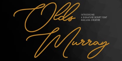 Olds Murray is an expressive casual signature script font. With regular consist mono-line contrast stroke, fun character with a bit of ligatures and alternates. To give you an extra creative work. Olds Murray font support multilingual more than 100+ language. This font is good for logo design, Social media, Movie Titles, Books Titles, a short text even a long text letter and good for your secondary text font with sans or serif. Make a stunning work with Olds Murray font. Cheers, Maulana Creative
 - Compacta by ITC,
$39.00 Compacta is the work of Fred Lambert and is reminiscent of the extremely narrow, sans serif stencilled fonts of the 1920s, then intended as titles or headlines for magazines and posters. The characters of all cuts are narrow and the space between letters is very small. The white spaces between strokes are perceived almost as only small white stripes and dots which stand out from the black bands of the lines of text. Compacta is not meant for longer texts but is impressive in titles and headlines.
 - Brakoda by IbraCreative,
$17.00 Brakoda is a delightful sans-serif typeface that effortlessly combines playfulness with a clean and modern aesthetic. Its lively and quirky letterforms exude a sense of fun, making it a perfect choice for projects that aim to capture a youthful and dynamic spirit. With a balanced blend of rounded curves and straight lines, Brakoda maintains readability while infusing a sense of whimsy, making it a versatile choice for a wide range of design applications, from branding and headlines to digital interfaces and creative marketing materials.
 - Gemsbuck Pro by Studio Fat Cat,
$14.00 Gemsbuck Pro is a typeface that was designed by Atok Khoirudin in 2022. It is a sans-serif font known for its bold and geometric design. Gemsbuck Pro features clean lines and a modern, industrial aesthetic, making it popular for various applications, including posters, headlines, and logos. The font family includes several weights and styles, ranging from light to bold, allowing for versatile use in different design contexts. Gemsbuck Pro has been widely used in print, advertising, and digital media due to its distinctive and impactful appearance.
 - Relove by Storictype,
$17.00 Relove typeface is a all caps typeface decorative-serif font embodying vintage and elegant curves with functional structure with a extra ornaments.it was inspired by natural forms and structures and the curved lines. with strong and sleek letters, which create a brilliant foundation for the flourished alternatives to rest. The result is beautiful interlocking and totally unique designs. Relove Typeface is great for any kind of display purpose from branding, emblem, advertising , t-shirt , etc you name it. Features : Uppercase Numbers & Punctuation Alternate 1 Alternate 2
 - Rusticform by Maulana Creative,
$14.00 Rusticform is a curvy signature script font, with light mono-line stroke, slanted and fun character. It has Opentype features ligatures of character and alternate lowercase option, To give you an extra creative work. Rusticform signature font support multilingual more than 100+ language. This font is good for logo design, Social media, Movie Titles, Books Titles, a short text even a long text letter and good for your secondary text font with sans or serif. Make a stunning work with Rusticform font. Cheers, MaulanaCreative