10,000 search results
(0.021 seconds)
- Allerton by Jeff Levine,
$29.00 Presenting a condensed Art Deco sans serif font with rounded corners and squared inner lines, based on the hand lettered title on the cover of the sheet music for 1944’s “Just A Little Fond Affection”. Allerton JNL is available in both regular and oblique versions, and was named after a neighborhood in the Bronx, New York.
 - Grottel by Hashtag Type,
$29.00 Grottel is a modern grotesque sans serif font family that follows the philosophy of original grotesque typefaces with enhanced personality. Fine details and tuning, balance functionality and the beauty representative of the aesthetic movement in the 19th century. Details include 5 weights, manually edited kerning, ligatures and alternatives to allow users to add further personality to the font.
 - Comforting Sounds by PizzaDude.dk,
$17.00 Sometimes the way forward is simplicity. That goes for your personal life as well as designing. Sometimes what catches the eye is something simple. My Comforting Sounds font is a handmade sans serif font. It has a crunchy line, an organic look and legibility even at very small sizes. And in a charming way, it is quite simple!
 - Palm Shine by Jafar07,
$14.00 Palm Shine is a beautiful and versatile font with a retro serif design that can be used in many different ways. Its elegant lines and modern look will make your designs stand out while maintaining a classic, timeless feel. It's also extremely versatile - perfect for logos, boho and groovy designs, and even silhouette art and more.
 - Caracas Stencil Pro by John Moore Type Foundry,
$25.00 Caracas Stencil Pro is a new family of stencil sans serif fonts, looking friendly, sweet and comfortable to read. Where text flow between straight lines and round by becoming transparent in the interest of readability. Caracas Stencil is ideal for working in small letters and texts of a technical nature. Caracas is a humanistic approach to reading sans forms.
 - Avegas Royale by Java Pep,
$15.00 Avegas Royale font is modern sans serif font that is made in 4 styles regular, italic, bold, and bold-italic. The shape is made to contrast curves and lines between light and thick so that it looks more stylish and stands out. This font that perfect for logo, headline, advertising, quote text, invitation card, branding identity, and more.
 - Styla Pro by URW Type Foundry,
$39.99 Styla is a refined romantic sans, in the best tradition of Didot and Bodoni. The combination between Styla’s feminine grace and sharp endings creates an air of seduction, ideal for magazines, ads and books on fashion, fine arts, philosophy, luxury goods, women and love. A typographic jewel, Styla brings romantic sensuality and refinement to the world of sans-serifs.
 - P22 Coda by IHOF,
$39.95 Coda Pro is a simple but decorative and controlled sans serif design. Coda literally means ‘tail’ (Italian, from latin cauda) and refers to the way the letters h, m and n stretch below the writing line towards the end of a sentence or before a final stop. Coda Pro is an elegant and contemporary font suited for display purposes.
 - ALS Mezzo by Art. Lebedev Studio,
$63.00 Mezzo is a slender, humanist sans serif with four font styles. Designers will find it useful when creating packaging, candy and pastry wrappers, perfume and wine labels, etc. Slim and elegant letterforms are especially fit for small pieces of text, headings and subheads. Mezzo is a good choice for women’s magazines with their particularly subtle approach.
 - Porlane by ATK Studio,
$15.00 Porlane™ is a condensed sans-serif typeface created to be used for bold titles with distinctive shapes into a display fonts way to make it legible for contemporary use. Come with single weight, legible and expressive shapes. Its glyph catalog provides an easy to compose system for Latin languages with high x-height and tight line spacing.
 - Sunrays by Supfonts,
$14.00 Sunrays Display is a modern and elegant display with incredible unusual lines that makes it far from the typical classic serif. Font is an open type with clean shapes and precise kerning. It includes ligatures encoded by the PUA. Language support: All European languages Don't forget to subscribe so you don't miss out on the new awesome fonts Dima
 - Braggadocio by Monotype,
$29.99 Braggadocio is a very black typeface. Braggadocio is a strange hybrid with characteristics of both sans serif and modern faces; and it belongs very much to its time. Like high society in the 1920's, it should not be taken too seriously. Use the Braggadocio font for display lines in advertising, magazines and light hearted communications.
 - Nokio by TypeUnion,
$25.00 Nokio is a clean, minimalist Sans Serif typeface designed in 2013 by TypeUnion. Nokio uses clean lines and curves matched with smooth, rounded terminals to produce a structured typeface with a subtle playfulness. Nokio is made up of 5 weights, and is built for multiple uses, from digital applications such as Apps and Websites to logotypes and print applications.
 - ITC Fenice by ITC,
$29.99 ITC Fenice font (pronounced fe-nee-chay) is the work of designer Aldo Novarese and was influenced by the traditional designs of Didot, Bodoni, and Ibarra. It displays the fine serifs of a Bodoni but blends such characteristics with a contemporary structural style. ITC Fenice font is perfect for applications requiring the economical use of space.
 - Halliday JNL by Jeff Levine,
$29.00 Halliday JNL was redrawn from impressions made by a rubber stamp sign printing set, thus providing the slight imperfection of line widths that gives a hand-made approach to the typeface. The lettering style is based on Beton Open Condensed, a clean and popular slab serif used for decades in print display titling and rubber stamp manufacture.
 - Vivala G Slab by Johannes Hoffmann,
$14.99 The geometric G-Slab family is characterized by distinct large serifs and variance of line width from hairline to bold. It is suitable for titles in different sizes as well as for text blocks. The family includes seven weights and two widths. The extended character set supports Northern, Western, Southern and Central European as well as Eastern European languages.
 - TKT Kate by TKT,
$35.00 TKT Kate is a new interpretation of elegant sans serif display font with a modern touch. It inspired from Optima and Humanist font. The overall look is round, open counters and with a large x-height, geometrically constructed which is intentionally meant to be used in branding projects such as packaging, corporate design to on line applications.
 - Aventra by Graphite,
$18.00 Aventra is a handmade organic sans serif typeface family. With curved edges and slightly uneven lines, it has a warm and friendly appeal. Its clean and minimal design makes it legibility and readable even in smaller point sizes. With a distinct and informal human touch, it is ideal for packaging, branding, display, posters, logos, advertising, signage and editorial design.
 - Ferpa by Typeóca,
$30.00 Ferpa is Typeóca's Fierciest Font Family. Drawn using only straight lines, Ferpa uses every kink, every kink and every serif as an opportunity for expressivity. From Thin to Black in both Roman and Italic constructions, Ferpa is available as 18 otf static font files, with a character set that goes a little beyond Latin Extended A.
 - Petrol Stencil by Naghi Naghachian,
$104.00 Petrol Stencil is a new creation of Naghi Naghashian. Petrol Stencil is designed for technical use. it is the first Arabic Stencil typeface known until today for stamping on packing crate, sacks and vehicles. This typeface offers a fine balance between calligraphic tradition and the sans serif aesthetic common in Latin typography. Petrol Stencil supports Arabic, Persian, and Urdu.
 - Skorid by Totem,
$20.00 Skorid is a geometric condensed sans serif font family, constructed only out of straight lines. Coming in 7 weights, regular and italic, from thin to black, you have a wide array of possibilities of using Skorid for any purpose you need. Skorid speaks around 70 languages, including Cyrillic. Contains a lot of alternative letters to boost your creativity.
 - Luncat by Eotype,
$12.00 Luncat is a fancy modern serif font. Luncat is characterized by extreme contrast between thin and thick lines. You can use this font in modern vintage designs. This font is very suitable for various kinds of projects such as, brands, magazines, logos and more. There are alternative style and ligature features that make the typeface look more unique.
 - Boston Breton NF by Nick's Fonts,
$10.00This engaging slab serif face made its debut in the 1906 ATF specimen catalog, and wears well over a century later. Its warm lines and a wide stance ensure that your headlines will be noticed. Both versions feature the complete Latin 1252, Central European 1250 and Turskish 1254 character sets, with localization for Lithuanian, Moldovan and Romanian. - Copperhead by Kustomtype,
$30.00 Copperhead is an 'all caps font' with thin rounded serifs. This font is specially designed for customers or companies fancying the Goudy's Copperplate font, though slightly different and restyled. Copperhead is a fine and easy readable font for advertising, logo design and can be used for headliners, all kinds of graphic & typographic work and corporate design also.
 - Impana by Craft Supply Co,
$15.00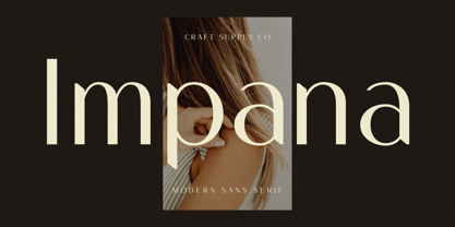 Introducing Impana: A modern sans-serif font that redefines contemporary design. With its sleek lines and versatile style, Impana brings a fresh perspective to modern aesthetics. This typeface is ideal for greeting card, packaging, brand identity, poster, or any purpose to make your design project look eye catching and trendy. Feel free to play with this typeface!
 - Adria Slab by FaceType,
$- Adria Slab is a smooth slab serif typeface that comes in seven weights and charming upright italics. Try combine it with its super friendly family member Adria Grotesk. Enjoy making great typography with a vast choice of lining, tabular and old style figures, numerators, denominators, tabular figures, fractions, ligatures, some sweet symbols and even alternate arrows.
 - Ancora by FAEL,
$20.00 I’m happy to announce the complete version of Ancora, a typeface I designed back in 2013. Ancora is a sans serif typeface with a distinctive style, inspired by the imagery in the production of the famous Port wine, such as boats, barrels, grapes, and bottle labels. Use Ancora for magazines, packaging, posters, stamps, brands and logos a new taste.
 - Lonie by Par Défaut,
$35.00 Lonie is sans serif font family (include 5 weight, italic and variable) It contains more than 1200 characters including the Latin, Cyrillic and Greek alphabet There are also 15 OpenType features (Superior; Inferior; Numerator; Denominator; Fraction; Tabular Lining; ;OldStyle Figure; Small Capital; Small Capitals from Capitals; Contextual Alternate; Case Sensitive; Ordinals; Access All Alternates; Stylistic Set).
 - Auster Variable by Resistenza,
$89.00 Auster Variable for Adobe's softwares. Auster packs sensational personality in its fine-tuned forms. Confident and quirky, yet comfortable to read, this distinctive san serif family stands out from the crowd. The curves cinch and strokes flair in unconventional places making Auster an unashamed rebel sure to turn heads. More About Opentype Features: https://bit.ly/opentype-rsz
 - Ridley Grotesk by Radomir Tinkov,
$25.00 Ridley Grotesk is a modern sans-serif. It comes in nine weights with matching italics, designed with powerful opentype features in mind. Each weight includes true small capitals, alternate characters, extended language support, ligatures and more. Perfectly suited for graphic design and any display use. It could easily work for web, signage, corporate as well as for editorial design.
 - Satero Sans by Linotype,
$29.99 Satero was designed by Prof. Werner Schneider in 2007. Never before have we had so much written material to consume; this is the age of mass-communication. Unfortunately, the decision of which typeface to use is too often made lightly. The typeface is one of the most elementary means of language, and it can play a major role in a text's legibility and the amount of time the reader needs for it. The Satero Type System offers a high degree of legibility due to its dynamic and forms. The individual characters have been based on classical concepts. They are clearly made, and leave all unnecessary elements behind. The type works to create an environment of extreme legibility. Essential parts of the a, c, e, s, and r are to be found at the x-height line, which is the most important area of a line of text in determining legibility. The Satero Type System includes two members whose basic forms are the same. The Sans Serif members are more horizontally differentiated than common grotesques, which aides their legibility. The Serif design employs asymmetrical serifs, avoiding elephant feet" altogether. Their dynamic is progressive. The condensed nature of the seriffed counterparts is optimal for newspaper and magazine applications, where space is at a premium and paper must be saved. All fonts in the Satero Type System include a number of alternate glyphs, as well as ligatures and proportional lining figures; all weights except the Heavy and Heavy Italic fonts are also equipped with small caps, small cap figures, and oldstyle figures as OpenType features. "
 - Georgia Pro by Microsoft,
$40.00Georgia was originally designed in 1996 by Matthew Carter and hand-tuned for the screen by Tom Rickner. The Georgia family received a major update in 2011 by Monotype Imaging, The Font Bureau and Matthew Carter. Georgia is the serif companion to the sans serif screen font, Verdana. It was designed specifically to address the challenges of on-screen display with elegant yet sturdy and open forms. If you must have one serif face for reading on a computer, then you've found the best one right here. The original Georgia family included four fonts: regular, italic, bold and bold italic. The new and expanded Georgia Pro family contains 20 fonts in total. The Georgia Pro and Georgia Pro Condensed families each contain 10 fonts: Light, Regular, Semibold, Bold and Black (each with matching italic styles). Georgia Pro includes a variety of advanced typographic features including true small capitals, ligatures, fractions, old style figures, lining tabular figures and lining proportional figures. An OpenType-savvy application is required to access these typographic features. - Fluidum by Monotype,
$29.99 Aldo Novarese designed the Fluidum typeface in 1951. As its name implies, the design is very fluid. This high contrast script face curls and twists across the line. It is sort of a cross between Giambattista Bodoni's cursive letters, and Aldo Novarese's later, heavier designs, like Microgramma, Eurostile, and Sprint. Fludium should be set in very large pint sizes. It is perfect for invitations, greeting cards, and fine logos.
 - Antipol by phospho,
$30.00 Antipol is a Sans Serif design that reverses the conventions of a regular Latin Sans Serif. With a weight emphasis on the horizontals and its vertical terminals Antipol radiates a 1970s charisma known from the like of Antique Olive. Its modern and avantgardistic attributes are most pronounced in the Hairline weight, where ultra thin lines meet distinctive arrowhead-corners. This particular weight is meant for display settings, think full-page magazine titles or posters. Antipol Wide and Antipol Extended are a generous statement for graphic design with enough space to let the type breathe: art catalogs, lead texts, invitations, letterheads or brand identity. Any style comes with a wide range of OpenType features that goes beyond a standard display font: Small Caps, Proportional and Tabular Oldstyle Figures and Lining Figures, Fractions, and much more. Type Specimen: http://bit.ly/2mxRCcA
 - Varent Grotesk by Identitype Co,
$25.00 Identitype is very pleased to present Varent Grotesk, a sans serif family designed by Hendra Maulia and Aulia Rahman who was inspired by modern sans serif. The weights of the family itself contain 18 styles plus italic, ranging from Thin to Black. Ideally, it works to capture in a graphic way the universe related to technology, sci-fi, industry, and similar topics. It is a mixed family because of the construction of certain letters (as in “a”, “e”, “h”, “k”, “A”, “B”, and more). Another important line in the creative concept of this typeface is the function of its ink traps, which, in addition to fulfilling their primary function, serve to gain gestuality in its use. This font is capable of covering complex design needs by enabling association with specific themes, which makes it highly competitive in its graphic line.
 - Castlery by Fikryal,
$25.00 Castlery Modern Serif Font is a modern and elegant font designed with great care to provide a professional look for documents and graphic designs. This font has smooth and clean lines, while maintaining clear and easy-to-read letter heights. With an elegant serif style, this font is perfect for use in logos, books, magazines, posters, and other marketing materials that require a classy look. Castlery Modern Serif Font is available with uppercase letters, making it easy to customize to meet your design needs. With the advantages of a very modern and elegant design, as well as the ability to give a professional impression to your designs, Castlery Modern Serif Font is the perfect choice for graphic designers looking for cool and high-quality fonts. Features: Multilingual Support Thank you
 - Aquene by Craft Supply Co,
$20.00 Introducing Aquene – Display Serif Font Are you in search of a unique serif font with a captivating flow for your display requirements? Look no further than Aquene – Display Serif. This meticulously crafted font is designed to make your text stand out and captivate your audience. Unique Flow for Captivating Text Aquene – Display Serif font boasts a distinctive flow that sets it apart. Firstly, its elegant curves and graceful lines lend a touch of sophistication. Secondly, it’s perfect for eye-catching headlines and titles that leave a lasting impression. Versatile Usage for Various Design Needs Moreover, Aquene is remarkably versatile. It’s suitable for posters, banners, or website headers, making it ideal for different design contexts. Whether you’re working on a promotional campaign, crafting a logo, or designing social media graphics, Aquene’s adaptability shines.
 - Quietism Variable by Michael Rafailyk,
$150.00 A smooth contemplative Antiqua with aspiring to the sky ascenders, inspired by the Quietism philosophy. Clarity of the mind is achieved by bringing the body into a state of calm and contemplation, and this is reflected in the design – the quiet horizontal serifs (body) are opposed to the peaky soaring ascenders (mind). The design also features four optical size subfamilies with different x-height and contrast, oldstyle diagonal stress, oldstyle figures by default, smooth details and slightly dark texture. Variable axes: Weight, Contrast, X-Height. Scripts: Latin, Greek, Cyrillic. Languages: 480+. The complete list of supported languages: michaelrafailyk.com/quietism Kerning: 4553 class-to-class pairs. Hinting: Not applied. Format: TTF – OpenType with TrueType outlines. Variable Font: Quietism Variable provides more options than static versions, and has three axes: Weight (Thin–Black), Contrast (Low-High), and X-Height (Low-High). Variable fonts includes thousands of styles that you can access using a sliders on graphic editor or via CSS on web browser. Mixing different axes gives you extra styles not represented by static fonts. Optical Size: The typeface is represented by four subfamilies: Text (low contrast, high x-height – for paragraph 10-20 pt), Deck (medium contrast, medium x-height – for subheading 20+ pt), Display (high contrast, medium x-height – for heading 72+ pt), Poster (high contrast, low x-height – for big size 120+ pt). Small Caps: Lowercase letters and Oldstyle Figures are replaced with Small Capitals forms. Capitals to Small Caps: Uppercase letters, all figures, and some punctuation are replaced with Small Capitals forms. Case Sensitive Forms: ()[]{}‹›«»-–—•·#%‰@ and Arrows are centered on capitals. Oldstyle figures are replaced with Lining figures. Oldstyle Figures: 0123456789 #%‰. Designed to work with lowercase letters. Used by default. Lining Figures: 0123456789 #%‰. Figures are the same height as uppercase letters (cap height). Proportional Figures: Lining, Oldstyle, Small Caps, Capitals to Small Caps. Tabular Figures: Lining, Oldstyle, Small Caps, Capitals to Small Caps. Ordinals: adehnorst. Superscript, Subscript, Numerator, Denominator: 0123456789. Fractions: ¼½¾⅐⅑⅒⅓⅔⅕⅖⅗⅘⅙⅚⅛⅜⅝⅞⅟ (precomposed). Any other fractions (even those typed through a slash) will also be displayed correctly, with the automatic replacement to Numerator + fraction + Denominator. Slashed Zero: All 0 figures. Contextual Alternates: Number sign character (#) before uppercase letters is replaced by its version centered on capitals. Hyphen character (-) between two uppercase letters is replaced by its version centered on capitals. First of two TT letters is replaced by its alternate form. Letters vwy before the letters fijmnprtuvwxy are replaced with an alternate shorter versions that fits better in the context. Contextual Alternates (Greek): ΆΈΉΊΌΎΏ. Greek uppercase accented characters lose their tonos accent and retain only dieresis in All Caps and Small Caps modes. Turned on by default. If you need tonos accents in All Caps then turn off Contextual Alternates (calt) feature. Stylistic Alternates: FTГТИЦЩцщ and their versions with diacritical marks. Stylistic Set 01 “Arrows”: Left <- Right -> Up Left Right <-> Up Down North West South East \> South West Stylistic Set 02 “Round-Square Cyrillic”: ДИЙЍЛФвгджзийѝклнптцчшщьъю characters are replaced with its Bulgarian or Russian forms. Stylistic Set 03 “Cyrillic Tse Shcha short tails”: ЦЩцщ characters are replaced with its alternate form with short tail. Stylistic Set 04 “Cyrillic I full serifs”: ИЙЍӢ characters are replaced with its alternate form with inner serifs. Stylistic Set 05 “FT bent inward serif”: FTГ characters and their versions with diacritical marks are replaced with its alternate form with right head serif that bent inside. Stylistic Set 06 “Small Caps centered on Capitals”: Small Caps are vertically centered on uppercase letters. Standard Ligatures: fi fl fb ff fh fj fk ffb ffh ffi ffj ffk ffl. Discretionary Ligatures: Th ct st. Localized Forms: 52 character substitutions for Azeri, Bulgarian, Catalan, Dutch, German, Kazakh, Macedonian, Moldavian, Polish, Romanian, Serbian, Tatar, Turkish. Glyph Composition/Decomposition (Diacritics): Full Latin and based Vietnamese set of diacritics (571 characters). Precomposed.
 - Gradus by Brenners Template,
$19.00Gradus is a multi-purpose typeface designed to properly mix elegance and rhythm. The balance between modern and sophisticated touches and styles can achieve the effect of harmonizing well with any device and channel. The hardness of the rigid stem of the grotesque typeface is transformed into a soft touch that organically matches words and sentences. Langages. Basic Latin. Western European, Central European, South Eastern European, South American, Oceanian, Basic Cyrillic, Ukrainian OpenTypeFeatures. Standard Ligatures : fi, ff, ffi. Discretionary Ligatures : ai, ia, il, ill, illi, ma, md, mi, mu, na, nd, ni, nu. Fractions, ss01, ss02, and more. - Venice La Corla by Jolicia Type,
$19.00 Venice La Corla is a breathtaking serif font that embodies timeless elegance and sophistication. This typeface exudes a sense of refinement and grace that is perfect for projects where a touch of classic charm is required. Each character in Venice La Corla is meticulously crafted to provide a harmonious balance between its serifs and elegant lines, resulting in a truly remarkable font. Key Features: 1. Serene Elegance: Venice La Corla's primary hallmark is its serene elegance. The font's graceful serifs and curvaceous letterforms create an atmosphere of sophistication that is suitable for various design applications. 2. Timeless Appeal: Inspired by the romanticism of the Italian city of Venice, this font transports you to an era of classic beauty. Its timeless appeal is perfect for projects that require a touch of nostalgia and charm. 3. Versatile Usage: Venice La Corla is incredibly versatile and adapts effortlessly to different design scenarios. Whether it's a formal wedding invitation, a vintage-inspired poster, or a high-end fashion magazine, this font adds a touch of class to any project. 4. Exceptional Legibility: Despite its ornate elegance, Venice La Corla maintains excellent legibility, making it a practical choice for long passages of text as well as for branding and display purposes. 5. Captivating Details: The font's characters are adorned with captivating details, making it a true work of art. Each letter is thoughtfully designed to enhance the overall visual appeal of your design. Recommended Uses: Venice La Corla is ideal for a wide range of projects, including but not limited to: - Wedding invitations and stationery - Vintage and classic-themed designs - High-end fashion and luxury branding - Editorial design and magazine layouts - Product packaging and labels - Fine art prints - Wine labels and menus for upscale restaurants Incorporate Venice La Corla into your design projects, and you'll instantly elevate the aesthetics, adding a touch of timeless elegance that will captivate your audience.